10,000 search results
(0.054 seconds)
- Nawin Arabic Ltn by Letterjuice,
$107.00 Nawin is an informal Arabic typeface inspired by handwriting. The idea behind this design is to create a type family attractive and ownable for children but at the same time a design that keeps excellent letter recognition for reading. Handwriting has been a great source of inspiration in this particular typeface. By emulating the movements of the pen, we have obtained letter shapes that express spontaneity. A bright group of letters create a lively and beautiful paragraph of text. To get closer to handwriting and the variety of letter shapes that we draw while writing, this typeface offers a large number of alternative characters, which differ slightly from the default ones. Because we have programed the «Contextual Alternate» feature in the fonts, these alternate characters appear automatically as you set a text on your computer. For instance, in the Arabic variability on vertical proportions between letters Alef and initial Lam, create movement in text and avoid the cold mechanical feel of repetition. In the case of the Latin a part from having an entire alternate basic alphabet, there are also different letterforms for characters with diacritics, this way variability becomes even greater. Nawin is quirky and elegant at the same time. Letter recognition is relevant when reading continuous text. For this reason, in the Arabic, we have added another contextual alternate feature with alternate characters that help to avoid confusion when letters with similar or the same shape repeat inside one word. This is the case of medial «beh and Yeh» repeated three times continuously in the same word. The alternate characters change in shape and length, facilitating distinction to the reader. Since this typeface is inspired by handwriting and the free movement of the hand while writing, we considered ligatures a good asset for this design. The Arabic has a wide range of ligatures that enhance movement and fluidity in text making look text alive, while the Latin achieves this same effect via contextual alternates.
 - FF DIN Arabic by FontFont,
$85.99
- DIN Mittel EF by Elsner+Flake,
$35.00The typeface DIN Mittel, offered by Elsner+Flake, is based on the DIN 1451 used in Germany since 1931. The DIN 1451 which was primarily seen in the areas of technology and traffic had to adhere to the so-called DIN Norms. Variations of the DIN 1451 are also employed in Austria, Eastern Europe, Greece and the Near East. With its new release Elsner+Flake has expanded the DIN Mittel with the characters EuropaPlus and Cyrillic. - FF DIN Paneuropean by FontFont,
$92.99 FF DIN: the famous, faithful and first revival of DIN 1451. FF DIN originates in the lettering models from the German standard DIN 1451, and is considered the perfect standard typeface due to methodical and engineered design. FF DIN Variable offers you more FF DIN than ever before. Pushing font technology to its limits, Variable fonts provide creatives a tool to dial in hyper specific variations which thrive in any design space. FF DIN Variable take bold steps in engineering, which the typefaces behaviour which brings in FF DIN’s technical look-and-feel into the smooth and almost organic world of Variable Fonts. Available in both upright and italic styles, there is a lot more FF DIN to discover with new era of type technology. FF DIN Italic is a sloped roman style, however it is optically corrected – slightly thinner, slightly narrower. As a result, FF DIN Italic stands out subtly. FF DIN Variable stays faithful to its parent’s DNA, the utmost care was taken to ensure that the new instances of FF DIN Variable remained consistent with all the well-known weights. Precision is the mantra of FF DIN, the FF DIN Variable is no exception to this design philosophy. Produce exquisitely fine-tuned typography and expressive animated headlines for any design. Infinite styles, intelligent, and powerful.
 - DIN Next Decorative by Monotype,
$40.99 This four-piece family is the DIN design, but not as you know it. The famously, crisp, clean and precise typeface has been given a textured update that's reminiscent of rusted metal, or rubber stamps. Underneath this lies the same sturdy, geometric shapes that have allowed DIN to stand the test of time, but with a new sense of tangibility. “This kind of treatment is more about creating a feeling or a mood that goes beyond the communication of the words themselves,” explains Monotype Studio director Tom Rickner. “I think it expands the repertoire of what DIN Next can express.” Designed for display, these four typefaces – DIN Next Rust, DIN Next Shadow, DIN Next Slab Rust and DIN Next Stencil Rust – show a new side of DIN Next's personality, as if the surface of each letterform has been gradually worn away over the years.
 - Holiday Thin Line by alphArt,
$25.00 “Holiday Thin Line” is a mesmerizing typeface with elegant and minimalist thin lines. It is specifically designed to add a touch of beauty and lightness to your designs. With its gentle and simplistic nature, this font is perfect for projects that require a modern touch, such as wedding invitations, logo designs, greeting cards, and more. Available in various character variations and symbols, it allows you to express limitless creativity. Get “Holiday Thin Line” now and enjoy the enchanting beauty of typography. Unlock a world of creative possibilities with an extensive collection of 369 meticulously crafted glyphs, offering limitless expression for your designs. Our font proudly supports an impressive range of 92 languages, ensuring seamless communication across cultures and borders. May it inspire you to create remarkable designs that leave a lasting impression. Thank you for joining us on this typographic journey!
 - Courier Line Draw by Monotype,
$29.99Designed as a typewriter face for IBM, Courier was redrawn by Adrian Frutiger for the IBM Selectric series. Courier is a typical fixed pitch design, monotone in weight and slab serif in concept. The Courier font is used to emulate typewriter output for reports, tabular work and technical documentation. - FF DIN Slab by FontFont,
$50.99 FF DIN: the famous, faithful and first revival of DIN 1451. FF DIN originates in the lettering models from the German standard DIN 1451, and is considered the perfect standard typeface due to methodical and engineered design. FF DIN Slab is a robust compliment to the FF DIN family. Designed by Antonia Cornelius and Albert-Jan Pool, it offer designers tools to create greater rhythm and design depth. FF DIN Slab’s proportions have been meticulously aligned with its Sans origins, offering the perfect balance between positive and negative space. The serifs are assertive, sturdy and balanced, they are engineered to emphasis a strong horizontal flow through text, a grounded utility and assurance in headlines. The result of this attention to detail is a typeface that harmonizes beautifully with other FF DIN styles. Pushing font technology to its limits, FF DIN Slab is also available as a Variable font. Allowing creatives to design hyper specific variations which thrive in any design space, and even seamlessly animate movement from one state to the next. FF DIN Slab distinctively carries on its parent’s DNA, speaks the same native language — but with a strong peculiar dialect. It expands the DIN family worthily — independent but integrated — and opens totally new possibilities of uses with the whole DIN family.
 - DIN Neuzeit Grotesk by Linotype,
$40.99 The German Standards Committee suggested the light Neuzeit-Grotesk’ font in 1970 for use in official signage, traffic directional systems, etc. The typeface had been designed by Wilhelm Pischner and appeared with the font foundry D. Stempel in 1928. The font Neuzeit Grotesk was once the standard in the print industry, as a timeless typeface with no real distinguishing features. Like other typefaces of the 1920s, DIN Neuzeit Grotesk reflects the philosophy of the times, Form is Function.’
 - DIN 2014 Rounded by ParaType,
$40.00 DIN 2014 Rounded is an extension of the industrial sans serif DIN 2014. It combines the softness and friendliness of the rounded endings with the seriousness and stability of the original typeface. Not a typical childish rounded font. DIN 2014 Rounded works well for medical or architectural topics, headings on the web or in periodicals, brand identity, packaging, and, thanks to the DIN proportions, for signage. DIN 2014 Rounded includes six styles ranging from extra light to extra bold, corresponding to the upright styles of DIN 2014, as well as a variable version. The typeface supports all European languages based on Latin, Cyrillic, and Asian Cyrillic (Tatar, Kazakh, Kyrgyz and other languages). Isabella Chaeva and Alexander Lubovenko worked on the rounded version. The typeface was released by Paratype in 2021.
 - DIN 17 SB by Scangraphic Digital Type Collection,
$26.00Since the release of these fonts most typefaces in the Scangraphic Type Collection appear in two versions. One is designed specifically for headline typesetting (SH: Scangraphic Headline Types) and one specifically for text typesetting (SB Scangraphic Bodytypes). The most obvious differentiation can be found in the spacing. That of the Bodytypes is adjusted for readability. That of the Headline Types is decidedly more narrow in order to do justice to the requirements of headline typesetting. The kerning tables, as well, have been individualized for each of these type varieties. In addition to the adjustment of spacing, there are also adjustments in the design. For the Bodytypes, fine spaces were created which prevented the smear effect on acute angles in small typesizes. For a number of Bodytypes, hairlines and serifs were thickened or the whole typeface was adjusted to meet the optical requirements for setting type in small sizes. For the German lower-case diacritical marks, all Headline Types complements contain alternative integrated accents which allow the compact setting of lower-case headlines. - Two Lines Loop by Kaer,
$21.00 Alphabet set made of two white parallel lines. They are looked like infinite looped icons. Ideal for dynamic app, minimalism design, sports identity, technology adv. What's included? Uppercase (lowercase are the same) Numbers Symbols Punctuation Multilingual support Please feel free to request any help you need: kaer.pro@gmail.com Best, Roman.
 - Baby Lyns ABC by Otto Maurer,
$9.90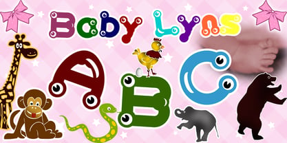
- DIN Next Stencil by Monotype,
$56.99 The DIN Next™ Stencil suite of designs is DIN with an attitude. It’s even more industrial strength than the original. DIN Next Stencil’s seven roman weights are perfect for projects that require a mechanized, military, or commercial vibe. If you’re looking to create commanding display typography, be it in advertising, apparel, packaging, posters, signage, wayfinding – or crash dummy name tags, DIN Next Stencil can be the perfect typographic enhancement. Based on Akira Kobayshi’s DIN Next with stenciling by Sabina Chipară, the wide range of weights and large complement of diacritical and international characters – including those for Cyrillic and Greek – further expand the design’s capabilities. The DIN Next Stencil fonts are powerful tools in their own right – and provide a distinctive supplement to the DIN Next typographic palette.
 - Ad Lib WGL by Bitstream,
$50.99 - LP Hand Eins by URW Type Foundry,
$19.99 LP Hand Eins is a typeface designed by German type designer Peter Langpeter. LP has been running his own design studio since 1995, working as a typeface and logo designer, as a calligrapher, cartographer and illustrator. During this time LP created a large number of excellent new typeface designs. LP Hand Eins is well-suited for plenty of applications, e.g. personal correspondence, invitations, greeting cards etc.
 - Washington Mono Line by Doeltype,
$20.00 Hi Ladies and Gentleman ! Introducing the Washington Mono Line font is a simple and classy font, comes with Elegant Variations, opentype features such as stylistic alternates, initial and final form, Washington Mono Line Features 515 glyphs and ligatures. We keep this font looks elegant, classy, readable, stylish, catchy and easy to use. The Washington Mono Line Font is the right choice for photography, signature or signature logo design, quotes, album covers, business cards, and many other design projects. From business cards to photo watermarks, because the Washington Mono Line font is a stylish signature with luxury. This is a very charismatic & confident font choice for your various design projects.
 - Vin Slab Pro by Mint Type,
$35.00 Vin (translated from Ukrainian as “he”) is a superfamily consisting of three robust typefaces with pronounced vertical stems and rounded corners. All three typefaces feature very large x-height for even more expression and assertiveness. Vin Slab Pro is a condensed rigid slab-serif with extra-large x-height and rounded corners. It is designed specifically for short texts to add significance and emphasis. Be sure to check other two typefaces of Vin superfamily: Vin Sans Pro and Vin Mono Pro .
 - Lina sans Arabic by Zaza type,
$24.00 Lina sans is an Arabic typeface from Lina type family, it expresses modern vigor based on simplicity and clarity. It's Strong, Bold, legible, clear, simple, Modern. With a handful set of OpenType features and alternatives. Lina type family consists of Lina soft, Lina sans, Lina round. the design is inspired by the Kufic calligraphic style and influenced by the Naskh style. Lina sans was highly crafted in order to perform well both on screen and in print. The large x-height and open counters make it function well even on small font sizes. It has a wide range of use possibilities headlines, logotypes, branding, books, magazines, motion graphics, and use on the web and Tv. Lina sans consists of 7-weight versions from thin to bold.
 - Hebrew Liane Std by Samtype,
$59.00 This is a modern, wonderful, and beautiful font. This font is super readable and can be used from Posters to a Hebrew Bible. The readability of this font is amazing. This font has the modern Hebrew punctuation: Shevana, Kamatz Katan, Dagesh Hazak, and Cholam Chaser. Designers: Sami Artur Mandelbaum Publisher: Samtype MyFonts debut: Jan 17, 2022
 - DIN Next Rounded by Monotype,
$56.99 The name DIN refers to the Deutsches Institut für Normung (in English, the German Institute for Standardization). The typeface began life as the DIN Institute's standard no. DIN 1451, published in 1931. It contained several models of standard alphabets for mechanically engraved lettering, hand-lettering, lettering stencils and printing types. These were to be used in the areas of signage, traffic signs, wayfinding, lettering on technical drawings and technical documentation. Rooted in earlier designs for Germany's railway companies, the alphabets were based on geometric shapes in order to be easily reproducible using compass and ruler. In post-1945 West Germany, the DIN alphabets were widely used, for instance on most road signs. They became available as fonts that were appreciated by designers for their industrial, somewhat quirky and “non-typographic” look and feel. From the 1990s onwards, more refined versions became available for use in book and magazine typography. DIN Next is a typographically corrected and expanded version of this quintessential 20th-century design. DIN Next Rounded is its softer, friendlier version.
 - Fling-a-Ling by TypeArt Foundry,
$45.00
- On The Line by Thaddeus Typographic Center,
$15.00On the line is a slanted stylistic script display typeface, with elegant features, beautiful curves and artistic forms all well balanced. Refined rough shapes combined with precise elegant strokes complement the personality of this typeface. A hybrid handmade round script, that evokes a quintessence of tradition while keeping its modern design esthetics. Ideal for brochure design, menus, invitations, package design, and advertising. - EF DIN 1451 by Elsner+Flake,
$35.00 - DIN 2014 Stencil by ParaType,
$30.00DIN 2014 Stencil is a stencil version of DIN 2014 typeface inspired by signage, data plates and stencilled building inscriptions. The typeface has a pronounced industrial spirit and can be used in the most rigorous conditions. DIN 2014 Stencil family consists of 18 styles which include six weights (corresponding to DIN 2014) with three grades of 'stencilness' for each weight. The typeface was designed by Vasily Biryukov and released by Paratype in 2017. - Lil' Diddles One by Patricia Lillie,
$25.00Aliens, toys, lawn ornaments and more. - Across the lines by Gassstype,
$27.00 Hello Everyone, introduce our new product Across The Line is Modern Display Typeface with a natural feel. This handmade font will make your design has a beautiful natural touch for each details.
 - Lina Soft Arabic by Zaza type,
$24.00 Lina soft is an Arabic typeface from Lina-type family, with a warm and humane feeling. It's legible, soft, clear, flexible, simple, and contemporary. With a handful set of OpenType features and alternatives. Lina type family consists of Lina soft, Lina sans, Lina round. The design is inspired by the Kufic calligraphic style and influenced by the Naskh style. Lina soft was highly crafted in order to perform well both on screen and in print. The large x-height and open counters make it function well even on small font sizes. It has a wide range of use possibilities headlines, logotypes, branding, books, magazines, motion graphics, and use on the web and Tv. Lina Soft consists of 7-weight versions from thin to bold.
 - Lion and Hare by Rook Supply,
$14.00 Lion & Hare is an ultra compressed, tall font family that portrays strength and power. The condensed characters maintain fairly square edges to give a more consistent geometric & industrial look to the font. The font family supports 27 languages and comes in 6 styles. Lion and Hare works fantastic for website headers, magazine layouts, logos, branding and much more.
 - Tin Lizzie JNL by Jeff Levine,
$29.00 One of the most unusual sets of antique stencils spotted for sale online comprises a set of twenty-four classic logos of early 20th Century automobile companies. For whatever purpose that is now lost to time, these stencils represented the logos of many of America's finest auto manufacturers; most now just historical memories. The logos were painstakingly redrawn, maintaining the distinctive look of the hand made cutting, although it was an exacting process - some of the images were taken at an angle, and a bit of artistic license had to be used as a compensatory factor. It is to be noted that any and all of the logos presented in this font are the intellectual property of the companies, successors or assignees that may still hold the rights to these symbols. No endorsements by such corporate entities are either expressed or implied. Additionally, it is advised that any use of these logos be restricted to historical or hobby purposes, and they should not be used in a way that would construe any authorized reproduction of the logos in a commercial fashion.
 - a Morris line by JOEBOB graphics,
$9.00 Here's a Morris line; a traditional and legible font in small sizes, but almost abstract in big sizes. Named after my son Morris and it's got nothing to do with a certain musical...
 - Yin Yang Messages by Ingrimayne Type,
$9.00 YinYangMessages contains two sets of letters, those on the upper-case keys that fit on the left side of a yin-yang symbol and those on the lower-case keys that fit on the left side of a yin-yang symbol. One can alternate the two sets manually but the OpenType contextual alternatives feature does this automatically in any program that supports this feature. The family contains two fonts. In one the filled half is on the left and in the other the filled half is on the right. The slash and backspace keys contain blank halves of the symbol, which are useful for completing words with an odd number of letters. The two styles can be used in layers. YinYangMessages is a fun and playful family that every once in a while may be the ideal typeface for some unusual situation.
 - Baldufa Cyrillic Ltn by Letterjuice,
$93.00 Baldufa is a charming typeface with strong personality, which looks very comfortable in text. There is a search to obtain complicated curves and detailed features, which gives the typeface a touch of beauty and elegance. However, this is also a self-conscious design that claims through the rounded serifs and irregular vertical stems appreciation for quirkiness and human imperfection. The letterforms are inspired by the slight distortions and idiosyncrasies that came with old printing methods. It has distinct, features such as rounded serifs, irregular vertical streams, ink traps and extremely thin junctions. In the Italic, serifs have been removed to enhance movement and expressivity. These experiments in form have not come at the cost of legibility: The typeface remains suitable for both small and display text. Baldufa Cyrillic Latin contains Cyrillic Extended and Latin.
 - DIN 1451 Paneuropean by Linotype,
$92.99 - One Thin Line by Gleb Guralnyk,
$13.00 Hi! Introducing a simple minimalistic font named "One Thin Line". Because almost all letters and characters are made of one line.
 - Mini Pics Lil by NicePrice Font Collection,
$4.99 - Winning Team JNL by Jeff Levine,
$29.00 The second volume of the Robbins Music Corporation's "Hollywood Song Folio" features the word "Hollywood" lettered in a condensed block style with inline, strongly reminiscent of sports or college-themed typography. This was the inspiration for Winning Team JNL.
 - FF DIN Stencil by FontFont,
$50.99 FF DIN: the famous, faithful and first revival of DIN 1451. FF DIN originates in the lettering models from the German standard DIN 1451, and is considered the perfect standard typeface due to the methodical and engineered nature of its design. The FF DIN family breathes an atmosphere of versatility and authority, FF DIN Stencil follows the same design principles with extra flair. The bridges are arranged vertically, which usually replaces the thinnest parts of the strokes — offering depth in your headlines. Go loud and scale up, as the weights get heavier, the width of the bridges skillfully expand and contract, enabling FF DIN Stencil to provide confidence in volume, and in any chosen style. Also made available as a Variable font, creatives can design hyper specific variations to thrive in any design space, and even to animate movement from one state to the next. Get innovative with the entire FF DIN family, FF DIN Stencil’s spacing and kerning is identical to FF DIN, this enables swapping between any FF DIN font without changes in word length or line breaks. For true FF DIN fans, FF DIN Slab and FF DIN Stencil designed by Albert-Jan Pool, Antonia Cornelius and Achaz Reuss, can be seen as harmonious companions to the FF DIN family, rather than alternatives. Bestowed with its parents distinctive DNA, all the FF DIN extensions open up new possibility with their own unique qualities, but stay true to the FF DIN design philosophy of engineered precision.
 - DIN Next Shapes by Monotype,
$29.99 Sabina Chipară's DIN Next Shapes typeface is a twist on the original German industrial classic, taking its skeleton and re-clothing it in dots, hearts, snowflakes and stars. The design offers a more approachable and whimsical tone of voice than the original, while maintaining all the legibility and clarity of form that makes DIN Next such a reliable and versatile design. It works in harmony with DIN Next, and is particularly suited for designers looking to be a little more expressive. DIN Next Shapes includes four fonts: Dots, Flakes, Hearts and Stars, and has pan European language support including Greek and Cyrillic. It also has OpenType features including stylistic alternatives, ligatures and fractions.
 - Vin Mono Pro by Mint Type,
$35.00 Vin (translated from Ukrainian as “he”) is a superfamily consisting of three robust typefaces with pronounced vertical stems and rounded corners. All three typefaces feature very large x-height for even more expression and assertiveness. Vin Mono Pro is a squarish monospaced font family with extra-large x-height and rounded corners. It is characterized by evident straight elements even in horizontal stems. Be sure to check other two typefaces of Vin superfamily: Vin Sans Pro and Vin Slab Pro .