10,000 search results
(0.108 seconds)
- Verdure by Sanyukt Foundry,
$12.00 The roundness of fresh Dewey leaves, the bending branches of canopy trees and the curvy luscious greens of dense forests; are all the things that inspire this clean display font. Its effortless and natural aesthetic makes it perfect for organic and luxurious brands. The strokes have a great contrast to give it a beautiful end to a long journey. The easy and elegant flow of the font brings one back right into the comforting arms of nature.
 - Vantely by Din Studio,
$29.00 Vantely is a modern sans serif font. Made for any professional project branding. It is perfect for printing, branding and quotes. Every letter has a unique and beautiful touch. Includes: Vantely (OTF) Features: PUA Encoded Multilingual Support Numerals and Punctuation Thank you for downloading premium fonts from Din Studio
 - Waranty by Din Studio,
$29.00 Waranty is a elegant serif font. Made for any professional project branding. It is the best for logos, branding and quotes. Every letter has a unique and beautiful touch. Includes: Waranty (OTF) Features: PUA Encoded Multilingual Support Numerals and Punctuation Thank you for downloading premium fonts from Din Studio
 - Heallington by Ditatype,
$29.00 Heallington is a handwritten brush font. With a natural handwritten style, it brings a classy and beautiful typeface. Heallington is best used for branding, logotype, and quotes. Includes: - Heallington (OTF) Features: - Multilingual Support - Stylistics Set - PUA Encoded - Numerals and Punctuation Thank you for downloading premium fonts from Dita Type
 - Amelliyo by Din Studio,
$29.00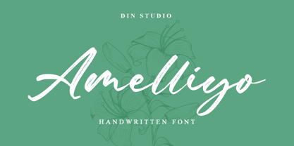 Amelliyo is a classy handwritten font. Made for any professional project branding. It is the best for logos, branding and of quotes. Every letter has a unique and beautiful touch. Features: Beautiful Ligatures Multilingual Support PUA Encoded Numerals and Punctuation Thank you for downloading premium fonts from Din Studio
 - Kanetin by Din Studio,
$29.00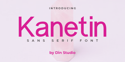 Kanetin is a elegant sans serif font. Made for any professional project branding. It is perfect for printing, branding and quotes. Every letter has a unique and beautiful touch. Includes: Kanetin (OTF) Features: PUA Encoded Multilingual Support Numerals and Punctuation Thank you for downloading premium fonts from Din Studio
 - Marquetta by Ditatype,
$29.00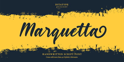 Marquetta is a modern handwritten font. With a classy and natural handwritten style, it brings a classy and chic typeface. Marquetta is best used for weddings, branding, logotype, and quotes. Features: - Beautiful Ligatures - PUA Encoded - Multilingual Support - Numerals and Punctuation Thank you for downloading premium fonts from Dita Type
 - Maraton by Din Studio,
$29.00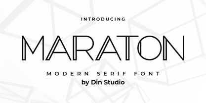 Maraton is a modern display font. Made for any professional project branding. It is the best for logos, branding and quotes. Every letter has a unique and beautiful touch. Includes: Maraton (OTF) Features: PUA Encoded Multilingual Support Numerals and Punctuation Thank you for downloading premium fonts from Din Studio
 - Fellicia by Ditatype,
$29.00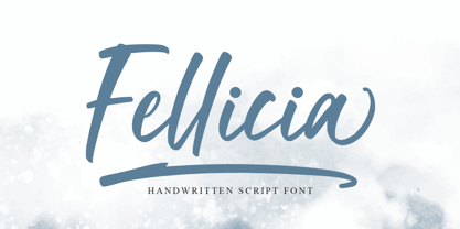 Fellicia is a modern handwritten font. With a classy and natural handwritten style, it brings a classy and chic typeface. Fellicia is best used for weddings, branding, logotype, and quotes. Features: - Beautiful Ligatures - PUA Encoded - Multilingual Support - Numerals and Punctuation Thank you for downloading premium fonts from Dita Type
 - Calvera by Din Studio,
$29.00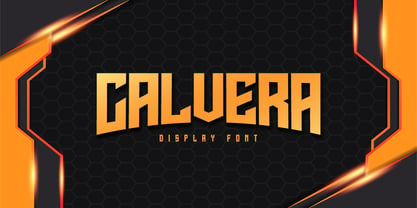 Calvera is a modern display font. Made for any professional project branding. It is the best for logos, branding and quotes. Every letter has a unique and beautiful touch. Includes: - Calvera (OTF) Features: - PUA Encoded - Multilingual Support - Numerals and Punctuation Thank you for downloading premium fonts from Din Studio
 - Striker by Din Studio,
$29.00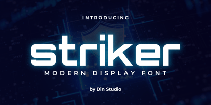 Striker is a modern display font. Made for any professional project branding. It is the best for logos, branding and quotes. Every letter has a unique and beautiful touch. Includes: Striker (OTF) Features: PUA Encoded Multilingual Support Numerals and Punctuation Thank you for downloading premium fonts from Din Studio
 - Axiforma by Kastelov,
$55.00 Axiforma was designed with the single idea of creating a font that starts with the letter A, because let's face it, this is the best letter. For those of you who didn't see it coming, Axiforma is a /drum roll/ geometric sans in 20 weights. If you are thinking "Oh boy, another geometric sans", you clearly know your stuff. Yet, Axiforma is different in at least three crucial ways: 1) It's made by me 2) It's not free 3) It's polite and humble Additionally, Axiforma is packed with Opentype such as oldstyle numbers, fractions, case sensitive alternates, localized forms, stylistic sets, cyrillic alphabets (Bulgarian & Russian) and many more. Basically it's quite extensive and kinda great. Upon using Axiforma, clients will start to behave differently around you and may even start paying you. Your spouse will start working out again just to gain your attention and your kid will become instantly popular at school. After all you are using Axiforma and rumors do spread quickly. That's what we are talking about - raw font power. With Axiforma regular typed text is suddently transformed into first class design. That includes branding, posters, headlines, display, presentation materials, websites, logotypes, etc. The world will now be your playground. To sum it up, Axiforma is badass, thus you should have it and use it everywhere.
 - Okiku by Hanoded,
$15.00 The tale of Okiku Of The Nine Plates is an old Japanese story full of lust, deceit, murder and revenge. It tells of Okiku, a beautiful servant whose master lusts after her. After she refuses his amorous advances, he accuses her of stealing a costly plate and has her thrown down a well, where she dies. She then turns into an Onryō (a vengeful spirit). Okiku font is a thin, all caps, scratched typeface. Upper and lower case differ and can be interchanged. Okiku comes with an afterlife of diacritics.
 - Reverie OT by District,
$20.00 Reverie is a cheerful band of letters that bounce across the page and get together to create words in four weights. Generous spacing and a modest x-height project an airy typeface that's open but not frail. Quirky without being too whimsical. Use the regular weight for surprisingly readable text or put the light and heavy weights to use for decorative headlines and titles. Reverie OT is the follow-up to the popular Reverie. This version comes loaded with new features: ligatures, small caps, swash caps, a larger numeral set, more language glyphs, and a fourth, heavy weight. This all adds up to a vastly more functional and flexible family of fonts.
 - SCR-N by URW Type Foundry,
$39.99 SCR fonts are screen optimized (also called 'pixel fonts'). Unlike standard fonts (and like the few well-hinted fonts like Verdana or Arial), they give a crisp look on screen at very small sizes, thus increasing legibility. The perfect applications for those fonts are web pages and software user interfaces (computer, cellular phones, console games and any other system that uses a screen interface). Unlike most pixel fonts, SCR fonts contain kerning information. Kerning is the adjustment of space between certain pairs of characters (like 'AV') to make text look more fluid, thus increasing legibility and appeal. To benefit from this feature, auto-kerning must be activated in the application. In Photoshop, kerning must be set to 'Metrics'. Although SCR fonts are optimized for screen, they can be used for print (in Illustrator or Indesign for example) for a decorative 'computer text' effect. In this case, there is no constraint: they can be used as any other font. For screen use (in Photoshop, Fireworks, Flash... ), they have to keep aligned with the screen pixel grid not to look blurred or distorted. To achieve this, here are the guidelines to follow: RESOLUTION If the application permits it (Photoshop, Fireworks), document resolution must be set to 72 pixels per inch. SIZE The font size must be set to 10 (or multiples of 10) points. POSITIONING & ALIGNMENT The reference points of text fields and text blocks (upper left corner for left aligned text, upper right for right aligned text) must be positioned at integer values of pixels. In Photoshop, text can be precisely moved with [Edit Free Transform]. In Flash, movie clips containing text fields must also be positioned at integer values on the stage. Text must be aligned to the left or right only. Center alignment can be simulated with left alignment by adding spaces at the begin of each line. To dispense with the positioning and alignment constraints, text anti-aliasing can be turned off if the application permits it (Photoshop, Flash MX 2004). OTHER SETTINGS Leading (line spacing), tracking (letter spacing), manual kerning and baseline shift must be set either to integer values of points or to multiples of 100 units (depending on the application). Vertical and horizontal scaling must be set to 100%. Faux bold or Faux italic must not be used. The document must neither be resized on export, nor allow resizing (Flash Movies).
 - SCR-I by URW Type Foundry,
$39.99 SCR fonts are screen optimized (also called 'pixel fonts'). Unlike standard fonts (and like the few well-hinted fonts like Verdana or Arial), they give a crisp look on screen at very small sizes, thus increasing legibility. The perfect applications for those fonts are web pages and software user interfaces (computer, cellular phones, console games and any other system that uses a screen interface). Unlike most pixel fonts, SCR fonts contain kerning information. Kerning is the adjustment of space between certain pairs of characters (like 'AV') to make text look more fluid, thus increasing legibility and appeal. To benefit from this feature, auto-kerning must be activated in the application. In Photoshop, kerning must be set to 'Metrics'. Although SCR fonts are optimized for screen, they can be used for print (in Illustrator or Indesign for example) for a decorative 'computer text' effect. In this case, there is no constraint: they can be used as any other font. For screen use (in Photoshop, Fireworks, Flash... ), they have to keep aligned with the screen pixel grid not to look blurred or distorted. To achieve this, here are the guidelines to follow: RESOLUTION If the application permits it (Photoshop, Fireworks), document resolution must be set to 72 pixels per inch. SIZE The font size must be set to 10 (or multiples of 10) points. POSITIONING & ALIGNMENT The reference points of text fields and text blocks (upper left corner for left aligned text, upper right for right aligned text) must be positioned at integer values of pixels. In Photoshop, text can be precisely moved with [Edit Free Transform]. In Flash, movie clips containing text fields must also be positioned at integer values on the stage. Text must be aligned to the left or right only. Center alignment can be simulated with left alignment by adding spaces at the begin of each line. To dispense with the positioning and alignment constraints, text anti-aliasing can be turned off if the application permits it (Photoshop, Flash MX 2004). OTHER SETTINGS Leading (line spacing), tracking (letter spacing), manual kerning and baseline shift must be set either to integer values of points or to multiples of 100 units (depending on the application). Vertical and horizontal scaling must be set to 100%. Faux bold or Faux italic must not be used. The document must neither be resized on export, nor allow resizing (Flash Movies).
 - Smart Sans by Monotype,
$29.99 Smart Sans is a personal tribute to Leslie (Sam) Smart, the first type director to be hired by a major typesetting house in Canada. Smart was a twentieth century design pioneer who raised the standards of Canadian typography. Together with three of his peers, he established the first Type Directors Club in Toronto. After Smart's death in 1998, type designer Rod McDonald decided that something should be done to commemorate Smart's life and achievements. I had first thought of establishing a scholarship in Sam's name, but a typeface design soon replaced this idea," says McDonald. "Once I decided to design a typeface, however, it became a foregone conclusion that it would be a sans serif - for no other reason than that I loved the name Smart Sans." Two typefaces served as inspiration for McDonald's work. "Like thousands of designers, I'm keen on Matthew Carter's Helvetica Compressed series. And, when I was younger, I also loved Fred Lambert's Compacta," says McDonald. "I thought there might be a place for a small range that could take over from these 'old workhorses' and, in the process, bring a fresher look to the genre." McDonald drew three weights for the Smart Sans family, all ideally suited for setting attention-getting headlines and powerful display copy. The two-storied 'g' contributes to the design's lively personality, and the short 'r' helps maintain tight, even spacing. Smart Sans is the perfect homage to a great typographer, because it raises the bar on what to expect from condensed sans serif typefaces. Sam Smart would be pleased."
 - Muggsy by Missy Meyer,
$10.00 I do a lot of taller, narrower handwriting fonts; this time around, I was inspired to make a wider, shorter handwriting font! MUGGSY has everything you expect from one of my fonts: clean and smooth curves, a full set of alternates, and a feeling of fun! MUGGSY has two uppercase-height alphabets (with a few lowercase-style letters like a and e in the lowercase set), plus a full set of 63 "smallternates" -- the same letters, numbers, and ampersand sized down to 75%, and beefed up in weight so they can be mixed in with the full-size letters. Plus 30 double-letter ligature sets, and a few additional alternates for variety! You also get a ton of punctuation, and my usual 300+ extended Latin characters for language support, for a total of over 600 glyphs! And just because you may want things a bit heavier, I've also made Muggsy Heavy, a bolder weight of Muggsy with all of the same alternates and extras. Enjoy, my fonty friends!
 - Sterling Script by Canada Type,
$54.95 Sterling Script was initially meant to a be digitization/reinterpretation of a copperplate script widely used during what effectively became the last decade of metal type: Stephenson Blake's Youthline, from 1952. The years from 1945 to 1960 saw a heightened demand for copperplate faces, due to post-war market optimism, as well as the banking and insurance industries booming like never before, which triggered the need for design elements that express formal elegance and luxury. The name Sterling Script is a tip of our hat to England, the Stephenson Blake foundry's country of origin. It is also a historical hint about copperplate scripts having been used mainly for banking and bonds in the 19th century. Originally we just wanted to resurrect a gorgeous metal type from the ashes of forgotten history. But after the main font was done we saw that the original s really needed an alternate. We made one. But we felt sorry for the original s and didn't want to see it dropped from use altogether, so we saved it by building a set of ligatures that solve the minor connection problem with the s at large sizes. Before the completion of the ligatures, a few different alternates were also drawn, and we were faced by the fact that the single font we set out to do was now a much larger set than we anticipated. While thinking about how to split up our unexpected bundle of large characters, we drew a few more alternates and some swashes. This abundance "problem" reached a certain point where there was no looking back, so we just decided to go all the way with this font. We added many more alternates, swashes, ligatures, and two full sets of each beginning and ending lowercase letter. The result is over 750 characters of sheer elegance. Sterling Script has many features that set it above and beyond other copperplate scripts: - It has 2 beginning and 2 ending alternates for every single lowercase character. The beginning and ending variants on the vowels are also available in accented form in the appropriate cells of the character map. - Sterling Script is the ultimate elegant font choice for luxury design. Very elegant, but not too soft. Its strong and confident shapes convey a message that is real, comforting and assuring. - One of the eventual purposes of expanding Sterling Script this extensively was to create a script that finds the middle ground between formal and informal without compromising either trait, a script where the degree of formality can be gauged, tweaked, cranked up or toned down depending on the layout's needs. Aside from beginnings and endings, there are multiple variations for the majority of the basic characters. This is a formal script on steroids, where twirls and swashes can be set to come out unexpectedly from any place in the word, which is great for reducing the inherent rigidity of words set in copperplate scripts and "humanizing" them whenever needed. This is especially useful for wedding, postcard and invitation design, where not every viewer of the collateral material has something to do with banking or insurance. - With such an extensive character set, a designer can easily set a word or a sentence in 10 or more different ways, and choose the perfect one for the task at hand. This is particularly useful for work where details are of utmost importance, like logos, slogans, or elegant engravings that consist of one to three words. Let those swashes and twirls intertwine for maximum elegance. The Sterling Script complete package consists of 7 fonts: Sterling Script, Alternates, Beginnings, Endings, Swashes, Swash Alternates, and Ligatures. Sterling Script is available in five different purchase options and price ranges. But with such a massive offering of variation, the Sterling Script complete package is definitely the most value-laden set in its class. Once you use Sterling Script, you will never want to go back to other copperplates.
 - DejaVu Sans Condensed - Unknown license

- DejaVu Sans - Unknown license

- American Favorite Script by Great Studio,
$20.00 American Favorite is a luxury font. which comes with a combination of modern and elegant fonts, namely serif and signature style. You can combine it to make beautiful typography. This hand display style makes it perfect for use in all your design projects be it logos, labels, packaging designs, blog titles, posters, wedding designs, social media posts, Instagram designs, card invitations, art quotes, home decor, book / cover titles , etc. Already matched up and ready to be used together for your next design! Here’s what’s included : -American Favorite Script Regular / Bold -Thin and realistic signature fonts containing 52 automatic ligatures, lowercase letters, uppercase letters, all punctuation & numbers American Favorite Serif -An all-caps Serif font containing uppercase, all punctuation & numerals. Language Support • Supports the following languages; English, French, Italian, Spanish, Portuguese, German, Swedish, Norwegian, Danish, Dutch, Finnish, Indonesian, Malay, Hungarian, Polish, Croatian, Turkish, Romanian, Czech, Latvian, Lithuanian, Slovak, Slovenian. I hope you enjoy this font. Thank you for your purchase!
 - Wonky by Ana's Fonts,
$16.00 The Wonky Font family is a set of 3 handmade fonts, made using three different materials: a pencil, a thin fineliner and a bold marker. Each font includes 3 variations for each letter and number, accessible through contextual alternates, for extra realism and fun. The pencil font is a SVG font, which allows for the texture of the pencil to be captured in a more authentic way, and is complemented with an extra doodles font. Wonky Font looks good at small sizes and will also look great in all caps texts. Use Wonky Font in designs such as postcards and notes, posters, logotypes, social media posts, branding and packaging. This font includes: a Wonky Pencil SVG font, with a vector alternative that preserves the texture a Wonky Thin font a Wonky Bold font a Wonky SVG Extras font, with 26 pencil doodles Software requirements for the SVG font: Photoshop CC2017+ // Illustrator CC2018+
 - Core Sans AR by S-Core,
$19.00 Core Sans AR Family is a rounded version of Core Sans A that is clean, simple and highly readable. It is a part of the Core Sans Series such as Core Sans N, Core Sans M, Core Sans E, Core Sans A, Core Sans D, Core Sans G, Core Sans R and Core Sans B. Letters in this type family are designed with genuine neo-grotesque and neutral shapes without any decorative distractions. The spaces between individual letter forms are precisely adjusted to create the perfect typesetting. Core Sans AR family consists of 8 weights (Thin, Extra Light, Light, Regular, Medium, Bold, Extra Bold, Heavy) with their corresponding italics. Core Sans AR contains complete Basic Latin, Cyrillic, Central European, Turkish, Baltic character sets. Each font includes proportional figures, tabular figures, numerators, denominators, superscript, scientific inferiors, subscript, fractions and case features. We highly recommend it for use in books, web pages, screen displays, and so on.
 - Valiety by Din Studio,
$25.00 Valiety is a serif font family to better charm your designing experiences. It consists of eight different levels to add elegant, modern touches to your designs. Valiety has a continuity aspect produced from each small stroke in order to help the eyes smoothly move from one letter to another. Besides, the thickness differences are unnoticeable so that it leaves stable, legible impressions. With such flexibility, you can use it in either bigger- or smaller-sized texts. Include 8 different weight fonts : Valiety Hairline Valiety Thin Valiety Extra Light Valiety Light Valiety Regular Valiety Medium Valiety Semi Bold Valiety Bold Features: Multilingual Supports PUA Encoded Numerals and Punctuation Valiety is best for any design projects, such as posters, banners, logos, book covers, invitations, quotes, headings, printed products, merchandise, social media, etc. Find out more ways to use this font by taking a look at the font preview. Thank you for purchasing our font and happy designing.
 - Chubiy by RGB Studio,
$19.00 Chubiy is a retro bold script style font, come with clean and rough font version. Inspired from retro typography and lettering in the 60's and 70's combine with bold typography style. This font perfect for vintage and retro design, badge, logos,t-shirt, poster, branding, packaging, signage, book coverand so much more! it has an extensive lingual support, covering European and Asian Latin scripts. The font contains all characters you'll ever need, including all punctuation and numbers. What you get, darling? Files Include : Basic Latin A-Z and a-z Numbers Symbols PUA Encode Multi-language Support In order to use the beautiful swashes, you need a program that supports OpenType features such as Adobe Illustrator CS, Adobe Photoshop CC, Adobe Indesign and Corel Draw. but if your software doesn't have Glyphs panel, you can install additional swashes font files: Thanks and have a wonderful day, If you have any questions, please get in touch with us Don't forget to check out our other products.
 - WrenchedLetters by Ingrimayne Type,
$14.95 WrenchedLetters is a novelty font in which characters are composed of wrenches and bolts. It is caps only, but the characters on the lower-case keys differ from those on the upper-case keys. It has a large set of accented characters. It is not often that one needs a typeface made of wrenches and bolts, but if one does, there is a font for that. For related, tool-based typefaces, see Screwged, NailsNStaples, and Hammered.
 - Broken Vows by The Type Fetish,
$10.00Broken Vows was one of two typefaces I created to go along with some fragmented poetry written as I went through a divorce, the second being WHORE. The letterforms contain fragments of familiar script faces that are attempting to hold themselves together. Some of the connecting elements of the letterforms remain and hold the face together. - Robson by TypeUnion,
$20.00 Robson is a fluid, condensed, uppercase font made up of eight weights, as well as a variable, that will provide instant visual impact to your projects. The font is made up of 486 glyphs which features extensive language support & stylistic alternates to give your designs the versatility they require. The font has a retro edge to it by using rounded structures on the A, M, N, W and Y glyphs that are reminiscent of posters and promos from the 70s and 80s. The ultra tight thin weight is made to be used at super sizes to bring a focal point to your designs. Robson is meant to be seen big (well, he's a bit of a show-off) Robson is perfect for your digital, print or branding projects. Or, for a poster on your fridge that says "You rock".
 - Baumarkt - Unknown license

- Yoshitoshi - Personal use only

- Planetary Orbiter Outline - Unknown license

- Radios in Motion - Unknown license

- Slimania - Unknown license

- PetitaMedium - Unknown license

- Planetary Orbiter - Unknown license

- Enter Sansman - Unknown license

- JH Noha by JH Fonts,
$40.00 JH Noha is a geometric modern Arabic typeface. It includes black, bold, medium and regular weights.
 - Quiny by Nestype,
$17.00 Quiny is built with bold and curvy characters, Perfect if you need fun for your projects.
 - Schneidler Grobe Gotisch by Intellecta Design,
$24.90a revival of a classic bold blackletter from the great german typedesigner F. H. Ernst Schneidler


