10,000 search results
(0.156 seconds)
- Chalkboy by Typefactory,
$14.00 Chalkboy – Handwritten Chalk Font is a fun and casual display font suited for kids, playground, or school theme. Whether you’re using it for crafting, digital designing, presentations, or greeting card making, it’s perfect!
 - Cardillac by Hoftype,
$49.00 Cardillac, named after E.T.A. Hoffmann’s literary figure, refers back to classical Didonesque, yet presents unique details which set it apart from historic models by adding a new flavour. Its clarity, noble appearance and cool elegance predestine it for magazines and newspapers. The Cardillac Family consists of 14 styles, provides many features which allow its application for ambitious typography. It comes in OpenType format with extended language support. All weights contain small caps, ligatures, superior characters, proportional lining figures, tabular lining figures, proportional old style figures, lining old style figures, matching currency symbols, fraction- and scientific numerals, matching arrows and alternate characters.
 - Hengela Script by Hrz Studio,
$14.00 Hengela - is a modern script calligraphic typeface with some alternate bonds and strokes. This font is created in a modern style with a start and end that is very beautiful, elegant, very casual and will suit many of your design needs Perfect for logos, branding, titles, social media posts, advertisements, product packaging, product designs, labels, photography, signs water, special events, magazines, web design, etc.
 - Stencil Box JNL by Jeff Levine,
$29.00 The lettering for Stencil Box JNL was found on the packaging of a children's toy stencil set circa the 1940s. Popular for years, Pencil Stencils were a series of "connect the line" stencils where a series of dashed lines were traced from the cutouts and the lines connected to complete pictures of animals or other subjects. Although the packaging itself was often updated to reflect the current times during the life of the product, it was this hand-lettered example of stencil-meets-Art Deco from the 40s that proved worthy of saving as a digital typeface.
 - Qubo by Hoftype,
$49.00 Qubo, a new forcefully drawn monoline face. Its clear graphics create its appeal and give it distinctive characteristics. The slightly squared round elements make for an open and elegant look; subtle details refer to humanistic models. Qubo is a neutral, cool and very versatile typeface. It works superbly both in print and on the web. Qubo is well-equipped for ambitious typography. The Qubo family consists of 14 styles, comes in OpenType format with extended language support for more than 40 languages. All weights contain ligatures, proportional lining figures, tabular lining figures, proportional old style figures, lining old style figures, matching currency symbols, fraction- and scientific numerals.
 - Gorod.Volgograd by FontCity,
$15.00The general idea: Can You imagine to yourself, what the hydroelectric power station is? The building of this electricity production foundry is half hidden under the water, but the visible above-water part astonishes your sense. It is a construction almost 1,5 km length dammed out the powerful river stream. Besides thousand of electricity conduction lines supports it bears also the highway and the railroad. From a faraway distance the train seems like a caterpillar that has climbed up the stout tree. There are also the navigable sluices, the flood channels and other erections. The idea of this typeface outlines arrived to the authors exactly on the viewing platform, under the impression of the waterfalls, which are escaping from the dam womb, falling from almost 50 meters altitude and becoming white-haired during this flight. Release: in the form of "gorod.Volgograd" font with the one style. We work with other styles now and sometime we will be very glad to introduce the Bold and Italic styles to You. We should explain the font name meaning. "Gorod" is "city of" in Russian and Volgograd is the old, big and famous Russian city. The Volga hydroelectric power station of a name of XXII congress of the CPSU caused the Volgograd sea formation. It expands of 14 km width and more than 600 km along the Volga river-bed. But HEPS isn't the sole Volgograd sight. There are many interesting places here. The most known tourist sight, the visit card of Volgograd is the Mamaev Hill. Being here You can see almost all 100 kilometers of city length. Due to its geographical position, Mamaev Hill has got a great importance during the Great Patriotic War (1941-1945). It became and still is the Main Height of Russia. Soviet people have built the huge stately memorial ensemble here. There are many other witnesses of the heroic past of Volgograd: the Alley of Heroes, the Perished Fighters Square, the Soldiers Field and others. The line of tank turrets is stretched out along all town not far from Volga bank. It marks the line, where fascist troops was stopped in 1943. It is very amazingly when You dive under the ground on a usual tram. Volgograders have built a few underground station for the high-speed tramway. The river tram need a quarter of an hour to get an island in the Volga. And You need the same time to walk across the river station. The Volga-Don navigable channel starts from Volgograd. There are planetarium, circus, some theatres, many museums in Volgograd. One of football matches of Euro-2004 qualifying round took a place in the "Rotor" stadium in Volgograd. Volgograd holds the longest - above 50 km - park in the world. Its avenues, squares, embankments are beautiful, Volgograd central districts are built in unique architecture style called the Stalin Empire. You can enjoy fountains, parks, attractions, water-pools and other Volgograd sights. If You visit Volgograd once You'll never forget it. You can read about the ancient history of Volgograd city on the Tsaritsyn font page. Also we plan to create the Stalingrad font and give You a short story about another period in Tsaritsyn-Stalingrad-Volgograd history. - Woonder by Khaiuns,
$15.00 Woonder Script Fonts, a handcrafted brush font! This bold, free-flowing, confident brush font is designed to be easily customized to your liking with 2 letter sets, also featuring swashes and some unique textures. Find a unique Woonder Script Font by adding a plus (+) to each letter and number and you'll have a cool letter. Woonder Script Fonts is a brush font which you can use and enjoy again and again, for anything from promotional material and handwritten quotes, to product packaging, merchandise and branding projects. Please message me if you want your language included or If there are any features or glyph requests, feel free to send me a message, I would like to update it. I hope you have a blast using Woonder Script Fonts!
 - Marihouse Script by Lettersams,
$9.00 Marihouse Script is a beautiful calligraphy design, including Regular and italic. This font is enough with a sweep. Can be used for various purposes. such as logos, product packaging, wedding invitations, branding, titles, signs, labels, signatures, book covers, posters, quotes and more. Marihouse script displays alternative OpenType styles, ligatures and Various International for most Western languages. To enable OpenType Stylistic alternates, you support programs that support OpenType features like Adobe Illustrator CS, Adobe Indesign & CorelDraw X6-X7, Microsoft Word 2010 or later. Marihouse script is encoded with PUA Unicode, which allows access to all features without special design software. Mac users can use Font Books, and Windows users can use Character Map to view and copy extra characters to paste into your favorite app / text editor. If you need help or have any questions, please let me know or send email "lettersams@gmail.com" I am happy to help :) Thanks & Happy Designing!
 - Kimberia Script by Lettersams,
$10.00 Kimberia script is a modern calligraphy design, including Regular and italic. This font can be used for various purposes. such as logos, product packaging, wedding invitations, branding, titles, signs, labels, signatures, book covers, posters, quotes and more. Kimberia script displays alternative OpenType styles, ligatures and Various International characters for most Western languages. To enable OpenType Stylistic alternates, use programs that support OpenType features like Adobe Illustrator CS, Adobe Indesign & CorelDraw X6-X7, Microsoft Word 2010 or later. Kimberia script is encoded with PUA Unicode, which allows access to all features without special design software. Mac users can use Font Books, and Windows users can use Character Map to view and copy extra characters to paste into your favorite app / text editor. If you need help or have any questions, please let me know or send email "lettersams@gmail.com" I am happy to help :) Thanks & Happy Designing!
 - Makel by La Boîte Graphique,
$13.00 Makel is a fanciful typography. Ideal for areas such as food, catering, packaging, youth publishing ... Thanks to its curves and the movement of letters, Makel wishes to bring good humor and dynamism to your communication media.
 - Freude by Typejockeys,
$25.00 Freude was originally developed for the album artwork of the Austrian musician Tombeck. The word Freude means “joy” in German. Supplemented by the addition of lowercase letters and refined by various OpenType features, the Freude typeface is charmingly playful. Created for everything fun, its design is relaxed and amiable – perfect for mama’s boys, chocolate freaks and pranksters alike. Thanks to its balanced letterforms, Freude is equally entertaining in both large and small sizes.
 - Cirque by Matt Frost,
$25.00 Cirque is a lively Western/Circus/Victorian/Whatever font—it'll fit in wherever you want to stick it to old Tschichold and make something cool instead. Mix up caps and lower case for curious results. To see more check out the Frost Foundry page at http://facebook.com/frostfoundry
 - Lily Stevan by Epiclinez,
$18.00 You know that feeling when you see something and you're like "Hey, I like this!"? Hopefully, Lily Stevan is that font. With its clean lines and playful design, it's perfect for fun little sayings, logos, and headlines. It's easy to use and will make your designs pop right off the page. Download Lily Stevan today! So what’s included : Basic Latin Uppercase and Lowercase Numbers, symbols, and punctuations Multilingual Support. Accented Characters : ÀÁÂÃÄÅÆÇÈÉÊËÌÍÎÏÑÒÓÔÕÖØŒŠÙÚÛÜŸÝŽàáâãäåæçèéêëìíîïñòóôõöøœšùúûüýÿžß PUA Encoded and fully accessible without additional design software Simple Installations Works on PC & Mac Thank You!
 - Shoganai by Hanoded,
$15.00 I really like the Japanese language, as it has words that describe a whole world of meaning. Like Shoganai. It literally means: ‘It cannot be helped’. That’s life, get used to it. Shoganai sums up a lot of the Japanese culture and way of thinking: if things cannot be helped, then accept it and move on. Shoganai is a set of Brush fonts: a thinner, script font and a heavy display font. Use if for book covers, product packaging and more. If you can’t use it, then, well, Shoganai.
 - Peanut Ache by PizzaDude.dk,
$17.00 I don't know what it is with me and peanuts. I simply love it! I like peanuts in all kinds of meals: breakfast, lunch, dinner and even in desserts! But with an addiction like this, an overload of peanuts sometimes appear...and I guess that's where the name of this font comes from :) The Peanut Ache font is super clean, and super steady - use it for anything that needs a clean look! I've added 5 slightly different versions of each letter, and this really helps making your text to look even more fresh and lively!
 - Whisper Script by Ferry Ardana Putra,
$15.00 Whisper is a stunning hand-lettered dry brush font. This typeface is very unique! It has an unique natural dry-brush feel which will outstand your project with ease! Combine it with its remarkable swashes which you can choose dozens of them! This typeface is perfect for creating elegant branding and headlines for handmade, food & beverage and artisan goods, quotes, invites, t-shirts, Logos, or use it to make your social media feed into another level! Whisper features: A full set of upper & lowercase characters Numbers & punctuation Multilingual language support PUA Encoded Characters Dozen of Swashes OpenType Features Whisper includes: ——— ⚠️To enable the OpenType Stylistic alternates, you need a program that supports OpenType features such as Adobe Illustrator CS, Adobe InDesign & CorelDraw X6-X7, Microsoft Word 2010 or later versions. There are additional ways to access alternates/swashes, using Character Map (Windows), Nexus Font (Windows), Font Book (Mac) or a software program such as Pop Char (for Windows and Mac). ⚠️For more information about accessing alternative, you can see this link: http://adobe.ly/1m1fn4Y ——— 🔑Important tutorial from the author: Tutorial for Mollusca font trio: https://lnkd.in/d984CQD6 How to use Midway | Retro Script Font on illustrator: https://lnkd.in/eusbZd7s How to use Midway | Retro Script Font on Photoshop: https://lnkd.in/evsYrwgs ——— ❤️Get in touch with the author: Instagram: https://www.instagram.com/ardana619 Behance: https://www.behance.net/ardana619 ——— 🔥Thankyou for purchasing our product, hope you like and have fun with our product. If you have any queries, questions or issues, please don't hesitate to contact us directly. If you satisfied with our product, please give 5 stars rating. ——— 😊Happy Designing...
 - Elisetta by Sudtipos,
$39.00 Musical notes and letterforms, silences and white spaces, pentagrams and lines, music and writing have much in common and go beyond time, cultures, styles and locations. This new typeface emerges from the blend between the lyrics and the harmony, rhythm, femininity and luminosity of the traditional musical forms. It`s not about blues or rock, tango or salsa, instead it recovers the neoclassical characteristics of the current musical notation system and revitalize the essence of its signs. Taking care of both the function and the form, Elisetta has been specially designed for the writing of texts and musical sheets considering all its elements and communication needs. This source of inspiration also makes the font really good for extensive texts, since its design is based on situations that require high line performance, great readability and high aesthetic coherence. With 5 variables that vary in weight and style, the typography gathers asymmetry and organic nature in vertical structure, narrow horizontal proportions, high x height and extreme contrast between black and white. Elisetta Book has been created for the writing of clear texts and long lines composed in small sizes inside and outside the pentagram; Elisetta Italic intensifies the organic nature of the musical keys by offering softer signs, contextual alternates and initial caps; finally, Elisetta Display increase and emphasize the contrast between vertical stems and horizontal lines to highlight short texts and titles. For those who love music and for those who like romantic forms, this typography has a lot to offer: Elisetta is the best option to write light words with style, compose clear and rhythmic lines and read comfortable paragraphs with high performance. You can tell everybody this is your font, how wonderful life is while you're in the world! * This typeface was originally designed and supervised as «Elisa», the main project of the Master in Typography at University of Buenos Aires, Argentina.
 - Air Corps JNL by Jeff Levine,
$29.00 What started as a small project for Mike Humphrey of Chiltern Image Service in the UK ended up as Air Corps JNL, a typeface featuring retro letters and numbers from military aircraft. Expanded to a full character set with punctuation, foreign accents, monetary figures and the like, Air Corps JNL is also available in an oblique version.
 - Cookie Powered by PizzaDude.dk,
$15.00 Tall, thin, grid, legible and handmade! What's not to like?! The font was made using a squared paper as a base for the lines. However, I managed to keep the free spirit of the handmade look, despite the guides. Play around with the 4 different versions of each letter and the swashes to make your text stand out!
 - Braggadocio by Monotype,
$29.99 Braggadocio is a very black typeface. Braggadocio is a strange hybrid with characteristics of both sans serif and modern faces; and it belongs very much to its time. Like high society in the 1920's, it should not be taken too seriously. Use the Braggadocio font for display lines in advertising, magazines and light hearted communications.
 - Snappy Fingers by Kitchen Table Type Foundry,
$11.00 Description: Snappy Fingers is a remake of a really old font, called Joe Schmoe, which I made for my other foundry years ago. I really like this font, but it needed a lower case and some serious tweaking. Snappy Fingers is a fun, handwritten font. I (now) comes with fantastic language support and a new lease on life!
 - Wappenbee by Kenn Munk,
$15.00Wappenbee is a 28 pixel bitmapped dingbat system for building crests for the modern, noble life. The dingbat allows you to build memorable crests like the skatepark crest, the smelly sock crest, the mixtape crest and many more. Vowels are mythical shield-holding creatures (upper- and lowercase are right- and leftfacing beasts), consonants are the various shields and numerals are 'crowns' above the crests. - PiS Wallride by PiS,
$34.00 This font is the byproduct of a T-shirt line for a punk/hardcore band I did a while ago. The guys like it skatestyle, so I scribbled their bandname and tagline with fat edding markers, which was so much fun that I decided to make it into a whole font. PiS Wallride features ligatures and OpenType alternates for an even grittier and more authentic feel.
 - Linotype Fehrle Display by Linotype,
$29.99Erich Fehrle designed this robust alphabet for headlines and titles in 1976. The constructed figures of Linotype Fehrle Display were built on the geometric form of the rectangle. Lines of text look closed and compact. The letter forms are the result of fine open spaces. Design-specific characteristics of Linotype Fehrle Display are its serif-like additions to the strokes of the figures a, c, G or M, and the alternating rounded and angular outlines of the figures a, e, s and others. Typefaces similar to Linotype Fehrle Display: Bigband, Frutiger 95. - Crescendo by Canada Type,
$29.95 A year after the tremendous success of Memoriam in the "Lives They Lived" issue of the New York Times magazine at the end of 2008, Patrick Griffin and Nancy Harris Rouemy teamed up once more to tackle the same project for the 2009 issue. This time the magazine's design concept revolved around a typeface they created specifically for custom vertical malleability, and that can play just as well in single- or multi-color environments. The result was another iconic commemorative issue that shows exotic tri-line letters merging, swashing, extending and flourishing in stunning gold, silver and blue on black on the cover, and in black on white on the inside pages. Just like in the previous year, the issue won multiple publication design and typography awards. Crescendo is that typeface, finally issued for retail by public demand. Just turn your setting into outlines in your favorite vector program, grab single strands and extend away, and do your best alternating colours between strands. Crescendo comes with a limited punctuation set, but accented characters for Western Latin languages are included, and there many, many alternates and ligatures in there as well. This typeface is best used in large display sizes.
 - Comply Slab by Arkitype,
$12.00 Comply Slab is inspired by action and extreme sports, Comply gets it's name from the well known skate trick the “No Comply”. This type family doesn't mess about! With 9 weights from thin to black, Comply Slab will give you some great options to use. This font family will “kill it” in both print and digital, in headlines for editorial, posters, banners, websites, apparel, packaging, logos or magazines just to name a few. If you want to make a statement that gets the message across in a slick way with some cool looking glyphs Comply Slab is the font! There is an alternate R and S so you can choose to go with the cool default sharp glyphs or swap them for a more traditional chamfered corner version. Each of the 9 weights has an italic version to add even more action.
 - SL Che by Sudtipos,
$29.00SL Che is a homage to Ernesto Guevara de la Serna, “El Che”, who lived between 1928 and 1967. El Che turned into an universal icon through a memorable photograph which was reproduced and multiplied to the infinite. It was that way he became a synonymous of resistance, revolution and change for lots of generations. That "Che" comes back today by the hand of the genial Jorge Alderete, who designed heroic, laughing and cool variations of that popular first icon. SL Che unfolds like a fan of thousands of "Che", in a development plenty of metaphors. SL Che abridges a sum of original iconographic illustrations in True Type format, which masterly synthesizes the most important themes of the grand genius of the literature. SL Che takes part of the "Icons of Icons" Gallery, developed by SinergiaLab for Sudtipos - Sofia Rough by Mostardesign,
$22.00 Based on the popular Sofia Pro typeface, Sofia Rough is a multifaceted font family with differents eroded variations. Sofia Rough contains sixteen fonts and two eroded sub families. With Sofia Rough Black for uppercase and Sofia Rough Script for lowercase you can create many variations. It has also several layers like shadows, inline or outline to create unique design. Sofia Rough contains also more than 80 extra graphics such as catchwords, ornaments, emblems, decorative lines, stars and many more.
 - Blackstripe by Mirror Types,
$15.00This font was inspired by the bricks of my wall, I stared at them all the time thinking, wouldnt be great if fonts live in cooperation with bricks, and then, it came to my mind…A font family that shows naked bricks, like it is RIGHT on the middle of design process. The main features are the informal and wired look that make it worthwhile for bands and informal invitations, flyers, for concerts or infantile designs. - Trapezoidal by Ingrimayne Type,
$9.00 The letters of Trapezoidal are like sheep: they do not like being alone but want to be part of a flock. Many of the individual letters of Trapezoidal look strange and unshapely in isolation because they are designed to fit into a pattern with other letters. That pattern is formed by alternating asymmetric trapezoids, with trapezoids that are wide at the top alternating with trapezoids that are wide at the bottom. The magic of the OpenType feature of contextual alternatives (calt) automatically alternates them. The fonts in the family are largely monospaced and have very tight letter spacing. (If for some reason one wants to use only one set of the letters, the letters will overlap unless one widens character spacing.) (If D and O are too similar, use the alternative versions of D.) The family has five weights and each weight has an italics formed by flipping the trapezoidal pattern over a vertical line. Like other alternating-character typeface families from IngrimayneType, this distinctive and visually-arresting family can be used for titles or advertising. (For another but very different typeface based on alternating trapezoids, see PoultrySign.)
 - Kaneda Gothic by Dharma Type,
$19.99 Kaneda Gothic is a whole new basic gothic. Philosophically, Kaneda Gothic is the one of the niche answers in the interspace between these antinomies. Image of near-future and giant metropolis in 80s, 90s vs our real life in the 2010s,20s. What we acquired by Industrial, scientific developments vs our emotional demands, imagination in our brain. Design transition in short period of time vs the consistency of real function which laid along the human history. Technically, Kaneda Gothic has a geometric letterform which called “gaspipe” or “Gothic” in woodtype era. But Kaneda has very sharp curves and lines for contemporary demands, that is to say, impact and clearness. Geometric and clear letterform is perfect for eye-catching part such like company logo, movie title and picture’s captions. Consists of seven weights and their matching italics. Supporting almost all latin languages.
 - Pumpkin Boy by PizzaDude.dk,
$14.00 October is the season for pumpkins - some of them are meant for soups, salad or other kinds of food. Others are cut into creepy looking pumpkinheads...and then there are the ones that are used for fun and games only! And that is exactly what this font is about! Pumpkin Boy is my laid back comic font with a jumpy x-height and crunchy lines. If you choose to write in uppercase only, the letters are a bit less funky, but still crunchy and great for headlines. I've added ligatures for double letters substitution for the most common letter combinations.
 - LTC Pabst Oldstyle by Lanston Type Co.,
$24.95 Frederic W. Goudy originally designed Pabst in 1902. This lettering was used by the Pabst Brewing Company for their promotional materials. It was later developed into type for ATF. Goudy later licensed Pabst Oldstyle to the Lanston Type Library. Lanston Pabst Oldstyle features several differences from the more familiar ATF version. Some caps are narrower while some lower case characters are wider than the ATF version. The descenders are also shorter in the Lanston version. Logotypes of italic words and, of, and the are included as originally designed as well as ligatures including the unusual tt ligature.
 - Dreamy Doodles by Typebae,
$12.00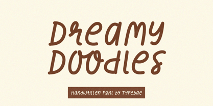 Dreamy Doodles is a stylish and joyful that captures the essence of a modern handwritten marker. It exudes a delightful and lively vibe, perfect for those seeking a refreshing and vibrant aesthetic. This font effortlessly conveys a cool and fashionable impression, making it an excellent choice for those looking to create eye-catching and trendy designs.
 - Creative Signature by Scratch Design,
$9.00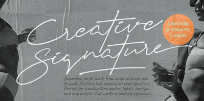 Introducing Creative Signature! It's a modern script font with a signature-style look. It's highly recommended for you who want to make some designs with a realistic signature style. This font will work for invitation design, wedding design, fashion design, advertising design, posters, packaging, book cover title, quote, social media post, etc. Open your Opentype features using the script font to use the ligatures, alternates, and swashes. As you type, your text will look like a natural signature or handwriting. So, enjoy the Creative Signature and make some cool stuff!
 - Overseas by Hanoded,
$15.00 I traveled a lot: in the beginning on my own, later as a tour guide. I always used the English word ‘abroad’ to describe a trip to a foreign country, but I noticed that the English, Australians and New Zealanders preferred the word ‘overseas’. I then realised that they all lived on an island, so most of the foreign countries for them were across the sea. I had to think of that when I made this font! Overseas is a brush font with a certain rough elegance to it. I made it using poster paint and a brush. Use if for posters, product packaging and book covers.
 - Hapsary by Allouse Studio,
$16.00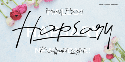 Proudly Presenting, Hapsary a Ballpoint Script Font. Hapsary come along with Ligatures, Underline Styles, and Multilingual-Support which will fulfill your need and give cool impression for you. We highly recommend using a program that supports OpenType features and Glyphs panels like many of Adobe apps and Corel Draw, so you can see and access all Glyph variations. Hapsary is perfect for any tittle, product packaging, branding project, megazine, social media, wedding, or just used to express words above the background. Enjoy the font, feel free to comment or feedback, send me PM or email. Thank You!
 - You are Superb by DainType,
$15.00 Nicely scribbled script font. It has a masculine, wild and wild mood. It also has a feeling of being torn. It is good when you want to use a lively atmosphere because of the fast flow of strokes. It is good to use when you want a cool and striking design such as a bromide for a rock festival, an album cover for music, a beer package, or a beer logo.
 - Channel Surfing JNL by Jeff Levine,
$29.00In 1999, Jeff Levine released a freeware font called "Channel Tuning JL" scanned from drawings made with a felt tip marker and designed as if the letters were breaking up due to poor reception such as on pre-digital TV sets. Over a decade later, Jeff has totally reworked the font—giving it cleaner lines, an extended character set and renaming it Channel Surfing JNL to set it apart from the roughly-drawn original. - Ad Words by Outside the Line,
$19.00 Just in time for the sale season. Ad Words is a font of words you would use if you did retail ads. Some words in script, some print, some bold, some not. Plus 2 starbursts. Enlarge the starbursts and then reverse one of the words out of it… like Now! Win! or Free! Other Outside the Line fonts work with this one, check out Architectural Lettering Regular and Bold, Plz Print or Plz Script.