10,000 search results
(0.05 seconds)
- Chantilly Lace NF by Nick's Fonts,
$10.00This little charmer combines an uppercase designed by American lettering artist J. M. Bergling with a lowercase designed by English architect Roland W. Paul. The result has a wiggle in its walk and a giggle in its talk: oh, baby, that’s what I like! Both versions of the font include 1252 Latin, 1250 CE (with localization for Romanian and Moldovan). - Luxiana by Canden Meutuah,
$15.00 Serif is a modern serif font packaged in a modern and classy style, complete with access to your feature to access a large selection of alternative letters and ligatures, the choice of letters you like from various uppercase and lowercase letters for a luxurious impression and elegant appearance. this is equipped with full uppercase, lowercase, numbers and punctuation + Multi-language support
 - Lemonade Fabrica by Abo Daniel,
$15.00 introducing LEMONADE FABRICA -the quirky handwritten font- It is a beautiful quirky font that perfect for a lettering project like cutting vinyl, silhouettes, t-shirt design, mugs, advertisements, book covers, posters, business cards, social media, and more. The doodles make this font so perfect. Features: - Uppercase - Lowercase - Number & Punctuations - Multilingual - Doodles - PUA encoded Hope you love it Regards, Abo Daniel Studio
 - Nebulous Promise by Kitchen Table Type Foundry,
$16.00 This font was called differently when I started out building it, but after a long and insightful conversation with a good friend, I decided to call it Nebulous Promise. Nebulous Promise was made using a broken satay skewer (I like using those!) and Chinese ink. It comes with a full set of alternates for the lower case letters and extensive language support.
 - Margoline by Letterhend,
$19.00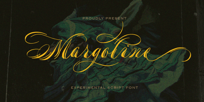 Introducing, Margoline script font. Margoline is a swash handwritten font that is perfect for branding, packaging, wedding invitation, card, etc. Features : uppercase & lowercase numbers and punctuation multilingual alternates and ligatures swash PUA encoded We highly recommend using a program that supports OpenType features and Glyphs panels like many of Adobe apps and Corel Draw, so you can see and access all Glyph variations.
 - Koara by Rosario Nocera,
$14.99 Koara is a handmade font family inspired by nature. It's composed of two versions, (rough and wild) and available in the weights, light, regular and bold, with an alternative capital K, linear lowercase and capital numbers. It's recommended for large titrations, small paragraphs, typographic compositions and logotype, Koara shines on several backgrounds like leafs, jungle, nature images and even organic food.
 - Turbinado by Aerotype,
$48.00 The ten font Turbinado™ Set was designed to be clear and easy to read with a friendly personality, ideal for advertising and packaging in both text and display settings. Included are three weights of brushed casual script, each with a dry version, two condensed all caps faces, another hand printed caps face and an Elements package with 100 brushed elements that include swashes, botanicals, shells, arrows, repeatable patterns and a few other doodads that play well with the fonts. Like our most recent release Fave, all of the fonts use the OpenType standard ligature feature to automatically differentiate consecutive lowercase letters and numbers, using separate glyphs rather than a single ligature so they can be set on a curve or colored separately, etc. They also automatically differentiate like characters that are separated by another letter when standard ligatures is enabled. The script fonts have alternate characters like swash glyphs for ends of words and a few ligatures too; single crossbar to unite the At and Att letter combinations etc. The two condensed faces also have a third set of less uniform glyphs that can be used to create a more quirky, fun and bouncy effect (see the ‘she sells seashells’ graphic above) when the discretionary ligature feature is on. The script fonts have 10+ lowercase t (and double t) crossbar alternates that can be selected from the OpenType glyph table manually, or you can enable the contextual alternates feature to automatically insert a bigger crossbar as the surrounding letters allow throughout a text box or document. Hello? Are you still there? :) And for those intrepid typographers who would rather fashion their own lowercase t to custom fit a specific design, all of the lowercase t ascenders and crossbars are also available separately in the glyph table, and can be combined manually.
 - Rational TW by René Bieder,
$39.00 Rational TW is the typewriter addition to the Rational family. It is a monospaced font building on the same principles as its proportional, neogrotesque brother, such as maximum legibility and flexibility while combining Swiss and American gothic elements with a modern aesthetic. Due to the monospaced environment, some of its letter shapes like “r”, “m”,“f”, “i” and “w” have been slightly adapted but kept the same in appearance. Rational TW comes in two version: Rational TW Display and Rational TW Text. As indicated by its name, Rational TW Text is not limited to, but works best in small font sizes because it features distinctive letter shapes like a double storey “a” or “g” in order to help differentiate similar glyphs in small sizes. Rational TW Display, on the other hand, creates a geometric uniformity by implementing round shapes in “a” and “g”, giving it a subtle friendly and open character. Unlike many other monospaced fonts, Rational TW has a large amount of opentype features like small caps, alternative glyphs, case sensitive shapes, and many more making it the perfect choice for countless scenarios. With more than 700 glpyhs per font, it performs excellently in any project from print to digital.
 - Marilyn by Eurotypo,
$32.00 Marilyn is a heavy sans typeface; the extreme variations of the baseline of their glyphs cause dramatic typographic effects, flexibility “glamour” with vintage taste. Marilyn has been designed for use in many forms of commercial jobbing and typographic work that have been mushroomed since de visual communication revolution — like posters, brochures, packaging, logotypes, magazines, children books, headlines, booklets, leaflets, websites, and much more. Marilyn comes also with a large set of ligatures, stylistic alternates and pictograms that enlarge visual expressive possibilities and give you more creative chances.
 - ITC Spirit by ITC,
$29.99While designing ITC Spirit, Patty King was influenced by classic typeface styles. The letter forms are clearly based on those of the Unziale, which, like ITC Spirit, is also composed of only capital letters. Hints of the Asian brush script style also show in this font. The irregular outer contours are best highlighted in larger point sizes and give the font the look of handwriting. ITC Spirit with its calligraphic style is best used for headlines and short texts in point sizes of 12 and larger. - Sierra by Linotype,
$29.99Sierra is an antiqua with a high x-height and generous, open counters. Many curves of the letters are almost right angles, which was particularly suited to the Digiset machines from Dr. Ing. Rudolf Hell, Kiel. The forms of Sierra with their flowing stroke contrast and half serifs have a calligraphic touch, which is especially highlighted in the italic weights. This is a graceful text type and its bold weights look almost like woodcuts. Sierra is an excellent choice for both texts and headlines. - Aure Teddy by Aure Font Design,
$23.00 Aure Teddy emanates the trusting tenderness of a favorite teddy bear. The hand-penned look of these forms engages the reader with a subtext of comfort. Teddy is delightfully legible as a text font and works well where a more organic look is wanted. It brings an unassuming charm to text and titles and a welcome empathy to astrological expressions and chartwheels. Its engaging charcter serves well in labeling diagrams and personalizing nametags. Teddy is an original design developed by Aurora Isaac. After more than a decade in development, 2018 marks the first release of the CJ and KB glyphsets in regular, italic, bold, and bold-italic. The CJ glyphset is a full text font supporting a variety of European languages. A matching set of small-caps complements the extended lowercase and uppercase glyphsets. Supporting glyphs include standard ligatures, four variations of the ampersand, and check-mark and happy-face with their companions x-mark and grumpy-face. Numbers are available in lining, oldstyle, and small versions, with numerators and denominators for forming fractions. Companion glyphs include Roman numerals, specialized glyphs for indicating ordinals, and a variety of mathematical symbols and operators. The CJ glyphset also includes an extended set of glyphs for typesetting Western Astrology. These glyphs are also available separately in the KB glyphset: a symbol font re-coded to allow easy keyboard access for the most commonly used glyphs. Aure Teddy fills a unique niche, being a modestly decorative font as well as a competant text font. Like Aure Jane, Aure Teddy serves well paired with the decorative touches of Aure Brash and Aure Sable. Give Aure Teddy a trial run! You may discover a permanent place for this font family in your typographic palette. AureFontDesign.com
 - Hartwell by W Type Foundry,
$25.00 Hartwell is a Neo-humanist sans serif type family. Its strokes and terminal are related to the calligraphic shapes from humanist typefaces in sets with geometric touches. This combination results in a versatile postmodern type family ready to use with many possibilities. Hartwell comes in 18 weights from thin to heavy plus its matching italics. Moreover, this family has OpenType features such as arrows, ligatures, fractions, special numbers, alternate glyphs, extended language support and many more. Hartwell has the ability to blend perfectly in all sort of projects like editorial design, branding, advertising, headlines and short texts. Finally, I would like to thank the entire W team and their collaborators for the months of learning, goodwill and make this project possible.
 - Al Embryotic by Aluyeah Studio,
$99.00 Bonjour! Embryotic is a mystical display font. This font was carefully crafted and inspired by world top fashion brand. In general, it creates a luxurious and elegant look in design. Coming to you with 90+ luxury alternate to create a perfectly mystical, beautiful, classy, elegant design. Use this font for your fashion brand, resort, cosmetics, invitations, wedding, branding, packaging, magazines, boutique, social media, restaurant, spa, greeting cards, headers, headline and many more. Features: OpenType support Multilingual support (15 languages) PUA Encoded Super Easy to Use alternates - It's OpenType support but you can easily call alternates character using special combination like A.2 B.4 h.3 etc. so you don't need special software. To get results like the preview just type E.4mb.2ryot.3ic
 - Announcement Board JNL by Jeff Levine,
$29.00 Many decades back, churches, schools and other buildings with a need to display an outdoor message often chose a sign making system utilizing characters silk screened onto metal pieces in a block chamfer style. Each piece had a crimp in the top of the metal which formed a hook to fit over the existing rails of a message panel. This allowed for a finished sign to be displayed within minutes, and a quick change of information was not very time-consuming. A popular version of these signs provided white letters and numbers on black backgrounds. This was the model for Announcement Board JNL, which is available in both regular and oblique versions. There are two different width blank panels on the broken and solid bars for those who wish to kern the letters tight to form a ribbon, however they were designed to have slight spacing in order to emulate the hand assembly of those vintage sign panels.
 - Quarter Braille by Echopraxium,
$20.00 Presentation QuarterBraille (Abbreviated as "QB" thereafter) is a decorative, steganographic and lattice font. Its core design concept is that Braille dots are represented as "quarters of a square"[1]. This is illustrated by posters 1 and 2 (NB: these glyph parts will be called "QB dots" thereafter). The other glyph parts (see poster 3) are purely decorative and meaningless in terms of Braille dots encoding[2]. All glyph parts are meant to generate a wide variety of patterns from horizontal and vertical combinations of glyphs. There is also a graphic convention to differentiate uppercase from lowercase letters with the presence or absence of shape subparts (in the "endings", "quarter of a circle with a ring" and "quarter of a diamond with a small square in the middle") like shown by poster 4. This font is suitable for very short texts (e.g. logos, acronyms, quotes, ambigrams, pangrams, palindromes, etc...) but on the other hand it may be used for steganographic purpose like geocaching as well as fictive alphabets (e.g. Alien/SciFi/Fantasy/Antique civilizations). Posters 1. Font Logo: the displayed text is " Quarter " followed by " Braille". There's a rainbow layer above the text to highlight the "QB dots", this is achieved by A..Z glyphs with "only QB dots" (codes 230..255) 2. Anatomy of a Glyph (L) and "QB Dots" (quarters of a square) 3. Glyphs Parts: Square and Cross (Inverted square), Circle and Inverted Circle (with or without the small circle in the middle), Diamond (with or without the small square in the middle), Inverted Square and Circle, Shape combos, Ending 4. Uppercase vs Lowercase (tiny shape subparts are shown in red) 5. Sample 1: Bathroom sink with QB tiles on the credence 6. Sample 2: Hands knuckle tatoos: "LOVE/HATE"[4] 7. Sample 3: Poker Hand: pocket Aces. It's an Ace of Hearts (Ah) on the left and an Ace of Spades (As) on the right. Like in regular cards, the card value (e.g. Ah) is displayed twice: at the top and rotated by 180 degrees at the bottom. This poster also illustrates that QB could be used to print embossed playing cards with tactile and visual display of card values. 8. Sample 4: Pangram: "Adept quick jog over frozen blue whisky mix" 9. Sample 5: Latin Magic Square: "SATOR AREPO TENET OPERA ROTAS" (NB: for compensation of the 2/3 glyph ratio, letters on each line are separated by a space: "S A T O R", ...). 10. Sample 6: Quote of Mahatma Gandhi: "Learn as if you will live forever, live like you will die tomorrow.". This is also a demonstration of border glyphs combinations. 11. Sample 7: Steganography use case: the text is a sequence of 64 aminoacids (1 Letter notation), this protein was described in a research paper "The complete Aminoacid sequence of an amyloid fibril protein AA of unusual size (64 residues) 1975". 12. Sample 8: Border Glyphs with the provided styles and mixed styles. The words are the same than in poster 9 ("SATOR AREPO TENET OPERA ROTAS"). Despite the 2/3 glyph ratio, the "TENET cross" was achieved by both inserting spaces in horizontally ("T ENE T") and by using the "thin borders glyphs". Notes a. Border glyphs[3] are meant to enhance the esthetics of text samples displayed with QB b. Special characters (e.g. *$()[].,;:&@# ...) are provided and follow the NABCC (North American Braille Computer Code) convention. c. A..Z Glyphs with only the "QB dots" are provided as demonstrated by posters 1 and 2 (A/N: this was very useful to create them). d. Glyph Map: 32..64: Special characters - 161..187: "Thin variant" of Border glyphs, 192..229: Border glyphs, 230..255: A..Z with only the "QB dots" - Codes 176 an 181 are "regular SPACE" (empty glyph). Footnotes 1. There is indeed two shapes which represent the braille dot: the "quarter of a square" and the "quarter of a cross". It's because a cross may be considered as an "inverted square" because the square corners are merged in the center. 2. That's why the SPACE glyph is only made of decorative/meaningless glyph parts (i.e. no "QB dots"). 3. For other fonts with border glyphs, please take a look at my other "decorative Braille fonts" (GoBraille, HexBraille, KernigBraille, StackBraille, MaBraille, DiamondBraille, LorraineBraille). 4. LOVE/HATE knuckle tatoos are inspired by the anthology scene from "The Night of the Hunter" movie (Charles Laughton 1955), it also appearead in "Do The Right Thing" movie (Spike Lee 1989). Disclaimer This font is not appropriate and not meant to print text documents in Braille for the blind readers audience.
 - LTC Garamont by Lanston Type Co.,
$24.95Frederic Goudy joined Lanston as art advisor in 1920. One of his first initiatives was to design a new version of Garamond based on original Garamond designs of 1540. Goudy intended his free-hand drawings to be cut exactly as he had drawn them and fought with the workmen at Lanston to keep them from “correcting” his work. This new type was called Garamont (an acceptable alternate spelling) to distinguish it from other Garamonds on the market. (The other Garamonds on the market at that time were later confirmed to be the work of Jean Jannon.) In 2001, Jim Rimmer digitized Garamont in two weights. The display weight is based on the actual metal outlines to compensate slightly for the ink gain that occurs with letterpress printing. The text weight is a touch heavier and more appropriate for general offset and digital text work. Digital Garamont is available to the public for the first time in 2005. - Intelo by Kastelov,
$25.00 Intelo was created with the single idea of redefining what makes a functional grotesque typeface nowadays. Its large x-height and letterforms with subtle elliptical finish create a distinctive look that can help brands cater to an increasingly design savvy audience. To top it off, Intelo comes in two versions - an attention-grabbing original cut and an additional version with flat endings for a more streamlined effect. The family weights range from thin to extrabold with matching italics making it a versatile choice and perfectly suited for digital applications including web and interaction design as well as printed media such as editorial and corporate materials. When it comes to Opentype features, Intelo is loaded with stylistic alternates, tabular figures, fractions, ligatures, and more. In addition, the font family has an extended language support featuring Western, Eastern and Central European languages. To sum it up, the friendly and inviting letterforms of Intelo came as a solution to the need for more human fonts in our technology-oriented environment.
 - Cooper Black Pro by SoftMaker,
$15.99 SoftMaker’s Cooper Black Pro is a friendly, chubby typefaces with rounded serifs and tilted back ovals. It is perfect whenever an informal, friendly character is desired in your designs. Oswald Cooper designed Cooper Black in 1919 for Barnhart Brothers & Spindler; later it was popularized by ATF. This release adds variations not present in the original design: In addition to a true italic and a condensed version, you can also experiment with a “poster” variant (tighter spacing, integral umlauts and accents) and a “stencil” variant. SoftMaker’s Cooper Black Pro typeface family contains OpenType layout tables for sophisticated typography. It also comes with a huge character set that covers not only Western European languages, but also includes Central European, Baltic, Croatian, Slovene, Romanian, and Turkish characters. Case-sensitive punctuation signs for all-caps titles are included as well as many fractions, an extensive set of ligatures, and separate sets of tabular and proportional digits.
 - Yummy Foodies by Scratch Design,
$9.00Yummy Foodies is an authentic handwritten font, this font is complete with all punctuations and multi-languages support. This font will applicable to comic book text, poster, menu design, stationery design kit, presentation for education, youtube text and title, and many more with casual concept design. This font also supports for mac and windows. Enjoy this font, and make some cool stuff! - Light Bearer by Letterara,
$12.00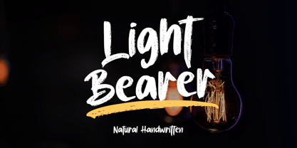 Light Bearer is a cool handwritten font. It's ideal for branding and decorate your projects. The Light Bearer font has a classy and modern look that can be used for logos, branding, posters, advertisements, stationery, movies, social media posts, youtube channels, and much more! This is a PUA code which means you can access all the glyphs and sweeps easily!
 - PAG Julio by Prop-a-ganda,
$19.99Prop-a-ganda offers retro-flavored fonts inspired by lettering on retro propaganda posters, retro advertising posters, retro packages all the world over. This is perfect font for your retrospective project. PAG Julio is a eye-catching, counter-contrast font with retro touch. This cool and cute font woks best for display uses, headlines, branding, print, and web design projects. - Bodoni Ornamental by FontMesa,
$30.00 New for 2020 Bodoni Ornamental now has two italics to choose from, one basic italic and a second which is more of a true italic with a few uppercase letters that have been stylized. Only one italic can be style linked to the regular upright version so in the second italic we've added Avanti to the name which means forward in Italian. When purchasing the regular upright and Avanti italic together they will install as two separate families. Bodoni Ornamental is a revival of a very old typeface based on the Poster Bodoni letter shape. Giambattista Bodoni passed away in 1813, this decorative version was created in the 1820’s or 1830’s which was the time period when many of these ultra bold decorated type faces began to appear, the original artist is currently unknown. The original version of this ornate classic was only available as a set of uppercase letters, today over one hundred eighty years later this font is now complete with a new lowercase, numbers and accented characters for Eastern, Central and Western European countries. Due to the ornate detail in Bodoni Ornamental when printing itís recommended to use a laser printer 600dpi or greater, a 1200dpi printer will give you the best results rendering the most detail at the smallest possible point size for this font. Small home user Ink Jet printers are not recommended for Bodoni Ornamental unless you set the font to a very large point size. With Ink Jet printers much of the detail in the letters will bleed together as the ink hits the page, commercial Ink Jet printers such as GiclÈe printers may give good results. When using Bodoni Ornamental for digital images including web site graphics it may help to add a one pixel stroke fill around the letters setting color to white or grey, this may help the web site images display better on some computer's. You will need a photo editing application such as Adobe Photoshop to create your image adding the stroke fill and save as a jpg , png or gif file. I hope you enjoy this old font as much as I did making it. Note: When previewing the Bodoni Ornamental font in the Windows font preview you may notice some letters appearing lighter and some darker, this is a problem with the preview window and some ornate fonts, Bodoni Ornamental will print normal and not with mixed light and dark letters.
 - Zira by Artcity,
$10.00 Zira is a playful hand-drawn font family designed by Daniel Bak (Artcity). It is available in three handy weights: regular, bold and screaming. It contains international language accent marks and diacriticals, including Greek and Cyrillic. Zira can be considered as smoothed serif version of Cornelius font. Zira as Cornelius as well is a chimpanzee character in the novel and movie series Planet of the Apes. Dr. Zira is a chimpanzee psychologist and veterinarian, who specializes in the study of humans, in the novel and subsequent movie series Planet of the Apes. Zira was played in the first three Apes movies by actress Kim Hunter. Unique among the Apes characters, Zira has blue eyes. Zira is the fiancée (later wife) of Cornelius, and both are ultimately responsible to the Minister of Science, Dr. Zaius. Zira's character and role are essentially the same in both the novel and the movies, though some story details differ. Her work in each involves both working with humans under laboratory conditions (e.g. learning and behavioural experiments), and working on them physically (lobotomy and other brain surgeries, vivisection, physical endurance and tolerance experiments, and subsequent autopsies). Zira is an outspoken liberal by nature, deploring war and militancy (and despising the gorillas, who seem to make both a way of life), and eager to seek and develop intelligence anywhere it can be found. Zira literally stands for her principles - or refuses to stand, as the case may be.
 - Lech Sans Pro by Ingo,
$44.00 A modern sans serif – large x-height, lively forms The Lech Sans Pro is businesslike-modern but at the same time present the effect of liveliness and movement. The shapes of the individual characters follow the "humanistic" form language of modern faces. In this way, Lech Sans Pro offers an attractive alternative to most of the sans serif fonts used today. The proportions have been selected to be very legible even as a body type for longer texts. The font is so robust in detail that a title in large capitals is very eye-catching. It can function positively as well as negatively and is also still legible from a great distance. Lech Sans Pro supports West European languages including Scandinavian, Central and Eastern European languages, also including Turkish, Vietnamese as well as Greek and Cyrillic. Along with ligatures for the letter combinations fi, ff, fl, tt and tz the font also includes stylistic alternates for N, R, f, l as well as for the German sharp s and the figure 3. Additionally, Lech Sans Pro offers several sets of figures: proportional standard figures of equal height lining figures in height of the capitals proportional medieval figures with ascenders and descenders disproportional tabular figures of equal width superior and inferior scientific figures and numerators resp. denominators for fractions circled figures
 - Bramz by Ergibi Studio,
$19.00 BRAMS Display Serif Font. This font has unique and sleek letterform, make it great to be used for modern and minimalistic design theme. The unique ligatures on serif makes this typeface cool and stands out rather than the regular serif font, perfectly for headlines, logos, posters, packaging, T-shirts,coffee shops, restaurants, magazine’s headers, signs or gift/post cards,cafe’s and weddings or any type of advertising purpose. BRAMS only comes with an uppercase, Numeral, Punctuation, Ligature, and also Support Multi Language. if you have any Question please Message Me. Thank you ERGIBI STUDIO
 - Milky Cream by Keristyper Studio,
$14.00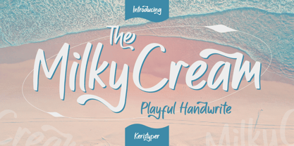 Milky Cream is a cool and playful handmade marker font. This font is good for logo design, Social media, Movie Titles, Books Titles, short text even long text letters, and good for your secondary text font with sans or serif. Featured: Standard Uppercase & Lowercase Numeral & Punctuation Multilingual : ä ö ü Ä Ö Ü ß ¿ ¡ Alternate & Ligature PUA encoded We recommend programs that support the OpenType feature and the Glyphs panel such as Adobe applications or Corel Draw. so you can use all the variations of the glyphs. Hope you enjoy our fonts!
 - Lostar by Ergibi Studio,
$19.00 LOSTAR Display Modern Font. This font has unique and bold letterform, make it great to be used for modern and minimalistic design theme. The unique ligatures on serif makes this typeface cool and stands out rather than the regular serif font, perfectly for headlines, logos, posters, packaging, T-shirts,coffee shops, restaurants, magazine’s headers, signs or gift/post cards,cafe’s and weddings or any type of advertising purpose. LOSTAR only comes with an uppercase, Numeral, Punctuation, Ligature, and also Support Multi Language. if you have any Question please Message Me. Thank you ERGIBI STUDIO
 - Stronger by MlkWsn,
$25.00 Stronger is a supercharged, street-wise brush font bursting with energy. With extra attention to quick strokes and sharp details, Stronger is ideal for logos, apparel, quotes, product packaging, or anything which needs a typographic turbo-boost. What's Included: Stronger Regular - The standard version of the font. Perfect for titles and logos. Stronger Swash - Need a cool underline under your text or a splash of paint? This font set has you covered. Type any letter a-z using this font, and you'll get a unique swash to accompany the font
 - Oun by Ezzazebra,
$15.00 Inspired from Cambodia’s alphabet, Khmer. I tried to explore the visual of the original character in Latin characters. Inspired by 2 gothic fonts, Old London (for the modern/straight feel) and Berliner (for the dynamic between thin and bold line). The letters are made with pencil in a millimeter block book, then scanned into clean vector format. And the result can be use for Display or a Headline with traditional or ethnic theme, including film, game, event, etc.
 - Parmezan MF by Masterfont,
$59.00 Your logo or tag line, your next signage or poster - it's all in this family.
 - Havin Delight by Letterhend,
$19.00 Havin Delight is a beautiful signature script based on manual hand writing. The natural flow make this font looks like a real hand writing. This type of font perfectly made to be applied especially in logo, and the other various formal forms such as invitations, labels, logos, magazines, books, greeting / wedding cards, packaging, fashion, make up, stationery, novels, labels or any type of advertising purpose. Features : uppercase & lowercase numbers and punctuation multilingual alternates and ligatures PUA encoded We highly recommend using a program that supports OpenType features and Glyphs panels like many of Adobe apps and Corel Draw, so you can see and access all Glyph variations. How to access opentype feature : letterhend.com/tutorials/using-opentype-feature-in-any-software/ Email us to letterhend@gmail.com if you need something! Happy Designing!
 - VTC Letterer Pro - Unknown license

- VTC Bad DataTrip - Unknown license

- VTC SikleCell - Unknown license

- VTC Bad DataTrip - Unknown license

- VTC Optika - Unknown license

- VTC Optika - Unknown license

- VTC SubwaySlam Caps - Unknown license

- Aribau Grotesk by Emtype Foundry,
$69.00 Born from the intersection of the geometric and grotesque typefaces. Aribau Grotesk combines low contrast and generous width proportions with typical traits of american gothics from the early 20th century, like the counters aperture and a double story ‘g’. Driven by the process, some details that come from the geometric style arose, like the clean-shaped figures and the circular dots that convey a more affable and contemporary look. Aribau Grotesk PDF.


