10,000 search results
(0.028 seconds)
- Hoppa by Soar Studio,
$29.00 Hoppa is a clean geometric typeface with a fun twist. It was carefully designed to the modern standards like big x-height and short descenders. With its smooth curves and loop-alike shapes, Hoppa will add a fresh and lively feel to your designs. Although it has been created to be used as a display face, it performs well in longer texts. Thanks to alternate glyphs, font gets more legible, neutral look. Hoppa supports most of Latin and Cyrillic languages and includes range of OT features.
 - New September by Nk Studio,
$19.00 New September is a whimsical and fun display font. Looks great on a variety of design ideas that need a trendy touch. Whatever the topic, New September will be a great asset to your font library, as it has the potential to enhance any creation. The New September is also made with the crafter in mind: there are no closed counters in either type, meaning they can easily be used for stencils and electronic cutters like the Cricut and Silhouette lines. Enjoy and thank you.
 - Home Run by Doyald Young,
$50.00Home Run Script has the formality of 18th-century English roundhands, narrow, tightly fitted and drawn in a very bold weight and inspired by my ITC Eclat font. The x-height is large, and the caps are simply drawn with minimal swashes. Its companion font Home Run Sanscript, sold separately also, has sans serif caps that enable the user to combine script and sanserif caps with the same slope. It has the same lowercase as Home Run Script with a few alternate characters and sans serif lining and Oldstyle figures. Both Young Finesse and Home Run include Richard Isbell’s “interrabang,” appropriately used for statements that are both interrogative and exclamatory. - Ashgabat by GlyphStyle,
$16.00 Ashgabat is a signature style font that looks natural with a pen stroke-like texture. A bold and elegant looking font like the original signature style. Font feature Uppercase, Lowercase, Numerals & Punctuations, Stylistic Alt, Swash Ligature, Multilanguage
 - Cashback by AVP,
$15.00 A rounded geometric font of uniform stroke weight. All strokes have rounded ends and with the exception of the math symbols, there are no diagonal strokes.
 - Yusyad by Eyad Al-Samman,
$20.00 The typeface Yusyad is designed mainly for a very sentimental and emotional reason. Metaphorically, it is a modest artistic gift offered virtually from the designer to one of his beloved and cherished persons in this life, namely, his loyal and devoting wife. She represents one of the most essential motives for many artistic and non-artistic works that the designer achieved during his life. This was done through her tranquil personality, infinite patience, sincere support, and endless encouragement. The designer's partner (i.e., the significant other) lives with him along with their three children looking both always for a life full of peace, achievements, philanthropy, and of course love. The typeface's name Yusyad is a portmanteau word consists of two morphemes. It is a simple name-meshing for two different names. Those names represent the name of the designer's wife (Yusra) and the name of the designer (Eyad). Yusyad is like an epithet that ties the two partners' honest and eternal relationship until the last day of their lives. Technically, Yusyad is a sans-serif condensed and display typeface. It comprises seven fonts with dual styles and multiple weights. Specifically, it has two main styles, namely, the normal and the inline design. The normal style comes in five weights (i.e., thin, light, regular, bold, and black) whereas the inline style has two weights (i.e., regular and bold). The typeface is designed with more than 700 glyphs or characters. Its character set supports nearly most of the Central, Eastern, and Western European languages using Latin scripts including the Irish and the Vietnamese languages. The typeface is appropriate for any type of typographic and graphic designs in the web, print, and other media. It is also absolutely preferable to be used in the wide fields related to publication, press, services, and production industries. It can create a very impressive impact when used in movies' or TV-series titles, posters, products’ surfaces, logos, signage, novels, books, and magazines covers, medical packages, as well as the product and corporate branding. It has also both of lining and old-style numerals which makes it more suitable for any printing or designing purposes. To end, Yusyad's condensed appearance—especially the inline style—makes it very memorable, eye-catching, and striking for advertising, marketing, and promotional purposes.
 - Motley Crew by Hanoded,
$20.00 Motley Crew is my last font for 2016. It is quite a lively, quirky and a little bit scary typeface, which will give your designs a little more ‘joie de vivre’. It was made with a soft brush and Chinese ink. The splatter was added after I had painted the glyphs. I forgot to put away my laptop, which now looks like this font… Motley Crew wishes you all the best for the coming year - in a lot of languages, as it comes with a generous splatter of diacritics.
 - Schwarz by Miguel Ibarra Design,
$20.00 Schwarz is a Black Letter typeface inspired by all that is black. Jagged edges and sharp diagonals make Schwarz a head banging font. Some stylistic alternates and ligatures are also available.
 - Whatchamacallit by Comicraft,
$19.00 We popped the Doohickey into the Framistat and out popped this Whatchamacallit! Is it fat? is it thin? Is it tall? Is it short? Is it light? Is it heavy? Is it condensed?! is it expanded?! Yes, yes, yes and yes -- It’s all of the above and more! Our resident mad scientist John “Mr. Fontastic” Roshell has developed a single contraption that can handle any design emergency, from crimelords to supervillain team-ups to alien invasions. Whatchamacallit is a friendly and readable sans-serif, inspired by some of our all-time favorites -- Gill Sans, Futura, Venus and Antique Olive. But, like its machinery-contraption namesakes Doohickey and Framistat, Whatchamacallit has a lively personality -- the strokes are a little wavy, the ends a bit bulbous, and the circles are like little loaves of bread, rising in the Whatchamacallit's oven... delicious!
 - Albe Sans by Hackberry Font Foundry,
$24.95Albe Sans is a font family that began life when I was struck by a full-color back page ad in a 1935 copy of Better Homes & Gardens. I loved the readability and general cleanliness of the design. This font is drawn from memory after that experience. It is loosely based on Palton for proportion, but heaviily modified (not to mention, Palton is serif): Lower case numbers, Euro, ballot box in the section slot. - Sharpe by Mans Greback,
$29.00 Sharpe is a stylish serif typeface family. The type has been drawn by Måns Grebäck during 2018 and 2019. It is clear, sharp and has brave, lively letter forms but with a conservative backbone. The five font weights balance beautifully in contrast to each other, and each weight has an italic equivalent, totaling in ten styles from Thin to Black. Each style contains ligatures and support for a wide range of languages.
 - Channel Surfing JNL by Jeff Levine,
$29.00In 1999, Jeff Levine released a freeware font called "Channel Tuning JL" scanned from drawings made with a felt tip marker and designed as if the letters were breaking up due to poor reception such as on pre-digital TV sets. Over a decade later, Jeff has totally reworked the font—giving it cleaner lines, an extended character set and renaming it Channel Surfing JNL to set it apart from the roughly-drawn original. - Quiza Pro by Mint Type,
$- Quiza Pro is a geometric display sans with added playfulness created around a single dot. Its peculiar rounded diamond shape has inspired many additional details such as similar cuts in diagonal strokes, or occasional serifs in ascenders and capital letters. Its low x-height together with friendly character makes Quiza Pro an interesting choice for packaging and branding purposes. Additionally, its balanced rhythm allows paragraph typesetting in corporate editorial projects – making it a real workhorse for an identity designer. Quiza Pro comes in 8 weights + matching italics each supporting numerous Latin-based languages as well as major Cyrillic languages. It is packed with OpenType features like ligatures, small caps, 6 sets of digits, 3 stylistic sets, superiors and inferiors, fractions, ordinals, respective punctuation varieties including all-cap punctuation, as well as language-specific alternates.
 - Hargloves by Heypentype,
$17.99 Hargloves is a modern sans serif font family. The overall design shapes taken from advance engineering technology themes in various industries like motorsports, biotech, games, architecture, robotics, and aerospace tech. A distinct visual characteristic of this font family can be found on 'G','O','P','Q', and 'R' letter. Each glyph design combined a geometric shapes and stylished ink-traps with parabolic curves. The design of the glyph curves taken from fast corner often found on motorsports circuit, when diagonal glyph shapes taken from aerodynamic in machine engineering and kinetic movement on sports. Hargloves consist of 12 font with 6 weight: From thin to Bold with each matching italics.It also contains extras 4 Icons designed specifically for sports entertainment. Hargloves support for most western languages and several opentype features.
 - Nakata by Hanoded,
$15.00 Mr. Nakata is another one of my favorite Haruki Murakami characters. Nakata typeface is handwritten, sloppy and messy, but comes with intelligent features like alternates and ligatures, to make it look more like handwriting and less like a font. Of course, Nakata speaks most Roman-based languages.
 - LiebeDoris by LiebeFonts,
$29.00 Inspired by a workshop with iconic American sign painter Mike Meyer, Ulrike of LiebeFonts set out to create a versatile, lovely typeface for sign painting that looks not at all like a font but rather like the letters on a unique, hand-painted storefront sign. LiebeDoris combines the best of two worlds: the beauty of all-American sign painting and the meticulous craft of German engineering. Each and every letter in each of the four different styles in LiebeDoris was hand-painted on large sheets of paper with a brush and ink, then carefully transferred for digital typesetting. So rather than being one typeface with different weights, think of LiebeDoris as a package of four individual designs that go together very well. Advanced OpenType features enable this font to really shine: every letter in this all-caps font comes in four variations, so that two of the same letters typed in a row won’t look the same, giving a truly handmade charm. (This feature requires layout software or a word processor with OpenType support.) And if you do have a storefront or a restaurant menu to prettify with LiebeDoris, you will love the integrated collection of store-themed catch words like “FREE”, “NEW”, and “SALE”. If you fall in love with LiebeDoris, you may also like our other best-selling fonts, LiebeErika and LiebeGerda, or our whimsical pictogram fonts such as LiebeMenu.
 - Hostile Portia by Letterhend,
$19.00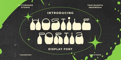 Hostile Portiais a reverse display font with fun and playful looks. This type of font perfectly made to be applied especially in storybook children or child theme which is need a standout font, and the other various formal forms such as invitations, labels, logos, magazines, books, greeting / wedding cards, packaging, fashion, make up, stationery, novels, labels or any type of advertising purpose. Features : regular & hand drawn numbers and punctuation multilingual PUA encoded We highly recommend using a program that supports OpenType features and Glyphs panels like many of Adobe apps and Corel Draw, so you can see and access all Glyph variations.
 - Cosmo Bones by Letterhend,
$16.00 Cosmo Bones is a reverse display font with fun and playful looks. This type of font perfectly made to be applied especially in storybook children or child theme which is need a standout font, and the other various formal forms such as invitations, labels, logos, magazines, books, greeting / wedding cards, packaging, fashion, make up, stationery, novels, labels or any type of advertising purpose. Features : regular & hand drawn numbers and punctuation multilingual PUA encoded We highly recommend using a program that supports OpenType features and Glyphs panels like many of Adobe apps and Corel Draw, so you can see and access all Glyph variations.
 - ZF Captiva by ZooFont,
$22.00 The name Captiva is derived from the word captivate, meaning 'enchanting' or 'capturing the heart'. Captiva is a geometric sans serif font with a harmonious blend of clean shapes and straight lines, diagonal lines, and curves. The simple yet sophisticated design shows a soft yet hard, hard yet beautiful appearance. It has a total of 9 thickness levels, and the edges and strokes are rounded to give the user a peaceful impression. The non-decorated form gives the user a comfortable reading of the text, and the high height value and wide inner space make it stand out from other fonts. In addition, it provides comfortable readability in various digital media as well as in general printing environments. Captiva has the following features: 9 thickness levels (from thin to heavy) extended latin 450+ glyphs fixed width numbers The Latin extension offers more than 130 languages with extensive multilingual Latin support for Western, Central, and Southeastern Europe.
 - Sancoale Slab Soft by insigne,
$24.75 Ready for the designs of today, the Sancoale superfamily takes a softer turn with a rounded slab serif. Crafted from Sancoale’s simple geometry, new softened slab serifs provide a lively typeface that conveniently enhances its cousins: Sancoale Softened--a sans with blunted terminals; Sancoale Slab; and, certainly, the first Sancoale. The weights of each and every member are balanced diligently to be compatible with one another. When used alongside one another, the combination makes for robust and tight design. With weights starting with the slender thin ranging to the juicy black, Slab Soft opens the doorway to the vary of uses. Its design is legible and neutral enough for bodies of copy--both in print and on your website. The web font also stands out perfectly as a headline or a display face. Slab Soft carefully places a foot ahead, and doesn't overpower like many slabs. This font’s the choice to seize the day and get the job done. All insigne™ fonts are absolutely loaded with OpenType options. Sancoale Slab is geared up for pro typography, together with alternates with stems, compact caps and lots of alts, together with “normalized” capitals and lowercase letters. The font features many numeral sets, with fractions, old-style and lining figures with superiors and inferiors. OpenType-capable programs like Quark or the Adobe suite allow you to quickly change ligatures and alternates. You can see these options shown in the .pdf brochure. Bundled are compact caps, fractions, old-style and lining quantities, scientific superior/inferior figures, entire ordinal and inferior alphabet. The Sancoale superfamily also features the glyphs to aid a variety of languages, together with Central, Eastern and Western European languages. In all, Sancoale Slab supports around forty languages that utilize the Latin script, earning Sancoale the pick for for multi-lingual publications and packaging.
 - Alfrine by Greater Albion Typefounders,
$12.00 Alfrine is a gently rounded oblique Sans-Serif typeface, ideal for banner text with a simple clear outline and a sense of motion and speed. Two typefaces are offered-regular and diagonally shaded forms.
 - Donovan Display by The Ampersand Forest,
$19.00 Meet Donovan Display! She's a lovely, high-contrast Didone with lots of options. Do you like sweeping flourishes at the end of your strokes? She's got 'em! Prefer juicy ball terminals? She's got 'em! Like a simpler, cleaner terminal? She's got those, too! She also has a set of grand swash capitals and a trunkful of ligatures that will add panache and elegance to any project that requires display-size type. Even better, she comes in two widths: Slim, for standard display use, and Skinny, a compressed version for spaces that require a bit of a squeeze and/or a more (traditionally) masculine feel! Donovan's lines are inspired by classic Didone faces — most notably the work of Firmin Didot (for architectural detail) and Giambattista Bodoni (for the look of the skinny version). She's sexy and stylish and she'll give you exactly the fashionable, elegant look you're after.
 - Chord Symbols by Tijs Krammer,
$24.00 Chord Symbols is a font for musicians. With this font, you can quickly write beautiful chords, using only simple keyboard characters as input. Musicians tend to write chords with regular characters. They use # instead of a genuine sharp, b instead of a genuine flat, dim instead of a small circle, etc. With Chord Symbols, your chords will be better looking, more easily readable and more efficiently notated. Chord Symbols helps you to write the chords the way you like it. Whether you prefer ‘maj7’ or ‘m7’ or a small triangle for a major seventh, whether you want ‘m’, ‘mi’, ‘min’ or a horizontal line for a minor chord, this font will suit you. Chord Symbols is originally created out of the need to write chords above pop song lyrics. It is designed to also work smoothly in music notation software, like Sibelius, Finale and Encore.
 - Man Ray by Andinistas,
$29.00 ManRay is a photogenic typefamily of 6 fonts designed by @andinistas, with more than 2600 glyphs distributed in 3 Scripts and 3 Caps. Its shapes are ideal for attention-grabbing and for its eloquent character set, each style is presented with three levels of erosion planned with meticulous dotted texture bézier drawing, diagonal texture, and vertical texture pattern. ManRay Script, Script2, Script3 is based on calligraphy made with a fine tip brush and therefore communicates pleasant and attractive ideas. Its capital letters measure three times the height of the lower case and stand out for its artistic curved lines ideal for writing on photos, logos, labels, packaging, posters, covers of food products, spirits, organic teas, etc. In that order, it also offers other expressive alternate letters that activate spontaneously, and each of the three styles is case-infinite with and without Swash, Stylistic, and Titling Alternates. ManRay Caps, Caps2, Caps3 are inspired by calligraphic Roman letters drawn with a brush with a square tip and are equipped with descending flourishes for word start and end. The core of ManRay mixes the ideas of Ed Benguiat and Ross F. George and its name is a tribute to the Dada hero who changed history a century ago by working against the conventions of art and photography.
 - Gentry by Device,
$29.00 With its strong diagonal emphasis, Gentry is a humanised techno face that manages to also incorporate some strong calligraphic touches. Powerful in short and single-word settings.
 - Storyville by Canada Type,
$29.95 This is the redrawn and expanded version of an alphabet Rebecca Alaccari made back in 2009 as a bespoke font for a tourism agency looking to recapture the appeal of New Orleans after the hurricane Katrina disaster robbed it of its core industries. The brief back then was to "revive the unique spirit of what always made Nola great for new adults, which is the excellent combination of history, romance, food and music." No word of a lie, the brief actually contained "new adults." Storyville contains two interchangeable sets of forms drawn in the doodly, loose and organic way now conspicuously popular with today's young designers, almost every one of whom thinks they will get to design something for a boutique coffee bar somewhere. Well, this whole thing perhaps means freedom, youth, fun, happiness, good stuff like that. But just in case, a little caution doesn't hurt: Use this font only if you know what you're doing. We don't want to go back to the 1990s. Please. We were nearly done for by that exposure the first time around. The ligatures feature in this font does some pseudo-randomization, so the forms in doubled letters don't repeat. Serious fun can be had by also applying the stylistic alternates feature, or picking a letter in the middle of a setting and disabling the ligatures feature. Or various sequences of all that. If you don't like any of that stuff, just forget about it. Uh, wutever.
 - Write by Aah Yes,
$12.00Write is a handwriting font, more like neat print than a flowing cursive script, which renders it highly readable and almost like a formal font, but still retaining the informality of handwriting. Also there are some "special effects" varieties. - Kilometro Display by Hueso,
$20.00 Kilometro Display is a Font Family inspired by the chrome car emblems of the auto industry. In the early 1950s Car manufacturers started using this sort of joint-lettering (script) to write their brand or model on their cars. The trend quickly made it’s way to other industries like electric appliances and it lasted for a good 30 plus years. Today only a handful of brands still uses this font style for their products. This geometric script re-lives a bold past all the way through 5 styles to a thin future.
 - ITC Cherie by ITC,
$29.99Some words from the designer... Like long legs walking a runway in stiletto heels, ITC Cherie is both sophisticated and feminine. West coast designer Teri Kahan developed this art nouveau-style font into two distinct all capital alphabets – one with a “high waist”, placed in the capital position, and the other a “low-waist,” placed in the lower case position. They work separately or together, and this dual nature gives a designer the ability to make subtle changes in a logo or line of text. Additional flourished letters round out this versatile headline font. - Doorkick by Bogstav,
$16.00 Doorkick is my grungy handmade font with rough lines and a squarish look. Each letter has 5 different versions, which automatically cycles as you type - leaving your text with a super lively and natural/organic look. I'd say that Doorkick is best for short words or shoutouts, but try it out it massive text too! I dare you! :)
 - Angelynn by Letterara,
$12.00 Angelynn is a beautiful Calligraphy font designed with an incredibly modern feel. This font is PUA encoded which means you can access all of the glyphs and swashes with ease! It features a varying baseline, smooth lines, gorgeous glyphs, and stunning alternates. Use this gorgeous and unique Calligraphy font to bring any DIY project to life!
 - Imperial Symbols - Unknown license

- Simpatico by The Words Face,
$9.00 Simpatico is a clean and fresh looking font, with a … nice character! (Simpatico in Italian language is a nice and funny behavior). Designed in two ways: standard and italic; each of which is divided into four weights: light, regular, semi-bold and bold. Simpatico is a versatile font! It has 595 glyphs including: letters that have been drawn with different accents for particular languages; ligatures between characters (eg fl, fi etc …); mathematical symbols and signs; differentiation between capital “i” and lowercase “l”; alternatives for characters like “a”; and much more. Simpatico is a multi-ethnic font! In addition to the glyphs commonly used, Simpatico is also in Greek and Cyrillic.
 - MFC Verre Monogram by Monogram Fonts Co.,
$69.00 The inspiration source for Verre Monogram is an unusual hand-drawn letterset from a vintage embroidery publication which comes off more as a Drop Cap or Initial lettering style than monogram. Although its original intention is uncertain, it has many possibilities. This monogram design from the early 1900’s has been updated from a Capitals only to a Caps/Smallcaps set with decorative linking ornamentation. The unique stained glass look of the letterforms allows for a lot of play with manual coloring, and the newly created linking ornaments offer interesting bracelet monogram design options. Download and view the MFC Verre Monogram Guidebook if you would like to learn a little more.
 - Crowbar by Hanoded,
$15.00 Technically a crowbar is a straight metal rod used for digging. The tool I had in mind when I named this font is called a jemmy or pry bar, but I guess I liked the name crowbar better. Crowbar font, like its namesake, is a very useful tool: its brush-like appearance fits any design, especially if you are aiming for the ‘scary’ look. Comes with a toolbox full of diacritics too!
 - Xmas Wishes by Resistenza,
$29.00 Xmas Wishes Font - A collection of 55 calligraphic Christmas greetings and 10 Christmas dingbats. All handwritten with different tools like broad nib pen, pointed pen and brush pen which allowed us to create diverse styles. The letterings are written in different languages; English, French, Spanish and Italian. Add the beauty of calligraphy to your layout and create unique gadgets for this Holiday Season like posters, greeting cards, wrapping paper, tags, and much more! You can also use the designs as photo overlays for your blog or social media content. Open the images to see all the details AWESOME FEATURES 'Font in .otf .ttf' '55 Handlettering Xmas words' '10 Hand-drawn Xmas dingbats' 'Languages in use English, French, Spanish and Italian' 'We highly recommend Turquoise Font to combine with the letterings.'
 - Blank Manuscript by Aah Yes,
$14.95Blank Manuscript allows you to produce sophisticated musical scoresheets even on basic Word Processors - anything from simple plain staves to complex full-page orchestral scores of your own design, to write in the notation yourself. The basic stuff is really easy and straightforward, but there's some quite advanced things you can do as well. So Copy and Save these Instructions. • The main stuff is simple and tends to follow the initial letter. Treble, Bass and Alto clefs are on upper case T B A (there are more clefs, below). The 5 Lines for the clefs are on L or l. • A small v will give a small vertical line (like a bar line) and a Big U will give a Big Upright - these can start or end a line or piece. • Time Signatures - type the following letters: Think of W for Waltz and it's easy to remember that 3/4 time is on W. Then from that they go up or down together like this: V=2/4 W=3/4 X=4/4 Y=5/4 Z=6/4 Compound Times are on H I J K like this: H=3/8 I=6/8 J=9/8 K=12/8 Common Time and Cut Common symbols can be found on semi-colon and colon respectively (all begin with Co- ). 2/2 3/2 are on lower case a and b, 7/4 and 7/8 are on lower case c and d, 5/8 is on small k (think POL-k-A) • Flat signs are on the numbers. Flat signs on LINES 1 to 5 are on numbers 1 to 5. Flat signs on SPACES 1 to 5 are on numbers 6 to 0 (space 1 being above line 1, space 5 being above the top line of the stave). Sharp signs are on the letters BELOW the long-row numbers. Which is q w e r t for the sharp signs on Lines 1 to 5, and y u i o p for sharp signs on spaces 1 to 5. Doing it this way means it works the same for all clefs, whether Treble, Bass, Alto, Tenor or any other. Sharp and Flat Signs always go in this order, depending on how many sharps or flats your key signature requires: Treble Clef Sharps t i p r u o e Flats 3 9 7 4 2 8 6 Bass Clef Sharps r u o e t i w Flats 2 8 6 3 1 7 = Alto Clef Sharps o e t i w r u Flats 7 4 2 8 6 3 1 • Guitar Chord Boxes are on G and g (G for Guitar) Upper Case G has a thick line across the top Lower case g has an open top, for chords up the fretboard TAB symbols are available: Six-string Tablature is on s & S for Six. Four-string Tablature is on f & F for Four. (Lower case has the "TAB" symbol on it, Upper Case has just the lines to continue.) Five-string tablature, is on lower case "j" (as in BAN-j-O) and of course L or l will continue the 5 lines. •RARE CLEF SIGNS including Tenor Clef, are on various punctuation marks, i.e. dollar, percent, circumflex, ampersand & asterisk, above the numbers 4 to 8. NOTE: The important symbols were kept on the letter and number keys, which are fairly standard all over, but some of the less important symbols are on various punctuation keys, which in different countries are not the same as on my keyboard. If it comes out wrong on your system, all I can say is it's right on the systems we've tried, and they'll be in here somewhere, probably on a different key. CLOSING THE ENDS OF THE LINES and BAR-LINES is done with the 3 varieties of brackets - brackets, brace and parentheses - Left/Right for the Left/Right end of the line. Parentheses L/R () which are above 9, 0 give a clef with a small vertical upright (the same as a bar line). Brace L/R and Brackets L/R (both on the 2 keys to the right of P on my keyboard) will close off a staff line with tall upright bars. Brace gives a double upright - one thick, one thin. Brackets give a single tall upright. A Big Upright is on Big U, (Big U for Big Upright) and a small vertical line is on small v (small v for small vertical). The Big Upright is the maximum height, and the small vertical is exactly the same height as a stave. And there's a tall upright Bar, on Bar (which is to the left of z on my keyboard, with Shift,) which is the same height as the bar on upper case U but twice as broad. • There's a staff intended for writing melodies, which is a little bit higher up than an ordinary treble clef giving a space underneath to put lyrics in - on m and M for Melody line. Lower case has the Treble Clef on, Upper case M has just the higher-up staff lines with no clef. (Use mMMMMMMM etc.) However this clef will be in the wrong place to put in sharp and flat signs, key signatures and so on, so if you use this clef you'll have to write the sharps, flats and key signature yourself. There's also a clef that's smaller (less tall) than the ordinary clef, but with the same horizontal spacing so it will align with other standard-sized clefs - on slash (a plain clef) and backslash (with a Treble Clef). • There are some large brackets for enclosing groups of staves, such as you'd use on large orchestral scores, on Upper Case N O P Q R, which can aid clarity. N and O on the left, Q and R on the right. P is a Perpendicular line to be used on both sides to increase the height of the enclosure, in this way but with the staff lines in between: N Q P P P P P P O R OTHERS —————————————— • Repeat marks are on comma (left) and period/full stop (right). • Hyphen is left as a sort of hyphen - it's a thin line like a single staff line, with the same horizontal spacing as ordinary staff lines - in case you want to draw a line across for a Percussion Instrument, or a Title or Lyric Line. • Space is a Space, but with HALF the width or horizontal spacing as ordinary staff lines, so 2 space symbols will be the same width as a clef symbol or line. • Grave (to the left of 1 on the long row, or hold down Alt and type 0096 then let go) gives a staff line that is one eighth the width of an ordinary staff line. • If you want manuscript in a clef and key which requires a flat or sharp sign in the space underneath the 5 lines, they’re on = equals and + plus . SYMBOLS • Many of these symbols will only be useful if you have worked out in advance which bars will need them, but they are here in case you've done that and wish to include them. • Symbols for p and f (piano and forte) are on 'less than' and 'greater than' < > (above comma and full stop) and m for mezzo is on Question, next to them. They can be combined to make mp, mf, ff, pp, etc. These signs -- and other signs and symbols like Pedal Sign, Coda Sign and so on -- can be found on various punctuation mark keys, including above 1, 2, 3 in the long row, and others around the keyboard. There's a sort of logic to their layout, but in different countries the keys are likely to give different results to what is stated here, so it's probably best to just try the punctuation and see if there's any you might want to use. (But on my keyboard a Coda sign is on circumflex - because of the visual similarity. Pedal sign is on underscore. A "Sign" symbol is on exclamation mark.) They were only included in case you really need them to be printed rather than handwritten. • However, a Copyright symbol is deemed necessary, and also included are a "Registered" symbol and a TradeMark symbol. They are found in the conventional places, and can be accessed by holding down ALT and typing 0169, 0174 or 0153 respectively in the numberpad section and letting go. • Staff lines with arco and pizz. above are on capital C and D respectively ---C for ar-C-o. • An empty circle above a staff line (to indicate sections by writing letters A, B, C or 1,2,3 inside for rehearsal marks) is on n. The actual signs for an A, B, C and D in a circle above the staff line can be produced by holding down ALT and typing 0188, 0189, 0190 and 0191 respectively and letting go. • The word "Page", for indicating page numbers, is on the numbersign key. • The two quotes keys, (quote single and quote double) have symbols representing "Tempo is", and "play as triplets", respectively. • INSTRUMENT NAMES There's a whole lot of Instrument Names built in (over a hundred) which can be printed out above the clef, and you do it like this. Hold down Alt and type in the given number in the numberpad section, then let go. For Piccolo it's 0130, for Flute it's 0131, Cornet is on 0154, Violin is on 0193, and the numbers go up to over 0250, it's a fairly complete set. There's also a blank which is used to align un-named clefs on 0096. Put them at the very beginning of the line for the best results. Here they are: WOODWIND Piccolo 0130 Flute 0131 Oboe 0132 Clarinet 0133 Eng Horn 0134 Bassoon 0135 Soprano Sax 0137 Alto Sax 0138 Tenor Sax 0139 Baritone Sax 0140 Saxophone 0142 Contrabassoon 0145 Recorder 0146 Alto Flute 0147 Bass Flute 0148 Oboe d'Amore 0149 Cor anglais 0152 Pipes 0241 Whistle 0242 BRASS Cornet 0154 Trumpet 0155 Flugelhorn 0156 Trombone 0158 Euphonium 0159 Tuba 0161 French Horn 0162 Horn 0163 Tenor Trombone 0164 Bass Trombone 0165 Alto Trombone 0166 Piccolo Cornet 0167 Piccolo Trumpet 0168 Bass Trumpet 0170 Bass Tuba 0171 Brass 0172 VOICES Vocal 0175 Melody 0176 Solo 0177 Harmony 0178 Soprano 0179 Alto 0180 Tenor 0181 Baritone 0182 Treble 0183 Bass 0197 (see also PLUCKED STRINGS) Descant 0184 Mezzo Soprano 0185 Contralto 0186 Counter Tenor 0187 Lead 0206 BOWED STRINGS Strings 0192 Violin 0193 Viola 0194 Cello 0195 Contrabass 0196 Bass 0197 Double Bass 0198 Violoncello 0199 Violin 1 0200 Violin 2 0201 Fiddle 0252 PLUCKED STRINGS Harp 0202 Guitar 0203 Ac. Gtr 0204 El. Gtr 0205 Lead 0206 Bass 0197 Ac. Bass 0207 El. Bass 0208 Slide Gtr 0209 Mandolin 0210 Banjo 0211 Ukelele 0212 Zither 0213 Sitar 0214 Lute 0215 Pedal Steel 0216 Nylon Gtr. 0238 Koto 0239 Fretless 0244 KEYBOARDS + ORGAN Piano 0217 El. Piano 0218 Organ 0219 El. Organ 0220 Harpsichord 0221 Celesta 0222 Accordion 0223 Clavinet 0224 Harmonium 0225 Synth 0226 Synth Bass 0227 Keyboards 0228 Sampler 0249 PERCUSSION and TUNED PERCUSSION Percussion 0229 Drums 0230 Vibes 0231 Marimba 0232 Glockenspiel 0233 Xylophone 0234 Bass marimba 0235 Tubular Bells 0236 Steel Drums 0237 Kalimba 0240 OTHERS Harmonica 0246 Mouth Organ 0247 FX 0251 Intro 0243 Verse 0245 Refrain 0248 Chorus 0250 un-named 0096 (this is a small spacer stave for aligning clefs without a name) ALSO copyright 0169 registered 0174 TradeMark 0153 Rehearsal marks 0188-0191 (giving A, B, C, D in a circle, an empty circle is on n ) Clef signs for Treble Bass Alto without any staff lines 0253-0255 An Alphabetic List of all signs: a 2/2 time b 3/2 time c 7/4 time d 7/8 time e sharp sign, centre line f Tab sign for 4-string tab g Guitar Chord Box, no nut h half-width stave I sharp sign, third space up j Tab sign for 5-string tab k 5/8 time l Lines - 5 horizontal lines for a stave m Melody Clef - a standard clef but placed higher up, with Treble sign n Stave with an empty circle above o sharp sign, fourth space up p sharp sign, space above stave q sharp sign, bottom line r sharp sign, fourth line up s Tab sign for 6-string tab t sharp sign, top line (fifth line up) u sharp sign, second space up v vertical line (bar-line) w sharp sign, second line up x Fretboard, four strings y sharp sign, first space up z Fretboard, five strings A Alto Clef B Bass Clef C “arco” above stave D “pizz.” above stave E Double Vertical Lines F Four Horizontal lines (for 4-string tab) G Guitar Chord Box with nut H 3/8 time I 6/8 time J 9/8 time K 12/8 time L Lines - 5 horizontal lines for a stave M Melody Clef - a standard clef but placed higher up, plain N Bounding Line for grouping clefs - top left O Bounding Line for grouping clefs - bottom left P Bounding Line for grouping clefs - Perpendicular Q Bounding Line for grouping clefs - top right R Bounding Line for grouping clefs - bottom right S Six Horizontal lines (for 6-string tab) T Treble Clef U tall, thin Upright line V 2/4 time W 3 / 4 time X 4/4 time Y 5/4 time Z 6/4 time 1 flat sign, first line up (the lowest line) 2 flat sign, second line up 3 flat sign, third line up 4 flat sign, fourth line up 5 flat sign, fifth line up (the top line) 6 flat sign, first space up (the lowest space) 7 flat sign, second space up 8 flat sign, third space up 9 flat sign, fourth space up 0 flat sign, space above stave - Ad Words by Outside the Line,
$19.00 Just in time for the sale season. Ad Words is a font of words you would use if you did retail ads. Some words in script, some print, some bold, some not. Plus 2 starbursts. Enlarge the starbursts and then reverse one of the words out of it… like Now! Win! or Free! Other Outside the Line fonts work with this one, check out Architectural Lettering Regular and Bold, Plz Print or Plz Script.
 - Mrs Eaves by Emigre,
$125.00 This typeface is named after Sarah Eaves, the woman who became John Baskerville’s wife. As Baskerville was setting up his printing and type business, Mrs. Eaves moved in with him as a live-in housekeeper, eventually becoming his wife after the death of her first husband, Mr. Eaves. Like the widows of Caslon, Bodoni, and the daughters of Fournier, Sarah similarly completed the printing of the unfinished volumes that John Baskerville left upon his death.
 - Fineday by Melvastype,
$29.00 Fineday is a clean and lining brush script. It is available with two different styles of uppercases: Style One and Style Two. Style One is swashy and decorative. Style Two is more plain and straightforward. Fineday is also available with connecting and non-connecting lowercases. All the Fineday versions have fancy alternate characters like ending swashes, tales and swashy ascenders. The family has an extended character set supporting most Central European and Eastern European languages.
