4,632 search results
(0.012 seconds)
- Shapiro by OGJ Type Design,
$175.00 A neogrotesque with a distinct mid-century feel. Shapiro’s multi-axis Variable Font comprises of 8 text weights, from Light to Black. Three additional sizes, “Headline”, “Display” and “Max” supply another 8 weights that are spaced for larger applications. To top off the package, 8 Wide styles are ready for that extra punch. Choose Shapiro for any job that calls for a restrained but confident voice. Give your design that professional look in the blink of an eye.
 - Antea by Wiescher Design,
$39.50 Antea is named after "Antaeus" the giant of Libya in Greek mythology, son of Poseidon and Gaia (mother earth), whose wife was Tinjis. He was extremely strong if he stayed in contact with the earth, but once lifted into the air he became weak and liquid. So is this font, strong if grounded and weak if floating in the air. I will in due course add different weights for different purposes. Your designer of very mysterious fonts, Gert Wiescher
 - Astomia Duslons by Maulana Creative,
$12.00 Astomia Duslons is a fancy casual handwritten script font. With light pen contrast stroke, fun character with a bit of ligatures. To give you an extra creative work. Astomia Duslons font support multilingual more than 100+ language. This font is good for logo design, Social media, Movie Titles, Books Titles, a short text even a long text letter and good for your secondary text font with sans or serif. Make a stunning work with Astomia Duslons. Cheers, Maulana Creative
 - Sketch Gothic by artill,
$17.00 Sketch Gothic is a hand-sketched headline font. The family contains a light and bold weight; both complement each other perfectly. The mundane, constructed basic forms of the Franklin Gothic, get their charming touch by the handmade hatching. Impressions of dominance and warmth are equally created. Created solely by me from sketch by hand and then digitized, Sketch Gothic makes a perfect font to create the hand-made character look, or to supplement illustrations with typography.
 - Lighters by Sarid Ezra,
$15.00 Lighters is a light and minimalist logo font family with unique lowercase that will make your logo and design looks more clean and simple. With three weight styles that you can use together will make your design more cool . You can use this font for any purpose, especially to make logotype and poster design. You can mix and match the uppercase and lowercase to make your logo more advanced. This font also comes with number, symbol, and multilingual support!
 - Forever Loved by Joanne Marie,
$19.99 Forever Loved is a delightful new handwriting font which is full of character and suitable for every occasion. It has OpenType features such as alternates (two sets of uppercase alternates), swashes, ligatures, terminal forms in lowercase, and a European language support. This wonderful script font is perfect for wedding stationery, engagements, and baby, family and friends orientated themes. Not only that - it can be used for logos, tattoos, delicious food and drink, mugs, clothing, the list is endless!
 - Sofimaria by Qaratype,
$18.00 Sofimaria is a super unique ligature font that you wont forget! It’s a high contrast serif that has loads of style. A modern take on a Caslon style typeface, this font is ideal for those bold headings or wedding invitations. It’s got hundreds of characters and ligatures plus all those European letters! Sofimaria pairs perfectly with a light scripts font or minimal sans serif. Main Features: Uppercase & Lowercase letters Punctuation and special characters Multilingual support Ligatures & Alternate glyphs
 - Quara by Delve Fonts,
$39.00 Quara is a typeface that takes its cues from cutting edge technology and new gadget lust. Quara enjoys short downloads on the web, long walks on mobile devices, and romantic dinners by LED light. An avid gamer (esp. MMORPG) and science fiction fan, Quara longs to be the first font in space and have its pixels scattered among the stars. Designed by Delve Withrington in 2009, this slightly rounded square sans has a generous x-height and low contrast.
 - Brownfauks by Maulana Creative,
$15.00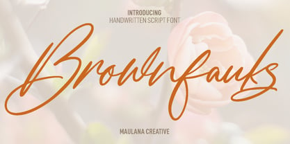 Brownfauks is a fancy handwritten script font. With signature style light contrast stroke, fun character with a bit of ligatures and alternates. To give you an extra creative work. Brownfauks font support multilingual more than 100+ language. This font is good for logo design, Social media, Movie Titles, Books Titles, a short text even a long text letter and good for your secondary text font with sans or serif. Make a stunning work with Brownfauks font. Cheers, Maulana Creative
 - Lafoyettes by Maulana Creative,
$12.00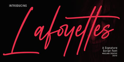 Lafoyettes is a Casual Signature Script font. With semi mono-line light stroke, fun character with a bit of ligatures. To give you an extra creative work. Lafoyettes font support multilingual more than 100+ language. This font is good for logo design, Social media, Movie Titles, Books Titles, a short text even a long text letter and good for your secondary text font with sans or serif. Make a stunning work with Lafoyettes font. Cheers, MaulanaCreative
 - Sanchez Slab by Latinotype,
$- Sánchez, designed by Daniel Hernández, is a serif typeface belonging to the classification slab serif, or Egyptian, that bears a strong resemblance to the iconic Rockwell. Offering contrast and balance to the square structure, Sánchez Slab is a new version, more robust with straight edges, that give greater character and power. Sanchez Slab comprises 12 variants, ranging from extra light to black, each of the same x-height. Regular and Italic variants are available for free.
 - Ringlings by Yanky Goldman,
$29.00 Ringlings stems from Yanky Goldman’s quest for a fresh and innovative display font that subtly attracts. Thus, this lively, dancing-in-the-sun typeface was created. Ringlings is ideal for logo design, package design, headlines and more. This single-stroke, semi-serif font family includes over 1,100 glyphs including uppercase, lowercase, stylistic sets, titling, petite caps, deco caps, ligatures, borders & ornaments and more. It supports most Latin and European languages. Ringlings is airy, light and quite versatile.
 - Orttisa by Maulana Creative,
$12.00 Orttisa is an slanted style script font. With light contrast stroke, fun character with a bit of ligatures and alternates. To give you an extra creative work. Orttisa font support multilingual more than 100+ language. This font is good for logo design, Social media, Movie Titles, Books Titles, a short text even a long text letter and good for your secondary text font with sans or serif. Make a stunning work with Orttisa font. Cheers, Maulana Creative
 - Jullysinty by Maulana Creative,
$13.00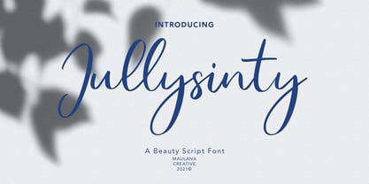 Jullysiinty is casual script font, with high contrast light stroke, slant and fun character. It has Opentype features ligatures of character, To give you an extra creative work. Jullysiinty script font support multilingual more than 100+ language. This font is good for logo design, Social media, Movie Titles, Books Titles, a short text even a long text letter and good for your secondary text font with sans or serif. Make a stunning work with Jullysiinty font. Cheers, MaulanaCreative
 - Stenka by Katatrad,
$39.00 Stenka is a sans-serif stencil typeface that stand for display typeface to use in any typographic situation. It has his own unique style in expressed perfect condensed forms. Stenka is an ideal font family for display, print, corporate identity, mobile devices, magazine cover, signage, and web design creation, with a set of ligatures and alternative characters for your design in any layout. The family has 4 weights ranging from Light to Black and their italic.
 - Happyfin by MNW,
$80.00 Happyfin is a sumptuous font based upon the free nature of a handwritten text, it balances the organic form with the necessary preciseness of a traditional typed font. With a smooth light hearted elegance, this font is perfect for designs involving organic produce and situations where a professional yet fun and friendly typeface is needed. The font has high readability level, and yet conveys a good deal of character and style within the simplest of forms.
 - Berndal by Linotype,
$29.99Bo Berndal, the master Swedish typographer, is the eponymous designer of Berndal, a contemporary text family with five different styles. This family represents a new achievement for Bo Berndal, who has spent many years working to optimize text legibility in the printed media. Several small tricks make the Berndal family an interesting milestone in legibility. Berndal's letterforms contain large x-heights. Large x-heights open up the counterforms of letters, making text appear lighter on a page, but their correspondingly shorter ascenders and descenders can hinder legibility. This does not occur in Berndal at all! Coupled with this experiment, Berndal's various font weights display a certain softness and roundness. The letterforms themselves are relatively wide, with an overall consistency in width. The calligraphic nature of the strokes has been minimized, yet a contrast stroke-thickness is still to be noticed within the alphabet. Berndal's five styles offer almost everything that one could want from a good text family. The Regular weight may be paired with Small Caps, Italic, Bold, and Bold Italic. All styles ship in the OpenType format, and include tabular and old style figures. The two italic weights are made up of true italics, not obliques. The Berndal family is a part of the Take Type 5 collection from Linotype GmbH." - Eloise by Wiescher Design,
$39.50 Ever since I first designed Ellida in 2005, that elaborate script in the tradition of the 18th-century English calligrapher George Bickham and the 19th-century American calligrapher Platt Rogers Spencer, I wanted to add a very high contrast cut to the family. I finally did so. But the result looks so much different to Ellida that I had to give it another name, hence "Eloise". Eloise should actually be written with a 'i' that has double dots, but that would be difficult for international use. Eloise is a beautiful first name not only for French girls. Pronounce: Ay-low-eese. If I would have had a daughter, I would have called her "Eloise" (with double dots!). But instead I have two phantastic sons, so I never got the chance to use it. Actually one of my sons discovered it on his little boys sand shovel, it was called Eloise. Your decorative designer with a heart for sand shovels Gert Wiescher
 - LiebeKlara by LiebeFonts,
$29.90 LiebeKlara is LiebeFonts’ most delicious gourmet creation yet. The mouth-watering look of savory swashes and the fine aroma of masterfully sprinkled contextual alternates will make everyone happy—your spouse, family, and friends. LiebeKlara is festive enough to sit on wedding menus, but still warm enough to give everyday dinner invitations the personal flavor they deserve. LiebeKlara likes company—for example when her girlfriend LiebeErika comes over and they have some LiebeOrnaments with their LiebeMenu. LiebeKlara also likes travelling! She speaks most Western languages fluently and with a cute accent. Try it for yourself—LiebeKlara is calorie-free but (or because) she is very delicate. We hope you like her as much as we do! Bon appétit! LiebeKlara comes with a tasty variety of ligatures and alternative forms available through OpenType features. (Please make sure your software supports OpenType if you wish to use the advanced features.) The font contains over 580 carefully hand-crafted glyphs—so it’s more like two or three fonts in one.
 - Neon Bugler by Breauhare,
$35.00 Neon Bugler is a font based on the third logo created by Harry Warren in early 1975 for his sixth grade class newsletter, The Broadwater Bugler, at Broadwater Academy in Exmore, Virginia, on Virginia’s Eastern Shore. This font design has these principles as its parameters: The letters generally follow what would be natural stroke directions; no sharp corners, all gentle turns; no lines back up over each other, cross each other, or run into each other. All of this civility between the lines produces an unintentional but welcome neon quality about it. This font can have a variety of vibes depending on its context--it has a certain nostalgia to it, yet it also has a slick, clean, futuristic look. It can even be used in a semi-grunge setting. This is a very versatile font! And if you like this font, check out the new boxy version of it, Neon Bugler Squared! Digitized by John Bomparte.
 - Schizotype Grotesk by Eclectotype,
$25.00 A neo-grotesk with a bit more bite, this is Schizotype Grotesk. It's not your usual grot; this is purely display typography. Notches cut deep into the letterforms and the thick/thin contrast isn't always where you might expect. It's intended to be a challenging typeface - not beautiful or particularly 'useful' in any conventional sense, but it is at the very least interesting. In a world where everyone and their dog has their own grotesk offering, perhaps being interesting and that little bit different is in itself enough to give the face its utility. Besides, beauty is in the eye of the beholder. What really matters is what you think! Schizotype Grotesk isn't bogged down with a million and one OpenType features you'll never use, but it does include proportional and tabular lining figures; automatic fractions; numerators and denominators; superscript and subscript numerals; case sensitive forms; and five stylistic sets that change [a], [g], [y], [IJ], and [@] respectively.
 - Neon Bugler Squared by Breauhare,
$35.00 Neon Bugler Squared is a soft, boxy version of Neon Bugler, which is a font based on the third logo created by Harry Warren in early 1975 for his sixth grade class newsletter, The Broadwater Bugler, at Broadwater Academy in Exmore, Virginia, on Virginia’s Eastern Shore. This font design has these principles as its parameters: The letters generally follow what would be natural stroke directions; no sharp corners, all gentle turns; no lines back up over each other, cross each other, or run into each other. All of this civility between the lines produces an unintentional but welcome neon quality about it. This font can have a variety of vibes depending on its context-it has a certain nostalgia to it, yet it also has a slick, clean, futuristic, sci-fi look. It can even be used in a semi-grunge setting. This is a very versatile font! Digitized by John Bomparte.
 - Boule Plus by Ingo,
$33.00 CAPITALIZED, geometric, bold and round. If the typographer sees a font like that, it's enough to make his toes curl. But sometimes it just has to be that way. Geometrically constructed fonts do not necessarily have to be pointed and angular; It also works consistently around. And if I say it consistently, then in this case, that's done consistently. The basis for the BOULE is the circle. The letters are drawn with constant line width, the “corners“ and endings all have the same radius, the lines are all the same thickness. The BOULE consists only of capitals. There is only one difference in the use of uppercase and lowercase letters: in the uppercase letters, the round letters are circular, while the lowercase letters are narrow. The character set of the Boule contains all letters and accents to support the Western, Northern, Central and Eastern European languages with Latin alphabet. The BOULE is not only very fat, it also runs very tight; that is, the glyphs are very close to each other. To avoid "holes" due to unfortunate letter combinations, the BOULE contains ligatures for FT, ST, TT and TZ. There are also other versions of the font: BOULE Brillant on the one hand. In this version, simple highlights simulate a light incidence from the top right. These light edges give the font a decorative effect that makes it easy to think of wet sausages or balloons in some shapes. And finally the BOULE Contour. As the name implies, it is the outer contour of the letters, combined with a shadow at the bottom left. The name BOULE (French for ball) says it already: this font is globated. Therefore, it is also very suitable for all three-dimensional alienation effects. With simple light and shadow you can achieve a very convincing 3D effect with little effort.
 - FS Conrad by Fontsmith,
$50.00 Art into type In 2008, Fontsmith were approached by their friend, Jon Scott, to investigate whether a typeface could assume the aesthetic of one artist’s body of work. Jon’s not-for-profit charity, Measure, was organising an event for the artist, Conrad Shawcross, whose giant mechanical installation, entitled Chord, was going on public display in the long-disused Kingsway tram tunnel in Holborn. Chord explores the way we perceive time, as either a line or a cycle. Two enormous machines with dozens of rotating arms and moving in opposite directions, weave rope with almost infinite slowness. An unusual brief Phil Garnham visited Conrad in his Hackney studio to get a feel for his work and ideas. “Conrad is a very clever and philosophical guy. He struggled to see how typeface design had any relevance to him and his art. This was going to be a challenge.” The artist presented the type designer with a pile of rope and a huge diagram of sketches and mathematical workings. “This was, in essence, my brief.” Phil developed three concepts, the simplest of which ticked all the boxes. “The idea of the strokes in the letterforms appearing and ending at peaks or points of origin fitted perfectly with Conrad’s idea of time occurring and ending at two ends of the sculpture.” Two versions Phil planned modules for two versions of the typeface: one with five lines in the letterforms and one with seven. He then drew the modules on-screen and twisted and turned them to build the machine that is FS Conrad. “This is not a simple headline typeface,” says Phil. “It’s not a rigid structure. It has varying character widths, and it’s informed by real typographic insight and proportions so that it actually works as piece of functioning, harmonious type.”
 - Fave by Aerotype,
$48.00 The hand-brushed Fave™ Set has ten informal scripts and other handwritten fonts made up of two subfamilies: Fave and the even-more informal Fave Casual, each have a primary script with a bold version and three other handwritten faces for a total of ten typefaces spanning the casual spectrum. All are optimized for large type use too so they look as good up close as they do set at smaller sizes. OpenType features The Fave family has a few features that happen largely in the background. All of the fonts use the OpenType Standard Ligature feature to automatically differentiate consecutive lowercase letters and numbers (using separate glyphs) and like our previous release Turbinado, they also automatically differentiate like characters that are separated by another letter. Alternate characters The script fonts have alternate uppercase and lowercase characters including multiple t (and double t) crossbar alternates that can be selected from the OpenType glyph table. Enable Contextual Alternates feature to automatically insert a bigger crossbar as the surrounding letters allow throughout a text box or document. You can also make your own custom lowercase t and crossbar to fit any situation–all of the lowercase t ascenders and crossbars are available separately in the OpenType glyph table, and can be combined and moved around manually. Stylistic sets and other goodies Fave Script and its bold counterpart have two Stylistic Sets. When enabled, one automatically substitutes non-connecting alternate characters at the ends of words, the other substitutes even bigger t crossbars than the Standard Ligature feature does. Smart apostrophes and ligatures Other subtle but hopefully helpful features include smart apostrophes, which insert themselves between two script characters in common situations without breaking their connection, and a few ligatures that also make character connections more seamless.
 - Hispania Script by HiH,
$10.00 Hispania Script is a distinctive and distinctly nineteenth century script. It was released by Schelter & Giesecke of Leipzig, Germany around 1890. Particularly noteworthy are the sharply-pointed legs of the upper case ‘K’ & ‘R’ that seem to be characteristic of the period. Similar strokes, often with a slight curve, may be seen in typefaces like Alt-Romanish and Tinteretto by Schelter & Giesecke, Artistic and Lateinsch by Bauer and Berthold and the poster lettering of Edward Penfield. The angle of this script (approximately 24 degrees) and the sharp delicate points must have made the manufacture of this face in metal type a challenge. The resulting type was probably quite fragile and subject to accidental damage. Additionally, the sharp points would be subject to wear. With digital type, these concerns are eliminated. As far as I know, no one has ever dropped a digital letter on the floor. Nonetheless, creating a digital outline for a typeface like Hispania Script, with many crossing strokes, can be quite time-consuming. Even with an accurate scan of a good quality original, it is usually necessary to construct each crossing stroke separately and then remove the overlap in order to obtain a sharp and convincing intersection. Steep internal angles are often defined with two points, rather than one, to minimize ink or toner fill that can muddy the rendering in smaller sizes. Like all formal scripts, Hispania Script is always useful for announcements and invitations. However, the distinctiveness of of this design strongly suggests that there are other applications that may benefit from its use. Step outside the box and try it in some unexpected places. It is the unexpected that often draws a person’s eye.
 - Turbinado by Aerotype,
$48.00 The ten font Turbinado™ Set was designed to be clear and easy to read with a friendly personality, ideal for advertising and packaging in both text and display settings. Included are three weights of brushed casual script, each with a dry version, two condensed all caps faces, another hand printed caps face and an Elements package with 100 brushed elements that include swashes, botanicals, shells, arrows, repeatable patterns and a few other doodads that play well with the fonts. Like our most recent release Fave, all of the fonts use the OpenType standard ligature feature to automatically differentiate consecutive lowercase letters and numbers, using separate glyphs rather than a single ligature so they can be set on a curve or colored separately, etc. They also automatically differentiate like characters that are separated by another letter when standard ligatures is enabled. The script fonts have alternate characters like swash glyphs for ends of words and a few ligatures too; single crossbar to unite the At and Att letter combinations etc. The two condensed faces also have a third set of less uniform glyphs that can be used to create a more quirky, fun and bouncy effect (see the ‘she sells seashells’ graphic above) when the discretionary ligature feature is on. The script fonts have 10+ lowercase t (and double t) crossbar alternates that can be selected from the OpenType glyph table manually, or you can enable the contextual alternates feature to automatically insert a bigger crossbar as the surrounding letters allow throughout a text box or document. Hello? Are you still there? :) And for those intrepid typographers who would rather fashion their own lowercase t to custom fit a specific design, all of the lowercase t ascenders and crossbars are also available separately in the glyph table, and can be combined manually.
 - DJ Cats font, crafted by the talented designer Donna J Morse, presents itself as a playful and engaging typeface that effortlessly captures the whimsical essence of our feline friends. Designed with ...
- Cryptocurrency by Bülent Yüksel,
$14.00 "Crypto Currency - Block Chain" quickly entered our lives and its use is increasing day by day. Blockchain became more popular in web, TV and printed works. It is necessary to use their logos when defining "Crypto Currencies". But it is not easy to access these logos fast. "Cryptocurrency Font Family" which I prepared for you, is a resource that you can reach without searching for too many logos. Cryptocurrency Font Family contains 200+ logos. These are the most popular "Block Chain" logos in recent years. The popularity rankings changed over time and you can contact me if you need new logos and changing logos. I can create the "Block Chain" logo you need or apply the changes. You can send your new logo and logo change requests to me at "buyuksel@hotmail.com". Subsequent corrections and additions will be completely free. After the first purchase, there is no additional payment for updates. When using Cryptocurrency Font Family, "Cryptocurrency No.00 Guide Map" is absolutely free to download and use. This will help you a lot to define coins. "Guide Map" contains the letter and the Unicode numbers. --- Contents --- Ardor ARDR, Bitcoin BTC, Bitcoin Cash BCH, Bitcoin SV BSV, Bitcoin Gold BTG, Bitcoin Diamond BCD, Bitcoin Private BTCP, Bitcoin Plus ZBC, Bitcoin Z BTCZ, Etherium ETH, Etherium Classic ETC, Xrp Ripple XRP, Ripple, Teher USDT, Litecoin LTC, Litecoin Cash LCC, Eos EOS, Binance Coin BNC, Monero XMR, Cardano ADA, Steller XLM, Tron TRX, Tezos XTZ, Unus Sed Leo LEO, Chain Link LINK, Cosmos Atom ATOM, Huobi Token HT, Neo NEO, Hedge Trade HEDG, Crypto.com CRO, Iota MIOTA, Dash DASH, Maker MKR, Usd Coin USDC, Ontology ONT, Nem XEM, Ve Chain VET, Dogecoin DOGE, Basic Attention BAT, Z Cash ZEC, Paxos Standard PAX, Ftx Token FTT, Decred DCR, Qtum QTUM, Syntehetix Network SNX, True Usd TUSD , Raven Coin RVN, Ox ZRX, Okex OKB, Algorad ALGO, Holo HOT, Centrality CENZ, Augur REB, ZB Token ZB, Seele SEELE, Omisego OMG, Swipe SXP, Waves WAVES, Horizen ZEN, Kucoin Shares KCS, Theta THETA, Nano NANO, Nervos Network CKB, Byton BTM, Lisk LSK, Molekular Futures MOF, Digibayt DGB, Bittorent BTT, Icon ICX, V Systems VSYS, Iost IOST, Abbc Coin ABBC, Komodo KMD, Nexo NEXO, Siacom SC, Monacoin MONA, Luna LUNA, Enjin ENJ, DxChain Token DX, Hyper Cash HC, Verge XVG, Bytecoin BCN, Steem STEEM, Zilliqa ZIL, Maidsafe Coin MAID, Energi NRG, Bitshares BTS, Digixdo DGD, Rif Taoken RIF, Aeternity AE, Block Stamp BST, Zcoin XSC, Matic Network MATIC, Quart QNT, Silverway SLV, Kyber Network KNC, Iexec Rlc RLC, Electironeum ETN, Ren REN, Status SNT, Status Euro EURS, Single Colleteral SAI, Nash Exchange NEX, Grin GRIN, Decentraland Mana MANA, Stratis STRAT, Solve SOLVE, Kick Token KICK, Aelf ELF, Golem GLT, Pumdi X NPXS, Enigma ENG, Metaversa Etp ETP, Digitex Futures DGTX, Elastos ELA, Gxchain GXC, Chiliz CHZ, Ripio Credit RCN, Aion AION, Fetch Ai FET, Loopring LRC, Dragon Coin DRG, Wayki Chain WICC, Thunder Token TT, Iotex IOTX, Nebulas NAS, Hedera Hashgraph HBAR, Bread BRD, Hyperion HYN, Ignis IGNIS, True Chain TRUE, Wax WAX, Tierion TNT, Wanchain WAN, Reddcoin RDD, Wink WIN, Gatechain Token GT, Diamond Platform DPT, Nuls NULS, Yap Stone YAP, Vertcoin VTC, Project Pai PAI, Denta Coin DCN, Ark ARK, Fun Fair FUN, Loom Network XMX, Edu Care EKT, Aragon ANT, Factom FCT, Populous PPT, Revain R, Harmony ONE, Qash QASH, Groestl Coin GRS, Civic CVC, Fantom FTM, Swiss Borg CHSB, Santiment Network SAN, Moeda Loyalty MDA, GoChain GO, Dent DENT, Edc Blockchain EDC, Storj STORJ, Divi DIVI, Pivx PIVX, Bancor BNT, Metal MTL, Loki LOKI, Wirex Token WXT, Bitkan KAN, Gnosis GNO, Network NEW, Thorchain RUNE, Odem ODE, Bibox Token BIX, Bosagora BOA, Oceon Protocol OCEON, Celer Network CELR, Chimpion BNANA, Mixin XIN, Veritasium VERI, Mine Bee MB, Bankera BNK, Bitcoin2 BTC2, Casino Coin CSC, Bitforex Token BF, Dynamic Trading DTR, Poseidon Network QQQ, Obyte GBYTE, Cloak Coin CLOAK
 - Jazz by ITC,
$29.00Jazz font is the work of British designer Alan Meeks and brilliantly captures the sophisticated elegance of the 1920s and 30s. The bold roman style is enhanced with an interior design almost like a piano keyboard or the lit windows of a skyscraper. Jazz font is a good choice for any headline or display which should have a refined, Art Deco look. - Linotype BlackWhite by Linotype,
$29.99BlackWhite is a titling typeface created by Ferdinay Duman in 1989 styled after the designs of the late 1980s. Like the name says, the figures emphasizes the play between dark and light. To this end, most inner spaces have been deleted. The constructed outlines of the robust figures draw the attention. In some weights, Duman split the figures horizontally, giving them a unique look. The technical and mechanical BlackWhite is perfect for generous headlines on fliers or in trendy magazines. - Ace Sans by Factory738,
$15.00 Ace Sans is a modern and minimalist sans serif font family. The combination of minimal and geometric elements renders a modern design. Ace Sans family includes 8 fonts, clean and modern caps, thereby creating more variability. This is irreproachable sans serif to diversify your headlines, branding visual identity, poster, logo, magazines and etc. 8 Weights (Thin, Extralight, Light, Regular, Medium, Bold, Extrabold, Black) Oblique font is available Numbers & Punctuation Extensive Language Support Thanks for looking, and I hope you enjoy it.
 - HS Dream by Hiba Studio,
$50.00 HS Dream is based on some modern lines of Kufi calligraphy which supports Arabic, Persian. The typeface has been optimized for corporate identity work and modern projects when a contemporary and simple look is requested. It is an Opent type Arabic font and features four stylistic sets. This font consists of four weights (light, regular, medium and bold) which can constitute a striking addition to the library of Arabic fonts models that meet the purposes of various designs for all taste.
 - Yakitori Alley by Kitchen Table Type Foundry,
$16.00 My son Sam saved all his pennies for a trip to Japan with me. Hi dream came true this year and we traveled around Honshu for 10 days. One of the things on his ‘to do’ list was eating yakitori, so I took him to famous Yakitori Alley in Tokyo. The setting was legendary, the smell was great, but the yakitori, unfortuntely, was so-so.. Yakitori Alley is a fun, scribbly script font with language support and a set of contextual alternates.
 - Amberday by Richarts,
$4.99 Amberday is a modern display serif typeface to be used more than just as a header font. When I was creating this typeface my first though was to create a light font but strong enough to stand as a header font. Amberday is a perfect typeface to use for logo design, webdesign, header design, typedesign, posters and many more. Amberday family includes eight weight starting with Thin and ending with a Heavy style. Each style includes kerning, ligatures and alternates.
 - Tecna Dark Down Triangle BNF by Descarflex,
$30.00 The Tecn@ Dark&Light Triangle Background Nomenclature Font family is differentiated by the direction of the triangle tip in the 4 cardinal points. The family were designed to head, enumerate, indicate or highlight writings or design plans, for this reason, the characters are available only in capital letters and some signs or symbols that can serve such purposes. A triangle or empty character is included so that the user can use it overlaying any character of his choice or to be used alone.
 - Racoti by Twinletter,
$12.00 Racoti is a sans serif font with four weights: Light, Regular, Medium, and Bold. It has a simple, calm, and elegant aesthetic. This font is ideal for a wide range of projects, including quotes, websites, logos, greeting cards, branding materials, and more! of course, your various design projects will be perfect and extraordinary if you use this font because this font is equipped with a font family, both for titles and subtitles and sentence text, start using our fonts for your extraordinary projects.
 - Halla by Wilton Foundry,
$19.00 Creating Halla was a bit unusual for me since I started out creating the italic version first and that inspired the name Halla, meaning to tilt in Icelandic. It is also a fairly common female name in Iceland. “Halla” is derived from old Norse word “hallr” = 'flat stone, rock' or 'sloping, leaning to one side' Halla is a true italic inspired by handwriting and mechanical type. The combination of Light and Italic makes Halla ideal for advertising, branding, signage, packaging and editorial design.
 - Behrensmeyer Vigesimals by Dharma Type,
$14.99 This 8-bit pixel font is designed with respect for 80s game designers and the pixel font pioneers in middle 90s. And for the calligrapher H.P. Behrensmeyer & Charles Paxton Zaner. Use at size 20 pixels or multiples of 20 and anti-alias off is recommended. List of our Pixel Font Project. ·Flat10 Antique ·Flat10 Artdeco ·Flat10 Arts&Crafts ·Flat10 fraktur ·Flat10 Holy ·Flat10 Holly ·Flat10 Segments ·Flat10 Stencil ·Flat20 Gothic ·Flat20 Headline ·Flat20 Hippies ·Flat20 Streamer ·Behrensmeyer Vigesimals ·Civilite Vigesimals
 - Contoursy by Maulana Creative,
$14.00 Contoursy is a Fancy Signature script font. With light stroke, slanted and fun character with a bit of ligatures and a bit lowercase alternatives. To give you an extra creative work. Contoursy font support multilingual more than 100+ language. This font is good for logo design, Social media, Movie Titles, Books Titles, a short text even a long text letter and good for your secondary text font with sans or serif. Make a stunning work with Contoursy font. Cheers, MaulanaCreative