10,000 search results
(0.037 seconds)
- FancyPants by Adriprints,
$8.00 FancyPants is the first script font for Adriprints. It is always a challenge to jump into something new, and cursive script was right up that alley. FancyPants is a semi-linking, quirky, cursive script available with extended glyphs for international use.
 - Horyzen - Personal use only

- THE BOLD FONT (FREE VERSION) - Personal use only

- Rezak by TypeTogether,
$36.00 Nothing is hidden in the simplistic forms and overt aesthetic of Anya Danilova’s Rezak font family. Rezak is not a type family directly from the digital world, but was inspired by the stout presence of cutting letters out of tangible material: paper, stone, and wood. With only a few cuts, the shapes remain dark and simple. With more cuts, the shapes become lighter and more defined, resulting in a dynamic type family not stuck within one specific category. The Black and medium weights began as one approach before separating into display and text categories. The four text weights were created through pendulum swings in design direction that experimented with contrast, angles, tangent redirections, and the amount of anomalies allowed. The text weights are vocal when set larger than ten points and subtle at smaller sizes. The tech-heavy Incised display style came last, employing a surprising range of trigonometric functions to make it behave exactly as desired. Its look can result in something distinctive and emotional or completely over-the-top. Most normal typefaces change only in thickness; Rezak changes in intention, highlighting the relationship between dark and light, presence and absence, what’s removed and what remains. Rezak’s Black and Incised display styles are like a shaft of light in reverse and are perfect in situations of impact: websites, headlines and large text, gaming, call-outs, posters, and packaging. The tone works for something from youthful or craft-oriented to organic and natural products. Try these two in logotypes, complex print layering, branding, and words-as-pattern for greater experimentation. The text styles are bold, energetic, well informed, and round out the family with four weights (Regular, Semibold, Bold, Extrabold) and matching italics for a family grand total of ten. These jaunty styles work well in children’s books, call-outs, movie titles, and subheads for myriad subjects such as architecture, coffee, nature, cooking, and other rough-and-tumble purposes. Rezak’s crunchy letters are meant to expose rough, daring, or dramatic text. A further benefit is that this family is not sequestered within one specific genre or script, so it can be easily interpreted for other scripts, such as its current Latin and extended Cyrillic which supports such neglected languages as Abkhaz, Itelmen, and Koryak. Rezak’s push toward creativity and innovation, with an eye on typography’s rich history, reinforces our foundry’s mission to publish invigorating forms at the highest function and widest applicability.
 - Migae by Jolicia Type,
$25.00 Migae is a versatile and elegant display font designed to captivate and engage audiences across a wide range of design applications. With 14 distinct weight variants spanning from delicate Light to commanding Black, and complemented by a refined set of italics, Migae offers a harmonious balance of strength and elegance to fulfill your typographic needs. Key Features: 1. 14 Weight Variants: Migae's extensive weight range, including Light, Regular, Medium, Semi-Bold, Bold, Extra Bold, and Black variants, allows you to choose the perfect weight for your design, whether it's a subtle headline or a bold statement. 2. Italics: In addition to its standard upright styles, Migae boasts a comprehensive set of italics that adds versatility to your typography, conveying an air of sophistication and style. 3. Strong to Elegant Styles: Migae's design philosophy seamlessly combines strength and elegance. Its strong weights provide a bold and impactful presence, while the lighter weights exude an effortless elegance, making it suitable for a wide array of creative projects. 4. Modern Aesthetic: Migae's clean, contemporary lines and carefully crafted details make it an ideal choice for modern graphic and web design, editorial layouts, branding, and advertising. 5. Legibility: Migae prioritizes legibility across all weights and styles, ensuring that your messages are communicated effectively, regardless of the chosen variant. 6. Versatile Applications: From branding and packaging to posters, editorial design, and web headings, Migae adapts to various design contexts, making it a versatile choice for graphic designers, typographers, and creative professionals. Design Inspiration: Migae draws inspiration from the harmony of nature, where strength and elegance coexist. Its name, derived from the Korean word "미래" (miraee), meaning "future," reflects its forward-thinking design approach that is equally rooted in tradition and innovation. Ideal Usage: Migae is an ideal choice for those seeking a display font that can effortlessly transition between bold and delicate, exuding confidence and refinement in every style. It's perfect for branding, packaging, advertising, editorial layouts, and any design project where typography plays a pivotal role. Migae is more than just a font; it's a design companion that empowers creatives to achieve a perfect balance between strength and elegance in their visual communications. Explore the world of Migae and let your design projects shine with its captivating charm and versatility.
 - P22 Sweepy Pro by IHOF,
$39.95 Sweepy is based on his popular Pooper Black but it is lighter and has connecting letters. Sweepy is a brush script that is casual and fluid. In the expanded OpenType version Sweepy is loaded with over 50 alternate characters and ligatures that offer more flexible lettering options. (Sweepy Basic includes 230 glyphs, Sweepy Pro includes 462 glyphs.)
 - Alumina by Rafaeiro Typeiro,
$27.00 Discover Alumina, a typeface that exudes elegance and authority. Its robust weights demand attention, while lighter variants display grace. From bold statements to subtle emotions, Alumina empowers your creativity effortlessly. Suitable for diverse mediums, Alumina remains legible and versatile. Unleash customization with OpenType features like ligatures and fractions. Embrace Alumina as your creative companion, sparking change and expression.
 - Brocken by RMU,
$35.00 Good ideas never will die. Based on the concepts of former Leipzig student Volker Küster in the mid-1960s, I redrew and digitized the basics and extended them into a complete multilingual caps-only poster font which I named “Brocken”. Its letter-forms strongly remind me of the mighty rocks covering the highest peak, Brocken, in Northern Germany.
 - Correntino Railway by Fabio Ares,
$- Correntino Railway is a product of argentine typographic archeology project called “Tipografía Histórica Ferroviaria” (Fabio Ares & Octavio Osores, since 2012). Is about the signboards of the stations of the line of the Argentine Correntino Economic Railway (1892-1969). The letter of this signboards can be described as display type, with elementary geometric shapes, vertical line modulation and slight contrast.
 - Boedimant by Fype Co,
$14.00 Pleased to introduce you to Boedimant new grunge display font! The letterforms have slight quirks to them, giving this bold sans-serif display font a perfect imperfection. You can use it for making special event logos, such as a skateboard or off-road bike races. This unique font is perfect for posters, T-shirt prints, and other promo designs.
 - Arequipa by Alan Meeks,
$45.00 Arequipa is a Latin font with serifs generally top left. The style is influenced by Aztec and Inca designs the Bold weight is excellant for Headline and the lighter weights work well in limited text. The geometric shape of the serifs, ij dots, full point, comma and cap Q give the font an unusual and distinctive look.
 - RM Elegance by Ray Meadows,
$19.00 With an obvious nod to Art Deco, this font offers a stylish design with distinctively elongated ascenders and descenders. Includes: Western European, Central European, Baltic & Turkish sets. Due to the modular nature of this design there may be a slight lack of smoothness to the curves at very large point sizes (around 100 pt and above).
 - Oxford by Monotype,
$29.99Oxford was designed by Arthur Baker for Agfa Compugraphic in 1989. A calligraphic typeface with a slight incline, fine lines, and delicate serifs, Oxford is easily identified by its quirky lowercase b. Oxford is a functional display type for headings, announcements, and brochures that also works for setting small amounts of text, such as ad copy. - Polyglot by MJType,
$19.00 Introducing Polyglot Typeface. The unique and fashionable font with tons of ligatures uppercase and lowercase. and supports multilingual languages. the straight lines combined with a slight curve make polyglot look minimalist and elegant. Create unique & elegant logotype, use it as an elegant for your next project headlines, logotype designs, posters or t-shirts, business cards. Thanks!
 - Tectura by Greater Albion Typefounders,
$11.95 Tectura is hand drawn letters that come to you from the typefounders. It's all about those slight-but-telling imperfections that separate hand lettering—which this really is—from machine drawn imperfections. Use it for any work that needs an authentic touch of the human hand, it's genuinely hand drawn, yet clear and legible at all sizes.
 - Muscleman by Big Typephoon,
$20.00A strong, heavy font that really packs a punch. Muscleman is there when your design needs a little extra lift. Originally created for a poster project, the font juiced up and grew quickly into the large fat size it is today. It works well for logos, posters, and t-shirt designs and has a slight deco look. - Halliday JNL by Jeff Levine,
$29.00 Halliday JNL was redrawn from impressions made by a rubber stamp sign printing set, thus providing the slight imperfection of line widths that gives a hand-made approach to the typeface. The lettering style is based on Beton Open Condensed, a clean and popular slab serif used for decades in print display titling and rubber stamp manufacture.
 - Holier Than Thou by Comicraft,
$19.00 Look well, Fontlovers, we wouldst have words with thee! By Odin's beard, let the naysayers beware, for 'tis true, Thor doth speak --and shouldst speak -- Mighty Words! Yay there shall be a "Thee" and a "Thou" and a "Thy" and a "Smite!" Verily, 'tis understood that Elizabethan English dost suit the Gods of Asgard, mortals can never get enow.
 - Heroum by Typebae,
$15.00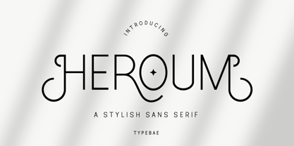 Heroum is stylish and beautiful sans serif font. It will look perfect in photography designs, watermarks, social media posts, advertisements, logos, branding, and various other projects. To use stylistics and ligatues, you don't need to use software that supports opentype, because we have made it separately so it's very easy to use. Features? Stylistic Alternates Ligatures Multilingual PUA Encode
 - Slogan by Linotype,
$29.99Helmut Matheis originally designed Slogan for the Ludwig and Mayer type foundry in Frankfurt, Germany. Slogan is an informal script of medium weight, with some variation in color. Its caps are flowing and the lowercase letters are close fitting. A lighter, more upright companion was designed by Helmut Matheis as well; its design is named Charme. - RM Hangle by Ray Meadows,
$19.00 This strong angular cousin of RM Hunky offers a bold display face. The distinctive nature of this design will be a welcome addition to any designers collection of useful fonts. Due to the nature of this design there may be a very slight lack of smoothness to the curves at extremely large point sizes (around 200 pt and above).
 - Zolina by Creativemedialab,
$20.00 Unique and fashionable font, the straight lines combined with a slight curve that makes Zolina looks modern and pretty. Try uppercase for clean and elegant look. Zolina is perfect for website header, logo, instagram story, or fashion related branding. This versatile family consists of 9 weights, variable styles as well as multilingual support, numbers, and currency symbols.
 - Retirement JNL by Jeff Levine,
$29.00 The hand lettered film credits for 1937’s “Make Way for Tomorrow” were done in a sans serif design with an ever-so-slight flare and a slightly semi-calligraphic look. Unusual in both style and varying character thicknesses, the lettering has been digitally redrawn as Retirement JNL, which is available in both regular and oblique versions.
 - EM by Wilton Foundry,
$29.00 Time to EMbrace the new EMerging typeface from WiltonFoundry : EM consisting of EM Regular, EM Italic, EM Bold, EM Bold Italic. Loosely based on our very popular Cyan typeface, EM is EMphatically the most distinctive and modern typeface we’ve created yet. Slight variations between thick and thin with stenciled effects, and Flared stem EMphasis for character. Go get’EM!!
 - Buro by Corentin Noyer,
$34.00 The Buro is a text font, monospace, sans-serif with rounded endings. It is characterized by its monolinear outline (slight optical corrections) and its discontinuous Roman structure. He tries to reproduce the outline of a letter drawn with a pen. The design of the Buro is inspired by the cursive letters used in Olympia typewriters of the 1950s.
 - Aragon Condensed by Canada Type,
$24.95The condensed version of Hans van Maanen's Aragon is a headline star. The elements that made Aragon a popular "Dutch Garamond" text repeat here, with the slight stress shifts and tapering stems optimized for headline use. Aragon Condensed also comes in bold and italic variations. All three fonts contain extended language support, superiors and inferiors, and class-based kerning. - As of my last update in April 2023, I don't have specific details about a font named "AZ" by Christoph Mueller in the databases I was trained on. It's possible that it could be a newly released typef...
- BLUSH BEAR - Personal use only

- Aniron - Unknown license

- PUDSEY BEAR - Personal use only

- Movember - Personal use only

- Price Tags JNL by Jeff Levine,
$29.00 Price Tags JNL is a multi-use dingbat font. Along with over twenty nostalgic price tags, there is a set of individual numbers [1 thru 0 keys] and number pairs [A-T and a-i keys] for creating old-style white-on-black price tags. Blank end caps are available on the parenthesis keys, the decimal point is on the period key, catch words FOR, DOZEN and EACH are on the left and right arrows and right brace respectively, and the dollars and cents marks are on the dollar and hyphen keys. You'll even find a few extras placed upon the bracket and left brace keys.
 - Herold by HiH,
$10.00 Herold is a bold Art Nouveau advertising face released by H. Berthold, Berlin, Germany in 1901. It is also seen under the name “Herold Reklame.” The design is attributed to Hermann Hoffmann by the Klingspor Museum. A herold (‘herald’ in English, ‘heraldus’ in Latin) is one who delivers proclamations and announcements. Medieval heralds are often pictured with a horn with which to get everyone’s attention prior to performing his function. His only PA system was his own voice. Left and right glyphs of a herald with horn may be found at positions 137 and 172. Herold is quite compact with a high x-height, just right for making -- what else? -- announcements.
 - Acre by Jonathan Ball,
$24.00 Acre is a geometric sans-serif type family of eight weights that's both inspired by and named after my great grandfather, Tex Acre. Tex was an artist and sign maker whose handcrafted signs illuminated the roadsides of the American Midwest and typified mid-century Americana. Acre is a tribute to him, his work, and many of my favorite early 20th century geometric typefaces. With eight weights ranging from Thin to Black, Acre is an extremely versatile family that can be used for display, text, or anything in between. Acre offers full European language support plus many OpenType features such as tabular and oldstyle figures.
 - DBE-Rigil Kentaurus - Personal use only

- Gunsmoke by FontMesa,
$25.00Gunsmoke is a revival of a James Conner's Sons font that's been listed under different names such as Extended Clarendon Shaded, Original Ornamented and Galena. Dating back to 1888 this font was available with an original lowercase, numbers and punctuation. Today we've expanded the set to include the original shaded version a regular black, open left, open right and a fill font for the two open faced versions. The single Gunsmoke fill font is in alignment with the Gunsmoke Open R version and will also work with Gunsmoke Open L by shifting your fill font layer to align with the Open L version. You will need an application that works in layers in order to use the fill font with the Gunsmoke Open L and R fonts. Make sure you check out the left and right pointing gun hands on the less than and greater than keys, the gun alone is on the left and right brace keys. Remember to check your gun in with the Marshal when entering Dodge City. - As of my last update, there's no widespread recognition or detailed information about a specific font named "Oktober." However, in imagining a font with such a name, we might envision a typeface that...
- Evita by ITC,
$29.99Gérard Mariscalchi is a self-made designer. Born in Southern France of a Spanish mother and an Italian father, he has worked as a mechanic, salesman, pilot, college teacher – even a poet (with poetry being the worst-paying of these professions, he reports.) “Throughout all this, the backbone of my career has always been design,” Mariscalchi says. “I’ve been drawing since I was five, but it wasn’t until I was twenty-four that I learned that my hobby could also help me earn a living.” It was about this same time that Mariscalchi fell in love with type. He studied the designs of masters like Excoffon, Usherwood and Frutiger, as well as the work of calligraphers and type designers such as Plantin, Cochin and Dürer. With such an eclectic background, it’s no surprise that Mariscalchi’s typeface designs are inspired by many sources. Baylac and Evita reflect the style of the art nouveau and art deco periods, while Marnie was created as an homage to the great Lithuanian calligrapher Villu Toots. However, the touch of French elegance and distinction Mariscalchi brings to his work is all his own. Baylac Who says thirteen is an unlucky number? Three capitals and ten lowercase letters from a poster by L. Baylac, a relatively obscure Art Nouveau designer, served as the foundation for this typeface. The finished design has lush curves that give the face drama without diminishing its versatility. On the practical side, Baylac’s condensed proportions make it perfect for those situations where there’s a lot to say and not much room in which to say it Evita Mariscalchi based the design of Evita on hand lettering he found in a restaurant menu, and considers this typeface one of his most difficult design challenges. “The main problem was to render the big weight difference between the thin and the thick strokes without creating printing problems at small point sizes,” he says. Unlike most scripts, Evita is upright, with the design characteristics of a serif typeface. Mariscalchi named the face for a close friend. The end result is a charming design that is light, airy, and slightly sassy. Marnie Based on Art Nouveau calligraphic lettering, Marnie is elegant, inviting, and absolutely charming. Mariscalchi paid special attention to letter shapes and proportions to guarantee high levels of character legibility. He also kept weight transition in character strokes to modest levels, enabling the face to be used at relatively small sizes – an unusual asset for a formal script. Marnie’s capital letters are expansive designs with flowing swash strokes that wrap affectionately around adjoining lowercase letters. The design easily captures the spontaneous qualities of hand-rendered brush lettering. - Baylac by ITC,
$29.99Gérard Mariscalchi is a self-made designer. Born in Southern France of a Spanish mother and an Italian father, he has worked as a mechanic, salesman, pilot, college teacher – even a poet (with poetry being the worst-paying of these professions, he reports.) “Throughout all this, the backbone of my career has always been design,” Mariscalchi says. “I’ve been drawing since I was five, but it wasn’t until I was twenty-four that I learned that my hobby could also help me earn a living.” It was about this same time that Mariscalchi fell in love with type. He studied the designs of masters like Excoffon, Usherwood and Frutiger, as well as the work of calligraphers and type designers such as Plantin, Cochin and Dürer. With such an eclectic background, it’s no surprise that Mariscalchi’s typeface designs are inspired by many sources. Baylac and Evita reflect the style of the art nouveau and art deco periods, while Marnie was created as an homage to the great Lithuanian calligrapher Villu Toots. However, the touch of French elegance and distinction Mariscalchi brings to his work is all his own. Baylac Who says thirteen is an unlucky number? Three capitals and ten lowercase letters from a poster by L. Baylac, a relatively obscure Art Nouveau designer, served as the foundation for this typeface. The finished design has lush curves that give the face drama without diminishing its versatility. On the practical side, Baylac’s condensed proportions make it perfect for those situations where there’s a lot to say and not much room in which to say it Evita Mariscalchi based the design of Evita on hand lettering he found in a restaurant menu, and considers this typeface one of his most difficult design challenges. “The main problem was to render the big weight difference between the thin and the thick strokes without creating printing problems at small point sizes,” he says. Unlike most scripts, Evita is upright, with the design characteristics of a serif typeface. Mariscalchi named the face for a close friend. The end result is a charming design that is light, airy, and slightly sassy. Marnie Based on Art Nouveau calligraphic lettering, Marnie is elegant, inviting, and absolutely charming. Mariscalchi paid special attention to letter shapes and proportions to guarantee high levels of character legibility. He also kept weight transition in character strokes to modest levels, enabling the face to be used at relatively small sizes – an unusual asset for a formal script. Marnie’s capital letters are expansive designs with flowing swash strokes that wrap affectionately around adjoining lowercase letters. The design easily captures the spontaneous qualities of hand-rendered brush lettering. - Marnie by ITC,
$29.99Gérard Mariscalchi is a self-made designer. Born in Southern France of a Spanish mother and an Italian father, he has worked as a mechanic, salesman, pilot, college teacher – even a poet (with poetry being the worst-paying of these professions, he reports.) “Throughout all this, the backbone of my career has always been design,” Mariscalchi says. “I’ve been drawing since I was five, but it wasn’t until I was twenty-four that I learned that my hobby could also help me earn a living.” It was about this same time that Mariscalchi fell in love with type. He studied the designs of masters like Excoffon, Usherwood and Frutiger, as well as the work of calligraphers and type designers such as Plantin, Cochin and Dürer. With such an eclectic background, it’s no surprise that Mariscalchi’s typeface designs are inspired by many sources. Baylac and Evita reflect the style of the art nouveau and art deco periods, while Marnie was created as an homage to the great Lithuanian calligrapher Villu Toots. However, the touch of French elegance and distinction Mariscalchi brings to his work is all his own. Baylac Who says thirteen is an unlucky number? Three capitals and ten lowercase letters from a poster by L. Baylac, a relatively obscure Art Nouveau designer, served as the foundation for this typeface. The finished design has lush curves that give the face drama without diminishing its versatility. On the practical side, Baylac’s condensed proportions make it perfect for those situations where there’s a lot to say and not much room in which to say it Evita Mariscalchi based the design of Evita on hand lettering he found in a restaurant menu, and considers this typeface one of his most difficult design challenges. “The main problem was to render the big weight difference between the thin and the thick strokes without creating printing problems at small point sizes,” he says. Unlike most scripts, Evita is upright, with the design characteristics of a serif typeface. Mariscalchi named the face for a close friend. The end result is a charming design that is light, airy, and slightly sassy. Marnie Based on Art Nouveau calligraphic lettering, Marnie is elegant, inviting, and absolutely charming. Mariscalchi paid special attention to letter shapes and proportions to guarantee high levels of character legibility. He also kept weight transition in character strokes to modest levels, enabling the face to be used at relatively small sizes – an unusual asset for a formal script. Marnie’s capital letters are expansive designs with flowing swash strokes that wrap affectionately around adjoining lowercase letters. The design easily captures the spontaneous qualities of hand-rendered brush lettering.


