10,000 search results
(0.089 seconds)
- tulisan tanganku - Unknown license

- quiñók - Unknown license

- lydeke Handwrithing - Unknown license

- ZeroGene - Unknown license

- Army Beans - Unknown license

- Orotund - Unknown license

- Habana by Vladislav Ivanov,
$15.00This font opens a new era of typewriting and type design. At first sight, the font seems creepy, but it has a deep connection with some urban motives in its tune. - Little Japan by Okaycat,
$19.50Okaycat proudly presents Little Japan, our new dingbats font full of traditional Japanese icons. See the sights of Japan - beautiful Mount Fuji, geisha, sushi, sumo, shiriken, geta and so much more. - Nicholas by Shinntype,
$39.00 Nicholas is a headline version of Goodchild , Shinntype’s version of Jenson . It has been specially modified with very fine details and an ultra-tight fit for headlines that really get noticed.
 - Alarionsa Serif by Kosinsky,
$40.00 Alarionsa - font with straight horizontal serifs, vertical serifs have a slight angle of inclination. Lowercase letters are designed with somewhat inflated x-height. Perfect for both creating headlines and regular text.
 - Verena by Autographis,
$39.50 Verena was written with a common felt marker pen, scanned and worked over, to keep just the right amount of roughness. The result is a very readable and usable handwritten font.
 - Bright Gesture DEMO - Personal use only

- The Astise - Personal use only

- Scott Room - Personal use only

- Galaxus - Personal use only

- Enchanted Land - Personal use only

- Biotrip Serif was born as a humanist slab serif , that particular kind of typeface that blends rational geometry with Egyptian boldness and the sensitivity of a hand-drawn stroke. Slab serifs—...
- Bunken Tech Sans by Buntype,
$49.00 The Bunken Tech Sans superfamily: A reminiscence of constructed fonts of the modern age designed with considerably cleaner forms. Bunken Tech Sans follows in the best tradition of the straight-lined and somewhat angular structures of its predecessors while offering a much more open and mild design. The shapes of the letters are therefore reduced to the most essential elements: The spurs on a, b, n and other lower case letters occur just as little as decorative or style details, the lightly rounded inside edges are more pleasing to the eye than certain historic role models and make for a harmonic, flowing style. Use In particular Bunken Tech Sans stands out as an easy, distinctive headline font with its straight-lined, technical design. Open counters and large x-height make it equally suited for use in shorter texts. It is also perfectly complemented by Bunken Sans or Bunken Slab in longer texts (available soon). Features Available in 10 styles with widths ranging from Light to ExtraBold with associated Italics. All of the styles are very extensive: Support for at least 58 languages, Small Capitals, 9 number sets (e.g. Lining, Oldstyle, Tabular and Small Cap Figures), ligatures, alternate characters, numerous Opentype functions, and lots of other small features that make it more pleasant to work with the font on a daily basis as well as fulfilling typographic desires. Each style contains more than 870 characters! Each style is available in a professional (Pro) and standard (Std) edition with a reduced range of functions. (Language support, OpenType features and number of glyphs). Details can be found on the respective pages. Bunken Tech Sans is part of the Bunken Tech superfamily and is available in Condensed, Normal and Wide. Also of interest: The slab serif variation Bunken Tech Slab Features in Detail: 12 Weights: -Light -Book -Medium -SemiBold -Bold -ExtraBold and corresponding Italics 3 Widths: -Condensed -Normal -Wide Alternate Characters: A, E, F, L, S, e, f, t, s, y, etc. Small Capitals 5 Sets of Figures: -Lining Figures -Old Style Figures -Tabfigures -Old Style Tabfigures -Small Cap Figures Automatic Ordinals Automatic Fractions Extended Language Support and more...
 - Teutonia by HiH,
$10.00 How can Teutonia be called “Art Nouveau” with all those straight lines? It seems like a contradiction. In fact, however, Art Nouveau embraces a rather wide variety of stylistic approaches. Five well-known examples in the field of architecture serve to illustrate the range of diversity in Art Nouveau: Saarinen’s Helsinki Railroad Station, Hoffman’s Palais Stocklet in Brussels, Lechner’s Museum of Applied Arts on Budapest, Mackintosh’s Glasgow School of Art and Gaudi’s Sagrada Familia in Barcelona. Only the last fits comfortably within the common perception of Art Nouveau. Whereas Gaudi would avoid the straight line as much as possible, Macintosh seemed to employ it as much as possible. The uniting factor is that they all represent “new art” -- an attempt to look things differently than the previous generation. Even when they draw on the past -- e.g. Lechner in the use of traditional Hungarian folk art -- the totality of the expression in new. Teutonia clearly shows its blackletter roots in the ‘D’ and the ‘M.’ Roos & Junge of Offenbach am Main in Germany produced Teutonia in a "back-to-basics" effort that has seen many quite similar attempts in the field of topography. In 1883, Baltimore Type Foundry released its Geometric series. In 1910, Geza Farago in Budapest used a similar letter design on a Tungsram light bulb poster. In 1919 Theo van Doesburg, a founder with Mondrian and others of the De Stijl movement, designed an alphabet using rectangles only -- no diagonals. In 1923 Joost Schmidt at Bauhaus in Weimer took the same approach for a Constructivist exhibit poster. The 1996 Agfatype Collection catalog lists a Geometric in light, bold and italic that is very close to the old Baltimore version. Even though none of these designs took the world by storm, they all made a contribution to our understanding of letterforms and how we use them. Teutonia is compact and surprisingly readable at 12 points in print, but does not do as well on the screen. Extra leading is suggested. Four ligatures are supplied: ch, ck, sch and tz. The numerals are tabular.
 - FF Meta Variable by FontFont,
$344.99The FF Meta® design is a sans serif, humanist-style typeface that was designed by Erik Spiekermann for the West German Post Office (Deutsche Bundespost). It was subsequently released in 1991 by Spiekermann's company FontFont The FF Meta family, initially released as a commercial font in 1991, now comprises over sixty fonts. The FF Meta 2 family was released in 1992, the FF Meta Plus family in 1993, and in 1998 a facelift of the complete font family reclassified the FF Meta series and combined them into family-sets named FF Meta Normal, FF Meta Book, FF Meta Medium, FF Meta Bold and FF Meta Black. These are all available in Roman, italic, small caps and italic small caps. Between 1998 and 2005, further light stroke weights and a condensed family were introduced by Tagir Safayev and Olga Chayeva and were named: FF Meta Light and FF Meta Hairline. The last addition to the growing FF Meta font family is FF Meta Serif released by FSI in 2007. FF Meta Variable Roman is a single font file that features two axes: Weight and Width. For your convenience, the Weight and Width axes have preset instances. The Weight axis has a range from Hairline to Black. The Width axis provides a range of condensed values. This Roman (upright) font is provided as an option to customers who do not need Italics, and want to keep file sizes to a minimum. FF Meta Variable Italic is a single font file that features an italic design with two axes: Weight and Width. For your convenience, the Weight and Width axes have preset instances. The Weight axis has a range from Hairline to Black. The Width axis provides a range of condensed values. This Italic font is provided as an option to customers who do not need Roman (uprights), and want to keep file sizes to a minimum. FF Meta Variable Set is a single font file that features three axes: Weight, Width and Italic. For your convenience, the Weight and Width axes have preset instances. The Weight axis has a range from Hairline to Black. The Width axis provides a range of condensed values. The Italic axis is a switch between upright and italic - Popten Display by Saffatin.co,
$10.00 Popten is a modern minimalist design typeface with semi condensed conture and include alternative character also some ligature. It is inspired by hype and urban design, freestyle and brutalism. Popten typeface suited for anything lifestyle project with trend design. It was designed to be versatile, to blend in your design with light or dark through thin to black weights can add a lot of touch of personality.
 - Lovato by Philatype,
$35.00 Lovato is a family of five fonts, perfect for branding applications, books, or poster designs that require a clear, sharp, stylish tone. The styles range from an elegant, delicate light weight up to a brazen, commanding black weight. This original Latin-serif family, designed by Kosal Sen, has primarily a geometric construction, with hints of details inspired by inscriptional lettering, all coalescing to fit a contemporary palette.
 - Mazot by Hurufatfont,
$29.00 Mazot is a modern sans serif with a compact and low contrast structure. Low contrast structure and terminals being flush with the body, gives it a raw effect. Perfect for Branding, Poster and Packaging designs. It has rich OpenType features. It consists of a total of 18 styles, from Light to Heavy with 9 weights and matching italics. It is available in 2-axes variable version.
 - Bookbag by Letradora,
$15.00 Bookbag is a font for teaching kids to read and write. It comes in 4 weights, from light to extrabold, and has dotted and lined versions for students to practice. Many glyphs have alternate versions, that can be accessed either through OpenType stylistic alternates, or using the Alt versions of the font. Bookbag has a very wide language support, with most latin languages supported.
 - Daffadowndilly NF by Nick's Fonts,
$10.00Here’s another offering based on the work of Alf Becker, long-time contributor to Signs of the Times magazine. This only comes from the 1940s, and is a light and bouncy single-stroke face that’s sure to pep up any project it graces. This font contains the complete Latin language character set (Unicode 1252) plus support for Central European (Unicode 1250) languages as well. - Carolina by Linotype,
$29.99Carolina is a part of the 1990 program Type before Gutenberg, which included the work of twelve contemporary font designers and represented styles from across the ages. Linotype offers a package including all these fonts on its web page, www.fonts.de. Gottfried Pott designed his Carolina in the tradition of the Carolingian Minuskel. The rhythmic flow of the font gives text a light and elegant feel. - Flawless Valentines by Aldedesign,
$25.00 Flawless Valentines is a beautiful and light handwritten font. Its unique feel and stunning impact will add a luxury spark to any design project you wish to create! This font is PUA encoded, which means you can access all of the amazing glyphs and ligatures with ease! Each Font Has: Stylish modern handwritten script Beautiful Swash (Ending tail) Beautiful Titling (Beginning tail) Special Ligatures Multilingual Support
 - Chantal by Device,
$29.00 A loose, casual felt-pen script, Chantal comes in three weights plus italics, and a Cyrillic version too. Alternate versions are available in the upper and lower case keys, so settings can be customised according to taste. Chantal communicates a hand-drawn light touch with character. Originally designed to letter the RoboHunter series that Peter Hogan and Rian Hughes produced for the comic 2000AD.
 - Cabarno by Katatrad,
$39.00 Cabarno is a sans-serif organic typeface that can be use in any typographic situation. It has his own unique style in expressed perfect condensed forms with a warm and humane feeling. This font can function as headings, subheadings and body text with a set of alternative characters for your design in any layout. The family has 4 weights ranging from Light to Black and their italic.
 - Airy by ParaType,
$25.00Airy is in fact a very light-minded summer font without any serious design concept. It is a collection of hand-drawn letters that with the help of OpenType features allow you to get a lace texture with mutable structure. Together with the font you also get a bonus — a set of naive pictures that you normally draw on the margins of your sketchbook. - Virtual by John Moore Type Foundry,
$25.00 Virtual is an experimental fantasy font based on a pseudo optical enclosure where a linear system that is not connected there. Virtual comes in three weights: regular. light, and thin also an virtual mix by mixing different thicknesses in a single font, with alternative variations through features of open type. Virtual is an experience based on play with the laws of the Gestalt of closing.
 - Brefa by Twinletter,
$10.00 Brefa is a san serif font family that carries a modern classic theme with a variety of designed fonts with light strokes that make up a vintage style with a rustic touch and a stamp With this font, you can beautify your work as well as strengthen your work in the form of storytelling, logos, typography, hand-lettering, packaging, t-shirts, labels, and much more.
 - FF Clair by FontFont,
$41.99 German type designer Ingrid Liche created this script FontFont in 1995. The family has 5 weights, ranging from Light to Black and is ideally suited for advertising and packaging, editorial and publishing as well as logo, branding and creative industries. FF Clair provides advanced typographical support with features such as ligatures, alternate characters, and case-sensitive forms. It comes with proportional oldstyle and proportional lining figures.
 - Giacometti by Linotype,
$29.99Giacometti Letter is a fun design by Sine Bergmann and Leonore Poth. It has a rough, handwritten-looking style that is perfect for informal communications. The letters are light and narrow similar to her thin figures in the Pi font Giacometti." When combining Giacometti Letter with other fonts, try using "Jump" - another of Sine's designs - which contrasts well since is it wider and bolder." - Malmont by Larin Type Co,
$15.00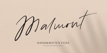 Malmont is an amazing handwritten font is light and elegant, and will emphasize your individuality in any project and will charm you with his signature. This font includes alternates and ligatures for lowercase. You can also use them to create a logo, branding, t-shirts, book covers, stationery, marketing, blogs, magazines, cosmetic, signboard and more. This font is easy to use has OpenType features.
 - ITC Samuel by ITC,
$29.99ITC Samuel is a delicate and lively calligraphy font designed by Phill Grimshaw. Every detail has been worked to create harmony. The stroke contrast, the light brush character, the graceful forms all give ITC Samuel the spontaneity and individuality typical of handwriting. The font includes several ligatures and is legible even in smaller point sizes. ITC Samuel is perfect for invitations, greeting cards and other personal correspondence. - Astegra by Great Studio,
$19.00 Astegra is a modern serif font with a unique ligature style, a high contrast and light font perfect for feminine logo signs, fashion heads & editorial designs, branding projects, Clothing Branding, packaging, magazine headings, advertising, T-shirts, postcards and much more. Astegra is also included full set of: Uppercase and lowercase letters Automatic ligatures for Uppercase and Lowercase Stylistic Alternates Multilingual characters Numerals Punctuation Thank you!
 - Tiva by Laura Worthington,
$29.00 Tiva is a light and breezy casual script reminiscent of handwriting and packed with contextual and stylistic alternates. This easy and friendly style adds a personal touch to any project. See what’s included! http://bit.ly/2c5Nn4K This font has been specially coded for access of all the swashes, alternates and ornaments without the need for professional design software! Info and instructions here: http://lauraworthingtontype.com/faqs/
 - Gaisma Latin by Lamatas un Slazdi,
$29.00 Art Nouveau typeface "Gaisma Latin" ("Light" in Latvian) draws inspiration from Vienna Secession movement and Nordic National Romanticism. The work on the design started as drawings of several characters for the graphic standard for the Jugendstil museum in Riga. It contains characters for all the European languages as well as a huge set of contextual and stylistic alternates and historical characters to replicate texts of the era.
 - Happy Go Lucky Display Font by Goldfish Girl Creative,
$9.00 A Feel Good Kinda Font This playful and light-hearted, sans serif, display font includes uppercase letters, numbers, and punctuation. Great for carefree, boho, and fun designs like stationery, logos, wall art, stickers, patterns, and products. Use the font styles separately or try layering them! Built for easy use in Canva too. Includes: Happy Go Lucky font in 3 styles: Regular, Outlined, and Rounded


PreviousPage 250 of 250