10,000 search results
(0.049 seconds)
- Genre by Storm Type Foundry,
$26.00The official terseness and grey of Neo-Classical type faces will stand out when we narrow them. The consistently vertical shading of the letters suppresses one's desire for eccentricity, just like tea with bromine. It would, however, be wrong to consider Bodoni as the originator of this - vertically shaded - trend in type face production. In his Manual we can also find type faces with a slanted axis of shade, picturesque italics and a number of normal, more human type faces. It remains a mystery why his name is connected only with one of his many works. Genre's basic design is fairly light in colour, which is why it looks good in illustrated magazines and short texts and directly calls for graphically striking, contrasting headings. It shows off beautifully next to photographs, on diplomas and on printed materials connected with a person's death. - Mrs Keppel by The Ampersand Forest,
$19.00 Remember when you first saw the credits of a Woody Allen movie and thought, "I love that typeface!" Well, maybe that was just us. That typeface—Windsor (specifically Windsor Light Condensed)—is a classic. But it has problems. The letterforms are sometimes REALLY wonky. And the ampersand is a tragedy. Plus, there's no italic, and the weights and widths available in digital form are a hodgepodge. That's where Mrs. Keppel comes in. Alice Keppel, one of the most famous illegitimate members of the Windsor household ever, lends her name to this typeface family with numerous weights and a true italic. It's a slim serif with Edwardian leanings. She's approachable, she's refined. She's equally charming and at home in mercantile settings, in elegant settings, in populist settings, and in Polite Society. She's a design response to a genuine need. She's Mrs Keppel!
 - Irongate by CozyFonts,
$25.00 The Irongate Font Family has a retro personality. The common denominators, in all the glyphs, is a blunt center serif. The main top & bottom of each Cap & lower case glyphs have 'fan serifs', yep serifs that fan out. This font's influence is based on a monogram I designed for my daughter's wedding where she described her image of the event being 'Classic with a Vintage Flair'. Irongate can be pictured on many things dated from 1918 - 2018. The font is available in 4 basic weights Light, Regular, Bold & Extra Bold. An additional pdf is included that gives the code for an additional 14 Dingbats, with each weight. Irongate works extremely well with Invites, Stationary, Signage, Embroidery, Letterpress, Ads, Logos and anything that feels Industrial or Hand-Crafted, eg. Coffee, Breweries, Antiques, Woodcuts, Western Styles, Sports Styles, etc.
 - Raldo RE by URW Type Foundry,
$49.99 Quite unusual, Musenberg started his Raldo design with the italic. However, he managed to preserve the temperament and vividness of the italic in the roman without questioning the stability of the individual characters. Raldo is a modern Sans Serif family already quite popular in Germany. The German IGEPA group chose Raldo as corporate typeface family. Now, Marc Musenberg redesigned and extended his Raldo typeface family. The new Raldo RE Pro comprises 10 styles, 5 roman and 5 corresponding italics. All fonts now include the complete Latin character set plus fractions, different sets of figures and fractions as well as small caps and small caps figures for Raldo RE Pro Text, Regular, Semibold and Bold. Raldo RE Pro has been chosen to be part of the URW++ SelecType.
 - PF Fusion Sans Pro by Parachute,
$79.00 Fusion Sans is an amalgamation of traditional early nineteenth-century sans-serif letters. Despite its monotone structure it retains certain features common to roman. For instance lowercase ‘a’ and the two-storey ‘g’ are normal roman characters, while most letters are designed with a thinning of stroke at the junction of rounds to stems. Other letters are borrowed from earlier gothics, like lowercase ‘t’ which was first seen on a typeface that was developed by Paul Rand for Westinghouse in 1960. Fusion Sans is a tall family of 4 weights which is suitable for long headlines. The new ‘Pro’ version developed in 2006, provides support for all European languages including Greek and Cyrillic while it comes loaded with 19 special OpenType features.
 - Ongunkan Venetic Script by Runic World Tamgacı,
$50.00 Venetic is an extinct Indo-European language, usually classified into the Italic subgroup, that was spoken by the Veneti people in ancient times in northeast Italy (Veneto and Friuli) and part of modern Slovenia, between the Po Delta and the southern fringe of the Alps, associated with the Este culture.[3][1][4] The language is attested by over 300 short inscriptions dating from the 6th to the 1st century BCE. Its speakers are identified with the ancient people called Veneti by the Romans and Enetoi by the Greeks. It became extinct around the 1st century when the local inhabitants assimilated into the Roman sphere. Inscriptions dedicating offerings to Reitia are one of the chief sources of knowledge of the Venetic language
 - Pivnaya-Arabic by Roman Type,
$35.00 An Arabic font designed by a German living in Berlin’s Neukölln district, between Karl-Marx-Strasse and Sonnenallee. This is the Latin+Arabic version of poster/display font Pivnaya designed and published by Roman Type. Designer Roman Wilhelm finds himself constantly surrounded by Arabic type and hand-lettering in his neighborhood. With this font, he is trying to answer to all these linguistic, type-related, and cultural inspirations. It works for Afrikaans, all languages of the Arab World, Albanian, Catalan, Croatian, Czech, Danish, Dutch, English, Estonian, Farsi, Finnish, French, German, Hungarian, Icelandic, Italian, Latvian, Lithuanian, Maltese, Norwegian, Polish, Portugese, Romanian, Slovak, Slovenian, Spanisch, Swedish, Turkish, Urdu, Vietnamese, Zulu. Equipped with a wide coverage of the International Phonetic Alphabet (IPA), the font is equipped for multi-purpose usage.
 - Analogia by George Tulloch,
$21.00 Analogia is a digital interpretation of types used in the mid-18th century in books printed at Leuven by Martin van Overbeke. It is intended primarily for use in running text. The roman is businesslike, yet with a distinct personality; it has a generous x-height and is slightly condensed, though without appearing cramped. It is complemented by a more lively italic, which retains some irregularities in the angle of slant that are characteristic of the original. Analogia provides wide support for west, central, and east European languages that use the roman alphabet. Among its OpenType features are ligatures, small caps, several sets of numerals, contextual alternates, intelligent implementation of long ‘s’, and fractions. For more detail, please see the pdf available in the Gallery.
 - Honesty by Océane Moutot,
$32.99 Honesty is sans serif font with flared stems. As such, it belongs to the incise genre which is historically inspired by the roman civilisation and letters carved in granite or marble. One of the major example of it is the Trajan’s Column in Rome which inspired a font called Trajan, designed by Carol Twombly in 1989. Honesty is also inspired by more brutal font such as the Albertus, designed in 1938 by Berthed Wolpe, and its shape is highly influence by the work of the hammer. Despite this brutality and urgency due to the carving technique, the design of Honesty bring softness to it thanks to its low contrast and smooth curves. Honesty’s design include 16 styles, from thin to black in roman and italic.
 - Aquawax Fx by Zetafonts,
$39.00 Aquawax FX was developed by Francesco Canovaro as a new variant of the Aquawax family, one of the most beloved Zetafonts classics. This new typefamily is characterised by a contemporary and elegant design, that revisits the original design of 2008 with new geometric inventions, twisted with the current fluid zeitgeist. Aquawax FX builds on the original Aquawax family by adding counter-inktraps to the letterforms and emphasizing the inner contrast of curves and corners creating a smoother, flowing and dynamic look. While inktraps are a design feature that prevents ink from bleeding or filling small spaces in letterforms to achieve a cleaner, more readable look, anti-inktraps characterize the design with a distinctive watery appearance, suitable for logo design and titles. This watery effect is possible through a slight rounding of the inner and outer corners, keeping the original cuts at the letter terminals. A Space variant pushes FX experimentation furthermore, providing an alternate stencil-like style that takes legibility to the extreme, ready for logos and sci-fi headings. This does not limit the usability of Aquawax FX to mere display intent. The Aquawax FX font family includes two versions (Roman and Space), each with nine weights, ranging from Thin to Heavy, and matching italics. With a total of 36 variants plus one variable version, Aquawax FX is a versatile type family that can be used for a variety of design projects, from branding and packaging to editorial design and advertising. Aquawax FX offers a fresh re-interpretation of the original Aquawax letterforms and proportions, with a dynamic and flowing look that is sure to make your projects stand out.
 - Khan - Unknown license

- Titus by Linotype,
$29.99British designer David Quay originally created Titus Light in 1984. A serif design, Titus Light is a wide, curvy, and round typeface that is best used in larger point sizes. - Atlas - Unknown license

- Western Sans JNL by Jeff Levine,
$29.00 Take a classic Western wood type where the horizontals are thicker than the verticals and remove the slab serifs… The result is Western Sans JNL, which is available in both regular and oblique versions.
 - Doppel Mittel Lapidar Azure by Intellecta Design,
$20.90 Doppel Mittel Lapidar Azure is a decorative display font great for large header-like usage. A classic font design remastered by the type foundry Intellecta Design, inspired by wood types from the XIX century.
 - Otago by Hanoded,
$15.00 Otago is a classic all caps Art Deco font. Clean, crisp and very, very legible. I took my inspiration for this font from a 1920's postcard. Otago comes with a bagful of diacritics.
 - Canniza by Prominent and Affluent,
$30.00 Canniza Typeface Family is a very aesthic display typeface designed for use in large sizes. It features 8 weights, from thin to bold. The typeface features a classic serif design with a modern twist.
 - Alamanda by ErlosDesign,
$19.00 Allamanda is a handwritten monoline script. It features an incredibly classic style, while still keeping a friendly feel. Perfect for titles, headings and logotypes for blog, products and lifestyle imagery like quotes and stuff.
 - Revelry Deco JNL by Jeff Levine,
$29.00 The namesake for this type design was the dust jacket for the 1926 book “Revelry”. A classic Art Deco thick-and-thin design, Revelry Deco JNL is available in both regular and oblique versions.
 - Capetown Signature by MJB Letters,
$15.00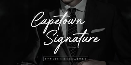 Capetown Signature is a modern and classic script font, perfect for signatures, branding, logos, photography, looks very clean and elegant, it will give the impression of luxury to your design. What’s include: – Ligature – Swash
 - Angkasa Script by Struggle Studio,
$16.00 Looking for vintage script fonts? Angkasa is a vintage handwritten font inspired by traditional Calligraphy, Angkasa font includes a full set of Classic upper and lower case letters, multilingual symbols, numbers, punctuation and ligatures.
 - Industriality JNL by Jeff Levine,
$29.00 Industriality JNL is a slab serif based on a classic typeface. Its condensed design allows for placing more copy inside a smaller area, and is best suited for ad headlines, titling or short blurbs.
 - Sodbuster NF by Nick's Fonts,
$10.00 Another William H. Page classic, Gothic Dotted, provided the pattern for this bold and brassy typeface. Both versions of this font support the Latin 1262, Central European 1250, Turkish 1254 and Baltic 1257 codepages.
 - Worldwide by Shinntype,
$39.00 Proven in newspapers around the world, Worldwide is a classic news face in the modern idiom, somewhat condensed, especially in the display weights. The Regular font of the Text family is loaded with features.
 - Rodenberg by Zealab Fonts Division,
$18.00 Rodenberg is multipurpose display typeface with cool characters, inspired by urban culture that combine the classic and modern style. It is perfect for headlines, logotypes, signs, posters, greeting card, letterhead, t-shirts and more.
 - HV Christo by Harmonais Visual,
$12.00 Christo - a serif with elegant, artistic, Renaissance touch. Specially designed for bold, artistic, grand projects. The font is perfectly suitable for creating elegant, artistic, classic design such as logo, packaging, social media, and more.
 - Atol by Type & Roll,
$30.00 Atol is a contemporary take on classic didone types. High contrast and modern proportions, combined with subtle details, makes it ideal for characteristic, bold, tightly-set headlines in magazines, branding, animated typography and more.
 - Rache Rache by Daylight Fonts,
$50.00 This is a modern font with a new interpretation of the classic font. It has sharp serifs, delicate hairlines, and beautiful curves that will make your typographic work look vinegar-lidded, stylish, and sexy.
 - Hellya by Arkrist Letter,
$14.00 Hellya is an elegant script font with a contemporary atmosphere and impeccable form, inspired by timeless classic calligraphy. This font is PUA encoded which means you can access all glyphs and swashes with ease!
 - Capital by Fenotype,
$19.00 Capital is a multifunctional super family with modernist roots. It is comprised of two distinct subfamilies: Gothic and Serif. Both share the same structure and proportions and come in seven weights – thin, light, regular, bold, extra bold and black, along with corresponding italics. Both Capital families are equipped with a full set of Cyrillic characters, making them a versatile choice for multinational use. All Capital fonts come with the following Open Type features: Small Caps, Old Style Figures, Fractions, Numero-sign & Ligatures. Features specific for Gothic roman versions only are Circle Numerals, Titling alternate for the R character and Arrows. The Gothic italics have a Titling alternates feature where the true italic forms are omitted and replaced with simpler stroke endings. Both Capital gothic and Serif families are true workhorse fonts that can carry out almost any typographic task. Combine them both for the best results – multi-pack available for a no-brainer price.
 - Framer Sans by 23-Jun,
$35.00 Framer Sans is sans-serif condensed type-family, created by June 23 Foundry. It is a geometric, lightly robust, simple and clean font, with a low contrast width. Framer Sans perfectly conforms to the ever-increasing demand for a diverse set of weights and additional support for non-Latin languages. The type system consists of 7 weights that for the clarity and users convenience is labelled with numbers from 100 to 700 (100 for “Thin”, 200 - “Ultra-Light”, and so on till 700 for “Bold”). It supports full Latin (European) character set, as well as Turkish, Vietnamese, Greek (basic) and Cyrillic languages. Framer Sans includes alternate characters, ligatures, symbols and 253 country codes that perfectly expand the design’s capabilities. Numerals contain six figure sets and Roman numbers. The variety of choices is expanded with additional stylistic sets for lowercases "a" and "g", as well as 3 stylistic sets for Latin uppercases with crossbars and letter “Q”.
 - ITC Chino by ITC,
$40.99 ITC Chino is a type family (Display & Text) designed by Hannes von Döhren and Livius Dietzel. ITC Chino Pro brings legibility and distinction to text copy. It is also a friendly design that will invite readers into content at large or small sizes. It is a melding of soft brush stokes and crisp edges. This is readily apparent in the bolder italic weights where the straight stems provide a counterpoint to the cursive terminals. The Typefamily is highly legible in a wide range of sizes. The text side of the family contains five weights of roman, each with an italic companion. Ranging from Light to Black, ITC Chino Pro provides a rich typographic palette. The OpenType fonts have an extended character set to support Central and Eastern European as well as Western European languages. Each font includes small caps, fractions, old style-, lining-, tabular numbers, scientific superior/inferior figures and a set of arrows.
 - Heroe by Lián Types,
$37.00 DESCRIPTION Now my feelings about didones are more than evident. After some years of roman-abstinence (1) I present Heroe, an interesting combination of elegance and sensuality. Heroe, spanish for hero, takes some aspects of roman typefaces to the extreme like my main inspiration, the great Herb Lubalin, did in the majority of his works: Thins turned into hairlines, altered proportions (for display purposes), unique ball terminals, poetic curves and a graceful way of placing them together on a layout. Its classy style makes the font perfect for a wide range of uses. Imagine Heroe Inline (my favorite) dancing over a bottle of perfume; printed on the cover of a fashion magazine; lighting wedding invitations up. Its partner, Heroe Monoline, may help you to make more elaborated pieces of design. Just combine it with Heroe, or Heroe Inline and see how perfect they match. TECHNICAL The difference between Pro and Std styles is the quantity of glyphs. While Pro styles have all the decorative characters available, Standard ones have only the basic set of them. Heroe Monoline Big and Heroe Monoline Small were made for better printing purposes. If you need to print the font in small sizes, then your choice should be Small. Heroe Monoline has the same alternates (and open-type code) as Heroe Pro and Inline, plus some decorative ligatures. NOTES (1) After fonts like Breathe , Aire , and the award winning Reina , I started experimenting with scripts a little more. Erotica , Bird Script and Dream Script are examples of that.
 - Goudy Text by Monotype,
$29.99The word Text" in Goudy Text™ is short for Textura, and textura is the style of blackletter or gothic writing developed in Northern Europe in the middle ages. The use of space in blackletter is quite different from what we know about Roman letterforms. Lowercase forms in blackletter writing and typefaces must be evenly textured with black and white elements, like the texture of weaving or fabric. Capital letters can provide either an integration of the even texture (by the use of decoration in their construction) or, if they are wide and open and filled with white, they provide bright spots of visual emphasis. Goudy, despite being an American in the twentieth century, understood well the fundamental texture of medieval blackletter and the importance of both density and light. He designed Goudy Text in 1928 for Lanston Monotype after studying the type in Gutenberg's 42-line bible; still one of the best models for designers of blackletter typefaces. The lowercase of Goudy Text has impact and medieval authenticity. The standard caps have some Victorian eccentricities but are mostly well drawn. The alternate, or "Lombardic" caps are spectacular - they set beautifully with the lowercase letters, providing the proverbial shafts of light through the Gothic cathedral's stained glass windows. Use this potent font in sizes 14 point or larger, for Christmas greetings, certificates, wedding invitations, advertising, or music collateral pieces." - Gumela by NamelaType,
$17.00 Gumela is a unique-sans family, based on rounded sans serif whose edges end with unique shapes. Gumela consist of 6 styles: Light, Light Italic, Regular, Italic, Bold and Bold Italic.
 - Lichtspiele by Typocalypse,
$29.00 Cinemas from the early 20th century are called “Lichtspiele” in Germany. “Lichtspiele” transports you back to a time where neon lights and marquee letters decorated cinema façades. Of the five styles, three have two versions of italics — the left-leaning italic evokes looking up from lower-left, the right-leaning italic is as if we are looking from lower-right. Display is the basic style, while Neon is inspired by the old neon letters found outside cinemas. Try placing Neon Outline on top of Display or Neon to add another layer to your artwork. Neon 3D is a extruded version of Neon. The Screen Credits style is based on the notes — producers, cast, crew and so on — on movie posters. Get more out of life, go out to a movie.
 - Tertius by Scholtz Fonts,
$21.00 Tertius, with its high ascenders and clubbed serifs, is a modern interpretation of the classic Carolingian style (7th - 9th centuries AD). There was no capital form in the Carolinian hand and Roman square capitals were originally used with it. The Carolingian hand began, after a while, to develop more cursive tendencies as people looked for a way to speed up the writing process. I have “capitalized” on this trend and have devised an appropriate and dramatic set of flowing capitals for this family. With its elegant swashes and bold letter shapes, Tertius embodies the romance of medieval life, of knights, castles, and chivalry. Tertius comes in four styles:- -- Regular: with elegant, smoothly penned characters; -- Crenellated: written with a scratchy pen over rough parchment -- many drops of ink and blotches have been left on the parchment (“Crenellated” means battlements -- the rough protrusions on the top of castle walls); and -- Romantic: the capitals have been loosely overwritten generating a contemporary version of illuminated capitals. -- Illuminated: richly decorated illuminated capitals for use with Tertius Regular (28 characters) All fonts have been carefully crafted, letterspaced and kerned and contain full character sets of 237 characters.
 - Ozana Pro by Mostardesign,
$99.00 Ozana Pro is a bracketed serif font family adapted to the professional requirements of graphic designers, web designers and mobile app developers. Comprised of 24 styles including 12 styles designed especially for headlines and 12 styles for text and long paragraph design, Ozana Pro is a very versatile family of fonts that can be used in many projects such as editorial design, branding or corporate identity creation, design of posters or logos, the creation of websites or the development of mobile applications. This serif font family, with a resolutely modern aspect, also hides a unique typographic design since it has 2 distinct styles (Roman and Display) which have 2 different optical sizes in order to graphically differentiate the appearance of titles, subtitles and long paragraphs. With this design of glyphs differentiated by the optical size according to the styles, the titles have a very graphic aspect while the long texts have a more classic design in order to keep an optimal readability in all cases. Ozana Pro is also equipped with powerful OpenType features such as case sensitivity, true small caps, ligatures, tabular figures, old styles figures, numbers circled. Ozana Pro is also available as a variable font family.
 - Core Sans GS by S-Core,
$29.00 The Core Sans GS Family is a rounded version of Core Sans G and a part of the Core Sans Series such as Core Sans N, M, A, E, D. Core Sans GS is constructed of straight, circular or square shapes. These geometric shapes are inspired by classic geometric sans (Futura, Avenir, Avant Garde etc.). Every stem is a rectangle or a straight line and every letter, lowercase or uppercase, seems to be in perfect geometric form and even weighted. The small x-height makes readability clean and clear. Core Sans G can be used equally well in headings or in body copy. The Core Sans GS Family consists of 9 weights (Thin, Extra Light, Light, Regular, Medium, Bold, Extra Bold, Heavy, Black) with maching Italics. It also includes alternate characters (a,g,t) and a bunch of ligatures. The Core Sans GS provides a wide range of character sets to support (Cyrillic, Central and Eastern European characters) and advanced typographical support with features such as proportional Figures, tabular Figures, numerators, denominators, superscript, scientific Inferiors, subscript, fractions, standard ligatures, discretionary ligatures and stylistic alternates. Core Sans G is an ideal font family for use in magazines, web pages, screens, displays, and so on.
 - Churchward Typestyle by BluHead Studio,
$25.00 Churchward Typestyle is a clean sans serif font, originally designed as a photo font by Joseph Churchward back in 2002. Under exclusive license, BluHead Studio has digitized this typeface by using his original drawings. We added any missing glyphs, being careful to maintain the aesthetic that makes this a classic Churchward design. Joseph intended this to be a six weight family, so we digitized the Light and Ultra Bold weights and interpolated the middle four. We enhanced the functionality of the family by creating a complimentary set of small caps, as well as creating a 10 degree oblique of each weight, being careful to correct the slanted curve forms of the letters. Churchward Typestyle is now an extensive 12 weight family, ranging in weights from Light to Ultra Bold, making it extremely useful in a broad range of design applications, from text and print, to display, posters and billboards. It’s sanserif design is clean and open, with a few of those characteristic Churchward goodies. Joseph loved his ink traps, so look for many of those! They especially become more apparent in the heavier weights. All of the Churchward Typestyle fonts support the major Western European languages, and have OpenType features for ligatures, smallcaps, tabular figures, superiors, inferiors, fractions, and ordinals.

