10,000 search results
(0.03 seconds)
- Gift Wrap JNL by Jeff Levine,
$29.00 Gift Wrap JNL takes a classic wood type display font and cuts it into diagonal striped lines to emulate package wrapping paper. An interesting side effect of the lettering is that at first glance you might perceive the style as being an oblique, but the letters are actually vertical. This typeface is perfect for holidays, birthdays and special events featuring a festive theme.
 - RM Serif by Ray Meadows,
$19.00 A modern classic which will readily find a place in your font folder. Great effort has been taken to ensure the balance of color and weight for every glyph to promote flowing legibility. Due to the modular nature of this design there may be a slight lack of smoothness to the curves at very large point sizes (around 100 pt and above).
 - Show Biz JNL by Jeff Levine,
$29.00 The lettering style of Show Biz JNL is a classic sanserif with Art Deco influences. Slight variations in some letter shapes set it off from similar releases. The basic inspiration for this font was a set of ceramic letters and numbers used for home movie titling, but a few touches were added to give the font its own style and flavor.
 - Neubank NF by Nick's Fonts,
$10.00The Neubank family builds on the firm foundation of Bank Gothic, a twentieth-century classic designed by Morris Fuller Benton for ATF, and adds a fluid, dynamic lowercase that makes it right at home in the twenty-first century. This font contains the complete Latin language character set (Unicode 1252) plus support for Central European (Unicode 1250) languages as well. - A Likely Story by Comicraft,
$39.00 Finally an animated alphabet with a tall tale to tell -- perfectly suited to putting words in the mouths of mutts, talking tigers and anthropomorphic animal characters of all kinds. The precise thick and thin pen strokes of these eight versatile weights are well suited to gag strips, classic cartoons and maybe even that internet meme you've been thinking about for weeks!
 - Empyrean by Greater Albion Typefounders,
$16.00 Empyrean is a display Roman typeface which sets out to be deliberately different. Its letterforms explore white space and the art of leaving things out. Empyrean is a futuristic Roman design which builds in respect for typographic tradition with an exploration of design possibilities.
 - Getman by Dima Pole,
$25.00 Getman is a light Gothic typeface. It made all the rules and traditions of classic Gothic typeface, but it has lightweight shapes, making it easy to read and understood. Getman is based on the works of type masters 1910s. This font has all 104 European alphabets, all Slavic alphabets, OpenType features (ligatures, oldstyle numerals, fistorical forms, localized forms, fractions, ordinals and others). Getman has an historic beauty of the medieval Germanic national script. Glory to the Germans!
 - Qisharon by LetterMuzara,
$20.00 Qisharon is a contrast sans serif font, consisting of four styles (light, book, regular, bold) and including 5 writing systems such as Latin (supporting all European languages and Turkish), Cyrillic, Greek, Hebrew, and Arabic. It is based on classic calligraphic rules and respects the traditions of every script. There are plenty of ligatures, that will draw attention to your design. Qisharon with it's formal and elegant nature is a perfect fit for logos, visit cards and magazine headings.
 - Honeydew by Molly Suber Thorpe,
$17.99 Honeydew Script: Light, Whimsical, Soft & Bright Honeydew is a calligraphic font in a monoline script style. It is a modern twist on classic schoolhouse cursive, and is extremely versatile. Use this typeface for branding, social media, weddings, stationery, packaging, layout design, and advertising. The sky's the limit! Honeydew has 527 glyphs, including the complete Latin alphabet (upper and lowercase), numbers (lining, old style, fractions, and super/subscript), punctuation, and diacritics, and over 40 standard and discretionary ligatures.
 - Ironhopes Monoline Signature by Maulana Creative,
$13.00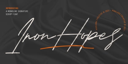 Ironhopes is a casual classic signature script font. With light mono-line stroke, fun character with some of ligatures and extra swash. To give you an extra creative work. Ironhopes font support multilingual more than 100+ language. This font is good for logo design, Social media, Movie Titles, Books Titles, a short text even a long text letter and good for your secondary text font with sans or serif. Make a stunning work with Ironhopes font. Cheers, MaulanaCreative
 - Arkitech - Personal use only

- Peloric by TanveerType,
$8.00 Introducing fresh PELORIC sans serif typeface which is well crafted for the classic and modern outlook. It can be read easily from a small size to a large size. Feeling fresh & trendy with it’s distinctive visual. It is well suited for branding, website & mobile layout and many more. It can also be used for branding materials, business cards, social media, packaging, prints, quotes & posters, etc. It comes up with 12 different weights as thin, thin italic, light, light italic, regular, italic, medium, medium italic, bold, bold italic, inline & inline italic. So, if you are looking for a new stylish and unique font, then here is the best font just designed for you and supporting any operating system and platform.
 - ED Muskrat by Emyself Design,
$9.00 ED Muskrat is a display font family that looks elegant classic and modern, this font is designed from a combination of serif and semi blackletter fonts that add a unique feel to the font. ED Muskrat has 9 styles: Thin, ExtraLight, Light, Regular, Medium, SemiBold, Bold, ExtraBold, and Black. ED Muskrat is equipped with ligatures, alternative characters, and supports multiple languages. and also this font is perfect for your design needs such as branding, poster design, books, fashion, social media design, logos, etc. Features: Stylistic alternates ( C, E, F, I, J, N, Q, S, Z ) Ligatures ( fi , fj , tt ) 9 Styles ( Thin, ExtraLight, Light, Regular, Medium, SemiBold, Bold, ExtraBold, and Black ) Multi Language Support 373 Glyphs
 - Vendetta by Emigre,
$69.00 The famous roman type cut in Venice by Nicolas Jenson, and used in 1470 for his printing of the tract, De Evangelica Praeparatione, Eusebius, has usually been declared the seminal and definitive representative of a class of types known as Venetian Old Style. The Jenson type is thought to have been the primary model for types that immediately followed. Subsequent 15th-century Venetian Old Style types, cut by other punchcutters in Venice and elsewhere in Italy, are also worthy of study, but have been largely neglected by 20th-century type designers. There were many versions of Venetian Old Style types produced in the final quarter of the quattrocento. The exact number is unknown, but numerous printed examples survive, though the actual types, matrices, and punches are long gone. All these types are not, however, conspicuously Jensonian in character. Each shows a liberal amount of individuality, inconsistency, and eccentricity. My fascination with these historical types began in the 1970s and eventually led to the production of my first text typeface, Iowan Old Style (Bitstream, 1991). Sometime in the early 1990s, I started doodling letters for another Venetian typeface. The letters were pieced together from sections of circles and squares. The n, a standard lowercase control character in a text typeface, came first. Its most unusual feature was its head serif, a bisected quadrant of a circle. My aim was to see if its sharp beak would work with blunt, rectangular, foot serifs. Next, I wanted to see if I could construct a set of capital letters by following a similar design system. Rectangular serifs, or what we today call "slab serifs," were common in early roman printing types, particularly text types cut in Italy before 1500. Slab serifs are evident on both lowercase and uppercase characters in roman types of the Incunabula period, but they are seen mainly at the feet of the lowercase letters. The head serifs on lowercase letters of early roman types were usually angled. They were not arched, like mine. Oddly, there seems to be no actual historical precedent for my approach. Another characteristic of my arched serif is that the side opposite the arch is flat, not concave. Arched, concave serifs were used extensively in early italic types, a genre which first appeared more than a quarter century after roman types. Their forms followed humanistic cursive writing, common in Italy since before movable type was used there. Initially, italic characters were all lowercase, set with upright capitals (a practice I much admire and would like to see revived). Sloped italic capitals were not introduced until the middle of the sixteenth century, and they have very little to do with the evolution of humanist scripts. In contrast to the cursive writing on which italic types were based, formal book hands used by humanist scholars to transcribe classical texts served as a source of inspiration for the lowercase letters of the first roman types cut in Italy. While book hands were not as informal as cursive scripts, they still had features which could be said to be more calligraphic than geometric in detail. Over time, though, the copied vestiges of calligraphy virtually disappeared from roman fonts, and type became more rational. This profound change in the way type developed was also due in part to popular interest in the classical inscriptions of Roman antiquity. Imperial Roman letters, or majuscules, became models for the capital letters in nearly all early roman printing types. So it was, that the first letters in my typeface arose from pondering how shapes of lowercase letters and capital letters relate to one another in terms of classical ideals and geometric proportions, two pinnacles in a range of artistic notions which emerged during the Italian Renaissance. Indeed, such ideas are interesting to explore, but in the field of type design they often lead to dead ends. It is generally acknowledged, for instance, that pure geometry, as a strict approach to type design, has limitations. No roman alphabet, based solely on the circle and square, has ever been ideal for continuous reading. This much, I knew from the start. In the course of developing my typeface for text, innumerable compromises were made. Even though the finished letterforms retain a measure of geometric structure, they were modified again and again to improve their performance en masse. Each modification caused further deviation from my original scheme, and gave every font a slightly different direction. In the lower case letters especially, I made countless variations, and diverged significantly from my original plan. For example, not all the arcs remained radial, and they were designed to vary from font to font. Such variety added to the individuality of each style. The counters of many letters are described by intersecting arcs or angled facets, and the bowls are not round. In the capitals, angular bracketing was used practically everywhere stems and serifs meet, accentuating the terseness of the characters. As a result of all my tinkering, the entire family took on a kind of rich, familiar, coarseness - akin to roman types of the late 1400s. In his book, Printing Types D. B. Updike wrote: "Almost all Italian roman fonts in the last half of the fifteenth century had an air of "security" and generous ease extremely agreeable to the eye. Indeed, there is nothing better than fine Italian roman type in the whole history of typography." It does seem a shame that only in the 20th century have revivals of these beautiful types found acceptance in the English language. For four centuries (circa 1500 - circa 1900) Venetian Old Style faces were definitely not in favor in any living language. Recently, though, reinterpretations of early Italian printing types have been returning with a vengeance. The name Vendetta, which as an Italian sound I like, struck me as being a word that could be taken to signifiy a comeback of types designed in the Venetian style. In closing, I should add that a large measure of Vendetta's overall character comes from a synthesis of ideas, old and new. Hallmarks of roman type design from the Incunabula period are blended with contemporary concerns for the optimal display of letterforms on computer screens. Vendetta is thus not a historical revival. It is instead an indirect but personal digital homage to the roman types of punchcutters whose work was influenced by the example Jenson set in 1470. John Downer.
 - Retrology by Letterhend,
$15.00 So classic, so retro... it's Retrology! Introducing, Retrology. This monoline typeface will bring you to the good ol' days with its classic touch!
 - Alessyia by Umbra95,
$15.00 Alessyia is a classic style typeface font. This font has classic but at the same time a fresh look. "Alessia family" includes 3 font types: Regular ( Classic and elegant with straight geometric lines ) Grunge ( Dirty and messy ) Retro ( Hand drawn brush font with an uneven texture )
 - Young Finesse by Doyald Young,
$50.00Young Finesse is a light, two-weight, announcement face with a large x-height whose characters contain only a few straight lines. It is based on the titling font that I designed for the dust jacket of my book Fonts & Logos. Its inspiration comes from Hermann Zapf’s Optima, a serifless roman text face, based on Renaissance inscriptions.Young Finesse italic has a set of elaborate swash caps that reference 16th-century writing hands. Both Young Finesse and Home Run include Richard Isbell’s “interrabang,” appropriately used for statements that are both interrogative and exclamatory. - Lyra by Canada Type,
$39.95 Lyra is an Italian Renaissance script that might have developed if metal type had not broken the evolution of broad pen calligraphy. It lies in the area between the humanist bookhand and the chancery cursive, combining the fullness and articulation of the Roman letters with a moderate italic slant and condensation. A steep pen-angle allows use of a broader pen relative to the x-height, giving the letters more contrast with light verticals and heavy curves. Lyra embodies the Renaissance spirit of refining technical advances of the late middle ages with reintroduction of ancient classical principles. Based on the moving penstroke with constantly changing pen-angle, it brings the vitality of handwriting to the ordered legibility of type. Lyra is a formal italic, too slow for copying books. By eliminating the element of speed, digital technology opens up a new level of calligraphy, bringing it into the sphere of typography as would naturally have happened if metalworkers had not controlled the process. If classical Western traditions are respected, digital calligraphy has the potential to recapture the work of the past and restart its stalled evolution. There is of course no substitute for the charm of actual writing, with each letter made for its space; but the tradeoff is for the formal harmony of classical calligraphy as every curve resonates in tune with every other. This three-weight font family marks Philip Bouwsma's much-requested return from a three year hiatus. It also reminds us of his solid vision in regards to how calligraphy, typography and technology can interact to produce digital beauty and vesatility. Each of the three Lyra fonts contains almost three character sets in a single file. Aside from the usual wealth of alternates normally built into Bouwsma's work, Lyra offers two unique features for the user who appreciates the availability of handy solutions to subtle design space issues: At least three (and as many as six) length variations on ascending and descending forms, and 65 snap-on swashes which can be attached to either end of the majuscules or minuscules. The series also offers 24 dividers and ornaments built into each weight, and a stand-alone font containing 90 stars/snowflakes/flowers, symmetric contstructs for building frames or separators, masking, watermarking, or just good old psychedelia.
 - Plusquam Sans by Typolis,
$40.00 Plusquam Sans is a humanist sans serif family in eight weights, roman and italic. It’s neutral character and legibility in smaller sizes recommend it as a text face, and wide range of weights and swash capitals make it usable for various designer purposes. While roman fonts are simple, although in humanist spirit, italics are more vivid. Typographic variants are supported through OpenType features. Several kind of numerals are offered: lining and Oldstyle, tabular and proportional, superior and inferior, fractions. Small caps and math symbols are provided. There is a range of standard and discretionary ligatures. Alternates sorted in three stylistic sets are created to soften the overall appearance. Most distinguished feature is a set of swash capitals balanced to match sans serif characters. Plusquam Sans comprises multilingual Latin and monotonic Greek characters.
 - 1756 Dutch by GLC,
$42.00 This family is inspired from the set of two styles, Roman normal and Italic, and the ornaments used by an unknown printer working around East Switzerland, circa 1750's. It is a Dutch style font, slightly bolder than usual Fournier's or Caslon's Roman fonts, with some emphasized serifs and finals parts and special letters as capital "U" for example. A set of initials, fleurons, ornaments and frame elements is joined to the family as a supplement. The two styles, Normal and Italic, are containing standard ligatures, a few alternative characters and titlings (who are more preferable than enlarged capitals). They are "small eye" or "Small x-eight" fonts. The standard characters set is completed with accented or specific characters for Western (Including Celtic) and Central Europe, Baltic, Eastern Europe and Turkish.
 - Moody Blue by Storictype,
$17.00 Introducing new classic display typeface it's call Moody Blue. Moody Blue typeface Inspired by Classic typografi design, vintage art, cover book and novel. OpenType features some characters that allows you to mix and match pairs of letters to fit in your designs. To access the alternat glyphs, you need a program that supports OpenType features such as Adobe Illustrator CS and Adobe Indesign No matter how is your design concept to looking serious. it can be FUN , scary, mystical, chilling, dark or light. With MOODY BLUE typeface, your design will more quieter, relax, enjoy, etc. You can use this font for various purposes.such as book cover, product packaging, labeling, logo, classic shop, badges, movie title, t-shirt, wedding invitation, posters, lable, greeting card, letterhead,logo, Titles Branding, etc. Open Type featuring Discretionary Ligatures Stylistic Alternates Above the description of this font, I hope you're satisfied with what I have created. if there's anyone who purchase and find some problem, don`t hesitate to using product support or email me storictype@gmail.com Thanks and enjoy designing.
 - The Augustus font is a distinctive typeface that exudes elegance and classical charm, reminiscent of the grandeur associated with its namesake, the revered Roman Emperor Augustus. This font is charac...
- Conga Brava by Adobe,
$29.00Conga Brava is the work of type designer Michael Harvey, a combination of the high-minded, purist letterforms of revivalist, modern calligraphers with the mundane, even crude, lettering of warehouse stenciling. The resulting lyrical yet utilitarian forms have a visually exciting graphic effect, which Harvey has frequently used in his book jacket designs. Like his other typefaces, Ellington, Strayhorn, and Mezz, Harvey named his design after a jazz classic, Conga Brava", by Duke Ellington and his trombonist Juan Tizol. The rolling rhythm, polished swing, and stacatto brass treatment of the tune suits the look of this sassy roman design and even more so, its stencil mate. When you need a typeface that radiates sound and motion, think Conga Brava." - Ostad Pro by Naghi Naghachian,
$65.00 Ostad Pro is designed by Naghi Naghashian. It is a headline font, as a modern interpretation of classic Sans Serif Roman characters in 2 weights: Regular and Bold. The character set of this Font family supports most western languages including: Afrikaans, Basque, Breton, Catalan, Danish, Dutch, English, Finnish, French, Gaelic, German, Icelandic, Indonesian, Irish, Italian, Norwegian, Portuguese, Sami, Spanish, Swahili and Swedish. There are 17 additional symbol characters: euro, litre, estimated, omega, pi, partialdiff, delta, product, summation, radical, infinity, integral, approxequal, notequal, lessequal, greaterequal, and lozenge. It also includes the characters necessary to support the following central European languages: Croatian, Czech, Estonian, Hungarian, Latvian, Lithuanian, Polish, Romanian, Serbian (Latin), Slovak, Slovenian and Turkish.
 - Burdigala Sans by Asgeir Pedersen,
$19.99 Burdigala is a clean-cut, modern yet classic typeface inspired by Didones and Aicher’s Rotis family. Burdigala Sans is especially well suited for on-screen usage such as in apps and pdf documents. It is also ideal for larger amounts of (printed) texts in brochures, magazines and books. It is slighty narrow in order to conserve space, but spacious enough to faciliate reading and overall clarity. Check out its sibling, the Burdigala Semi Serif version. The expanded versions, being wider and more open, works equally well in media intended both for print and on-screen reading, e.g. in Pdf-documents etc. Burdigala is the ancient Roman name of the city of Bordeaux France.
 - Gertrud by T4 Foundry,
$21.00First place in a spelling-bee competition, a Harvard University diploma or the Nobel Peace Prize? You can't go wrong with this classic Swedish calligraphy font, created by veteran designer Bo Berndal. He named Gertrud after his better half, but was also inspired by old handwritten documents: "Gertrud is a calligraphic letter design from the 16th century. I used it when I engrossed diplomas with a flat-nibbed pen in the 1980's. When I got my Mac I generated the typeface in Fontographer." Gertrud (the typeface) comes in three weights, with roman and italic. It is an OpenType creation, for both PC and Mac. Swedish type foundry T4 premieres new fonts every month. Gertrud is our sixth introduction. - Ravensara Serif by NaumType,
$19.00 Ravensara Serif - elegant high contrast classic serif. Style of the typeface originates in a classic Didone but took a step to simplify some letter forms and make Didone feel more contemporary. Ravensara Serif is a part of the Ravensara superfamily, united by the same anatomy, which currently also includes Ravensara Sans and Ravensara Stencil. Ravensara Serif, despite its ancient roots and due to simplified and smoothed forms, can be used in a variety of different styles. It’s a perfect choice for bold headlines, oversize typography, fashion logos, branding, identity, website design, album art, covers, posters, advertising, etc. It is available in 7 weights, including Thin, Light, Regular, Medium, SemiBold, Bold and Black. Ravensara Serif extends multilingual support to Basic Latin, Western European, Euro, Catalan, Baltic, Turkish, Central European, Pan African Latin and Afrikaans.
 - Flinders by Eko Bimantara,
$24.00 Flinders is a modern humanist sans serif font family designed by Eko Bimantara in 2023. This typeface is intended to be used for various reading purposes and has letterforms optimized for legibility and ease of reading. The styles of Flinders are a sans serif interpretation of classical roman proportions, characterized by a low x-height, subtle calligraphic strokes, angled stroke ends, and open counters and apertures. Flinders is a versatile typeface that is readable in both large and small sizes. Its legibility makes it an excellent choice for body text in books, magazines, and newspapers, while its modern design and open counters make it well-suited for digital screens and web design. Flinders can also be used for branding and identity design, as well as packaging and signage. Overall, Flinders is a contemporary and readable typeface that is suitable for a wide range of design projects. Its humanist characteristics and modern design make it a unique and versatile option for designers looking for a typeface that combines classical proportions with contemporary style.
 - Laureatus by Intellecta Design,
$19.90inspired in a old time roman chiseled inscription in a stone wall - Core Mellow by S-Core,
$20.00 Core Mellow is a condensed geometric sans-serif typeface family that can be used in various applications especially for short texts. The letterforms in roman style are mild, minimal, simple, and clean in appearance. The Core Mellow Family consists of 3 widths (Compressed, Condensed, Normal), 7 weights (Thin, Extra Light, Light, Regular, Medium, Bold, Extra Bold) and Italic for each format. The Core Mellow provides a wide range of character sets to support Cyrillic, Central and Eastern European characters and advanced typographical support with features such as proportional Figures, tabular Figures, numerators, denominators, superscript, scientific Inferiors, subscript, fractions, standard ligatures, discretionary ligatures and stylistic alternates. Core Mellow looks smooth in any layout with its sleek rounded lines, use it for your magazines, brochures, web pages, screens, and so on.
 - English Script by Wiescher Design,
$39.50 English Script is the classic Spencerian English script. I always wanted to do one of these; now finally I did. Your classical designer Gert Wiescher
 - Garota Sans - Personal use only

- Garota Serif - Personal use only

- ClerestorySSK - Unknown license

- Phoenix - Unknown license

- Young Morin by Alit Design,
$23.00 Presenting the Young Morin typeface from alitdesign. Young Morin font is designed by combining elegant script font with a classic serif font style. The Young Morin font is inspired by a classic roman design that we apply modern elements according to current trends. This bold classic concept will create a design that is frightening but still looks modern and elegant. The Young Morin font is perfect for the design of young people who dare to be different and unique from the current trending design concept. Young Morin font is highly recommended to be a collection of fonts for current or future design creation. Young Morin is perfect for magazine cover designs, brochures, flyers. Instagram ads, Canva Design and so on with unique and modern and brave concepts. besides that this font is very easy to use both in design and non-design programs because everything changes and glyphs are supported by Unicode (PUA). The "Young Morin"contains 660 glyphs with many unique and interesting alternative options. Language Support : Latin, Basic, Western European, Central European, South European,Vietnamese. In order to use the beautiful swashes, you need a program that supports OpenType features such as Adobe Illustrator CS, Adobe Photoshop CC, Adobe Indesign and Corel Draw. but if your software doesn't have Glyphs panel, you can install additional swashes font files.
 - Andovai by Eurotypo,
$39.00 Andovai, a modern Roman cursive family, fast and slightly aggressive as today's Rome, deriving its name in Roman dialect of the phrase "Ma 'ndo vai...", the meaning of which in Italian is "Dove vai?" (Where are you going?) ... in a game to define a current and irreverent gestural typography.
 - Bethencourt by Apostrof,
$30.00 Bethencourt is a font family designed by Vsevolod Buravchenko & Viktor Kharyk with technical support by Konstantin Golovchenko. It is based on uncial, half-uncial, Old Roman Cursive and New Roman Cursive. The character set includes Latin Extended characters, stylized Cyrillic and decorative elements in the form of playing dolphins.
 - Stockholm LP by LetterPerfect,
$39.00 Stockholm is a contemporary roman typeface designed by Paul Shaw in collaboration with Garrett Boge in 1998. Its strong yet refined roman character shapes were inspired by twentieth century Swedish lettering. The face is appropriate for both text and display settings. Stockholm is part of the LetterPerfect Swedish Set
 - Silfer Queen Script by Soft Creative,
$18.00 Introducing Silfer Queen Script vintage calligraphy font. Silfer Queen Script is a classic calligraphy font. This is a classic thin font with an italic style. Here you will get a beautiful classic font. This font is available in several modern swirls that can make your work look elegant, sweet and perfect.


