10,000 search results
(0.037 seconds)
- Cack-handed by Kerry Colpus Designs,
$25.00 Cack-handed was created by writing with my left hand even though I am right handed.
 - Matchbox by K-Type,
$20.00 Display font for pixel lovers - mad for right angles and hard edges? Constructivists ate my bitmaps.
 - Bedaax - Personal use only

- wmxyo - Personal use only

- pixcoose - Personal use only

- roinert - Personal use only

- renvem - Personal use only

- Chiq by Ingo,
$36.00 The name suggests it: the Chiq is based on a well-known system font from Apple's classic Mac OS operating system. By revamping and expanding good old “Chicago“, I want to make that 90s tech charm available for the future. The model consisted of just a single style and inspired me to create “Chiq Bold,” which later became the starting point for the entire font family. The shapes of the Chiq are constructed according to a very simple principle. The contrast of stems and hairlines becomes more pronounced towards the bolder cuts. A few basic shapes form the framework for all characters. The shapes are very regular and sometimes form somewhat unusual figures, which has a negative effect on readability and makes the font rather unsuitable for long passages of text, but results in a very even typeface. This is particularly true for the extra-wide “UltraExpanded,” which is so wide that you can no longer recognize word images but literally have to spell them out. In this way, words are turned into letter bands with a great decorative effect. With variants from “Light” to “Black”, from “Normal” to “Ultra Expanded” and the italics, Chiq reaches beyond its archetype. This opens up a wide range of uses. It is even clearer, even more sober, and to a certain extent speaks an even more modern formal language. Chiq is also a variable font!
 - Jazz Gothic by Canada Type,
$24.95Jazz Gothic is a digitization and expansion of an early 1970s film type from Franklin Photolettering called Pinto Flare. This type became an instant titling classic with jazz and soul album designers; then it caught on wildly with film and television designers. Blue Note and Motown would not have been the same without this face. Jazz Gothic is a simple geometric idea, quite likely originally inspired by the heavier display weights of Futura. The resulting product is a versatile message-driver that stands quite strong and cherishes the limelight, yet shows a playful and artistic side within its curvy thick swashes and rebellious unicase forms. In the hands of a good designer, Jazz Gothic eliminates any doubt about the delivery of the message or the attractive purposeful way it is delivered. It is the kind of typeface that loves a design program's bells and whistles. Knock it out of dark or light backgrounds, shade it, mask-alize it, roughen it, stretch it, squeeze it, and the message will still stand larger than life. Jazz Gothic comes in two fonts, a main one with a full character set to accommodate the majority of Latin-based languages, and a second one that contains about 50 alternates and swashed forms. The OpenType version is a single font that has all the alternates and swashes at the disposal of the buttons of OT-savvy program palettes. - Mundo Sans by Monotype,
$50.99 Mundo Sans, by Carl Crossgrove for the Monotype Studio, is distinctive, approachable – and ready to tackle jobs both big and small. Its open counters and large x-height, which give the design a straight-forward no-nonsense mien, are softened by inviting calligraphic undertones. With 10 weights and a complementary suite of cursive italics, there is little outside the range of the Mundo Sans family. The light weights are elegant in packaging and brochure design, the medium are easy readers in digital blogs and print periodicals and the bold command attention in banners and headlines. Mundo Sans is at home in a wide range of sizes, and comfortable in everything from wayfinding to mobile apps. Mundo Sans takes on complicated branding projects with efficient grace. The family enables companies and products to express their brand seamlessly in websites, advertising, corporate messaging, packaging – virtually everywhere visible engagement is possible. A large international character set, that includes support for most Central European and many Eastern European languages, ensures ease of localization. Mundo Sans was originally released with seven weights. The family was updated with three new roman weights and their italics in 2019 that extend and diversify its range of use: a fine hairline weight, a book weight, slightly lighter than regular, and a demi that is subtly lighter than the medium. The design is also is a good mixer. It easily pairs with everything from refined Didones to stalwart slab serif designs. And if you need a more harmonious palette, look no further than Mundo Sans’ relative, Mundo Serif. The two designs harmonize with each other perfectly in weight, typographic color and proportion. Mundo Sans’ italics are true cursive designs, with fluid strokes and obvious calligraphic overtones. The flick of the down-stroke in the ‘a,’ the descending stroke of the ‘f’ and baseline curve of the ‘z’ add grace to the design and distinguish it from more mechanistic styles. Mundo Sans is a design with deep roots. It was originally drawn to pair with classic Renaissance book typefaces like Bembo® and ITC Galliard®. With a hint of diagonal stroke contrast and gentle flaring of strokes, Mundo Sans complements these designs with warmth and grace. Crossgrove says that Mundo isn’t meant to be showy or distinctive. It is intended to follow the tradition of sans serif designs that have a wide range of uses, enabling comfortable reading and clear expression. Crossgrove has designed a variety of typefaces ranging from the futuristic and organic Biome™ to the text designs of Monotype’s elegant Walbaum™ revival. His work for Monotype also often takes Crossgrove into the realm of custom fronts for branding and non-Latin scripts.
 - Imagine, if you will, sneaking into a bustling cityscape deep in the heart of a neon-lit night. Everywhere you look, shimmering lights dance against the dark, outlining shapes and letters with a glow...
- Ma Braille by Echopraxium,
$5.00 The "Ma" in "Ma Braille" is used as a minimalist way to say "Negative Space". "Ma" in japanese arts is an "esthetical usage of emptiness". Thus this font explicits the negative space around visible braille dots in each glyph. A. Font user guide a.1. Lowercase glyphs { A..Z } In these glyphs, dots are represented as "black squares" while the negative space is displayed as 1 or 2 white filled polygons. a.2. Uppercase glyphs { a..z } In these glyphs, dots are represented as "white squares" while the negative space is displayed as 1 or 2 black filled polygons. a.3. Digits: they are just the same than a..j, but the "North US version" is also provided in ascii codes 0xE0..0xE4 (1..5) and 0xE7..0xEB (6..0). a.5. "Dashed Border": a.5.1. "Black dashed" border glyphs; { £, ¥, µ, Â, Ä, Ê, Ë, Î, Ï, Ô } a.5.2. "White dashed" border glyphs; { Ö, Õ, °, ô, ö, î, ï, û, u, õ } B. Posters Poster 1: "Font Logo" version 1, it displays "Ma Braille" text surrounded by the "black dashed border" glyphs. Poster 2: "Font Logo" version 2, it displays "MA" glyphs in big size and smaller "Braille" glyphs within "M" and within "A" as well. Poster 3: the classical pangram to test a font "The Quick Brown Fox jumps over the Lazy dog". Poster 4: Article 1 of the Human Rights: All human beings are born free and equal in dignity and rights. They are endowed with reason and conscience and should act towards one another in a spirit of brotherhood. Poster 5: the "Glyph set" (Border glyphs not included) with A..Z, a..z, digits and special characters.
 - As of my last update in early 2023, the font "Paper" designed by Swimming Poulp isn't a widely recognized or specifically documented font in major typographic resources or font directories. However, ...
- Ah, the Grave Digger font, a delightful little morsel from the imagination of Dieter Schumacher, falls into a category that could be described as "Halloween chic" meets "Zombie apocalypse signage." I...
- Local Eatery JNL by Jeff Levine,
$29.00 Here's yet another variation of the classic Futura Black Art Deco stencil form of display lettering. The inspiration for this typeface came from various images of the Blossom Dairy Co. restaurant, originally opened as an ice cream and sandwich shop located on Quarrier Street in Charleston, West Virginia. The restaurant first opened in 1938 as an outgrowth of the Blossom Dairy Co. itself, and existed under various ownerships until it permanently closed on Nov. 11, 2016. Digitally redrawn as Local Eatery JNL, it is available in both regular and oblique versions.
 - Barwastu by IbraCreative,
$17.00 Barwastu, a refined serif typeface, epitomizes timeless elegance with its meticulous design and sophisticated aesthetic. The graceful curves and distinctive serifs of Barwastu convey a sense of tradition and authority, making it an ideal choice for projects that demand a touch of class and professionalism. The well-balanced letterforms and subtle variations in stroke width contribute to its readability and versatility across various applications, from editorial layouts to branding. Barwastu seamlessly blends a classic sensibility with a contemporary edge, ensuring that it stands out as a distinguished and tasteful typeface in the realm of typography.
 - Elfario by Keristyper Studio,
$14.00 Elfario is a classic high-contrast serif font that exudes sophistication and elegance. Its tall, thin letterforms and dramatic thick-to-thin strokes make it perfect for luxurious branding, editorial design, and high-end fashion projects. Featured: Standard, Uppercase & Lowercase Numeral & Punctuation Multilingual : ä ö ü Ä Ö Ü ß ¿ ¡ Alternate & Ligature PUA encoded We recommend programs that support the OpenType feature and the Glyphs panel such as Adobe applications or Corel Draw, so you can use all the variations of the glyphs. Hope you enjoy our fonts!
 - Arwidie by Letterhend,
$16.00 Arwidie is a monoline script with a casual and classic theme. This type of font perfectly made to be applied especially in logo, headline, signage and the other various formal forms such as invitations, labels, logos, magazines, books, greeting / wedding cards, packaging, fashion, make up, stationery, novels, labels or any type of advertising purpose. Features : Uppercase & lowercase Numbers and punctuation Alternates & Ligatures Multilingual PUA encoded We highly recommend using a program that supports OpenType features and Glyphs panels like many of Adobe apps and Corel Draw, so you can see and access all Glyph variations.
 - Carelia by My Creative Land,
$29.00 Carelia is a modern multilingual (including cyrillic) serif family with classic forms, enhanced by extended OpenType features. It is well suited for all sorts of design - starting from web, to editorial and branding. Its stylistic alternates, swashes and ligatures (more 1200 glyphs in each font) will make your design even more stylized and unique. Carelia comes in two styles Upright and Italic - each has it's own character but both share the same curves and style. Both fonts are fully unicode mapped - can be used in any application of your choice.
 - Olio by Little Fonts,
$15.00 Olio is a chunky geometric sans serif typeface. The bold version takes inspiration from classic geometric fonts like Futura and works well when creating clean, balanced typography. The inline version is the same font with a stylish and decorative stripe effect to each character. Olio inline is a nod towards graphic design champion Lance Wyman and his typographic treatment for the iconic Mexico 68 Olympic identity. Although both versions are designed in reference to great (timeless) graphic design from the past, they have a contemporary finish making them suitable for any design purpose or application.
 - Rennie Mackintosh Venezia by CRMFontCo,
$20.00Derived from the world famous Rennie Mackintosh Font, the Venezia version gives a very modern look to this classic font, especially when filled with a gradient fill in a graphics package such as Photoshop or CorelDraw - although it even looks great "out of the box". The Venezia name comes from the native name of the city of Venice - one of several Italian cities Mackintosh visited on a sketching tour of Italy early in his architectural career. Venice was also one of the venues of an exhibition of Mackintosh's work on a European tour. - Zapf Elliptical 711 by ParaType,
$30.00 The Bitstream version of Melior, a twentieth century modern face commissioned by Stempel and designed by Hermann Zapf in 1952. It is based on Zapf’s thoughts about the squared-off circle known as a super-ellipse. The type was originally intended as a newspaper text face by Linotype. Hermann Zapf’s Melior exhibits a robust character through classic and objective forms. Versatile and extremely legible, it can be used for a variety of texts and point sizes. Cyrillic version was developed by Natalya Vasilyeva and licensed by ParaType in 2002.
 - Ludeco by WildOnes,
$12.00 Ludeco is a modern display font with an asymmetrical structure. Letterforms have some resemblance to classic Art Deco style, but with a twist - the weight of the letterform shifts by making a unique pattern. Ludeco Font is perfect for logo design, branding, art prints, wedding cards and invitations, packaging, business cards, greeting cards, posters, magazines, social media, home decors, stationary, blogs, website design, and more. Ludeco Font contains all uppercase and lowercase letters from A to Z and numbers from 0 to 9. Latin Extended letters are supported together with other bonus characters.
 - Kumba by AukimVisuel,
$9.00 Kumba is inspired by classic typography and brings its own unique style to any design project. This fantastic sans serif font is best suited for headlines of all sizes, as well as for blocks of text that have both maximum and minimum variations. Whether it’s for web, print, moving images or anything else – Kumba will look spectacular. It is a great sans serif font. Whether you’re looking for fonts for Instagram or calligraphy scripts for DIY projects, Kumba will turn any creative idea into a true piece of art!
 - Retra by Dima Pole,
$36.00 Retra is unusual serif high-contrast font family in Bodonian style. Some elements has not classical forms, so the font looks interesting and unusual. It is suitable for headlines and some texts. Font family Retra has as bright a display font style and a relaxed textual font styles, and sans-serif font styles. There are many OpenType features, also all the 104 European languages and all Slavic languages. Retra also has an alternative set of Slavic natural lowercase. Text, typed Retra, of course, attracts attention. Overall, Retra leaves a memorable and attractive experience.
 - Magern by Craft Supply Co,
$20.00 Introducing Magern – Serif Typeface Versatility and Elegance Firstly, Magern stands out with its versatility. Created meticulously, it beautifully complements various editorial and magazine layouts. Consequently, it brings elegance and readability together. Craftsmanship in Design Besides, the craftsmanship in Magern is impeccable. Each letterform is thoughtfully designed, ensuring it carries a classic yet contemporary feel. As a result, it captivates readers’ attention effortlessly. Adaptability Furthermore, Magern proves to be exceptionally adaptable. While it exhibits a strong presence in headings, it also maintains subtlety in body texts. Thus, it enhances overall readability.
 - Delicious Pro by Yes Please,
$45.00 Delicious Pro from Yes Please is a bold, contemporary take on the classic Americana script. Inspired by the vibrant history of early 20th Century American packaging vernaculars, Delicious Pro delivers unique flavor packed with gestural personality perfect for headlines, packaging and more! Delicious Pro features conventional ligatures, a standard set of accents and symbols, and a full set of extended custom styling ligatures to provide a versatile end-user experience. Delicious Pro has played hard for Nike Women's Training, Nike Sportswear, IFC and more. Delicious Pro is designed by Lee Schulz.
 - Antique Trove by Letterhend,
$16.00 Antique Trove is a classic display font. This type of font perfectly made which is need a standout font, and the other various formal forms such as invitations, labels, logos, magazines, books, greeting / wedding cards, packaging, fashion, make up, stationery, novels, labels or any type of advertising purpose. Features : Lowercase & uppercase Numbers and punctuation multilingual ligatures PUA encoded We highly recommend using a program that supports OpenType features and Glyphs panels like many of Adobe apps and Corel Draw, so you can see and access all Glyph variations.
 - Christmas Melody by Reyrey Blue Std,
$15.00 Christmas Melody is modern calligraphy font made by handwritten with a classic style and a touch of elegance. Christmas Melody is perfect for red wine label, vodka label, upscale packaging, wedding stationery, invitations, business cards, branding and other projects that require a touch of handwriting and luxury. Try Christmas Melody, enjoy the richness of OpenType features and let her fun and elegant excitement make you happy and enhance your creativity! You can use this font very easily. Features : · All Uppercase and Lowercase · Number & Symbol · Supported Languages · Alternates and Ligatures · PUA Encoded
 - Wanderer by FontMesa,
$25.00This font was inspired by the title logo of the TV show The Wild Wild West (season two). The font was named after the train in the TV show. Wanderer is a combination of my Classic Tuscan Rodeo Clown font and a Robust Slab Serif font. Wanderer is available as a stand alone font or with the optional fill fonts. Caution: Use of this font may cause the Wild Wild West theme song to play over and over in your head. Solution: Try temporarily using another FontMesa font such as Rough Riders. - Heraldica Script by Sudtipos,
$79.00 Ornamented scripts are a Koziupa/Paul specialty, and Heraldica is one of their most expressive. It attains the very definition of deluxe by conjoining the classic thin-and-thick script treatment with thin-only counterpart strokes, then it goes the extra mile with a varied complement of overlaid flourishes. The usual assortment of multiple alternates and ending forms pushes it even further in class and versatility. Monograms, logos, jewelry packaging and book covers are only a few of the possibilities with such a high-end script. Crafted Koziupa and digitized by Ale Paul.
 - Le Vangeline by Reyrey Blue Std,
$14.00 Le Vangeline - is a romantic calligraphy font, with classic root and elegant touch. It is perfect for any projects such as : logos, branding projects, homeware designs, product packaging, mugs, quotes, posters, shopping bags, t-shirts, book covers, name card, invitation cards, greeting cards, label, photography, watermark, special events, and all your other lovely projects that need a beautiful script taste. Add it to your most creative ideas and notice how it makes them come alive! Features : · All Uppercase and Lowercase · Number & Symbol · Supported Languages · Alternates and Ligatures · PUA Encoded
 - Hand Stamped JNL by Jeff Levine,
$29.00Years before the many "modern" ways to creates signs and posters, the popular method was the rubber stamp printing set. Many of these sets used the classic DeVinne typeface, and were manufactured by at least a half dozen different companies. The "sign and chart printers" (as they were known) often consisted of both upper and lower case letters, numbers, punctuation, pointing hands and other symbols. "Hand Stamped JNL" puts all the fun of the rubber stamp printing set into an easy-to-use digital font with no messy ink spills or clean-up. - Still Shine by Joelmaker,
$18.00 Still Shine is a script font, smooth, modern and classic, wavy, which was created to meet the needs of your next design project. Still Shine can used for various purposes. such as titles, signatures, logos, correspondence, wedding invitations, letterhead, signages, labels, newsletters, posters, badges, etc. Still Shine Script contains a full set of lower- and uppercase, a large range of punctuation, numerals, and multilingual support. The font also contains several ligatures, Discretionary Ligatures, stylistic alternates, Swash, and Stylistic Set, for you who have opentype capable software (e.g. Photoshop/Illustrator, Corel Draw).
 - Sophia by Bosstypestudio,
$18.00 Sophia is a display font that strikes the perfect balance between classic and modern, combining serif and sans serif styles in a unique way. Its timeless appeal makes Sophia a great choice for stylish and impactful designs. The font family includes 5 different weights, uppercase, lowercase, punctuation, and multilingual support. Includes: Sophia Regular (uppercase & lowercase) Sophia Italic (uppercase & lowercase) Sophia Outline (uppercase & lowercase) Sophia Bold (uppercase & lowercase Sophia Heavy (uppercase & lowercase) Numbers & punctuation Foreign language support If you have any question, don't hesitate to contact me by email :bosstypestudio@gmail.com Thank you!
 - Handbills And Posters JNL by Jeff Levine,
$29.00 At first glance, Handbills and Posters JNL bears a strong resemblance to Classroom JNL. True, they both share the visual qualities that are based on Franklin Bold Condensed, but this is where the similarity ends. Handbills and Posters JNL is a refined re-draw of the classic design, based largely on vintage typographic examples. There are also some character variances. Classroom JNL is a rougher alphabet with varying curves and lines, and resembles such letters traced and cut out of construction paper for a bulletin board display at school.
 - Zart by DSType,
$40.00 Zart is a heavy yet delicately sensitive display typeface filled with character, a free interpretation of the classical French styles from the late eighteenth century, reimagined for modern use. While it’s vertical strokes carry the typical weight of this style, the thinness of the horizontal strokes is further extended into the characters with the introduction of large vertical ink traps. This allowed us to design slightly narrower letters which, coupled with shorter serifs, result in a overall darker expression, creating really impactful headlines. Zart is available in three versions: Regular, Italic and Script.
 - Tecnica Slab by Graviton,
$20.00 Tecnica Slab font family has been designed for Graviton Font Foundry by Pablo Balcells. It is a modular, geometric, slab serif typeface with a slightly condensed design and subtle rounded angles. It has been conceived to be most suitable for all sized headlines, as well as short and middle length text blocks. The standard styles give texts a classic appearence while alternate styles give texts a playfull one. Tecnica Slab consists of 4 styles, 2 weights plus alternates, each containing small caps and glyph coverage for several languages.
 - Greybridge by Letterhend,
$19.00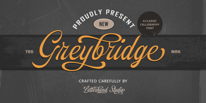 Introducing, Greybridge - Classic Calligraphy Typefce. This type of font perfectly made to be applied especially in logo, and the other various formal forms such as invitations, labels, logos, magazines, books, greeting / wedding cards, packaging, fashion, make up, stationery, novels, labels or any type of advertising purpose. Features : uppercase & lowercase numbers and punctuation multilingual alternates and swashes PUA encoded We highly recommend using a program that supports OpenType features and Glyphs panels like many of Adobe apps and Corel Draw, so you can see and access all Glyph variations.
 - Barbedor by Linotype,
$29.99The Swiss designer, Hans Eduard Meier, originally designed Barbedor for the Hell Digiset machine. Barbedor is based on handwritten humanist book scripts of the 15th century, and its chracters are typical of the style of those made by broad tipped pens. Tiny serif-like elements reveal the line of the writing utensil and emphasize the nature of this typeface. Classic and legible, Barbedor is a clear, harmonious typeface and an excellent choice for longer body texts. Its large choice of weights offers variety, which makes the typeface suitable for multiple design applications.


