10,000 search results
(0.042 seconds)
- PF DIN Serif by Parachute,
$36.00 DIN Serif: Specimen Manual PDF The DIN Type System: A Comparison Table This is the first ever release of a true serif companion for the popular DIN typeface. DIN Serif originated in a custom project for a watchmaking journal which required a modern serif to work in unison and match the inherent simplicity of DIN. As a result, a solid, confident and well-balanced typeface was developed which is simple and neutral enough when set at small sizes, but sturdy and powerful when set at heavier weights and bigger sizes. It utilizes the skeleton of the original DIN and retains its basic proportions such as x-height, caps height and descenders, whereas ascenders were slightly increased. DIN Serif makes no attempt to impress with ephemeral nifty details on individual letters, but instead it concentrates on a few modern, functional and everlasting novelties which express an overall distinct quality on the page and set it apart from most classic romans. This is a low contrast typeface with vertical axis and squarish form which brings out a balance between simplicity and legibility. Its narrow proportions offer economy of space which is critical for newspaper body text and headlines. At small sizes the text has an even texture, it is comfortable and highly readable. The serifs are narrow at heavy weights and when tight typesetting is applied at large sizes, the heavier weights become ideal for headlines. DIN Serif was inspired by late 19th century Egyptian and earlier transitional roman faces. Bracketed serifs were placed on the upper part of the letterforms (this is where we mostly concentrate our attention when we read) whereas small clean square serifs were placed on and under the baseline to simplify the letterforms. In order to reduce visual tension at the joins and make reading smooth and comfortable, a slight hint of bracketed serif was added at the joins in the form of a subtle angular tapered serif, which softens the harsh angularity. These angular tapered serifs tend to disappear at smaller sizes (or smooth out the joins) but stand out at bigger sizes exuding a strong, modern and energetic personality. What started out as a custom 2 weight family, it has developed into a full scale superfamily with 10 styles from Regular to ExtraBlack along with their italics. Additional features were added such as small caps, alternate letters and numbers as well as numerous symbols for branding, signage and publishing. All weights were meticulously hinted for excellent display performance on the web. Finally, DIN Serif supports more that 100 languages such as those based on the Latin, Greek and Cyrillic alphabet.
 - Christmas History by Sakha Design,
$14.00 Christmas History is a friendly, fresh, rich, and elegant handwritten font. It is ideal for holiday-themed greeting cards and for any crafting project that requires a romantic touch.
 - Christmas Thania by Andrey Font Design,
$14.00 Christmas Thania is a friendly, fresh, rich, and elegant handwritten font. It is ideal for holiday-themed greeting cards and for any crafting project that requires a romantic touch.
 - Christmas Mint by Brithos Type,
$11.00 Christmas Mint is a friendly, fresh, rich, and elegant handwritten font. It is ideal for holiday-themed greeting cards and for any crafting project that requires a romantic touch.
 - Mollandia by Romie Creative,
$13.00 Mollandia is a romantic typefaces. bold, elegant & fun vintage script font. Can be used for various purposes.such as logos, wedding invitation, t-shirt, letterhead, signage, news, posters, badges etc.
 - Glitter Girl by Comicraft,
$19.00 Glitter Girl is a naive but romantic and flirty face with fragments of tinsel in its hair. Here's a font with a fresh attitude dressed in frilly flowing flower child fabrics sparkling with sequins. If you're looking for a light feminine aesthetic to grace your chic fashionista blog or livejournal, give it a little Glitter Girl Gossip, a safe text with long legs that will treat your thoughts with a twinkle and a touch of magic. These chic, cozy, clean, warm and fuzzy fonts are BFF -- Best Fonts for Facebook statements you want to share with your social network!
 - Elastik by bb-bureau,
$65.00 Grotesk typeface with elastic punctuation & diacritical mark. in 4 weights: Light, regular, Medium and Bold by 4 styles: A (small diacritical), B (normal diacritical), C (hight diacritical) and D (very hight diacritical) language: all latin glyphs
 - Boonville JNL by Jeff Levine,
$29.00Boonville JNL is a slightly condensed version of Cloverdale JNL - a "Western" style typeface based on classic wood type from the 1800s. - Scriptage by Wiescher Design,
$39.50Scriptage is a very weathered classic English Script, also known under the name of Artists Script. From your weathered typedesigner, Gert Wiescher. - Etymon by A New Machine,
$15.00 Etymon is upscale and stylish - great for magazines, books, music, or luxury packaging that requires clean, classic typography with a modern spin.
 - Rough Fleurons by Intellecta Design,
$22.90 A decorative dingbat font design featuring many borders, ornaments and frame like illustrations. Works great in classic and vintage themed design projects.
 - LD Count Fontula by Illustration Ink,
$3.00LD Count Fountula takes you back to Transylvania and this classic-themed font lets you celebrate this spooky season in style. Enjoy! - Benjamin by Wilton Foundry,
$29.00Wilton's "Benjamin-Regular" is a delightful twist on a classic - reminiscent of Franklin Gothic, Helvetica and Frutiger with it's own contemporary twist. - Jaggard by Intellecta Design,
$23.90 Jaggard is a classical renaissance penmanship inspired font which works great when used for display reasons only. Contains only uppercase alphabet designs.
 - Hebrew Modern by Samtype,
$49.00 This is a classic design from the beginning of the 20th century. This font can be used in many kinds of books
 - Peterlon by Intellecta Design,
$17.90 Peterlon is an intricate and highly ornamental set of decorative initials, mixing Victorian style in the decorative boxes with classic chancery capitals.
 - LD Remington Portable by Illustration Ink,
$3.00This font represents the type style created by this very famous classic typewriter. Remington was considered the father of all typewriter companies. - Cagke by Ardyanatypes,
$15.00 Cagke is a font that offers a captivating classic and retro style. With nine weights ranging from thin to Black, Cagke provides flexibility for various design needs. The main advantage of Cagke is its ability to support multiple languages, making it easily usable worldwide. With the provided OpenType features, Cagke offers additional variations and sensitivity when designing with this font. Cagke is highly suitable for designs with classic, retro, vintage, modern, or elegant aesthetics. In various projects, including posters, books, magazines, advertisements, and even films, Cagke will provide the perfect touch. Another advantage of Cagke is its ease of development to meet various design requirements. Classic and retro styles, this font will enrich every design creation you make.
 - Grosse Pointe Metro by GroupType,
$19.00GP Metro® is a faithful version of the Dwiggins 1930 urban classic: Metrolight, Metromedium, and Metroblack. In 1929, English type designer, William Addison Dwiggins, (WAD) was commissioned by the Merganthaler Type Foundry to design a warmer, more humanistic, and less mechanical sans to effectively compete with Futura, a highly-popular geometric sans designed by Paul Renner in 1927 and first released by Meganthaler's arch-rival, the Bauer Type Foundry in Germany. FontHaus has licensed from GroupType updated files with additional styles including 2 rough versions and a soft together with the classic Regular styles and weights. These new styles will offer designers a wider range of options to design with these amazing classics. - Prillwitz Pro by preussTYPE,
$49.00 Johann Carl Ludwig Prillwitz, the German punch cutter and type founder, cut the first classic Didot letters even earlier than Walbaum. The earliest proof of so-called Prillwitz letters is dated 12 April 1790. Inspired by the big discoveries of archaeology and through the translations of classical authors, the bourgeoisie was enthused about the Greek and Roman ideal of aesthetics. The enthusiasm for the Greek and Roman experienced a revival and was also shared by Goethe and contemporaries. »Seeking the country of Greece with one’s soul«. All Literates who are considered nowadays as German Classics of that time kept coming back to the Greek topics, thinking of Schiller and Wieland. The works of Wieland were published in Leipzig by Göschen. Göschen used typefaces which had been produced by until then unknown punch cutter. This punch cutter from Jena created with these typefaces master works of classicist German typography. They can stand without any exaggeration on the same level as that of Didot and Bodoni. This unknown gentleman was known as Johann Carl Ludwig Prillwitz. Prillwitz published his typefaces on 12th April 1790 for the first time. This date is significant because this happened ten years before Walbaum. Prillwitz was an owner of a very successful foundry. When the last of his 7 children died shortly before reaching adulthood his hope of his works was destroyed, Prillwitz lost his will to live. He died six months later. His wife followed him shortly after. The typeface Prillwitz as a digital font was created in three optical styles (Normal, Book and Display). The typeface Prillwitz Press was created especially for a printing in small sizes for newspapers. »Prillwitz Press« combines aesthetic and functional attributes which make written text highly readable. It was originally designed for a newspaper with medium contrast to withstand harsh printing conditions. Its structure is quite narrow which makes this typeface ideal for body text and headlines where space is at premium. For the Normal – even more for the Book – a soft and reader-friendly outline was created through a so-called »Schmitz« and optimized in numerous test prints. The arris character and the common maximal stroke width contrast of the known classicist typefaces (Didot/Bodoni) were edited by the study of the original prints. This was also done in order to reach a very good readability in small type sizes. This typeface is perfectly suited to scientific and belletristic works. Accordingly it has three styles: Regular, Bold and Italic as Highlighting (1). The typeface Prillwitz is a complete new interpretation and continuing development of the conservated originals from 1790. They have been kept in the German Library in Leipzig. It was always given the priority to keep the strong roughness and at the same time optimizing the readability of this striking font. The type family has all important characters for an efficient and typographic high quality work. ----------- (1) Accentuation of particular words or word orders (e.g. proper names, terms etc.). Typographic means for Highlighting could be Italic, SmallCaps or semi-bold.
 - Sanchez by Latinotype,
$- CHECK OUT Sánchez Niu (new, nova, neue, next) Sánchez, designed by Daniel Hernández, is a serif typeface belonging to the classification slab serif, or Egyptian, that bears a strong resemblance to the iconic Rockwell, but with rounded edges— offering contrast and balance to the square structure. Sánchez & Sánchez Condensed comprises 12 variants, ranging from extra light to black, each of the same x-height. Regular and Italic variants are available for free. Download specimen pdf
 - Sixta by Hoftype,
$39.00 Sixta, a new monoline face with a classical background, has comfortable proportions and a puissant appearance. Although it has plenty of movement and is eventful, its discreet stroke ductus makes it excellent both for text and display. Sixta comes in eight weights, in OpenType format and with extended language support for more than 40 languages. All weights contain proportional lining figures, tabular lining figures, proportional old style figures, lining old style figures, matching currency symbols, fraction- and scientific numerals.
 - Nakilla by Nurrontype,
$14.00 Hello, i'm Nakilla, a contrast, yet beautiful display serif font. In some vocal both in uppercase and lowercase, my designer made some tweak alternate to give me modern feeling, along with ligature, it would make your next project outstanding. You can see me in action, kindly swipe my preview image. I can be headline, i can be body, my Uppercase lookin cool right ? Modern, classic and minimalist. I'm ready for your next project, buy me now. Peace out!, Nakilla.
 - sh klicker by shType,
$30.00 sh klicker is the first release by shType. Inspired by and built upon the metrical skeleton of pixel based typefaces, sh klicker opens up a whole new way in perceiving the classic impression of static grids. sh klicker is a modular, pixel based, graphically rich shapeshifter in eight different weights, best suited as a display font or where it is possible to use larger type sizes. Comes in Latin, Greek and Cyrillic with additional characters for most European languages.
 - Telenovela NF by Nick's Fonts,
$10.00Here's a retooling of the Art Deco classic Novel Gothic, designed by Morris Fuller Benton and Charles H. Becker for American Type Founders in 1929. We've added a little sparkle to this classic with a reflected-highlight treatment, to help create attractive and commanding headlines. Both versions include the complete Latin 1252, Central European 1250 and Turkish 1254 character sets, as well as localization for Moldovan and Romanian. - Didot LP by LetterPerfect,
$39.00 Didot LP is a very elegant rendition of the 18th-century French typeface -- Didot. This design took the earlier Italian neo-classical model (Bodoni) to a new level of refinement, with fully rationalized shapes and delicate hairlines. Didot LP accentuates these qualities, providing a classical text face with a clear and modern voice. The companion face -- Didot LP Display -- optimizes the proportions, spacing and hairlines for use at very large sizes.
 - Hemera II by Konstantine Studio,
$18.00 To celebrate the milestone of our all time bestseller font called Hemera, After four years now we're ready to the next level of it. Please welcome Hemera II. A sophisticated vintage victorian era fonts, inspired from the old advertising and classic sign back in circa 1800 - 1900s. Perfectly fit for your vintage vibes and classic touch on any branding works. Logo, badges, label, headline, retro decoration, you name it.
 - Kaczun Oldstyle Bold by Type Innovations,
$39.00 There are many subtle and dramatic differences incorporated into this classic beauty. Many shapes have undergone a bold transformation, while others lines remain faithful to that classic period of time that we all know and love. Kaczun Oldstyle works great in headlines, but it works equally well in text at a wide range of point sizes. Use it instead of the old times because, after all, we live in new times.
 - Caseopia by Letteralle,
$29.00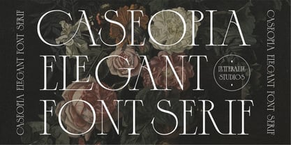 Caseopia is a modern font that takes a classic style. Designed to give the impression of elegance and luxury with a classic feel. Contains uppercase-only characters, all punctuation & numerals. There are also ligatures that will bring a unique style. Perfect for editorial projects, Logo design, Wedding, Clothing Branding, product packaging, magazine headers, or simply as a stylish text overlay to any background image. Enjoy the font, Thank You!
 - Zafrada by Pedroglifos,
$12.00 Zafrada features classic wedge serifs that can be sharp like a machete or round like molasses. Inspired in the sugar cane, this typeface brings great display legibility with versatile expressions. While the edgy version reminds us of classical rustic grotesk typefaces, the round version brightness the tone considerably. Be it display, branding, campaigns or content creation, this font has a sure space in many projects for it's reliable and versatile nature.
 - Mixottally by Zamjump,
$17.00 Introducing Mixottally Serif Display Font – a perfect fusion of vintage and classic themes, available in both regular and stamp styles. The regular style exudes timeless elegance, ideal for branding and logo design. Meanwhile, the stamp style adds a touch of vintage authenticity, perfect for a weathered, classic look. Elevate your creative projects with this versatile font, designed for a range of applications from modern branding to nostalgic designs.
 - Wukang by Twinletter,
$15.00 Want to go bold with a classic and elegant look? Introducing Wukang Blackletter font. Our latest gothic font evokes confident elegance with striking details on each side of the lettering. This font can be used in a variety of projects to create a vintage and elegant style. Use it to enhance visual projects, titles, or banners, packaging with a bold classic look that exudes style, elegance, and strong personality.
 - Rikafu by Twinletter,
$15.00 Introducing Rikafu Arabic font. Create beautiful Arabic and Islamic ornament designs using this exclusive font. All characters and alternates are beautifully styled. With this stunning font going for a stunning display, you’re sure to add a classic touch of elegance to your projects while presenting them in a variety of styles from modern to classic. This Arabic Style font will be your ultimate tool in creating high-end and luxurious designs.
 - Opheline by Nasir Udin,
$19.00 Opheline is modern display serif family of 9 fonts. The family consists of 9 weights, ranging from thin to black. The thin version reflects elegance and soft texture, while the black version represents modern and strong appearance. The vast range of Opheline family will help you to tackle your designs problem that need professional or classical touch; from the professional-look branding of law firm to classic-historical product branding.
 - Miracly by Sensatype Studio,
$15.00 Mager is a A Modern Display serif font for Vintage, classic, and retro branding needs. Based on our experience as a graphic designer who works for a lot of companies. This is perfect for BRANDING and LOGO DESIGN. You will get vintage, classic, and certainly unique logos with this font. Mager is also included full set of: uppercase letters multilingual symbols numerals punctuation Wish you enjoy our font. :)
 - Ozana Pro by Mostardesign,
$99.00 Ozana Pro is a bracketed serif font family adapted to the professional requirements of graphic designers, web designers and mobile app developers. Comprised of 24 styles including 12 styles designed especially for headlines and 12 styles for text and long paragraph design, Ozana Pro is a very versatile family of fonts that can be used in many projects such as editorial design, branding or corporate identity creation, design of posters or logos, the creation of websites or the development of mobile applications. This serif font family, with a resolutely modern aspect, also hides a unique typographic design since it has 2 distinct styles (Roman and Display) which have 2 different optical sizes in order to graphically differentiate the appearance of titles, subtitles and long paragraphs. With this design of glyphs differentiated by the optical size according to the styles, the titles have a very graphic aspect while the long texts have a more classic design in order to keep an optimal readability in all cases. Ozana Pro is also equipped with powerful OpenType features such as case sensitivity, true small caps, ligatures, tabular figures, old styles figures, numbers circled. Ozana Pro is also available as a variable font family.
 - FS Untitled Variable by Fontsmith,
$319.99Developer-friendly The studio has developed a wide array of weights for FS Untitled – 12 in all, in roman and italic – with the intention of meeting every on-screen need. All recognisably part of a family, each weight brings a different edge or personality to headline or body copy. There’s more. Type on screen has a tendency to fill in or blow so for each weight, there’s the choice of two marginally different versions, allowing designers and developers to go up or down a touch in weight. They’re free to use the font at any size on any background colour without fear of causing optical obstacles. And to make life even easier for developers, the 12 weight pairs have each been designated with a number from 100 (Thin) to 750 (Bold), corresponding to the system used to denote font weight in CSS code. Selecting a weight is always light work. Easy on the pixels ‘It’s a digital-first world,’ says Jason Smith, ‘and I wanted to make something that was really functional for digital brands’. FS Untitled was made for modern screens. Its shapes and proportions, x-height and cap height were modelled around the pixel grids of even low-resolution displays. So there are no angles in the A, V and W, just gently curving strokes that fit, not fight, with the pixels, and reduce the dependency on font hinting. Forms are simplified and modular – there are no spurs on the r or d, for example – and the space between the dot of the i and its stem is larger than usual. The result is a clearer, more legible typeface – functional but with bags of character. Screen beginnings FS Untitled got its start on the box. Its roots lie in Fontsmith’s creation of the typeface for Channel 4’s rebrand in 2005: the classic, quirky, edgy C4 headline font, with its rounded square shapes (inspired by the classic cartoon TV shape of a squidgy rectangle), and a toned-down version for use in text, captions and content graphics. The studio has built on the characteristics that made the original face so pixel-friendly: its blend of almost-flat horizontals and verticals with just enough openness and curve at the corners to keep the font looking friendly. The curves of the o, c and e are classic Fontsmith – typical of the dedication its designers puts into sculpting letterforms. Look out for… FS Untitled wouldn’t be a Fontsmith typeface if it didn’t have its quirks, some warranted, some wanton. There’s the rounded junction at the base of the E, for example, and the strong, solid contours of the punctuation marks and numerals. Notice, too, the distinctive, open shape of the A, V, W, X and Y, created by strokes that start off straight before curving into their diagonal path. Some would call the look bow-legged; we’d call it big-hearted. - FS Untitled by Fontsmith,
$80.00 Developer-friendly The studio has developed a wide array of weights for FS Untitled – 12 in all, in roman and italic – with the intention of meeting every on-screen need. All recognisably part of a family, each weight brings a different edge or personality to headline or body copy. There’s more. Type on screen has a tendency to fill in or blow so for each weight, there’s the choice of two marginally different versions, allowing designers and developers to go up or down a touch in weight. They’re free to use the font at any size on any background colour without fear of causing optical obstacles. And to make life even easier for developers, the 12 weight pairs have each been designated with a number from 100 (Thin) to 750 (Bold), corresponding to the system used to denote font weight in CSS code. Selecting a weight is always light work. Easy on the pixels ‘It’s a digital-first world,’ says Jason Smith, ‘and I wanted to make something that was really functional for digital brands’. FS Untitled was made for modern screens. Its shapes and proportions, x-height and cap height were modelled around the pixel grids of even low-resolution displays. So there are no angles in the A, V and W, just gently curving strokes that fit, not fight, with the pixels, and reduce the dependency on font hinting. Forms are simplified and modular – there are no spurs on the r or d, for example – and the space between the dot of the i and its stem is larger than usual. The result is a clearer, more legible typeface – functional but with bags of character. Screen beginnings FS Untitled got its start on the box. Its roots lie in Fontsmith’s creation of the typeface for Channel 4’s rebrand in 2005: the classic, quirky, edgy C4 headline font, with its rounded square shapes (inspired by the classic cartoon TV shape of a squidgy rectangle), and a toned-down version for use in text, captions and content graphics. The studio has built on the characteristics that made the original face so pixel-friendly: its blend of almost-flat horizontals and verticals with just enough openness and curve at the corners to keep the font looking friendly. The curves of the o, c and e are classic Fontsmith – typical of the dedication its designers puts into sculpting letterforms. Look out for… FS Untitled wouldn’t be a Fontsmith typeface if it didn’t have its quirks, some warranted, some wanton. There’s the rounded junction at the base of the E, for example, and the strong, solid contours of the punctuation marks and numerals. Notice, too, the distinctive, open shape of the A, V, W, X and Y, created by strokes that start off straight before curving into their diagonal path. Some would call the look bow-legged; we’d call it big-hearted.
 - Roos by Canada Type,
$24.95 The Roos family is a digitization and expansion of the last typeface designed by Sjoerd Hendrik De Roos, called De Roos Romein (and Cursief). It was designed and produced during the years of the second World War, and unveiled in the summer of 1947 to celebrate De Roos's 70th birthday. In 1948, the first fonts produced were used for a special edition of the Dutch Constitution on which Juliana took the oath during her inauguration as the Queen of the Netherlands. To this day this typeface is widely regarded as De Roos's best design, with one of the most beautiful italics ever drawn. In contrast with all his previous roman faces, which were based on the Jenson model, De Roos's last type recalls the letter forms of the Renaissance, specifically those of Claude Garamont from around 1530, but with a much refined and elegant treatment, with stems sloping towards the ascending, slightly cupped serifs, a tall and distinguished lowercase, and an economic width that really shines in the spectacular italic, which harmonizes extremely well with its roman partner. The Roos family contains romans, italics and small caps in regular, semibold and display weights, as well as a magnificent set of initial caps. All the fonts contain extended language support, surpassing the usual Western Latin codepages to include characters for Central and Eastern European languages, as well as Baltic, Celtic/Welsh, Esperanto, Maltese, and Turkish.
 - Tyma Garamont by T4 Foundry,
$49.00The TYMA Garamont Roman was inspired by the Berner-Egenolff type sample from the 1560s. The Italic was inspired by a sample from Robert Granjon, also from the 1560s. The name TYMA is short for AB Typmatriser, a Swedish company founded 1948, because the Second World War stopped all import of matrices for Linotype and Intertype typesetting machines. It took until 1951-52 before the import was up to speed again. Until then, Sweden had to fend for itself. TYMA produced all technical equipment needed for type production, including the pantograph to cut the matrices, a complete set for each size and version. The templates for Garamont Roman were initiated by Henry Alm 1948. Bo Berndal was hired the following year, and continued the work by drawing and cutting templates for the rest of Garamont Roman, as well as for the remaining Garamont family. Bo Berndal stayed at TYMA until it went bankrupt in 1952. At that time Bo Berndal had already kick-started his career as type designer by drawing the typeface Reporter for one of the big daily newspapers, Aftonbladet, a version of Cheltenham for another daily, Dagens Nyheter, and copied several old typefaces for other customers. Librarian Sten G. Lindberg at The Royal Library of Stockholm, Kungliga Biblioteket, procured copies of original type samples. Henry Alm started the work in 1948, and Bo Berndal completed it - finally in this OpenType version.