10,000 search results
(0.041 seconds)
- Garuda by Campotype,
$49.00 Garuda typeface, featuring the shape and style based on "Garuda Pancasila", the state symbol of the Republic of Indonesia. Garuda is a mythical bird in the Javanese puppet stories, is very similar to the eagle. At the typeface we can find more ligatures beside than the standard. Within Garuda at least encoded 792 glyphs per weight onto major codepage: win 1252, 1250, 1254, 1257 including Mac OS Roman. It is containing more OpenType features such as swash, contextual alternate, stylistic, figures/number, and a few bit ornaments. The typeface has a pretty good readability and legibility even in small sizes. So it is useful for short texts (text length? Whom fear) for print and screen material. Usage on headlines, posters, titles, or something like that, can utilize ornament lines as a sweetener. Please find more information about the OpenType Manual of this typeface on the gallery page (pdf).
 - Lectio by Eurotypo,
$14.00 Lectio is a Roman font based on a Venetian Renaissance early typefaces, but with a modern and expressive design. His obvious calligraphic influence favors continuous text reading. The generous internal "eye" gives Lectio an appropriate legibility, its soft and organic modulation avoids fatigue, its robust character is attractive and stimulating in large bodies, especially for use in headlines. Lectio comes in two versions: Lectio and Lectio B. Lectio has seven weight and their corresponding slanted variables (true italics). Lectio B is composed only of Italics in six weight. The ascenders are slightly lower, the descending are more regular and the oblique trace of some letters have a more constant rhythm. Each of these faces has the optimum amount of contrast agains the background and clear and open internal letter shape. These fonts include diacritics for CE languages, Old Style figures, standard and discretional ligatures.
 - Cal Uncial Rough by Posterizer KG,
$19.00 Cal Uncial Rough is a calligraphic font based on sketches written with cane calligraphy pen and ink on coarse-textured paper. Because of the fact that the Uncial don't have lowercase letters, there are small capitals instead of the lowercase. As the Latin version of the Uncial was created from the Greek Uncial script (translating the Bible from Greek into Latin), in addition to the standard Latin graphemes, the font contains the Greek alphabet (and also the Cyrillic letters (Ustav), derived from the Greek Uncial too). Regardless of the stylistic connection, there is a difference between the morphology of related Greek, Latin and Cyrillic letters. Most of the graphemes are based on traditional roman and insular uncial calligraphy. Cal Uncial Rough is suitable for the preparation of calligraphic sketches as well as an application in typography that should bring us closer to historical topics (European literature, quotes, history, film ...).
 - Ergonomique by Monotype,
$31.99 Ergonomique is a humanist sans serif typeface that has been designed to be efficient and comfortable to use across all applications. Ergonomique’s personality is defined by its spurless lowercase glyphs – the stems are truncated and blend into their adjoining arcs, as can be seen in the a/b/d/m/n/p/q/r/u characters. Ergonomique is ideal for branding and display purposes, but also performs well as body copy if you’re seeking a unique style for your text. With its nine weights and complementing italics, Ergonomique is highly versatile, especially when you consider that there are small caps and old style figures included, along with a Latin Extended character set. Key Features: • 18 font family – 9 weights in Roman and Italic • Small Caps, Ligatures, with Proportional, Old Style, and Small Cap figures, plus Fractions, Numerators, Denominators, Superiors, and Inferiors • Full European character set (Latin Extended) • 800+ glyphs per font.
 - Slow Tempo by Dharma Type,
$19.99 Slow Tempo is a relaxed, loose-fit font that you can easily enjoy. Slow Tempo has basic, natural and neutral letterforms and skeletons for a wide range of usage. Though, there are some distinctive features. As you can see, Slow Tempo has low curvature of the intersections between stem & shoulder or bowl and also has large and open apertures. This makes this font relaxed. The letterform has low contrast and geometric shape to be neutral design, large x-height and humanistic terminal to be legible and distinguishable. Slow Tempo consists of 8 weights and their matching Italics for a wide range of usages. Further, Slow Tempo is supporting international Latin languages and basic Cyrillic languages including Basic Latin, Western Europe, Central and South-Eastern Europe. Also CSS covers Mac Roman, Windows1252, Adobe1 to 3. This wide range of international characters expands the capability of your works.
 - 1785 GLC Baskerville by GLC,
$42.00 This family was created/inspired from the well-known Baskerville Roman and Italic typefaces created by John Baskerville, the English font designer. We were inspired by the original family sent by Baskerville’s wife after his death. The full Baskerville collection was bought by the French editor and author Pierre-Augustin Caron de Beaumarchais who used it to print - in Switzerland - for the first time the complete works of Voltaire (known as the “Kehl edition” from the "Imprimerie de la société littéraire typographique"). We have used this edition, with copies from 1785, to reconstruct these two genuine historical styles. The font faces, kerning, and spacing are scrupulously identical to the original. This Pro font includes characters for Western, Eastern and Central European languages (including Celtic) and Turkish, with a complete set of small caps, standard and “long s” ligatures in each of the two styles.
 - Garibaldi by Harbor Type,
$50.00 🏆 Selected for Tipos Latinos 6. 🏆 Selected for the 12th Biennial of Brazilian Graphic Design. 🏆 Typographica Favorite Typefaces of 2015. Garibaldi is a text typeface based on humanist calligraphy. It has an organic look and feel, while preserves the traditional construction of roman typography. It all started with a desire to learn more about the origin of the strokes on humanist typefaces. To accomplish that, Garibaldi features a 20° axis, medium contrast based on translation and expansion, asymmetric serifs, and terminals related to the broad nib stroke. Garibaldi Regular was nominated for Tipos Latinos 2014. Since then, the family was expanded with more weights and matching italics, making it a solid choice for setting books, magazines and documents. Among many OpenType features, each font contains small caps, ligatures and contextual alternates, totalling more than 750 glyphs and supporting at least 80 languages.
 - Cavolini by Monotype,
$50.99 The Cavolini™ typeface family, by Carl Crossgrove, is unique to handwriting fonts. It is a family of several designs, and it was developed for imaging on small screens. While drawn for a specific use, the family is also equally at home in many interactive and print applications. Cavolini has all the casual charm and immediacy of handwriting, while maintaining high levels of typographic clarity. Cavolini’s large x-height, open character spacing, clearly defined apertures, and easily differentiated forms enable high levels of legibility and readability at small sizes, while the family’s multiple designs of roman, bold and italic in regular and condensed proportions enable breadth of choice for creating emphasis, hierarchy, and typographic diversity a wide variety of environments. A large character set enables the setting of most Western European and many Eastern European languages, including Cyrillic and Greek – and adds to the family’s broad range of uses.
 - Sunshine by Chank,
$49.00 Sunshine is the unlikely alphabet collision of Gobbler and Liquorstore. Chank's napkin scrawl smashed into the letters commonly found on signage at the neighborhood liquor store. Gobbler's blotchy textures fragmented Liquorstore's uniform stroke. It began as a hideous lumpy thing with random vector points everywhere. Chank came to the rescue with his Alphabetician's first aid kit. He smoothed the blunt corners with a few hammer blows. He wrapped the font in extra strokes, in a sans serif Roman style, to increase its contrast. His industrial influence helped stabilize Gobbler's gloppy qualities and his grunge aesthetic softened Liquor store's checkerboard rigidity. The end result is a font with a solid structure and a painterly wiggle that creates a dirty display or a slightly clumsy text face. Because of its many detailed strokes, it tends to look a little better in print than on the web. All organic. Earthy.
 - Short Films by Dharma Type,
$19.99 Short Films is an all-new-styled family, which kind of looks like Art Deco Style. Wide opened counters and softly rounded bowls create a new feeling – Retro but futuristic, geometric but humanistic. Exquisite contrast between thin and bold parts of glyphs make mixed feeling – Pop and feminine, formal and casual, strong and soft. The most distinctive feature is a coexistence of decorativeness and Readability. This coexistence expands the range of font usage. You can use this font for not only titling but also body-text. Short Films consists of 6 weights and their matching Italics for a wide range of usages. Further, Short Films supports international Latin languages and basic Cyrillic languages including Basic Latin, Western Europe, Central and South-Eastern Europe. Also, Short Films covers Mac Roman, Windows1252, Adobe1 to 3. This wide range of international characters expands the capability of your works.
 - Medieval Leaves by Kaer,
$19.00 Once I found a pretty H letter initial on an ancient book. The letter was illuminated by beautiful engraved leaves. Based on it, I designed A-Z and 0-9 sets and assembled Medieval Leaves font. Medieval Leaves font family has Regular and Colored styles. It's all you need to precisely imitate medieval style text. Use this font as a decorative element at the beginning of a paragraph or section, other part of the paragraph should be in regular black letter font. You’ll get Drop Caps & Numbers set. --- *You can use color fonts in PS CC 2017+, AI CC 2018+, ID CC 2019+, macOS 10.14 Mojave+ * *Please note that the Canva & Corel doesn't support color fonts!* *Please download this test file with only A letter ( https://www.dropbox.com/s/03e7i78j4bz4mnm/MedievalLeaves-Test.otf?dl=0 ) to check your app & system.* --- Please feel free to request any help you need: kaer.pro@gmail.com Best, Roman.
 - Chapman by James Todd,
$40.00 Chapman is the result of spending too many hours staring at the often all-capital engraver typefaces from long-gone foundries. The wide serifs, high contrast, and various widths seem to have so much character but also remain so neutral. From these references, Chapman began to emerge. It seemed natural that the lowercase would be based on a Scotch Roman model, much like the original all-capital faces. Chapman does not pull directly from any one source but from the genres themselves. It was, from the beginning, the goal to create a typeface that would be relatively neutral but not boring; an adaptable solution that works anywhere and, depending on the chosen width, can be squeezed or stretched to fit anywhere. The idiosyncrasies of the original designs are tamed in some places and turned up in others. The result is something familiar but unique and contemporary.
 - Scribal by Loaded Fonts,
$15.00Designed with help and inspiration from legendary tattoo artist Dustin Horan. This beautiful time saver was designed specifically for skin application. Short words and initials can instantly be turned into seamless tribal style tattoos. Each glyph links with the next allowing letters to flow endlessly around limbs and in circles. Respecting the rhythm and geometry principles laid forth by American pioneering tribal artist Leo Zulueta, Scribal makes flowing text shapes that disguise themselves as design. When mirrored back to back and rotated vertically, Scribal becomes well-crafted tribal pattern. Typeface wise, Scribal breaks the mold. While a script font, Scribal was designed to be written in all capitals. Each capital is a mono-spaced glyph, providing even spacing. The shape influences are also vast, ranging from scripts, to blackletters, to romans. Making Scribal a very "Americanized" font, reflective of this "Americanized" style of Tribal Tattooing. - Boule Plus by Ingo,
$33.00 CAPITALIZED, geometric, bold and round. If the typographer sees a font like that, it's enough to make his toes curl. But sometimes it just has to be that way. Geometrically constructed fonts do not necessarily have to be pointed and angular; It also works consistently around. And if I say it consistently, then in this case, that's done consistently. The basis for the BOULE is the circle. The letters are drawn with constant line width, the “corners“ and endings all have the same radius, the lines are all the same thickness. The BOULE consists only of capitals. There is only one difference in the use of uppercase and lowercase letters: in the uppercase letters, the round letters are circular, while the lowercase letters are narrow. The character set of the Boule contains all letters and accents to support the Western, Northern, Central and Eastern European languages with Latin alphabet. The BOULE is not only very fat, it also runs very tight; that is, the glyphs are very close to each other. To avoid "holes" due to unfortunate letter combinations, the BOULE contains ligatures for FT, ST, TT and TZ. There are also other versions of the font: BOULE Brillant on the one hand. In this version, simple highlights simulate a light incidence from the top right. These light edges give the font a decorative effect that makes it easy to think of wet sausages or balloons in some shapes. And finally the BOULE Contour. As the name implies, it is the outer contour of the letters, combined with a shadow at the bottom left. The name BOULE (French for ball) says it already: this font is globated. Therefore, it is also very suitable for all three-dimensional alienation effects. With simple light and shadow you can achieve a very convincing 3D effect with little effort.
 - College Grad by Throndsen,
$9.00 College Grad is inspired by my Graphic Design class of 2019!
 - Kallinsha by Sibelumpagi,
$18.00 Kallinsha is a classy signature typeface. Kallinsha has a natural & modern handwritten style for any purpose, it comes with ligatures and alternates for ending swashes. Kallinsha is perfect for many different projects such as logos & branding, invitation, stationery, wedding designs, social media posts, advertisements, product packaging, product designs, label, photography, watermark, special events or anything.
 - Rebelion by Gassstype,
$23.00 Here comes a New font,Introducing REBELION It's Unique Rough Brush Font is a Strong Style and classy style, this font is great for your creative projects such as watermark on photography, and perfect for logos & branding, invitation,advertisements,product designs, stationery, wedding designs,label ,product packaging, special events or anything that need handwritting taste.
 - Philomena Script by Letterhend,
$16.00 Philomena is a signature script that brings the classy and luxury look. The natural feel of the signature works perfect for those who needs a typeface for headline, logotype, apparel, invitations, branding, packaging, advertising etc. This font is comes in uppercase, lowercase, punctuation, symbols, numerals, stylistic set alternate, ligatures, etc., as well as multilingual support.
 - Spontial by Lemonthe,
$12.00 Spontial consists of two fonts, Script and Slab serif, designed to complement each other perfectly. Whether together or separate, these fonts will add an elegant and classy touch to your design. It is perfect for many different projects such as logos & branding, invitation, stationery, wedding designs, signature, product designs, labels, photography, and much more!
 - Aulletta by Nissa Nana,
$25.00 Aulletta is a beautiful and flowing script font. Its modern and classy look makes it the perfect font for creating outstanding DIY projects! This font is PUA encoded which means you can access all of the cute glyphs and swashes with ease! It also features a wealth of special features including alternate glyphs and ligatures.
 - Beyond Comfort by Tom Chalky,
$16.00 Introducing Beyond Comfort - A classy and stylish font duo inspired by 80's editorial type. At first glance, they look pixel perfect, but on further inspection, you'll notice perfect imperfections, revealing that the fonts are in fact entirely hand-drawn; As all of my fonts are, adding to the overall character of the duo.
 - Malven by Craft Supply Co,
$15.00 Malven is a modern serif features thin stroke, low-contrast modulation, with small serif that make it elegant and classy. It can be used to create almost all types of design projects like print materials. Just use your imagination and your project will become more alive and look great than ever with this typeface.
 - Weather In October by Wildan Type,
$10.00 Weather in October is a handwritten font. The letters are classy and unique. Use Weather in October to get a more elegant look This font is perfect for quotes, headings, blogs, invitations and more! This purchase includes Regular,Italic, Movement, and Hollow Style You will be able to use this font in ANY program!
 - Okinawa by Din Studio,
$29.00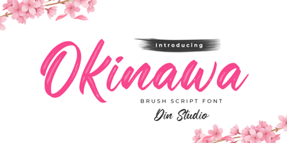 Okinawa is a classy script font. This brush font will make your design project more powerful. Made for any professional project branding. It is the best for logos, branding and quotes. Every letter has a unique and beautiful touch. Features: Ligatures Multilingual Support PUA Encoded Numerals and Punctuation Thank you for downloading from Din Studio.
 - Kaylar by Letterhend,
$14.00 Kaylar Script & Serif is a pair of elegant typeface consist of script and serif font. The beauty script and the condensed serif perfectly matched and bring a luxury and classy feel. What makes it even more special is its unique opentype feature which allows you to enable the swash ornament in a very simple way.
 - Rettrama by Gassstype,
$23.00 Hello Everyone, introduce our new product Font Rettrama This Is Simple Script Display Font .This is a Textured Natural Style and classy style with a clear style and dramatic movement. This font Rettrama is great for your next creative project such as logos, printed quotes, invitations, cards, You can activate 16 Ligatures glyphs OpenType panel.
 - Revolter by Gassstype,
$25.00 Here comes a New font,Introducing Revolter It's Unique Rough Brush Font is a Authentic Style and classy style, this font is great for your creative projects such as watermark on photography, and perfect for logos & branding, invitation,advertisements,product designs, stationery, wedding designs,label ,product packaging, special events or anything that need handwritting taste.
 - Ambassador by Juraj Chrastina,
$39.00 Hairline display fonts are elegant and subtle with touch of luxury. They are the Champagne of type. Ambassador represents a classy typeface best suitable for magazines, cosmetics packaging, advertising or any kind of fine and sensitive design. The quality of the display-oriented spacing and kerning of this font is ensured by Igino Marini.
 - Orchide by Almarkha Type,
$27.00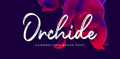 Introducing **Orchide** – Handwritten Brush is a handwritten script font with a Signature Style and classy style, this font is great for your creative projects such as watermark on photography, and perfect for logos & branding, photography, invitation, watermark,advertisements,product designs, stationery, wedding designs,label ,product packaging, special events or anything that need handwritting taste.
 - Yogeo by Rochart,
$14.00 Give your designs a classy feel. "Yogeo" is perfectly suited to stationery, logo, typography quotes, magazine or book cover, website header, clothing, branding, packaging design and more. A minimalist serif font containing uppercase and lowercase characters, numerals, a large range of punctuation, international language and ligatures. I hope you make something cool with it!
 - LA QATRIE by Hishand Studio,
$15.00 Experience refined design with La Qatrie, a display font that boasts an elegant look and a touch of luxury, setting a new standard for sophistication in typography. Perfect for those needing a touch of elegance, classy, stylish, beautiful bold type, and modernity for their design. Complete with ligatures alternates regular hollow icon kerning multilingual support
 - Homestone by Typebae,
$17.00 Homestone is an exquisite handwritten font, masterfully designed to become a true favorite. It maintains its classy calligraphic influences while feeling contemporary and fresh. To use alternates, heart connector, beginning and ending swashes, you don't need to use software that supports opentype, because we have made it separately so it's very easy to use.
 - Lost In South by Gassstype,
$27.00 Introducing Lost in South – Natural Brush Font is a Signature Style and classy style, this font is great for your creative projects such as watermark on photography, and perfect for logos & branding. Lost in South a natural handwritten feel. This handmade font will make your design has a beautiful natural touch for each details.
 - Seathera by Almarkha Type,
$35.00 Seathera is a beautiful script that feels classy, elegant, and modern. It is perfectly suited for a wide variety of projects! This font is PUA encoded which means you can access all of the magical glyphs and swashes with ease! It also features a wealth of special features including alternate glyphs and ligatures. Thank you
 - ITC Founder's Caslon by ITC,
$40.99The Englishman William Caslon punchcut many roman, italic, and non-Latin typefaces from 1720 until his death in 1766. At that time most types were being imported to England from Dutch sources, so Caslon was influenced by the characteristics of Dutch types. He did, however, achieve a level of craft that enabled his recognition as the first great English punchcutter. Caslon's roman became so popular that it was known as the script of kings, although on the other side of the political spectrum (and the ocean), the Americans used it for their Declaration of Independence in 1776. The original Caslon specimen sheets and punches have long provided a fertile source for the range of types bearing his name. Identifying characteristics of most Caslons include a cap A with a scooped-out apex; a cap C with two full serifs; and in the italic, a swashed lowercase v and w. Caslon's types have achieved legendary status among printers and typographers, and are considered safe, solid, and dependable. ITC Founder's Caslon® was created in 1998 by Justin Howes, an English designer who used the resources of the St. Bride Printing Library in London to thoroughly research William Caslon and his types. As was common in the eighteenth century, Caslon had punchcut several different sizes of his types, and each size had a slightly different design. Howes digitized every size of type that Caslon cast, keeping their peculiarities and irregularities and reproducing them as they appeared on the printed page. This family has the 12 point, 30 point, 42 point, and Poster styles, as well as a full set of bona fide ornaments. In keeping with the original Caslon types, none of the sizes have bold weights, the numerals are all old style figures, and a full set of ligatures (some with quaint forms) are included. ITC Founder's Caslon® is a remarkable revival in the true sense of the word, and works beautifully in graphic designs or texts that require an authentic English or historical flavor. - Caslon Graphique by ITC,
$29.99 The Englishman William Caslon punchcut many roman, italic, and non-Latin typefaces from 1720 until his death in 1766. At that time most types were being imported to England from Dutch sources, so Caslon was influenced by the characteristics of Dutch types. He did, however, achieve a level of craft that enabled his recognition as the first great English punchcutter. Caslon's roman became so popular that it was known as the script of kings, although on the other side of the political spectrum (and the ocean), the Americans used it for their Declaration of Independence in 1776. The original Caslon specimen sheets and punches have long provided a fertile source for the range of types bearing his name. Identifying characteristics of most Caslons include a cap A with a scooped-out apex; a cap C with two full serifs; and in the italic, a swashed lowercase v and w. Caslon's types have achieved legendary status among printers and typographers, and are considered safe, solid, and dependable. Caslon Antique was designed by Berne Nadall and brought out by the American type foundry Barnhart Bros & Spindler in 1896 to 1898. It doesn't bear any resemblance to Caslon, but has the quaint crudeness of what people imagine type looked like in the eighteenth century. Use Caslon Antique for that old-timey" effect in graphic designs. It looks best in large sizes for titles or initials. Caslon Black was designed by David Farey in the 1990s, and consists of one relatively narrow and very black weight. It is intended exclusively for titles or headlines. Caslon Black has a hint of the original Caslon lurking in the shadows of its shapes, but has taken on its own robust expression. Caslon Graphique was designed by Leslie Usherwood in the 1980s. The basic forms are close to the original Caslon, but this version has wide heavy forms with very high contrast between the hairline thin strokes and the fat main strokes. This precisely drawn and stylized Caslon has verve; it's ideal for headlines or initials in large sizes."
 - Garamond Premier by Adobe,
$35.00Claude Garamond (ca. 1480-1561) cut types for the Parisian scholar-printer Robert Estienne in the first part of the sixteenth century, basing his romans on the types cut by Francesco Griffo for Venetian printer Aldus Manutius in 1495. Garamond refined his romans in later versions, adding his own concepts as he developed his skills as a punchcutter. After his death in 1561, the Garamond punches made their way to the printing office of Christoph Plantin in Antwerp, where they were used by Plantin for many decades, and still exist in the Plantin-Moretus museum. Other Garamond punches went to the Frankfurt foundry of Egenolff-Berner, who issued a specimen in 1592 that became an important source of information about the Garamond types for later scholars and designers. In 1621, sixty years after Garamond's death, the French printer Jean Jannon (1580-1635) issued a specimen of typefaces that had some characteristics similar to the Garamond designs, though his letters were more asymmetrical and irregular in slope and axis. Jannon's types disappeared from use for about two hundred years, but were re-discovered in the French national printing office in 1825, when they were wrongly attributed to Claude Garamond. Their true origin was not to be revealed until the 1927 research of Beatrice Warde. In the early 1900s, Jannon's types were used to print a history of printing in France, which brought new attention to French typography and the Garamond" types. This sparked the beginning of modern revivals; some based on the mistaken model from Jannon's types, and others on the original Garamond types. Italics for Garamond fonts have sometimes been based on those cut by Robert Granjon (1513-1589), who worked for Plantin and whose types are also on the Egenolff-Berner specimen. Linotype has several versions of the Garamond typefaces. Though they vary in design and model of origin, they are all considered to be distinctive representations of French Renaissance style; easily recognizable by their elegance and readability. Garamond Pemiere Pro was designed by Robert Slimbach, and released in 2005." - BlincType Letterpress Fontpak by Chank,
$99.00 Add some old fashioned charm to your designs with the distressed alphabets in the new BLINCtype Letterpress Fontpak, a brand new font collection containing 8 letterpress-inspired fonts from the creative minds at Blinc Publishing in St. Paul, MN. The BLINCtype Letterpress Fontpak contains a handy concise assortment of old-school display fonts. From the old Western "WANTED" poster look of Prospect Modern, to the no-nonsense all-caps classic Goshen and its lowercase companion Gideon, these fonts are inspired by wooden letterpress blocks and other archaic technologies. It's like having your own letterpress print studio! Except it's all instantly downloadable right now as easy-to-use fonts! Designers love working with the Cheltenham-esque Gomorrah and its grittier, grungier counterpart, Sodom. The bouncy Golgotha has a rough and tumble readiness that exudes a hand-made charm, while Hamilton Offset has a cryptic, experimental look and feel that gives the impression of double-vision. You also get the newest member of the Blinc font family, Player Piano, which was based on punch-cut stencil letters on an old player piano paper song roll. Purchase the BLINCtype Letterpress Fontpak today and you'll be able to download and start using these 8 great fonts right away! The BLINCtype Letterpress Fontpak contains the fonts: Gideon, Golgotha, Gomorrah, Goshen, Hamilton Offset, Player Piano, Prospect Modern and Sodom.
 - Klainy by Identity Letters,
$29.00 An unadorned Grotesque with a refreshingly personal touch. If “Grotesque” mainly means “industrial, mechanical, anonymous typeface” to you, Klainy might redefine your image of the genre. Yes, it’s a Grotesque—but with a contemporary look and a lot of personality. Klainy’s apertures are more closed at the top and more open at the bottom, creating an informal rhythm that sets Klainy apart: a confident, optimistic voice with a clean appearance. Terminals are subtly back-bent: these quaint “hooks” make Klainy a bit more personal, a bit friendlier. (You can find them in the a, c, f, and r.) Just like its old-style Grotesque ancestors, Klainy is optimized for display sizes and short texts. There, its unobtrusive quirks can be wholly appreciated. However, the familiar Grotesque appearance makes sure that the typeface is comfortable to read in smaller sizes, as well. Use Klainy whenever a basically classic sans-serif typeface with a modern and individual twist is called for. This font family comes in eight weights ranging from Thin to Black, each with a matching italic style. More than 500 glyphs and a bunch of Open Type Features make it a reliable companion for all of your projects. You can fine-tune the flavor of Klainy with Stylistic Alternates such as a one-story a and a two-story g. Their simple construction blends perfectly with the design concept of this typeface. Klainy is a seasoned blue-collar worker that surprises you with wit and team spirit. It’ll be a great addition to your font library.
 - Annalena Script by Seniors Studio,
$23.00 Annalena Script is a romantic typefaces. bold, elegant & fun vintage script font. Can be used for various purposes.such as logos, wedding invitation, t-shirt, letterhead, signage, news, posters, badges etc. Features 423+ glyphs and 160 alternate characters, ligatures, swash and multiple language support. To enable the OpenType Stylistic alternates, you need a program that supports OpenType features such as Adobe Illustrator CS, Adobe Indesign & CorelDraw X6-X7. There are additional ways to access alternates/swashes, using Character Map (Windows), Nexus Font (Windows), Font Book (Mac) or a software program such as PopChar (for Windows and Mac).