10,000 search results
(0.03 seconds)
- MPI French Antique by mpressInteractive,
$5.00 French Antique was first shown in the specimen books of William H. Page & Company in 1869. The font is extremely tall and thin, with serifs taller than many character's widths. Lines are straight and clean with no fuss. French Antique can fit a lot of headline into a small space.
 - Magnify PRO by XdCreative,
$32.00 About Magnify Pro Magnify Pro Geometric sans 2 Style in 1. Magnify PRO Geometric sans is the latest version of "Magnify" by. Faldykudo. Comes up with more complete language support and features, including ink-trap and reverse contrast will add more different taste & style to the art of modern typography. Magnify PRO has two style in one font, normal & inverse contrast. If you are like normal: just type with regular letters, if you are like reverse contrast: just access your opentype features to find the alternate letters. Thank You.
 - FS Olivia Paneuropean by Fontsmith,
$90.00Antwerp On a visit to Belgium and the Netherlands while still an MA student at Reading University, Eleni Beveratou made some important discoveries. First, there was the letter ‘g’ from the Didot family seen at Plantin Moretus Museum in Antwerp, which seemed “almost like a mistake”. Then there were strange details such as the serifs on the “l”, “h”, “k”, “b” and “d” in Egmont Cursive and other typefaces by Sjoerk Hendrik de Roos, found in volumes of poetry she picked up from a chaotic bookshop in Amsterdam. These were characters that stood out from the text but seemed to blend harmoniously with the rest of the letters. “And there it was, the spark. I decided to design a typeface that would capture the details of the process of writing.” A guiding hand Eleni shared her initial thoughts with Phil Garnham and Jason Smith. They liked what they saw in her tentative first sketches, and gave her the chance to develop her ideas further. Phil, in particular, provided valuable input as FS Olivia took shape. Eleni’s main influence – the handwritten – would give the font its character. “When creating a typeface,” says Eleni, “it’s fair to say that it reflects some of the designer’s personality. And that’s certainly the case with FS Olivia. “Although technology is part of my everyday life. I am a great admirer of traditional graphic design where you can touch and feel paper and ink.” Irregular “What I particularly like,” says Eleni, “is that a printed item can develop its own personality sometimes as a result of imperfections in the print. “FS Olivia has some of these characteristics as it’s inspired by handwriting, and yet it also includes some very modern features.” Feminine and fascinating, FS Olivia captures the expressive twists and turns of (the poet’s?) pen on paper, with low junctions, deep top serifs and semi-rounded edges. Round outstrokes contrast with the rough corners of the instroke, while strong diagonals and inclined serifs create a richly textured pattern. Polytonic It’s only fitting that there should be a version of this poetic font for one of the birthplaces of poetry and song. Eleni, who hails from Athens, developed an extensive range of glyphs that could be used for the Greek language, in both modern and ancient texts. For the latter, there is a version of Olivia for displaying polytonic Greek (a system that utilises a range of accents and “breathings”), which brings the 21st century technology of OpenType to the presentation of poetic texts from Ancient Greece. Just think what Homer could have done with that. - FS Olivia by Fontsmith,
$70.00 Antwerp On a visit to Belgium and the Netherlands while still an MA student at Reading University, Eleni Beveratou made some important discoveries. First, there was the letter ‘g’ from the Didot family seen at Plantin Moretus Museum in Antwerp, which seemed “almost like a mistake”. Then there were strange details such as the serifs on the “l”, “h”, “k”, “b” and “d” in Egmont Cursive and other typefaces by Sjoerk Hendrik de Roos, found in volumes of poetry she picked up from a chaotic bookshop in Amsterdam. These were characters that stood out from the text but seemed to blend harmoniously with the rest of the letters. “And there it was, the spark. I decided to design a typeface that would capture the details of the process of writing.” A guiding hand Eleni shared her initial thoughts with Phil Garnham and Jason Smith. They liked what they saw in her tentative first sketches, and gave her the chance to develop her ideas further. Phil, in particular, provided valuable input as FS Olivia took shape. Eleni’s main influence – the handwritten – would give the font its character. “When creating a typeface,” says Eleni, “it’s fair to say that it reflects some of the designer’s personality. And that’s certainly the case with FS Olivia. “Although technology is part of my everyday life. I am a great admirer of traditional graphic design where you can touch and feel paper and ink.” Irregular “What I particularly like,” says Eleni, “is that a printed item can develop its own personality sometimes as a result of imperfections in the print. “FS Olivia has some of these characteristics as it’s inspired by handwriting, and yet it also includes some very modern features.” Feminine and fascinating, FS Olivia captures the expressive twists and turns of (the poet’s?) pen on paper, with low junctions, deep top serifs and semi-rounded edges. Round outstrokes contrast with the rough corners of the instroke, while strong diagonals and inclined serifs create a richly textured pattern. Polytonic It’s only fitting that there should be a version of this poetic font for one of the birthplaces of poetry and song. Eleni, who hails from Athens, developed an extensive range of glyphs that could be used for the Greek language, in both modern and ancient texts. For the latter, there is a version of Olivia for displaying polytonic Greek (a system that utilises a range of accents and “breathings”), which brings the 21st century technology of OpenType to the presentation of poetic texts from Ancient Greece. Just think what Homer could have done with that.
 - Chaste by Jafar07,
$15.00 Chaste a very elegant sans serif font featuring clean lines, and sharp edges with oval combinations, very pretty but still has strong straight lines. Chaste makes it very easy for those of you who design minimalist and modern designs, it has upper and lowercase letters that are very easy to combine with other fonts. Support for 80 languages : Afrikaans, Albanian, Czech, Dutch, English, French, Italian, Portuguese, Swedish, Irish, Norwegian Bokmål, Norwegian Nynorsk, Nyankole, Oromo, Filipino, Finnish, Swiss German, Taita, Teso, Upper Sorbian, Uzbek (Latin), Volapük, Vunjo Etc.
 - Gaudi ND by Neufville Digital,
$29.60 Gaudí ND was designed in 1962 by Ricard Giralt Miracle and awarded with a Delta d’Or from ADIFAD. It combines the constructive spirit of the lapidary Roman with the modern sans serif. The rectangular endings constitute a recurring rhythm, resulting in a futuristic character that refers to a digital context and the interior life of computers. Gaudí is a Trademark of BauerTypes SL.
 - Felfel Arabic by Boharat Cairo,
$20.00 Felfel is an Arabic typeface inspired by the rich history of the Arabic Ruq’ah, one of the most widely used Arabic calligraphy styles, but with a modern pinch influenced by the visual identity of Egyptian streets. Born from the fundamental need in the Arabic design scene, Felfel is made to celebrate the elegance and timeliness of Arabic calligraphy while solving the problem of the cascading nature of Ruq’ah that results in increased line spacing. Felfel is space-friendly, perfect for headlines and quotes. Felfel supports major Arabic-script-based languages and covers Arabic, Hindu, and Farsi numbers. Like Traditional Ruq'a, Felfel works with the same context, but it adjusts to your needs without the rigidity of Ruqa’ah’s slanted baseline to give you the flow, beauty, and richness of the Arabic calligraphy with a modern feel. Felfel is dynamic. A substantial part of the font is based on versatile components, that minimizes characters and maximizes possibilities. the dots are in motion! They rotate from and to horizontal and vertical form, based on the word to match the calligraphy and the context, also the dots and marks move up and down, left and right to prevent all kinds of overlapping.
 - FG Adam by YOFF,
$15.95FG Adam turned out (it always is like that) a bit crazy with the baseline shift it makes a good greeting card font. I like it and it's fun! - Eskorte Latin by Rosetta,
$60.00 Eskorte is a diligently designed Latin type family with an uncomplicated, engaging poise that conveys a crisp, businesslike tone. Its precise range of styles looks to no-nonsense efficiency and ease of use by non-designers in the office and text-intensive professional environments. Eskorte supports over ninety languages in a full range of weights, with both upright and matching italics. The italics are lively, fluid forms that infuse their charms into text settings or take on their own personality in large, dominant headlines. In concert with the hardworking upright styles, the two fit smartly into a range of publications, from corporate to casual. All of the weights and styles offer an adept set of features like small caps, case-sensitive punctuation, and both tabular and proportional figures to make short work of any typographic task. Whether employed in enterprise reports, lifestyle publications, or identity work, Eskorte is ready for business.
 - ITC Adderville by ITC,
$29.99On a cold winter's night, George Ryan, of Galápagos Design Group, began musing on the possibilities for a “truly original” sans serif typeface. What came out of his musing, and his always-present sketchpad, was ITC Adderville, a typeface whose visual impact is immediate and strong. Ryan explains how he did it: “The rounded ends of its strokes and their skewed baseline contact create an illusion of dancing feet. The tops of lowercase stems emit serif buds, suggesting transition into or out of the serifed form. The spear-like lowercase stroke terminators, along with other distinctive elements such as the stylized reticulation of the lowercase 'g' segments, the salute of that same character's spur, and the bold, non-self-conscious 'i' and 'j' dots, all contribute to the playful and unique nature of this design.” The result is a friendly, lively type family whose graduated weights -- book, medium, and heavy -- lend themselves especially well to use at small display sizes and in short blocks of text. - Loveslick by PizzaDude.dk,
$20.00A playful font that just smells like love! - Angellove by Nissa Nana,
$24.00 Angellove is a beautiful and elegant script font. Its modern and classy look makes it the perfect font for creating outstanding DIY projects! This font is PUA encoded which means you can access all of the glyphs and swashes with ease! It features a varying baseline, smooth lines, gorgeous glyphs and stunning alternates.
 - Ventralie by Din Studio,
$29.00 Ventralie is authentic and modern blackletter font. The font is suitable for any branding project like logo, t-shirt printing and many more. Outstanding in a wide range of contexts. Featured : Alternates Accents (Multilingual characters) PUA encoded Numerals and Punctuation (OpenType Standard) Extra Ornaments Thanks for downloading premium font from Din Studio
 - Butterline by Nissa Nana,
$26.00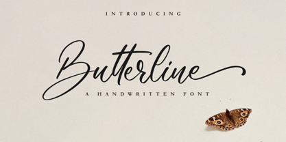 Butterline is a beautiful and elegant script font. Its modern and classy look makes it the perfect font for creating outstanding DIY projects! This font is PUA encoded which means you can access all of the glyphs and swashes with ease! It features a varying baseline, smooth lines, gorgeous glyphs and stunning alternates.
 - Celtiva Florance by GuseType,
$12.00 Celtiva Florance is a display serif font. This font is perfect for various designs especially classic, retro and vintage style. this font also good for your project like logotypes, magazine headlines, posters, cover albums and much more. Celtiva Florance provides a collection of glyphs include numeral & symbols, multilingual support, alternative glyphs & ligatures.
 - VTCKomixationHand - Unknown license

- Spinat by Bogstav,
$16.00 Spinat is spinach in danish. I like all kinds of things with spinach: salads, lasagne, fish, burgers and even with spinach! Yes, I love spinach so much I can eat it without anything else! :) I hope you too like spinach or even Spinat - it has 5 different versions of each letter and multilingual support.
 - Square Cat by Lalelum,
$12.99 This is a blocky typeface with thick lines and no serifs. It's a modern design with a hint of vintage lettering with a thicker vertical line on one side of each letter. Most letters are square shaped. The two styles are regualar and hollow, with the hollow style having the thicker areas hollowed out.
 - Understory by Hanoded,
$15.00 Lately I feel reluctant to watch the news: The Amazon Forest is burning, Australian forests are burning, palm oil controversy… It really brings tears to my eyes to see all this destruction around me. It is like people hate nature with a vengeance - I cannot explain it otherwise. I made this font to take my mind off things. It was loosely based on Futura, a font I really like. Understory was completely made by hand. It comes with some cute upper case swashes and a whole bunch of diacritics. The good thing is: no trees were cut down or burned to make this font; in fact, I donated a nice amount of $ to help save the rainforests!
 - 1536 Civilite Manual by GLC,
$42.00 This font was created inspired from a handwritten copy of the "Brief story of the second journey in Canada" (1535) by French explorer Jacques Cartier. It is an early "Civilité" manual style, closely looking like the "Civilité" script font carved by Robert Granjon a few years later and still strongly influenced by blackletters forms, clearly visible in the capitals or long s, d, e, f or t forms. (Look at our "1557 Civilite Granjon Pro" and the latest "1638 Civilite Manual"). It is containing Western (including Celtic) and Northern European, Icelandic, Baltic, Eastern, Central European and Turquish diacritics. Historical forms, titling alternates and the numerous lower alternates or ligatures made the font looking like a real various hand.
 - Bronwen by Hanoded,
$15.00 In Welsh mythology, Bronwen was the daughter of Llyr, the god of the sea. It is a popular girls name in Wales and it apparently means "white breast" or "pure heart". I really like this name and I think it fits the font. Bronwen is a fantasy font with a bit of roughness to it. It comes with some curly swashes and a handful of alternates. Use it for your books, cards and products!
 - Feuerfeste - Unknown license

- Fidelma by Patricia Lillie,
$29.00Can't decide whether you're feeling archaic or modern today? Try Fidelma. Fidelma is drawn entirely with straight lines, no curves, giving it a rough but still readable look.Includes four fonts: Regular, Bold, ExtraBold, and a nifty set of Drop Caps. - 21 Emmerson by Deniart Systems,
$20.00 A bit grungy, a bit stern, 21 Emmerson is a tribute to my birthplace and was designed with punky headline posters in mind. The simple lines of this font are angular and sharp - great for party posters, invitations, labels, etc.
 - ITC Wild West by ITC,
$29.99Janet Murphy designed ITC Wild West Pi in 1997. A symbol font containing all of the cowboy-like pictograms one could ever need, ITC Wild West Pi includes such symbols as a ten-gallon hat, horseshoes, revolvers, and steer skulls. - P22 Basala by IHOF,
$24.95 P22 Basala was created using straight horizontal and vertical lines, but with large rounded corners to create an unconventional softness for a bold face. The naming of the font reflects this juxtaposition: Basara= Basala= (in Japanese) free and unrestrained, unconventional.
 - Herbie by The Infamous Foundry,
$49.00 Herbie is a uppercase display font with alternates on every character (upper/lowercase), based only on circles and geometric lines. Herbie is inspired by, as the name might indicate, Herb Lubalin’s work and the decorative style and kerning of his era.
 - Ignorant by Bogstav,
$14.00 Ignorant was actually drawn on a grid. But due to the loose strokes of the pen, Ignorant has a lively look. I was thinking products for kids, packaging, organic products or something alike that needs a slightly rough and handmade font!
 - Courant by Hanoded,
$20.00 Courant means "newspaper". Courant font was modeled on 17th century Dutch newspapers and most of the glyphs are authentic. The 'modern' glyphs, like @, $, €, * and several others have been designed by me, as they were not in use in the 1600's.
 - Thinkerbery by Mightyfire,
$15.00 Need a semi-formal yet unique font? Thinkerbery is the answer! The look of Thinkerbery is like a digital typing style but still has its uniqueness. We bring a strong looks for your text. Enjoy in creating unique arts using Thinkerbery! :)
 - April Rain by Scrowleyfonts,
$16.00 April rain is a delicate, elegant font with teardrop line endings. It is designed to be interesting and a little unusual while remaining robust enough to be used in a variety of contexts from titling and lists to short paragraphs.
 - Egyptian Oldstyle by Solotype,
$19.95Here's a wide, very light version of the widely known font P. T. Barnum (or French Clarendon, if you prefer). We have used this to good effect as secondary lines on old fashioned stationery. Reads well in very small sizes. - Czykago Rough by TypoGraphicDesign,
$19.00 From 2019 back to the 90s … The typeface “Czykago Rough” by Alexander Branczyk and Manuel Viergutz is a re-issue of the font “Czykago” published in 1995 by the font label “Face2Face”. Designed as a re-release for the Font Foundry “Typo Graphic Design” in 2019. The rough sans serif display font is inspired by the 80s and 90s. Glyhph-Set: Latin Extended (Adobe Latin 3). 907 glyphs with 3× A–Z & a–z and 350+ decorative extras like icons, arrows, dingbats, emojis, symbols, sign of the zodiac, geometric shapes, catchwords, decorative ligatures (type the word #LOVE for ❤ or #SMILE for ☺ as OpenType-Feature dlig) and stylistic alternates (4× stylistic sets). For use in logos, magazines, posters, advertisement plus as webfont for decorative headlines. The font works best for display size. Have fun with this font & use the DEMO-FONT (with reduced glyph-set) FOR FREE! ■ Font Name: Czykago Rough ■ Font Weights: Cond + Stretch + Mix + CondBG + Icons + DEMO (with reduced glyph-set) ■ Font Category: Display for headline size ■ Font Format: .otf (OpenType Font for Mac + Win) + .ttf (TrueType Font) ■ Glyph Set: 907 glyphs with 350+ decorative extras like icons ■ Language Support: 80+ for Latin Extended (Adobe Latin 3). Afrikaans, Albanisch, Baskisch, Bemba, Bena, Bosnisch, Dänisch, Deutsch, Englisch, Estnisch, Färöisch, Filipino, Finnisch, Französisch, Friulisch, Galizisch, Gusii, Indonesisch, Irisch, Isländisch, Italienisch, Kabuverdianu, Kalenjin, Katalanisch, Kinyarwanda, Kölsch, Kornisch, Kroatisch, Lettisch, Litauisch, Luhya, Luo-Sprache, Luxemburgisch, Machame, Madagassisch, Makhuwa-Meetto, Makonde, Malaiisch, Manx, Morisyen, Niederländisch, Niedersorbisch, Nord-Ndebele, Norwegisch Bokmål, Norwegisch Nynorsk, Nyankole, Obersorbisch, Oromo, Pare, Polnisch, Portugiesisch, Rätoromanisch, Rombo, Rukiga, Rumänisch, Rundi, Rwa, Samburu, Sango, Sangu, Schottisches Gälisch, Schwedisch, Schweizerdeutsch, Sena, Shambala, Shona, Slowakisch, Slowenisch, Soga, Somali, Spanisch, Suaheli, Taita, Teso, Tschechisch, Türkisch, Turkmenisch, Ungarisch, Vunjo, Zulu ■ Specials: Alternative letters, stylistic sets, automatic contextual alternates via OpenType Feature (3× different versions of A–Z & 0–9 + a–z), Euro, kerning pairs, standard & decorative ligatures, Versal Eszett (German Capital Sharp S), 350+ extras like Dingbats & Symbols, arrows, hearts, emojis/smileys, stars, further numbers, lines & geometric shapes ■ Design Date: 1995–2019 ■ Type Designer: Alexander Branczyk and Manuel Viergutz
 - Fine Dining JNL by Jeff Levine,
$29.00 The lettering for Fine Dining JNL was inspired by the opening titles for the 1940 Barbara Stanwyck-Fred MacMurray film "Remember the Night". A stylized Art Deco sans, the typeface conjures up images of elegant dining, being out on the town and all we warmly associate with the night life of the 1930s and 1940s.
 - 1557 Civilité Granjon by GLC,
$42.00 Living from 1545 in Lyon, France, the famous punchcutter Robert Granjon created a typeface that looked like his own handwriting. The first book printed with this font, in 1557, was probably Dialogues de la vie et de la mort by Innocent Ringhier. We offer the complete typeface. It is a charming font with historical forms (long s, final s and others) and many ligatures, enriched with accented letters and other characters that did not exist in the original (thorn, eth, lslash and others), and a lot of alternates that permit rich and varying typography. Warning: all characters appear with the 1500s manual blackletter old style, especially letters “e” “r” or “h” alternate and some ending forms, and may be difficult to read at first, but it quickly becomes very easy. The font contains all characters for Baltic, Western European (Including Celtic), Eastern European, Northern European, and Turkish languages.
 - PF Square Sans Condensed Pro by Parachute,
$79.00 Square Sans Pro is one of Parachute’s most popular typefaces. It has been used by the likes of companies such as Samsung and organizations like the European Commission. Now a new version has been released. Square Sans Condensed Pro is a square-shouldered, modern and self-assured text typeface which lends style to a variety of projects. With its generous x-height, full-bodied counters and uniform stroke weight, it provides high legibility and uniform typographic color at all sizes. This is an exceptionally warm and comprehensive type family -with slightly rounded edges and softened curves- which possesses a robust and friendly appearance. The family consists of 12 fonts -from extrablack to thin- including true italics. It supports opentype features like small caps, fractions, ordinals, etc. and offers multilingual support for all European languages including Latin, Greek and Cyrillic. Download its complehensive PDF Specimen Manual for further details.
 - Carat by Hoftype,
$49.00 Carat is a contemporary interpretation of a classic serif type. Fresh and clean in appearance. Straight, unsentimental and objective. Ideally suited for text but also with crisp details in display. Well-equipped for ambitious typography, the Carat family consists of 12 styles, comes in OpenType format with extended language support for more than 40 languages. All weights contain small caps, proportional lining figures, tabular lining figures, proportional old style figures, lining old style figures, matching currency symbols, fraction- and scientific numerals.
 - Rectilinear Ornaments by Gerald Gallo,
$20.00 Rectilinear Ornaments are radiating geometric shapes composed of straight lines. There is an assortment of 47 ornaments located under the character set keys.
 - Lenorah JNL by Jeff Levine,
$29.00Lenorah JNL is a block-like design with spur serifs and is one of a number of wood type revivals by Jeff Levine. - Heath Notted by YuliusParyadi,
$11.00 Heath Notted is suitable for display like poster, halloween, witch theme. We created it inpired by the night, because some times night is not always just dark, but sometimes it's beautiful. Heath Notted is includes: - full set uppercase and lowercase letter; - numerals; - large number of punctuations; - ligatures, and swash. Please add this font as your favorit, hit like button, or follow me. I'll very happy for that and aprreciated it. Thank you!

