10,000 search results
(0.032 seconds)
- Ollie Wollie by Thomas Käding,
$2.00 A simple sans-serif font made from straight line segments and true circles and arcs.
 - FG Caroline by YOFF,
$14.95FG Caroline is a thin handwriting font. It's charming and looks like real notebook scrawls. - AZN Knuckles Varsity by AthayaDZN,
$10.00 Introducing "AZN Knuckles Varsity" font by AthayaDZN. Revolutionizing a varsity slab serif, combining sharp and rounded edges, angled serif, and a variety of weights, fitting it into the modern scene. Equipped with 3 styles ( Defined, Regular, Stencil ) Use the Defined version if you are aiming for that slab serif look, just like the name suggested, it defines the modernized slab serif on each letter, giving it that retro look yet still in the modern scene. Especially on the light weight of this version, the slab serif is really prominent. Use the Regular Version if you are aiming for any type of design that you see this font fits especially the modern scene, just like how it's advertised. Use the Stencil version if you are aiming to make a statement, my favorite one is the Bold and Italic version of the Stencil if I was to make a statement, just like the preview where it says "Anarchy", the separated shapes of the letter combined with it's bold and slanted shape is perfect to make a strong statement. Language Support : Afrikaans, Albanian, Danish, Dutch, English, Estonian, Filipino, Finnish, French, Galician, Indonesian, Irish, Italian, Luxembourgish, Norwegian, Portuguese, Romansh, Scottish Gaelic, Spanish, Swedish, Swiss German, Uzbek (Latin). And that's it for this font, thank you for purchasing the product, I wish you success on your projects. Please enjoy the font and let me know if you needed any help or if you have any questions -Athaya twitter.com/Athaya_DZN behance.net/athayadzn
 - Core Narae by S-Core,
$59.00 CoreNarae is an upright, casual handwriting style font and all glyphs have been hand-crafted. This typeface is live and friendly because of its bending strokes and rhythmic feeling, so it is good for fun text for posters, headers or cards. Supported codepages are MS Windows 1252 Latin1 and MS Windows 949 Korean consisting of 11,172 Korean letters and Symbols except Chinese. This font will make your works more friendly and emotional.
 - Tyrumate by Differentialtype,
$12.00 Tyrumate is an elegant serif font with a vintage touch and classic. Comes in two styles, regular and italic. Its clean lines and meticulous attention to detail embody the essence of classic typography, making it a chic serif font. Tyrumate is suitable for template design, brochures, videos, advertising branding, logos, invitations, layout designs, elegant crafts, beauty designs, and much more. It will add a splash of luxury to any design project you want to create!
 - Western Nightmare by Woodcutter,
$55.00 The Font has an aggressive and bloody appearance, evoking the wild west and supernatural horror. The design is dense and strong, with each letter occupying a significant space in the line. Overall, the font creates a sense of danger, death, and horror in the old west. It's perfect for use in horror western movie posters, event advertisements, or anywhere you want to create an atmosphere of suspense and tension in the wild west.
 - Kinsey by Talbot Type,
$19.50 Kinsey is inspired by traditional typewriter font styles. Although now largely consigned to history, the bulbous slab serifs and soft curves of typewriter fonts have left a lasting legacy; they’re paradoxically easy on the eye, yet utilitarian and business-like. Kinsey offers a modern take on this classic style and is available in a full family of five weights and includes a ‘proper’ italic with modified characters for an easy, flowing style.
 - ArgentaBobbed by Ingrimayne Type,
$5.00ArgentaBobbed is an informal, "hand-printing" font with little balls that some people, often children, like to add to the ends of strokes. Maybe it could be called a ball-serif or dot-serif font. The family has six members. Each of the two weights, plain and bold, have oblique styles. There are also two variants: ArgentaBobbed-Wig is squiggly handwriting with the dots, and ArgentaBobbed-Squish is condensed handwriting with dots. - Ollives by Olivetype,
$18.00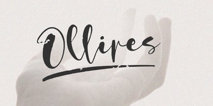 Introducing Ollives, a stylish modern calligraphy-styled script font. This beautiful font is perfect for adding a touch of elegance to any project. With its flowing lines, cool textures and graceful curves, Ollives is sure to add a touch of class to your work. So what’s included : Basic Latin Uppercase and Lowercase Numbers, symbols, and punctuations Multilingual Support. PUA Encoded and fully accessible without additional design software Simple Installations works on PC & Mac Thank You.
 - FP Dancer Tango by Fontpartners,
$29.00 FP Dancer Tango is a humanist-influenced techno-like font, designed 2012-14 by Morten Rostgaard Olsen & Ole Søndergaard. FP Dancer Tango will be a useful tool, helping you to create wonderful headlines and text-columns in magazines and so. The font is surprisingly readable, even in small point sizes. Among other things as a result of the smooth transitions between the angular shapes. In addition, the condensed shapes saves a lot of space.
 - Georude by Letterhend,
$17.00 Introducing, Georude, a quick geometry font. This font is perfectly made for branding, packaging, headline, logos, magazines, books, greeting / wedding cards, packaging, fashion, make up, stationery, novels, labels or any type of advertising purpose. Features : uppercase & lowercase numbers and punctuation multilingual PUA encoded We highly recommend using a program that supports OpenType features and Glyphs panels like many of Adobe apps and Corel Draw, so you can see and access all Glyph variations.
 - Logo Sans by Emily Lime,
$16.00 Logo Sans is a clean, geometric sans-serif created with an obvious use in mind - logos (although quite suitable for longer texts as well). It is a clear, easy to read font that comes in a variety of weights & italics ...allowing for pleasing logo design combination and marketing pieces. Its wide characters and linear lines have a very modern, luxurious appeal. The family includes 5 weights...plus italics - for a total of 10 fonts.
 - Fanky Bubble by Fitrah Type,
$12.00 Fanky Bubble is the newest typeface with a bubble graffiti style. There are three styles of font. Regular, line, and extrude styles Inspired by a throwup of graffiti. The entire typography has been designed to work on large sizes. This font is good to use on posters, zines, hero websites, stickers, and t-shirts. Features : - Lowercase & Uppercase ( All Caps ) - numbers and punctuation - Alternate & Ligature - multilingual - PUA encoded Please contact us if you have any questions.
 - Dramatic Style by Juncreative,
$19.00 Dramatic Style is a delicate, elegant and flowing handwritten font. It has beautiful and well balanced characters and as a result, it matches a wide pool of designs. Add it to your most creative ideas and notice how it makes them come alive! This font is PUA encoded which means you can access all of the glyphs and swashes with ease! It features a varying baseline, smooth lines, gorgeous glyphs and stunning alternates.
 - Jerhiyof by Stringlabs Creative Studio,
$29.00 Jerhiyof is a delicate, elegant and flowing handwritten font. It has beautiful and well balanced characters and as a result, it matches a wide pool of designs. Add it to your most creative ideas and notice how it makes them come alive! This font is PUA encoded which means you can access all of the glyphs and swashes with ease! It features a varying baseline, smooth lines, gorgeous glyphs and stunning alternates.
 - Friday Freak PB by Pink Broccoli,
$16.00 Friday Freak PB is a playful font inspired by the titling of the 1976 Disney film, "Freaky Friday". This font has a slightly clumsy stumble to it, adding to its personality and appeal. From slightly weird weighting to a ligatures feature that will auto-shuffle all-caps and all-lowercase settings to have a mix of both, keeps typesetting lively. Stir things up and get a little crazy with Friday Freak today!
 - Massillo by Nissa Nana,
$23.00 Massillo is a delicate, elegant and flowing handwritten font. It has beautiful and well balanced characters and as a result, it matches a wide pool of designs. Add it to your most creative ideas and notice how it makes them come alive! This font is PUA encoded which means you can access all of the glyphs and swashes with ease! It features a varying baseline, smooth lines, gorgeous glyphs and stunning alternates.
 - Daily Tabloid JNL by Jeff Levine,
$29.00 Daily Tabloid JNL was redrawn from a set of wood type that was popularly used for newspaper headlines, posters, broadsides and the like.
 - Print Embellishments JNL by Jeff Levine,
$29.00 Print Embellishments JNL gathers together a number of vintage typographic enhancements that can be used as simple spot decorations, rule lines or borders, adding a bit of design elegance to any project.
 - Aeogo Pro by ffeeaarr,
$9.00 Aeogo is unique font, the form was made are different like as usual. we made it include a pixel style font
 - Wine Stoney by Forberas Club,
$16.00 Wine Stoney font is inspiration from simple cloud. This font can use for comic style , cartoon, and serious like horror themes.
 - Larisch by HiH,
$8.00 Larisch is a hand-lettered design by the Austrian calligrapher and teacher, Rudolf von Larisch. The original was used for the title page of the 1903 edition of Beispiele Kunstlerischer Schrift (Examples of Artistic Writing). Larisch is an attractive, casual set of caps of even strokes with rounded terminals. Except for the terminals, it is similar in style to Kunstler Grotesk. The numerals are lining or ranging figures, meaning they line up with the baseline, unlike old-style text figures. All are of equal width for setting up columns of numbers. The letters are well formed and easy to read, as you would expect from a writing master. Ligatures includes CH (123), CK (125), FT (135), LA (137), LO (167), OO (172), CO (177) and TT (181. An alternative O with underscore is provided at position 111. Friendly, but not fancy -- a very useful all-cap font.
 - Red Border Labels JNL by Jeff Levine,
$29.00 In the pre-computer, pre self-adhesive label era of office supplies a number of companies (including Dennison, Maco and Denny-Reyburn) manufactured a wide variety of gummed labels for just about any use or purpose. Blank labels, specialty labels and decorative holiday seals were just a part of this line. One popular style was that of labels with parallel thick-and-thin borders of red lines and corners chamfered, rounded or straight cut. Occasionally, one could find similar labels with blue, green or gold borders but red was the mainstay, hence naming this typeface Red Border Labels JNL. Presented in this font is a collection of twenty-six standard and specialty shape label borders on the capital (A-Z keys) and twenty-six solid panel versions on the lower case (a-z) keys which can be used as backfills for the borders or as stand-alone labels.
 - Haboro Sans by insigne,
$- Quit trudging through the thick with encumbering fonts, and spring to the front of the pack with the cutting edge sans serif, Haboro Sans. With nothing to clutter up your work, your editorial designs, websites, and software will be sharp and clear. While this hyperfamily is simple in character, it (like Haboro Slab and Haboro as well) provides you with plenty of options. Haboro Sans features simple geometric shapes to help you achieve that perfect effect wherever you use it. Enjoy the comforting reassurance that this multi-tool of a typeface family can work on most anything, including packaging, branding, web copy, and more. Take the simplicity of Haboro Sans a step farther with OpenType features, too. Haboro Sans contains special glyphs like Titling, Small Caps and Oldstyle figures that give your work just enough of a distinct touch. For even more options, use the entire Haboro hyperfamily to expand your capabilities. Put some simple class into your projects with the traditional look of Haboro Sans. Your layouts, websites, iPhone apps, advertising, and newspapers (to name just a few) will thank you.
 - Little Ribbon by IKIIKOWRK,
$17.00 Introducing Little Ribbon - Cutie Type, created by ikiiko. Little Ribbon is a beautiful handwritten typeface with bold shapes combining simple lines. This letter is suitable if you want to show a cheerful impression or playful design with solid color. This typeface is perfect for an kids stuff like ads, poster, flyer, or email blast. And also good for packaging product, food & beverages, quotes, or simply as a stylish text overlay to any background image. What's included? Uppercase & Lowercase Number & Punctuation Stylistic & Swashes Multilingual Support Get also a good offer & FREEBIE at our site : www.ikiiko.com Enjoy our font and if you have any questions, you can contact us by email : ikiikowrk@gmail.com
 - Vialog 1450 by Linotype,
$40.99Designed by Werner Schneider and Helmut Ness, the Vialog® 1450 typeface family has been drawn within the standards of the German DIN 1450 regulations. The typefaces conform to the DIN specifications for proportion and line thickness and also contain characters designed in accordance with its requirements. These include characters that can be easily confused, such as uppercase I and lowercase l, and the uppercase O and figure 0, with the corresponding accentuating graphemes and ligatures. In addition, letter pairs that can readily seem to merge together under less than ideal reading environments have also been redesigned. Characters like the g, J and R have also been redrawn to be more legible. Normal glyphs are available as alternatives. - Gotti by Resistenza,
$39.00 Introducing Gotti. Where Timeless Precision Meets Seventies Flair We are thrilled to unveil our latest creation, Gotti font family, born and meticulously crafted during an inspiring journey to Goteborg. This typeface seamlessly fuses the Bauhaus essence with the spirited vibes of the seventies, resulting in a font that's not just a visual treat but a design experience. Gotti draws its creative fuel from the geometric elegance of the Bauhaus movement, prioritising functional simplicity and razor-sharp lines. However, its design journey doesn't end there. Imbued with the unmistakable energy of the Seventies, Gotti emerges as a font family that encapsulates both nostalgic charm and contemporary boldness. At its core, Gotti boasts a geometric skeleton that has been intricately designed to redefine precision. Ranging from light to black, the weight variations offer a broad spectrum of expressive possibilities. Gotti is perfect for display use, advertising, and branding, it transforms your creative vision into a visual masterpiece. Stand out with confidence, whether it's a captivating logo, a compelling headline, or an unforgettable advertisement. Elevate your brand identity with Gotti. It brings strategic branding to life, communicating sophistication and modernity. Your advertising materials become memorable works of art, leaving a lasting impression on your audience. Curious about the magic Gotti can bring to your designs? Our showcase reveals real-world applications, demonstrating its adaptability and aesthetic appeal. See for yourself how this font family turns ordinary designs into extraordinary visual experiences. Follow us on social media for updates, inspiration, and a glimpse behind the scenes. Have questions or just want to share your thoughts? We're here for you!
 - Saturday Brunch by Rachel White Art,
$18.00 Saturday Brunch is a smooth script. It fits into tight and tall places, has big loops, and lots of attitude. Saturday Brunch has a set of alternate lowercase letters with no tails (which are coded to work with tricky letters like x and z who don't play well with tails), a bunch of double letter ligatures, and a few fun alternates, like t's with long swooping crossbars, and 3 alternate ampersands so you can pick the perfect style for your project.
 - Tooth & Nail by Set Sail Studios,
$12.00 Introducing Tooth & Nail; a rustic & hearty hand-painted dry brush font, designed to work in both all-caps as well as lowercase. It also includes a bonus vector pack, featuring 24 elements designed to boost your text and reaffirm it's hand-made style. With rough bold strokes and high quality textures throughout, Tooth & Nail is the perfect workhorse font for product packaging, promotional messages, handwritten quotes, home decor and branding projects. Tooth & Nail is reliable and familiar, like meeting someone for the first time and feeling like you've been reunited with an old friend. Tooth & Nail consists of 2 styles: 1. Tooth & Nail • A handwritten brush font containing upper & lowercase characters, numerals and a large range of punctuation. 2. Tooth & Nail Alt • This is a second version of Tooth & Nail, with a completely new set of lowercase characters. If you wanted to avoid letters looking the same each time to recreate a custom-made style, or try a different word shape, simply switch to this font for an additional layout option.
 - Loraine by Homelessfonts,
$49.00 Homelessfonts is an initiative by the Arrels foundation to support, raise awareness and bring some dignity to the life of homeless people in Barcelona Spain. Each of the fonts was carefully digitized from the handwriting of different homeless people who agreed to participate in this initiative. MyFonts is pleased to donate all revenue from the sales of Homelessfonts to the Arrels foundation in support of their mission to provide the homeless people in Barcelona with a path to independence with accommodations, food, social and health care. Loraine was born in London. She was an ordinary, hardworking family person, with nothing to worry about beyond paying the rent at the end of the month or keeping the fridge full. Until in 2009 she came to Barcelona on holiday. Soon after she arrived her passport was stolen from her and she had a series of problems with the British embassy. Somebody had made illegal use of her passport. So Loraine found herself in a strange place, unable to get home. She didn’t know anyone there and her circumstances meant she couldn’t ask for help from England, either. She had to sell all her possessions and, in time, learn to speak Spanish. “Living in the street is a wonderful adventure,” she says. In the street she discovered a new city, a new country and a new culture. “There are lots of people who prefer to sleep under the stars.” She also made lots of friends who helped her in a completely unfamiliar world.
 - Morris Sans by Linotype,
$40.99 Morris Sans is a newly revised and extended version of a small geometric family of typefaces originally produced by Morris Fuller Benton in 1930 for ATF. His initial design consisted of an alphabet of squared capital letters with a unique twist that characterized its appearance: corners with rounded exteriors and right-angle interiors. The types were intended for use in the fine print found on business cards, banking or financial forms, and contracts. But over the ensuing decades, this design became a popular element in all sorts of design environments, and several foundries revived the typeface in digital form. Since digital fonts are bicameral, with slots for both upper and lowercase letters, new cuts of the type opted filled the lowercase slots with small caps. In 2006, Linotype commissioned its own version of the typeface-an extension for 21st century use. Under the advisement of Linotype's type director Akira Kobayashi, Dan Reynolds redrew the uppercase and added an original lowercase for the first time. Additionally, a number of extras were brought into the fonts, including six figure styles (tabular and proportional lining figures, tabular and proportional oldstyle figures, and special tabular and proportional small cap" figures). Small caps, which have become an iconic element over time, are accessible in each font as an OpenType feature. To differentiate this version from the original, Linotype's new family is named Morris Sans, in honor of Morris Fuller Benton. All fonts in the Morris Sans family are OpenType Com fonts; they include a character set capable of setting 48 European languages that employ the Roman alphabet, including all Central and Eastern Europe languages, those from the Baltics, and Turkish. This glyph coverage extends to the small caps as well. Morris Sans is a wide typeface, especially in its regular widths; the condensed faces set a more conventional line of text. The new lowercase letters are less geometric than the uppercase, except for those that share the same basic forms (e.g., c, o, and s). Instead of following this geometric trend, the new lowercase tends to strengthen the humanist elements that were present in several characters from the original type, including the uppercase D and the figures 5, 6, and 9. Morris Sans also sports a number of glyphic flares, like the stroke found on the original uppercase Q. Morris Sans is a clean, modern design best suited for headlines, advertising, posters, expressive signage (especially on storefronts), and corporate identity work."
 - Genie by Canada Type,
$24.95The flower children of Canada Type are at it again. This time we went above and beyond the call of duty and right into the land of reconstruction in order to make this font. When we saw a few letters from an early 1970s film type called Jefferson Aeroplane, we had the sudden urge to bring their beauty to digital life. But since further research revealed no more letters or information, we just had to "wing" the rest of this Aeroplane. Now this Genie is out of the lava lamp, and it's nothing short of groovy. A few symbols and alternates come within the font, so make sure to check out the very full character set. We love this font so much that we couldn't help but play with it for a week. Some of the Wes Wilson-inspired results are in this page's gallery, so check them out for a flashback. Keep on trucking! - FF Pastoral by FontFont,
$50.99 A sturdy workhorse with the grace of a gazelle, the FF Pastoral typeface family marries pure craftsmanship with rapturous excesses of form. With his fifteenth release under the FontFont brand, prolific French designer Xavier Dupré has filled a typographic toolbox with plentiful options ranging from a tender, feathery Thin to a robust, healthy Black. At a glance, FF Pastoral appears deceptively simple, particularly in the middle weights. That surface serenity is intentional and allows for easy reading and quick comprehension of short blocks of copy. Upon closer inspection, FF Pastoral is complex and nuanced, carrying a balanced tension in its forms. This plays particularly well in magazine spreads and corporate logos, where uniqueness is a virtue. In creating his latest design, Dupré drew inspiration from a tasteful mix of references, combining diverse elements with a deft hand. While its letter shapes were informed by humanist-geometric hybrid Gill Sans, FF Pastoral’s proportions have been optimized for contemporary typography. Slightly condensed but generously spaced, FF Pastoral features a tall x-height, open counters, and subtle, sprightly italics slanted at just 5°. Proportional oldstyle figures are the default in the family, with tabular and lining numbers and fractions accessible through OpenType features. Elegant details evocative of calligraphy judiciously pepper the FF Pastoral glyph set. The ‘e’ bears an oblique crossbar, while the right leg of the ‘K’ and the ‘R’ are insouciantly curved in both the upright and italic variants. Further flourishes appear throughout the italics, notably in the ‘T’ and the ‘Z’, the gloriously looped tail of the ‘G’, and an extraordinary ampersand. Sharp-eyed fans of Dupré’s work may feel like they’re in familiar territory, and they would be right. An early version of FF Pastoral sprang to life in 2017 as Malis, a family in four weights on the heavier side of the spectrum. Over time, Dupré refined his original design, expanding it with four lighter styles and including true italics for all. The lightest weights are ethereal, with exquisitely delicate strokes drawing the eye in and across a line of type. The most substantial styles are tremendous in their power, allowing text to make a deep impression in print or on screen. Fully fleshed out, FF Pastoral works sublimely in a vast array of text and display settings. Dupré sees his latest FontFont offering as a ‘cultural’ typeface, perfect for the pages of an oversized coffee-table book or business communications where warmth and informality will win the day. Born in Aubenas, France (1977), Xavier Dupré is a gifted user of type as well as an award-winning type designer and lettering artist. After training in graphic design in Paris, Dupré studied calligraphy and typography at the Scriptorium de Toulouse. Since releasing FF Parango in 2001, Dupré has published such FontFont classics as the FF Absara and FF Sanuk superfamilies, FF Megano, FF Tartine, and FF Yoga. A designer of Khmer fonts as well as Latin typefaces, Dupré splits his time between Europe and Asia.
 - Holo by Missin Glyphs,
$25.00 Inspired by 'Neon Sign' lettering, Holo is a modern, modular, mechanical & industrial display font constructed entirely with polygonal shapes. Holo is suitable for large display settings like sports jerseys, shop fronts, billboards and neon signs.
 - Dining Room JNL by Jeff Levine,
$29.00 Inspired by the basic letter concept of Walter Huxley's 1935 gem Huxley Vertical, Dining Room JNL is a completely re-drawn typeface, adding even more of an Art Deco feel to an already classic Deco-era letter form consisting of condensed, rounded letters. Thick vertical lines balance against lighter weight ones, giving a dramatic contrast so typical of the Streamline Era of design concepts. This font marks another milestone in the Jeff Levine library of retro-inspired type faces. Beginning in 2006 with only ten designs, the collection has grown steadily with Dining Room JNL being the 750th font in the library.
 - Boston Angel by Great Studio,
$18.00 Boston Angel Serif is a modern vintage serif font packaged in a modern and classy style, complete with access to your OpenType features to access a large selection of alternates letters and ligatures, the choice of letters you like from variations of uppercase and lowercase letters to get a display luxurious and elegant. Unique, playful and versatile serif family with 35 ligatures and 114 alternatives to beautify the design you like. This font is perfect for branding projects, Logo design, Clothing Branding, packaging, magazine headings, advertising, T-shirts, postcards and much more. What is included: Boston Angel Thin Boston Angel Light Boston Angel Regular Boston Angel Medium Boston Angel Bold Features • All Uppercase and Lowercase • Number & Symbol • Supported Languages • Alternates and Ligatures • PUA Encoded If you have any questions, don't hesitate to contact me. Thank you, Great Studio
 - Ballerina by profonts,
$51.99 Ballerina Pro... sounds like music, ballet, elegance and classic quality. That's exactly how Ballerina Pro carries the message to the reader. Ballerina Pro is a more of a formal script, light-weighted and quite beautiful, redesigned, digitized, completed and expanded as OpenType in the profonts type studio.Ballerina Pro comes with round about 600 characters covering the complete Latin glyph set for West and East including Baltic and Turkish. Additionally, there is a large selection of manually designed character combinations and alternates to make this beautiful script design a perfect font for OTF-savvy applications like e.g. InDesign or Quark Xpress 7.Ballerina Pro is a very distinguished, elegant and versatile script font well-suited for anything in the area of ballet, classical music, art, ballet etc. Also, it is good for certificates, reports, documents and alike.
 - Lapis Pro by Canada Type,
$29.95 Lapis was Jim Rimmer's venture into a territory he'd earlier explored with his Lancelot and Fellowship faces. This time he stayed much longer, dug pretty deep, and had plenty of fun in there. The end result is the kind of mosaic of influences only a guy like Jim could consider, gather, manage and apply in a way that ultimately makes sense and works as a type family. On the surface Lapis seems like something that can be billed as what Jim would have called an "advertising text face". But under the hood, it's a whole other story. On top of the calligraphic, nib-driven base Jim usually employed in his faces, Lapis shows plenty of typographic traits from a variety of genres, from Egyptian to Latin, from blackletter angularity to Dutch-like curvature, with an overall tension even reminiscent of wood type. There are some Goudy-informed shapes that somehow fit comfortably within all this. Then it's all strung together with a mix of wedged, tapered and leaning serifs, placed with precision to reveal expert spontaneity and a great command of guiding the forms through counterspace. In the fall of 2013, the Lapis fonts were scrutinized and remastered into versatile performers for sizes large and small. The three weights and their italic counterparts have been refined and expanded across the board to include small caps, alternates, ligatures, ordinals, case-sensitive forms, six kinds of figures, automatic fractions, and a character set that covers an extended range of Latin languages. Each of the Lapis Pro fonts contains over 760 glyphs. For more details on the fonts' features, text and display specimens and print tests, consult the Lapis Pro PDF availabe in the Gallery section of this page. 20% of Lapis Pro's revenues will be donated to the Canada Type Scholarship Fund, supporting higher typography education in Canada.
 - Linotype Brewery by Linotype,
$29.99Linotype Brewery is part of the Take Type Library, chosen from the contestants in the International Digital Type Design Contests of 1994 and 1997. This text font is available in six weights from light to black and was designed by Gustav A. Grinberg. An outstanding characteristic of the font is its light stroke contrast and its constructed forms. Its tiny, triangular serifs first become noticeable in very large typesizes, much like the Dutch fonts of the 17th century, Copperplate, for example. Linotype Brewery is cool and elegant and well-suited to middle-length texts and headlines. - Hoodie by TypeUnion,
$25.00 Hoodie was born out of a love for retro Americana and vintage signs but designed with a contemporary fresh twist that makes the font a true attention seeker. The font is made up of 7 weights, plus 3 fun specials (dots, lines and shade) that create a multitude of uses and options. From logos to packaging and everything in between, Hoodie will be an attention grabber in all types of layouts and placements. Hoodie has features such as extensive language support, case sensitive characters, ligatures and number options (Denominator, Numerator, Superior and Inferiors), making it a truly versatile font.