10,000 search results
(0.014 seconds)
- Glamour Absolute by Nicky Laatz,
$42.00 Introducing "Glamour Absolute" - A brand new "two-faced" bold serif with both modern and vintage curves. A Two-faced beauty : Modern or Vintage If you are going Vintage Retro : Access your OpenType features to access the large selection of alternate letters and ligatures, select the letters you like from the large variety to get the vintage look you are after. Vary between a light and heavy vintage look based on how many letters you alter. If you are going Modern Chic : Just type with regular letters :) Play with your letter spacing to add even more class to your designs. Due to its split personality , Glamour Absolute is a very versatile font, covering a wide range project types, from bold magazine imagery , to wedding invitations, to branding, poster design and so much more.
 - Full Moon BT by Bitstream,
$50.99A collaboration based on lettering by Vermont illustrator/artist Mary Trafton and brought to typographic life by Charles Gibbons, the Full Moon Suite is a collection of casual typefaces called after folk names for full moons. A winner of the TDC2 2003 Type Design Competition. Family members include: Falling Leaves, Rustling Branches, Black Cherry, Black Cherry Alternate, Black Cherry Ligatures and Black Cherry Doubles. - Moon Type by Thomas Käding,
$1.00 This font of Moon Type is modelled after Dr. Moon's original poster. He developed this embossed writing system to help those who have lost their sight later in life, and so are familiar with the shapes of English letters. Moon writing is still used, and you can find books written with it. This font only contains the letters and punctuation that are in the Moon Type system.
 - Candida by Bitstream,
$29.99German designer Erbar drew the Candida typeface for the Ludwig & Mayer foundry shortly before his death in 1935. The typeface was released posthumously in 1936. An italic designed by Walter Höhnisch was published the following year and a reworked version was produced in 1945. Bold weights followed in 1951. Thanks to its clarity and readability in small sizes, the Candida family remained popular in the digital age. - Gridlock by I Can Be Your Type,
$10.00A condensed font using constructivism history to convey the cold hearted steel of machinery and progress. Gridlock tries it's best to fit as much info as possible in a small space neatly in line and with the subtle curves and smoothness of bent steel. The inspiration for Gridlock actually came accidentally after designing some lettering for a self-promo project and it needed something that just was condensed with visual appear. So imagining about how condensed fonts feel, I imagined them being squished together just like cars in traffic are forced to work together to make it to their end destination. - Diediedie - Unknown license

- Morgan - Personal use only

- Wires and Cowboys - Unknown license

- esthervandenbos - Unknown license

- BACK TO SCHOOL - Personal use only

- Udon Soup by Hanoded,
$15.00 Udon Soupis my all time favourite Japanese food! I like it so much that I decided to name a font after it. Udon Soup font is a handmade script font, kind of messy, kind of weird, but very legible and useful. Comes with oodles of diacritics and double letter ligatures.
 - Storyboard by Atlantic Fonts,
$26.00 Storyboard is expressive, rough, partly connected and full of painterly, brushed energy like the sketches of a storyboard. It's bold and kind of edgy, but can be friendly too. There are tons of ligatures you can turn on or off depending on the look you're after. So what's your story?
 - Braderia by Aldedesign,
$25.00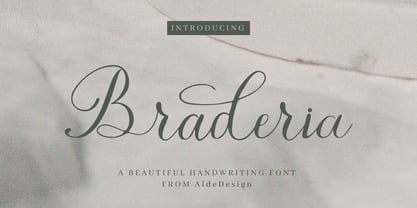 Braderia // Modern Calligraphy is a stylish script font that features a varying baseline, smooth line, modern, and depth of love. For those of you who need a touch of love and modernity for your designs or branding, it can be used for various purposes such as headings, weddings, invitations, signatures, logos, branding, t-shirt, letterhead, signage, labels, news, posters, badges, etc. Each Font Has: Stylish modern handwritten script Beautiful Swash (Ending tail) Beautiful Titling (Beginning tail) Special Ligatures Multilingual Support
 - Premiere Christmas by Aldedesign,
$25.00 Premiere Christmas // Modern Calligraphy is a stylish script font that features a varying baseline, smooth line, modern, and depth of love. For those of you who need a touch of love and modernity for your designs or branding, it can be used for various purposes such as headings, weddings, invitations, signatures, logos, branding, t-shirt, letterhead, signage, labels, news, posters, badges, etc. Each Font Has: Stylish modern handwritten script Beautiful Swash (Ending tail) Beautiful Titling (Beginning tail) Special Ligatures Multilingual Support
 - Cardigan Christmas by Aldedesign,
$25.00 Cardigan Christmas // Modern Calligraphy is a stylish script font that features a varying baseline, smooth line, modern, and depth of love. For those of you who need a touch of love and modernity for your designs or branding, it can be used for various purposes such as headings, weddings, invitations, signatures, logos, branding, t-shirt, letterhead, signage, labels, news, posters, badges, etc. Each Font Has: Stylish modern handwritten script Beautiful Swash (Ending tail) Beautiful Titling (Beginning tail) Special Ligatures Multilingual Support
 - Barrage by RagamKata,
$14.00 Barrage Display Font Barrage presents a modern take on typeface design, merging cheerful boldness with artistic touches. Each letter is meticulously shaped, striking a balance between confidence and elegance. The box-like lines provide a sturdy foundation, while the subtle curves add a delightful creative flair. With its lively boldness and delicate lines, Barrage conveys courage and a positive personality.
 - Sworded by Fabulous Rice,
$35.00 Sworded is a font family of 8 fonts that was inspired by such diverse things as architecture, tombstones, video games, watching old movies or reading comic books. The art of creating beautiful letters has slowly declined with the rise of the digital age and its solid-colour, 2D fonts. And most of the time, the care given to typography in cultural products just isn't what it used to be anymore. This was the inspiration for Sworded, a family of 4 layerable fonts that can bring a feeling of depth to its letters, and offers endless possible combinations. Sworded Regular is the basic shape of all the characters. Sworded Deep gives an impression of depth to characters or acts on its own as an illusion. Sworded Bright can be used as the bright side of a bevel. Sworded Dark can be used to flesh out the dark side of a bevel. Sworded Shadowed is a contour font with a shadow effect. Sworded Wire is a wire font without depth indication. Sworded Outline is an outline font. Sworded Hatched is a variation of Sworded Shadowed with lines giving a gradient illusion. But of course, any font can be combined with any other font(s) to obtain various results. There are hundreds possible combinations with these eight fonts. Have fun!
 - Sushi Bar by Hanoded,
$20.00 Since I am still in a Japanese mood, I decided to name this font after my favourite pastime in Japan: hunting for the smallest, nicest sushi bar in town. After all, there’s just nothing like eating freshly made sushi and washing it all down with a cup of green tea or a warm sake. Sushi Bar is a very detailed brush font - all caps, but upper and lower case differ and can be mixed. It is an ideal font for posters, albums, headlines and book covers. Comes with a bento box full of diacritics as well!
 - VLNL Spaghetti by VetteLetters,
$35.00 Originally drawn in 1999 as a college project with the ambition to make the ‘most beautiful’ alphabet in the world. After these heroic beginnings Spaghetti lay dormant in the VLNL vaults for many years, appearing to silently peter away. Now look at it! Ten years hence, it is finally being served up in glorious OpenType, precisely al dente. As automated special sauce, each lowercase character before or after a space receives a nice little ball ending to round things off. And finally, the parmesan cheese sprinkled on top is like a tasty bunch of ligatures – enough to make your mouth water.
 - Soft Rock by Studio K,
$45.00 Soft Rock is a bold condensed sans serif with rounded contours that contrives to be gentle and dynamic at the same time: rather like the soft rock bands (Chicago, Air Supply, Fleetwood Mac etc) after which it is named. It's a warm, friendly font ideal for branding everything from soup to soft furnishings.
 - Sketchica - Personal use only

- Lenga by Eurotypo,
$29.90 Lenga is a kind of beech originally from South America. The explorers who discovered this beech in Tierra del Fuego, thought it looked like a tree from their home country and named it 'Lenga'. Like many of southern hemisphere beeches, the Lenga beech is fast growing and hardy, making it an ideal timber tree. It regenerates easily after fires. The wood has good quality, moderate durable, and easy to work. The Lenga fonts were inspired in the nobility, robustness and flexibility of those trees. They have a distinctive personality within contemporary atmosphere. These fonts are quite appropriate for headlines, subheadings and with its text flow works very well for long texts. Their legibility is suitable for editorial purposes mainly in newspapers and magazines. Lenga comes in 16 styles carefully done in OpenType format. All styles contain standard and discretional ligatures, proportional lining figures, lining old style figures, scientific superior/inferior figures. The complete set supports Western European, Central and Eastern European languages.
 - KG Primary Penmanship by Kimberly Geswein,
$5.00 I come from a family of educators- my mom, husband, stepmom, brother-in-law, and sister are all currently teaching and I have taught in the past. This font was created after speaking to several elementary school teachers who were struggling to find just the right font to use on worksheets and projects in their classroom. They liked many features of other fonts, but needed small things altered in order to make a "perfect fit" for their class. Hand-drawn by me, this font hopefully addresses several of those issues. As penmanship styles vary across the globe, I am sure this font will not work in every classroom. But hopefully this style will work for many teachers to give their early readers a highly legible, neat, accurate font. It is best used with kerning turned on to allow for accurate letter spacing.
 - Hymers JNL by Jeff Levine,
$29.00 Born on May 8, 1892 in Reno Nevada, Lewis Franklin (“Lew” ) Hymers left an indelible mark as a caricaturist, cartoonist and graphic artist. At the age of twenty [in 1912] he worked for the San Francisco Chronicle. During World War I he worked for the Washington Post. He even was employed for a time by Walt Disney as an animator - but most of his life was spent in either Tujunga, California or his birthplace of Reno, Nevada as a self-employed illustrator. Hymers inked a feature for the Nevada State Journal called “Seen About Town”, which was published during the 1930s and 1940s. In this panel, he caricaturized many of the familiar faces around Reno. He also designed signs, logos, post cards and numerous other commercial illustrations for clients, but what has endeared him to a number of fans was his vast library of stock cuts (the predecessor to paper and electronic clip art) which feature his humorous characters in various professions and life situations. So popular is his work amongst those “in the know” that a clip art book collection of over seven hundred of his drawings that was issued by Dover Publications [but long out of print] commands asking prices ranging from just under $15 to well over $100 for a single copy. Lew Hymers passed away on February 5, 1953 just a few months shy of his 61st birthday. Although his artwork depicts the 1930s and 1940s lifestyles, equipment and conveniences, more than sixty years after his death they stand up amazingly well as cheerful pieces of nostalgia. The twenty-seven images (and some variants) in Hymers JNL were painstakingly re-drawn from scans of one of his catalogs and is but just a tiny fraction of the hundreds upon hundreds of illustrations from the pen of this prolific artist.
 - Polla - Unknown license

- Junkwerk by PizzaDude.dk,
$20.00 Junkwerk is my heavy metal grunge font! It has got that feel like something that was stamped on, jumped on, shaken and headbanged for hours...just like how you would feel after hours of heavy metal! Comes with different upper- and lowercase letters, alternate letters and ligatures for both double letters and double numbers - and ofcourse it has got unique accented letters! You will need to use OpenType supporting applications to use the ligatures.
 - Silly Habit by Bogstav,
$12.00 Don't we all have a silly habit? I've got mine, for sure! - like checking whether I remembered to bring my keys, immediately after locking the door...and then checking again like 2 minutes later! Silly Habit is my laid back comic font, easy to read and fresh enough for a design that needs an extra party to it! Comes with contextual alternates, which in this case means 4 different versions of each lowercase letter
 - Gerlach Sans by Juraj Chrastina,
$29.00 As the foundry’s top–of–the–line family, Gerlach Sans was named after the highest peak in Slovakia. Its functional design is enhanced by a few subtle ingredients, adding life and giving words a more playful voice. The family has eight weights ranging from delicate hairline to the super thick black. Each of them includes a genuine italic companion with variant shapes. The large character set accessible through OpenType features provides the designer with a wealth of opportunities and supports a wide range of Latin-based languages. It is stuffed up with tabular and proportional figures, old-style and lining figures, fractions, superscripts and subscripts, ordinals, case-sensitive forms, circled numbers, arrows, icons and many more. Combining legibility and usability of its grotesque style with cool elegance, Gerlach Sans provides a strong partner for your print and web project. You can download the instruction PDF here.
 - Longhorn by Belldorado,
$20.00 I saw a cool UT-Ligature on an old (maybe 70's or 80's) Texas Longhorns fan-shirt - it was in 3D and I wanted something like that with my own initials A and B to print it on a baseball hat. I started drawing it and when I was finished, I thought it might be nice to do the same for my officemates. I needed another G, T and K. After finishing that I thought it might be cool to do this for other people as well. Since the source of all the 3D glyphs is found in the regular ones which get moved by a 45 degree angle and then connected with lines , I first draw all the uppercase regular glyphs. The thing that followed was kind of an addiction: after finishing the uppercase letters, I wanted to add lowercase letters, after finishing the 3D letters, I thought it would be nice to have a fill version to layer with the 3D letters. Having a rough, woodcut version of the regular style would be cool, too. And the font is also pretty much suited to make a stencil version. When all this was done, I was interested on how the font would look like without the serifs and curves instead of the 45 degree angles, so I did the Longhorn Sans. Good to use for all sports-related designs, especially retro-style soccer/football shirts. Uppercase characters can be combined to form ligatures or logotypes.
 - ITC Tremor by ITC,
$29.99ITC Tremor is the work of British designer Alan Dempsey. You might think that it looks like the letters are in a seismically lively geological zone, but Dempsey had other kinds of motion in mind. Most of the faces I design come from trace 'work-outs' for advertising products. In the case of Tremor, it was to reflect a lively teenager," says Dempsey. The result is ITC Tremor, a cartoony slab serif typeface with irregular angles, straight-edged curves, and lines surrounding each character, making them look like they are jittery. - Luis Serra by Homelessfonts,
$49.00 Homelessfonts is an initiative by the Arrels foundation to support, raise awareness and bring some dignity to the life of homeless people in Barcelona Spain. Each of the fonts was carefully digitized from the handwriting of different homeless people who agreed to participate in this initiative. Please Note: these fonts include only the latin alphabet; no accented characters, no numbers or punctuation. MyFonts is pleased to donate all revenue from the sales of Homelessfonts to the Arrels foundation in support of their mission to provide the homeless people in Barcelona with a path to independence with accommodations, food, social and health care. Luis Serra was born in Alicante. There he grew up and even started a family His life was there. But at the age of 35 he split up with his wife and decided to go to Barcelona in search of a new life. And it wasn’t easy for him. He had to turn his hand to all kinds of jobs and didn’t manage to find the stability he needed. Luis is a shy, retiring person who takes great pleasure in the little things in life such as walking in the mountains or celebrating the victories of his football team, Barça. After four years living in Barcelona, Luis found himself in a position he’d never imagined. “The street’s much worse now, there’s more trouble, there’s more tension,” says Luís. In the street he had to learn, as he always had, to move fast, to find a place to sleep and something to eat. Luís is one of those people who don’t let circumstances mould him, but adapts to them and always tries to do his best.
 - Albrecht Pfister by Proportional Lime,
$14.99 Herr Pfister was a printer in the city of Bamberg Bavaria. He is known to have published nine works. And it has been contentiously argued that he printed the “36 line Bible.” He was responsible for two innovations. The first was printing in his native German language and the second was the use of woodblock prints to add illustrations to the text. These were both first with the use of movable type. He was heavily influenced by Gutenberg’s typefaces but there are a range of notable and also subtle differences between the two men’s output. He was known to be active in the industry from about 1460 to his death in 1466. This font was specifically based on his "Biblia Paperum."
 - Gilman by Miller Type Foundry,
$29.00 The idea for Gilman started simple enough, a serif typeface that works well for large amounts of text. However, after many struggles creating a quality typeface digitally, I decided to first draw the complete alphabet by hand on paper, and then trace that digitally. The result is a unique workhorse typeface with a subtle “human touch” that is very rare in this modern technological age. Gilman has extensive language support and comes with many opentype features like true small caps, tabular lining figures, stylistic alternates, ligatures and more. Gilman Sans (derived from the serif) is an excellent compliment and works together harmoniously with Gilman on the page.
 - Dreamworld by Hanoded,
$10.00 The last couple of years felt like I was living in a bad dream: I witnessed crazy leaders, climate change and now Covid. I usually name my fonts after things that affect me and this one is not different. Dreamworld is a font I made with a cheap marker pen I liberated from my kids’ pencil box (I will put it back, pinky promise…). It is a bit rough, but also very easy to read and distinctive enough to make your work stand out. Of course it comes with extensive language support (let me mention Vietnamese again…) and two sets of alternate glyphs, that cycle as you type.
 - Bornholm Tejn Low by Trine Rask,
$25.00 Bornholm Tejn is named after a village »Tejn« on the only rocky island in Denmark »Bornholm« Bornholm Tejn Low is the lowercase variant of Bornholm Tejn, released in 2012, the first face in a series of rough stone cut typefaces, that shares proportions, but differs in any other aspect like different pieces of rock. It is a powerful face, but still very friendly. Good for very big sizes, but can be used for small texts, movie titles, cartoons … Bornholm Tejn Low has a large x-height which supports the heavy and black look of the typeface. It contains tabular and proportional old style and lining figures.
 - Dream Lover by TypeArt Foundry,
$45.00 Casual script styled after 1950s signage.
 - Dramaminex by Emboss,
$12.40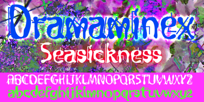 Designed after a bout with seasickness.
 - Steelyard by TypeArt Foundry,
$45.00 Inline styled after retro Luggage Label.
 - Babalon by Emboss,
$24.95 Fashioned after the tower of "Babble".
 - Albe Sans by Hackberry Font Foundry,
$24.95Albe Sans is a font family that began life when I was struck by a full-color back page ad in a 1935 copy of Better Homes & Gardens. I loved the readability and general cleanliness of the design. This font is drawn from memory after that experience. It is loosely based on Palton for proportion, but heaviily modified (not to mention, Palton is serif): Lower case numbers, Euro, ballot box in the section slot.


