10,000 search results
(0.041 seconds)
- Fantini by Canada Type,
$29.95 Fantini is the revival and elaborate update of a typeface called Fantan, made in-house and released in 1970 by a minor Chicago film type supplier called Custom Headings International. In the most excellent tradition of seriously-planned American film faces back then, CHI released a full complement of swashes and alternates to the curly art nouveau letters. Fantan didn't fare much among the type scene's big players back then, but it did spread like electricity among the smaller ones, the mom-and-pop type shops. But by the late 1980s, when film type was giving up the ghost, most smaller players in the industry were gone, in some cases along with little original libraries that existed nowhere else and became instant rarities on their way to be forgotten and almost impossible to resurrect for future technologies. Fantini is the fun and curly art nouveau font bridging the softness and psychedelia of the 1960s with the flirtatious flare of the 1970s like no other face does. Elements of psychedelia and funk flare out and intermix crazily to create cool, swirly letters packed with a lot of joy and energy. This is the kind of American art nouveau font that made its comeback in the late 20th century and is now a standard visual in the branding drive of almost every consumer product, from coffee labels to book and music covers to your favorite sugar or thirst-crunching fix. Alongside Fantini's enormous main font come small caps and three extra fonts loaded with swashy alternates and variations on plenty of letters. All available in all popular font formats. Fantini Pro, the OpenType version, packs the whole she-bang in a single font of high versatility for those who have applications that support advanced type technologies. In order to make Fantini a reality, Canada Type received original 2" film specimen from Robert Donona, a Clevelander whose enthusiasm about American film type has never faltered, even decades after the technology itself became obsolete. Keep an eye out for that name. Robert, who was computer-reluctant for the longest time, has now come a long way toward mastering digital type design.
 - Happy Trip by Vozzy,
$10.00 Introducing vintage label font named Happy Trip. This font has a wide languages support with west european and cyrillic characters (check out all available characters on previews). The font familty has six styles: Regular, Aged, Texture, Outline and three colorful styles. This font will look good on any vintage styled designs like a poster, T-shirt, label, logo, etc.
 - Barely Legal by Vozzy,
$10.00 Introducing a vintage font named Barely Legal. This font was inspired by bootleggers in the 1930s. All available characters you can see at the screenshots. This font has six styles: Regular, Shadow, Texture, Rough, Shadow FX and Texture FX. This font will look good on any retro and mafia styled designs like a poster, T-shirt, label, logo, etc.
 - Beer Time by Vozzy,
$10.00 Introducing a vintage look label font named "Beer Time". This font support multilingual characters and punctuation symbols. All available characters you can see at the screenshot. This font have 2 basic styles (Serif and sans serif) and 4 effect styles for each. This font will good viewed on any retro design like poster, t-shirt, label, logo etc.
 - Sport Bar by Vozzy,
$10.00 Introducing original label font named Sport Bar. This font has a wide languages support with west european and cyrillic characters (check out all available characters on previews). The font family has six styles: Regular, Contour, Fill1,Fill2, Rough1 and Rough2. This font will look good on any vintage styled designs like a poster, T-shirt, label, logo, etc.
 - Bowhead by Balpirick,
$15.00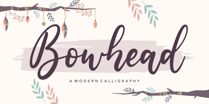 Proudly Present, Bowhead Font. Bowhead is a Modern Calligraphy Font. This sweet font has nice smooth lines. Bowhead is perfect for product packaging, branding project, megazine, social media, wedding, or just used to express words above the background. Bowhead also multilingual support. Enjoy the font, feel free to comment or feedback, send me PM or email. Thank you!
 - Ahuta by Twinletter,
$15.00 Ahuta Arabic style font. This particular font is designed to look like a true vintage Arabic font, but in a simple and elegant form, so you can use it in all your designs which will surely make your projects beautiful. This font has been created by our dedicated team to create the best quality typeface you will ever find.
 - No Remorse by Vozzy,
$10.00 Introducing vintage label font named No Remorse. This font has a multilungual and cyrillic characters support (check out all available characters on previews). The font family has six styles: Regular, Inline, Shadow, Inline FX, Shadow FX and Aged. This font will look good on any vintage styled designs like a poster, T-shirt, label, logo, etc.
 - Power GYM by Vozzy,
$10.00 Introducing original label font named Power Gym. This font family has an additional characters and multilungual support (check out all available characters on previews). Regular and Script fonts has seven styles: Regular, Effect, Shadow, Texture, Shadow FX, Texture FX, Grunge. This font will look good on any sport styled designs like a poster, T-shirt, label, logo, etc.
 - Beard Point by Vozzy,
$15.00 Introducing vintage label font named Beard Point. This font family has an additional characters and multilingual support (check out all available characters on preview). The font family has six styles: Regular, Shadow, Texture, Shadow FX, Texture FX, Aged. This font will look good on any vintage styled designs like a poster, T-shirt, label, logo, etc.
 - Hell Rider by Vozzy,
$10.00 Introducing vintage label font named Hell Rider. This font has an additional characters and multilungual (check out all available characters on previews). This font family has six styles: Regular, Shadow, Shadow FX, Scratch, Scratch Shadow, Scratch Shadow FX. This font will look good on any vintage styled designs like a poster, T-shirt, label, logo, etc.
 - The Bossman by Sipanji21,
$15.00 The Bossman is a display font with a graffiti-like appearance, this font only uses uppercase letters and the standard number as well as the standard punctuation. This font is good for various design purposes, such as: title posters, banners, logotypes, apparel, wall displays, crafting, packaging, advertising, or whatever. make your design more attractive with this font.
 - PAG Syndicate by Prop-a-ganda,
$19.99Prop-a-ganda offers retro-flavored fonts inspired by lettering on retro propaganda posters, retro advertising posters, retro packages all the world over. This is perfect font for your retrospective project. PAG Syndicate is rectangle and rather narrow font. This font has squarish face designed only by straight line, it spices up even the short words. - Vida Bandida by Vozzy,
$20.00 Introducing vintage label font named Vida Bandida. It is based on my other font, Black Widow. All available characters you can see at the screenshots. This font has six styles: Regular, Full, Shadow, Shadow FX, Texture and Texture FX. This font will look good on any vintsge styled designs like a poster, T-shirt, label, logo, etc.
 - FormPattern Color Six by Tarallo Design,
$14.99 Use this font to make lines, borders, patterns, backgrounds, unique bullets, or use it inline within text. Let your imagination explore the possibilities to combine these geometric shapes. Use letter spacing to connect the shapes in a continuous pattern, or space them apart horizontally. Stack them vertically and control their distance with leading (line spacing). Make fields of pattern and explore layering and opacity for color mixing. FormPattern Color Six takes inspiration from mosaic patterns seen in the south of Italy. It is easier to use this font to make patterns than to use drawings because you can control the size, color, and spacing from the type menu. It is also an effective way to make web graphics that are responsive with text. Using it is simple. As you type, forms will appear instead of letters. Each font in this collection is a colored set. The sets are primary, secondary, tertiary, analogous, dark, old world, vintage, greyscale, cool grey, and warm grey. There is a solid font that can be colored in the same way as regular fonts. The color fonts are accessed in the type menu where you would normally find the different weights or italics Most design software, such as Illustrator, InDesign, and Photoshop provide a glyphs palette where you can choose the precise form you want. It can work with the simplest text editors too. However, these may not support the color options. FormPattern Color Six is a vector-based and fully scalable SVG OpenType format. Color fonts are supported by Photoshop 2017, Illustrator 2018, and QuarkXPress 2018 (and later versions). This version of FormPattern Color Six is compatible with all FormPattern fonts by Tarallo Design. The display artwork shows it paired with the typeface Scanno.
 - MFC Botanical Borders by Monogram Fonts Co.,
$19.95 The inspiration source for MFC Botanical Borders is a collection of border treatments from the 1886 “Spécimens de caractères d'imprimerie” by E. Houpied a Paris. This collection of elegant floral and foliage borders has been put together with their original decorated rules, as well as alternate matching precision rules for added versatility. You can start with a new document or work on a new layer within an existing document. Select MFC Botanical Borders from the font menu. (Some users may have font previewing enabled in the font menu which will cause the font name to appear as border elements, disable this option in order to choose the name) Make certain that the point size of the font is the same as the leading being applied to the font so the borders will meet up properly. While we’ve adjusted this within the font, your program may override these settings. For instance a 12 point font should have 12 points of leading. A PDF guidebook for MFC Botanical Borders is included in the font package. Download and view the MFC Botanical Borders Guidebook if you would like to learn a little more.
 - Mistery Brush by Ditatype,
$29.00 Mistery Brush is a captivating script font that exudes an air of intrigue and enigma. Designed in large letters with a thick weight, this typeface commands attention and makes a powerful statement. Each letter is meticulously crafted with brush-like strokes, adding a touch of handcrafted artistry to the font. The brush details in Mystery Brush lend the font an organic and dynamic feel, as if the letters were painted with the strokes of an enigmatic artist. These artistic details add depth and character, making every word a work of art. For the best legibility you can use this font in the bigger text sizes. Enjoy the available features here. Features: Multilingual Supports PUA Encoded Numerals and Punctuations Mistery Brush fits in headlines, logos, movie posters, flyers, invitations, greeting cards, branding materials, print media, editorial layouts, headers, and many more. Find out more ways to use this font by taking a look at the font preview. Thanks for purchasing our fonts. Hopefully, you have a great time using our font. Feel free to contact us anytime for further information or when you have trouble with the font. Thanks a lot and happy designing.
 - CA Capoli by Cape Arcona Type Foundry,
$29.00 CA Capoli is a fine script typeface with a vintage touch. Perfect for illustrative titles or logotypes. It comes in two styles, Regular and Stroke. The inspiration came during our trip to Italy, where we took a short rest in a bar during a hot day. We discovered a simple ceramic ashtray on the table. The word “Nido” was inscribed in a typeface that looked like it dated back to the 1950s. We made some investigations about the word, its meaning and origin but it still remains a big mystery. Was it the name of a hotel or a restaurant or some vintage Italian cigarettes? We don’t know. We were so amazed about the design of the logo that we decided to create a typeface out of it. A sophisticated endeavor because we just had four letters. How could the rest of the letters – if it ever existed – have looked like? Our hypothesis is CA Capoli. A typeface with a full Central European character set and some nice alternative letters to chose from. When we thought about “Nido” and its possible derivation of hotel business, we felt like creating a small side project for this typeface, a brand for a fictional hotel called Hotel Capoli with business cards, letterheads, a reception book, key fobs and embroidered patches for the service dress of the hotel service stuff. The Hotel Capoli is located at the wonderful beach of Cape Arcona on the fictional country of Arcona Islands where our type foundry is located.
 - BikyBold - 100% free

- Changing by PintassilgoPrints,
$24.90 Changing is a lively font, loaded with many automatic interlock pairs that do their magic in OpenType aware applications. Its peculiar design and such choices for letter combinations make this a very dynamic, spirited and useful typeface.
 - Stellus by The Arborie,
$11.00 Stellus is a handmade futurist font. It symmetrical and geometric nature make it perfect for modern uses. The separation on the glyphs makes it look a little alien, yet it maintains softer qualities like the rounded ends.
 - Peitago Goulya by Herry92,
$13.00 I like the letters on the Peitago goulya because each letter is curved and rounded at the edges, it looks unique and has characteristics. Peitago goulya is handwritten, intentionally made with indentations. This font looks very pleasant.. !
 - FF Assuri by FontFont,
$30.99 German type designer Fabian Rottke created this display FontFont in 1994. The font is ideally suited for poster and billboards. FF Assuri provides advanced typographical support with features such as ligatures. It comes with proportional lining figures.
 - AZ Imperial by Artist of Design,
$25.00 AZ Imperial font was inspired from miscellaneous vintage tin packaging. Complete with an "old look" to the line work with barely a serif still visible. Ideal for use as headline or sub-head text in you design.
 - FF Littles by FontFont,
$30.99 German type designer Simone May created this display FontFont in 1995. The font is ideally suited for poster and billboards. FF Littles provides advanced typographical support with features such as ligatures. It comes with proportional lining figures.
 - Halcom by The Northern Block,
$49.50 A modern sans serif typeface inspired by the historic geometric’s of the 1920’s, specifically Futura. The design is not a simple pastiche of what went before this is much more than that. It is a close investigation to how Futura inspired other type designs like Avenir and helped push the boundary of what is a modern typeface of its generation. Overlaying perfect geometric shapes careful adjustment is made for each character and each corner to a point of balance between pure mathematics and optical correctness. The result is a distinctively modern geometric font family that is strikingly simple in design yet perfectly pleasing to the readers eye. Details include 550 characters with an alternative lowercase a, g and y, five variations of numerals, manually edited kerning and Opentype features.
 - Walnut Candy by Nathatype,
$29.00 Ready to enhance your branding? Looking for that “something” that’ll make your audience go WOW and clients get on board immediately? Ready to enhance your branding? Looking for that “something” that’ll make your audience go WOW and clients get on board immediately? If you need to create a big, bold logo for your business, work on a poster for an event, or whatever your project may be-then this is the perfect font for you. Walnut Candy-A Signature Font Walnut Candy is a handcrafted font designed to bring your branding to life and add a touch of elegance, modernity and style. Perfect for social media branding projects, fashion designs, printed quotes, packaging, or even as a stylish text overlay to any background image. Our font always includes Multilingual Support to make your branding reach a global audience. Features: - Ligatures - Stylistic Sets - PUA Encoded - Numerals and Punctuation Thank you for downloading premium fonts from Nathatype
 - Lichtspiele by Typocalypse,
$29.00 Cinemas from the early 20th century are called “Lichtspiele” in Germany. “Lichtspiele” transports you back to a time where neon lights and marquee letters decorated cinema façades. Of the five styles, three have two versions of italics — the left-leaning italic evokes looking up from lower-left, the right-leaning italic is as if we are looking from lower-right. Display is the basic style, while Neon is inspired by the old neon letters found outside cinemas. Try placing Neon Outline on top of Display or Neon to add another layer to your artwork. Neon 3D is a extruded version of Neon. The Screen Credits style is based on the notes — producers, cast, crew and so on — on movie posters. Get more out of life, go out to a movie.
 - Hideout by Monotype,
$50.99 Jim Ford's Hideout typeface is definitely walking on the wrong side of the law. Inspired by the flared serif lettering of antique tobacco tins, its sturdy shapes are confident, eye-catching, and hark back to the Wild West. Large sizes bring Hideout's details to life, emphasising the delicate nicks in its Ks and Rs. For designers that need to soften some of its swagger, a set of decorative alternatives offer a little Art Deco elegance, adding some refinement to its chunky letterforms. With its 14 weights, Hideout is an adaptable design that works especially well when used for display – for example in book covers, packaging, posters, restaurant menus, or editorial. Don't miss the ghost weights, which hint at the kinds of weathered lettering found on faded and peeling Wanted posters.
 - Englewood by Lipton Letter Design,
$19.00 Richard Lipton’s inspiration for Englewood came from the calligraphic hand of Philip Grushkin. Lipton has always admired his somewhat loose but disciplined hand and felt that it was worthy of keeping this style alive in a typeface that could be a somewhat accurate emulation of the warmth and life found in these letterforms. Spontaneity is a challenge to capture in a type treatment but with Englewood, Lipton hopes to honor Mr. Grushkin with a design that works especially well for an invitation, a menu, or in any display setting that calls for an informal calligraphic hand. This single weight display script includes small caps — somewhat of a rarity for a handwritten script — for flexible typesetting, along with 42 alternates that include 18 contextual ligatures to simulate the appearance of spontaneous writing.
 - JAF Facit by Just Another Foundry,
$42.00 Facit is a contemporary sans serif text face. It is designed to be a highly legible and flexible font that does not draw the attention to itself. Instead of being original by itself it is the result of a careful examination of ancient as well as modern formal concepts. “It is by definition impossible to design an un-conventional typeface. Type is pure convention, this is why we can read each other’s written words”, says its designer Tim Ahrens. However, rather than generating an average, existing principles were consciously combined into a unique design solution: The word ‘Facit’, in its German version, means ‘conclusion’. The fonts are provided in OpenType format. Each font contains 720 glyphs. Technically, they follow the Adobe Pro fonts and provide the same glyph set and OpenType functionality. OpenType features include ligatures, true small capitals, superiors, inferiors, numerators and denominators. Every font contains old style and lining figures, both in a proportional and a tabular design. For some letters there alternate characters.
 - Rastiku by Twinletter,
$18.00 The Rastiku Groovy font is a bold, fun, and retro character, for all your design purposes! This is a versatile and vintage typeface that is perfect for any of your creative projects and will help make your designs stand out. The ideal font for your readers because it’s easy to read and ideal for branding, product packaging, or just to add a little flair to your editorial work. This fun Rastiku font has the right shape and subtle blend of different letter angles making this font very pleasing to the eye as both the title and sentence text of your projects. So what are you waiting for? Stop procrastinating and immediately incorporate it into your designs! What’s Included : Standard glyphs Iso Latin 1 Simple installations We highly recommend using a program that supports OpenType features and Glyphs panels like many Adobe apps and Corel Draw, so you can see and access all Glyph variations. PUA Encoded Characters – Fully accessible without additional design software. Fonts include Multilingual support
 - Panton by Fontfabric,
$47.00 NEW! Update 3.0 What’s New: • New Narrow version of 18 weights • Bulgarian Localization Support • Tabular Figures • Case-Sensitive Punctuation • Extended Glyph Case • Icon Sets PDF Specimen available: http://myfonts.us/suAc3K Panton has been expanded with Panton Narrow! It has 9 uprights and 9 matching italics ranging from Thin to Heavy. The Panton font family includes 54 fonts - 19 uprights with 19 matching italics and 16 icon sets as a bonus! It is characterized by excellent legibility in both web & print design areas, well-finished geometric designs, optimized kerning, excellent web-font performance and legibility etc. Inspired by the classic grotesque typefaces - Panton has his own unique style, expressed in perfectly softened geometric forms. The font family is most suitable for headlines of all sizes, as well as for text blocks that come in both maximum and minimum variations. Panton font styles are applicable for any type of graphic design in web, print, motion graphics etc and perfect for t-shirts and other items like posters and logos.
 - Super Retro by RagamKata,
$14.00 Super Retro is a font that offers a classic groovy retro style with a unique hand-drawn sketch touch. It draws inspiration from the retro era, filled with vibrant colors and a sense of fun. Each uppercase letter has its own distinctiveness compared to the lowercase letters, providing an interesting visual variation. Super Retro features chubby and rounded letterforms, creating an impression that embodies cheerful and joyful characters. Each capital letter is written with winding and wavy lines, adding an artistic effect reminiscent of trendy hand-drawn art. The font showcases a style inspired by the energetic music scene of the retro era, characterized by freedom of expression. The letters appear to sway and move dynamically, as if they are dancing on stage. Rough lines and details add an authentic touch, capturing a strong vintage aura. Super Retro highlights each letter with its unique qualities and characteristics. Every uppercase letter has a special touch that sets it apart from the lowercase letters. Some letters may have extra extensions at the top or bottom, providing distinctive decorative elements. There are also letters written in a more eccentric style, with slightly elongated or condensed proportions, creating intriguing and refreshing differences. This font is ideal for designing posters, logos, titles, and various designs that require a strong retro impression. With its ability to adapt to different letter characteristics, Super Retro offers limitless variations in your design creativity.
 - Buddy Smile by Create Big Supply,
$15.00 Introducing Buddy Smile, a unique handwritten font that adds a splash of color, cheerfulness, and playfulness to your designs. With its charming and lively style, this font is perfect for enhancing your brand identity, book covers, children's events, quotes, and more. Buddy Smile brings a touch of personality to your projects with its combination of uppercase and lowercase letters. The fluid and organic strokes create a friendly and approachable feel, making your text feel warm and inviting. Whether you're designing a logo or crafting a heartfelt message, this font will leave a lasting impression. With its extensive language support, Buddy Smile ensures that your message can reach a diverse audience. Express yourself in different languages and connect with people from around the world. The font also includes numbers and punctuation marks, allowing you to maintain consistency throughout your designs. Experience the convenience of PUA (Private Use Area) Encoding, which provides access to special characters and glyphs. Customize your typography and add extra flair to your compositions, making them truly one-of-a-kind.
 - Neumatic Compressed by Arkitype,
$12.00 Neumatic compressed has a super compressed character set, increased cap height and tight kerning that combine to give you the ability to create large, beautiful and effective headlines and copy for your artwork. Neumatic Compressed packs punch when it comes to large copy lines and is perfect for posters, display copy, headlines in printed materials like magazines and books . The family comes in 8 weights from extra light to Black so it's versatile. Its extra light weight can give you some great height due to how narrow it is. Play around with the opentype Superscript with an underline or the Opentype stylistic sets which turns the default squared dots on i's, j's and punctuation to round dots.
 - Wubble by Typodermic,
$11.95 Welcome to Wubble Labs—where we don’t just think outside the box, we dissolve it! Our team of mad scientists has been busy experimenting with the latest in colloidal glopulation technology, and we’re thrilled to present our latest creation: Wubble, the blobbiest, squishiest, most liquid font you’ve ever seen! We know what you’re thinking, “liquid font? What the heck does that even mean?” Well, let us tell you, Wubble is more than just a font—it’s a living, breathing, dripping typographical workfish. Each letter is like a tiny blob of ooze, flowing and shifting in a mesmerizing dance of liquidy goodness. But don’t let Wubble’s gooey exterior fool you—this font is the product of years of careful research and development. Our team of scientists have spent countless hours studying the precise characteristics of colloidal glopulation, perfecting every last detail to bring you the finest liquid font ever produced. So if you’re ready to take your design game to the next level, come on down to Wubble Labs and see what all the fuss is about. We promise, once you go Wubble, you’ll never go back! Most Latin-based European writing systems are supported, including the following languages. Afaan Oromo, Afar, Afrikaans, Albanian, Alsatian, Aromanian, Aymara, Bashkir (Latin), Basque, Belarusian (Latin), Bemba, Bikol, Bosnian, Breton, Cape Verdean, Creole, Catalan, Cebuano, Chamorro, Chavacano, Chichewa, Crimean Tatar (Latin), Croatian, Czech, Danish, Dawan, Dholuo, Dutch, English, Estonian, Faroese, Fijian, Filipino, Finnish, French, Frisian, Friulian, Gagauz (Latin), Galician, Ganda, Genoese, German, Greenlandic, Guadeloupean Creole, Haitian Creole, Hawaiian, Hiligaynon, Hungarian, Icelandic, Ilocano, Indonesian, Irish, Italian, Jamaican, Kaqchikel, Karakalpak (Latin), Kashubian, Kikongo, Kinyarwanda, Kirundi, Kurdish (Latin), Latvian, Lithuanian, Lombard, Low Saxon, Luxembourgish, Maasai, Makhuwa, Malay, Maltese, Māori, Moldovan, Montenegrin, Ndebele, Neapolitan, Norwegian, Novial, Occitan, Ossetian (Latin), Papiamento, Piedmontese, Polish, Portuguese, Quechua, Rarotongan, Romanian, Romansh, Sami, Sango, Saramaccan, Sardinian, Scottish Gaelic, Serbian (Latin), Shona, Sicilian, Silesian, Slovak, Slovenian, Somali, Sorbian, Sotho, Spanish, Swahili, Swazi, Swedish, Tagalog, Tahitian, Tetum, Tongan, Tshiluba, Tsonga, Tswana, Tumbuka, Turkish, Turkmen (Latin), Tuvaluan, Uzbek (Latin), Venetian, Vepsian, Võro, Walloon, Waray-Waray, Wayuu, Welsh, Wolof, Xhosa, Yapese, Zapotec Zulu and Zuni.
 - BD Megatoya by Balibilly Design,
$25.00 Overview of BD Megatoya Consists of 41 fonts, including nine upright, nine italics, nine extended, nine extended italics, all in nine weights from thin to black. 4 outline version in black weight. 1 variable with three axes (weight, width, slant). 1,470 glyphs in each font. Opentype features include small caps, stylistic alternates, ligatures, complete numeral figures, ordinal, case-sensitive forms. language support: Western European, Central European, and Southeastern European. About BD Megatoya Taking a geometric sans serif approach, we designed the letterform with details on round characters to pursue harmony and leave a slightly boxy feel to the extended style. The stylistic alternate is one of our concentrations to make them versatile yet still preserve consistency in stem and metrics to provide good readability in small text. Overall, the various treatments for each character will encourage each other to dynamic colours, flexible, and functional impressions in their application. Slicing edges The edge of the letter slice in 45 degrees will give the impression of a sparkle of light when you look at them for the first 2 seconds (our experience). This is what we did a few years ago when working on automotive branding. The word-mark logotype with slicing form gives an exclusive and different impression from its crowds. If you agree with us, does BD Megatoya deserve to be called a problem solver in branding projects? Jump over to .ss07, .ss08, .ss09, and .ss10 to find them! The Features BD Megatoya font family includes 41 great fonts in nine weights, an extended character set of over 1400 glyphs, multilingual support such as Southeastern Europe, Central Europe, Western Europe. Also advanced & useful open-type features: case-sensitive forms, small caps, standard and discretionary ligatures, stylistic alternates, ordinals, fractions, numerator, denominator, superscript, subscript, circled number, slashed zero, old-style figure, tabular and lining figure. Use BD Megatoya BD Megatoya is very suitable for branding projects and many designs purpose like advertising, posters, invitations, branding, logos, magazines, merchandise, presentations, etc. It's a FREE Get one weight from the BD Megayoya family for Free! Apply to your amazing projects and enlarge your creative tools by adding the complete BD Megatoya family to your font library.
 - Brotherline by Hendra Pratama,
$25.00 Brotherline is a connected script built from a single bold mono-line, inspired by hand-lettering style and various calligraphy letterforms.The first idea with this font is to create a font for Logotypes. Curves are smooth and flow with very nice circle shapes. This font is great for logos, logotypes, packaging, and store-front or signboard. NOTE: To access the alternate glyphs, you will need a program that supports OpenType Features. Activate the Ligature (liga) and Contextual Alternates (calt) for better experience.
 - Advertisers Gothic by HiH,
$12.00 Advertisers Gothic is bold and brash, like the city it comes from, Chicago. It was designed by the accomplished German-American matrix engraver, Robert Wiebking, for the Western Type Foundry in 1917. As its name suggests, it was designed for commercial headliner work, much as Publicity Gothic by Sidney Gaunt for BB&S the year before. See our Publicity Headline. Alternate letters ‘A’ & ‘S’ are provided. The most popular ad words “Free!”, “New!” and “Sale” (with both esses) are provided at an angle for dramatic tension. Advertisers Gothic became quite popular because it was effective. It can work equally well for a flyer advertising a non-profit event as for a magazine product ad. This font refuses to be a wimp. Use it boldly. Advertisers Gothic ML represents a major extension of the original release, with the following changes: 1. A total of 335 glyphs (compare) with added glyphs for the 1250 Central Europe, the 1252 Turkish and the 1257 Baltic Code Pages. 2. Added OpenType GSUB layout features: pnum, ornm, liga, hist & salt ˜ with total 13 lookups. 3. Added 209 kerning pairs. 4. Revised vertical metrics for improved cross-platform line spacing. 5. The most popular ad words “Free!”, “New!” and “Sale” (with both esses) are provided at an angle for dramatic tension The zip package includes two versions of the font at no extra charge. There is an OTF version which is in Open PS (Post Script Type 1) format and a TTF version which is in Open TT (True Type)format. Use whichever works best for your applications.
