10,000 search results
(0.013 seconds)
- The Beetles - Unknown license

- Verve - Unknown license

- Baveuse - Unknown license

- Deco Pimp - Unknown license

- pehuensito - Unknown license

- Spin Cycle 3D OT - Unknown license

- Yurine Overflow - Personal use only

- Komika Text - Unknown license

- My Nerd - Personal use only

- PopUp - Unknown license

- Veruca - Unknown license

- JptBubbles - Personal use only

- Caliph - Unknown license

- Prussian Brew - Unknown license

- Heavy Rotation - Unknown license

- Prushkov by Arrière-garde,
$9.00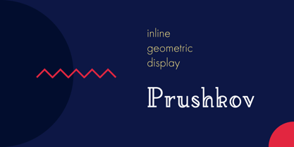 Prushkov is the first typeface that I made. Its name comes from the town I lived in at the time. The design was inspired by both geometric typefaces like Futura, and didone fonts like Bodoni. Its aim (perhaps quite bold) is to blend high contrast with mathematical excellence. Prushkov will work well as a display font, both in uppercase and lowercase. It has a wide array of stylistic alternates for all of the capitals and some lowercase glyphs too.
 - Megattor by Letterhend,
$14.00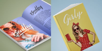 Introducing: Megattor typeface! This font is beautifully made to look like natural hand writing. As you can see, the flow of the bold and thin lines creates a realistic hand lettering just by typing on your keyboard! It has many OpenType features like ligatures, stylistic alternate, and lots of Stylistic Set, also support many languages. This typeface is based on handwriting which is very suitable for any design needs you have especially for script logotype project.
 - Austina Capitton by HansCo,
$15.00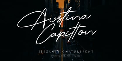 Austina Capitton is our new modern, clean, and stylish monoline signature font and was created to look as a naturally handwritten as possible. Built with unique style in OpenType features, this script comes to life as if you are writing it yourself. This font is very suitable to be used to brand a product because if you write a brand name it will look like your company signature. Austina Capitton is perfect for photographers, bloggers, trademarks, magazines, fashion, logos, business cards and much more. There are two styles in this font package, they are Alt and Regular. You can use Regular style if you like the curve of the font or you can use Alt style if you like simple and minimal ones. It's highly recommended to use it in OpenType capable software - like a Coreldraw, Photoshop, Illustrator and Indesign. This font come with Uppercase, Lowercase, Numbers, Punctuation and swash. It offers Multilingual Support, works on Mac and Windows OS and is easy to install. Enjoy!
 - Lyllo by Eurotypo,
$34.00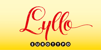 Lyllo is a casual script font with a huge personality and a bouncy baseline. Each glyph was drawn by hand with a calligraphy pen for later, to be digitized with great precision, carefully guarding the authentic look. It is perfect if you want to convey individuality and style. Lyllo has 745 glyphs: a lot of ligatures that help to sustain the natural flow of handwriting, swashes, finishes, initial shapes and a lot of alternatives for a realistic look with handwriting and for you to give a personalized flare to your designs. Lyllo also offers many catchwords and adornments that complement the charm and uniqueness of the font. To activate the optional glyphs you may click on buttons in any OpenType savvy program or manually choose the characters from Glyph Palette. This lovely font has already an extended character set to support Central and Eastern as well as Western European languages. Lyllo is a perfect choice for greeting cards, posters, labels, t-shirt design, logos, and more. Lyllo was made to make your project more beautiful and attractive!
 - P22 Preissig Calligraphic by P22 Type Foundry,
$29.95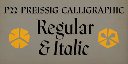 P22 Preissig Calligraphic was originally designed by Czech typographer, artist, and designer Vojtěch Preissig (1873–1944). Preissig developed this type design in 1928 and has remained unpublished until recently. One can only speculate why this wonderful design was never produced into a commercially available typeface. His original designs feature an accompanying italic as well as small caps. Preissig had originally named the typeface design after his former employer in New York, Butterick Publishing Co. The ‘Butterick’ typeface retains the angularity of his previous typeface, Preissig Antiqua (AKA P22 Preissig Roman), but displays a more fluid calligraphic influence. P22 Preissig Calligraphic was started shortly after Richard Kegler saw the original drawings in an exhibit in Prague in 2004. A sympathetic security guard allowed a few photographs and the contraband images fueled a development of the typefaces. The design simmered for many years and is now ready to enter the world of contemporary design. P22 Preissig Calligraphic is a 2 font family that contains the originally designed small caps as an OpenType feature, as well as all the necessary diacritical to cover most European languages.
 - Strangelove NextSlab by FaceType,
$12.00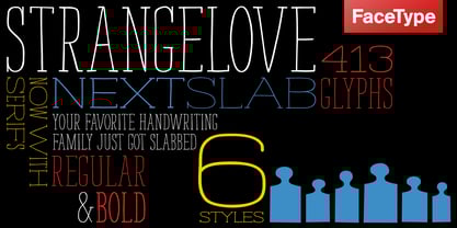 Strangelove NextSlab is a serif version of our bestseller Strangelove Next. It contains 3 styles with two weights each. (Be sure to have ‘Contextual Alternates’ activated in your design app of choice to get a more lively look when it comes to subsequent letters like ee, gg ... etc).
 - Liberty Walk by Sipanji21,
$15.00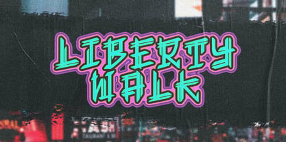 "Liberty Walk" is a display font featuring characters with straight, upright lines. Fonts like this are often used to give a clean, simple, and assertive appearance to designs. They are suitable for various design projects, including logos, posters, titles, or other design elements that require clear and upright typography.
 - Lifeform by Supremat,
$12.00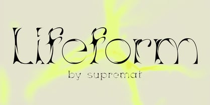 Lifeform is a modern display font created as a result of my experiments on the forms of letters. While working on the font, I had ambivalent feelings, on the one hand I liked the individual curved lines, on the other hand they seemed very strange, alien and illogical. It was like looking into a microscope and seeing something strange. I wanted to develop and study these forms as something new, because I had never seen anything similar before. The result is a contrasting font that has both curves and sharp, and smooth lines that resemble some kind of organic matter. The font is well suited for large headlines, posters and covers. Its strange design catches the eye and will not leave the viewer indifferent.
 - Indie by Lián Types,
$37.00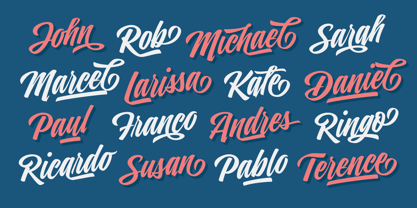 A FEW THOUGHTS Indie is a trendy script, result of the wide range of possibilities that can be achieved using a pointed brush. (1) “You Only Live Once” say The Strokes, (to me, symbols of indie music) so, what would represent that sensation of volatility better than a brush? As you may already know, this time inspiration came from hipsters and indies around us: We may sometimes criticise them, we may sometimes want to be like them, but the truth is that the universo gráfico they generated these past years is gigantic, full of colour and variations. (2) Brush lettering and Sign painting are fields I've been fond of since I started as a designer. Nowadays, these styles are getting a lot of attention and maybe it’s due to the undeniable mark of life that is materialised when using a brush. This tool is so expressive that shows the passions and fears of the artist, and materialises that idea of “living the present”, so popular in this era. When you see Indie, you think of skaters, rollers, surfers, hiphop dancers, street artists, summer, and why not? California beaches. So if you feel life is only one, it’s high time you got Indie into your fonts' collection! STYLES Indie comes in 4 styles plus another one which consists only in capitals. Indie; Indie Shade; Indie Shade Solo; Indie Inline are all open-type programmed and have exactly the same glyphs and metrics, so you can combine them without probem. (I.E. You may use Indie Inline, then write the same word using Indie Shade Solo, and finally put them together). In applications such as Adobe Illustrator, the font has nice results when fi ligatures is activated. However, if you want a more casual look, activate the contextual and the decorative ligatures. NOTES 1. After several years of practicing calligraphy I can say that to me, there’s nothing more satisfying than being able to create fonts out of your own handlettering. I owe a lot of this brush-style to Carl Rohrs. He was the very first calligrapher who taught it to me. His style is unique and what he can do with a brush is truly marvelous. I'm serious. 2. In spite of some particular cases, I can say I'm happy to live in a present in which Typography is living a kind of Renaissance along with Lettering. Like it happened with W. Morris a hundred years ago, handcrafts are being revalued/reborn, and some of this may be happening thanks to these indie designers that, trying to be unique, gave new/fresh air to different areas of graphic design.
 - Sonny Gothic Vol 2 by W Type Foundry,
$25.00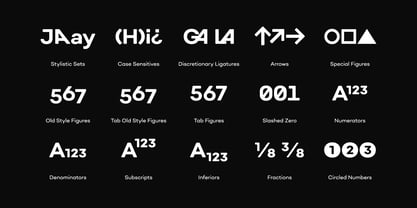 Sonny Gothic Vol 2 is an extension of our popular font Sonny Gothic. All corners have been softened to get a friendlier and fluffy visual language. As Sonny Gothic, this typeface has ligatures inspired by the incredible work of Herb Lubalin, chiefly Avant Garde. We designed carefully Sonny’s Vol 2 ligatures, and we also created new ones to control the whites formed between softened characters such as FL, FB, FD, FE, FF, FH, FI, FK, FN, and FR. Developed with powerful OpenType features in mind. Each weight includes alternate characters, ligatures, fractions, special numbers, arrows, extended language support, small caps, and many more. Perfectly suited for graphic design advertising.
 - Bear Club by Pink Broccoli,
$19.00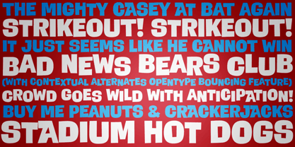 Another offbeat typeface inspired by the lettering on a design by Patrick Owsley for the Chicago Bears. There's nothing more lively than animated text, and Bear Club has that flavor in two ways. With counter inspirations drawn from fonts like Ad Lib and Nightclub, an automatic alternating caps and alternate caps feature, as well as a contextual alternates set that creates a true animated bounce, just like Hip Hopper. Let the fun begin with this spunky, lighthearted and heavy-weighted comic typeface.
 - Fidusmager by PizzaDude.dk,
$17.00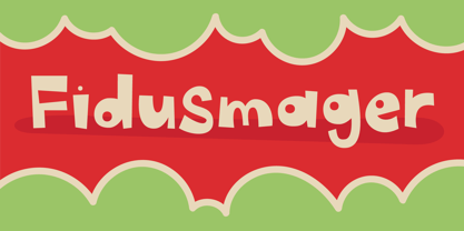 This is definitely a font suitable for kids toys. The letters are legible, and at the same time totally wacky! Kinda like what a kids toy should be! Fidusmager started out as a handdrawn, slightly rugged looking fon. However I ended up manually tracing each letter in order to have those smooth lines. By the way, Fidusmager is danish and actually means someone who’ll trick you - but as a kid I didn’t know that, and found that it most likely was something positive! :)
 - Fiction Crusader by PizzaDude.dk,
$17.00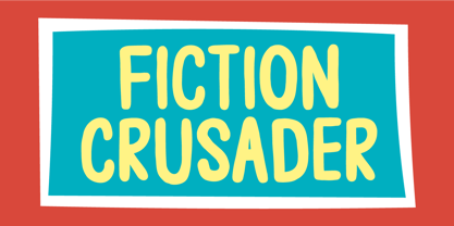 The name “Fiction Crusader” was generated by a random word generator. It may sound odd, but I like the feel of it. Use your imagination: what exactly is a fiction crusader? Each letter has 6 slightly different versions, and they automatically cycle as you type. A great way to make your text look more lively and vibrant! I guess that this is an all-purpose font, because I can’t think of a project that couldn’t use a font like this!
 - Legal Eagle JNL by Jeff Levine,
$29.00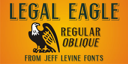 The lettering on the cover of the sheet music for 1919's "The World is Waiting for the Sunrise" was set in a decorative sans serif with an engraved line adorning each character. Reminiscent of the headlines of legal documents, way bills, stock certificates and the like, the digital version of the design was given the name Legal Eagle JNL and is available in both regular and oblique versions. A companion font without the engraved lines is also available as Junior Clerk JNL.
 - Connectica by Tour De Force,
$25.00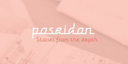 Connectica, as the name itself refers, is joined monolinear script family. Comes in two weights, Light and Regular. Due to specific design, we added fake Swash OpenType feature for initial capital characters, where letters like E, F, U, V, W, Y lack joining line on the left side of the characters.
 - Askan Slim by Hoftype,
$49.00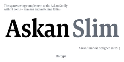 Askan Slim has the same design features as Askan , cap-height, x-height, descenders and ascenders. It is a moderately condensed version of Askan and works superbly as an addition to Askan or as independently for space saving applications. It is the perfect complement of the Askan family. Like Askan, Askan Slim consists of 18 styles and is well equipped for advanced typography. It comes in OpenType format with extended language support. All weights contain small caps, ligatures, superior characters, proportional lining figures, tabular lining figures, proportional old style figures, lining old style figures, matching currency symbols, fraction- and scientific numerals, matching arrows and alternate characters.
 - Impara by Hoftype,
$39.00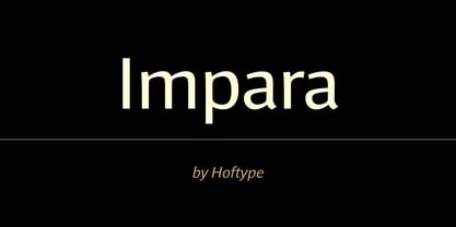 Impara was designed in 2010. It is a slightly contrasted sans serif with a lively stroke ductus and distinct humanistic characteristics. It represents a synthesis of linear coolness and classic elegance. It qualifies for informational text applications and, in display sizes, it reveals elaborate details. Impara comes in 10 styles in OpenType and TrueType format. Each font is equipped with an extended character set containing: standard and discretional ligatures, small caps, proportional lining figures, tabular lining figures, proportional old style figures, lining old style figures, matching currency symbols, fraction- and scientific numerals. Impara supports Western European as well as Central and Eastern European languages.
 - Lavolta by Fauzistudio,
$10.00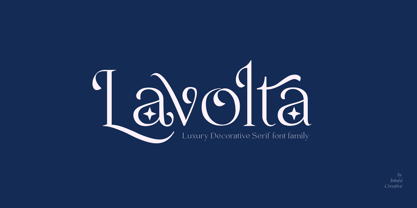 Introducing - Lavolta is a fancy and functional serif font family, featuring two distinct style combinations. Lavolta has a mordern style, great for invitations, product branding, packaging, movie titles, book covers, magazines, websites and much more. Lavolta Swash has a slightly vintage style, there are 130+ alternative characters and is equipped with a contextual alternates (CALT) feature to make your life easier when using it on long texts. Lavolta Swash Decoratif with stars creates a lively and festive atmosphere.
 - ITC Connectivities by ITC,
$29.99Some words from the designer... West coast artist Teri Kahan developed a "design font" of 68 pictographs capturing the sentiments of relationship, connection and synchronicity. Many of the characters were created with phrases in mind like, "handing you the world on a platter", "howling at the moon", and "message in a bottle". Others represent life experiences. The clean, simple illustration style originates from the look of hand-carved rubber stamps, and lends itself beautifully to logos and graphics. - Mc Lemore by Galapagos,
$39.00Back when OpenType hadn't yet opened and Apple was developing the Line Layout Manager called GX Typography I created a test font that I name after my stepdaughter, Kristen (now ITC Kristen). Not wanting to offend my wife I started on a font project and gave her name to this new set of glyphs, Roberta. Unfortunately, the name was already in use so I needed to find another name for the fonts. After September 11th I decided that there were people I'd met during my life who were truly cut from the cloth of the hero. Master Sargent McLemore of the 75th Ranger Battalion was one of these people. I met the Sarge when I was in basic training at Fort Gordon. I saw him 2 weeks before he died in 1970. All of the heroes we see on the silver screen pale in comparison to this man. John Wayne and Clint Eastwood both have played the type well, both could have taken lessons from the Sarge. - Jabberwub by Sentinel Type,
$30.00A fresh new decorative display face bubbling with life & spontaneity, Jabberwub belongs to a rare genus of creature fonts that time forgotócasual animated. A fun & bouncy eye-catcher that crosses into the land of the zany, dancing a whacky line between discord & rhyme, Jabberwub packs tons of fun into a state-of-the-art OpenType font loaded with 270 extra glyphs, including stylistic alternates, discretionary ligatures, word ligatures and capitalized ligatures, allowing creative typographers to achieve a custom hand-lettered look without all the mess & spilt glue of a manual paste-up job. Just like using rub-down type but it never cracks or splits, and it never runs out. The moment you start using Jabberwub you'll be laffing! Jabberwub is ideal for whatever zany stuff springs to mind. It takes an outline with no problem-o, and you can squish & squoosh it as the occasion takes your fancy. Optimal results are achieved by hand setting each individual glyph. Available in OpenType only. - Forgotten Dream by Hanoded,
$15.00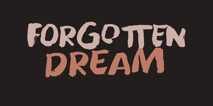 I had a really weird dream the other night, but when I woke up, I had forgotten it. I had the feeling it was about something important, but I cannot, for the life of me, recall what I dreamt about! Forgotten Dream is a horror brush font, which I made with a brushy brush and Chinese ink. It looks like something right out of a nightmare, but you can also use it for something important. Like a ‘keep your distance’ poster, or a sign about the importance of washing ones hands. But then again, if you play in a death metal band, then Forgotten Dream font could be exactly what you need for your album cover!
 - PF Square Sans Pro by Parachute,
$79.00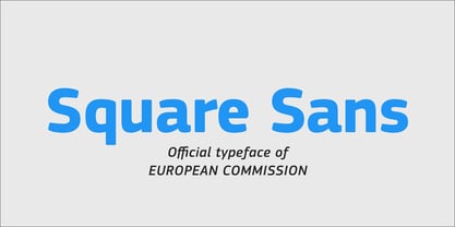 Designer Panos Vassiliou created Square Sans Pro in his quest for a true square-like text typeface which could balance simplicity with vitality and enhance with its subtle power the identity of any product or service, without compromising its characteristics as a text typeface. The family consists of 12 fonts—from extrablack to thin—including true italics. It supports 19 special OpenType features like small caps, fractions, ordinals, etc. and offers multilingual support for all European languages including Greek and Cyrillic. Finally, every font in this family has been completed with 270 copyright-free symbols, some of which have been proposed by several international organizations for packaging, public areas, environment, transportation, computers, fabric care and urban life.
 - Jantze by Fontosaurus,
$19.95The Jantze font is a project undertaken by Dan Bailey of Fontosaurus and Michael Jantze, creator of the nationally-syndicated comic strip, The Norm. All their royalties from the font will go to The Lance Armstrong Foundation. For those that have been living under a rock for the last five years, Lance is a professional bike racer that overcame advanced testicular cancer to not only come back to his sport, but to dominate its premiere event, the Tour de France. In climbing to the top of his sport, he has become a legend among cyclists and a beacon of hope for those battling cancer and their families. His foundation provides financial grants to researchers working to improve our odds against the disease, individuals stricken with cancer, and survivors of the disease that are advocates for survivorship issues in their communities. Michael Jantze and Dan Bailey would like you to consider the quote from Ralph Waldo Emerson that brought us to this project: "The purpose of life is not to be happy. It is to be useful, to be honorable, to have it make some difference that you have lived and lived well. We hope that you will help us help Lance Armstrong's legacy be more than that of just sports legend. We hope that you will help those that may someday help you as much as we hope that you will never have to suffer the ravages of cancer. We hope. - Roughwork by Scriptorium,
$18.00Roughwork was developed in response to repeated requests for a set of initials which looked like sketches of a font in development. So we took our True Golden font and reverse-engineered the lines and arcs needed to define the character shapes and the result has the look of original typeface drawings.


