9,471 search results
(0.026 seconds)
- Taiko by astype,
$20.00 Taiko is a strong headline typeface based on a design by Otto Arpke from 1928. Taiko Std is the basic version with 235 glyphs. The full version with over 650 glyphs includes the following OpenType features: - central European glyphs - small caps - tabular & mediaeval numerals - dynamic fractions
 - Georgina Pro by FoxType,
$9.00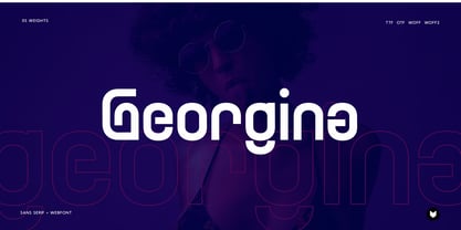 Georgina pro is a Unique Modern Elegant Typeface with Web-fonts. It’s a very versatile font that works great in large and small sizes. Georgina would perfect for branding, logos, headlines, Captions. or simply as a stylish text overlay to any background image. 5 Weights Included.
 - Hardren by Horizon Type,
$40.00 Hardren is a semi condensed sans serif typefamily. It has 20 weights 10 uprights and 10 italics. Each weight includes 500+ glyphs, extended language support, fractions, tabular numbers, arrow sets, alternative characters (stylistic sets) Please see the pdf specimen for more information. PDF Specimen: https://cutt.ly/Swg5M3r4
 - Rollman by Par Défaut,
$9.00 Rollman is a Diplay font family containing 16 Fonts (5 Weight; Left; Right; Straight and Variable), covering many languages using latin and cyrillic alphabet. It's a perfect font for titles. There are also 7 OpenType features (Numerator; Denominator; Fraction; Ordinals; Small Capital; All Access Alternate; Ligature).
 - Antebas by Lafontype,
$35.00 Antebas is a sans serif family with a geometric touch. Available in 16 styles from Thin to Heavy and it's matching italics. OpenType features such as fractions, ordinal, superscript, subscript, numerators, denominators and tabular figures are available. besides Latin letters, Antebas also supports Cyrillic and Greek letters.
 - Ruddy by Inhouse Type,
$33.32 Ruddy is a display sans serif type family. It has a playful and mischievous presence. Exaggerated geometry and varied vertical character stem placement contribute to its animated appearance. Ruddy comes in 4 weights with matching italics. OpenType features include Contextual Alternates, Tabular Figures, Fractions, Numerators and Denominators.
 - Kerndog by Elemeno,
$25.00Thick, ballooned chunks, strung together by thinner sections, Kerndog looks as if it's been constructed from flexible corn dogs. Perfect for kid stuff and unusual advertising needs. Kerndog is legible at most sizes, but best when used large so the thick and thin combination is visible. - Reveler JNL by Jeff Levine,
$29.00 The sheet music for "Good Night Angel" from the 1937 motion picture "Radio City Revels", had the movie's title hand lettered in a free form Art Deco sans serif design. This has been recreated digitally as Reveler JNL, which is available in both regular and oblique versions.
 - Atophuzomekosou by Meyerfonts,
$15.00 Atophuzomekosou is a sans serif typeface that can be used for a lot of purposes, including: signage, posters, campaigns, videos, artworks, billboards, games, and many more. The 7-segment and Arbitrary fraction characters are located in the Private Use Area at U+E000 and U+E100 respectively.
 - Hawker Display by Webhance,
$4.00 Hawker is a beautiful modern display font family. Hawker carries a powerful, unique, cute, artistic, and social character line with a premium finish, giving a new impression. Hawker is perfectly crafted for logos, magazines, advertisements, websites, headlines, titles, captions, UIs, games, apps, films, apparel and more.
 - Avenger by Larin Type Co,
$15.00 Avenger is a vintage screen font with many stylish alternative substitutes that will provide you with many options when working with your project. This font can be easier when using lowercase letters, as well as more playful, try using alternatives they will make your design unique.
 - Aiffon by Awanstudio,
$18.00 Aiffon handwritten script allows you to create stunning and easy hand-lettering in an instant. Ideal for the logo, quotes, wedding, product label/packaging, fashion, letter, advertising, invitation, poster, merchandise, greeting cards, etc. This font came along with lots of ligatures options for more natural looks.
 - Bobbin Cyrllic by Typoforge Studio,
$25.00 To design the font Bobbin Cyrillic I was inspired by the You And Me Monthly published by National Magazines Publisher RSW Prasa that appeared from Mai 1960 till December 1973 in Poland. In the Bobbin Cyrillic family, every variety contains 3 alternative characters with automatic replacement.
 - Merlo by Typoforge Studio,
$25.00 Font Merlo is the younger sister of Cervo. Font Merlo is characterized by eight different varieties – lower and uppercase characters. It is inspired by a You And Me Monthly published by National Magazines Publisher RSW "Prasa” that appeared from May 1960 till December 1973 in Poland.
 - Handmaster by Atom,
$17.00 Handmaster is an elegant monoline handwriting. with 2 options regular and thin will make your project stand out, look classy, and extraordinary in any of your design projects. Iso it looks natural and unique, perfect for branding, packaging, grating cards, website headlines, and other fantastic projects.
 - Margoth by Asterisk,
$33.00 Margot font family, has more than 1000 + glyphs in each font. The font includes advanced language support, fractions, table shapes, ligatures, and more. Perfect for graphic design and any display use. It can easily work for websites, signage, corporate, and editorial design. documents and folders, mobile interface.
 - Giom Mod by Ardyanatypes,
$15.00 Giom Mod is a unique and elegant display font with a distinctive serif style. This font offers nine different thickness options, ranging from Thin to Black, providing a wide range of choices for various applications. Each thickness of Giom Mod has its own unique characteristics, allowing you to select the one that best suits your design aesthetics. For example, Thin may be suitable for light and elegant designs, while Black can be used for more dramatic and bold appearances. Furthermore, Giom Mod comes equipped with various OpenType features. These include features such as ligatures, which allow specific characters to combine beautifully, and alternative letterforms that provide more design options. With these features, you can create more engaging and unique text elements in your designs. Additionally, Giom Mod is designed to support multiple languages, making it suitable for use in many countries. This makes it highly versatile and appropriate for a wide range of multilingual design projects. So, if you are looking for a font that combines the beauty of serif with various thickness options, useful OpenType features, and multilingual support, Giom Mod is the perfect choice to meet your design needs.
 - Sign Vendor JNL by Jeff Levine,
$29.00 Sign Vendor JNL is a simple sans modeled from hand-lettering with a touch of Art Deco influence. The design is from a 1930s poster promoting winter activities in New York State.
 - Soft Press by Canada Type,
$24.95 This is the rounded, softer version of Canada Type's popular Press Gothic. Originally done in 2011 for a global publisher, this font has already seen plenty of magazine and book cover action, perhaps even more than the sharp condensed face that spawned it. And like Press Gothic, Soft Press comes with small caps and biform/unicase forms, in addition to the main upper/lowercase set. The extended language support covers a wide range, including Greek and Cyrillic, Turkish, Baltic, Central and Eastern European languages, Celtic/Welsh and Esperanto. The Pro version combines all three TrueType fonts into one OpenType-programmed font, taking advantage of class-based kerning, the small caps feature, and the stylistic alternates feature for the biform shapes.
 - Wagner Round by Canada Type,
$24.95 This is the rounded, softer version of Canada Type's popular Wagner Grotesk. Originally done in 2011 for a global publisher, this font has already seen plenty of magazine and book cover action, perhaps even more than the sharp condensed face that spawned it. And like Wagner Grotesk, Wagner Round comes with small caps and biform/unicase forms, in addition to the main upper/lowercase set. The extended language support covers a wide range, including Greek and Cyrillic, Turkish, Baltic, Central and Eastern European languages, Celtic/Welsh and Esperanto. The Pro version combines all three TrueType fonts into one OpenType-programmed font, taking advantage of class-based kerning, the small caps feature, and the stylistic alternates feature for the biform shapes.
 - Ventella by Kereatype,
$12.00 Ventella is a beautifully nostalgic upper and lowercase typeface that works best as a focal display text (think logos, headers, pretty quotes, calls to action, etc.). Featuring an elegant upright serif, light and clean italic, this duo brings a splendid, clean visage to websites, logos, brand identities, quotes, and anything else you can think of! Ventella serif is a versatile font that gives your projects a modern and minimalist look. Ventella is a classy and supremely legible font that stands out in both large and small designs be it a display or body text. Ventella comes with adorable 89 quirky ligatures and alternates for a custom typography look. All duo fonts provide a full set of uppercase and lowercase letters, numerals, and punctuation.
 - Lanvier by Greater Albion Typefounders,
$12.00 Lanvier is an all capital display face, inspired by the thirties streamline era look. The family is offered in four style, Regular, Oblique, Double Oblique and Reverse Oblique, as well as two weights, Regular and bold. Bring the thirties back to life in all their chromium plated, streamlined and fast moving glory with the Lanvier family.
 - Qwatick by Ingrimayne Type,
$7.95 Qwatick is a decorative serifed family with three weights, each with an italic style. It is squarish and has small serifs. The bold style has high contrast and the regular style remains readable even at small point sizes. The family originated as a reworking of the odd display font Quidic, moving it toward normality and greater legibility.
 - Vanhille Quaver by Viswell,
$18.00 Venhille Quaver is inspired by classic typography and brings its own unique style to any design project. This fantastic handwritten font is best suited for headlines of all sizes, as well as for blocks of text that have both maximum and minimum variations. Whether it’s for web, print, moving images or anything else – Venhille Quaver will look spectacular.
 - Epiphany by Device,
$39.00 Epiphany is an elegant serif with wide proportions and an unusual stencil effect. This communicates honesty with an understated refinement. Suitable for headlines and shorter paragraphs of text. The design uses several repeated forms that give it a forward-moving rhythm, for example the small ‘flicks’ on the lower-case letters and the tails on g and y.
 - Trochera by Sardiez,
$20.00 The agressive moves, the lateral spurs and the heavy leaf endings of Trochera resemble the silvan plants behavior giving it a very expressive and festive personality. Its features make Trochera very useful for flamboyant and colorful purposes, but it is also attractive in black and white, the saturation of the ornaments will give an appealing texture to headings.
 - Phat Boi by Comicraft,
$19.00 Word up! DJ Dongboi and triple threat "JG" Roshell has been bustin' out for all the young font gunnahs out there. He bein' crazy, givin' out the love and non-stop dope moves... You feel it? Be showin' ya respect and holla at the Phat Boi an' y'all be cool. Aiiiigggghhht?! Phatboi is Da Next Big Thang! Stay bent.
 - Strobos by ITC,
$29.99Strobos was designed by Vince Whitlock, who used the Corinthian typeface as a model. It is a dramatic, high-tech alphabet which is most effective in large display sizes. Strobos is a sans serif typeface whose characters are surrounded with details which make each letter look as though it is shaking, spinning, or otherwise constantly moving. - House Doodles by Outside the Line,
$19.00 Little houses, little houses and none are the same. Cute cottages, beautiful bungalows, homey homes and darling dwellings to use to make ads, flyers, invitations for moving, change of address, open house parties, address stamps... Some have a lot of detail so use them at larger sizes. The less detailed for can be used in a smaller size.
 - Dance Lesson JNL by Jeff Levine,
$29.00 Dance Lesson JNL is a reinterpretation of the popular "Latin Bold" typeface. The font's name is a reference to the Latin dance craze of the 1950s, when the Cha-Cha, Meringue, Tango, Mambo and even the "Chalypso" - a hybrid of Cha-Cha and Calypso rhythms had everyone moving to the beat of Central and South America.
 - Ah, the font Dismembered - a name that immediately evokes a sense of gothic charm mixed with the unapologetic flair of a horror movie poster. Imagine, if you will, each letter painstakingly carved ou...
- Postillon by RMU,
$30.00 Herbert Post’s (1903-1978) blackletter fonts redesigned for nowadays’ use. Both font styles contain adorning swash caps. Typing N, o, and period, and activating the OT feature Ordinals produces an oldstyle number sign.
 - Dough by Zefrar,
$19.00 Dough is inspired from making dough, and you can feel the freedom of making letters in a unique and outlaw style. This font can be used in colored illustrations, kids activities and more.
 - Lutetia Nova by RMU,
$45.00 Jan van Krimpen’s famous Lutetia, released at the late 1920s, revived by a complete fresh design. To get access to all ligatures in both styles, it is recommended to activate Discretionary Ligatures too.
 - Tempora LGC Uni - 100% free

- Prisma - Unknown license

- joeHand 1 - Unknown license

- Typographer Rotunda Alt - Personal use only

- brunoBook - Personal use only

- Ganz Grobe Gotisch - Personal use only


