10,000 search results
(0.036 seconds)
- Sign Trade JNL by Jeff Levine,
$29.00Sign Trade JNL is a reworking of Sign Crafter JNL. With a traditional M,N and W replacing the stylized versions of these letters in the previous font, Sign Trade JNL also offers an oblique version. - Melodie Nouveau JNL by Jeff Levine,
$29.00 The Art Nouveau hand lettering on the sheet music for 1915's "I'm Glad It was Only A Dream" served as the inspiration for Melodie Nouveau JNL, which is available in both regular and oblique versions.
 - Thanks Friend by Attractype,
$12.00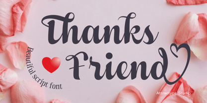 Thanks Friend is a beautiful script font with thickness suitable for greeting card designs, invitations, t-shirt sublimation, event lettering, and crafts. This font features a lovely swash in all lowercase and several ligatures and alternatives.
 - Roxy Vp by Bejeletter,
$14.00 Roxy Vp comes in bold, its a cool, robotic and thick lettered display font. This font is ideal for writing web designs, business cards, or pretty much anything else that requires a modern and techno touch.
 - Livingstone by Stringlabs Creative Studio,
$29.00 The Livingstone is an unique blackletter decorative font. It’s suitable for use in various projects such as gothic lettering, tattoo, headlines, posters, magazines, newspapers, t-shirts, labels, and every other design which needs a striking typeface.
 - Gemstone JNL by Jeff Levine,
$29.00 A late-19th Century song book entitled "Gems of Scotland - A Beautiful Collection of Scottish Songs" had the words "Gems of Scotland" hand lettered in an ornate, condensed type style now reproduced digitally as Gemstone JNL.
 - Nouveau Spur JNL by Jeff Levine,
$29.00 The condensed, spur serif hand lettering for the title on the 1906 sheet music cover of “Gee! But this is a Lonesome Town” inspired Nouveau Spur JNL; which is available in both regular and oblique versions.
 - Time Count JNL by Jeff Levine,
$29.00 On the 1966 movie poster for “Seconds”, Saul Bass designed a hand lettered title utilizing a ‘futuristic’ stencil style. This inspired the digital typeface Time Count JNL, which is available in both regular and oblique versions.
 - Leytta by AEN Creative Studio,
$10.00 Leytta is a sweet, soft hand-lettered handwritten font. Fall in love with its authentic feel and use it to create gorgeous wedding invitations, beautiful stationary art, eye-catching social media posts, and cute greeting cards.
 - Via Roma Display by Font&Co.,
$19.00 A font inspired by regime propaganda inscriptions found in Italian institutional and civic architecture of the 20’s and 30’s. Bold, severe lettering, suggestive of pre-war Italian Art Deco and American Depression Modern aesthetics.
 - Helinda Rook by Monotype,
$29.99The Helinda Rook font is a popular choice in advertising, invitations, greeting cards, and wherever a formal hand-lettered or engraved look is desired. Helinda Rook is an elegant connecting alphabet font based on formal handwriting. - Radio Singer JNL by Jeff Levine,
$29.00 The hand lettered sans serif title on the sheet music for the 1930s song "I'm Alone Because I Love You" was the inspiration for Radio Singer JNL, which is available in both regular and oblique versions.
 - Plowright by Scriptorium,
$18.00Plowright is a new font based on hand lettering from the 1880s. It's a great example of the style we often associate with signmaking in the old west, with a lot of quirks and original character. - Gingerbread Hobs by Adita Fonts,
$11.00 Gingerbread Hobs is display font for this festive season! Come with baked cookie detail in letter. Perfect for decorating your project, logo design, shirt design, etc. Easy to use , Cricut Support, Silhoutte Support, and All Program
 - Rice Wine JNL by Jeff Levine,
$29.00 A piece of sheet music from Richard Rodgers and Oscar Hammerstein II's 1958 hit "Flower Drum Song" had the play's name lettered in its iconic Anglo-Japanese style. This became the basis for Rice Wine JNL.
 - Madelief by Balpirick,
$15.00 Madelief is a sweet, soft hand-lettered handwritten font. Fall in love with its authentic feel and use it to create gorgeous wedding invitations, beautiful stationary art, eye-catching social media posts, and cute greeting cards.
 - Back Lot Stencil JNL by Jeff Levine,
$29.00 Back Lot Stencil JNL is a hand lettered slab serif stencil design based on the titles and credits from the 1954 film “Human Desire” and is available in both regular and oblique versions. Caps only Font.
 - Kitchen Utensils by Celebrity Fontz,
$24.99 Kitchen Utensils is a pictorial font with 36 different common kitchen tools and appliances in the shape of the letters of the alphabet and numbers. Perfect for cooking and kitchen-related texts, recipes, and culinary publications.
 - Raider Stencil JNL by Jeff Levine,
$29.00 The dust jacket for the 1929 Western novel "The Raider" by Charles Alden Seltzer featured the title and author's credits in a hand-lettered extra bold stencil design. This became the model for Raider Stencil JNL.
 - Scratchers by PizzaDude.dk,
$15.00 Scratch me here and scratch me there - use my font to get some atmosphere. A quirky sans with scratchy lines, with contextual alternates in 4 different versions of each lowercase letter and multilingual support. Enjoy Scratchers.
 - Moyenage by Storm Type Foundry,
$55.00Blackletter typefaces follow certain fixed rules, both in respect to their forms and to the orthography. Possibly, they were a reaction to the half-developed Carolingian minuscule which was soon to end in the Latin script. Narrow, ordered script was to replace the round, hesitant and shattered shapes of letters in order to simplify writing, to unify the meaning of individual letters, and to save some parchment, too. Opposed to the practice common in monasterial scriptoriums where Uncial, Irish and Carolingian inspiration flew freely and as a result, the styles of writing differed in each monastery, the blackletter type was to define one, common standard. It was to express spiritual verticality, in perfect tune with the architecture of the Gothic era. Typography became an integral part of the overall style of the period. The pointed arch and the blackletter type were the vanguard of the spectacular transformation from the Middle Ages towards the modern era, they were a celebration of a time when works of art were not signed by their makers yet. Some unfortunate souls keep linking blackletter solely with Germany and the Third Reich, while the truth is that its direct predecessor, the Gothic minuscule, evolved mostly in France. Even Hitler himself indicated blackletter type obsolete in the age of steel, iron and concrete – thus making a significant contribution to the spreading of the Latin script in Germany. Once we leave our prejudice aside, we find that the shapes of blackletter type have exceptional potential, unheard of in sans-serif letterforms. The lower case letters fit into an imaginary rectangle which is easily extended both upwards and sideways. In its scope and in the name itself, the Moyenage type family project is to celebrate the diversity of the Middle Ages. I begun realizing the urge to design my own blackletter when visiting the beer gardens of Munich and while walking through the villages of rural Austria. The letters from the notice boards of inns are scented with spring air, with the flowers of cudweed, with white sausage and weissbier. The crooked calligraphic hooks and beaks seem to imitate the hearty yodeling of local drinkers and the rustle of the giant skirts of girls who distribute the giant wreaths of beer jugs. Moyenage is, however, a modern replica of blackletter, so it contains some otherwise unacceptable Latin script elements in upper case. I chose these keeping the modern reader in mind, striving for better legibility. The font is drawn as if written with a flat pen or brush, and with the ambition to, perhaps, serve as a calligraphic model. In medium width, the face is surprisingly well legible; it is perfect for menus as well as posters and CD covers for some of the heavier kinds of music. It has five types of numerals and also a set of Cyrillic script, symbolising the lovelorn union of Germans and Russians in the 20th century. Thus, it is well suited for the setting of bilingual texts of the German classic literature, which, according to the ancient rules, must not be set in Latin script. - Slik by Trine Rask,
$40.00 Slik is a type family developed with packaging in mind. It started as one word in the boldest weight while working on an update of the Swedish liquorice brand »Läkerol« , a rejected proposal with the logotype in all upper case letters. It has very characteristic elements and is still simple and consistent in a way that is suitable in packaging design. The family consists of seven weights from Ultralight to Extrabold. It contains some alternative characters more suitable for text & numbers for pricing.
 - Quadrat Grotesk New by ParaType,
$30.00 Designed for ParaType in 2004 by Vladimir Pavlikov. It is a new version of popular type Quadrat Grotesk by the same author. Letters of the new version in contradistinction to the old one are clean and have no traces of exploitation. Quardat Grotesk New due to its rectangular proportions is extremely readable in small sizes and can be successfully used in Web pages and in documents with long lists where critical aspect is a number of lines rather then length of a line.
 - Spy Stencil JNL by Jeff Levine,
$29.00 Dean Martin starred in four movies as Matt Helm, the titular character in a series of spy novels by Donald Hamilton. Martin’s version of the government counter-agent followed his TV persona – a fun-loving ladies man who (in this case) just happened to be a spy. The movie poster for 1966’s “The Silencers” has its title hand lettered in an extra bold sans serif stencil style. This is now available as Spy Stencil JNL in both regular and oblique versions.
 - Alinea Incise by Présence Typo,
$36.00Alinea is a typeface in 3 styles (Sans, Incise, and Serif) conceived for being mixed in the same document. Alinea incise is a flare serif (incise in French). It finds its origin in the roman letters carved in stone. The great advantage of such a style is that it can be associated to any other style of typeface. The most famous flare serifs are: Optima of Hermann Zapf, Pascal of José Mendoza, Amerigo of Gerard Unger and Alinea Incise of course! - Ladronn by Comicraft,
$39.00 Comicraft first created this font, based on the unique European lettering style of Ladronn, for the Marvel X-book CABLE in 1998. It was later upgraded for THE INHUMANS mini-series, and modified again for the HIP FLASK mini-series in 2002. In 2018, we Remastered it for the new LOST IN SPACE series from Legendary, with improved spacing and kerning, an additional Bold weight, and our patented Crossbar I Technology to automatically place the crossbar I in the right spots.
 - Achispado by Linotype,
$29.99Achispado which means tipsy or slightly drunk in Spanish is the name of a crazy funk font that was designed by Richard Yeend in 2003. Full of comic almost architectural elements bit and pieces of the entire history of lettering come together to create the letterforms of this typeface. Text set in Achispado will look just plain fun if a little tipsy at the same time! Achispado could be used in large display settings, in fashion or on jewelry items. - Paverify by Esintype,
$14.00 Paverify is an all-caps geometric slab serif display face inspired by a particular pavement tile component which is evoking a blocky “I” letter. All other characters were interpreted based on its look and drawn accordingly. There are three uppercase Roman fonts in different weights and widths substantially. With the additional versions, type family consisting of 7 fonts in total. Over 220 Latin, Cyrillic and Greek script languages supported. Each font contains an extensive multilingual support with more than 1600 glyphs and OpenType features, including number forms, fractions, and stylistic alternate sets those provide different looks by the typographic preferences. For the lowercase letters there are small caps variants, i.e., shorter caps. These also have identical glyphs and matching marks to enable “Small Capitals From Capitals” feature. Narrower Medium and Bold styles was produced to accompany the Black first design. Paverify comes with an ornaments font named as “Extras”, which contains geometric graphical elements, i.e., paver stone patterns, banner/sticker background sets, star comps and a collection of catchwords to simplify creating feature rich layouts. As is known as interlocking paver in certain regions — a rectangular shape with the distinctive diagonal tabs — transcribing the simplest letter to draw into the whole alphabet was a challenging task. Not only it was the single thing that can be used as a source, considering its thick form in roughly 1.2:1 proportions compared to the sophistication of letterforms was the challenge. Starting point was keeping design consistent while both avoiding and preserving a particular appearance to achieve a similar texture, basically a repeating pattern on the streets. In contrary of a traditional approach, Paverify tend to have more contrast than the other slab serifs which helps to reduce massive stem weight of the source form. This look contributes to its hand painted sign effect achieved in a certain degree, which may otherwise impractical to transform because the source material is an inorganic, static form by definition. Tight and even spacing of the pavement tiles was inspirational for the kerning balance of the letters. Although the lighter weights have more space between the letter pairs, black weight adjusted as to be close to each other as the original grid. Tight spacing can be ignored by using Capital Spacing OpenType feature for the Outline versions as layer fonts. In one stroke, this gives an extra space between the letters to avoid diagonal armed letter terminals overlap. Black typographic colour and texture gives a sturdy appearance to the lines, it is useful for the projects where a robust display faces preferred for the titling, strong headlines, letter stacks, dropcaps, initials, short names on materials such as advertisements, book covers, posters, logotypes, wordmarks, package designs, and more in print or digital. Paverify can be paired as a complimentary face in a combination with broader type systems, where vintage look compositions and woodcut style fusions requiring an extra stunning texture.
 - Symply by TripleHely,
$16.00 Hi there! Let me introduce Symply – a handwritten signature-style font. Symply is perfect for logos, branding, quotes, blog headlines, magazine and book design, product packaging, web design – or for any text on postcards and your favorite photos. Symply contains: a standard set of characters with wide multilingual support: Western-, Central- and Eastern-European, Baltic, Turkish, Latin-type Africans, and Asian (94 languages in total) 2 additional sets of alternative characters for lowercase letters 8 alternative characters for some initial letters 28 ligatures for double letters and frequent combinations a bonus font with 62 swashes and doodles Symply has two types of embedded auto-replacements: lowercase letters without connecting strokes (for a case of the last character of the word), and ligatures (for a case of two letters that do not pair well together). These features work well in many apps (even simple ones like Notepad/TextEdit), and if you need to customize their application – you could use programs that support OpenType features (for example, Adobe apps or CorelDraw). All these additional glyphs are PUA-encoded, so if your software does not support OpenType — you could access them through Character Map (Windows) or Font Book (Mac) Swashes and doodles come in a bonus font, Symply Swashes. To type them, please press keys with letters A – X, a – x, and numbers 0 – 9 I hope you will like Symply and create great designs with it! And if you have any questions, feel free to contact me via e-mail: triple.hely@gmail.com
 - Masked Hero by Linecreative,
$18.00 Introducing "Masked Hero," a dynamic and commanding font that stands tall as a bold, oblique, all-cap typeface. This font is not just a collection of letters; it's a visual narrative of strength, speed, and superhero prowess. "Masked Hero" takes typography to new heights by incorporating uppercase letters adorned with intricate wing patterns, elevating your design into a powerful champions. The uppercase characters in "Masked Hero" aren't just letters; they're symbols of superheroic identity, each adorned with wing-like patterns that evoke a sense of flight and strength. These letters become the emblem of your design, embodying the essence of masked heroes ready to leap into action. To provide designers with unparalleled flexibility, "Masked Hero" is equipped with alternates for both uppercase and lowercase letters. This feature allows you to customize the appearance of your text, giving you the creative freedom to push the boundaries of typographic design. The alternates enhance the visual impact of your message, ensuring that every word becomes a statement. With a sharp and bold aesthetic, "Masked Hero" is tailor-made for projects that demand speed, strength, and a touch of superhero flair. Whether you're designing a logo for a masked vigilante, creating dynamic sports-themed graphics, or crafting the name of a superhero, this font is your ally in making a bold statement. Masked Hero offers you: 1. 4 options of letters, All Caps (All options of the characters are included in one font) 2. Numbers and Punctuation 3. Multilingual Support (Latin Western Europe)
 - Chettos Script by Josstype,
$10.00 Introduce Chettos Script, Hand Lettered Calligraphy Font with beautiful waves and natural flow. has a unique letter style, with natural handdrawn, and has a softer and smoother character subtly connect all the characters. They have a simple elegant swashes in separate letters, you can use graphic design software to access the alternate letter. Chettos Script is perfect for weddings, invitations, greeting cards, quotations, posters, branding, business cards, stationary, title design, header blog, excerpts of art, the art of typography, letter envelopes modern or design books, occurred styles such as design handdrawn, title , letter marriage, pop vintage design, or purpose to make the project / art design we look beautiful and trendy. Chettos Script comes complete with 259 glyphs. This includes uppercase, lowercase, numbers, fractions, punctuation, multi-language support. and some other flying machines are variations that part of OpenType features such as; Standard ligatures, stylistic set, alternative style. If you have any questions, please feel free to contact me via email: joelpopon@gmail.com
 - 3 Prong Tree - Unknown license

- Katastrofe by PizzaDude.dk,
$20.00 Katastrofe is danish for … well, catastrophe - you may have guessed that! This font was almost a catastrophe to make! I cut out all the letters in a cardboard, and went outside to spray the letters with a spraycan. Everything went smooth as planned, but suddenly the wind started to blow and the papers started to fly away! Luckily I found some stones I used to make the papers stay in place. Lucky for me - otherwise it would have been a catastrophe! Seconds after finishing this font project, it started to rain…I just avoided a catastrophe! But is this font really a catastrophe, or does it just mimic punk/spray/grunge/riot? Make your own statements using Katastrofe, or perhaps your very own punk sayings like “Punk is not dead”, “Anarchy Rebel” or what suits you the best. Whatever you choose to write, you will definitely get that real punk look! Perhaps you could even do a t-shirt print that says “Katastrofe” :) Comes with different upper and lowercase letters along with alternate versions of each letter - and of course a lot of foreign letters, because punk is not dead and punk is universal!
 - Open Book ING by Ingrimayne Type,
$9.00 OpenBookING is a gimmick or novelty font that has letters on pages of a book. It is caps only and monospaced. The letters on the upper-case keys are on the left-handed pages of an open book and the letters on the lower-case keys are the same letters but on the right-handed pages of an open book. One could alternate upper and lower case keys to get letters on complete books, but the Opentype feature of contextual alternatives (calt) does this automatically. Several previous typefaces from IngrimayneType used the calt feature to alternate shapes that fit together in an interlocking pattern, such as alternating concave and convex shapes. OpenBookING uses the calt feature in a different way, to alternate two halves of a symmetrical shape. To provide two copies of numbers and common symbols, some non-alphabetical characters are unavailable because their slots were taken by the second form of the number or common symbol. If stylistic set one (ss01) is turned on, spaces are replaced with empty pages. This may leave you with unwanted spaces at the end of lines, and to eliminate them, turn off the feature (or change the font) for these spaces. The empty pages can be used in a layer to add color to the text. There is also a second set of empty pages with a filled page that can also be used in layers. (See poster for examples.) These pages are on the (logicalnot multiply) and (register divide) characters for the first set and on the (ordmasculine ellipsis) and (macron trademark) keys for the second set. Finally, OpenBookING has a large set of accented characters if anyone should need them. The letters used on the books were derived from the font Myhota-Bold. For a related typeface of letters on book covers, see NewLibrary. OpenBookING has limited uses and is priced accordingly.
 - Metrolox - Unknown license

- StageDive - Unknown license

- Deltras by Abbasy Studio,
$17.00 Deltras is handmade modern vintage display typefaces, which is combining the style of classic typography with an modern handlettering style. The font have smooth edges to make vintage printing, so it will bring a handdrawn classic look feels. It easily cooperating together and perfect for creating the traditional style logos, labels, package design, lettering for t-shirts and much others. There are more than 355 glyphs in the font including Stylistic sets, Contextual Alternates etc. OpenType features with Stylistic Alternates, Contextual Alternate in some characters that allows you to mix and match pairs of letters to fit your design.
 - Racers Energy by Din Studio,
$29.00 Do you want energetic designs? Racer energy is a font created in capital letters with the racing theme producing courageous strong impressions in no time making it worth adding to your design list. Letters are made similar to firm rectangle blocks with sharp-angles. Enjoy other incredible features available on this font. Features: Multilingual Supports PUA Encoded Numerals and Punctuation This font looks great on any design projects such as posters, banners, logos, book covers, headings, printed products, merchandise, social media, etc. Find out more ways to use this font by taking a look at the font preview. Purchase it now. Happy designing.
 - Plain Stupid by PizzaDude.dk,
$17.00 Really, there is nothing stupid about this font. In some strange and weird way, I just thought that the name sounded like something eye-catching - in the same way that the font is eye-catching! It may look like your average comic font, but it's not! I carefully put a lot of funk, twist, comic and a spoonful of pizzadude into each and every letter. The result is a bouncy crazy looking comic font. Oh, I almost forgot - I topped the letters with a spoonful of grafitti mixed with the sounds of a party...that's the recipe for this lovely multilingual font! :)
 - Beijin by Abbasy Studio,
$10.00 Introducing Beijin Layered Font Beijin is a serif font and comes with 7 layer style, that allows you to stack however you want. There are more than 407 glyphs in this font including Stylistic sets, Contextual Alternates etc. OpenType features with Stylistic Alternates, Contextual Alternate in some characters that allows you to mix and match pairs of letters to fit your design. Beijin Layered Font is suitable for Logo, greeting cards, quotes, posters, branding, stationary, design title, blog header, art quote, typography art, modern envelope lettering or any purpose to make our art/design project look pretty and trendy.


