10,000 search results
(0.027 seconds)
- Eckhardt Brushletter JNL by Jeff Levine,
$29.00 The wealth of vintage hand-lettering styles found in a 1941 edition of the Speedball® Lettering Pen instruction book has allowed Jeff Levine to re-draw a number of them in digital format for today's designers. As with other fonts in the Eckhardt Series of sign painter-inspired styles, this font is named in honor of Jeff's good friend Albert Eckhardt, Jr. Al was quite the talented sign writer, and ran Allied Signs in Miami, Florida from 1959 until his passing.
 - Fingerz by Sergejs Kolecenko,
$19.95 This typeface was started as assignment in Academy, then the idea grew to develop into a font family with different styles for interesting combinations. Inspiration came from my own hands -- it is amazing how fingers can form letters, so each letter has it’s own personality. Fingerz font family is perfect to use in posters, booklets and other typographic elements also in all other media that needs to catch attention. This font comes in 5 different styles to combine in various color combinations.
 - Guest Invitation JNL by Jeff Levine,
$29.00 Samuel Welo was a sign painter who had published in the 1920s and again in 1960 editions of his “Studio Handbook – Letter and Design for Artists and Advertisers”. In-between, in 1930 Welo also published “Lettering - Practical and Foreign”. Within the pages is an Art Deco outline slab serif design using multiple thin lines to create an “incised” or “engraved” look within the characters. This intriguing type style is now available as Guest Invitation JNL, in both regular and oblique versions.
 - Seasick by Ingrimayne Type,
$8.95Seasick and Seasick-Mirror features wobbly, wavy, distorted letters. They were derived from the almost monoline font Kwersity. The letters of Seasick have a slight backward slant and the letters of SeasickMirror have a slight forward slant. Each of them comes in four weights: Light, Regular, Bold, and ExtraBold. - Lie Detector by PizzaDude.dk,
$15.00A comic font with a twist of crunch! The Lie Detector font deserves headlines and comic lettering, but most of all it deserves long letters. Use Lie Detector next time you want to spice up your letter or invitation, and you'll be surprised by the powers in this font! - Soest St Mary by New Renaissance Fonts,
$10.00Unusual decorative capitals from embroidery work in a German church. Upper case has a diamond-shaped frame around each letter; lower case is just the letters without the diamond frame; and the ampersand gives just the diamond frame so you can use a different colour from the letter. - California Poster SG by Spiece Graphics,
$39.00 Known to many eastern artists as the California Poster Letter because it originated in the West, this old 1930s style has reappeared in digital form. Carl Holmes, in his wonderful book on old lettering styles, pays tribute to this uniquely American design. Faintly reminiscent of the lettering of Fred G. Cooper, California Poster Bold is at times wildly exaggerated and boisterous. Letters appear to be inflated and loopy. The design might aptly be described as a kind of rollicking Cooper Black (Oswald Bruce Cooper). An extensive range of alternates and figures has been provided for your convenience. California Poster Bold is now available in the OpenType Std format. Some new characters have been added to this OpenType version as stylistic alternates and historical forms. These advanced features work in current versions of Adobe Creative Suite InDesign, Creative Suite Illustrator, and Quark XPress. Check for OpenType advanced feature support in other applications as it gradually becomes available with upgrades.
 - ITC Ironwork by ITC,
$29.99ITC Ironwork is the work of Serge Pichii, who was inspired by a piece of decorative lettering done by Jan Tschichold in the early 1920s. Tschichold had interlocked a series of rough sans serif letters and embellished them with scattered decorative elements. The original was of only capital letters, touching and overlapping like an ironwork gate made of letters. Pichii completed the typeface with lowercase forms and smoothed the edges. The scrolls of the capitals were extended to the lowercase and Pichii based them on iron scrollwork he found in Vienna and Prague. A lot of attention was paid to the elements of the typeface in order to 'smooth out' and balance proportional relations between the elements," says Pichii. ITC Ironwork is great for signage and display but also works well in short texts." - Use Your Words by Joanne Marie,
$10.00 Here’s a different kind of font for the hand lettered look! Use Your Words is a catchwords font family consisting of 3 fonts: 1.) Use Your Words Circles 2.) Use Your Words Arrows 3.) Use Your Words Banners It’s all hand drawn and hand lettered in a monoline script font with a shadow effect to boot. This font will be perfect to include on designs such as mugs, t-shirts, bags, notebooks, inspirational quotes for the home and office, and more. There are 215 words (no more than 4 letters per word) in both upper and lowercase, plus numbers, ampersand, question and exclamation marks in all three styles. There are 444 glyphs per font. I love using this font in my hand lettering designs and I hope you will too!
 - Stamped Metal JNL by Jeff Levine,
$29.00 Online auctions offer a myriad of unique, vintage and novel lettering devices – all which are fertile ground for typographic inspiration. In this instance, a set of stamped metal letters for outdoor signage was the basis for Stamped Metal JNL. Some of the non-traditional letter weights makes these simple block letters a wonderful change of pace for bold, attention-getting headlines.
 - Teapot by Ingrimayne Type,
$9.00 Teapot is a font with letters on teapots. Upper-case letters have the handles on the right and lower-case characters have the handles on the left. The letters on the teapots are from the typeface InsideLetters. A revision in 2018 added some characters that can be used to create multicolored lettering. A pdf file here shows how to use them.
 - Tropical Lounge by Fenotype,
$19.00 Tropical Lounge is an interlocking display typeface inspired by the hand lettering in 60s pulp magazine covers. It’s filled with a playful and vibrant 60s vibe, as well as modern OpenType features. Contextual Alternates switch the previous letter depending on the following one, giving it a bouncy, jazzy feeling. Both lowercase and uppercase letters are capitals, but uppercase features a set of taller and wider letters. You can also mix and match uppercase and lowercase for a suitable combination. In addition, Tropical Lounge has a set of Swash and Stylistic Alternates that can be used for a larger variety. There are also lining numbers and a set of arrows and swooshes in lowercase Stylistic Set 1.
 - Vasetters by Ingrimayne Type,
$9.00 In Vasetters the letters are cut from the shape of a tessellating vase. To get the tessellating effect, the two sets of letters (and numbers and some symbols) must alternate, and this is done automatically in applications that support the OpenType feature of Contextual Alternatives (calt). Vasetters is monospaced and comes in two weights. The regular weight is tightly spaced, which should not be a problem at large point sizes. At small point sizes adjacent letters can be colored differently or the character spacing can be increased. The lighter weight can be used alone or layered above the regular weight to create the effect of hollow lettering. Vasetters is is fun, bizarre, weird, and obviously a decorative display font.
 - Imperija Roman by Lewis McGuffie Type,
$39.99 Imperija Roman is a display typeface inspired by stone engraved lettering. Supporting west, central and east European languages it contains over one-hundred discretionary ligatures and a stylistic set for old style diacritics. The original letters were drawn from a memorial engraving in Ljubljana, Slovenia. Further development and several iterations later, Imperija Roman has a flowing organic feel while staying true to the rigid constraints of stone-cut letters. The alternative diacritics in stylistic set one were included to give the user more options for a historical feel to the lettering. The discretionary ligatures also offer a huge range of variation and were drawn based off of historical Roman sources and common frequency digraphs in major European languages.
 - Lianhua by Quatype,
$15.00 Lianhua is a handwritten font with a soft touch, given by a Chinese ink brush. There are lots of Chinese western fonts having a strong, sharp visual feeling, like the strokes of Chinese characters, so I decide to do the opposite: soft. Because except for Yang, there is also Yin in Chinese culture. The name 'Lianhua' means lotus in Chinese. This font is flexible and widely-used, it's suited for book titles, posters, brochures, flyers, even for menus of a Chinese restaurant. The total glyphs in this font is 351, including basic Latin letters and symbols, Latin-Expand A, 10 ligatures and 2 alternate letters, which are the letter g and letter y.
 - Dyna Pro by Anatoletype,
$33.00 Elena Albertoni on Dyna: “While studying in Paris, I worked for a design studio specialized in packaging. French supermarkets are full of lettering with a handwriting flavor, which seems to go very well with a wide range of very different products. With the aim to analyze and summarize the qualities of these letterings in one typeface, I faced choices and limits similar to the ones encountered with handwriting. The letters are sloped at different angles, which gives them rhythm; their open shapes suggest movement and gesture. Letters want to dance!” Dyna Pro’s extended character set provides support for a wide range of European languages that share the Latin and Cyrillic scripts. Cyrillic characters designed by Elena Novoselova
 - Headline Nouveau JNL by Jeff Levine,
$29.00 The hand lettered title for the 1890s book called “The Octopus” featured extra bold Art Nouveau lettering with rounded serifs. This is now available as Headline Nouveau JNL in both regular and oblique versions.
 - School Desk JNL by Jeff Levine,
$29.00 School Desk JNL is a block-style sanserif based on die-cut cardboard letters used in classrooms during the 1940s and 1950s for making various projects and teaching children the basic shapes of letters.
 - 99 Names of ALLAH Complete by Islamic Calligraphy75,
$12.00 We have transformed the “99 names of ALLAH” into a font. That means each key on your keyboard represents 1 of the 99 names of ALLAH Aaza Wajal. The fonts work with both the English and Arabic Keyboards. We call this Calligraphy "complete" because this is the only calligraphy where the complete set of decorative letters have been used. The calligraphy is more on the traditional side, letters don't overlap, the "ye" at the end of the names doesn't have the two dots, and a decorative "ye" has been included. The first "Alef" doesn't have a "hamzit wasel" nor a "fatha", this indicates to skip the pronunciation of that first letter. So instead of saying "AR-RAHMAAN" you say "R-RAHMAN". (in the zip file you will find a pdf file explaining the differences in the "harakat", pronunciation and spelling according to the Holy Quran). In other calligraphy you don't usually find the decorative letters: "Dal, Ra & Ye" but we like them and we use them. Decorative letters used in this calligraphy: "Mim, Aain, Sin, HHe, He, Kaf, Tah, Dal, Ra, Alef, Ye & Saad". Purpose & use: - Writers: Highlight the names in your texts in beautiful Islamic calligraphy. - Editors: Use with kinetic typography templates (AE) & editing software. - Designers: The very small details in the names does not affect the quality. Rest assured it is flawless. The MOST IMPORTANT THING about this list is that all the names are 100% ERROR FREE and you can USE THEM WITH YOUR EYES CLOSED. All the “Tachkilat” are 100% ERROR FREE, all the "Spelling" is 100% ERROR FREE, and they all have been written in accordance with the Holy Quran. No names are missing and no names are duplicated. The list is complete "99 names +1". The +1 is the name “ALLAH” 'Aza wajal. Another important thing is how we use the decorative letters. In every font you will see small decorative letters, these letters are used only in accordance with their respective letters to indicate pronunciation & we don't include them randomly. That means "mim" on top or below the letter "mim", "sin" on top or below the letter "sin", and so on and so forth. Included: Pdf file telling you which key is associated with which name. In that same file we have included the transliteration and explication of all 99 names. Pdf file explaining the differences in the harakat and pronunciation according to the Holy Quran. Here is a link to all the extra files you will need: https://drive.google.com/drive/folders/1Xj2Q8hhmfKD7stY6RILhKPiPfePpI9U4?usp=sharing
 - Nazare by Ndiscover,
$39.00 It all started with a Portuguese soap packaging from the first half of the 20th Century. The 5 uppercase letters that spell NAZARÉ were sufficient to drive the creation of this design. Nazaré fits in a semi-serif category and it has a large contrast. It works outstandingly in display use specially in the bolder weights that have even more contrast. The regular weights have a more moderate contrast and an overall less extravagant design, fitting best in the typographical conventions. this provides a better render in text use. You can use this font in large headlines, logos, posters, book covers, and general display use as well as short strings of text. Nazaré is the name of a small Portuguese fishing village known for its giant waves and peculiar people.
 - Catalina by Kimmy Design,
$10.00 Earlier this year I visited a bakery in Newport Beach, CA and fell in love with the organic design and typography of the place. Hand-drawn menus, table cards, chalkboards, and wall quotes surrounded the charming spot. It inspired me to create a new font family based on the combination of hand drawn fonts. Included in this package are 5 font families, with 2 graphic ornament fonts. Each font family contains at least a light, medium and bold. Here is a breakdown of what's cookin' at Catalina's Bakery: Catalina Anacapa: Tall and skinny, this font comes in 3 weights for both sans and slab serif styles. It includes contextual alternatives (giving 3 versions of each letter), stylistic alternatives for select letters (A, K, P, Q, R, Y) and also includes Small Caps. Catalina Avalon: Based off Anacapa, this sub family has a high contrasting line weight. It comes in light, regular and bold as well as an inline alternative for both sans and slab serif styles. Avalon also includes opentype features such as contextual alternatives (giving 3 versions of each letter), stylistic alternatives for select letters (A, K, P, Q, R, Y) and small caps for each letter. Catalina Clemente: In a more standard width, Clemente is one of the two sub families that can be used for paragraph text as well as headlines. It's organically geometric in style and comes in ALL CAPS and lowercase, includes upright and custom italics, and has the opentype feature giving 3 versions of each letter. Catalina Script: A great compliment with the display sub-families, Catalina Script rounds out the package with a hand-drawn cursive flair. It includes contextual alternatives (giving 2 variations to each letter) as well as stylistic alternatives for many of the capital and lowercase letters. It has special ligatures for some letter combinations, and titling alternatives for all the capital letters. Catalina Typewriter: The second of the paragraph text sub-families, this typewriter inspired hand-drawn font family works great as either a display or paragraph text. It has contextual alternatives with 3 versions of each letter, and comes in both upright and custom italics versions. Catalina Extras! These two fonts go perfectly with the Catalina Family. They includes borders, frames, arrows, banners, flourishes and more. Catalina Flourish has all of it's options in a light and bold style, to use the light version type all lowercase letters, then to make something bold, used it's uppercase (or shift+) characters. For a breakdown of graphic/letter correlation, see the breakdown PDF. All of Catalina was drawn by the same hand, using the same ink and technique. While they contrast in their type styles, they work together perfectly to create one cohesive font family.
 - Victorina Black Shadow by John Moore Type Foundry,
$35.00 Victorina Shadow is a fantasy sans letter display, inspired by the Victorian letters whose stylistic influence dominated the scene graph of the nineteenth and Twentieth century. Victorina has a perfect structure rigorous geometry. Victorina comes in several versions, in this set you will find the Shadow version in black and italic to complement the varied repertoire of styles of Victorina family, besides providing small caps and ornaments. Victorina Shadow let to work fine fantasy headlines when they overlap in layers of different styles. Victorina Shadow is a letter designed to recreate, with a contemporary vision, the spirit of those days of the industrial revolution and the early days of modernism.
 - HeyPumpkin by Ingrimayne Type,
$14.95 HeyPumkin is a letterbat font designed for use in the late autumn, when the leaves are falling and the harvest is underway. October 31 is an especially good time to use it. The upper- and lower-case letters are almost identical. If you want a version of this face without the pumpkins, try Ingone. Buried in the font is another set of letters on pumpkins. They are on unicode characters in the 2400 block, circled digits and letters. These characters can also be accessed using the OpenType stylistic sets feature. (The alternative characters are further developed in a separate typeface, part of the InsideLetters family.)
 - Villantez by Ilhamtaro,
$23.00 VILLANTEZ is a display that is basically a serif font that has been modified in such a way that there are breaks or distances at the body meeting of each letter, almost like in stencil letters. Creating a more attractive and different impression from other display serifs, this font can also be categorized in a more modern Victorian style by carrying a slight stencil modification. This font is also an all caps font with different letter and character heights in the uppercase and lowercase. To enable the OpenType Stylistic alternates, you need a program that supports OpenType features such as Adobe Illustrator CS, Adobe Indesign & CorelDraw X6-X7. Cheers!
 - Solpera by Storm Type Foundry,
$32.00This type face fills one of the gaps between the world of Roman alphabets and that of linear alphabets. The first to be designed was the set of upper-case letters. The expression of these characters cannot conceal that they were originally intended only for the sculptor's use, as a type face for three-dimensional inscriptions. Their width proportions reflect a dialogue between the contemporary feeling and the legacy of classical Roman inscriptions. The type face was later complemented with a set of lower-case letters and elaborated into further designs. Its clear, concise letter forms end with small serifs which not only make the type face more refined, but above all anchor the individual letter signs visually to the horizontal of the text line. The austere construction of the majority of the letters is balanced by the more exuberant, humanizing forms of the most frequently used letters "a"; "e". (The three variants of the lower-case "e" enable to create rhythmically differentiated texts.) The letters in which a straight stroke is connected with an arch are designed in two ways. That means that the letters "n", "h","m" and the group of letters "b","d","p","q" are conceived in a different way. Thus an interesting tension is created in the structure of the text, which, however, does not endanger legibility. The economizing, slightly narrowed design of this type face predetermines its use for the setting of usual texts. In larger sizes, however, it produces a rather serious, even solemn, impression. - Enagol Math by deFharo,
$12.00 The Enagol Math family consists of 4 weight plus True italics. It is a typeface with rounded Slab-Serif of Semi-Condensed proportions. I have composed all the proportions of the character based on a study of mathematical proportions related to the golden sequences of Perrin, Lucas and Fibonacci. From an initial matrix of golden proportions applied in the letters 'H' for capital letters and 'n' for lowercase letters, calculated for the versions of the extremes of the Light and Bold type, below I do the whole calculation of proportions using my formula of three axes and by interpolation I generate the intermediate versions Regular and Medium. For the Italic versions I have drawn a complete set of lowercase letters that give these fonts an aspect close to the Italic writing. In these versions I have also applied many optical corrections to balance the deformations created in many curves by the mere inclination of the letters, which in the case of this type is 11°.
 - Maiers Nr 42 Pro by Ingo,
$42.00 A handwritten decorative font with brush characteristics This attractive decorative script is found in a pamphlet of script samples from around 1900 which was issued by Otto Maier publishing house in Ravensburg/Germany. The forms and flow of Maier’s Nr. 42 are obviously influenced by Art Nouveau. In the original sample, only the Latin alphabet appears. All other characters, especially the Greek and Cyrillic letters, were modeled on elements of the original. A typeface can first reveal a true "handmade" character when the letter forms do not continually repeat themselves – a completely normal occurrence with handwriting. Thanks to OpenType, some key letters of Maier’s Nr. 42 appear in various alternative forms depending on the combination of letters. For example, the difference is obvious between an e followed by i and an e followed by l. Using this principle, a number of letter combinations are presented with alternative character forms so that overall a very lively impression is created.
 - Flatbush Beanery JNL by Jeff Levine,
$29.00Serve up a generous portion of nostalgia with this retro font inspired by lettering in old diners, drive-ins and eateries of the 40s and 50s. - Hannah Joie by LightHouse,
$49.00Hannah Joie was influenced by the early lettering that appeared on posters in Israel (e.g. the 1950s). The style of the lettering was bold, heavy, and prominent. Hannah Joie is an OpenType/TTF Unicode font. - Handmade Gothic JNL by Jeff Levine,
$29.00 Handmade Gothic JNL is one of many typefaces inspired by lettering samples in a 1941 Speedball® Lettering Pen instructional booklet. The bold, Deco-style sans is perfect for many attention-getting headlines and titles.
 - Congratulatory Latin by Dmitriy Shchetinskiy,
$19.00 Congratulatory font consist of 36 calligraphic latin greetings letterings for different event. Letterings are original and handwritten. This font makes it possible to use high quality calligraphy in your projects - greeting cards, invitation cards etc.
 - Oaklinn by Awanstudio,
$15.00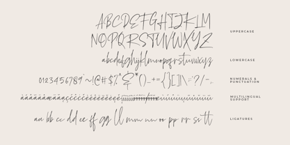 Oaklinn is a handwriting script font. It allows you to create stunning and easy hand-lettering in an instant. Ideal for the logo, quotes, product label/packaging, fashion, letter, advertising, poster, merchandise, greeting cards, etc
 - KampFriendship by Ingrimayne Type,
$9.95 KampFriendship is a casual, informal typeface family with serifs. The circular letters have an odd triangular shape. Because it has no contrast in the strokes, it appears to be neat but somewhat peculiar hand lettering.
 - DinoTracks by Ingrimayne Type,
$9.00 DinoTracks is a novelty or letterbox font in which the letters are formed with dinosaur footprints. It is readable at small point sizes, but then one cannot see that the letters are made from footprints
 - Camonflet by TanveerType,
$12.00 This unique set of letters designed in the style of serif. It's cutting edge and expanded looks carefully designed to feel like classic lettering. It's easy to read and cover a small area to utilize.
 - Aubrielle by Awanstudio,
$13.99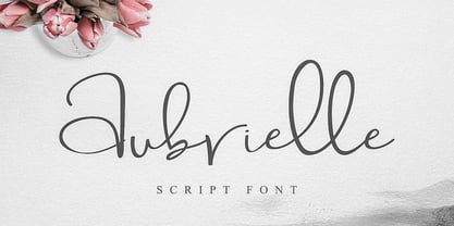 Introducing Aubrielle script font! It allows you to create stunning and easy hand-lettering in an instant. Ideal for the logo, quotes, wedding, product label/packaging, fashion, letter, advertising, invitation, poster, merchandise, greeting cards, etc.
 - OldHaroldRee by Ingrimayne Type,
$12.95 OldHaroldRee is a modification of PhederFrack, a calligraphic fraktur face. It keeps the lower case letters and inserts a completely different set of upper-case letters, which is in the “Old English” rather than the “Old German” or fraktur style. It comes in two weights, a bit unusual for an Old-English style typeface.
 - Poster Contoured JNL by Jeff Levine,
$29.00 Sheet music for a selection from the 1928 musical “New Moon” had the show’s title hand lettered in a bold sans serif that reflected the upcoming Art Deco movement, along with a contoured outline around the letters. This served as the model for Poster Contoured JNL, which is available in both regular and oblique versions.
 - Amarelinha by PintassilgoPrints,
$24.00 Amarelinha is a casual and dynamic handwritten font, charming in its own peculiar way. It is a unicase alphabet, counting two versions for each letter, easily accessible through keyboard upper and lower cases. It also has a pocketful of automatic ligatures, providing an organic and spontaneous hand lettering feel. Available in two handy weights.
 - Moho FX Shadow Pro by John Moore Type Foundry,
$40.00 A display font collection for fantasy headlines within the concept of Moho Condensed based in letters with shadows as Moho Umbra Regular and Italic, or simple shadow effect as Moho Shadow Regular and Italic, or font effects to be used in color layers. all ideal for interesting lettering to magazines, posters and labels design.