10,000 search results
(0.037 seconds)
- Bibalgo by Mchcrafter,
$18.00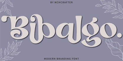 Bibalgo font is a Modern Stylistic Serif typeface A new serif that we created specially for branding needs, with extra ligatures and alternates in a unique shape just to add value to your brand. It is so nice to leverage designers or product owners who need solutions to make their designs look more stylish and modern. And specially for Bibalgo font, We prepared all the ligatures, and the alternate characters to help you create unlimited variations for your creative needs. Bibalgo font includes: - All uppercase & lowercase letters - All numbers 0-9 & Punctuation - Ligatures & Alternates - Symbols - Multiligual Letters
 - Agradable Sans by Mchcrafter,
$18.00 Agradable Sans is a Modern Stylistic Sans Serif typeface A new sans serif that we created specially for branding needs, with extra ligatures and alternates in a unique shape just to add value to your brand. It so nice to leverage designer or product owner that need solutions to make their design look more stylish and modern. And specially for agradable sans font, We prepared all the ligatures, and the alternates characters to help you create unlimited variations for your creative needs. Agradable Sans includes: All uppercase & lowercase letters All numbers 0-9 & Punctuation Ligatures & Alternates Symbols Multiligual Letters
 - Planton Script by Genesislab,
$15.00 Planton Script is a new script calligraphy, hand lettered, modern variant font. There are more than 433 glyphs in the font including stylistic sets, Contextual Substitute & Special Unicode Code etc. OpenType features with the Stylistic Alternates, a few characters that allows you to mix and match pairs of letters according to your design. To access alternate glyphs, you need a program that supports OpenType features such as Adobe Illustrator CS and Adobe InDesign, Corel Draw, Microsoft Word 2010. Can be used for various purposes such as title, signature, logo, wedding invitations, t-shirts, letterhead, signage, labels, newsletters, posters, badges etc.
 - Ruby Dance by Beary,
$13.00 Ruby Dance is inspired by a playful style and combination with hand lettering. Every single letter has been carefully crafted to make your text look beautiful. This font is PUA encoded so you can access extras from character map in most design software. Multi-lingual support is included. To enable the OpenType Stylistic alternates, you need a program that supports OpenType features such as Adobe Illustrator CS, Adobe Indesign & CorelDraw. There are additional ways to access alternates, using Character Map (Windows), Nexus Font (Windows), Font Book (Mac) or a software program such as PopChar (for Windows and Mac). Happy Creating
 - Aronia by Struvictory.art,
$14.00 Aronia is a thin line uppercase font with floral motives. The typeface includes a Decorative and a Symbol version. To get an elegant and unique design, combine letters with elements. The font is easy to use in various design programs or without any program. Aronia is suitable for feminine business branding, eco-friendly and minimalistic art, social media design. The font works great for craft products branding and packaging (organic cosmetics and food, jewelry, handmade soap ect.) Also use individual letters and symbols to create logos and monograms. Aronia combines well with modern graphics: abstract shapes and line art.
 - Minimalist by Ingrimayne Type,
$12.95 PostScript fonts are constructed by connecting dots, dots that have special attributes that control the shape of the connecting lines. In designing Minimalist, I wanted to see how few dots could be used to construct each letter. This is the source of the name--it is (or was) a minimum-point alphabet. I did not expect much from it, and was surprised that it turned out as well as it did. Since I originally drew it, I have added some points to some of the letters to get them to generate proper bitmaps, so it no longer has minimum points.
 - Winterday by Romie Creative,
$12.00 Winterday Elegant Calligraphy font that comes with exquisite character changes, a kind of classic decorative copper script with a modern twist, designed with high detail for an elegant style. Winterday Elegant Calligraphy font attractive because it is subtle, clean, feminine, sensual, glamorous, simple and very readable, because it has many fancy letter joints. I also offer a number of decent stylistic alternatives for multiple letters. Classic styles are very suitable to be applied in various formal forms such as invitations, labels, restaurant menus, logos, fashion, make up, stationery, novels, magazines, books, greeting / wedding cards, packaging, labels or all kinds of advertising purposes
 - Bibalgoski Pro by Mchcrafter,
$18.00 Bibalgoski Pro is a Modern Stylistic Serif typeface A new serif that we created specially for branding needs, with extra ligatures and alternates in a unique shape just to add value to your brand. It so nice to leverage designer or product owner that need solutions to make their design look more stylish and modern. And specially for Bibalgoski Pro font, We prepared all the ligatures, and the alternates characters to help you create unlimited variations for your creative needs. Bibalgoski Pro includes: All uppercase & lowercase letters All numbers 0-9 & Punctuation Ligatures & Alternates Symbols Multiligual Letters
 - Ingrid Mono by Jörg Schmitt,
$35.00 The birth of the monospaced types dates back to the past. There was a need for the creation of typesets for typewriters. The difficulty was to align the different glyphs in the same width. This led to particular problems with letters like "M" and "l"; the former seemed to be squeezed into the same width of all letters and the second one appeared way too stretched. Despite - or perhaps because of - the impression of the typewriter it is still popular with Graphic Designers. The Ingrid Mono font family with a high range of glyphs and symbols has that special appearance.
 - Concierge JNL by Jeff Levine,
$29.00 On occasion, one type design's influence can result in a completely different end result. Take the hand lettering found on a 1920s piece of sheet music for the song "Let Me Call You Sweetheart". The simple sans with a few Art Nouveau-inspired characters started out as the basic design of Concierge JNL, but shortly after beginning the project, the lettering took on more of an Art Deco flavor. Add to this the many rounded-edge characters that have a bit of a techno look to it and the typeface takes on many different design characteristics.
 - Moonspace by Jafar07,
$17.00 Moonspace is a unique display sans-serif font with a captivating wave-like character on each letter. Despite its slightly taller height, this font remains highly legible and suitable for a wide range of designs. With its distinctive design that sets it apart from other sans-serif fonts, Moonspace adds an artistic touch to your designs. It's perfect for use on posters, magazines, brochures, and other creative projects. Crafted with precision and balanced letter proportions, Moonspace delivers a professional and eye-catching look. It's suitable for use in a variety of designs, from modern to classic.
 - Linotype Not Painted by Linotype,
$29.99Linotype Not Painted is part of the Take Type Library, chosen from the contestants of Linotype’s International Digital Type Design Contests of 1994 and 1997. This fun font from German designer Robert Bucan grabs attention immediately. The forms are made up of multiple layers. The upper case’ alphabet forms, numerals and punctuation are two different styles of the same character, one over the other, and the lower case’ letters are composed of the lower case and upper case of the same letter superimposed. Linotype Not Painted is particularly good as a headline font in larger point sizes. - Maron King by Storictype,
$19.00 Introducing new display typeface its called Maron King Inspired by victorian style with classic style .OpenType features some characters that allows you to mix and match pairs of letters to fit in your designs. It’s an all caps typeface, with strong and sleek letters. offering an infinite opportunity to customise and create logos, headlines, titling, product packaging, labeling, logo, classic shop, badges, movie title, t-shirt, posters, label, greetingcard, letterhead, book cover, etc. To access the alternate glyphs, you need a program that supports OpenType Features : Character Set A-Z Numerals & Punctuations (OpenType Standard) Ligatures Accents (Multilingual characters) Thanks and enjoy designing
 - Mid Century Sans by Dharma Type,
$19.99 Mid Century Sans (MCS) is composed of high-geometric shapes. László Moholy-Nagy —professor in the Bauhaus— said “Typography is a tool of communication. It has to be communication in its most intense form. The emphasis must be on absolute clarity since this distinguishes the character of our own writing from that of ancient pictographic forms.” As same as you can see in modern typefaces in the early twentieth century, MCS has very efficient, clear and minima letterforms. There are not any decorative parts in the skeleton of letters. At the same time, Mid Century Sans has one more feature. In the middle of the twentieth century, one big movement which was called Mid-century modern had occurred. The Mid-century modern movement in the U.S. was an American reflection of the International and Bauhaus movements and it was slightly more organic in form and less formal than the International Bauhaus-style. In other words, it was friendly and stylish. We added Mid-century-spices to the Bauhaus-modernism. The basic letter form is geometric yet it has very friendly strokes and human touch. Mid Century Sans consists of 8 weights and their matching Italics for a wide range of usages. Farther, Mid Century Sans is supporting international Latin languages and basic Cyrillic languages including Basic Latin, Western Europe, Central and South-Eastern Europe. Also MCS covers Mac Roman, Windows1252, Adobe1 to 3. This wide range of international characters expands the capability of your works. Lowercase "a" has OpenType stylistic alternates for advanced typography.
 - Moliere by Eurotypo,
$44.00 The life of Molière is a story of struggle, hard work, domestic unhappiness, death and burial in obscurity and almost in shame. Molière left behind a body of work that not only changed the face of French classical comedy, but has also come to influence the work of other dramatists from around the world. Despite his own preference for tragedy, which he had tried to further with the Illustre Théâtre, Molière became famous for his farces, which were generally in one act and performed after the tragedy. Both the comic and the serious drama were powerfully affected by the work of Molière, not only in his own age and country but everywhere and up to the present time. Didot is a name given to a group of typefaces named after the famous French printing and type producing family. The classification is known as modern, or Didone. The typeface we know today was based on a collection of related types developed in the period 1784–1811. Firmin Didot cut the letters, and cast them as type in Paris. Along with Giambattista Bodoni of Italy, Firmin Didot is credited with establishing the use of the "Modern" classification of typefaces. The types that Didot used are characterized by extreme contrast in thick strokes and thin strokes, by the use of hairline serifs and by the vertical stress of the letters. As in the extreme contrasts of the literature of Molière, in Didione's typefaces, thick and thin strokes, straight and curved, are the most relevant characteristic for an era marked by the changes.
 - Areplos by Storm Type Foundry,
$53.00To design a text typeface "at the top with, at the bottom without" serifs was an idea which crossed my mind at the end of the sixties. I started from the fact that what one reads in the Latin alphabet is mainly the upper half of the letters, where good distinguishableness of the individual signs, and therefore, also good legibility, is aided by serifs. The first tests of the design, by which I checked up whether the basic principle could be used also for the then current technology of setting - for double-sign matrices -, were carried out in 1970. During the first half of the seventies I created first the basic design, then also the slanted Roman and the medium types. These drawings were not very successful. My greatest concern during this initial phase was the upper case A. I had to design it in such a way that the basic principle should be adhered to and the new alphabet, at the same time, should not look too complicated. The necessary prerequisite for a design of a new alphabet for double-sign matrices, i.e. to draw each letter of all the three fonts to the same width, did not agree with this typeface. What came to the greatest harm were the two styles used for emphasis: the italics even more than the medium type. That is why I fundamentally remodelled the basic design in 1980. In the course of this work I tried to forget about the previous technological limitations and to respect only the requirements then placed on typefaces intended for photosetting. As a matter of fact, this was not very difficult; this typeface was from the very beginning conceived in such a way as to have a large x-height of lower-case letters and upper serifs that could be joined without any problems in condensed setting. I gave much more thought to the proportional relations of the individual letters, the continuity of their outer and inner silhouettes, than to the requirements of their production. The greatest number of problems arose in the colour balancing of the individual signs, as it was necessary to achieve that the upper half of each letter should have a visual counterbalance in its lower, simpler half. Specifically, this meant to find the correct shape and degree of thickening of the lower parts of the letters. These had to counterbalance the upper parts of the letters emphasized by serifs, yet they should not look too romantic or decorative, for otherwise the typeface might lose its sober character. Also the shape, length and thickness of the upper serifs had to be resolved differently than in the previous design. In the seventies and at the beginning of the eighties a typeface conceived in this way, let alone one intended for setting of common texts in magazines and books, was to all intents and purposes an experiment with an uncertain end. At this time, before typographic postmodernism, it was not the custom to abandon in such typefaces the clear-cut formal categories, let alone to attempt to combine the serif and sans serif principles in a single design. I had already designed the basic, starting, alphabets of lower case and upper case letters with the intention to derive further styles from them, differing in colour and proportions. These fonts were not to serve merely for emphasis in the context of the basic design, but were to function, especially the bold versions, also as independent display alphabets. At this stage of my work it was, for a change, the upper case L that presented the greatest problem. Its lower left part had to counterbalance the symmetrical two-sided serif in the upper half of the letter. The ITC Company submitted this design to text tests, which, in their view, were successful. The director of this company Aaron Burns then invited me to add further styles, in order to create an entire, extensive typeface family. At that time, without the possibility to use a computer and given my other considerable workload, this was a task I could not manage. I tried to come back to this, by then already very large project, several times, but every time some other, at the moment very urgent, work diverted me from it. At the beginning of the nineties several alphabets appeared which were based on the same principle. It seemed to me that to continue working on my semi-finished designs was pointless. They were, therefore, abandoned until the spring of 2005, when František Štorm digitalized the basic design. František gave the typeface the working title Areplos and this name stuck. Then he made me add small capitals and the entire bold type, inducing me at the same time to consider what to do with the italics in order that they might be at least a little italic in character, and not merely slanted Roman alphabets, as was my original intention. In the course of the subsequent summer holidays, when the weather was bad, we met in his little cottage in South Bohemia, between two ponds, and resuscitated this more than twenty-five-years-old typeface. It was like this: We were drinking good tea, František worked on the computer, added accents and some remaining signs, inclined and interpolated, while I was looking over his shoulder. There is hardly any typeface that originated in a more harmonious setting. Solpera, summer 2005 I first encountered this typeface at the exhibition of Contemporary Czech Type Design in 1982. It was there, in the Portheim Summer Palace in Prague, that I, at the age of sixteen, decided to become a typographer. Having no knowledge about the technologies, the rules of construction of an alphabet or about cultural connections, I perceived Jan Solpera's typeface as the acme of excellence. Now, many years after, replete with experience of revitalization of typefaces of both living and deceased Czech type designers, I am able to compare their differing approaches. Jan Solpera put up a fight against the digital technology and exerted creative pressure to counteract my rather loose approach. Jan prepared dozens of fresh pencil drawings on thin sketching paper in which he elaborated in detail all the style-creating elements of the alphabet. I can say with full responsibility that I have never worked on anything as meticulous as the design of the Areplos typeface. I did not invent this name; it is the name of Jan Solpera's miniature publishing house, in which he issued for example an enchanting series of memoirs of a certain shopkeeper of Jindrichuv Hradec. The idea that the publishing house and the typeface might have the same name crossed my mind instinctively as a symbol of the original designation of Areplos - to serve for text setting. What you can see here originated in Trebon and in a cottage outside the village of Domanín - I even wanted to rename my firm to The Trebon Type Foundry. When mists enfold the pond and gloom pervades one's soul, the so-called typographic weather sets in - the time to sit, peer at the monitor and click the mouse, as also our students who were present would attest. Areplos is reminiscent of the essential inspirational period of a whole generation of Czech type designers - of the seventies and eighties, which were, however, at the same time the incubation period of my generation. I believe that this typeface will be received favourably, for it represents the better aspect of the eighties. Today, at the time when the infection by ITC typefaces has not been quite cured yet, it does absolutely no harm to remind ourselves of the high quality and timeless typefaces designed then in this country.In technical terms, this family consists of two times four OpenType designs, with five types of figures, ligatures and small capitals as well as an extensive assortment of both eastern and western diacritics. I can see as a basic text typeface of smaller periodicals and informative job-prints, a typeface usable for posters and programmes of various events, but also for corporate identity. Štorm, summer 2005 - Sassoon Handwriting Starter by Sassoon-Williams,
$45.99 Sassoon fonts package for handwriting starters The three upright "infant" fonts developed to meet the demand for letters to produce pupil material for handwriting as well as for reading. Letters have extended ascenders and descenders ideal on screen and print. They facilitate word recognition. The exit strokes link words together visually, also crucially, they space the letters for improved legibility. The "joined" font puts the skills gained into practice producing joined-up handwriting. Together these typefaces provide a valuable resource for Teachers to create consistent material across the curriculum. Sassoon Infant Tracker B font: This font with its direction arrows helps pupils to start in the correct place. Motor movements can be refined by keeping inside the line. When starting and direction is no problem, the arrow font can be dropped and the Dotted font used. Sassoon Infant Dotted B font: Writing over the dots of this font refines motor skills. The aim here is to give confidence by reinforcing starting points, exits and to now encourage fluidity. Sassoon Infant font: With some words in this font and a baseline beneath to copy onto, pupils can use their learned starting points and exit strokes to write freely along the baseline - still unjoined. Once learned, this leads to spontaneous joins along the baseline leading logically to a joined-up hand. Sassoon Joined font: Having learned to write letters with correct starts and exits, this is when the joined font for teaching handwriting can be used. With some words in this font and a baseline beneath to copy onto, pupils can use their learned starting points and simply extend their exit strokes to make joined-up writing. The default joins the font provides are recommended, however there are alternative letterforms that are so important for some Teachers which can be accessed. Create ‘pen lifts’ anytime too! NOTE: Fonts display unjoined by default on this website and are delivered that way - joining is controlled by your text editing application such as Word or TextEdit, read more for instructions… Free to download PDF resources: Stylistic Sets and how to access the alternative letters feature in these OpenType fonts. Using the separate letter fonts Using the joined font Teachers copybooks using these fonts: How to teach pre-cursive Copybook How to teach cursive handwriting Copybook
 - Hello My Love Pro by Debi Sementelli Type Foundry,
$39.00 “Hello My Love” is a font love story. Inspired by my own long and happy marriage of 35 years, it was created to celebrate love! A classic hand-lettered script with a modern and fresh feel, it fits beautifully with current designs and yet is sure to stand the test of time. Made with invitation designers in mind, the Hello My Love Pro script font includes a total of 1985 glyphs plus a BONUS FONT, Hello My Love Ornaments! It has 91 hand illustrations including frames, florals and design elements. As a result, you will be able to create a variety of designs to highlight your special project. It’s especially well-suited for invitations for branding weddings and other special occasions! And it supports 129 languages! The font is loaded with features: Stylistic and Contextual Alternates, Swash Caps, Standard and Discretionary Ligatures, Beginning Swashes for lower case letters, Cross-less t and f that can be combined with a flourished letter to avoid clashing plus 3 ampersands, small word art "and" & "No.", Roman Numerals, Ordinals and Fractions. This font was created to make designing easy. Need to convert upper case letters into Roman numerals throughout a guest list? Just turn on contextual alternates in Open Type capable programs and presto, the caps become Roman! Want a variety of letter choices? There are 215 stylistic alternate upper cases and 259 stylistic alternate lower cases as well as 69 ligatures to give you plenty of options. You can choose from swashes in 4 different styles and 3 different lengths resulting in unique beginning lower case letters. Works for Cutting Machines! No special software is required to use Hello My Love. All of my fonts have been specially coded for PUA (Private Use Area) so you can access all of the swashes and alternates using Character Map (PC) or Character Viewer (Mac) or with any number of apps including PopChar. If you would like to purchase PopChar at a special discount email me and I will send you the link. For Microsoft Word users, you can easily access the Stylistic and Contextual Alternates and the Roman Numerals through the Typography feature. (Microsoft Word 2010 and later) For more details about how to use my fonts, check out my video tutorials on my YouTube channel: https://www.youtube.com/user/Letteringartstudio/videos
 - Moppetops LL by Leftover Lasagne,
$25.00 Moppetops is a sophisticated yet quirky handwritten typeface that comes with a huge amount of graphical elements, accented and even greek letters. The font features auto ligatures for duplicate letters, some connected letters, quite a few graphical elements that can be accessed by shortcuts (lowercase letter + number form 0-9) and smallcaps.
 - Waba by Lewis McGuffie Type,
$40.00 Waba Pronounced ‘Vah-bah’, is a font family that I designed. The name comes from a historical variation on the Estonian word ‘vaba’ – meaning ‘free’, or 'at liberty'. Back in 2017 I visited the Estonian Print & Paper Museum in Tartu to see its great collection of type (well worth a visit!). While I was there I saw some big woodcut blocks of Reklameschrift Herold - a super Art Nouveau/Jugendstil style display font. The Print & Paper Museum's collection covers both Latin and Cyrillic faces and as a foreigner in these parts I'm kind of fascinated by the exoticism of Cyrillic. How it is different but the same to the Latin letters I take for granted (as a humble Englander – no excuses). Not to mention, Jugendstil with its imitation of natural form, reverse-weights and looping-delicious curves (like you've left the window open all summer and the garden plants are climbing in). This mix of Jugendstil, Cyrillic letters and the beautiful historical border town of Tartu inspired me to start drawing Waba. Trimming the serifs from Herold, simplifying those angles and expanding the category of weights, then taking look at the magical logic of Berthold Block and doing a few things that just seemed right at the time – Waba is a bit of love letter to Estonia, the Baltics and the visual history of Eastern Europe. Waba Monogram Waba also contains a monogram face, which allows you to create any monogramming latin and cyrillic. Simply type out your 2-3-4 characters in Waba Monogram, making sure Contextual Alternates is turned on them voila! Monograms can be customised manually using the OpenType select-pop-up in Adobe. Also included are a few Discretionary Ligatures for Mc, De, Von etc. Monograms work best when Contextual Alternates is turned on.
 - Alfarooq by Eyad Al-Samman,
$20.00 Alfarooq is the most widely known epithet for the Islamic figure Umar ibn al-Khattab (c. 586 - 644) who was a leading companion and an adviser to the Islamic prophet Muhammad (peace be upon him) who later became the second Muslim Caliph after Muhammad’s death (pbuh) in 632. Muslims widely know Umar ibn Al-Khattab (may Allah be pleased with him) as Alfarooq (i.e., he who knows and distinguishes between truth and falsehood). Alfarooq is a unique, wide, and headline Arabic display typeface. The main trait of this typeface is the novel design of its letters' tails and its dots which renders it as one of the modern stylish typefaces used for headlines and titles. This can be noticed in different letters such as Ain, Ghain, Jeem, Khah, Seen, Sheen, and others. In addition, Alfarooq font has an Arabic character set which supports Arabic, Persian, Kurdish, and Urdu letters and numerals with a limited range of specific Arabic ligatures. This typeface comes in two ultra-bold styles (i.e., Alfarooq and Alfarooq-Pro) and more than 430 distinctive glyphs with a single weight for each style. Alfarooq typeface effectively offers diverse typographic and digital usages including mainly the very large and wide poster-size works. Due to its strong baseline-stroke, Alfarooq typeface is appropriate for heading and titling works in Arabic, Persian, Kurdish, and Urdu newspapers, magazines, and other printed materials. It is also elegantly suitable for signs, book covers, advertisement light boards, street and city names, products- and services names, and titles of flyers, pamphlets, and posters. The wide style of Alfarooq font’s characters gives it more distinction when it is used in greeting cards, covers, exhibitions' signboards, external or internal walls of malls, and also the exits and entrances of airports and halls.
 - Bojimtes by Twinletter,
$12.00 Introduce Bomjites font. Calligraphy fonts are made by hand in detail on each letter character so that they can be combined with various kinds of writing design needs. This font is designed to produce lovely and beautiful words and sentences, creating beautiful writing has never been easier. Not limited to that, the bold calligraphy font is designed to keep paying attention to the beauty of each letter, there are alternate options for the letters which are certainly easy for you to access, so you can automatically customize the letters you want to enhance the visual appearance of your design project. This charming font also offers the beauty of abstract typography harmony for a wide variety of design projects, including digital natural handwriting for designs, quote designs, for social media business designs, advertisements, trademarks, food and beverage promotion banners, text, posters, a signature, and all designs require handwriting or whatever design you want. ============================================================================================================ What’s Included : File font Web Fonts Standard glyphs Ligature Works on PC & Mac Simple installations Accessible in Adobe Illustrator, Adobe Photoshop, Adobe InDesign, even work on Microsoft Word. PUA Encoded Characters – Fully accessible without additional design software. Fonts include multilingual support for; Afrikaans, Albanian, Croatian, Czech, Danish, Dutch, English, Estonian, Finnish, French, German, Hungarian, Italian, Norwegian, Polish, Portuguese, Slovak, Slovenian, Spanish, Swedish Thank you for your purchase! Hope you enjoy our font!
 - Halfroy by Heypentype,
$20.00 Halfroy is our answer to generic geometric sans trends exploding nowadays who creates sameness. Halfroy brings new sans perspectives by combining rounded and sharp edges to create delicate sans fonts. See the difference by looking at counter-shapes compared to outline, insides counter shapes you will sees a sharp edges while round but not geometrical on outlines. Halfroy gives your project unique visual impact whatever your design project is, but we recommend using thin, semibold to Fat as display then light and regular. Halfroy taken inspirations not from looking at other sans typeface, but its design inspirations comes from observing a land contour and geographical statistics in our city, Kota Batu. We found that our city geographic consist of steep slope like waves with sharp peaks and surrounded by small and third highest mountains peak on our country. From then on we begin visualize and applied on few letters. Take a look on our 'O', 'f', 's' letters, its like a stone carved letters. Its hard edges and soft edges outline clearly draws from our inspiration source. Even Halfroy looks stony, hard as individual letters, we treat this type with humanist approach in mind. Therefore you can sense a friendly yet casuals of typical sans serif fonts when it grouped together to form a words or sentences. We hope Halfroy will gives your design project a unique on its own.
 - PR Vanaheim by PR Fonts,
$10.00 This is a perfect font for historical or fantasy titles. It is influenced by ancient Nordic runes. the strokes flare slightly, to a concave terminal for a finely carved appearance. There are two sets of capitals in PR-Vanaheim-DC (Dual Capitals); one set of narrow letters, more closely related to Runic forms, and one set which includes wider and circular letters, which can be freely combined with the narrow letters for the variety associated with hand lettering. There is one version with dots placed in the centre of large counters and one version without the dots. The broad caps character set includes characters which allow for tight spacing; a dropped L, and a tall T. There are also two different lowercase sets, one modern, and one archaic, all of which can be freely mixed to fine tune the appearance of your text. Here is the brief description of the available faces: PR-Vanaheim-Med-DC-01 Duplex Caps PR-Vanaheim-Med-DC-02 Duplex Caps, Dotted counters and dot space PR-Vanaheim-Med-DC-03 Duplex Caps, Dotted counters PR-Vanaheim-Med-LC-04 Broad Caps, with modern style lower case. PR-Vanaheim-Med-LC-05 Narrow Caps, with modern style lower case. PR-Vanaheim-Med-LC-06 Broad Caps, with archaic lower case. PR-Vanaheim-Med-LC-07 Narrow Caps, with archaic lower case.
 - LC Trinidad by Compañía Tipográfica de Chile,
$34.00 Lc Trinidad is the result of a series of wonderings regarding geometric Sans Serif typography design, in particular; Futura of Paul Renner. A “conversation” arose between me and the designer – actually there was no conversation, it is an euphemism for “I saw his designs, I draw them and discussed with myself some of his decisions – that ended up being the origin of this font firsts glyphs: A, H, N, O, R and S. I started with uppercase letters, and here is when Rudolf Koch with Kabel and his “Das schreibbuchlein” joined the conversation. This is how I could develop some alternative lowercase letters so as to illustrate this imaginary discussion. The result is a sans serif, geometric, modern typeface with classical Roman proportion in the uppercase letters; two stylistic sets for lowercase letters (setKoch and setRenner), rational, open and sharp ends. It is ideal to form titles, medium length texts, branding, exhibitions and animations. The family consists of 9 weight variants and their corresponding oblique versions and small caps. With more than 900 glyphs, it covers more than 190 Latin languages and together with its Opentype functions it creates a modern and versatile family. Besides, it has powerful OpenType features for each style, including stylistic sets, extended language support, ligatures, contextual alternates, lining figures, oldstyle figures, small caps numbers, arrows, fractions, superscripts, subscripts and many more.
 - Fantini by Canada Type,
$29.95 Fantini is the revival and elaborate update of a typeface called Fantan, made in-house and released in 1970 by a minor Chicago film type supplier called Custom Headings International. In the most excellent tradition of seriously-planned American film faces back then, CHI released a full complement of swashes and alternates to the curly art nouveau letters. Fantan didn't fare much among the type scene's big players back then, but it did spread like electricity among the smaller ones, the mom-and-pop type shops. But by the late 1980s, when film type was giving up the ghost, most smaller players in the industry were gone, in some cases along with little original libraries that existed nowhere else and became instant rarities on their way to be forgotten and almost impossible to resurrect for future technologies. Fantini is the fun and curly art nouveau font bridging the softness and psychedelia of the 1960s with the flirtatious flare of the 1970s like no other face does. Elements of psychedelia and funk flare out and intermix crazily to create cool, swirly letters packed with a lot of joy and energy. This is the kind of American art nouveau font that made its comeback in the late 20th century and is now a standard visual in the branding drive of almost every consumer product, from coffee labels to book and music covers to your favorite sugar or thirst-crunching fix. Alongside Fantini's enormous main font come small caps and three extra fonts loaded with swashy alternates and variations on plenty of letters. All available in all popular font formats. Fantini Pro, the OpenType version, packs the whole she-bang in a single font of high versatility for those who have applications that support advanced type technologies. In order to make Fantini a reality, Canada Type received original 2" film specimen from Robert Donona, a Clevelander whose enthusiasm about American film type has never faltered, even decades after the technology itself became obsolete. Keep an eye out for that name. Robert, who was computer-reluctant for the longest time, has now come a long way toward mastering digital type design.
 - Corleone by FontMesa,
$- Corleone was originally designed as a two font family in 2001 and offered for free. This year we've expanded the font family to twelve fonts including small caps and italics. While the new Corleone has been greatly refined and is a much more professional quality font we've decided to still offer the original two fonts for free. Corleone is the perfect font for t-shirts and other merch, the new small caps make this font stand out and bring attention to whatever you use it on. Corleone is the font you can't refuse. Tech notes: Corleone was designed after a famous movie logo in the 1970's with a title name that sounds a lot like The Grandfather if you know what I mean. The movies had three installments, my original font was patterned after the logo for the third movie, the new Corleone Primo and Secondo versions are patterned after the logos of the first two movies. The differences are noticed mostly in the lowercase letters. One thing you will not find in this font family is the puppeteer or puppet master hand because it's been registered as a separate trademark of Paramount Pictures. If you're using an application that works in layers then you'll be interested in the four extra over score glyphs included in some of the versions of this font. Sorry, MS Word does not work in layers so this feature will not work in MS Word. When you open up the glyph map in Adobe Creative Suite you should see the over score glyphs when you scroll down to the bottom. These extra over score glyphs allow you to extend the top line of a single capital letter, with four different lengths you should be able to mix and match to achieve the length that you desire. When using the over score glyphs it's best to divide your word or headline into separate text objects, the cap being one object and the remaining letters being the second. If you try using the over score glyphs on a single text object then with each over score that you add the text after it will get pushed down the line.
 - Lillius by Aga Silva,
$22.50 This font contains images in two variants, that is: tiles (seamless, endless) and dingbats showing plants, leaves, blooms, frogs, butterflies and ants. Note: Please be aware that you may need to prepare those patterns in order to work with them in CAD-CAM or if you intend them for bolt cutter etc.
 - Ongunkan Wakanda Runic by Runic World Tamgacı,
$50.00 Wakandan is an alphabet designed by Hannah Beachler, and used in the 2018 film Black Panther. It is based on Nsibidi symbols. In the film it is used to transliterate English text in the credits and other on-screen text. Another script used in the film was developed by Oluwaseun Osewa and inspired by Nsibidi, a system of symbols used in southeastern Nigeria between about 400 and 1400 AD. In addition, the symbols of several different ancient languages were also used for the alphabet. Like Old North Arabia, Old Tifinagh. I did not draw for this font, except for a few letters. I transferred the sound values from the ancient writing languages fonts that I had made before to the Wakanda font, so I did not take much time, I finished it in 4-5 hours.
 - Eris Pro by DBSV,
$120.00 Rolling gemstones… The name "Eris" is again borrowed from Greek mythology, is related to the myth "the apples of Hesperides" which were gold and one of them got the Erida!!! More about this myth can be found on the web... And in this font (as in one section in the "Cyceon" font) I have mixed in the lower case with the capitals in many letters.I tried here to give a different illustration in lowercase letters, simply because of whims or because the monotony is tiring me!!! One can also mix here with two levels to get a third color depiction using the “ErisPro-Black” with “ErisPro-Strap” or “ErisPro-BlackIt” with “ErisPro-StrapIt” This series is composed and includes twenty-four fonts with 658 glyphs each, with true italics and supports Latin, Greek and Cyrillic.
 - Efiles by Absonstype,
$17.00 EFILES is the playful display typeface with high contrast combine uppercase and lowercase looks and feel nice balanced. Provide the ligatures font in variant style make the design letter looks nice. Honestly it works perfectly for headlines, logos, posters, packaging, T-shirts and much more. Recommended to use in Adobe Illustrator or Adobe Photoshop with opentype feature. Ligatures feature is default setting in Adobe Illustrator or Adobe Photoshop in Uppercase character. So when you want not to use the ligatures. Open glyphs panel : In Adobe Photoshop choose tool Window Character and then please click fi symbol In Adobe Illustrator choose tool Window Type Open Type and then please click fi symbol If you have questions, just send me a message and I’m glad to help. Have a great day, Absonstype
 - Soulmate Matters by Absonstype,
$20.00 Soulmate Matters are the epic combination font duo, wide all caps style of the sans and elegant modern script feel nice balanced. Provide with ligatures in script makes the design letter looks nice. Honestly it works perfectly for headlines, logos, posters, packaging, T-shirts, Branding and much more. Recommended to use in Adobe Illustrator or Adobe Photoshop with opentype feature. Ligatures feature is default setting in Adobe Illustrator or Adobe Photoshop in Uppercase character. So when you want not to use the ligatures. Open glyphs panel : In Adobe Photoshop choose tool Window Character and then please click fi symbol In Adobe Illustrator choose tool Window Type Open Type and then please click fi symbol If you have questions, just send me a message and I’m glad to help. Have a great day, Absonstype
 - 1651 Alchemy by GLC,
$38.00 This family is a compilation created from a Garamond set in use in Paris circa 1651, but similar to those, eroded and tired, that were in use during centuries to print cheap publications, as well as in Europe than in America, and from a large choice of printed symbols—all specially redrawn—used for alchemical, pharmaceutical and astrological books, covering 1550 to late 1800s period. Each alphabet is doubled by a slightly different one, and a special OTF encoding allows to give an irregular effect with never the same twin letters in a single word. The Normal style is enriched by small caps, and the Italic style by Swashes. A lot of symbols, too, are given twice with differences. This font may be used with our calendar specialized 1689 Almanach.
 - Rescueton by Absonstype,
$15.00 RESCUETO is the sporty sans serif style with all caps but different looks and feel nice balanced. Provide ligatures font in uppercase variant style make the design letter looks nice. Honestly it works perfectly for headlines, logos, posters, packaging, T-shirts and much more. Recommended to use in Adobe Illustrator or Adobe Photoshop with opentype feature. Ligatures feature is default setting in Adobe Illustrator or Adobe Photoshop in Uppercase character. So when you want not to use the ligatures. Open glyphs panel : In Adobe Photoshop choose tool Window Character and then please click fi symbol In Adobe Illustrator choose tool Window Type Open Type and then please click fi symbol If you have questions, just send me a message and I’m glad to help. Have a great day, Absonstype
 - Razom Script by DizajnDesign,
$39.00 Razom Script is a typeface with deep roots in pointed brush calligraphy that takes advantage of current font technology to go beyond handwriting and reach new limits. A successful blend between printed and handwritten letterforms is visible when comparing upper and lowercase. The weight of the typeface evolve in a way that pushes the limits of a script typeface to suggest new uses. Normally, families are developed in weights, not proportions. Also, having several weights in a script family is rather rare. But in Razon Script, as the fonts gain weight, big differences show up in the font outlines: the thin weight looks soft and delicate but as we examine darker variables, they also seem to get broken. The counters of the letters rotate from vertical to horizontal during this process.
 - Serpentine by Image Club,
$29.99Dick Jensen (USA) designed Serpentine, is a contemporary-looking display font, for the Visual Graphics Corporation in 1972. With the rise of digital typesetting and desktop publishing, this typeface quickly became both popular and ubiquitous. This dynamic, wide, boxy design is identifiable via tiny triangular swellings at the stroke endings - what might be called semi-serifs. Serpentine is available in six different font styles: Light, Light Oblique, Medium, Medium Oblique, Bold, and Bold Oblique. Serpentine" is a greenish rock that sometimes resembles a serpent's skin, and is often used as a decorative stone in architecture. Though this font doesn't seem at all snaky or sinuous, it does have an architectural, stone-like solidity. The subtle, almost non-existent curves and semi-serifs keep it from being too stern or cold. Although the underlying strokes of each weight are similar, the six members of the Serpentine font family all present their own individual personalities. Serpentine Light lends itself well to text for onscreen displays, for instance, while the numbers from typeface's heavier weights are seen around the world on soccer jerseys! Additionally, the oblique styles convey a streamlined sense of speed, furthermore lending Serpentine well to sport and athletic applications (especially the faster, high-speed varieties). Because of its 1970s pedigree, Serpentine has come to be known as a genuine "retro" face. This makes the typeface even more appropriate for display usage, in applications such as logo design, magazine headlines, and party flyers. If you like Serpentine, check out the following similar fonts in the Linotype portfolio: Copperplate Gothic (similar serifs) Eurostile (similar width) Princetown (another "athletic" font) Insignia (similar "techno" feeling)" - Serpentine by Linotype,
$29.00Dick Jensen (USA) designed Serpentine, is a contemporary-looking display font, for the Visual Graphics Corporation in 1972. With the rise of digital typesetting and desktop publishing, this typeface quickly became both popular and ubiquitous. This dynamic, wide, boxy design is identifiable via tiny triangular swellings at the stroke endings - what might be called semi-serifs. Serpentine is available in six different font styles: Light, Light Oblique, Medium, Medium Oblique, Bold, and Bold Oblique. Serpentine" is a greenish rock that sometimes resembles a serpent's skin, and is often used as a decorative stone in architecture. Though this font doesn't seem at all snaky or sinuous, it does have an architectural, stone-like solidity. The subtle, almost non-existent curves and semi-serifs keep it from being too stern or cold. Although the underlying strokes of each weight are similar, the six members of the Serpentine font family all present their own individual personalities. Serpentine Light lends itself well to text for onscreen displays, for instance, while the numbers from typeface's heavier weights are seen around the world on soccer jerseys! Additionally, the oblique styles convey a streamlined sense of speed, furthermore lending Serpentine well to sport and athletic applications (especially the faster, high-speed varieties). Because of its 1970s pedigree, Serpentine has come to be known as a genuine "retro" face. This makes the typeface even more appropriate for display usage, in applications such as logo design, magazine headlines, and party flyers. If you like Serpentine, check out the following similar fonts in the Linotype portfolio: Copperplate Gothic (similar serifs) Eurostile (similar width) Princetown (another "athletic" font) Insignia (similar "techno" feeling)" - JabcedHy by Ingrimayne Type,
$5.95 JabcedHy is a serifed, legible typeface in four weights with each weight having both an upright and an italic style. The original four fonts (plain, italic, bold, and bolditalic) were constructed by blending two other typefaces, and because the result seemed better than either parent, the parents were retired. Semibold and extra bold weights were added in a 2019 revision.
 - Boomerang JY by JY&A,
$39.00Based around the Australian boomerang, Greg Bastin’s design originally appeared on private Christmas cards and individual projects. It was formalized into a font in 2002 by David Philpott (JY Circles) and brings a quirky antipodean style to the JY&A Fonts range. This display family is available in Solid and Outline forms, the latter containing patterns that parody those of Aboriginal culture. - Molleta Script by Carpiola Studio,
$12.00 Molleta Script is an elegant timeless handwritten font. It is the best choice for creating attractive logos, branding, clothing designs and quotes. Each letter adds a unique and beautiful touch to your design, bringing it to life with a classy, elegant look and more flattering. This font is PUA encoded, which means you can access all of the glyphs and swashes with ease!