10,000 search results
(0.039 seconds)
- Reiseburo Display by Elyas Beria,
$5.00 Pack your bag, Reisebüro is about to take you on a romp to the most wunderbar destinations around the globe. This quirky and playful display font is inspired by hand painted lettering. Pick a city from the list in the travel agency’s window and book your flight—your glass of champagne will be waiting for you in First Class. 4 Styles included: Regular Oblique Thin Thin Italic
 - Levity - Unknown license

- The Begundals by HansCo,
$12.00 The Begundals is a modern brush script font in hand lettering style. This font looks cool in any design and is very recommended for craft, posters, books, branding, quotes, print templates, packaging, invitations or anything else that needs a unique and fun touch. The Begundals comes in uppercase and lowercase, with punctuation, symbols, numerals, stylistic alternate sets, ligatures, and also has multi-lingual support. You can access all alternates from your OpenType panel in your design software. Tutorial how to Install & use Alternate / Special Character : https://hanscostudio.com/tutorial/ Enjoy!
 - Arcaro JNL by Jeff Levine,
$29.00 There are times when a typeface is used so consistently that it becomes somewhat synonymous with the subject it's used in. The opening and end titles for the ABC-TV series "Naked City" (1958-1963) were set in a bold version of a popular font emulating the look of calligraphic hand lettering. Arcaro JNL is a somewhat lighter and slightly modified version of this typeface and is offered in both regular and oblique versions. The name Arcaro comes from one of the regular characters in this superbly-written police drama, Detective Frank Arcaro.
 - Little Bubbly by Supersemarletter,
$10.00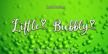 Little Bubbly is a script style in Uppercase and Lowercase feel nice balanced. Provide ligatures with special character make the design letter looks incredible. Honestly it works perfectly for headlines, logos, posters, packaging, T-shirts and much more. Font Features : • Regular version • Character set A-Z in uppercase and lowercase • Ligatures in Lowercase and special • Numerals & Punctuation • Accented Characters • Multiple Languages Supported Recommended to use in Adobe Illustrator or Adobe Photoshop with opentype feature. If you have questions, just send me a message and I'm glad to help.
 - Silent Movies JNL by Jeff Levine,
$29.00 An ad in the Oct. 27, 1919 issue of the trade magazine “The Moving Picture World” promoted “Princess Virtue” from Bluebird Pictures starring Mae Murray – The Adorable [as noted by the movie studio in the ad]. The Art Nouveau hand lettering emulated the style usually drawn with a round nib pen, but was given a specialized treatment for the ad. It was re-drawn in a more traditional ‘pen nib’ look for digital revival. The end result is Silent Movies JNL, which is available in both regular and oblique versions.
 - Linotype Paint It by Linotype,
$29.99Jochen Schuss designed Linotype Paint It in 1997 with exclusively capital letters and in two weights. The best way to describe the weight Paint It might be to compare it with a labyrinth in which the figures only become clear to the reader dedicated to finding them. The second weight, Paint It black, is almost the solution to this puzzle. The characters are black and stand out strikingly from the background. Linotype Paint It is particularly good for headlines in large point sizes or wherever a text should display a playful character. - Arrow Callouts JNL by Jeff Levine,
$29.00 Here’s a set of arrow shaped callouts in two varieties within one font. The black-on-white letters are on the upper case keys, and the white-on-black characters are on the lower case keys. The numerals 1 thru 10 in black-on-white are in the standard key positions, while the white-on-black numbers are on the same keys when engaging the “shift” key. The 'zero' key houses the number '10'. For a more dynamic look, the font is also available in an oblique version.
 - Kakarotto by Supersemarletter,
$11.00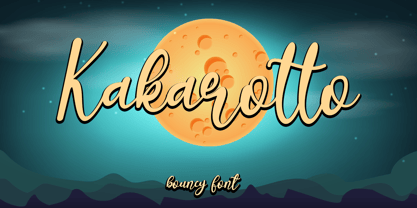 Kakarotto is a flowing handwritten font, described by an elegant touch, perfect for your favorite projects. Fall in love with its bouncy and joyful style and use it to create lovely designs! Font Features : • Regular version • Character set A-Z in uppercase and lowercase • Ligatures in Lowercase and special • Alternates option • Numerals & Punctuation • Accented Characters • Multiple Languages Supported Recommended to use in Adobe Illustrator or Adobe Photoshop with opentype feature. If you have questions, just send me a message and I'm glad to help. Best Regards, Supersemar Letter
 - 1751 GLC Copperplate by GLC,
$38.00 This family was inspired by an engraved plate from Diderot & Dalembert's Encyclopedia (publication beginning in 1751), illustrating the chapter devoted to letter engraving techniques. The plate bears two engravers names : "Aubin" (may be one of the four St Aubin brothers ?)and "Benard" ( which name is present below all plates of the Encyclopedia printed in Geneva ). It seems to be a transitional type, but different from Fournier or Grandjean. Small caps are included in fonts for TTF and OTF version, separate files are included in the family sets of the Mac TT version.
 - Plain Nouveau JNL by Jeff Levine,
$29.00 The Women's Suffrage Movement gained women the right to vote in 1920. Up until then there were many ways undertaken to rally sympathy for the cause. In 1916 Alice Paul formed the National Woman's Party. That same year a song with the [exhaustive] sixteen word title "She's Good Enough to be Your Baby's Mother (And She's Good Enough to Vote with You)" yielded a hand lettered Art Nouveau sans serif design in the main portion of the title. This became the basis for Plain Nouveau JNL, which is available in both regular and oblique versions.
 - ITC Cherie by ITC,
$29.99Some words from the designer... Like long legs walking a runway in stiletto heels, ITC Cherie is both sophisticated and feminine. West coast designer Teri Kahan developed this art nouveau-style font into two distinct all capital alphabets – one with a “high waist”, placed in the capital position, and the other a “low-waist,” placed in the lower case position. They work separately or together, and this dual nature gives a designer the ability to make subtle changes in a logo or line of text. Additional flourished letters round out this versatile headline font. - Heraklion by Andrew Sinn,
$14.50 Heraklion letters are drawn with their gravity in the metric vertical – instead of resting on a baseline, they dance acrobatically on a string. This allows for a more drastic variation among the glyphs, which no longer have a fixed x-height. In order to create a simplistic and mathematic character, shapes are constrained to circles and straigh lines. The design principles result in a playful expressive set that is surprisingly clear. “A choreography where the individual actors freedom of expression is enclosed in foundational rules that create interconnectivity and belonging.”
 - Catorze27 Style 1 by Scannerlicker,
$22.00 Catorze27 is a typeface inspired by northern Portuguese modernist lettering. Wrought iron is a widely used element on Portuguese architecture and, as such, the typeface started after collecting several photographs of modernist iron signage in several cities in the north of Portugal, specially in Espinho, Porto, Ponte de Lima and Viana do Castelo. As a result, Catorze27 / Style 1 is the first of 3 styles, featuring 570+ glyphs, 7 weights, case-sensitive forms, 2 styles of numerals in 2 sizes, Greek (Monotonic), Cyrillic and supports most of the Latin Unicode ranges.
 - Skippy is Canon by Edd's Aurebesh Fontworks,
$5.00 Working on a Star Wars project? This font is in the main Star Wars written language of Aurebesh, and contains all the additional letters found in the language as glyphs. Designed to be a blocky workmanlike font that has the roughness commonly found in Star Wars related visuals. All numbers are also included as well as central punctuation symbols. The name is a very obscure reference to the old Star Wars expanded universe, when a force-sensitive droid self destructed in order for Uncle Owen to purchase R2-D2.
 - Aetna JY Pro by JY&A,
$49.00 JY Ætna was designed originally by Francesco Griffo in 1495, and appeared in a book by Cardinal Bembo the following year. The typeface was re-created by Jack Yan in 1994, in time for its 500th anniversary. The original x-heights, quaint letters and other niceties have been restored. An italic complement, based on the design by Giovantonio Tagliente, has also been developed. JY Ætna has been one of JY&A Fonts’ more popular families over the years, with some typographers preferring its taller ascenders and descenders for headline work.
 - Manchester Condensed by Vástago Studio,
$23.90 Every day we are faced with designing on small screens and new formats; This is where condensed fonts have great potential, as they make the most of tight spaces in big headlines. Manchester Condensed is a typeface family designed by Vástago to be applied in large headlines in different formats, such as web, editorial or packaging. Just to mention a few. Different Manchester weights enhance performance at large type sizes, providing hierarchy and imposing style with its elongated shapes. Its use in capital letters is remarkable and fits perfectly into very precise diagramming spaces.
 - Empirelines by Haksen,
$19.00 Empirelines are the family of blackletter style with Uppercase and Lowercase feel nice balanced. Provide alternates font in lowercase variant style make the design letter looks incredible. Honestly it works perfectly for headlines, logos, posters, packaging, T-shirts and much more. Recommended to use in Adobe Illustrator or Adobe Photoshop with opentype feature. How to access Alternates Character? Open glyphs panel : In Adobe Photoshop choose tool Window >> glyphs In Adobe Illustrator choose toolType >> glyphs If you have questions, just send me a message and I’m glad to help. Have a great day, Haksen
 - Monotype Clearface by Monotype,
$29.99A rather narrow and compact design, Monotype Clearface combines both old style and antique characteristics. The lowercase letters are tall, the ascenders and descenders quite short. The intention was to produce a typeface that was easy to read in small sizes, hence the name. Monotype Clearface Bold was first cut for mechanical composition in 1922, and was based on the Clearface Gothic design created by Morris Fuller Benton for ATF in 1910. Although designed as a text face, Monotype Clearface is now more commonly used in advertising and display work. - Gamundia Pro by RMU,
$50.00 In 2012 the city of Schwäbisch Gmünd will celebrated its 850th anniversary, and in 2014 it was host town to the State Garden Show of Baden-Württemberg. These both celebrations were the background to create a special font for my home town and give it the town’s ancient name. Inspired by Excoffon’s Diane, I drew and digitized a new, multilingual script font which covers the main European languages written in Latin or Cyrillic letters. For users typing in the Serbian language, I recommend to activate the OT feature Stylistic Alternatives.
 - Sho by Linotype,
$29.99Karl Georg Hoefer’s Sho first appeared in 1992 with Linotype-Hell. The font is a part of the package Calligraphy for Print, which also contains Ruling Script and Wiesbaden Swing. Calligraphy for Print 2 completes the set. These packages offer modern calligraphy fonts particularly well-suited to use in posters, magazines and advertisements. Sho distinguishes itself in the extreme contrast between the strokes. A unique characteristic of the font is the way it uses simple round forms in some of its letters, giving it a peppy and playful feel. - Anything by Supersemarletter,
$10.00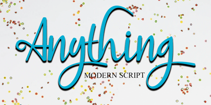 Anything is a handwritten script style in Uppercase and Lowercase feel nice balanced. Provide ligatures with special character make the design letter looks incredible. Honestly it works perfectly for headlines, logos, posters, packaging, T-shirts and much more. Font Features : • Regular version • Character set A-Z in uppercase and lowercase • Ligatures in Lowercase and special • Alternates option • Numerals & Punctuation • Accented Characters • Multiple Languages Supported Recommended to use in Adobe Illustrator or Adobe Photoshop with opentype feature. If you have questions, just send me a message and I'm glad to help.
 - Dalek by K-Type,
$20.00 DALEK is a distressed, small caps typeface based on the lettering used in the Dalek Book of 1964 and in the Daleks strip in TV21 comic. The fonts have overtones of Greek, Phoenician and Runic alphabets. The updated Dalek fonts contain a full complement of Latin Extended-A characters, and also include Greek capitals and small caps. In addition to the original Regular font, Heavy and Light weights are available, and optically corrected obliques for each weight. Also check out Dalek Pinpoint, a clean and precise version of the Dalek typeface.
 - Marazion by Studio K,
$45.00 Marazion takes its name from a Cornish seaside resort in the UK's West Country. It was inspired by some hand lettering I came across at a local inn on the seafront where I was enjoying a lunchtime pint (always a good place to seek inspiration in my experience!) Being based on a hand drawn script Marazion is a smooth, fluid and rounded font that is both fresh and distinctive. Personally, I think it is well suited to applications in food and fashion, but in practice its uses are more or less universal.
 - Dirty Bakers Dozen by Typodermic,
$- Dirty Baker’s Dozen, was released in 1998 and has since become the gold standard in raunchy stencil fonts. This version of Dirty Baker’s Dozen is pants-full of handy symbols, fractions, accents and what not. Need numeric ordinals? Probably not, but if you do, Dirty Baker’s Dozen will be there with boots on and numeric ordinals a-blazing. Two new styles were introduced in 2009: Scorch & Spraypaint. When you're using Scorch or Spraypaint styles in an OpenType savvy application, common letter pairs will be automatically replaced by custom pairs for a more realistic, filthy effect.
 - FHA Modernized Ideal Classic by Fontry West,
$25.00 Frank H. Atkinson's book Atkinson Sign Painting was published in 1909. For decades, this book served as the manual for sign painters - a handbook for hand lettering. Atkinson’s book described techniques, layouts and several sample alphabets. Modernized Ideal Classic was inspired by one of these demonstration alphabets. Although Classic has its beginnings in art deco, it is very comfortable in any period or style of design. It is most appropriate in headline and display text, poster copy and signs. We've included some nice stylistic alternates and an interesting array of ligatures.
 - Mockejoe Font by Tebaltipis Studio,
$13.00 MOCKEJOE FONT was born in the modern era which was inspired by the letters found in various print and digital media. Comes with a modern and futuristic style that will rock your great design! It is suitable for you to use in logotype designs, posters, typography, t-shirts, tickets, and other modern designs. The alternative characters in this font were divided into several OpenType features such as Stylistic Alternates, Stylistic Sets, and Ligature. The OpenType features can be accessed by using the OpenType program such as Adobe Illustrator, Adobe Photoshop, and Adobe InDesign.
 - Poole Chiselcut by Poole,
$36.00The Poole Chiselcut faces are a useful companion to the regular Poole fonts. In the Standard weight, the diamond shapes inside each character, work toward an elegant, sophisticated look. In the Mid and Heavy weights the chisel cut makes the alphabets look Victorian. In particular, the Heavy weight look is that of a circus letter. Of course the 2 color options for this group are endless. Used in concert with the rest of the Poole Family, or as stand alone fonts, the Poole Chiselcut set is a useful addition to your library. - Royal Stencil JNL by Jeff Levine,
$29.00 An image spotted on the internet of a brass shipping stencil for the Royal Quality Brand (for the John H. Fitch Company of Youngstown, Ohio – a coffee and spice merchant). The lettering style for “Royal Quality” was a hand-cut, condensed, slightly flared sans serif with various character flourishes, giving the letters a stylish, somewhat regal look. Expanding on this idea, a full character set was developed and redrawn digitally as Royal Stencil JNL, which is available in both regular and oblique versions.
 - Adelya by Craft Supply Co,
$17.00 Adelya - Elegant Signature Font is a free-flowing monoline, the two style typeface exploits the common letter-to-letter transitions of the typical cursive hand by utilizing two style points controlled within the machinations of OpenType Contextual Alternates. It can be used to create almost all types of design projects like print materials. Just use your imagination and some graphic design set in Extras, your project will become more alive and look great than ever with one of the Adelya font.
 - Karolina by Studio Indigo,
$17.00 Karolina is a calligraphic serif font. It is inspired by Edward Johnstons (1872–1944) calligraphy and the foundational hand (which was based on the carolingian letters and therefore the name Karolina). The Uppercase letters are based on the perfect proportioned roman capitals. Karolina is a classic and clean typeface with smooth shapes that will give an elegant touch to your projects. It is suitable for formal use and works well both for headlines and as body text in smaller sizes.
 - Fidusmager by PizzaDude.dk,
$17.00 This is definitely a font suitable for kids toys. The letters are legible, and at the same time totally wacky! Kinda like what a kids toy should be! Fidusmager started out as a handdrawn, slightly rugged looking fon. However I ended up manually tracing each letter in order to have those smooth lines. By the way, Fidusmager is danish and actually means someone who’ll trick you - but as a kid I didn’t know that, and found that it most likely was something positive! :)
 - FXMachina by Comicraft,
$19.00 YES! Seemingly insoluble lettering challenges can now be resolved by Comicraft’s uneFXpected and eFXceptional new font, FXMACHINA! Generate Enormous Threatening Sound Effects or Sinister Spikey Logos and Titanic Title Lettering with this Nefarious Machination designed by John Roshell. Crossover Events between Parallel Universes will instantly become Darker and more Secretive with the application of this Apocalyptic Omega/Alphabet. It’s like a Celestial Intervention! FXMachina features upper and lowercase characters, Western & Central European accents, and “Spike Mode” in Opentype Stylistic Alternates.
 - Herald Banner by Greater Albion Typefounders,
$18.50 Herald Banner is the newest (as at January 2017) of Greater Albion’s ‘Banner’ or ‘Masthead' typeface. It tales the form of letters on a long heraldic banner twined about a central mace. It is offered in two forms- a conventional monochrome typeface and a set of eight interrelated typefaces designated ‘Colour’ 1 through to ‘Colour 8’. These (and indeed the monochrome face) have identical metrics and can be overlaid to produce multi-coloured lettering with the bare minimum of effort.
 - Crayonize by PintassilgoPrints,
$19.00 Crayonize is a casual handwritten font with a fresh crayon look, available in two weights. Both styles are all-caps with two options for each letter and numeral, for a natural, organic hand-lettered feel. Contextual alternates feature is included, making it easy to cycle the alternates. Crayonize is excellent for display purposes and small chunks of text: packaging, books, apparel, editorial, greetings cards, opening titles, screens, the list has no end. Give it a try, have fun, and keep on creating!
 - Burger Shake by Bogstav,
$17.00 A burger and a shake - the classic companions! Mix those two and you get the Burger Shake - it may not sound very delicious, but the thought of mixing two nice things is great...or something! :) Anyway, the Burger Shake font is about having fun in a legible way. The letters are slightly uneven and rough here and there, and has this nice handmade organic feeling. I've added 5 slightly different versions of each letter, and they automatically cycle as you type!
 - Batelik by Sulthan Studio,
$10.00 Batelik -This is handwriting on paper using a pen and then we turn it into 3 styles such as regular Batelik which is original or natural handwriting without being cleaned or tidied up in the slightest while Batelik1, or Batelik2 I tidy it up and clean it, it's very modern and minimalist, it's really cool and it's amazing that you can try it for the job you're doing. letters are equipped with uppercase and lowercase letters, punctuation numbers and also language support
 - Pattycake by Atlantic Fonts,
$26.00 Pattycake family is artsy and friendly. Pattycake is a 3D sketched block letter font with lots of hand-drawn energy and bounce. Pattycake Solid is a smooth and cheerful stand alone font that complements Pattycake, and works nicely as a loose fill under Pattycake so you can easily have fun with color! Both fonts have double-letter ligatures in upper and lower for plenty of movement, and are ready to brighten any fun project, especially those designed for young people.
 - Possum Saltare NF by Nick's Fonts,
$10.00Lewis F. Day, in his Alphabets Old and New, presented these letters as examples of rustic Roman lettering of the first through third centuries, AD. An uppercase-only typeface, most of the lowercase positions are occupied by letterform variants. It should be noted that the name does not refer to a savory dish made from a nocturnal American marsupial; it’s Latin for “I can dance”. Both versions of the font include 1252 Latin, 1250 CE (with localization for Romanian and Moldovan). - Rostra by Tail Spin Studio,
$20.00It was during a visit to the Roman Forum that we were inspired by a seemingly unique style of lettering on a tablet among the ruins. The Latin message was chiseled in a condensed, free-style manner, almost as if it were intended as a personal note. While the stone showed only the capital letter forms of the period, we felt the creation of a lowercase would help extend the fonts usability and also add a whimsical feel to the design.
