10,000 search results
(0.048 seconds)
- FF Info Pict by FontFont,
$62.99 Erik Spiekermann, working in collaboration with Ole Schäfer, originally designed FF Info® Display for use in the context of wayfinding systems. The variants FF Info™ Text and FF Info™ Correspondence were developed later for text setting and office communication. FF Info Display The sober and clear forms of the sans serif FF Info Display have been deliberately molded to make them perfect for use on wayfinding systems. The font by Ole Schäfer and Erik Spiekermann not only takes the problem of lack of space into account - it is some 15% narrower than comparable typefaces - the characters have also been designed to ensure they remain legible even in adverse conditions for reading. As text on signs often contains words with which readers are unfamiliar and which are thus deciphered letter for letter rather than perceived as whole words, it is essential to provide for a clear differentiation between glyphs. Additional serifs on the lowercase "i" and uppercase "I" and a small arch on the terminal of the lowercase "l" ensure that it is possible to readily discriminate between these particularly problematic letters. Moreover, sharp corners on glyphs can also make it difficult to read signs with backlighting or when driving past. The rounded corners of FF Info Display counteract this effect and make sure that the character forms remain well defined.FF Info Display is available in five carefully coordinated weights, from Regular to Bold. In the corresponding italic variants, the letters appear overall more rounded while the lowercase "a" has a closed form and the "f" has a descender. Also included among the glyphs of FF Info Display are several ligatures and arrow symbols. Pictograms with different themes that complement the typeface are also available in four weights. FF Info Text Thanks to his know-how gained through designing other typefaces, Erik Spiekermann became aware that fonts created for use in problematic environments can be used in many different situations. In smaller point sizes, FF Info Display cuts a fine figure when used to set longer texts. So Spiekermann carefully reworked FF Info Display to produce FF Info Text, a font perfected for use in this context. Not only can the characters be more generously proportioned, certain features, such as additional serifs to aid with the differentiation of problematic letters, are also no longer necessary in textual surroundings. The upright styles have a double-story "g" while Spiekermann has added oldstyle figures and small caps. FF Info Correspondence FF Info Correspondence has also been designed for setting block text although it recalls the style of old typewriter characters and is specifically intended for use in office communication. The characters of this third member of the family are thus more formal, without rounded terminals but with rectangular punctuation marks. The narrower letters are provided with large serifs to give them more space although, at the same time, this reduces the differences in terms of letter width among the alphabet. In contrast with its two siblings, FF Info Correspondence has only three weights, each with corresponding italic.The three styles of the FF Info super family cover an extensive range of potential applications. If the different kerning is adjusted manually, the three styles harmonize happily with each other and can be readily used in combination to set, for example, headlines and texts and also creative display options.
 - ITC Werkstatt by ITC,
$29.99ITC Werkstatt is a result of the combined talents of Alphabet Soup's Paul Crome and Satwinder Sehmi, along with Ilene Strizver and Colin Brignall. It is inspired by the work of Rudolph Koch, the renowned German calligrapher, punchcutter, and type designer of the first third of this century, without being based directly on any of Koch's typefaces. Werkstatt has obvious affinities with the heavy, woodcut look of Koch's popular Neuland, but also with display faces like Wallau and even the light, delicate Koch Antiqua. Brignall began by drawing formal letters with a 55mm cap height, which Sehmi reinterpreted using a pen with a broad-edge nib. “Not an easy process,” says Brignall, “since one of the features of Koch's style is that while it was calligraphic in spirit, most of the time his counter shapes did not bear any resemblance to the external shapes, as they would in normal calligraphy. This meant that Sehmi could not complete a whole character in one go, but had to create the outside and inside shapes separately and then ink in the center of the letters.” The process was repeated, only without entirely filling in the outlines, for the Engraved version. Crome handled the scanning and digitization, maintaining the hand-made feel while creating usable digital outlines. “The collaboration of artisans with particular skills,” says Brignall, “in a modern-day, computer-aided studio environment, seems very much in step with the 'workshop' ethos that Rudolph Koch encouraged and promoted so much.” - Spaclar by Ditatype,
$29.00 Spaclar is a captivating display font with a game-themed design, featuring uppercase letters with consistent proportions and rectangular shapes with sharp corners. This font shows uppercase letters with uniform proportions, ensuring a clean and balanced visual experience. Each character maintains the same size and shape, resulting in a cohesive and harmonious composition. This design choice creates a sense of order and precision, reflecting the strategic nature of gaming. The rectangular shapes with sharp corners in Spaclar add a modern and futuristic touch to the font. The clean lines and defined angles exude a sense of sleekness and sophistication, reminiscent of advanced technology and sci-fi aesthetics. This unique feature adds an element of visual intrigue, making this font the perfect choice for game-related designs that embrace a cutting-edge atmosphere. For the best legibility you can use it in the bigger text. Enjoy the available features here. Features: Alternates Ligatures Multilingual Supports PUA Encoded Numerals and Punctuations Spaclar fits in headlines, logos, posters, titles, branding materials, print media, editorial layouts, website headers, and any other game-themed projects. Find out more ways to use this font by taking a look at the font preview. Thanks for purchasing our fonts. Hopefully, you have a great time using our font. Feel free to contact us anytime for further information or when you have trouble with the font. Thanks a lot and happy designing.
 - Equinox by ITC,
$29.99Equinox is the work of British designer Vince Whitlock. This lighthearted typeface is extremely versatile due in part to its array of alternative characters. Equinox should be set with tight letter and word spacing for maximum visual impact. - Canarsie JNL by Jeff Levine,
$29.00Take a bit of Brooklyn attitude, add a dash of hand-lettered appeal and mix in a slightly Art Deco flair... Your result is Canarsie JNL; a bold sans serif face that would make any New Yorker proud! - Nouveau Yorke JNL by Jeff Levine,
$29.00 Inspired by the hand-lettered address for the publisher of some 1920s sheet music, Nouveau Yorke JNL is a throwback to a simpler period in time when sheet music and piano rolls were the mainstay of parlor entertainment.
 - Epos by Serebryakov,
$39.00 All-cap titling typeface, Epos, comes in three widths and includes a range of decorative ligs & alts – as well as both Latin & Cyrillic scripts. It reminds of hand-lettered book covers from the early and mid 20th century.
 - Kallisto Lined by Device,
$39.00 A lined variant of Kallisto, suggestive of scan lines, speed and display screens. Kallisto weds a rational, machine-made aesthetic with a certain warmth that derives from more familiar letter shapes found on diestamped or embossed boilerplate signs.
 - Isabel by Letritas,
$30.00 Isabel was made out of necessity to create a new font for children and teenagers, that could be enough friendly and versatile for text in words or even easy-to- read long texts. The purpose of Isabel is to combine all the nice and friendly features of the simple letters that the teachers teach to the pupils at primary school, as they starting to learn to read, together with the normal editorial fonts we read every day. In this way it generates a very joyful serif font, or even friendly font, with some conservative aspects. In other words, Isabel is a font that, despite of being a “classic features” typography, is proud to show its innocent and ingenuous elements, this gives to the font a new point of view. The family is composed of 3 parts: the regular version, the italic version and the unicase version. Each one of them has 5 weights, 551 characters and is composed of 208 languages.
 - Newercastle by Chank,
$49.00 Newercastle is the new incarnation of a popular Chank font formerly known as "Newcastle". A consistent fan favorite since its initial release in 2005, the distressed blackletter font is new and improved. This sinister script is now bulked up with all-new capital letters, a bit of punctuation, and smattering of new crowns, griffins and other heraldic doodads. Designer Kevin Hayes opted for an assortment of gritty old icons instead of more traditional punctuation, because he felt that's just the way this type of font could perform best for you, the font enthusiast. "At-signs and percentile glyphs just aren't believable in fraktur-style fonts," says Kevin. You benefit by getting a bit of clip art with the new font instead of boring old punctuation. Use the new bats indiscriminately to add a regal air to even the most mundane newsletter. Or use layer upon layer to add a rustic richness to a poster project. Enjoy this wicked, textural type and use it with extreme force.
 - Klute by Alias Collection,
$60.00 Klute references stylised forms of writing; historic Germanic, blackletter letterforms and graffiti and tagging. Its references are based on a personal idea of lettering - the action of writing is more personal and human than the craft of calligraphy or the mechanics of typing. These references suggest the idea of saying something particular and personal.
 - Linotype Sjablony by Linotype,
$29.99Linotype Sjablony is part of the Take Type Library, chosen from the entries of the Linotype-sponsored International Digital Type Design Contests of 1994 and 1997. Designed by Dutch artist Mark van Wageningen, the typeface with its interrupted strokes has the characteristics of the stencils seen on crates and barrels. The difference lies in the raw contours of this font, which make the characters look as though they were slowly eroded away by water and wind. Linotype Sjablony is composed exclusively of heavy capital letters and is particular suitable for initials and headlines with point sizes of 18 and larger. - Linotype Killer by Linotype,
$29.99Linotype Killer is part of the Take Type Library, selected from the contestants of Linotype’s International Digital Type Design Contests from 1994 and 1997. Designed by German artist Andre Nossek, the font seems to describe the Technosound of the 1990s with its electronically produced sights and sounds. It represents repetition, mass production and conformity. The alphabet consists exclusively of capital letters, all based on a rectangular form, all of the same height, and, with the exception of the I’, all of the same width. The cool and distant Linotype Killer is best suited to short headlines. - Digofa by Twinletter,
$10.00 Introducing the Digofa sanserif font. is an aesthetic font, which in its use has a natural beauty and has a modern style. This clean font when you use it will create an elegant and beautiful impression. We designed this san serif family font by paying attention to the combination of each letter to create a beautiful impression and appearance, making it easier to answer your needs, both formal and non-formal needs. This font is perfect for a wide variety of design projects, sporting events, branding, banners, posters, movie titles, food and beverage, technology, quotes, clothing, logotypes, and more. Of course, by using this font your various design projects will be perfect and amazing, because this font comes with a family of fonts, both for titles and subtitles and sentence text, start using our fonts for your amazing projects.
 - Sedid World by Fontuma,
$28.00 Sedid, “solidity; It is an Arabic term meaning “righteousness”. In particular, the correctness and soundness of a word is indicated by this word. The fact that I gave this name to the writing family is to point out its accuracy and robustness. This typeface, which is sans serif, consists of three families: ▪ Sedid: Font family containing Latin letters ▪ Sedid Pro: Font family including Latin, Arabic and Hebrew alphabets ▪ Sedid World: A family of typefaces including Latin, Cyrillic, Greek, Arabic and Hebrew alphabets Do you want a difference in your work? Then meet the Sedid World font family. This font will meet all your expectations in terms of the languages it supports and the variety of glyphs it contains. You can easily use the Sedid World font family in every project. Because this font has beautiful and soft lines. The font family includes open type features, as well as a large number of ligatures, small caps, modifiers, and currency symbols of many countries.
 - Letreiro by Scannerlicker,
$11.00 Letreiro is a nostalgic display font family, a personal view on portuguese hand lettering from the mid 20th century.
 - Love Cake by Rixdesigns,
$14.00 Use this font for your beautiful awesome projects. You will get: Lower Case and Uppercase Letters, Numbers, & Extended Punctuation
 - Dotee by Gaslight,
$10.00 Dotee inspirit by lettering from soviet book. Dotee is fat decorative font with numerous cut style ligatures and alternatives.
 - Collegiate by K-Type,
$20.00 Collegiate is a full font based on the lettering around an old mosaic tile badge at Liverpool Collegiate School.
 - Rejoicingly by Get Studio,
$15.00 Rejoicingly is a sweet marker handwritten font. It comes with unique lower and uppercase plus numbers, punctuation & multilingual letters.
 - Hillstone by 38-lineart,
$14.00 Hillstone is a handwritten font with a rough texture, the process of making letters with scratched with strong and fast stroke on paper to make the rough texture that characterizes of Hillstone, so this is a font with a rough and dry brush style. We repaired the letters computerically and if they didn't unite well and we made several alternate glyph. There is no problem for long or short text, so this font can be used in various designs widely. you can use this font for instagram, quotes and other long text, this font is also unique for one word text or short typing, that you can use for product brands, company logos, books and magazine covers, everytype will look very typical. use ligatures and alternatives to your taste.38. Anything made with this font will definitely be wrapped in a very contemporary style and elegance. We make several priview images as a guide for designing directions, please check them all Best regard and thank you very much.. 38.lineart studio
 - Rachela by MrLetters,
$15.00 Introducing:Rachela Lovely Calligraphy! A new and beautiful font, created to meet your needs in creating a beautiful and elegant design, this font is special for you. Rachela Lovely Calligraphy Font is perfect for branding, wedding invitations, magazines, mugs, business cards, quotes, posters, and more you can use on your big project would be very beautiful. This font has been equipped with OpenType features and has many glyphs. By having many of these glyphs will be able to choose the letters according to your liking, lots of variations and options for each letter, so you can customize your design choices and also have other languages supported. This font is perfect for use with programs that support OpenType features like Adobe Photoshop Cs / Adobe Photoshop CC, Adobe Illustrator CS / Adobe Illustrator CC, Adobe Indesign and Corel Draw and many more programs that support OpenType. I've also included a special alternative so you can use any program. This font can be used by everyone! If you have any questions, please feel free to contact me by email at hello.mrletters@gmail.com. Thank you and congratulations designing :-)
 - DT Partel by Dragon Tongue Foundry,
$9.00 DT Portal: This stylised, partially serifed font, made with a slightly rounded square form, may have been inspired initially by old cathode ray tubes and computer screens. Although not intended to be purely a ‘tech’ font, it can have a strong tech feel to it. More suited to being a headline font than body text. It also appears to have a monospaced look to it, since most letters, (other than letters like ‘i, l and t’), do have the same width. There is some automatic contextual shape adjustment happening in places, to avoid taking up too much space, so contextual ligatures should be turned on. As is the case with most of my fonts, when given the choice, ‘metric’ spacing should be used in preference to ‘optical’. Initially this font was going to be called ‘DT Portal’, because its form was similar to that of a window or doorway. But due to other fonts already having that name, I chose to rename it as ‘DT Partel’, for no reason other than it is only a very small change visually.
 - Marcus Traianus by Eurotypo,
$48.00 The famous lettering “Capital Trajana” (inscription at the bottom of the column that bears its name erected in the year114 A.D.) is usually identified as the classic example that defines Imperial Capital forms. However, much earlier, there were already countless examples of Greco-Roman epigraphy of excellent execution, as evidenced by the monumental inscriptions from year 2 b.C. sculpted in the Portico di Gaio e Lucio Cesari in front of the facade of the Basilica Emilia, in the Roman Forum, erected by Augustus, dedicated to his two grandchildren for propaganda and dynastic needs. It has been more than two thousand years and the forms of these letters are still part of our daily life, product of their qualities of readability and beauty. It is probably the added semantic value that have made them an icon full of symbolism that expresses majesty, monumentality, order and universal power. Numerous authors, calligraphers and designers have studied this legacy such as Giovanni Francesco Cresci, Edward Catich, L.C. Evetts, Armando Petrucci, Carol Twombly, John Stevens, Claude Mediavilla, just to name a few. Marcus Traianus font is a fitted version of the two models mentioned, which is accompanied by Small Caps, lowercase (carolingas) and a set of numbers (Indo-Arabics) in addition to the Romans figures and diacritics for Central European languages Marcus Traianus is presented in two weight: Regular, Italic, Bold and ExtraBold.
 - Klip Klop by Samuelstype,
$24.00 Designed by Hans Samuelson in 2023. With two weights and many variations Klip Klop offers a large set of characters for playful lettering. The flavouring is strong avant garde and the build is strict geometrical with even stroke thickness throughout. One unusual feature is that the bottom and top horizontal strokes are centered on the baseline and capital height. This renders the same optical size between the thin and the medium but different actual heights and baselines. Use it for Headlines or signage in any medium! Klip Klop!
 - EFCO Colburn by Ilham Herry,
$15.00 Colburn is a squarish typeface inspired by lettering found on vintage tins, Colburn is a display typeface that captures the essence of nostalgia while offering modern versatility. Colburn's variable font technology ensures seamless transitions between different styles, empowering you to create dynamic and harmonious compositions. From packaging and posters to websites and branding materials. PDF SPECIMEN
 - Stove Plate JNL by Jeff Levine,
$29.00 An old printer's advertising cut for Red Star Oil Stoves yielded a typeface that was both vintage and somewhat techno at the same time. Originally drawn as a slanted logo, the individual letters had an array of chamfered, angled and flat sides combined with a bold outline. This font is available in both vertical and oblique versions.
 - Halloween Rules by AEN Creative Studio,
$15.00 Halloween Rules is a cool-lettered and spooky decorative font. It is perfectly suitable for any Halloween-related project or crafty idea! Add it confidently to your favorite creations and let yourself be amazed by the outcome generated. Halloween Rules is PUA encoded, which means you can access all of the glyphs and swashes with ease!
 - Gibroma by Letterena Studios,
$9.00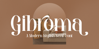 Proudly present Gibroma – a modern and classic serif typeface with its own unique style & modern look. This typeface is perfect for an elegant & luxury logo, book or movie title design, fashion brand, magazine, clothes, lettering, quotes, and so much more. This font is PUA encoded, which means you can access all of the glyphs and swashes with ease!
 - Wintersing by Sronstudio,
$18.00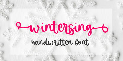 Wintersing is a natural calligraphy font perfect for crafting, branding, invitation, stationery, wedding designs, social media posts, advertisements, product packaging, product designs, label, photography, watermark, special events, or anything. Wintersing comes with full set of uppercase and lowercase letters, swash alternates, ligatures, multilingual symbols, numerals and punctuation. If you have any questions don't hesitate to drop me a message ;)
 - Magical Spring by Sronstudio,
$18.00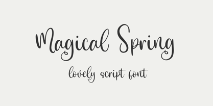 Magical Spring is a Lovely Script font perfect for crafting, branding, invitation, stationery, wedding designs, social media posts, advertisements, product packaging, product designs, label, photography, watermark, special events, or anything. Magical Spring comes with a full set of uppercase and lowercase letters, multilingual symbols, numerals, and punctuation. If you have any questions don't hesitate to drop me a message ;)
 - Kaftice by Locomotype,
$15.00 Kaftice is a casual handwritten font created based on unique brush strokes. To add a personal touch, you can put a swash at the beginning and end of a word by activating the swash feature or by simply putting two underscores before / after a letter. In addition, Kaftice also includes standard ligatures to make your typography more interesting.
 - Dante Alighieri by RMU,
$35.00 From the great Schelter & Giesecke collection, Dante Alighieri is a splendid companion to Aldo Manuzio. With its rather condensed characters it makes an ideal body text font even for narrow columns. Dante Alighieri comes with the historical long s and swash letters of H and T. It can be used for all major West and Central European languages.
 - Hugio by Rockboys Studio,
$23.00 Hugio is a simple and casual serif font with an undeniably clean feel. With its neat and beautiful arrangement of letters, this typeface will look outstanding in both formal and non-formal designs. PUA encoded = Accessible in the Adobe Illustrator, Adobe Photoshop, Adobe InDesign, even work on Microsoft Word. PUA Encoded Characters - Fully accessible without additional design software.
 - The Macksen by Kotak Kuning Studio,
$17.00 The Macksen is a new, bold script font which has two styles: Clean and Textured. With those kind of styles, The Macksen will give your designs a vintage and classic look. The Macksen is great for logotype, branding design, logo design, digital lettering arts, t-shirts/apparel, posters, magazines, signs, advertising design, and any vintage design needs.
 - Snowmany Snowmen by Comicraft,
$19.00Snow, Snow, Thick, Thick Snow! Sweetly and simply illustrated by the lovely 'Lilou', Our Snowmany Snowmen font features fifty (count 'em) hilarious Snowmen, perfect for creating Seasonal Greetings for homemade Christmas Cards, decorating your children's 'Thank You' letters -- or just print them out for your kids to color while Uncle Frank's shovelling snow out of the driveway! - Binattiah Script by Sulthan Studio,
$12.00 Binattiah Script has a romantic and modern calligraphy, ready to give your design a fresh and fabulous Style. Binattiah Script comes as a single font file packed full of great features. Perfect for weddings, branding and romantic invitations and also suitable for various purposes such as digital lettering, headings, logos, wedding invitations, t-shirts, letterheads, signage’s and much more!.
 - Happy Teas by Kellina James Designs,
$20.00 Happy Teas is a handwritten script font that was designed to create a sense of joy and fun. It includes upper and lowercase letters, numerals, punctuation, and multilingual support. In addition, there are also special characters, alternates, and ligatures to add more flair to your projects. Great for invitations, headers, packaging, branding, wall art, and more.
 - Daniela Charming by Sronstudio,
$18.00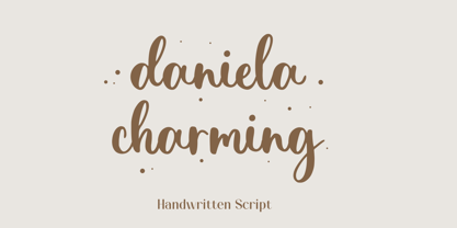 Daniela Charming is a natural calligraphy font perfect for crafting, branding, invitation, stationery, wedding designs, social media posts, advertisements, product packaging, product designs, label, photography, watermark, special events, or anything. Daniela Charming comes with a full set of uppercase and lowercase letters, multilingual symbols, numerals, and punctuation. If you have any questions don't hesitate to drop me a message ;)
 - Dingers by Sarid Ezra,
$15.00 Dingers is a sans-serif based typeface with fancy rounded shape that will make your design looks hi-tech and trendy. This font can be used for a variety of purposes, including logotype, sci-fi movie posters, and for branding. To make your logo stand out, mix and match uppercase and lowercase letters. This typeface is also multilingual.