10,000 search results
(0.62 seconds)
- Luxgard by Tadiar,
$25.00 Luxgard is an authentic vintage font of 8 design styles (done as separate fonts) created for such areas as Media & Entertainment, Food & Drinks, Clothes, Music, Games & Applications, etc. with Multilingual support (Latin Extended). Well use in vintage labels, headers & titles, Posters, Street Signs and other Outdoor, Package Design. Please see the preview image with three letters S: You can make different combinations of these styles to get amazing looks of designs.
 - LT DIE HARD by Latam Type Foundry,
$9.00 LT DIE-HARD FONT DUO+EXTRAS is a handcrafted typeface, carefully designed to capture the essence of strength and determination. With its horrible and worn strokes, this font transmits a sensation of resistance and solidity, Each letter is made in a unique style, creating a sense of movement and dynamism in the text. DIE-HARD typeface is ideal for projects requiring a strong and determined approach, such as posters, titles, logos...
 - Furqan by Putracetol,
$28.00 Furqan - Arabic Font beautifully encapsulates the essence of Arabic calligraphy, with its distinctive style that closely resembles traditional Arabic letters. Each character is adorned with intricate dots, paying homage to the intricate detailing found in classical Arabic writing. This font carries an air of authenticity and cultural richness, making it an excellent choice for a wide array of design purposes. From logos and branding materials to posters, product packaging.
 - Caros by cretype,
$20.00 Caros Family is a modern sans-serif typeface that is clean, simple and highly readable. Letters in this type family are designed with geometric shapes without any decorative distractions. The spaces between individual letter forms are precisely adjusted to create the perfect typesetting. Caros is a versatile type family of 18 fonts. Caros family consists of 9 weights (Thin, ExtraLight, Light, Regular, Medium, Bold, ExtraBold, Heavy & Black) with their corresponding italics. The Open Type fonts contain complete Latin 1252, Cyrillic, Central European 1250, Turkish 1254 character sets. Each font includes proportional figures, tabular figures, numerators, denominators, superscript, scientific inferiors, subscript, fractions and case features. We highly recommend it for use in books, web pages, screen displays, and so on.
 - Tallitha by alphArt,
$15.00 Tallitha, a stylish handwritten font that looks cute, elegant, stylish and is perfect for any awesome projects that need lettering taste. Tallitha could be perfect for watermark, social media posts, advertisements, logos & branding, invitation, product designs, label, stationery, wedding designs, product packaging, special events and more. Tallitha also includes a full set of uppercase and lowercase letters, multilingual symbols, numerals, punctuation. The font has a smooth wet ink texture, so would be perfect for all types of printing techniques and you can do embroidery, laser cut, gold foil etc. Features : ligature alternate multi lingual I hope you enjoy this font. If you have any questions please don't hesitate to drop me a message :)
 - High Billion by Haksen,
$15.00 Introduce Excellent combination modern font duo in High Billion the stylish modern and natural fonts combination with casual chic flair. These are perfect for branding, wedding invites and cards, and more option for your requirement.High Billion include two font styles with full set of natural hand draw for script and elegant with all uppercase letters for sans serif. Numerals, a large range of punctuation and ligatures giving realistic hand-lettered style. In order to use the beautiful ligatures for script also all uppercase for sans serif, you need a program that supports OpenType features such as Adobe Illustrator CS, Adobe Photoshop CC, Adobe Indesign and Corel Draw. Thanks and have a great day :) Haksen
 - Rithalica Jope Babes by Akrtype Studio,
$19.00 Presenting Riethalica Jope Babes luxury chic handwritten font Handwriting that is light and made as natural as possible to give the impression of pure digitalized handwriting, So that in its use it can give the true beauty of handwriting. And suitable for use in various media such as advertisements, web templates, invitations, social media templates, posters, weddings, and many more Riethalica Jope Babes luxury chic handwritten font include ligatures, capital letters and alternate letters. You need a program that supports OpenType features like Adobe Illustrator, Adobe Photoshop CC, Adobe Indesign and Corel Draw. and you can also access alternative flying machines via Font Book (Mac users) or Windows Character Map (Windows users).
 - Navigated by Ditatype,
$29.00 Introducing Navigated, a captivating script font that seamlessly combines boldness with balance. Navigated showcases a unique connected letterform design, where each letter is expertly linked, resulting in a fluid and harmonious appearance. With consistent proportions and a low-contrast style, Navigated offers both stability. Adding a touch of flair to Navigated, you'll find striking swinging endings on select letters. These graceful flourishes bring an element of charm and sophistication to your words, making them stand out with a captivating visual appeal. Navigated fits in headlines, logos, posters, flyers, branding materials, print media, editorial layouts, and many more designs. Find out more ways to use this font by taking a look at the font preview.
 - Austria Memories by Haksen,
$17.00 Introduce powerful font duo collaboration in Austria Memories the stylish modern and natural fonts combination with casual brush in script and elegant in Serif. These are perfect for branding, wedding invites and cards, and more option for your requirement. Austria Memories include two font styles with full set of natural brush style draw for script and elegant with all uppercase letters for serif. Numerals, a large range of punctuation and ligatures giving realistic hand-lettered style. In order to use the beautiful ligatures for script also all uppercase for sans serif, you need a program that supports OpenType features such as Adobe Illustrator CS, Adobe Photoshop CC, Adobe Indesign and Corel Draw. Thanks and have a great day :) Haksen
 - Natalle by Masinong Studio,
$10.00 Natalle Brush is a handmade brushed signature font font with stunning characters. Ideal for logos, name tag, handwritten quotes, product packaging, merchandise, social media & greeting cards. It contains a full set of lower & uppercase letters, a large range of punctuation, numerals, and Multi-Lingual support. The font also contains several alternatives for lowercase characters, accessible in the Adobe Illustrator Glyphs panel, or under Stylistic Alternates in the Adobe Photoshop OpenType menu. But If you don't have any OpenType specific software, you can still use Natalle as is with its standard lowercase and uppercase letters. Natalle Brush comes with Regular and Underlines style. If you have any question, don't hesitate to contact me by email masinong.studio@gmail.com Thank you!
 - Rosellinda Alyamore by Hanzel Space,
$25.00 Rosellinda Alyamore font. i hope this font is perfect for creating signature logos and watermarks for photography studio or wedding invitation, Lable, Logo, Magazine best for initial or branding logo signature. I madefully with love and unique !! Rosellinda Alyamore a full set of beautifull hand letters, numerals, a large range of punctuation and ligatures. Giving realistic hand-lettered style. What do you get, darling? In order to use the beautiful swashes, you need a program that supports OpenType features such as Adobe Illustrator CS, Adobe Photoshop CC, Adobe Indesign and Corel Draw. but if your software doesn’t have the Glyphs panel, you can install additional swashes font files Happy Design 🙂 Thank You! Hanzel Space
 - Alfazine Script by Mysterylab,
$24.00 Alfazine Script is a bold and spirited script with extensive ornate detailing. This versatile font is evocative of antique signpainters' letters, circus wagon & carnival booth graphics, groovy 1960s psychedelic scripts, and even sportswear team insignias, all combined with a modern approach towards lively curlicues and ball finial stroke ends. As with all other font offerings from Mysterylab Designs, we take great care with artful kerning and weight-matching of glyphs to allow this font to be used not only at attention-grabbing headline and logo sizes, but also at small body copy sizes in extended passages. Alfazine also features an extruded shadow version that's very useful for designing logos and customized layered lettering.
 - Miaupaws by Aisyah,
$12.00 Meows Display Font is a fun and playful font that is perfect for a variety of design projects. This font features a unique paw print in place of a traditional dot over the letter "i" giving it a playful and whimsical feel. The Meows Display Font is a bold and attention-grabbing font that is sure to make a statement in any design. The paw print feature gives the font a touch of personality and quirkiness, making it ideal for use in children's books, animal-themed designs, and other creative projects. The Meows Display Font is designed to be used as a display font, meaning it is best used in larger sizes such as headlines, titles, and logos. The font includes a full set of upper and lowercase letters, as well as numbers and punctuation, making it a versatile and practical choice for designers. Overall, Meows Display Font is a fun and unique font that brings a touch of playfulness and quirkiness to any design project. Whether you're creating a children's book, designing a pet-themed product, or working on a logo, this font is sure to make your project stand out.
 - Good Day by Fontop,
$11.00 Welcome my new hand lettered, cute and decorative font Good Day. The font family includes two fonts – Regular and Italic – both with Latin multilingual uppercase letters, lowercase letters, numbers and basic punctuation. With so many stylistic alternates and swashes it’s easy to create cute designs and signs for wedding branding, quotes, ads, logos, prints, social media texts, blogs, and so much more. Swashes are controlled by adding 0/1/2 before or after any letter while alternates can be chosen from the glyphs panel in Adobe apps. Really very easy to use! Both OTF and TTF are included for each font.
 - Funny Business JNL by Jeff Levine,
$29.00 The hand lettered title on the sheet music for "Gee, But I'd Like to Make You Happy" (from the 1930 MGM motion picture "Good News") presented a conundrum. Some of the lettering was a classic Art Deco "thick and thin" design while the others resembled comic book title lettering. Leaning toward the comic book style, the conflicting letters were revised and the finished result became Funny Business JNL; available in both regular and oblique versions.
 - Ministry Script by Sudtipos,
$99.00 Ministry Script was designed to be “A time capsule that marks both the American ad art of the 1920s, and the current new-millennium acrobatics of digital type.” First letters of Ministry comes from a how-to lettering book but immediately turned on a complex and modern new digital typeface design with thousand glyphs. Ministry’s OpenType features include contextual and stylistic alternates, swash characters, and a galaxy of ligatures. A single face with over 1,000 characters to explore. The OpenType palette provides access to four different variants of each letter. For more info about the use of Ministry, its background, ligatures, alternates, please read The Ministry Script Guide in the Gallery section.
 - Archibald BA by Bannigan Artworks,
$19.95 This typeface is inspired by the lettering of Archibald Knox (1864 – 1933), a designer for Liberty & Co. from the Isle of Man.
 - Plasterboard by K-Type,
$20.00 Based on the blobby lettering printed on the sheets of plasterboard (drywall) used in a garage conversion during the summer of 2004.
 - Diamondwood JNL by Jeff Levine,
$29.00 Diamondwood JNL is based on examples of vintage wood type with condensed, elongated diamond shapes containing the various letters of the alphabet.
 - Vendetta by Emigre,
$69.00 The famous roman type cut in Venice by Nicolas Jenson, and used in 1470 for his printing of the tract, De Evangelica Praeparatione, Eusebius, has usually been declared the seminal and definitive representative of a class of types known as Venetian Old Style. The Jenson type is thought to have been the primary model for types that immediately followed. Subsequent 15th-century Venetian Old Style types, cut by other punchcutters in Venice and elsewhere in Italy, are also worthy of study, but have been largely neglected by 20th-century type designers. There were many versions of Venetian Old Style types produced in the final quarter of the quattrocento. The exact number is unknown, but numerous printed examples survive, though the actual types, matrices, and punches are long gone. All these types are not, however, conspicuously Jensonian in character. Each shows a liberal amount of individuality, inconsistency, and eccentricity. My fascination with these historical types began in the 1970s and eventually led to the production of my first text typeface, Iowan Old Style (Bitstream, 1991). Sometime in the early 1990s, I started doodling letters for another Venetian typeface. The letters were pieced together from sections of circles and squares. The n, a standard lowercase control character in a text typeface, came first. Its most unusual feature was its head serif, a bisected quadrant of a circle. My aim was to see if its sharp beak would work with blunt, rectangular, foot serifs. Next, I wanted to see if I could construct a set of capital letters by following a similar design system. Rectangular serifs, or what we today call "slab serifs," were common in early roman printing types, particularly text types cut in Italy before 1500. Slab serifs are evident on both lowercase and uppercase characters in roman types of the Incunabula period, but they are seen mainly at the feet of the lowercase letters. The head serifs on lowercase letters of early roman types were usually angled. They were not arched, like mine. Oddly, there seems to be no actual historical precedent for my approach. Another characteristic of my arched serif is that the side opposite the arch is flat, not concave. Arched, concave serifs were used extensively in early italic types, a genre which first appeared more than a quarter century after roman types. Their forms followed humanistic cursive writing, common in Italy since before movable type was used there. Initially, italic characters were all lowercase, set with upright capitals (a practice I much admire and would like to see revived). Sloped italic capitals were not introduced until the middle of the sixteenth century, and they have very little to do with the evolution of humanist scripts. In contrast to the cursive writing on which italic types were based, formal book hands used by humanist scholars to transcribe classical texts served as a source of inspiration for the lowercase letters of the first roman types cut in Italy. While book hands were not as informal as cursive scripts, they still had features which could be said to be more calligraphic than geometric in detail. Over time, though, the copied vestiges of calligraphy virtually disappeared from roman fonts, and type became more rational. This profound change in the way type developed was also due in part to popular interest in the classical inscriptions of Roman antiquity. Imperial Roman letters, or majuscules, became models for the capital letters in nearly all early roman printing types. So it was, that the first letters in my typeface arose from pondering how shapes of lowercase letters and capital letters relate to one another in terms of classical ideals and geometric proportions, two pinnacles in a range of artistic notions which emerged during the Italian Renaissance. Indeed, such ideas are interesting to explore, but in the field of type design they often lead to dead ends. It is generally acknowledged, for instance, that pure geometry, as a strict approach to type design, has limitations. No roman alphabet, based solely on the circle and square, has ever been ideal for continuous reading. This much, I knew from the start. In the course of developing my typeface for text, innumerable compromises were made. Even though the finished letterforms retain a measure of geometric structure, they were modified again and again to improve their performance en masse. Each modification caused further deviation from my original scheme, and gave every font a slightly different direction. In the lower case letters especially, I made countless variations, and diverged significantly from my original plan. For example, not all the arcs remained radial, and they were designed to vary from font to font. Such variety added to the individuality of each style. The counters of many letters are described by intersecting arcs or angled facets, and the bowls are not round. In the capitals, angular bracketing was used practically everywhere stems and serifs meet, accentuating the terseness of the characters. As a result of all my tinkering, the entire family took on a kind of rich, familiar, coarseness - akin to roman types of the late 1400s. In his book, Printing Types D. B. Updike wrote: "Almost all Italian roman fonts in the last half of the fifteenth century had an air of "security" and generous ease extremely agreeable to the eye. Indeed, there is nothing better than fine Italian roman type in the whole history of typography." It does seem a shame that only in the 20th century have revivals of these beautiful types found acceptance in the English language. For four centuries (circa 1500 - circa 1900) Venetian Old Style faces were definitely not in favor in any living language. Recently, though, reinterpretations of early Italian printing types have been returning with a vengeance. The name Vendetta, which as an Italian sound I like, struck me as being a word that could be taken to signifiy a comeback of types designed in the Venetian style. In closing, I should add that a large measure of Vendetta's overall character comes from a synthesis of ideas, old and new. Hallmarks of roman type design from the Incunabula period are blended with contemporary concerns for the optimal display of letterforms on computer screens. Vendetta is thus not a historical revival. It is instead an indirect but personal digital homage to the roman types of punchcutters whose work was influenced by the example Jenson set in 1470. John Downer.
 - Screenplay JNL by Jeff Levine,
$29.00Screenplay JNL was modeled from the signage seen in an old photo of the RKO movie studios building circa the 1930s. This multi-line lettering is so classic of the Art Deco period. For best effect and readability, use wider spacing between letters. For single words or initials, regular spacing should do fine. - Nouveau Dreams JNL by Jeff Levine,
$29.00 The 1910 sheet music for “In All My Dreams I Dream of You” had the title hand lettered in an eclectic sans serif that typified the free form Art Nouveau movement of the time. The lettering was recreated digitally as Nouveau Dreams JNL, and is available in both regular and oblique versions.
 - LHF Welo Thin by Letterhead Fonts,
$42.00 A classic Art Deco period style inspired by Samuel Welo, circa 1930. Letters are widely spaced to allow the subtle beauty of the letters to shine. Includes over 30 bonus alternates and two sets of small caps which are designed to be used at the cap height rather than sit on the baseline.
 - Odd Stencil JNL by Jeff Levine,
$29.00 The sheet music for "Dancing Butterfly" had the title of the 1929 composition hand lettered in what can be only described as an odd hybrid of letters with an Art Nouveau stencil influence. This quirky style became the basis for Odd Stencil JNL, which is available in both regular and oblique versions.
 - Mixed Drinks JNL by Jeff Levine,
$29.00 Mixed Drinks JNL derives its look from a set of gold foil self-adhesive letters made by a company called Cameo for the Schenley distilling company circa the late 1950s or early 1960s. The letters were used to personalize bottles of whiskey for your own bar or to give as a unique gift.
 - Plectrum CP by CounterPoint Type Studio,
$29.95 As the first multi-font family designed for the CounterPoint font library, Plectrum offers designers and font lovers an alternative to the usual display style fonts of CounterPoint with a low key yet elegant sans serif family that can serve a variety of functions. Designed as a humanist style sans serif, the letters have variation in stroke weight. The italic faces have some variation in the letter design making them more of a true italic rather than simple oblique faces. The complete family consist of four weights: Regular, Italic, Bold and Bold Italic which can be purchased separately or as a complete package. The typeface has some unique features which add warmth to the design such as a slanted cross bar on the lowercase e and a large x-height. This is a solid, versatile family. Available in OpenType and contains support for Latin based and Eastern European languages.
 - Allaina by Creativemedialab,
$22.00 Allaina is a stylish and elegant Serif family consisting of three styles, Regular, Medium and Bold with matching italics. It has many alternates and some unique attractive ligatures. This pretty serif family could be used for fashion, label packaging or elegant vintage style lettering. Combining standard letters with alternative letters wil give you beautiful and unique words.
 - Dance and Sing JNL by Jeff Levine,
$29.00 A 1932 fan magazine from Spain entitled “Films Selectos” (“Select Films”) had those words hand lettered in a decorative Art Deco type style that was a cross between the “Futura Black” style of stencil influenced display lettering and “Fiesta” lettering. This hybrid design is now available digitally as Dance and Sing JNL in both regular and oblique versions.
 - Magley by Flawlessandco,
$9.00 Introducing "Magley" a font that effortlessly blends playful script elements with a retro charm, creating a nostalgic yet contemporary feel. This unique typeface doesn't just stop at capturing attention — it transports your designs to a world where every letter tells a story. Magley doesn't just bring letters to life; it introduces a dynamic trio of styles — regular, solid, and fun — adorned with patterns in fun styles that add an extra layer of delight to your designs. There's some connected letters and some alternates that suitable for any graphic designs such as branding materials, t-shirt, print, business cards, logo, poster, t-shirt, photography, quotes .etc This font support for some multilingual. Also contains uppercase A-Z and lowercase a-z, alternate character, numbers 0-9, and some punctuation. If you need help, just write me! Thanks so much for checking out my shop!
 - Avallon by Set Sail Studios,
$16.00 Avallon is a wild and playful paintbrush font. With each letter authentically hand painted, Avallon maintains a wonderfully messy texture and realistic strokes. It's the perfect choice for lively & loud display typography. Avallon also contains a full set of alternate lowercase characters in the 'Alt' version. If you wanted to avoid letters looking the same each time to recreate a custom-made style, or try a different word shape, simply switch to this font for an additional layout option. Not only that, Avallon contains a third variation - Avallon All Caps. This is a brand new set of capital letters, designed to pair perfectly with the regular version, and provide you with even more layout options for your text composition. Language Support; English, French, Italian, Spanish, Portuguese, German, Swedish, Norweigen, Danish, Dutch, Turkish, Polish, Finnish, Romanian, Hungarian, Estonian, Filipino, Indonesian, Icelandic, Romansh.
 - Hubber by LomoHiber,
$16.00 Presenting my font called Hubber. This font has been inspirited by product retro posters from 60s-70s. I tried to make letters as much streamlined and gentle as possible. I hope you'll enjoy how sweet it came up. Hubber consists of such features as swashes, alternate glyphs, ligature, and additional shadow font. Hubber perfectly fits for retro designed logos, posters, prints. Hubber Features: Up to 19 alternates for each letter with swashes Contextual alternates feature will automatically match alternate letters depending on their position or pairing 21 ligatures Shadow effect font to save your time. Just place the layer with Shadow font behind Regular to make the shadow effect Carefully tuned kerning (preview above doesn't show it for some reason) If you have some issues, questions, please let me know: lhfonts@gmail.com Hope you'll enjoy using Hubber!
 - Sigmund Freud Typeface by Harald Geisler,
$29.00 “For those who regret what keyboards and touch screens have done to their penmanship, typographer Harald Geisler has an answer: Sigmund Freud.” — The Wall Street Journal Sigmund Freud was a neurologist who lived from 1856 to 1939. His research and studies led to the foundation of ‘Psychoanalysis’. When I first saw Freud’s century old letters, I was fascinated by the beauty of these historic manuscripts. It made me smile to imagine a person writing his or her shrink a letter set in Freud’s handwriting. I started to plan creating a font based on his manuscripts. I contacted the Sigmund Freud Museum Vienna and Freud Museum London. To start the creation I selected eight handwritten documents from the archive in Vienna – This selection of specimen was my orientation during the design process. The Samples were created between 1883 to 1938 and are of various character such as handwritten scientific papers, personal letters, notes and a telegram. A successful Kickstarter Campaign "The Sigmund Freud Typeface - A Letter to your Shrink" with over 1400 Backers enabled me to visit the archive in Vienna and study the original manuscripts of Sigmund Freud. After a year of preparation and design work, I finished four alphabets based on Freud’s handwriting. What are the different Versions PRO, Kurrent, #1, #2, #3 and #4 about? “This project gives people the convenience afforded by the computer while maintaining the romantic nostalgia, beauty, and character of letter writing with real handwriting.” — Daniel Vahab, The Huffington Post When you write with your hand, every letter looks a little different. When you write a text on your computer every letter looks exactly the same. In order to make type look like handwriting, I chose four different variations of each letter from Freud’s manuscripts, drew and stored them in the font. The font is then programmed to exchange letters while you are typing. This makes the rendered result on your screen or print look like unique handwriting. PRO While you are typing… the PRO Version actively combines all four alphabets and exchanges them automatically. Through this mechanism never the same two o’s will stand next to each other. With every touch a unique look is generated. This works in certain applications i.e. Word 2010(or newer), Pages, TextEdit, Editor(Pre-installed on Windows 7 or newer), InDesign, Illustrator… →Here you can see an animation of what this effect looks like in action. (Please Note: some applications like LibreOffice, OpenOffice do currently not support this feature. Date: December 2013) #1 #2 #3 and #4 The Sigmund Freud Typeface #1, #2, #3 and #4 each hold one individual lowercase alphabet based on Freud’s handwriting. Kurrent Most of Freud’s correspondence was written in German. Until the 1950′s a different handwriting was taught throughout German speaking countries (Switzerland, Austria, Germany). This style is called Kurrent. The name Kurrent and Cursive derive from the Latin word currere - to run, hurry - both styles were designed to write fast. As you can see in the samples above, Freud practiced both Kurrent and when writing english Cursive (Latin script or Joined-up). Kurrent has three significantly different letters (s,h,e). Use Kurrent to render the authentic look of an historic Sigmund Freud letter in German. Bundle On the Top of this page you can get all six fonts of the Sigmund Freud Typeface Family in a bundle. International Typeface All styles of the Sigmund Freud Typeface feature a wide range of accented letters so you can write to all your friends in Sweden (Bjørn) France (Chloé & Zoë), Ireland (Dáirine), Poland (Łucja), Germany (Jörg) and almost everywhere around the globe (Find a complete list in the tech specs). Usage recommendations I hope that this design will be valuable to you and most of all that you have fun with this typeface! 1. Point Size — To reproduce the size of Sigmund Freud’s handwriting adjust the type size between 18-24 point in your word processor. If you are using an imaging software like Photoshop set the resolution to 300dpi and adjust the point size between 18-24. 2. Line Spacing — Narrow the line hight until swashes of capital letters touch the baseline above. This also happens when you write a letter and gives the document a unique handwritten look. 3. Right Aligned — Freud had the habit to write towards the right edge of the page and start loosely on the left. Set your text alignment to ‘right’ to incorporate this dramatic expression also to your documents. What do other People say about the Sigmund Freud Typeface? “Wouldn’t you love to write a letter to your shrink using the Sigmund Freud typeface?” — Dorothy Tan, Design TAXI ''“JUST DON’T WRITE A LETTER TO YOUR MOTHER WITH IT… …until the reader looks a bit closer, and they see 70+ years of modern science weighing in on turn-of-the-century pop psychology."'' — Mark Willson, Fast Company “Doctor, what does it mean if you dream of creating a font of Freud’s handwriting?” — Ayun Halliday, Open Culture “…geekily romantic, at once artistic and scientific” — Edie Jarolim, Freud’s Butcher “…sympathisch” — Jürgen Siebert, Fontblog !WOW! Thank you for reading the complete font description! You are awesome! If you still have a question please contact me through MyFonts or my website haraldgeisler.com. Credits This project was made possible by the help of 1481 Backers on Kickstarter and the kind support of the Sigmund Freud Museum Vienna and the Freud Museum London. Thank you. All of Freud’s Manuscripts shown are © Sigmund Freud Museum Vienna. Poster Image: IN17 - Sigmund Freud, Germany 1932. © Freud Museum London. Flag Image: IN19 - Sigmund Freud 1930’s. © Freud Museum London.
 - Bloco Pro by CheapProFonts,
$10.00 Geometric elements combined to create solid square letters. Makes for interesting blocks of text - and headings. All the diacritical letters have the diacritic embedded into the base letter, so every glyph in this font is within a square. Start stacking your text! ALL fonts from CheapProFonts have very extensive language support: They contain some unusual diacritic letters (some of which are contained in the Latin Extended-B Unicode block) supporting: Cornish, Filipino (Tagalog), Guarani, Luxembourgian, Malagasy, Romanian, Ulithian and Welsh. They also contain all glyphs in the Latin Extended-A Unicode block (which among others cover the Central European and Baltic areas) supporting: Afrikaans, Belarusian (Lacinka), Bosnian, Catalan, Chichewa, Croatian, Czech, Dutch, Esperanto, Greenlandic, Hungarian, Kashubian, Kurdish (Kurmanji), Latvian, Lithuanian, Maltese, Maori, Polish, Saami (Inari), Saami (North), Serbian (latin), Slovak(ian), Slovene, Sorbian (Lower), Sorbian (Upper), Turkish and Turkmen. And they of course contain all the usual "western" glyphs supporting: Albanian, Basque, Breton, Chamorro, Danish, Estonian, Faroese, Finnish, French, Frisian, Galican, German, Icelandic, Indonesian, Irish (Gaelic), Italian, Northern Sotho, Norwegian, Occitan, Portuguese, Rhaeto-Romance, Sami (Lule), Sami (South), Scots (Gaelic), Spanish, Swedish, Tswana, Walloon and Yapese.
 - The Signer by Ably Creative,
$9.00 The signer is an organic handwritten font that is suitable for branding, signature, wedding invitation, promotion, product packaging, and other needs. This font is modern, simple, but still authentic. You will get full set of lowercase and uppercase letters, numerals and punctuation, multilingual symbols,ligatures and alternates lowercase.
 - Yaty by Mans Greback,
$59.00 Yaty is a relaxed and spontaneous script font. With its long descenders, bold capital letters and genuine style, this typeface fits perfectly for a down-to-earth logo or headline, emitting familiarity and friendliness. The font contains ligatures and support for an extensive range of world-wide languages.
 - The Fashionist by Mas Anis Studio,
$16.00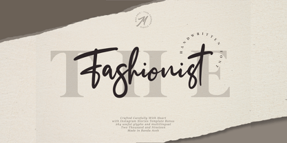 The Fashionist is a natural handwritten font, this font Is perfect for logo, invitation, stationery, wedding designs, social media posts, advertisements, product packaging, product designs, label, photography, watermark, special events or anything. Comes with full set of uppercase and lowercase letters, lowercase beginning & ending swashes , multilingual symbols, numerals, punctuation.
 - Amelliyo by Din Studio,
$29.00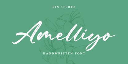 Amelliyo is a classy handwritten font. Made for any professional project branding. It is the best for logos, branding and of quotes. Every letter has a unique and beautiful touch. Features: Beautiful Ligatures Multilingual Support PUA Encoded Numerals and Punctuation Thank you for downloading premium fonts from Din Studio
 - Senistia by GuseType,
$12.00 Senistia is a decorative serif font with condensed and elegant glyphs characteristics. This font can be used in a various of designs such as posters, magazines, logos, headlines, brands & identities, and more. Feature: - Kerning - Alternative Style and Ligature - Uppercase and Lowercase Letters - Numeral - Punctuation and Symbols - Multilingual Supports
 - Rosyidun by Twinletter,
$15.00 Rosyidun is an authentic and geometric Arabic display font. Its capital letters and forms are rotated, creating a visually stunning display for captions, posters, or headlines. You’ll fall in love with the beautiful and ornate patterns of the Arabic Display font. The perfect addition to any design project.
 - Viva Moira by Creativemedialab,
$22.00 Viva Moira is an experimental psychedelic display font inspired by the delicate and curled leaves of Monstera esqueleto. This font has an all-caps format with charmingly connected letters or ligatures, making it an ideal choice for posters, titles, and designs that require a distinctive and vibrant theme.