10,000 search results
(0.036 seconds)
- CANDY BABY by Flawlessandco,
$9.00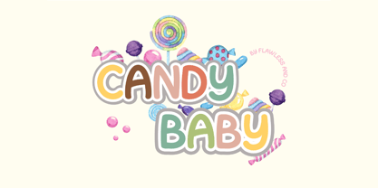 Introducing "Candy Baby" - a delightful and whimsical font that adds a touch of playfulness to your designs. With its unique and charismatic letterforms, Candy Baby brings a sense of joy and lightheartedness to any project. There's some connected letters and some alternates that suitable for any graphic designs such as branding materials, t-shirt, print, business cards, logo, poster, t-shirt, photography, quotes .etc This font support for some multilingual. Also contains uppercase A-Z and lowercase a-z, alternate character, numbers 0-9, and some punctuation. If you need help, just write me! Thanks so much for checking out my shop!
 - Cherile by Flawlessandco,
$9.00 Introducing "Cherile" - a lively and playful handwritten font that injects a sense of fun and joy into your designs. With its whimsical letterforms and energetic strokes, Cherile adds a delightful and carefree vibe to any project. There's some connected letters and some alternates that suitable for any graphic designs such as branding materials, t-shirt, print, business cards, logo, poster, t-shirt, photography, quotes .etc This font support for some multilingual. Also contains uppercase A-Z and lowercase a-z, alternate character, numbers 0-9, and some punctuation. If you need help, just write me! Thanks so much for checking out my shop!
 - RF Marshall by Magpie Paper Works,
$18.00 RF Marshall was inspired by an 1883 tombstone, tucked away in a pioneer cemetery. The 4-sided marker is sparsely adorned with homespun carvings of a handprint, two tulip poplar leaves, and these words: "RF Marshall died 1883 Aged 72 years." The font faithfully reproduces the stone's hand-carved lettering and artwork, as well as artwork from other 18th and 19th century American headstones. It was drawn with calligraphy nibs dipped in walnut ink and delights in a range of end uses including period films, rustic decor, Halloween decorations, historical logos and branding, and on the pages of children's books.
 - Gioties by IbraCreative,
$11.00 Gioties is an adorable display font that radiates an irresistible charm and playfulness. With its cute and whimsical letterforms, Gioties encapsulates the essence of innocence and joy. The rounded edges and friendly curves of each letter exude a sense of approachability, making it the perfect choice for designs that require a touch of sweetness and lightheartedness. Gioties effortlessly adds a delightful flair to children's books, playful merchandise, and cheerful branding. Its unique character variations and vibrant energy create a captivating visual experience, ensuring that any project adorned with Gioties becomes a canvas of endearing cuteness and boundless creativity.
 - Sassoon Primary Cond by Sassoon-Williams,
$48.00 Those who design books for young children should consider the different needs of their readers. When laying out pages for young readers, particular care should be taken over word spacing. Don't forget that justifying short lines disrupts spacing. Justification should be used only when absolutely necessary. In the research undertaken with young readers the importance of consistent spacing was clear. It also appeared that the poorer readers profited from wider word spacing, while spacing that suited the poorest readers, positively annoyed the better readers. These typefaces have built-in letter spacing because of their exit strokes, as well as extra clarity designed into them. Sassoon Primary Medium Condensed is a compact style for headlines combining the right amount of weight, yet in a friendly style. When used at large sizes the friendliness of Sassoon types really shines. Why not use it for headings throughout a book. You can find many other new ways to use this typeface. Ideal perhaps for the masthead or a magazine? Free to download resources: How to access Stylistic Sets of alternative letters in these fonts
 - Syncopate Pro by Stiggy & Sands,
$29.00 The Syncopate Pro Family is a unicase design where the traditional lowercase x-height has been abandoned and a single uppercase height rules the design of all of the alpha and numeric glyphs. Some uppercase glyphs are copied to their lowercase slots, where other lowercase glyphs such as the a, e, and r, are scaled up to uppercase heights. This motif allows for a vast array of typesetting possibilities. A modern and stylish sans inspired by the many trendy sans serif typefaces that are prevalent today, the Syncopate Pro Family, primarily intended for display and headline use, also works well for limited text runs. The thin and regular weights and wide body impart a certain level of elegance, while the unicase approach keeps the look lively and fresh. The bold weight imparts a powerful substantiality, lending a strong corporate presence to any design. Opentype features include: - Stylistic Alternates for a collection of alternate Small Caps - Full set of Inferiors and Superiors for limitless fractions - Lining and Proportional figure sets
 - Amudi by Arabetics,
$39.00 The Amudi type family follows the guidelines of the Mutamathil Taqlidi type style. It has one glyph for every basic Arabic Unicode character or letter and one additional, final-position, glyph for each Arabic letter that is normally connected with other letters from both sides in traditional cursive Arabic strings. Amudi employs four fixed x-height values, two above and two below the x-axis.. Values are high to give a slight vertical overall look. Amudi family includes all required Lam-Alif ligatures and uses ligature substitutions, and marks positioning but it does not use any other glyph substitutions or forming. Text strings composed using types of this family are non-cursive with stand-alone isolated glyphs. It employs our “natural Arabic input” method where first glyph is displayed in its non-isolated form. Tatweel (or Kashida) glyph is a zero width space. Keying it before any glyph will display that glyph isolated form. Keying it before Alif Lam Lam Ha will display the Allah ligature. it Amudi family includes both Arabic and Arabic-Indic numerals, all required diacritic marks, Allah ligature, in addition to all standard English keyboard punctuations and major currency symbols. The fonts in this family support the following scripts: Arabic, Persian, Urdu, Pashtu, Kurdish, Baluchi, Kashmiri, Kazakh, Sindhi, Uyghur, Turkic, and all extended Arabic scripts.
 - Ravensara Sans by NaumType,
$19.00 Ravensara Sans — fashionable, high-contrast humanist sans. Ravensara family was born from the idea of taking the concept of Didone to weight extremes. Ravensara Sans is available in 7 weights, including Thin, Light, Regular, Medium, SemiBold, Bold and Black. Depending on weight, Ravensara Sans, like the other members of this font family, show quite different behavior. Heavy weights function above all as display fonts and work particularly great in all-caps. Medium weights of Ravensara Sans represent humanist grotesque, descended from the pages of fashion magazines. Thin weight perfectly complements the others if you need an especially wide choice of weights. Also, all the weights work great in all-caps. Ravensara Sans is a part of the Ravensara superfamily, united by the same anatomy, which currently also includes Ravensara Serif and Ravensara Stencil. If you need to achieve classic Haute Couture look — Ravensara Sans is a great choice. It’s a perfect choice for fashion logos, headlines, short texts, magazines, due to its simplicity looks great in oversize typography, branding, identity, website design, album art, covers, posters, advertising, etc. Ravensara Sans extends multilingual support to Basic Latin, Western European, Euro, Catalan, Baltic, Turkish, Central European, Pan African Latin and Afrikaans.
 - Retrorocket NF by Nick's Fonts,
$10.00 A French lettering chapbook from the 1920s, entitled "Art du Tracé Rationnel de la Lettre," provided the inspiration for this decidedly Deco exercise in alternative letterforms. Both flavors of this font feature the 1252 Latin, 1250 Central European, 1254 Turkish and 1257 Baltic character sets.
 - Janda Scrapgirl Dots - Personal use only

- Click Clack by Fonthead Design,
$15.00ClickClack is a family designed by Ethan Dunham that is made of hand-drawn typewriter letters. An actual sample of a typewriter alphabet was blown up and carefully traced into the two versions, regular and light. This family has a bouncy, informal feel and is a departure from other typewriter fonts. - Dear Sans by Stiggy & Sands,
$24.00 The Dear Sans Collection is comprised of four widths ranging from Condensed, Regular, Expanded, and Wide; each of which are comprised of a three font family of weights: Book, Regular & Bold. Cleanly readable, with just a slight hint of silliness, the Dear Sans Collection brings adds the perfect level of lightheartedness to your designs. The Dear Sans Collection comes with: - Approx. 367 Character Glyph Set per font - including standard & punctuation, international language support, and basic “fi fl” ligatures per font. - 3 Weights per family including: Book, Regular, and Bold. - Loads of Personality for your designs.
 - Erotique Sans by Zetafonts,
$39.00 Designed by Cosimo Lorenzo Pancini and Maria Chiara Fantini with the help of Solenn Bordeau, Erotique Sans is the sans serif version of Erotique: a typeface that evolved the original design of Lovelace mixing its romantic curves with the glitchy & fluid aesthetic of trans-modern neo-brutalist typography with the aim of creating a design that was feminine in an assertive and self conscious way. With its restrained, didonesque elegance, Erotique Sans is mostly thought for display use. Its high-contrast design is ready to take center stage in projects where a subtle elegance and an edgy, contemporary touch are required. All its weights (regular, medium, bold and monoline) have been paired with an Alternate version to give immediate access to a wide array of exotic alternate letterforms, available as Open Type Stylistic Sets in the standard family. For logo design and titling use Erotique Sans is paired by Erotique Flourishes, a set of whiplike fleurons that can not only be added to some letters, but also be used as interlocking patterns. For editorial use, since its high contrast requires big text size, the family is complemented by the Erotique Text weight that allows for longer text typesetting thanks to streamlined design, lower contrast and better readability. With a character set of over 500 glyphs, all the the weights of Erotique cover almost 200 languages using extended latin, and include advanced Open Type features as Stylistic Alternates, Standard and Discretionary Ligatures, Positional Numerals, Swash and Case Sensitive Forms. If you liked Erotique, you won't be able to avoid falling in love with Erotique Sans - the font that can't keep its serifs on...
 - Sicret Mono by Mans Greback,
$29.00 Sicret Mono is a monospaced and geometric typeface family. It was drawn by Måns Grebäck in 2020, and was created by following a strict mathematical pattern consisting of only two basic shapes, in four different combinations, set on a 2 by 3 grid. The resulting product is a font with a serious and solid character, with an official look while yet going towards sci-fi because of its digital nature. The family consists of nine weights: Thin, Extra Light, Light, Regular, Medium, Semi Bold, Bold, Extra Bold and Black. The range of weights makes it very adaptable, and all the weights works very well together to give a sentence or graphic tone and emphasization. As Sicret Mono is a font with over 850 glyphs, it is guaranteed to contain all characters you'll ever need, including all punctuation and numbers. It has a very extensive lingual support, covering Greek, Cyrillic, Hebrew as well as European and American languages.
 - Sicret by Mans Greback,
$29.00 Sicret is a perfectly geometric typeface family. It was drawn by Måns Grebäck in 2020, and each one of its glyphs was manually created by following a strict mathematical pattern consisting of only two basic shapes, in four different combinations, set on a three units tall grid. The resulting product is a true monoline font with a solid character, with an official look while yet going towards sci-fi because of its digital nature. The family consists of nine weights: Thin, Extra Light, Light, Regular, Medium, Semi Bold, Bold, Extra Bold and Black. The range of weights makes it very adaptable, and all the weights works very well together to give a sentence or graphic tone and emphasization. As Sicret is a font with over 850 glyphs, it is guaranteed to contain all characters you'll ever need, including all punctuation and numbers. It has a very extensive lingual support, covering Greek, Cyrillic, Hebrew as well as European and American languages.
 - Avenir by Linotype,
$42.99 In drawing the Avenir® typeface, Adrian Frutiger looked to both the past and the future for inspiration. His goal was to reinterpret the geometric sans serif designs of the early part of the 20th century in a typeface that would portend aesthetics of the 21st century. He succeeded handsomely. In doing so, Frutiger added a bit of organic humanism to the design, freeing Avenir from the rigid geometric overtones of the earlier designs. Avenir is employed on signage at Dallas Fort Worth and Hong Kong international airports. The city of Amsterdam adopted Avenir as its corporate typeface in 2003. The original Avenir family is made up of designs with gradual weight changes in order to satisfy the needs of specific text applications. While the book and light weights have similar stroke widths, the book weight is well suited for body text, whereas the light was designed for captions and subhead text. Featured in: Best Fonts for Resumes
 - Silian Calligraphy by Mans Greback,
$49.00 Silian Calligraphy is a sharp serif typeface. With classy letterforms and an organic appearance, this calligraphic lettering has a proper look, yet a vivid personality. Use [ ] { } for decorative elements. Example: [Silian Calligraphy] The Silian Calligraphy typeface family consists of eight high-quality styles: Light, Regular, Bold and Black, and each style as Italic. The font is built with advanced OpenType functionality and has a guaranteed top-notch quality, containing stylistic and contextual alternates, ligatures and more features; all to give you full control and customizability. It has extensive lingual support, covering all Latin-based languages, from North Europe to South Africa, from America to South-East Asia. It contains all characters and symbols you'll ever need, including all punctuation and numbers.
 - Autumn Melody by PeachCreme,
$22.00 Autumn Melody is a modern calligraphy font that adds a classy and deluxe touch to your designs. The main pursuit of this font is to give you that authentic hand-calligraphy feel. Autumn Melodycomes with a full set of uppercase and lowercase letters as well as ligatures and beautiful letter alternates. The font provides several (up to15) alternates of some frequently used letters such as a, t, h, n, s, etc. The number and look (length, width) of the swashes vary depending on the frequency of this or that letter's usage. Autumn Melody is suitable for many projects related to the wedding industry (stationery, logo, etc.)
 - Cristal Text by Johannes Krenner,
$5.00 »Cristal Text« has nice to read lower case letters. It contains 636 letters per font style and some Open Type features: Different stylistic alternates and different sets of numerals. It is not monospaced: Therefor it stays not true to an underlying grid like it’s bigger brother »Cristal True«. But this offers a better legibility. The basis of this font is a Union-Jack or sixteen-segment display (SISD). I have found myself in the need of a precise and well-made font, that simulates the look of such a LCD display. Also it should offer enough letters and language support for the whole European region as well as different font styles.
 - LTC Italian Old Style by Lanston Type Co.,
$39.95LTC Italian Old Style is not to be confused with the English Monotype font also called Italian Old Style, which is an earlier design from 1911 based on William Morris’s Golden Type that is based on Nicholas Jenson’s Roman face. Goudy went back to Jenson’s original Roman and other Renaissance Roman faces for his inspiration and the result is what many consider to be the best Renaissance face adapted for modern use. Bruce Rogers was one of the biggest admirers of Italian Old Style and designed the original specimen book for Italian Old Style in 1924 using his trademark ornament arrangement. These ornaments are now contained in the pro versions of the Roman styles—Regular Pro and Light Pro. With most digitizations of old metal typefaces, one source size is often used as reference (as was Goudy’s method for his own cuttings of his Village foundry types) so that all sizes refer to one set of original artwork. The original hot metal fonts made by Lanston Monotype (from Goudy’s drawings) and other manufacturers used two or three masters for different size ranges to have optimal relative weights—smaller type sizes would need proportionally thicker lines to not appear thin and larger sizes would require thinner lines to not appear to bulky. The variations in size ranges can also be affected by the size of the cutter head in making the master patterns. The light weights of LTC Italian Old Style were digitized from larger display sizes (14, 18, 24, 30, 36 pt) and the regular weights were digitized from smaller composition sizes (8,10,12 pt). The fitting for the regular weights is noticeably looser to allow for better setting at small sizes. Very few font revivals take this approach. Italian Old Style, originally designed by Frederic Goudy in 1924, was digitized by Paul Hunt in 2007. In 2013, it has been updated by James Grieshaber and is now offered as a Pro font. The newly expanded Pro font includes all of the original ligatures, plus small caps and expanded language coverage in all 4 Pro styles. - Pargrid by Linotype,
$29.99Pargrid is a grid-based typographic experiment from the young Swiss designer Michael Parson. In the Pargrid family, which contains three separate weights, Parson has created an intriguing system of small circles-similar to LED's or light bulbs-that live separately on a grid, creating unique letterforms. In small sizes, these circles blend together to create seemingly fluid lines, giving Pargrid's letters a wide, rectangular appearance. In larger sizes, the letterforms transform themselves into objects d'art-virtual and ordered communities populated by various points. Fantastic in both display settings as well as short strings of text, Pargrid may offer the exact look that your next project is looking for. Pargrid and nine other constructed type designs from Parson are included in Take Type 5 collection, from Linotype GmbH." - Flamante Serif by deFharo,
$8.00 Flamante Serif is a family of 8 typographies with thick square serifs of the slab type, also known by the Egyptians, which are released with four weights: Light, Book, Medium and Bold and their corresponding italic versions. They are heiress fonts of the Egyptian types arisen at the beginning of the S. XIX and descendants of the fonts "Flamante Sans" Special corporate typographies to design resounding titles on any advertising medium, also for any type of publication like magazines or newspapers. They include the Bitcoin symbol. ================================== OpenType Features: Standard Ligatures, Additional languages, All Alternates, Alternate Annotation Forms, Superscript, Kerning, Superiors, Capital Spacing, Localized Forms, Superior letters, Discretionary Ligatures, Subscript, Fractions, Slashed Zero, Inferiors, Extended Fractions, Scientific Inferiors, Ordinals, Denominators, Oldstyle Figures, Numerators, Historical Forms, Historical Ligatures. - 500 glyphs. Latin Extended-A • OTF & TTF.
 - Cavas Nera by Authentype,
$13.00 Cavas Nera modern & elegant font with discretionary ligatures that give each word a different shape. Also contains a swash with an elegant, contrasting, and clean, perfect for logo designs, posters, and various types of promotional media. Including 8 Font weight Thin, ExtraLight, Light, Medium, SemiBold, Bold, ExtraBold, Black. – Standard glyphs uppercase and lowercase letters – Numerals, a large range of punctuation and ligatures. – Swashes. – Multilingual – Works on PC & Mac. Simple installations, accessible in Adobe Illustrator, Adobe Photoshop, Adobe InDesign, even work on Microsoft Word. PUA Encoded Characters – Fully accessible without additional design software. Fonts include multilingual support for; ä ö ü Ä Ö Ü ß ¿¡ _________________________________________________________________________________________ Image used: All photographs/pictures/logo/vectors used in the preview are not included, they are intended for illustration purposes only. Thank you for your purchase! Hope you enjoy our font!
 - Ravensara Serif by NaumType,
$19.00 Ravensara Serif - elegant high contrast classic serif. Style of the typeface originates in a classic Didone but took a step to simplify some letter forms and make Didone feel more contemporary. Ravensara Serif is a part of the Ravensara superfamily, united by the same anatomy, which currently also includes Ravensara Sans and Ravensara Stencil. Ravensara Serif, despite its ancient roots and due to simplified and smoothed forms, can be used in a variety of different styles. It’s a perfect choice for bold headlines, oversize typography, fashion logos, branding, identity, website design, album art, covers, posters, advertising, etc. It is available in 7 weights, including Thin, Light, Regular, Medium, SemiBold, Bold and Black. Ravensara Serif extends multilingual support to Basic Latin, Western European, Euro, Catalan, Baltic, Turkish, Central European, Pan African Latin and Afrikaans.
 - Hando Soft by Eko Bimantara,
$24.00 Hando Soft is a variant of Hando neo grotesk sans family. Each letter on Hando Soft has curve strokes end, which gives a soft and more ease-looking letterforms. Hando offers a wide range of usage possibilities. It's low x-height and variety of light size options make it a good choice for reading, it's tenuous white spaces in the counter letterforms make it legible enough to be recognized remotely. It's curved tensions on the circular letterforms gave a futuristic impression. It's sleek and simple strokes make it perfect for a broad range design purposes. Hando consists of 10 styles from Hairline to Black with each matching oblique. Contains more than 440 glyphs that support a broad latin language. Also some Opentype features e.g. stylistic alternates, variation of figures, e.t.c
 - HS Almidad by Hiba Studio,
$50.00 HS Almidad has been started in coincidence with my designing logotypes consisting of triangle geometric, looking shape and overall structure. After designing several words, I thought of using the design concept of this logo to develop a geometric Kufi font. All letters of this typeface family were conceived with suitable and coordinated dimensions to create five weights: Thin, Light, Regular, Medium and Bold: They support Arabic, Persian, Urdu and Kurdish languages. With a triangle look, this font is a simple and creative addition, which can be useful for book titles and variety of other geometrical constructions projects. It brings new design concept to enhance beauty and harmony and enrich our previous geometrical font contributions, which started with the release of HS Alhandasi , HS Almohandis and HS Alfaris from HibaStuido.
 - Estragon Pro by Stabenfonts,
$45.00 Estragon is a vivid sans-serif text face with venetian influences, suitable especially for books. It is remarkable for: its light slant, to the right, for most of the verticals, its small sized uppercase letters making it suitable for languages where they are often used (for example German,) and its just lightly inclined true italics. For a wide language support, Estragon contains a lot of accented characters including the polish kreska. It is generously equipped with ligatures, special and alternate characters as well as various kinds of numbers: besides the standard old-style figures to be set as part of text copy there are small-cap and tabular numbers as well as a set of fraction figures. Estragon comes with two weights, uprights and true italics, each with small-caps.
 - Titla Brus by ParaType,
$25.00 Font family Titla Brus was developed as an extension of Titla, released earlier in 2009. New slab serif family consists of 20 members the normal and condensed proportions that present 6 weights from Light to Ultra. The fonts can be used in combination with Titla or by itself in different display matters. Typefaces demonstrate original and catchy way of using serifs -- in some places there are traditional slab serifs, in other places -- one-sided and often there are no serifs in the places where they normally should be. This approach brings to the letter shapes an unusual appearance and peculiarity. Design was developed by Oleg Karpinsky. Released by ParaType in 2011--2013 at first as a set of ten condensed styles and later in extended version enhanced by ten normal styles.
 - HU Milksherbet KR by Heummdesign,
$25.00 This typeface was inspired by milk sherbet, which is enjoyed cold on a hot summer day. Rounded shapes and soft stroke endings make the typeface look cute. Heavy works great for headlines with its extra-heavy stroke weight and size, while Regular and Light are best for body text.
 - HU Milksherbet by Heummdesign,
$15.00 This typeface was inspired by milk sherbet, which is enjoyed cold on a hot summer day. Rounded shapes and soft stroke endings make the typeface look cute. Heavy works great for headlines with its extra-heavy stroke weight and size, while Regular and Light are best for body text.
 - Churchward Legible by BluHead Studio,
$25.00 Churchward Legible is an extensive typeface family designed by New Zealand type designer Joseph Churchward. A geometric sans serif, it is, as its name boasts, highly legible and readable on screen as well as in print. The family includes five weights from Light to Extra Bold, with companion italics.
 - Eirlys by Typomancer,
$24.00 Eirlys a Gothic serif typeface with a touch of Celtic feeling. A combination of sharp serif and smooth joint gives a sweet & smart characteristic. Font comes with 4 weights: Light, Regular, SemiBold, Bold and suitable Italic, Especially Small Caps, Swash styles and dozen of alternates for your own experiment.
 - Ruqia Arabic by Zaza type,
$29.00 Ruqia Arabic typeface is a modern Arabic typeface designed by Ahmed Zaza. the design is inspired by the Naskh style. The result is a hybrid that combines modern proportions with Classic Arabic scriptsit's suitable for branding, editorial, packaging, and advertising.Ruqia Arabic Features five weights from Light to Black.
 - Mafra by DSType,
$26.00 Mafra, the debut typeface by Pedro Leal, a type family suited both for editorial and corporate design, available in five weights, ranging from Light to Black with matching italics. Mafra is a contemporary typeface with plenty of style, asymmetrical and very dynamic serifs, and pleasant openness and balance.
 - Commentary JNL by Jeff Levine,
$29.00Commentary JNL is a serif treatment of Jeff Levine's popular Stylor JNL sans serif font. Offered in two weights—regular and light—Commentary is a perfect alternative to formal text fonts and has just a touch of hand-made design to make for a more casual reading experience. - FF Kurt by FontFont,
$41.99 German type designer Vivien Palloks created this display FontFont in 1998. The family contains 3 weights: Light, Regular, and Bold and is ideally suited for festive occasions. FF Kurt provides advanced typographical support with features such as ligatures and case-sensitive forms. It comes with proportional oldstyle figures.
 - Cyntho Next by Mint Type,
$35.00 Cyntho Next is a totally reworked typeface based on our previous bestseller Cyntho Pro. It also has a slab-serif counterpart - Cyntho Next Slab. Cyntho Next is a modern geometric sans based on a hybrid waterdrop-like shape with eight weights varying from Thin to Black and featuring Cyrillic.
 - Chauncy Pro by Chank,
$99.00 Chauncy Pro is a bouncy, artistic, childish handwriting font that comes in four practical weights: Regular, Italic, Bold and Bold Italic. The jaunty little font is based on the left-handed penmanship of an artist and it's ready to go play with some of your fanciful, light-hearted designs.
 - Tomboy LP by LetterPerfect,
$39.00 Tomboy is a type design based on informal handwriting. Its presence on the page is friendly and easy to read, suitable for correspondence, brief text, and for display use in titles and headlines. Three weights -- Light, Medium & Bold -- allow Tomboy to speak in a wide range of voices.
 - Visage LP by LetterPerfect,
$39.00 Visage is a contemporary text family designed by Garrett Boge in 1988. Its delicate serifs, subtly tapered stems, and generous proportions offer both distinction and readability to the text at any size. The family consists of five weights - Light, Book, Medium, Bold and Black, with corresponding oblique styles.
