10,000 search results
(0.042 seconds)
- Metro New Two by JAB'M,
$15.00The main inspiration is from Art Nouveau which flourished in Europe at the end of the 19th and beginning of the 20th centuries. This design included furniture (Majorelle, Lalique) and architecture (Victor Horta, Henry Van de Velde, Gaudi, Alfons Mucha). But Hector Guimard remains the favorite for all aspects of its art and, of course, its typefaces used on the Parisian Metropolitan posters. In particular, the various kerning of the various letters he used to make the poster a whole design from singular designs, leading to numerous variations. As a designer, I initially worked a first version, called Metro New One, which is more geometric and traditional. This design "Two" has more flexible shapes and long vertical hooks. It can be used to enhance specific parts in letters and books in the context of Art, specially Art Nouveau and Art Deco of course, posters of any kind. - Superb by Resistenza,
$49.00 Superb is a new typeface based on real brush pen script and also influenced by lettering shapes from the sixties and seventies. The font includes various swashes with volume and curls.. Superb’s letters got high contrast and some psychedelic curves. This font includes negative figures and a full alphabet set with cut out shapes. Take a look at the Superb Video https://vimeo.com/94062611 It’s designed with high contrast and enhanced legibility regardless its artistic look. Superb’s original letterforms are a beautiful piece of art and elegance no matter you observe them as separate symbols or as words, text paragraphs etc. Their appropriate use could be found therefore in many different aspects – from decorative greeting card, fresh packaging or expressive headline, to artistic t-shirt design, poster or distinguished brand name. Superb has a lot more to show when you access its OpenType features.
 - Thought by Scholtz Fonts,
$15.00 Thought, with its versatile five styles, is ideal for contemporary display work. It has style, flair, legibility, and interesting, flowing letter shapes. The Family: -- REGULAR - of medium weight - clear and legible; -- BLACK - for bolder statements and best readabilty; -- LINEAR 25 - light weight, mono width line -- LINEAR 45 - medium weight, mono width line -- ZEST - variable line, casual, exaggerated appearance Use a combination of styles for product branding, book covers, invitations, greeting cards. Thought has not been designed to be used in "ALL CAPS". The best effects for headings and subheads are obtained with an initial upper case letter followed by lower case characters. If you are using upper and lower case then it is not necessary to use kerning. Thought contains over 250 characters - (upper and lower case characters, punctuation, numerals, symbols and accented characters are present). It has all the accented characters used in most European languages.
 - Glorious Song by Stiggy & Sands,
$24.00 A type from vintage Hollywood to your computer screen. Glorious Song is a display serif typestyle that was inspired by the poster lettering for the 1948 movie "Words and Music". It's an all capitals typeface that has alternate caps in the lowercase slots to convey all of the spunk and visual dance of the original inspiration. See the 5th graphic for a comprehensive character map preview. Glorious Song comes with features for customisation options: - An all capitals typeface with alternate capitals in the lowercase slots - A Ligatures feature that alternates between Capital and Alt Capitals characters. - A SmallCaps feature just to mix things up a little. - A Full set of Inferiors and Superiors for Limitless Fractions - Tabular and Proportional figure sets Approx. 546 Character Glyph Set: Glorious Song comes with a glyphset that includes standard & punctuation, international language support, basic ligatures, alternate numeral styles, subscript and superscript, and Small Cap letters.
 - Gareh Note by Afkari Studio,
$19.00 Introducing Gareh Handwritten Marker Note Font, a font that merges the liveliness of handwritten script with a unique, natural touch. Crafted to captivate attention and infuse a fresh vibe into your designs, Gareh strikes the perfect balance between the elegance of handwriting and a casual feel. With expressive characters and authentic marker accents, each letter exudes warmth and originality. Gareh is the ideal solution for design projects seeking a personal and creative touch. Whether you're creating posters, greeting cards, logos, or working on branding projects, this font will leave an unforgettable impression. Every stroke brings inviting warmth and inspirational vibes. With Gareh, you can add a new dimension to your messages. Easy to use, this font grants the freedom to express limitless creativity. Get Gareh now and discover how each letter can lend that special handmade touch to every design of yours." Highlighted Features: – Uppercase, Lowercase, Number, and Punctuation – Special alternates and ligatures – Works on PC & Mac – Simple installations – Accessible in Adobe Illustrator, Adobe Photoshop, Adobe InDesign, and even work on Microsoft Word – Fully accessible without additional design software. – Mültîlíñgúãl Sùppört for; ä ö ü Ä Ö Ü ß ¿ ¡ Hope you enjoy our font and this font is a useful font for your projects!
 - Gloria Monoline by IM Studio,
$15.00 Gloria Monoline is a text serif with an editorial focus designed by Ikhsan Maulana. The idea for a typography job came from a design school letter-making exercise: Get a pair of scissors and some large sheets of paper, and start cutting. The resulting letters and the act of cutting them from paper inform the type design process, resulting in strong, simple shapes and open, inviting textures. The tone is crisp and straightforward. The classic letterforms, with a playful touch, give the design a personality that is both practical and spontaneous. The text weight is capable of adjusting copies at various sizes to print and render clearly on screen. Its lightest and heaviest weights work best at display sizes. Great care has been taken to save typists time with OpenType features including contextual punctuation and symbols to match case-sensitive, lower-case, and all-caps settings, as well as set images set for each use.
 - Greylock by dotHK Studio,
$28.00 Greylock is a casual script and clean brush script with a bouncing baseline. Include OpenType alternates and common ligatures. Try the alternates and ligatures to give your designs looks good, fresh, casual, stylish, and modern. Greylock is equipped with 279 glyphs. and by having many of these glyphs there will be able to choose the letters according to your likes, lots of variations and options for each letter, so you can customize on your design choices. with pleasure and happiness, in this font package you will get: Greylock Regular OTF to use a variety of flying machines, you need a program that supports OpenType features such as Adobe Photoshop Cs / Adobe Photoshop CC, Adobe Illustrator CS / Adobe Illustrator CC, Adobe Indesign and Corel Draw and many more programs that support OpenType. If you do not have a program that supports OpenType, you can access all the alternate glyphs using Font Book (Mac) or Character Map (Windows) Thanks and happy designing Thank You for purchase! Arief.hk
 - MVB Dovetail by MVB,
$79.00 MVB Dovetail is an editorially focused text serif designed by David Sudweeks. The working idea for the typeface came from a design school letter-making exercise: Take a pair of scissors and a few large sheets of paper, and start cutting. The resulting letters and the action itself of cutting them out of paper informed the type design process, producing strong, simple shapes and an open, inviting texture. Dovetail’s tone is crisp and straightforward. Its classic letterforms, set off with a touch of playfulness, give the design both a practical and spontaneous personality. The text weights capably set copy at a variety of sizes for print and render crisply on screen. Its lightest and heaviest weights perform best at display sizes. Care has been taken to save the typographer’s time with OpenType features including contextual punctuation and symbols to fit mixed-case, small-caps, and all-caps settings, as well as figure sets tuned to each use.
 - Kalyubi by Sabrcreative,
$25.00 Introducing Kalyubi Script, a captivating and versatile script font that combines elegance with a touch of playfulness. With its fluid and graceful letterforms, Kalyubi Script adds a unique charm to your designs, making it perfect for various creative projects. Whether you're designing invitations, logos, branding materials, or quotes, Kalyubi Script will effortlessly elevate your work and leave a lasting impression. The Uppercase and lowercase letters of Kalyubi Script offer a seamless blend of sophistication and versatility, allowing you to create captivating typographic compositions. The inclusion of numbers and punctuations ensures that this font is well-equipped to meet all your design needs. With multilingual support, Kalyubi Script enables you to effectively communicate your message across different languages, expanding your reach to a global audience. Featuring PUA encoding, Kalyubi Script provides easy access to a wide range of alternate characters and ligatures. These special letter combinations and decorative elements add a unique and handcrafted touch to your designs, giving them an extra level of creativity and visual appeal.
 - Panamericana by Andinistas,
$19.95 @andinistas presents an update of Panamericana in 2019, a typographic family worn out and expressive with 10 fonts perfect for short writings with cursive and stained calligraphic look. Panamericana works perfectly in headlines or logos of a film because its different thicknesses of corrosion and textures guarantee striking messages on t-shirts, stickers, skateboards, magazines, printed quotes, packaging, headings and all the designs you can imagine. Panamericana works best by exchanging and mixing letter by letter among its 10 fonts. In this way, you will take advantage of its corrosion levels by mixing the 3 uppercase, lowercase and ideal calipers for the beginning, middle or end of words, phrases or short paragraphs. Each empty and full Panamerican area was designed with care, care and attention and that is why its more than 2000 glyphs were carefully planned in 10 fonts designed for maximum performance in compositions that need scruffy and creative visual properties.
 - Envisage by Type Innovations,
$39.00 Envisage is a distinctive new grotesk design by Alex Kaczun. Characterized by distinct details throughout as particularly visable in the capitals A, H and N. There is a more organic and natural feel to the overall design as in the sutle curves introduced in many of the lower case letter forms, specifically the a, h, m and n. And, especially evident in the warm overall curves within the l‘case g. In addition, incorporating flexibility in form and function, Alex has also included alternate letter forms in this OpenType font; allowing the graphic designer a choice in the overall look and feel. Envisage has impact and zeal. It's a wonderful choice for a distinctively unique headline treatment, and works equally well in text in a large range of point sizes. Use this friendlier sans serif as an alternate to Futura and Gill Sans. We think you will like what you see. The large Pro font character set supports most Central European and many Eastern European languages.
 - Floral Decay by Mircea Boboc,
$22.00 This is Floral Decay, your seasonal autumn font with jaded, weathered, and earthy contours of rustic lettering. As they blend into words, the characters evoke floral arrangements of a decaying beauty. It is versatile, playful, and perfect for Graphic Design decorations! This font is unique because, in order to create it, I had to answer some tricky questions: What makes autumn… autumn? Capturing the essence of the other seasons into your letters comes easier. For instance, in order to suggest summer, you only need to draw a few flowers. How about autumn? You could garnish your letters with a few grapes, you might think, but it would only result in a grape-themed font. The notion that is more directly associated with autumn is the image of falling and withering leaves, which brought me to the second question. How exactly are you going to create something beautiful out of a somewhat morbid premise, like wilted leaves? Well, I soon realized that by creating a handwritten font and preserving the right imperfections, you can actually portray collateral beauty. In this context, asymmetry is important because it suggests decay. Further on, the design concept required the letters to come very close together, so that every typed word can be regarded as a floral arrangement. How close together, though? As much as possible without confusing one with the other, risking a lack of legibility. Therefore, in contrast with the demo version of this font, this actual version provides the ideal kerning.
 - Bourton Text by Kimmy Design,
$25.00 Bourton Text is a modern sans-serif typeface family perfect for both text type settings and display purposes. While it’s not a layering type family like its brother, Bourton, it come packed with features, extras and over 2,000 characters that make it stand on its own. HISTORY Bourton Text is a new take of the Bourton family that was one of the best-selling and favorite fonts of 2016. After countless requests for lowercase alphabet, or suggestions for a font pairing with Bourton, this new text setting family is based on the original shapes of Bourton. DESIGN & CREATION In taking Bourton Base was the starting point as they narrowest width and boldest weight. From there, lowercase shapes were designed that matched the aesthetic and details of the popular capitals. As Bourton was a heavy display font, some small tweaks were done to make it more fitting for smaller text settings, including reducing the letter-spacing and reworking some counters. Some areas needed complete reconstruction, such as the figures. The design of those began anew with a style that worked with the capitals and lowercase but also as a standalone set. Currency shapes were updated to match the numerals. Punctuation was also reimagined to work better in smaller type settings. Diacritics and extended language support was also updated and expanded to include full Latin plus language support for 219 latin based language spoken in 212 countries. Once the basic alphabet for Bourton Text Bold Narrow was formed, the font was expanded in both weight and width. Taking the weight from Bold down to Hairline, it allowed for more range in use. The typeface needed to be expanded in order to reach better as a book weight and width, in addition to a regular width, a wider version was create as well. FEATURES Once the extremes were set in place, small capital forms were designed for text and display purposes. These also allow for nested capital letters, lifted small caps and other display features offered in the typeface. One of the most popular fonts in the Bourton layering font family is Bourton Line. This led to an experimentation with rounded Bourton Text completely and thus a complete set of duplicated characters with rounded terminals. By using the Opentype Panel, a rounded font is a single click away. Every feature has been carefully thought out and updated across the entire font. In total, Bourton boasts over 2,300 glyphs, 42 font files with 3 widths and 7 weights in upright and italic.
 - Relaunch by Fype Co,
$16.00 Relaunch delivers a classy, smart and timeless look. To make it look like handwriting, we created 20 ligatures and 15 alternates, so you can mix and match it to make a better style on your design.
 - Cal Roman Black by Posterizer KG,
$19.00 Cal Roman Black is one more font from the PKG “Cal” (Calligraphic) group. This time for calligraphic sketches we used a wide brush instead of the iron pen. Instead of minuscule letters, there are Small Caps (which are almost the same weight as capitals). There was an intention to keep the spacing as small as possible, because of that, there is no obvious difference in the stroke thickness of the capitals and the lowercase capital letters. The difference in height is only one-third of the brush-width. Cal Roman Black font is rhythmic, informal, dark and hefty... romantic and strong at the same time (just like Ferdinand). As such, this font is widely used in the typographic creation of shorter and closely packed text forms such as magazine headlines, brochures and book covers, t-shirt designs, logos, posters, movie spots, banners...
 - Billion Laughter by Haksen,
$20.00 Billion Laughter is a Bold serif display style with unique anatomy every letter. Provide variant alternates and ligatures make the design letter looks incredible. Honestly it works perfectly for headlines, logos, posters, packaging and much more. Recommended to use in Adobe Illustrator or Adobe Photoshop with opentype feature. Ligatures feature is default setting in Adobe Illustrator or Adobe Photoshop in Uppercase character. So when you want not to use the ligatures. Open glyphs panel : In Adobe Photoshop choose tool Window Character and then please click fi symbol In Adobe Illustrator choose tool Window Type Open Type and then please click fi symbol How to access Alternates Character? Open glyphs panel : In Adobe Photoshop choose tool Window glyphs In Adobe Illustrator choose tool Type glyphs If you have questions, just send me a message and I’m glad to help. Have a great day, Haksen
 - Rondolux Cyrillic by Ira Dvilyuk,
$18.00 Rondolux Cyrillic Serif Font is a narrow classy all-caps serif typeface with narrow lowercase, wide uppercase letters, and tons of ligatures. Perfect for gorgeous logos and titles, Rondolux Cyrillic Serif Font will pair beautifully with many fonts and work well with whatever project you're working on. You can choose to use narrow or wide glyphs to make your typography more varied. Rondolux Latin part contains 38 ligatures which you can get by typing the number 1 after letters such as OC1 KO1 Lu1... Rondolux Cyrillic part also contains 27 ligatures Multilingual Support for 32 languages: Latin glyphs for Afrikaans, Albanian, Basque, Bosnian, Catalan, Danish, Dutch, English, Estonian, Faroese, Filipino, Finnish, French, Galician, Indonesian, Irish, Italian, Malay, Norwegian Bokmål, Portuguese, Slovenian, Spanish, Swahili, Swedish, Turkish, Welsh, Zulu. And Cyrillic glyphs support Russian, Belorussian, Bulgarian, Ukrainian, and Kazakh languages.
 - Gatha by Khaiuns,
$15.00 Gatha is a fun font duo that includes signature scripts and elegant, soft sans that grab 4 styles – it's fit and ready to go together for your next design! Gatha includes a complete set of beautiful upper and lowercase letters, numbers, a wide variety of punctuation marks, ligatures, and super pretty prefixes as well as a final sweep thus providing a realistic handwriting style. These typefaces are versatile and can be used successfully in Magazines, Posters, Branding, Websites, etc. Fonts include multilingual support. Please message me if you're unsure of any language support. Ligatures • Are also available for several lowercase characters (double-letters which flow more naturally). These are only accessible via software with opentype capability or a glyphs panel, e.g. Photoshop/Illustrator. I hope you have a blast using Gatha. Thanks for use this font ~ Khaiuns X zelowtype
 - Northern Worssley Ligature by Typetemp Studio,
$20.00 Northern Worssley is a made with a stylish elegant and modern touch, this font is ready to use with your brand and design, Access your OpenType features to access the large selection of alternate letters and ligatures, select the letters you like from the large variety to get the display font you like. This font with alternatives, ligatures, and multilingual support. Perfect for editorial projects, Logo design, Clothing Branding, product packaging, magazine headers, or simply as a stylish text overlay to any background image. Features : Uppercase and Lowercase Stylistic Alternates & Ligatures Numerals & Punctuation Multilanguange PUA Encoded Web Font Included Language Support • English, French, Italian, Spanish, Portuguese, German, Swedish, Norwegian, Danish, Dutch, Finnish, Indonesian, Malay, Hungarian, Polish, Croatian, Turkish, Romanian, Czech, Latvian, Lithuanian, Slovak, Slovenian. Contact me with an inbox message If you have any question. Thank you! Happy Creating
 - Sheridan Gothic SG by Spiece Graphics,
$39.00 Sheridan Gothic, also known as Grant Antique, is a quaint design produced in the late nineteenth century. Its proportions are in keeping with extra condensed faces of the times. Its uppercase letters are quite narrow. Its lowercase letters are equally narrow and tall. This pleasant and enduring design contains a touch of novelty, too. Swelled terminal flourishes on such characters as C, J, S, c, e, r, and s help add interest and warmth to what is basically a friendly old soul. Sheridan Gothic is now available in the OpenType Std format. Some new stylistic alternates have been added to this OpenType version. Advanced features work in current versions of Adobe Creative Suite InDesign, Creative Suite Illustrator, and Quark XPress. Check for OpenType advanced feature support in other applications as it gradually becomes available with upgrades.
 - Glamour Brains by Haksen,
$21.00 Glamour Brains is a contrast serif display style with unique anatomy every letter. Provide variant ligatures make the design letter looks incredible. Honestly it works perfectly for headlines, logos, posters, packaging and much more. Font Features : Character set A-Z in uppercase and lowercase Ligatures in Uppercase Numerals & Punctuation Accented Characters Multiple Languages Supported Recommended to use in Adobe Illustrator or Adobe Photoshop with opentype feature. Ligatures feature is default setting in Adobe Illustrator or Adobe Photoshop in Uppercase character. So when you want not to use the ligatures. Open glyphs panel : In Adobe Photoshop choose tool Window Character and then please click fi symbol In Adobe Illustrator choose tool Window Type Open Type and then please click fi symbol If you have questions, just send me a message and I’m glad to help. Have a great day, Haksen
 - Lightly Sailler by Zamjump,
$17.00 Lightly sailler is a beautiful new serif font that's created to complement a classic style for your project needs to be more perfect. Classic curves and sharp serifs make the Lightly sailler Serif feel elegant and nostalgic, at the same time, while still leaving enough simplicity to use for both headings and body types. It is also equipped with four special ligatures (ct, st, it, ck, sl, el, et, the, and end) as well as alternate features either capital or lowercase with a little tail that bumps the letters after which is a combination idea to give a more elegant impression. provides extra flair and body text legibility. Test the Lightly sailler in the box above to see how it works for your next project! Lightly sailler Includes: Uppercase & lowercase letters Numbers & Punctuation Ability Foreign language Ligature Alternate
 - Hwaiting Serif by Konstantine Studio,
$20.00 Inspired by the emerging Korean culture that grabbing the worldwide actuation in so many realms of the industry. To bridge the vibes and to make it easier to consume, we found the gap to fill with simple things in life that are useful for it, and yes, it's a new day it's a new font. So without any further ado, please welcome Hwaiting Serif. 3/3 series of Korean vibes typefaces. It's a serif font with a thick and thin style of visuals, aiming the luxury and glamorous tone to catch up with high-fashion branding and today's graphic design trends Crafted with deep research about Korean traditional letters, shaped up with the approach of universal Latin letters. This is the last drop of 3 series from the Hwaiting family. Thank you for your engagement with us.
 - Mario by Tipo Pèpel,
$22.00 Once upon a time, Mestre Patau, the «Black» magician, concerned about children´s typefaces historical ugliness, decided to settle the matter and using his vector powers, made letters embellished to be used in that stories so that they were according with the great genius all children have inside. Well done face but happy, goodness is not incompatible with joy. A solid construction, smooth, rounded, vibrant, generous curves and even more generous x-height and general proportions, give to the letter the vitality and freshness needed for use in projects where formality is not a requirement. Naughty but welldone, although not heeding the overshoots or the formal alignments, no symmetry in the horns is, despite this, or because of it, a fresh, cheerful but perfectly legible type. A full menu of freshness in your tales and stories!
 - Monkton News by Club Type,
$36.99 This classified version of Monkton, with its expanded proportions and extended serifs can be used at small sizes for classified advertising, newspaper text or larger displays. Its semi-medium weight (heavier than Book weight) makes it robust to be legible when smaller and cope with various printing methods. The inspiration for this typeface family came from my childhood experiences at Monkton, amidst an historic part of the South West of England. Studies of the original incised capitals of the Trajan column in Rome were analysed and polished for this modern version. The lower case letterforms and numerals were then created in sympathy, taking their proportions from the incised letters of local gravestones. Its name honours not only the area where the original alphabet was conceived and drawn, but also the people responsible for fostering my initial interest in letters.
 - AnoStencil by Alias,
$60.00 Stencil typefaces are popular because they are striking and decorative, and their associations - whether Utility, Travel, Vernacular, etc - are evocative. Anostencil is developed from, but not exactly like, our Ano typeface. Ano’s geometric skeleton, tweaked a bit, allows for a level of abstraction while retaining legibility. Some of Ano’s characters, such as the a, e, f and r, have been amended to make clearer, more graphic shapes when the stencil design has been applied. Different application of the stencil gaps in the letters make functional but decorative and expressive linear forms. This is particularly evident in Anostencil’s extended character set which features codified, semi abstract shapes. So the stencil design in Anostencil has been applied in not necessarily the most logical or immediate way, but in a way that makes each letter a striking and graphic shape.
 - Palengue Script by Strong,
$20.00 Palengue script with modern calligraphy type font, I hope you are interested in this font, if you want to use it for your work, this font can be used easily and simply because it contains many features that contain a full set of uppercase and lowercase letters. letters, various punctuation marks. , numbers, and multilingual support. This font also contains several alternative ligatures and Style Stylistic Sets for those of you who have software capable of running OpenType (Photoshop/Illustrator/InDesign). Palengue Script is perfect for today's growing design market, this font has a trendy, natural and subtle style, with this font you can use every moment as a great way to highlight a celebration. your best party, because this font will support for purposes such as wedding invitations, parties, graduations, birthdays, social gatherings, etc. Thank you,
 - Alergia Grotesk by Borutta Group,
$29.00 Alergia Grotesk was made as a hybrid between a classical geometric grotesque and a linear antiqua. This typeface is characterised by a lot of details, which gives it a strong character. Unpredictable cuts in a letters “a” and “s”, or a double “g” in combination with a delicate contrast, makes Alergia Grotesk a good choice for many purposes from headlines to short flowing texts. A big range of width varieties allows to versatile use and can give a nice effect while mixing extreme varieties with each other in one project. The family consists of 10 weights, 3 widths and set of italics – together 60 styles. The whole family has a comprehensive set of characters. In addition to the Latin letters, Alergia Grotesk also has a full set of characters for Vietnamese, extended Cyrillic (with Abkhasian) and Greek.
 - Minty Foxs by Joelmaker,
$18.00 About the Product Minty Foxs layered Font Minty Foxs is a layered fonts that appear with various styles such as Extrude, Engrave, Shadown and outline version, This font comes with an bold and shadow effects. this font to complement your perfect vintage design or Retro! a collection of letters inspired by retro 70s typographic designs with original handwriting. perfect for branding, logos, stickers, posters, vintage designs, screen printing on t-shirt, wall art and more! Minty Foxs includes: Stylistic Alternates, Ligatures & Stylistic Sets. You can choose an alternative style, Stylistic Sets per letter and Glyphs. By using Glyph in software programs like Photoshop, Illustrator and CorelDraw X version. You can also access this in many other programs by using your character map (Windows) or font book (Mac). Let's play with "Mint Foxs" for the beauty of your next design project.
 - Fadilla by MrLetters,
$20.00 Fadilla Script is perfect for branding, wedding invitations, magazines, mugs, business cards, quotes, posters, and many more that you can use on your big project will be very beautiful. Fadilla Script is equipped with OpenType feature and has many glyphs, giving you the chance to choose letters to your liking, having lots of variations and choices for each letter, so you can customize your design choices. Fadilla Script also support other languages. You need a program that supports OpenType features such as Adobe Photoshop CS / Adobe Photoshop CC, Adobe Illustrator CS / Adobe Illustrator CC, Adobe Indesign and Corel Draw and many more programs that support OpenType. If you don't have a program that supports OpenType, you can access all the alternate glyphs using Font Book (Mac) or Character Map (Windows) If you have any question, don't hesitate to contact me by email.
 - Ornate Initials by Gerald Gallo,
$20.00 Style One is composed of a floral ornament rotated and reflected at 90 degree increments combined with a letter or number to form each ornate initial. The initials are A through Z and 1 through 0 for a total of 36 initials. Each initial is located under its respective key in the character set. Style Two is composed of floral ornaments rotated and reflected at 90 degree increments combined with a letter to form each ornate initial. There are two sets of initials A through Z. Under the character set the initials are negative on a positive floral background. Under the shift + character set the initials are positive on a negative floral background. Each initial is located under its respective key. Style Three is composed of floral ornaments rotated and reflected at 90 degree increments combined with a letter or number to form each ornate initial. There are two sets of initials A through Z and 0 through 9 for a total of 72 characters. Under the character set the initials are negative on a positive floral background. Under the shift + character set the initials are positive on a negative floral background. Each initial is located under its respective key.
 - Festina by Twinletter,
$14.00 Festina is our newest font, which is handwritten which is neat and clean and proportionate in usage. gives a friendly, relaxed, and cool impression when reading. Not limited to that, the bold calligraphy font is designed to keep paying attention to the beauty of each letter, there are alternate options for the letters which are certainly easy for you to access, so you can automatically customize the letters you want to enhance the visual appearance of your design project. This charming font also offers the beauty of abstract typography harmony for a wide variety of design projects, including digital natural handwriting for designs, quote designs, for social media business designs, advertisements, trademarks, food and beverage promotion banners, text, posters, a signature, and all designs require handwriting or whatever design you want. What’s Included : File font Web Fonts Standard glyphs Ligature Works on PC & Mac Simple installations Accessible in Adobe Illustrator, Adobe Photoshop, Adobe InDesign, even work on Microsoft Word. PUA Encoded Characters – Fully accessible without additional design software. Fonts include multilingual support for; Afrikaans, Albanian, Croatian, Czech, Danish, Dutch, English, Estonian, Finnish, French, German, Hungarian, Italian, Norwegian, Polish, Portuguese, Slovak, Slovenian, Spanish, Swedish Thank you for your purchase! Hope you enjoy our font!
 - Neroli by Pelavin Fonts,
$25.00 Neroli is an oil distilled from the blossom of the bitter orange tree and used extensively in perfumery. Its scent is sweet, honeyed with green and spicy facets. The eponymous OpenType font is of tidy Art Deco construction and will lend its own unique bouquet to any typographic composition.
 - Quache by Mans Greback,
$29.00 Quache is a flexible sans-serif, created by Måns Grebäck between 2018 and 2020. It has unique, stylish curvatures and is clear, legible and sharp with open letter forms. The font family consists of six weights and four widths, totaling in 28 main styles: Thin, Light, Regular, Bold, Black, Heavy and Condensed, Normal, Expanded, ExtraExpanded It supports Latin-based languages, and contains numbers and all symbols you'll ever need.
 - Drunk & Proud by Woodcutter,
$55.00 "Drunk and Proud" is a bold and rebellious typeface that embodies the essence of the punk movement. Its chaotic and distinctive letters are designed to challenge convention, adding a wild touch to your designs. With carefully incorporated accents and punctuation marks, this typeface maintains its versatility. Perfect for projects seeking a disruptive and daring image, "Drunk and Proud" is the ideal choice for posters, album covers, and edgy designs.
 - Syakira by Sulthan Studio,
$10.00 Syakira Script has a romantic and modern calligraphic style, and is ready to give your design a fresh and fabulous Style. Syakira Script comes as a single font file packed full of great features and cuteness. Perfect for weddings, branding and romantic invitations and also suitable for various purposes such as digital lettering, headings, logos, wedding invitations, t-shirts, letterheads, signage and much more! Thank You, Sulthan Studio
 - Bergamotte by Supfonts,
$15.00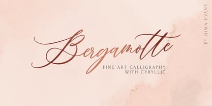 Bergamotte is a modern calligraphic font with exquisite accents. It is perfect for branding, wedding invitations and invitation cards and many more Font includes a full set of gorgeous uppercase and lowercase letters, numbers, a large selection of punctuation marks and ligatures, and Cyrillic support. Includes: Latin languages support Cyrillic languages support Uppercase and lowercase Numbers and punctuation Ligatures Check out my blog: https://www.instagram.com/di.zigner/ pinterest.com/dmitriychirkov7 Enjoy
 - Hawkes by Kimmy Design,
$15.00 Hawkes is an extensive handmade typeface family that comes with a bundle of weights, widths and styles, all designed to work cohesively. Here is a breakdown of the Hawkes family. Hawkes Sans: The primary subfamily is a sans-serif typeface that includes nine fonts: three weights (light, medium and bold) and three widths (narrow, regular and wide). Within this set are an array of stylistic features; including small capitals, character style alternatives, discretionary ligatures and contextual alternatives. See details below for more information on OpenType Features. Hawkes Variable Width Sans: The secondary subfamily is the same base sans-serif fonts but combined in variating widths. Essentially, it takes all three widths of each weight and randomly mixes them together. This creates a funky and creative alternative to the more traditional sans-serif set. The variations are for the uppercase, lowercase, small capitals, ligatures and numbers. Hawkes Script: The last subfamily is the script typeface. It’s a quirky script with variations of its own, including ligatures, swashes and contextual alternatives (again, see below for further details.) The script font works great as a complimentary style to the sans-serif, or on it’s own. FEATURES Alright, let’s get into all the extra goodies this typeface has to offer. Small Capitals: Small caps are short capital letters designed to blend with lowercase text. These aren’t just capital letters just scaled down but designed to fit with the weight of both the lowercase and capitals. With Hawkes, small caps can either sit on the baseline (in line with the base of the capital and lowercase) or to be lifted to match the height of the capital letters by applying the discretionary ligature setting in the OpenType panel. These small capitals have a dot underlining them that sit along the baseline. The feature offers a unique display affect that is great for logos, titles and other headline needs. Discretionary Ligatures: A discretionary ligature is more decorative and unique combination than a standard ligature and can be applied at the users discretion (as the name indicates.) The specific styling for these ligatures varies for different fonts. With Hawkes, they are used as an all capital styling feature, or to lift the small capitals to align with the height of the capitals. In the former setting, both lowercase and uppercase letters are first changed to all capitals, then a specialized set of letter combinations are transitioned so small characters are positioned within a main capital letter. These combinations only happen with main characters that include an applicable stem, such as C F K L R T Y. Some of these combinations include two or three characters. When Small Caps is turned ‘on’, this feature will lift the small caps to the height of the capital letter. For more information, please check out the user guide! Stylistic Alternatives: Stylistic alternates are a secondary form of a character, often used to enhance the look or style of a font. For Hawkes, these alternatives provide a slightly more handmade feel. A - the capital and small capital A will lose its pointed apex and become rounded. Think of it more as an upside-down U than an up-side-down V ;-) Oo, G, Ss, Cc- these characters’ topmost terminal becomes a loop. The O is applied automatically, the G S and C need to be turn on individually. Titling Alternatives: This feature does sort of the opposite of what it intends. Instead of being used for titling purposes, this feature makes the text look better in paragraph text settings. Kk Rr h n m - curved terminals on the are straightened e - the counter stroke also gets straightened from a more looping motion y - the shape of y is changed from a rounded character to a sharper apex (think more like a ‘v’ than ‘u’) Contextual Alternatives: Contextual alternates are glyphs designed to work within context of other adjacent glyphs. With Hawkes Sans, there are three slightly different variations per character. The feature rotates the application of each variation. This helps with organic authenticity, so if you have two e’s next to each other, they won’t look identical (reflecting the natural variations in handwriting and lettering.) With Hawkes Variable width fonts, I have created a contextual pattern that randomizes the widths of each character. So, when the feature is turned ‘on’ in the OpenType panel, the widths would alternate in a pattern such as: Narrow, Wide, Regular, Narrow, Regular Wide, Narrow, etc. It happens automatically so the user doesn’t have to think or worry about getting a random seed. With Hawkes Script, contextual alternates allow strokes to connect properly from one character to the next while maintaining a believable, natural flow. Connecting strokes are present for two letters next to each other but are replaced by a shorter stroke when located at the end of a word or sentence. Some characters have in-strokes when located at the start of a word. When a character is preceded by a capital letter that doesn’t connect, it too needs an in-stroke or altered spacing. This feature is complicated and messy, but luckily you don’t really have to think about it! I’ve done all the coding so all you have to do is turn ‘on’ the feature in the OpenType panel and you are off to the races! I’m just letting you know what’s happening behind the scenes. Swashes: These are just for Hawkes Script and provide tail swashes to the start and ends of letters. There are three different options. You can pick the basic option by turning ‘on’ the swash feature in the OpenType panel, or you can pick using the Glyph panel. Stylistic Sets: This feature work in new versions of Illustrator CC and InDesign CC. You can pick specific styling sets instead of turning on an entire feature. For example, let’s say you want to have a loopy S, but not a loopy C or O, you can just turn on the S in the Style Set. It also helps create the little drop box that pops up when you hover over a character, showing you the alternates associated with that character. This makes it easy to pick and choose specific styles you want in a word or headline. ---------- And there it is folks! That’s all the basic info on Hawkes, I know it’s been a lot and I appreciate you hanging on. If you are like me and need more of a visual reference to accessing all these goodies, I’ve made a user guide to help navigate Hawkes and everything it has to offer. Altogether this extensive family boasts 14 total fonts in a wide array of styles, weights and widths, making it a great addition to any handmade type collection. Enjoy!
 - Circulo by MMD Fonts,
$6.29 Bound to rules, unbound in the usage. Hyper geometric, and minimal contrast. Circulo V1 is based on a font project I originally started because of a client I had. I wanted to create a display and text font for their product design brand, which is all about reducing the amount of necessary materials and production steps. Before I started the course at tipo-g it was called -“REDUCE“ and was more or less finished. The concept was based on the name. How far can letter shapes be reduced to their core geometric concepts and still be identified as letters? But in a way, it lacked a unique approach and was just a generic geometric Sans Serif with a lack of finesse. There was already a glimpse of characteristics visible which would later define Circulo V1. The high focus on geometric shapes was not of the same severity, and the angle on the stems was less intense. Those, as I call them, fake serifs turned out to be a significant factor in legibility and the characteristic of the font. Besides those changes and improvements, I decided to implicate a new feature to the concept, a condensed style. I quickly realised that it is impossible to keep my perfect circles and half-circles in this style without breaking my rules for the font. This „problem“ turned out to be the most crucial feature of the condensed set. Circular-based Letters will ignore the rules and boundaries of the condensed style and stay as they are. This feature allows the user to create a unique rhythm in their texts, and if you use the variable font, you can decide how intense this rhythm will be. In this situation, the user can choose which letters are allowed to keep their shapes and which will be put in their condensed corset. All, some or none of them, you decide.
 - Decorata by Positype,
$29.00 How many times have you seen lettering on a book cover, poster, or card and wanted to make something similar? Decorata’s eight intertwining weights finally make that possible in an intelligent way. The first major collaboration of its kind, Decorata pairs the talents of supreme lettering artist Martina Flor and masterful type designer Neil Summerour. Lettering was traditionally understood as using words in an artistic way, while type design created written language for easy reading, the one overlapping the other in several ways. For this unique project, Martina created several versions of the alphabet and its decorative layers in her eye-catching style. Neil then took those designs and created an enormous eight-style font family that respects the designer’s need for control and capitalizes on the artist’s expressiveness. Each style can work separately but, on top of the foundational styles, try placing the Lace, then Filigree in contrasting colors. Use any OpenType-capable program to turn headlines from blasé to wowza, make posters with some pow, and design your own cards with that just-right level of detail. Whatever idea you can imagine with the Decorata family, it promises to be a playful and precise wordsmith where the words themselves are the art. Decorata’s glyphs are bifurcated, have medium contrast to showcase their intricate interactions, and include Shadow, Regular, Outline, Filigree, Lace, Fancy, Intricate, and Dingbat styles — eight in all. The Regular style sets the word or phrase to begin the design, Shadow ensures it lifts off the background, and Outline attempts to restrain its ornate flair. Think of those as the foundation and use the rest of the styles for flamboyance. The Intricate and Filigree styles vary only in the thickness of the glyphs, with Filigree being thinner. Lace removes the external curls around each letter but keeps the internal negative space from those decorative lines. The Fancy style is a solid lettershape that includes its attendant elements, and the Dingbats are exactly as expected: borders, manicules, patterns, frames, and many stylized items to bring designs to life.