10,000 search results
(0.047 seconds)
- Odeon by Scriptorium,
$12.00Odeon is the kind of font you would have seen on theatre or concert posters around the turn of the twentieth century. It is based on Art Nouveau sign lettering and has a heavy, playful look that's hard to miss. - Dyane by Wiescher Design,
$39.50 Dyane is based on monolinear scripts from the Bauhaus time. But it is very special for ist counterstrokes in the lowercase letters a, h, m and n that gives the script a very distinct rhythm. Your rhythmic type-designer Gert Wiescher
 - Hurley 1967 by Tyfomono,
$16.00 Hurley 1967 is a bold script, with clean lines and smooth curve combined with beautiful features! Simply amazing fonts, comes with 7 styles. Hurley 1967 has a bunch of styles as a families to designed lettering style logotype using the fonts.
 - Darkness by BaronWNM,
$14.00 Blackletters have a long history and appeal to the world of lettering. "Darkness" is a blackletter font, but with a contemporary style with a simple form. Darkness is very suitable for use on product labels, logos, ads, brochures, invitations, etc.
 - Skelett Antiken NF by Nick's Fonts,
$10.00 You can pack a lot of letters into a single line with this face, originally released as Clarendon XX Condensed in 1859. Both versions of this font support the Latin 1262, Central European 1250, Turkish 1254 and Baltic 1257 codepages.
 - Katydid JNL by Jeff Levine,
$29.00 Vintage sheet music for a song from the Broadway Musical “Kiss Me Kate” is the inspiration for Katydid JNL. The play’s name was written in a ball-and-line type of lettering which somewhat resembles either 'Tinker Toys' or celestial mapping.
 - Scary Vampire by Sronstudio,
$12.00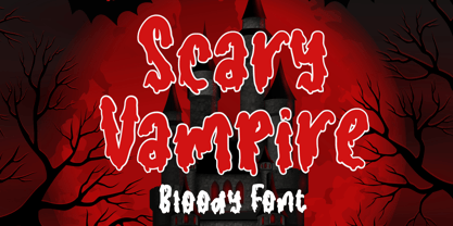 Scary Vampire a bloody font that perfect for you any spooky project. Scary Vampire comes with uppercase and lowercase letters, multilingual symbols, numerals, punctuation. If you have any questions please don't hesitate to drop me a message :) Thank You, Sronstudio
 - Typewrither by PizzaDude.dk,
$20.00Typewrither is not your every-day-typewriter-font. It comes with almost 200 different ligatures to help avoiding repeating letters - this includes ligatures for both lowercase, uppercase and numbers. You will need to use OpenType supporting applications to use the autoligatures. - Sassoon Book by Sassoon-Williams,
$48.00 Semi-Serif Roman and Italic for typefaces for setting legible children’s reading books. A gentle introduction for young readers to seriffed letterforms they will encounter. Free to download resources: How to access Stylistic Sets of alternative letters in these fonts
 - Super Monogram by MonogramBros,
$10.00 Super Monogram is a perfect shaped monogram font consisting of 26 letters. With just a single font file you will be able to create beautiful monograms in just a matter of minutes after the purchase! Numbers and special characters not included.
 - Shinrin by ReivNick,
$12.00 Introducing our latest product Shinrin Script Font! Shinrin is perfect for fashion, e-commerce brands, trend blogs, or any business that wants to appear classy. It contains a basic set of lower & uppercase letters, a large range of punctuation, and numerals.
 - Piacere by Michael Rafailyk,
$9.00 Piacere is a spacious, full of air typeface with broad letters and wide serifs. Design of serifs inspired by the sound waves of pleasant classical music. In musical terms, piacere means pleasure, so type with pleasure, or “Digita con Piacere”!
 - Ru'ach by ITC,
$29.99Ru'ach is the work of British designer Timothy Donaldson, a dynamic, dry brush script typeface. The typeface should be set with close letter and word spacing. Donaldson's experiments with writing tools on different surfaces resulted in Ru'ach's strong, confident letterforms. - Milkhouse by Sronstudio,
$12.00 Milkhouse is a handwritten font, this font Is perfect for logo, invitation, stationery, wedding designs, social media posts, advertisements, product packaging, product designs, label, photography, watermark, special events or anything. Milkhouse comes with uppercase and lowercase letters, multilingual symbols, numerals, punctuation.
 - Newsletter Stencil by Volcano Type,
$19.00The font "Newsletter Stencil" is based on the font family Newsletter which is to be published by die Typonauten. During the toilsome development of this font family it was a pleasure to destroy the letter forms and to create a bastard. - Propeller by Gleb Guralnyk,
$15.00 Introducing a script font named "Propeller". This font has a trendy look inspired by vintage aircraft ads. It has connected letters with smooth shape and round endings. Intersecting lines are made with a small overlay that gives a tiny volume effect.
 - Liquida by Resistenza,
$49.00 Liquida is a decorative script font with slanted inclination. All characters were designed with brush and walnut ink on paper using real ink drops to generate a trickling effect. A display typeface perfect to set a refreshing liquified lettering in seconds!
 - Candy Shop by Gleb Guralnyk,
$15.00 Candy Shop is a vintage decorative font. It has a classic elegant look, perfect for food packaging and label design. Additional curly swashes can help you to create a unique lettering compositions. Five additional swashes can be found in "Glyphs" panel.
 - Digitalika by PizzaDude.dk,
$15.00 Inspired by some scribbles I made as a young kid in the 80'ies at school - when I should have paid attention to the teacher! Comes with a complete multilingual set of letters with alternate versions of both upper- and lowercase
 - Faqro Extended by ffeeaarr,
$9.00 Ditch the generic, embrace the expressive. In a world saturated with pixels and noise, your brand deserves to stand out. Our meticulously crafted digital tech fonts are more than just letters – they're the secret weapon to unlocking your brand's full potential
 - Coffee Bar JNL by Jeff Levine,
$29.00 An image of the wide, Art Deco influenced lettering of a sign over a coffee bar inside a Jacksonville, Florida Lovett’s Supermarket (a predecessor to Winn-Dixie) inspired the namesake font Coffee Bar JNL – available in both regular and oblique versions.
 - Picture Postcard NF by Nick's Fonts,
$10.00Lettering artist Alf Becker suggested that this typeface was suitable for postcard work, and we agree (although it's suitable for a great many other uses, as well). It packs a lot of information in a limited amount of horizontal space. - Magisk Time by Bogstav,
$11.00 This is my roughly handprinted typewrite-ish font. It has all the cool and classic moves of the traditional typewriter look, but with a more rough attitude due to the contextual alternates (which offer 6 different versions of each letter!)
 - Blue Point by Solotype,
$19.95We began with the Victorian font Dotted, so-called because the counters of many of the letters contained a dot. We knocked out the dots, added a lowercase, and voila! a more useful type than the original without losing its charm. - Tamarind Brush by OCSstudio,
$13.00 Introducing the new Tamarind Brush Font! A casual font, with brush letters. Perfect for: using bold, brushed handwritten based designs :) Use it for Branding, Logos, Greeting Cards, Stationery Designs, Invitations, T-shirts, Clothing, Packaging Designs, Posters, Typography Designs and much more!
 - Thai Foon NF by Nick's Fonts,
$10.00One in the series of fonts celebrating the Halcyon Days of Handlettering. Thai Foon, a fun-loving, freewheeling script, is based on a font presented in the book "Lettering of Today" (today being 1933), by W. Ben and Ed C. Hunt. - Upona by Bunny Dojo,
$17.00 Inspired by 19th century storybook lettering, Upona is a font fit to tell all tales. Fresh yet familiar, Upona blends classical styling with whimsical flourishes. Carrying a sense of history and tangibility, stories set in Upona are worth holding onto.
 - Whoopee Cushion NF by Nick's Fonts,
$10.00One in the series of fonts celebrating the Halcyon Days of Handlettering. Whoopee Cushion is a slightly wacky headline font, based on a work by lettering artist Samuel Welo from the 1931 version of his "Studio Handbook for Artists and Advertisers." - Glancing by Etcsupply,
$8.00 Glancing™ script typeface with bounce style designed by Ilham Nashrul Huda and published by Etcsupply. Glancing script typeface created inspired from lettering artist in social media. Glancing features: Glancing Vol 1 OTF Glancing Vol 2 OTF Glancing Swash OTF
 - Today - Unknown license

- Rose Avenue by Set Sail Studios,
$26.00 Introducing Rose Avenue, an extra bold serif font with soft, charming rounded edges and curves. Rose Avenue brings chunky retro typography to the modern era, and includes 70 additional special characters with additional flair and flourishes - providing you with a variety of captivating custom text arrangements. Whether it's a fancy retro-inspired logo, or engaging bold header text - Rose Avenue is able to deliver. Accessing Alternate Characters • Many letters of this font have multiple alternate versions (see final image). In order to access each one, simply make sure 'Standard Ligatures' are enabled, and follow your letter with a number. For example, typing 'A1, A2, A3, A4, A5' will generate the 5 alternate versions shown for capital A. Accessing Ligatures • There are 10 lowercase ligatures (double letters) included. In order to access these, simply make sure 'Standard Ligatures' are enabled, and the ligatures will automatically generate as you type. All special characters can also be accessed via a Glyphs panel. Language Support • Rose Avenue supports the following languages; English, French, Italian, Spanish, Portuguese, German, Swedish, Norwegian, Danish, Dutch, Finnish, Indonesian, Malay, Hungarian, Polish, Croatian, Turkish, Romanian, Czech, Latvian, Lithuanian, Slovak, Slovenian
 - Ephemera Sickles by Ephemera Fonts,
$35.00 A debut from the most anticipated vintage digital typefoundry by Gilang Purnama and Ilham Herry, who stucked their mind, body and soul back into the first era of 18th century. They build this intense visual-time machine that no one capable before. Started by the visual branding of the Ephemera Fonts, they bring every letters of it to the another level of journey. They called it Ephemera Sickles. Ephemera Sickles is a ornamented letterhead style typeface-inspired by the era of victorian (1800-1900) and this style was commonly used by engrossers at the turn of the century to embellish official documents, such as diplomas and other certificates. Carefully crafted for every single letters with the soul of Sickels Lettering, Spencerian, and some research from the Penmanship Journal book. The style is named after Charles Sickels, who headed the art department of Electro-Light Engraving Co. in New York City during the early 20th century. There’s no doubt that such a very strong presence typeface like Ephemera Sickles will bring a powerful identity to your visual project. Will be a perfect joint for a logo, visual branding, poster, beer label, packaging, classic bar decor, vintage hotel, et cetera.
 - Long Vacation by Din Studio,
$27.00 Do you want something prominent yet legible? This is Long Vacation, our new handwritten font, ideal for all of your design needs. Long Vacation is a visually interesting handwritten font showing a unique handwriting style giving the natural, lovely nuances on your designs. The flowing letters are interconnected and the scratches that connect the letters make the font look more natural. Details on each letter and curves on the edges show high contrasts. Due to its great legibility, you can apply this font to both big and small text sizes. Additionally, enjoy the features available here. Features: Stylistic Sets Multilingual Supports PUA Encoded Numerals and Punctuations Long Vacation fits best for various design projects, such as brandings, posters, banners, invitations, greeting cards, magazine covers, quotes, printed products, merchandise, logos, social media, etc. Find out more ways to use this font by taking a look at the font preview. Thanks for purchasing our fonts. Hopefully, you have a great time using our font. Feel free to contact us anytime for further information or when you have trouble with the font. Thanks a lot and happy designing.
 - Night Circus by Yumna Type,
$25.00 Night Circus is a capitalized display font in a circus theme having unique, interesting designs with big, prominent letter sizes to catch attention. All of its letters are peculiarly designed in bright colors and many decorative circus elements. The power-expressing big, thick letters are perfect to use in power, boldness message-delivering designs. The advantages of Night Circus font, which provides a clipart in line with the theme, are the abilities to produce unique, charming nuances to your designs and to make your products more interesting which increases the products’ attractiveness. You can use it in big text sizes to be greatly legible and enjoy the available features here. Features: Multilingual Supports PUA Encoded Numerals and Punctuations Night Circus fits best for various design projects, such as brandings, headings, magazine covers, quotes, printed products, merchandise, social media, etc. Find out more ways to use this font by taking a look at the font preview. Thanks for purchasing our fonts. Hopefully, you have a great time using our font. Feel free to contact us anytime for further information or when you have trouble with the font. Thanks a lot and happy designing.
 - Sweet Sans by Sweet,
$59.00 The engraver’s sans serif—strikingly similar to drafting alphabets of the early 1900s—has been one of the most widely used stationer’s lettering styles since about 1900. Its open, simple forms offer legibility at very small sizes. While there are digital fonts based on this style (such as Burin Sans™ and Sackers Gothic™, among others), few offer the range of styles and weights possible, with the versatility designers perhaps expect from digital type families. Sweet Sans fills that void. The family is based on antique engraver’s lettering templates called “masterplates.” Professional stationers use a pantograph to manually transfer letters from these masterplates to a piece of copper or steel that is then etched to serve as a plate or die. This demanding technique is rare today given that most engravers now use a photographic process to make plates, where just about any font will do. But the lettering styles engravers popularized during the first half of the twentieth century—especially the engraver’s sans—are still quite familiar and appealing. Referencing various masterplates—which typically offer the alphabet, figures, an ampersand, and little else—Mark van Bronkhorst has drawn a comprehensive toolkit of nine weights, each offering upper- and lowercase forms, small caps, true italics, arbitrary fractions, and various figure sets designed to harmonize with text, small caps, and all-caps. The fonts are available as basic, Standard character sets, and as Pro character sets offering a variety of typographic features and full support for Western and Central European languages. Though rich in history, Sweet Sans is made for contemporary use. It is a handsome and functional tribute to the spirit of unsung craftsmanship. Burin Sans and Sackers Gothic are trademarks of Monotype Imaging.
 - Violense by Putracetol,
$28.00 Introducing Violense - a stylish display font that draws inspiration from unique typography and lettering found in elegant alphabets from stylish displays, combined with an elegant typography style. This font features modern ligatures that allow you to create stunning lettering for your artwork. With its OpenType features, including alternates and end swashes, you have ample options to customize your lettering and create unique designs. Violense is perfect for various design purposes, including logotypes, headings, covers, posters, logos, quotes, product packaging, headers, merchandise, social media, greeting cards, and more. Its versatile design makes it suitable for a wide range of projects, and it also supports multi-language characters, making it accessible for designers around the world. To access the alternate glyphs, you'll need a program that supports OpenType features, such as Adobe Illustrator CS, Adobe Photoshop CC, Adobe InDesign, and Corel Draw. This allows you to take full advantage of the alternate characters and swashes to create custom compositions that suit your design needs. In your zip package, you'll receive the Violense font files in otf, ttf, and woff formats, providing flexibility for different design projects. The font includes uppercase and lowercase letters, numerals, punctuation, and symbols, ensuring that you have all the essential elements for your designs. Violense also supports multilanguage characters, making it suitable for designing in different languages. Whether you're creating designs in English, Spanish, French, or any other language, Violense has got you covered. In summary, Violense is a stylish display font that offers unique typography and modern ligatures for creating eye-catching designs. With its OpenType features and multilanguage support, Violense is a versatile font for various design purposes. Thank you for choosing Violense from our collection. Happy designing!
 - La Chic by Cultivated Mind,
$39.00 The La Chic family comes loaded with an extended character set of 575 glyphs covering a range of languages and alternate versions of letterforms for display use. La Chic's Ligature feature comes with the standard fi and fl ligatures, as well as ff, ffi and ffl ligatures. La Chic Pro's Stylistic Alternates feature adds a little more flair to the mix with mildly flourished Capitals, scripted so that when typeset in all caps, only the first Capital will be flourished to preserve readability and avoid unsightly collisions. La Chic Pro's Stylistic Alternates feature also includes automatic Initial & Final lowercase letterforms that will automatically swap to avoid any letter collisions as you type. La Chic's Swash Alternates feature takes the flair even further with elegantly flourishing Capitals, also scripted so that when typeset in all caps, only the first Capital will be flourished to preserve readability and avoid unsightly collisions. The complete lowercase is also substituted for a flourishing lowercase set. By enabling BOTH the Stylistic Alternates and Swashes features, automatic Initial & Final lowercase letterforms that will automatically swap to avoid any letter collisions as you type including the flourishing swashes lowercase. But there's still more style and flair yet. All features have Special Titling Swap-Out Ligatures for the following words "and", "of", "at", "from", "by", "and the" when typed in Parenthesis (whether typeset in Capitals or lowercase). All features also include a small batch of Special Long Flourish characters enabled by typing an underscore after each letter (IE: H_, L_, t_ ,and w_). And there's STILL MORE. 51 additional letters not blended into any of the Opentype features are accessible by way of a Glyph map in compatible programs and/or system options to customize your La Chic designs even further.
 - Sweet Sans Pro by Sweet,
$79.00 The engraver’s sans serif—strikingly similar to drafting alphabets of the early 1900s—has been one of the most widely used stationer’s lettering styles since about 1900. Its open, simple forms offer legibility at very small sizes. While there are digital fonts based on this style (such as Burin Sans™ and Sackers Gothic™, among others), few offer the range of styles and weights possible, with the versatility designers perhaps expect from digital type families. Sweet Sans fills that void. The family is based on antique engraver’s lettering templates called “masterplates.” Professional stationers use a pantograph to manually transfer letters from these masterplates to a piece of copper or steel that is then etched to serve as a plate or die. This demanding technique is rare today given that most engravers now use a photographic process to make plates, where just about any font will do. But the lettering styles engravers popularized during the first half of the twentieth century—especially the engraver’s sans—are still quite familiar and appealing. Referencing various masterplates—which typically offer the alphabet, figures, an ampersand, and little else—Mark van Bronkhorst has drawn a comprehensive toolkit of nine weights, each offering upper- and lowercase forms, small caps, true italics, arbitrary fractions, and various figure sets designed to harmonize with text, small caps, and all-caps. The fonts are available as basic, Standard character sets, and as Pro character sets offering a variety of typographic features and full support for Western and Central European languages. Though rich in history, Sweet Sans is made for contemporary use. It is a handsome and functional tribute to the spirit of unsung craftsmanship. Burin Sans and Sackers Gothic are trademarks of Monotype Imaging.
 - VLNL Vondelpark by VetteLetters,
$35.00 The Vondelpark is the famous Amsterdam city park, 47 hectares stretching out from Leidseplein to the Amstelveenseweg. It was founded in 1864 when a group of well-to-do Amsterdam citizens got together and bought land at the (then) edge of the city centre in order to create a park ‘for riding and strolling’. Designed by architect J.D. Zocher, it opened officially in 1865. The park received its name two years later when a statue of Dutch writer Joost van den Vondel was placed in the park. In the 1960s and 1970s the Vondelpark became a symbol and epicenter of the hippie flower power era. The park was declared a state monument in 1996. Donald DBXL was intrigued by the handmade iron nameplate lettering on the park’s entrance gates, and decided to design VLNL Vondelpark in its glory. The somewhat clumsy iron letters were not revived as is but optimized to turn it into a useful typeface. The all-caps serif with a deliberate constructed feel, contains a Positional Open Type feature that places half circles on the vertical stems, at the beginning and end of a word, to enliven the rhythm.
 - Retail Packaging JNL by Jeff Levine,
$29.00 The retail storage box for a vintage metal numbering stamp manufactured by the American Numbering Machine Company had its brand name hand lettered in an Art Nouveau style that most likely went back to the 1920s, as the company was in existence from 1908 to around 1971. Numbering machines were used in offices, schools, libraries, and anywhere a series of numbers needed to be marked onto printed items. Similar to what was called a ‘crash numberer’ used in letterpress shops, the machines could be set to do a run of digits [for example: 4000, 4001, 4002] or repeat numbers for forms used as carbon copies. As computers took over most forms of printing, the use of numbering machines dwindled, but they are still available. The American Numbering Machine Company was one of several Brooklyn, New York companies that specialized in the manufacture of these machines. Retail Packaging JNL replicates the lettering from their packaging, and is available in both regular and oblique versions.
