10,000 search results
(0.042 seconds)
- Quadratish Serif by Gaslight,
$20.00 QuadratishSerif is an interesting ultra black type design with serif, that contains both solid and outlined lettering styles. A third design style can be created when combining the two styles over top of each other.
 - Christmas Glee by Seemly Fonts,
$14.00 Christmas Glee is a simple lettered handwritten font. It can easily be matched to an incredibly large set of projects, so add it to your creative ideas and notice how it makes them stand out!
 - Kazincbarcika Script by Roland Hüse Design,
$9.00 An elegant calligraphy script. I named it after my hometown, Kazincbarcika. I think it looks interesting written down.The first letter I designed was the initial "K" and I have built the whole set around that.
 - Loving Moment by Seemly Fonts,
$14.00 Loving Moment is a simple lettered handwritten font. It can easily be matched to an incredibly large set of projects, so add it to your creative ideas and notice how it makes them stand out!
 - Barclay Outline by Monotype,
$29.99Barclay Outline is a headline font in the style of a modern typeface. The letters of the Barclay Outline font are like a bold modern face with a fine outline contrasted and strong shadow strokes. - Express Christmas by Seemly Fonts,
$14.00 Express Christmas is a simple lettered handwritten font. It can easily be matched to an incredibly large set of projects, so add it to your creative ideas and notice how it makes them stand out!
 - Nimble Bear by Seemly Fonts,
$14.00 Nimble Bear is a simple lettered handwritten font. It can easily be matched to an incredibly large set of projects, so add it to your creative ideas and notice how it makes them stand out!
 - Cabaret by ITC,
$29.00Cabaret was designed by Alan Meeks, a light-hearted, fun font. From the shapes of the letters to the shading within the outline forms, Cabaret displays a variety of details making it unique and appealing. - Speedster by Vozzy,
$10.00 Introducing a vintage label font named Speedster. This strong typeface is perfect for lettering on vintage style posters, t-shirts, greeting cards, logo etc. All available characters and styles you can see at the preview.
 - Sandy House by Sronstudio,
$15.00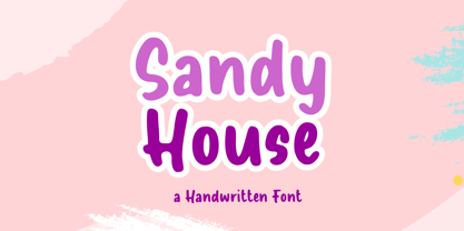 Sandy House is a fun Handwritten Font, this font Is perfect for lproduct packaging, product designs, label, photography, watermark, special events or anything. Sandy House comes with uppercase and lowercase letters, multilingual symbols, numerals, punctuation
 - Passing Stranger by Bogstav,
$17.00 Say hello to my all caps wannabe typewriter font. It’s distressed, but still perfectly legible! I have added 5 slightly different versions of each letter for a more handmade feeling, and of course multilingual support!
 - Fander by Roman Melikhov,
$23.00 Fander font family is designed to create minimalist logos, wordmarks, titles, taglines. Each letter of the font has up to 12 alternates. You can mix default characters and alternate characters to get the best combinations.
 - Artiste by ITC,
$29.00A casual, open brush script style designed with a shadow effect for a three-dimensional impression by British designer Martin Wait. This typeface looks best with tight letter and word spacing in large display settings. - Holo by Missin Glyphs,
$25.00 Inspired by 'Neon Sign' lettering, Holo is a modern, modular, mechanical & industrial display font constructed entirely with polygonal shapes. Holo is suitable for large display settings like sports jerseys, shop fronts, billboards and neon signs.
 - Shirah Joie by LightHouse,
$49.00The main challenge with Shirah Joie was how not to design just another monoline font, and how to add liveliness while condensing the letters a little bit. Shirah Joie is an OpenType/TTF Unicode font. - Amestina by Aqeela Studio,
$20.00 Amestina’s most recent letter styles are ideal for projects that call for a handwritten aesthetic, including wall displays, wedding invitations, social media post logos, commercials, product packaging, product designs, labels, photographs, watermarks, invitations, and stationery.
 - October Story by Sronstudio,
$15.00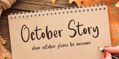 October Story is a fun Handwritten Font, this font Is perfect for product packaging, product designs, label, photography, watermark, special events, or anything. October Story comes with uppercase and lowercase letters, multilingual symbols, numerals, punctuation.
 - Pumpkin Story by Sronstudio,
$15.00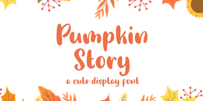 Pumpkin Story is a fun Handwritten Font, this font Is perfect for lproduct packaging, product designs, label, photography, watermark, special events or anything. Pumpkin Story comes with uppercase and lowercase letters, multilingual symbols, numerals, punctuation.
 - Roller Poster by HiH,
$12.00 Roller Poster is named after Alfred Roller. In 1902, Roller created a poster to advertise the 16th exhibit of Austrian Artists and Sculptures Association, representing the Vienna Secession movement. The exhibit was to take place in Vienna during January & February 1903. The location is not mentioned because everyone in Vienna knew it would be held at the exhibit hall in the Secession Building at Friedrichstraþe 12, a few blocks south of the Opernring, near the Naschmarkt. Designed by Joseph Maria Olbrich in 1897, the buiilding has been restored and stands today as one finest of the many fine examples of Art Nouveau architecture in Vienna (see vienna_secession_bldg.jpg). Because of its dome, it is called “the golden cabbage.” The poster itself is unique. The word “secession” is in one type style and takes up two-thirds of the elongated poster. At the bottom of the poster are the details in a different lettering style. It is this second style at the bottom that is the basis for the font Roller Poster. In keeping with our regular naming conventions, we were going to call it Roller Gezeichnete (hand-drawn), but the wonderful play on both words and the shape of the three S’s in secession was too compelling. In November 1965 there was an exhibit of Jugendstil and Expressionist art at the University of California. Alfred Roller’s Secession Poster was part of that exhibit. Wes Wilson was designing promotional material at Contact Printing in San Francisco. Among their clients was a rock promoter named Bill Graham, staging dance-concerts at Fillmore Auditorium. Wilson saw the catalog from the UC exhibit and Roller’s lettering. Wilson adapted Roller’s letter forms to his own fluid style. The result was the poster for the August 12-13, 1966 Jefferson Airplane/Grateful Dead concert at Fillmore put on by Graham (BG23-1). Wilson continued to use Roller’s letter forms on most of the posters he did for Graham through May 1967, when he stopped working for Graham. The posters were extremely successful and the lettering style along with Roller’s letter forms were picked up by other artists, including Bonnie MacLean, Clifford Charles Seeley, James Gardner, and others. The Secession poster and the Fillmore posters have inspired a number of fonts in addition to ours. Among them are JONAH BLACK (& WHITE) by Rececca Alaccari, LOVE SOLID by Leslie Carbarga and MOJO by Jim Parkinson. Each is different and yet each clearly shows its bloodlines. Our font differs in two ways: 1) the general differences in the interpretation of the letter forms and 2) the modification of the basic letter form to incorporate the diacriticals within the implied frame of the letter, after the manner of the original design by Roller. We borrowed Carbarga’s solution to the slashed O and used it, in a modified form, for other characters as well to accomplish the same purpose. We recommend that you buy ours and at least one of the other three. According to Alaccari, a version called URBAN was released by Franklin Lettering in the 70’s (and is shown on page 51 of The Solotype Catalog). For comparison of our font to original design, see image files roller_poster_2s.jpg of original poster and roller_poster_2sx.jpg showing reconstruction using our font for the lower portion (recontructed area indicated by blue bar). Please note the consistency of character width. In the lower case, 23 of the basic 26 letters are 1/2 EM Square wide. The ‘i’ is an eighth narrower, while the ‘m’& ‘w’ are one quarter wider. All the Upper Case letters are 1/8 EM wider than the lower case. This is to make it easier to fill a geometrical shape like a rectangle, allowing you to capture a little of the flavor of Wes Wilson’s Fillmore West poster using only a word processor. We have also included a number of shapes for use as spacers and endcaps. If you have a drawing program that allows you to edit an ‘envelope’ around the letters to distort their shape, you can really get creative. I used Corel Draw for the gallary images, but there are other programs that can accomplish the same thing. The image file “roller_poster_keys.jpg” shows the complete character set with the keystrokes required for each character (see “HiH_Font_readme.txt” for instruction on inserting the non-keyboard characters). The file “roller_poster_widths.jpg” shows the exact width of each character in EM units (based on 1000 units per EM square). You will notice that the font is set wide for readability. However, most programs will allow you to tighten up on the character spacing after the manner of Roller & Wilson. In MS Word, for example, go to the FORMAT menu > FONT > CHARACTER SPACING. Go to the second Drop-Down Menu, labeled ‘Spacing’ and select "condensed' and then set the amount that you want to condense ‘by’ (key on the little arrows); two points (2.0) is a godd place to start. Let your motto be EXPLORE & EXPERIMENT. Art Nouveau has always been one of my favorite movements in art -- I grew up in a home with a couple of Mucha prints hanging on the living room wall. Perhaps because of that and because I lived through the sixties, I have enjoyed researching and designing this font more than any other I have worked on. Let’s face it (pardon the pun), Roller Poster is a FUN font. You owe it to yourself to have fun using it.
 - LiebeGerda by LiebeFonts,
$29.00 Go out into the wilderness. Cut down a tree. Stop and smell the roses. And then treat yourself with this unplugged, hand-lettered typeface. LiebeGerda is an effortless-but-refined, spontaneous-but-elegant brush font. She is ready for your next project, and she wants to add that little crafty something that makes the difference. Her natural breath of fresh air lets you escape those same old monotonous script fonts you’ve been using. After our successful first brush font, LiebeDoris, and our first interconnected script, LiebeLotte, we’re combining both genres and taking them to the next level: an interconnected brush script. OpenType magic varies LiebeGerda’s letterforms: Most characters have no less than three different variations that are automatically shuffled and inserted as you type. Plus, the “All-Caps” OpenType feature exchanges uppercase letters with less-swashy variants. Now you know why every one of the four styles contains more than 1,200 characters! Ulrike of LiebeFonts painted LiebeGerda’s four styles individually from scratch and carefully adjusted every detail by hand. Rather than being one typeface with different weights, LiebeGerda is a package of four individual fonts that go together really well. Ulrike’s high level of type-nerdy craftsmanship shows. When you use LiebeGerda, your designs will easily convince your audience that they’re looking at a hand-crafted piece of lettering. Feel free to add a few of the stacked ligatures like “the”, “for”, and “new” to round off the illusion. Last but not least, LiebeGerda has a lot more detail than most other brush fonts. That means there’s no ugly, lazy bézier artifacts in the brush traces. You can print words at billboard size, and people will still believe they smell the paint from your brush!
 - Oyster by PintassilgoPrints,
$19.00 The Oyster family is a useful toolkit for hand-draw moods. It's a super casual and somewhat messy font that comes in two flavors: regular and outline, or rather, truly-hand-drawn-outline. Both styles have two choices for each upper- and lower-case letter, for that additional handmade feel. The OpenType contextual alternates feature instantly get these alternate glyphs to dance. The regular style also brings a set of glyphs with filled counters in a stylistic alternates pack, for a little twist now and then. And finally, the family has also a picture font with useful icons and ornaments. Handmadify your message and give Oyster a try!
 - Dellyco by Keristyper Studio,
$14.00 Dellico stylish font is a signature hand-painted typeface designed to help you create the look of stunning custom hand-lettering. The Uniqueness comes with upper and lowercase characters, punctuation, numerals, supports international languages, and OpenType features with Stylistic Alternates, Contextual, and ligatures Dellico Handwriting Font multilingual support: Afrikaans, Albanian, Catalan, Danish, Dutch, English, Estonian, French, Finnish, German, Icelandic, Indonesian, Italian, Malay, Norwegian, Portuguese, Spanish, Swedish, Zulu, and many more. What’s Included : Standard & Multilingual glyphs Ligature Works on PC & Mac Simple installations Accessible in Adobe Illustrator, Adobe Photoshop, Adobe InDesign, even work on Microsoft Word. Hope you enjoy our font!
 - Sandglow by Burntilldead,
$14.00 Sandglow is a fancy hand lettered script typeface with a clear style, good mood, and dramatic movement. It allows you to create beautiful hand-made typography in an instant. It’s suitable for headlines, logotype, editorial design, branding, letterhead, poster, apparel design, product packaging, label or anything that need handlettering style. Comes with many variations on each character, including uppercase, lowercase, numerals & punctuation, stylistic styles, ligatures, discretionary ligatures, and titling. You will also discover extras swash added to give that finishing touch to your texts. Available in OTF and TTF format, Support Opentype features, Multilingual languages and PUA unencoded.
 - MFC Viper Monogram by Monogram Fonts Co.,
$19.95 The inspiration source for Viper Monogram is the 1934 Book of American Types by American Type Founders. Found in that specimen book, was a sophisticated two-color monogram design called Hollywood Combination Initials, which was available in limited size metal castings. This wonderful monogram style is now digitally recreated, revived, and updated for modern use! Viper Monogram supports one and two letter monograms, but due to its super condensed style works best for three letter monograms. The default typing style for Viper Monogram is an all horizontal all caps setup which can be used for headlines and titling. Type in Capitals for an outline effect, lowercase for a solid effect. By enabling OpenType Contextual Alternates, you can type diagonal top-aligned monograms up to three letters. By typing in all lowercase, and layer a copy of the lowercase with Stylistic Alternates enabled, you can create a two-color effect. Viper Monogram is available in Pro format Opentype fonts only due its unique setup. Download and view the MFC Viper Monogram Guidebook if you would like to learn a little more.
 - Mareka Japanese Style by Twinletter,
$15.00 Mareka, our newest font, is now released. Beautiful, tidy, and elegant font with a distinctive shape. If you employ this typeface, your once-good project will become something truly unique. This typeface is appropriate since the shape of each letter may be used in a variety of ways, including serious, relaxed, and natural. Because everyone does not necessarily understand Japanese letters, we supply fonts with letters that can be utilized for your project. We produced this display font with a Japanese theme or an Asian font, which we designed to fulfill the needs of your Japanese-themed project. Of sure, your initiative will be understood by people all around the world. Logotypes, food banners, branding, brochure, posters, movie titles, book titles, quotes, and more may all benefit from this font. Of course, using this font in your various design projects will make them excellent and outstanding; many viewers are drawn to the striking and unusual graphic display. Start utilizing this typeface in your projects to make them stand out.
 - Pacific Clipper SG by Spiece Graphics,
$39.00 Pacific Clipper has its roots in an old 1930s showcard lettering style. An extra bold version of this sign painter’s relic is shown in Carl Holmes' wonderful book on lettering. It may be described as what happens when Rudolf Koch's Kabel Heavy meets ATF's Novel Gothic. Also known as Sam’s Tune, Pacific Clipper’s noteworthy features include wedged crossbars in the capital A, E, F, and H. Overcurving is present in the capital B, D, P, and R while vertical strokes in the lowercase b, d, h, k, l, and t are chopped off obliquely. Figures in Pacific Clipper are also refreshingly different, particularly the number 4. This lettering favorite turned retro typeface has been extended to include a variety of weights. Pacific Clipper is now available in the OpenType format. Some new characters have been added to this OpenType version as Stylistic Alternates and Historical Forms. These advanced features work in current versions of Adobe Creative Suite InDesign, Creative Suite Illustrator, and Quark XPress. Check for OpenType advanced feature support in other applications as it gradually becomes available with upgrades.
 - ITC Merss by ITC,
$29.99ITC Merss proves that sometimes accidents work out just fine. Late one evening Eduardo Manso, an Argentinean graphic and type designer, spilled coffee on his desk. When he began to wipe up the mess, he noticed that one of the splashes looked like a roman letter 'l' - complete with serifs. This triggered his imagination. “What if a complete alphabet was created with this same irregular flow to the character designs?” ITC Merss was the result of Manso's experiments with “fluid” letter shapes. The oddly handsome design looks aged and spontaneous at the same time. Its irregular texture is striking-the result of careful modeling of character shapes. While Manso wanted to maintain the free-form character of spilled liquid, he also knew the individual letters had to work together with an underlying harmony. When not experimenting with typefaces - or spilled coffee - Manso creates award-winning graphic and publication designs. A contributor to the design magazine el Huevo (the Egg), he also writes articles on type and typography and is part of the publication's design team. - Anbar by Arabetics,
$39.00 Anbar is an Arabetic typeface design with visually connected glyphs, named after the historical Iraqi province Anbar, which is traditionally believed to be the birthplace of the earliest Arabic script, Jazm. It follows the guidelines of the Mutamathil Taqlidi type style with one glyph for every basic Arabic Unicode character or letter, as defined in Unicode Standards, and one additional final form glyph for each Arabic letter that can connect with other letters from both sides in traditional cursive Arabic strings. Anbar employs variable x-height values. It includes all required Lam-Alif ligatures and selected marks. Tatweel (or Kashida) glyph is a zero width space. Keying it before any glyph will display that glyph isolated form, if desired. Keying Tatweel before Alif Lam Lam Ha will display the Allah ligature. Anbar typeface family includes both Arabic and Arabic-Indic numerals; all required diacritic marks, in addition to Standard English keyboard punctuations and major currency symbols. Anbar is available in regular and italic (slated to the left) styles.
 - Neospace Expanded by deFharo,
$21.00 Neospace Expanded is an avant-garde typeface designed for technology and science fiction lovers. With its elegant geometric minimalism, Neospace redefines typographic aesthetics with a perfect fusion between modern and futuristic. Geometric Inspiration Designed with an expanded proportion and thin thickness, it exudes its own high-tech, futuristic and space style. Each Neospace character has been sculpted from the letter “O”, using the mathematical proportions of the Fibonacci sequence in curves, metrics and kerning, adding a golden ratio to each character. This meticulous approach ensures exceptional readability and a unique aesthetic that evokes a sense of order and precision. Three styles: Regular, which provides a modern and clean look; the Dot Layer, which adds a touch of color and creativity to typographic titles; and the Bold version, which evokes the feeling of futuristic and sophisticated electronic circuits, bringing a sense of avant-garde and advanced technology to your projects. Neospace allows you to create typographic titles in various colors, imitating the sophistication of futuristic electronic circuits. Limitless Versatility Neospace goes further by offering alternative letters and signs, multiple sets of numbers and capital letters, as well as monetary and cryptocurrency symbols. In addition, it incorporates complex OpenType functions that further enrich the design possibilities, allowing even greater customization in your typographic designs.
 - Hollgates by Mozatype,
$17.00 Proudly present our new font. It is named Hollgates - Elegant Signature Font. Hollgates is script handwritten style with a natural charm. This font which is a modern signature and unique style handmade comes with very beautiful character changes. To keep the maximum real hand-lettered effect, there were created 240 ligatures (you can see them among the presentation pictures). When creating the font, we should take into consideration that each letter should be able to be connected with other letters. For example, the letter "a" should be well connected as well as with "l" and "n" and with any other letters. This limits us: we have to start letter from exact one point and finish at exact second point. So here come ligatures. Hollgates font contains following ligatures: ab ad af ah ai ak al am an ao ap as at az az bh bl bk bt bx br cb cl ch ck cc cr cs ct co cx cz dd db dh dl dk dt dr ds dx dz eb ef eh ek el et ett er em en es ex ez ff fh fl fk fi fo fs ft fr fz fx gg gh gr gb gf gl gk gt go gs gz hf ho hs ht hz ib if ih ik il it itt ii in im ip is ir iz ix jo kl kk kh ko ks kr kt kx kz lo li ls lu lr lx ly lz mm mf mi mh ml mk mo mp ms mt mz mx nb ni nf nh nl nk no ns nr np nt nx nz ob of oh oi oj ok ol om on op os ot ott ou ox oz ph ppl pp ps pt pu pi pr po px pz rs rr st sh sl sk sb si sm sn so sp su sx sy sz oll all ell ill ull th tl tk ti ts tr to tu tx tz ty ub ul uh uk ul ut utt un um up us ux uz vh vl wh wl wo zz ee ll ff oo rr ss tt dd ff It’s the perfect fit for all luxury projects, such as wedding invitation, signatures, luxury logos, printed quotes, grettings cards, social media headers, product packaging and many more! It includes a full set of uppercase and lowercase letters, multilingual symbols, numerals, punctuation and ligatures. It is PUA encoded which means you can access all of the glyphs and swashes with ease! Fall in love with its incredibly versatile style and use it to create spectacular designs! Use this font for any crafting project that requires a personalized look! What’s Included : – Works on PC & Mac – Easy to use ( Installations ) – Easy Convert to webfont – Compabilty Windows, Apple, Linux, Cricut, Silhouette and Other cutting machines Thanks for downloading, and I hope you enjoy it!
 - Retroactive by profonts,
$51.99 profonts Retroactive Pro is an all-caps texture font with four variations for each letter. This enables the user to create letter graphics that seem to have a unique handmade texture. Ideal for applications which are supposed to have a vintage or distressed look.
 - Corinth by Albatross,
$19.00 Do you need that perfectly-imperfect yet highly legible font to pair with a script or supplement a logo? Corinth is a hand drawn geo sans with 4 styles plus ornaments that pairs well with scripts, is readable at small sizes and still achieves the retro, or hand made feel. The classic geometric letterforms in combination with the imperfections of being hand drawn give Corinth a unique personality without sacrificing legibility. Corinth is a small caps family with comprehensive language support, uppercase and lowercase alternates, double-letter ligatures for added realism, and over 100 ornaments and symbols. Corinth's legibility and classic style makes it very handy for any designer's arsenal and comes in useful for almost any subject matter.
 - Love Script by Positype,
$55.00 Love Script came about as a way to finally answer the requests by individuals to take my brush pen/marker lettering styles and turn them into a typeface. Literally, everything lined up perfectly and there was a renewed impetus to push this genre, this style of lettering I have adapted over the years into what will become a series of brush pen/marker typefaces. The first I chose to complete was a high-contrast variant… I seem to be attracted to high contrast, high energy letters (think Lust, Lust Slim and Lust Script). As I was finalizing everything, I kept saying ‘I love this script’, which ultimately led the christening of the typeface as Love Script. For more fun, visit the Love Script Minisite Designer’s note: for this font to truly sing, be sure you have Contextual Alternates on in your OpenType settings. Hope you love it as much as I do.
 - Unchain My Heart by Harald Geisler,
$68.34 Unchain My Heart is Font that renders hearts on a string with a capital letter in the middle. All hearts are designed to align to a perfect string by remaining the handmade look. Lowercase letters produce a heart with outline. Uppercase letters produce a filled heart. Type in a parenthesis and a loose string end will be rendered either on the right or left side. Look in the full character set to find out more about the special decoration. Ideal for individualized mailings and greeting cards. Unchain My Heart is a part of the Light Hearted Font Collection that is inspired by a recording of Jean Baudrillard with the title, "Die Macht der Verführung" (The Power of Seduction) from 2006. Further inspiration came from the article, "The shape of the heart: I'm all yours". The heart represents sacred and secular love: a bloodless sacrifice. by British writer Louisa Young printed in EYE magazine (#43) London, 2002.
 - VLNL Boulangerie by VetteLetters,
$35.00 VLNL Boulangerie was originally an incomplete set of early 20th century wood type letters, that Donald Roos found in a dust covered carton box stashed away somewhere at the Royal Academy in The Hague. Charmed by the letter forms Donald decided to print them on paper with a printing press. Next he digitised the prints as they came out, including small imperfections and damages. The missing characters were composed and added digitally to complete the alphabet. (See if you can spot those!?) We think VLNL Boulangerie is a little French in appearance (hence the name), it's joyful, warm, a little crunchy and round-ish. It defenitely has that ‘je-ne-sais-quoi’ that seperates it from most wood type grotesques. It can be perfect for lettering on a storefront window of – let's say a bread shop or a lunchroom. Or a logo for a downtown hipster café. VLNL Boulangerie hardly has any limitations actually.
 - MFC Phonograph Monogram by Monogram Fonts Co.,
$19.00 The inspiration source for MFC Phonograph Monogram is a vintage monogram specimen named “Kent” showing only a CBA sample. It was a style I could find no other reference for, but was desperate to recreate this record like styling of monogram. Finally, it all comes to life in MFC Phonograph Monogram. I even threw in a little dog and phonograph icons hidden in the font as decorative icons reminicent of old Victrola records. Phonograph Monogram supports two and three letter monograms, although the two letter style break from the circular record design and creates a zulu style shield design. MFC Phonograph Monogram uses the Ligatures feature, available in most OpenType savvy applications, such as Adobe Illustrator CS (see Fig. 1). The Ligatures feature is typically enabled automatically, but you may need to confirm this in your program if you are not certain. If any second lowercase letter typed does not automatically switch to form the right side of the rounded form, you do not have Ligatures enabled.
 - Newgate by Factory738,
$15.00 Introducing NEWGATE, a trendy font that is both retro and contemporary, is now available. Its thick curves give it a 70s groovy vibe, while the serifs return it to tradition. NEWGATE fits right in with those vintage moodboards and logos. It has separate lower and uppercase letters, as well as numbers, punctuation, and multilingual letters. The Ligature fonts will come in handy for anything your imagination can dream up! 5 Weights (Light, Regular, Semibold, Bold, Black) Basic Latin A-Z and a-z Numerals & Punctuation Stylistic Ligatures Multilingual Support for ä ö ü Ä Ö Ü ... Free updates and feature additions Thanks for looking, and I hope you enjoy it. Check out Leonardo Sans which is a great pair for Newgate.
 - Sandokan by Matyas Machat,
$30.00 Sandokan is a brush script font with a character and morphology that nears Oriental calligraphy, Art Nouveau typefaces, psychedelic “flower power” fonts from the Sixties and Tuscan poster fonts from the 19th century. Its main features are the high contrast between thick and thin strokes and the extreme slanted angle in the typewriter imprints, creating inverse shadowing. The letter set is further accentuated by exotic decorative details and the often unusual connectors between small letters. The typeface supports all languages using the universal Latin character set. Sandokan is a slightly sweetened cultural cocktail. As such it looks best on everything that needs to come across as exotic and rather solid but unmistakeably eccentric - such as labels and packaging on exotic delicacies or circus posters.
 - Marceaux by Hexagon Foundry,
$17.00 Marceaux is a sophisticated font with a touch of elegance and modernity. The letterforms are sleek and slender, with clean lines that give this font a refined and graceful appearance. Whether you're creating a logo, a book cover, or a website, Marceaux will bring a touch of class to your project. Marceaux features a complete set of small caps, uppercase, and lowercase letters. The font has been developed in six weights, from light to black, with corresponding true italics and oblique letters, and two styles (serif and sans-serif) for a total of 24 styles, making it versatile enough to use in a variety of design applications. Marceaux includes an expanded character set that supports over a hundred latin-based languages.
 - Falkirk Script by Mysterylab,
$17.00 Introducing Falkirk Script, a three-font suite that is excellent for product branding, logos, t-shirts, high-end food and beverage labels, and much more. This collection includes the main letter body font (Falkirk Script Bold), an extruded shadow version, and finally a horizontal line engraving version that highlights the upper half of the letters. Stack the font variations in alignment, assign different colors, outlines, and/or gradients to each layer, and you'll see a wealth of versatile design possibilities opening up. This script has a unique topheavy wedge effect in the lower case, and lyrical old-world script detailing in the capitals. The tapered sweep and simplified ascender design works extremely well in the context of curved arc or arched word designs.