10,000 search results
(0.067 seconds)
- Night Scream by Ditatype,
$29.00 Night Scream is a spine-chilling display font that brings a horrifying twist to your designs. With its big letters and bold weight, this font commands attention and instills fear. The details of the letters are carefully crafted to resemble menacing plant roots, adding a nightmarish and eerie touch to the font. Each letter in this font is bold and impactful, demanding to be noticed. The large size of the letters adds to the font's imposing presence. The root-like details in Night Scream give the font an organic and otherworldly appearance, reminiscent of sinister, twisted plant life. These details add an element of the unknown and create an atmosphere of dread, immersing the viewer into a world of dark and chilling horrors. For the best legibility you can use this font in the bigger text sizes. Enjoy the available features here. Features: Multilingual Supports PUA Encoded Numerals and Punctuations Night Scream fits in headlines, logos, movie posters, flyers, invitations, branding materials, print media, editorial layouts, headers, and any project that requires a terrifying touch. Find out more ways to use this font by taking a look at the font preview. Thanks for purchasing our fonts. Hopefully, you have a great time using our font. Feel free to contact us anytime for further information or when you have trouble with the font. Thanks a lot and happy designing.
 - PR Vanaheim by PR Fonts,
$10.00 This is a perfect font for historical or fantasy titles. It is influenced by ancient Nordic runes. the strokes flare slightly, to a concave terminal for a finely carved appearance. There are two sets of capitals in PR-Vanaheim-DC (Dual Capitals); one set of narrow letters, more closely related to Runic forms, and one set which includes wider and circular letters, which can be freely combined with the narrow letters for the variety associated with hand lettering. There is one version with dots placed in the centre of large counters and one version without the dots. The broad caps character set includes characters which allow for tight spacing; a dropped L, and a tall T. There are also two different lowercase sets, one modern, and one archaic, all of which can be freely mixed to fine tune the appearance of your text. Here is the brief description of the available faces: PR-Vanaheim-Med-DC-01 Duplex Caps PR-Vanaheim-Med-DC-02 Duplex Caps, Dotted counters and dot space PR-Vanaheim-Med-DC-03 Duplex Caps, Dotted counters PR-Vanaheim-Med-LC-04 Broad Caps, with modern style lower case. PR-Vanaheim-Med-LC-05 Narrow Caps, with modern style lower case. PR-Vanaheim-Med-LC-06 Broad Caps, with archaic lower case. PR-Vanaheim-Med-LC-07 Narrow Caps, with archaic lower case.
 - Pacioli by MADType,
$29.00 This font is based on an alphabet published by Luca Pacioli in his 1509 mathematical treatise De divina proportione. In this book, Pacioli describes how to build the Roman alphabet geometrically using lines, squares and circles. Pacioli was not the first or the last man in his era to describe the building of letters mathematically. Felice Feliciano did this before Pacioli, and Albrecht Dürer further developed these forms years after. According to Pacioli, the thick strokes should be 1/9th of the height, and the thin strokes should have 1/2 the weight of the thick strokes. I felt that this beautiful alphabet needed to be restored to its full geometric glory and set out to construct an accurate replica using Pacioli's instructions. Included in the font you'll find the letters that have the grid overlay and also the letters without the grid. The letters J, W, U, and Z were not included in the book, so I have created my own versions of these characters that fit into Pacioli's grid. Pacioli shows two different Os in the book, so I have included the second O as well as a second J, Q, and Z as OpenType stylistic alternates. Also included in the font are border patterns and a fleuron taken from the cover of the book.
 - Scary Notes by Ditatype,
$29.00 Scary Notes is a spine-chilling display font designed to evoke fear and horror. With its big letters and bold weight, this font demands attention and is sure to send shivers down your spine. The details of the letters are meticulously crafted to resemble brush strokes, adding an unsettling and handcrafted touch to the font. Each letter in Scary Notes is bold and commanding, creating an impactful presence that cannot be ignored. The big size of the letters adds to the font's intensity. The brush details in this font give the font an organic and chaotic appearance, reminiscent of chilling hand-painted writings. These details add a sense of unpredictability and terror, immersing the viewer into the world of horror and fear. For the best legibility you can use this font in the bigger text sizes. Enjoy the available features here. Features: Multilingual Supports PUA Encoded Numerals and Punctuations Scary Notes fits in headlines, logos, movie posters, flyers, invitations, branding materials, print media, editorial layouts, headers, and any project that requires a terrifying touch. Find out more ways to use this font by taking a look at the font preview. Thanks for purchasing our fonts. Hopefully, you have a great time using our font. Feel free to contact us anytime for further information or when you have trouble with the font. Thanks a lot and happy designing.
 - LC Trinidad by Compañía Tipográfica de Chile,
$34.00 Lc Trinidad is the result of a series of wonderings regarding geometric Sans Serif typography design, in particular; Futura of Paul Renner. A “conversation” arose between me and the designer – actually there was no conversation, it is an euphemism for “I saw his designs, I draw them and discussed with myself some of his decisions – that ended up being the origin of this font firsts glyphs: A, H, N, O, R and S. I started with uppercase letters, and here is when Rudolf Koch with Kabel and his “Das schreibbuchlein” joined the conversation. This is how I could develop some alternative lowercase letters so as to illustrate this imaginary discussion. The result is a sans serif, geometric, modern typeface with classical Roman proportion in the uppercase letters; two stylistic sets for lowercase letters (setKoch and setRenner), rational, open and sharp ends. It is ideal to form titles, medium length texts, branding, exhibitions and animations. The family consists of 9 weight variants and their corresponding oblique versions and small caps. With more than 900 glyphs, it covers more than 190 Latin languages and together with its Opentype functions it creates a modern and versatile family. Besides, it has powerful OpenType features for each style, including stylistic sets, extended language support, ligatures, contextual alternates, lining figures, oldstyle figures, small caps numbers, arrows, fractions, superscripts, subscripts and many more.
 - Wakerobin Variable by Monotype,
$209.99Wakerobin takes its charming swagger from the hand-painted billboard, poster and signage lettering of the mid-19th century. These showy styles did everything they could to stand out from the background cacophony of advertising, with signwriters using sharp and high contrast serif letters, squared block shapes, or art nouveau forms to grab the attention of passersby. Wakerobin embraces the spirit of these letterforms, bringing these various styles together in one typeface - as if users had their own sign painter on hand. Just as lettering artists had to adapt to a variety of sizes - from wide streetcar lettering to compressed forms that squeezed into narrow Victorian windows - the variable version of Wakerobin scales up and down in width to fit whatever environment the user’s working in. The static fonts come in three widths and five weights. As well as its adaptability, Wakerobin is bursting with vintage flavour, making it hard to ignore. Its distinctive, spiky serifs would be right at home on food and drinks packaging, as well as shop windows, adverts, and any other place that calls for some typographic showmanship. It performs particularly well in busy environments, or anywhere with a lot of visual noise - just as its historic predecessors did. And while Wakerobin is first and foremost a display typeface, it’s surprisingly elegant when used at text size, or in the lighter end of the weight spectrum. - Snowdrop by Supfonts,
$17.00 Thanks for checking out Snowdrop Script! A fabulously fun yet elegant script font with tons of energy, allowing you to create beautiful hand-made typography in an instant. With extra bouncy curves & alternates, Snowdrop Script is guaranteed to make your text stand out - perfect for wedding invitations, printed quotes, cards, product packaging, headers and whatever your imagination holds. By the way, you can make your own design IN ANY language What's really awesome is that Snowdrop Script comes with a complete set of lowercase alternates, which allows you to create even more authentic custom-feel text. Another great feature is the bonus ornaments font, which allows you to add some really unique and elegant finishing touches to your script text. Here's what you get in the download: 1. Snowdrop Script - A handwritten script font containing upper & lowercase characters, numerals and a large range of punctuation. Fully support of all Latin and Cyrillic languages 2. Snowdrop Swirls - The set of small letters with swirls at the beginning and end of the letter. You can use A-Z and A-z to get to them 3. Snowdrop Alt - The set of small letters with special endings + a set of letters with special curls for the middle of words Fonts are provided in TTF / OTF / WOFF formats. You do not need a special design program. Font easy and convenient to use.
 - Directors Cut Pro by Type Innovations,
$39.00 Directors Cut Pro is a compelling new font series designed by Alex Kaczun. It recently won the second place—a commendation in the Canberra Typeface Competition. This handsome Geometric Antique serif design is based on the early 19-century Moderns and Scotch styles, infused with the warm charm of traditional antique, added for interest. Capturing the best of both ages: it's warm, comforting and persuasive. Directors Cut Pro's graceful aspects naturally invite uses at large sizes, for which we have created a stunning and elegant lighter weight. But, this workhorse typeface series incorporates a solid regular weight, along with its italic—ideal for a multitude of text purposes, at varying point sizes. A robust Bold weight is available for headlines and emphasis. Director Cut Pro comes with proportional as well as tabular lining figures for quickly setting up charts and tables. It also contains an extended character set—including most Central European languages. Alex Kaczun is in the process of expanding this typeface series to include additional weights, styles and proportions. Stay tuned! The large Pro font character set supports most Central European and many Eastern European languages.
 - Futura by Linotype,
$42.99 First presented by the Bauer Type Foundry in 1928, Futura is commonly considered the major typeface development to come out of the Constructivist orientation of the Bauhaus movement in Germany. Paul Renner (type designer, painter, author and teacher) sketched the original drawings and based them loosely on the simple forms of circle, triangle and square. The design office at Bauer assisted him in turning these geometric forms into a sturdy, functioning type family, and over time, Renner made changes to make the Futura fonts even more legible. Futura’s long ascenders and descenders benefit from generous line spacing. The range of weights and styles make it a versatile family. Futura is timelessly modern; in 1928 it was striking, tasteful, radical — and today it continues to be a popular typographic choice to express strength, elegance, and conceptual clarity. NEW: the new Futura W1G versions features a Pan-European character set for international communications. The W1G character set supports almost all the popular languages/writing systems in western, eastern, and central Europe based on the Latin alphabet including Vietnamese, and also several based on Cyrillic and Greek alphabets Futura® font field guide including best practices, font pairings and alternatives.
 - Happy Holidays by Comicraft,
$19.00 Back in 2006 when we first released our Happy Holidays font, we thought the War on Christmas was over! We'd taken down our Menorahs, our Christmas trees, reclining Buddhas and red, black and green Kwanzaa decorations, and were prepared to sprinkle nothing more than a little Season's Greetings over our end of year celebrations. When we saw our friends and neighbors at department stores, we'd greet them with a simple, cordial, non-denominational “Happy Holidays.” But the font showed up at our company party this year having learned over 200 new languages (and, it must be said, a little bit loaded on Stylistic Alternates) in a mood to celebrate EVERYTHING. It was wishing people happy Bodhi Day, Solstice, Festivus, you name it! It even brought (count 'em) THREE new outfits based on the colors of Christmas, Hanukkah and Kwanzaa. So may the designs on the cups of the hot beverages that take you through the long dark coffee break of the soul that stretches from Halloween to Thanksgiving to New Year's Day be a little more festive this year with the refreshed, Remastered, all-inclusive spirit of Happy Holidays!
 - Cooper Screamers by Wordshape,
$- In 1925, at the request of Barnhart Brothers & Spindler, the foundry he worked for, Oswald Bruce Cooper designed a wide selection of "screamers", oversized exclamation points used to grab attention in display advertising. The foundry rushed the screamers into production, much to Cooper's dismay. Cooper was disappointed with the final form of the screamers– they were designed in assorted weights to match the assorted Cooper series of typefaces, as well as in a variety of other formal solutions- squaredoff, incised, wavy, Tuscan, and rounded. Cooper's working design methodology was to re-draw his projects a number of times in order to refine the formal results. However the screamer project was hastily cut by the head of BB&S's matrix engraving room in fourteen sizes from the initial sketches, causing Cooper to fire off a fiery missive stating, "Everything I draw is bum the first half-dozen times I draw it; the trouble with these is that I drew them only once!" This typeface is the result of researching Cooper's original drawings and series of engraved proofs for the screamers, as well as the original Screamer type specimen. Cooper Screamers have never been available before in digital format.
 - Chubby Lines by Yumna Type,
$15.00 It can be a difficult task to find a unique, attractive, prominent display font for your design because you always want to use a more distinctive font than the others. Therefore, Chubby Lines offers you the best solution. It is a lovely display font in rounded shapes to express soft, friendly nuances to your design. Its unique geometry details and contrast sketch lines create a visually interesting font. To be easily readable, this font is best applied for big text sizes, which also provides you with a special clipart as a bonus. Furthermore, you can enjoy the available features here. Features: Multilingual Supports PUA Encoded Numerals and Punctuations Chubby Lines fits best for various design projects, such as brandings, posters, banners, headings, magazine covers, quotes, printed products, merchandise, social media, etc. Find out more ways to use this font by taking a look at the font preview. Thanks for purchasing our fonts. Hopefully, you have a great time using our font. Feel free to contact us anytime for further information or when you have trouble with the font. Thanks a lot and happy designing.
 - Codec Pro by Zetafonts,
$39.00 Codec Pro is the newest incarnation of the Codec family, developed in 2017 by Francesco Canovaro, Cosimo Lorenzo Pancini and Andrea Tartarelli as a research on the subtleties and the variations on the theme of the geometric sans-serif design. The original typeface has been completely redesigned and expanded to feature a wide range of eleven weights, from the hairline thin to the bulky fat, while the character set has been extended to include not only latin, cyrillic and greek but also arabic, farsi and urdu scripts. A veritable swiss-knife for the designer, Codec Pro also includes a wide range of alternates and stylistic sets that cover all the subfamilies and the moods of the original type system. So while the standard set (Codec Cold) has terminals cut parallel or perpendicular to the baseline, emphasizing geometry for a more constructed look, stylistic set 4 (Codec Warm) uses open diagonal cuts and humanist shapes to give the typeface a gentler, warmer feeling. Set 3 (Codec Cold Logo) comes alive with funky ligatures, while Set 5 (Codec Warm Logo) stretches uppercase characters horizontally for a dynamic, unexpected effect
 - Perfora by In-House International,
$15.00 Perfora is the typographic antidote to our relentlessly anxious and uncertain times. On one hand, Perfora is heavy, monospaced and brick-like. It feels secure, permanent, reliable. On the other, Perfora is extra variable—stretching taller or growing wider as needed—so all your words can fit perfectly together. And this seeming contradiction is the sweet spot we’ve all been missing: sturdy but not rigid. Named for its punch-hole shaped counters and eyes, Perfora is a flexible powerhouse that’s easy to use, stack, and click into any shape. Use it to assemble everything from dynamic logos to posters and festival lineups, from seamlessly responsive titles to instantly recognizable product lines. Perfora features two uppercase styles—rounded and angular—punctuation, numbers, latin diacritics, and stylistic alternates for a subset of characters. It also includes 19 ornamental glyphs to compose with flair and add some rhythm to your copy. It’s available (and recommended) as a variable type (.ttf) for designers using compatible platforms. It’s also available in opentype format (.otf) as a set of 25 static fonts, spanning 5 widths and 5 heights. Perfora was created by In-House International, designed by Alexander Wright and developed by Rodrigo Fuenzalida.
 - Aderos by Eko Bimantara,
$22.00 Aderos is a refined and professional slab serif font family that offers a fresh take on the modern and bold aesthetic of its predecessor, Adero. This font family introduces a range of styles that provide versatility and visual impact. With its four width variations – Normal, Extended, Wide, and Stretch – Aderos delivers an exciting array of extreme wide letterforms that command attention. Designed with precision and attention to detail, Aderos is particularly well-suited for branding projects, where it can lend a distinctive and authoritative presence. Its strong and bold letterforms make it an excellent choice for titles and headings that demand impact and legibility. The spacious layout of Aderos further enhances its professional appeal, allowing for clear and organized content presentation. Whether used in print or digital applications, Aderos brings a sense of sophistication and professionalism to a variety of design projects. Its versatility and range of styles make it a valuable asset for designers seeking to create visually compelling and memorable visuals. With Aderos, you can elevate your designs with its refined slab serif style and confidently communicate your message to your audience.
 - Moodboard by Mans Greback,
$59.00 Moodboard is a unique blend of hand-drawn and AI-generated design, bringing a fresh twist to the retro serif font. With bold rounded letterforms and a funky vibe, Moodboard is perfect for young-at-heart audiences. Its combination of sketch and machine learning makes it usable and versatile, while still retaining its cool new-retro feel. Use Moodboard in logotypes, headlines, and graphics for a standout, youthful look. Its designer Mans Greback has created an exceptional mix of vintage and modern design elements in Moodboard font. Choose Moodboard for your next project to add a touch of fun and boldness to your designs! The Moodboard family consists of six high-quality fonts: Regular, Italic, Light, Light Italic, Bold and Bold Italic The font is built with advanced OpenType functionality and has a guaranteed top-notch quality, containing stylistic and contextual alternates, ligatures and more features; all to give you full control and customizability. It has extensive lingual support, covering all Latin-based languages, from Northern Europe to South Africa, from America to South-East Asia. It contains all characters and symbols you'll ever need, including all punctuation and numbers.
 - Futura Paneuropean by Linotype,
$65.00First presented by the Bauer Type Foundry in 1928, Futura is commonly considered the major typeface development to come out of the Constructivist orientation of the Bauhaus movement in Germany. Paul Renner (type designer, painter, author and teacher) sketched the original drawings and based them loosely on the simple forms of circle, triangle and square. The design office at Bauer assisted him in turning these geometric forms into a sturdy, functioning type family, and over time, Renner made changes to make the Futura fonts even more legible. Futura’s long ascenders and descenders benefit from generous line spacing. The range of weights and styles make it a versatile family. Futura is timelessly modern; in 1928 it was striking, tasteful, radical — and today it continues to be a popular typographic choice to express strength, elegance, and conceptual clarity. NEW: the new Futura W1G versions features a Pan-European character set for international communications. The W1G character set supports almost all the popular languages/writing systems in western, eastern, and central Europe based on the Latin alphabet including Vietnamese, and also several based on Cyrillic and Greek alphabets. - Benda by Suitcase Type Foundry,
$45.00 Benda is a modern geometric script font with roots in the calligraphy and lettering of legendary artist Jaroslav Benda. With bold, predominantly low joins, the robust monolinear character strokes shine in one-word and short inscriptions as well as in longer headlines. The practical letterforms do not clutter the space with loops and curlicues, while the emphasised baseline helps to underline the importance of the message. What’s more – Benda is a smart font, automatically replacing conflicting characters with suitable alternatives as you write so that the final text flows seamlessly. Because Benda is the sequel to Jaroslav, it derives the slant, colour, and geometric characteristics from the sans typeface, forming the perfect companion to the font. So much so, it can serve as a second italic emphasis in long texts.
 - Red Circle - Unknown license

- Meet John Henry - Unknown license

- Diehl Deco - Alts - Unknown license

- Aeterna by Dawnland,
$13.00 Hand drawn, sketchy antiqua that come in two font variants: Regular, Small caps with old style figures. Æterna was revised 2012 and now hold a full character set of basic english/latin letters and west european diacritics!
 - Congratulatory by Dmitriy Shchetinskiy,
$19.00 Congratulatory consist of 36 Cyrillic calligraphic greetings for different events. Greetings are original and handwritten. This font makes it possible to use high quality calligraphy in your projects - greeting cards, certificates, invitation cards, letters of commendation etc.
 - Emotional Expression by Seemly Fonts,
$14.00 Emotional Expression is a cute and simple lettered handwritten font. It can easily be matched to an incredibly large set of projects, so add it to your creative ideas and notice how it makes them stand out!
 - Ye Benjamin by Yinon Ezra,
$30.00 Ye Benjamin is a smooth italic typeface, that will spread style and good vibes everywhere you put him. The crystallization of the letters shape was through seeking an iconic look, that would be a useful branding tool.
 - Dizzy Boy by Mchcrafter,
$14.00 Dizzy Boy is a cool and thin lettered display font. It can easily be matched to an incredibly large set of projects, so add it to your creative ideas and notice how it makes them stand out!
 - Caster by Mans Greback,
$59.00 Caster is a thick poster script, created by Måns Grebäck during 2019. It is a high quality typeface and has energetic, drama-filled letter forms. It contains all necessary symbols and supports a wide range of languages.
 - Milena Juliette by Aestherica Studio,
$12.00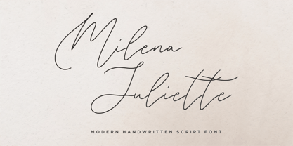 Milena Juliette is a lovely and timeless handwritten font. It is the best choice for creating eye-catching logos, branding, and quotes. Every letter has a unique and beautiful touch, which will make your design come alive!
 - Ordinary Guy by PizzaDude.dk,
$15.00 Just another ordinary brushfont? No! There is more to the picture than meets the eye! Ordinary Guy has 8 different versions of each letter! Just like magic, they cycle as you type! Included is multiple language support!
 - Song Sheet JNL by Jeff Levine,
$29.00 Sheet music for the 1930s song "Josephine" had its title hand lettered in a simple, bold sans design that is recreated in Song Sheet JNL. This bold sans is perfect for titling wherever strong emphasis is necessary.
 - Hero by Roman Polishchuk,
$20.00 Hero is an eccentric, handwritten font. It features high detail and natural forms. Support for ligatures allows you to create a truly unique typography that resembles lettering. Each designer should have a hero who inspires him. Enjoy!
 - Display Magazine by Letterena Studios,
$10.00 Display Magazine is a bold, distinct and assertive serif font. This font is imposing and features uniquely shaped letters, and as a result, it will easily match a wide range of creations that require a distinct touch.
 - Arrogant by Ametype,
$5.00 ARROGANT is a geometric monospace, which in use is supposed to resemble an unknown (sci-fi) script. The letters was made in geometric style consist of repetitive modules. Font is available in 8 styles and variable version.
 - HU Blackout by Heummdesign,
$15.00 HU Blackout is a typeface for titles that feels like letters are trapped in a square and has a constant and very narrow inner space. It is composed of three types of family typeface to increase usability.
 - Alestha Butterfly by Yoga Letter,
$18.00 "Alestha Butterfly" is a beautiful handwriting font. This font is equipped with capital letters, lowercase, numerals, punctuation, numerals, multilingual support, alternates, swashes, titling, and ligatures. It is suitable for weddings, engagements, Christmas, Valentine's Day, invitations, and others.
 - Lisa's Hand by Matthias Luh,
$15.00 Lisa's Hand is a well-formed handwritten Font. The letters are not connected which combines the style of both handwritten and computer fonts. Lisa's Hand is offered in Regular, Bold, Italic, Bold Italic, Condensed and Condensed Italic.
 - Salute Riches by FHFont,
$17.00 Salute Riches is a handwritten script font with a hand lettering pen style, so many opentype features are included in the font. Suitable for element design, wedding, events, t-shirt, logo, badges, sticker, and other awesome work.
 - Shockproof by Haiku Monkey,
$19.00 Shockproof takes its inspiration from 1940s hand lettering. It's a display font that mixes elegance with a touch of informality. Great for use in identity, signage, posters, and anywhere that tall, cool typographic drink would be refreshing.
 - Sursum by TeGeType,
$29.00 Sursum, inspired by the Roman monumental letterform, was designed to provide the possibility to play with the 58 OpenType ligatures and the 25 alternates letters. The Sursum family includes 3 weights, all with the same OpenType features.
 - Angelica by Deniart Systems,
$15.00 Let the angels adorn your documents. This series features a string of celtic style letters surrounded by angels - whether you need chapter headings or drop caps, these angels are sure to give your documents a celestial flair.


