10,000 search results
(0.036 seconds)
- und4 by URW Type Foundry,
$39.99 The rasterized square (clear, therefore 4 as part of the font name) was the constructive basis. The intention was to put all characters within this grid and produce a highly structured, yet lively, resting in itself, display font. Relaxed but exciting, just. An absolutely noteworthy detail are the classical construction principles (based on a typography book from the 50's for poster designers), the so-called optical weighting, derived and slightly exaggerated character elements: The characters are not purely symmetrical and the curve shapes do not close justified with the surrounding square. Loops and tongues slightly hang over; the upper bows are slightly less protruding than lower ones, etc. The kerning is tuned to fit these design details: the white space between the characters match the same filling space.
 - Treacherous by Comicraft,
$29.00 Midnight, Pacific Coast Highway. You're driving home alone at night and your battery's dying. Your headlights have dimmed and you can barely see the road or the signpost up ahead. But there's an eerie green light glimmering in your rear view mirror and that strange warning uttered by the pump attendant at the Devil's Elbow gas station has put the frighteners on you. Is that Satan's face glowering at you through the mist, or something far worse? The only way to handle this font is with one foot on the gas pedal and one foot on the brake. Originally designed by John Roshell for GAMBIT titles, this sharp font has appeared on vampire & rock magazine covers, Star Wars & Star Trek merch, and the logo for the INHUMANS comic & TV show!
 - Pastonchi by Monotype,
$29.99Italian poet and author, Francesco Pastonchi was commissioned to produce a new edition of the Italian Classics but was unable to find types which satisfied his needs. He decided to embark on designing a new typeface, assisted by Professor Eduardo Cotti at the Royal School of Typography in Torino. Early printed works, manuscripts and inscriptions were carefully studied before drawings were presented to Monotype for matrix production. A process of careful refinement of the design was carried out in the Monotype Type Drawing Office before the typeface was ready for manufacture. Pastonchi is a Venetian style face with a fresh, almost exotic appearance, ideally suited to classical works such as poetry and short stories. The Pastonchi font family has beautiful character shapes that also make excellent display and advertising copy. - Preface by Shinntype,
$39.00 Preface vs. Helvetica/Futura/Gill: a different strategy of text color. Whereas the established classes of sans serif typeface achieve a dynamic balance between stroke and space by combining a diversity of letterform with an evenness of fit, Preface switches the emphasis, driving out diagonals to create a dominant harmony of curves and perpendiculars, matched with a greater variety of inter-character space shapes—the result of extra width introduced in the “f” and “t”, and by the openness that accompanies the wide tails of the “ a” and “l”, the long ear of the “r”, and the serif of the “i”. En masse, and in keeping with the present trend in typography, Preface exhibits a coarser texture than the traditional sans serif faces, but one that is nonetheless even and precise. With tabular, oldstyle figures.
 - Wall Scrawler by Comicraft,
$39.00 This slick, marker style font was created by our fontmeister, Mr Fontastic, based on the slick, marker style of... Well, Mr Fontastic himself! Check it out in the pages of Marvel's classic DAREDEVIL story GUARDIAN DEVIL. DD scribe and indy movie maker Kevin Smith himself told us it was the coolest font he'd ever seen in his entire life! No, sorry, that is a lie, but he did tell us he liked the design work Mr Fontastic created for the JAY & SILENT BOB trades, No, seriously, he did. We wouldn't lie to you. Well, except for that last time. By the way, this font also doubles as a dynamite sound effect font, that's why we're charging you twice as much as usual. No, sorry, lying again. About the price, not the sound effect thing.
 - Summer of Love by Mysterylab,
$14.00 It's the Summer of Love all over again with this groovy psychedelic font. Designed in 2019, this typeface harks back to the carefree days of the late 1960s. Whimsical and offbeat with its swaying verticals, it nonetheless remains one of the more legible reimaginings of the genre, sporting all of the handlettered vibe of posters and album covers from the original hippie era, but with polished color and weight that evens out the legibility even at relatively small point sizes. Predominantly a unicase font, with a couple of alternate glyphs from upper to lowercase, Summer of Love works best as a large headline face, and benefits greatly from twisting and morphing the type blocks as was common during the original psych era. It's a real groove machine, baby.
 - Skiltmaler by Imagi Type,
$15.00 Skiltmaler is the typeface that refers to the style of decorative arts during the Victorian era 1837 to 1901, the Victorian era was the period in which fly poster typography emerged. The large amount of colour in combination with large font sizes were created from movable metal type. As well as being made from wood, this was used to create the two-coloured typefaces. You would imagine this would be specific to the '3D' styled type seen on the poster to create the drop shadow. Skiltmaler works well with normal size text, but it works even better for large displays, short words, or even just to incorporate a few or single characters in a design.
 - Gangsoka by Prioritype,
$15.00 A unique looking but classy and elegant looking font, that's the conclusion of this font. It's perfect for your design project and there is a choice of unique character alternatives. Can be applied to your designs such as logos, packaging, accessories, clothing, crafts, creative posts, branding, landing pages, UI / UX and others. See some of the previews above for reference. Features: -Uppercase -Lowercase -Numeral -Punctuation -Stylistic Alternate -Multilingual Note: To access the Opentype feature, it would be better if you use a program that supports it and is available with a glyph panel so you can see various alternative characters. Examples of programs such as Adobe Illustrator, Corel Draw or Inkscape. Thanks.
 - Brillo by Alessandro Pivetta Type,
$15.00 Brillo Typeface stems from the effort of combining the modern look of a grotesque sans serif font with the elegance of the calligraphic copperplate's swashes. The result is a typeface that is perfectly suitable for modern graphic applications, such as publishing, branding and web, but which has some ornamental features that differentiate it from all the other grotesque families. Brillo doesn't want to be a neutral typeface. It's a font with a strong personality, which can give outstanding aesthetic and conceptual relevance to the graphic projects which will be used in. Brillo is a typeface thought for titling rather than for texts. For this reason it works better with character sizes bigger than 16 points.
 - Linka Stencil by Vanarchiv,
$42.00 This font family is display stencil sans-serif with different stylistic layers available as open type font. The main characters are geometric and neutral but when we change the contextual alternates open type feature the letterforms activate the cursive stylish set. The word composition is divided by initial, medial and final forms, available for all uppercase and lowercase, the diacritics for Latin encodings (Western and central Europe and Baltic countries) are available. However the contextual alternate features (cursive mode) can only work on Adobe CS Indesign and Illustrator softwares. This typeface also has uppercase swash and stylish alternates. A large group of discretionary ligatures are also available to improve better legibility and readability on specific characters combinations.
 - Rotis Sans Serif by Monotype,
$45.99 Rotis is a comprehensive family group with Sans Serif, Semi Sans, Serif, and Semi Serif styles, for a total of 17 weights including italics. The four families have similar weights, heights and proportions; though the Sans is primarily monotone, the Semi Sans has swelling strokes, the Semi Serif has just a few serifs, and the Serif has serifs and strokes with mostly vertical axes. Designed by Otl Aicher for Agfa in 1989, Rotis has become something of a European zeitgeist. This highly rationalized yet intriguing type is seen everywhere, from book text to billboards. The blending of sans with serif was almost revolutionary when Aicher first started working on the idea. Traditionalists felt that discarding serifs from some forms and giving unusual curves and edges to others might be something new, but not something better. But Rotis was based on those principles, and has proven itself not only highly legible, but also remarkably successful on a wide scale. Rotis is easily identifiable in all its styles by the cap C and lowercase c and e: note the hooked tops, serifless bottoms, and underslung body curves. Aicher is a long-time teacher of design and has many years of practical experience as a graphic designer. He named Rotis after the small village in southern German where he lives. Rotis is suitable for just about any use: book text, documentation, business reports, business correspondence, magazines, newspapers, posters, advertisements, multimedia, and corporate design.
 - Gnuolane Jump by Typodermic,
$11.95 Meet Gnuolane Jump, the lighthearted typeface that bounces with personality. Inspired by early twentieth-century grotesque designs, Gnuolane Jump is a typeface with a playful 1960s twist. Its superelliptical appearance gives it a unique charm that sets it apart from other headline fonts. Gnuolane Jump features old-style numerals, adding to its vintage appeal. But what really makes this font stand out is its OpenType ligatures. With tailored combos that automatically substitute common character sequences, Gnuolane Jump creates a bouncing effect that brings your text to life. If you’re looking for a more subdued style, be sure to check out Gnuolane and Gnuolane Stencil. But if you want to inject some fun and personality into your headlines, give Gnuolane Jump a try. Its lively spirit and unique character will add an extra touch of charm to your design. Most Latin-based European writing systems are supported, including the following languages. Afaan Oromo, Afar, Afrikaans, Albanian, Alsatian, Aromanian, Aymara, Bashkir (Latin), Basque, Belarusian (Latin), Bemba, Bikol, Bosnian, Breton, Cape Verdean, Creole, Catalan, Cebuano, Chamorro, Chavacano, Chichewa, Crimean Tatar (Latin), Croatian, Czech, Danish, Dawan, Dholuo, Dutch, English, Estonian, Faroese, Fijian, Filipino, Finnish, French, Frisian, Friulian, Gagauz (Latin), Galician, Ganda, Genoese, German, Greenlandic, Guadeloupean Creole, Haitian Creole, Hawaiian, Hiligaynon, Hungarian, Icelandic, Ilocano, Indonesian, Irish, Italian, Jamaican, Kaqchikel, Karakalpak (Latin), Kashubian, Kikongo, Kinyarwanda, Kirundi, Kurdish (Latin), Latvian, Lithuanian, Lombard, Low Saxon, Luxembourgish, Maasai, Makhuwa, Malay, Maltese, Māori, Moldovan, Montenegrin, Ndebele, Neapolitan, Norwegian, Novial, Occitan, Ossetian (Latin), Papiamento, Piedmontese, Polish, Portuguese, Quechua, Rarotongan, Romanian, Romansh, Sami, Sango, Saramaccan, Sardinian, Scottish Gaelic, Serbian (Latin), Shona, Sicilian, Silesian, Slovak, Slovenian, Somali, Sorbian, Sotho, Spanish, Swahili, Swazi, Swedish, Tagalog, Tahitian, Tetum, Tongan, Tshiluba, Tsonga, Tswana, Tumbuka, Turkish, Turkmen (Latin), Tuvaluan, Uzbek (Latin), Venetian, Vepsian, Võro, Walloon, Waray-Waray, Wayuu, Welsh, Wolof, Xhosa, Yapese, Zapotec Zulu and Zuni.
 - Baby Chipmunk by Stefani Letter,
$14.00 Baby Chipmunk is a cute and sweet handwritten font with an incredibly friendly feel. Get inspired by its playful feel! This font is PUA encoded which means you can access all of the cute glyphs and swashes with ease! It also features a wealth of special features including alternate glyphs and ligatures.
 - Salsa Billa by Sulthan Studio,
$12.00 Salsa Billa is new, fresh, funny, interesting, cute calligraphy font. It includes hearts and cute cords as alternatives. It is suitable for greeting cards, branding materials, business cards, quotes, posters, and more! Salsa Billa is coded with Unicode PUA, which provides full access to all additional characters without having special design software.
 - Sweet Unicorn by Stefani Letter,
$12.00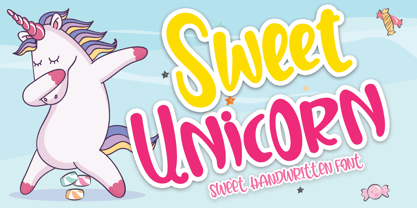 Sweet Unicorn is a cute and sweet handwritten font with an incredibly friendly feel. Get inspired by its playful feel! This font is PUA encoded which means you can access all of the cute glyphs and swashes with ease! It also features a wealth of special features including alternate glyphs and ligatures.
 - Fictionalism by Haiku Monkey,
$10.00 Fictionalism is carefully handcrafted slab serif, slightly condensed to fit lots of beautiful text wherever you need. It's handwritten, but neat as a pin; it's tidy, but has a lively character that grabs attention in a friendly way. Use it for branding, posters, text, or a million and one other design applications.
 - ITC Jellybaby by ITC,
$29.99ITC Jellybaby is the work of British designer Timothy Donaldson, bouncing all over the place but somehow remaining compact and legible. It began as an extremely fattened version of Donaldson't typeface Pink but then became transformed into a play on the futuristic" typefaces of the 1960s. Jellybaby expresses both retro and modern design." - Saint Capital by Rillatype,
$15.00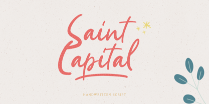 Introducing, Saint Capital. a new handwritten script font. Saints Capital is a cute handwritten font with feminine touch to emphasize your design and bring more cute and feminine feel to your design. this font is perfect for branding, packaging, merchandise, printing, quotes, etc. Saint Capital also come with multilingual support and PUA encoded.
 - Strangeways by Ana's Fonts,
$12.00 Meet Strangeways! A cute handwritten font in 2 weights, bold & italic, with: A-Z, a-z, 0-9, accents punctuation and symbols Ligatures Extra squiggles that can be used to underline, strike through or decorate your text. New! Cyrillic alphabet Strangeways great for any of your cute designs, in quotes, postcards, logos.
 - Creepy Crawly by Comicraft,
$19.00There are worms in the earth, hairy bugs under the bed and strange bloodshot eyeballs peering at you from out of the closet. Lilou's Creepy Crawly font is perfect for scaring away Trick-or-Treaters, just install our font and print out your signs with the legend: WE EAT LITTLE CHILDREN HERE! - Maglisan by Kartiny Type,
$12.00 Maglisan is a beautiful script perfect for branding, wedding invitations, and other romantic projects. This love centered look makes it perfect for use in all your design projects be it logos, labels, packaging designs, blog titles, posters, wedding designs, social media posts, Instagram designs, etc. Font Features: Lowercase letters start and end swash swipe up and down 2 Style Connect hearts You will get : Contains full set: -Uppercase -Lowercase -Alternative -Ligatures -Punctuation -Number -Multilingual support. I hope you enjoy this font. If you have any questions, feel free to message me :) Thank you for your purchase!
 - Bulby by Mircea Boboc,
$25.00 After creating an original light bulb symbol from scratch, I incorporated it in all letters and punctuation signs, ensuring a distinct rhythm and creative variation. The result is a highly recognizable font with a unique appearance, which can inspire you as a designer in many imaginative directions. This font is especially fitting for Christmas-themed projects where light installations take center stage. Similarly, if you represent a light bulb company, consider utilizing it in your indoor presentations or social media posts to showcase the playful voice of your brand. After all, everybody needs their light bulb moment.
 - Generisch Mono by Akufadhl,
$29.00 Generisch Mono is a monospaced version of Generisch Sans. Generisch - a german equivalent of generic - sans serif typeface has gain its own place among designers and earn such popularity due to its "simple" design. Generisch is influenced by early grotesk typefaces from early 1900's when sans was starting to get popular and used as a body type. Some old ligatures such as ch ck and ng are present in generisch (not the ct and st tho), old style numeral for better typesetting experience and more.
 - LiebeDoni by LiebeFonts,
$29.90 LiebeDoni is pure Italian art. A contemporary nod to Italian typographic heritage, LiebeDoni’s warm and friendly style is perfect for—literally—bold headlines and impressive invitations. Take a seat on LiebeDoni’s Vespa and enjoy the sweet curves of dolce far niente. But don’t let the relaxed hand-crafted appearance fool you: You’re dealing with a solid quality typeface that has received painstaking attention to detail. Round like the Colosseum, some lines are as colloquial as the Tower of Pisa—but all this with almost Teutonic obsession for technical perfection. Feature-wise, we went the full quattro stagioni: Variations and alternatives for many letters, swashy initials and swirly ligatures—plus language support that goes way beyond English and Italiano. Double-o ligature, anyone? Two different www ligatures? Check. (Please make sure your software supports OpenType if you wish to use the advanced features.) Get both the outline and the filled version and go crazy on creative layering and endless possibilities. Each font contains over 600 glyphs and both contain the full character set. Make a bold move to italy—treat yourself with this font. If you like LiebeDoni, you may also like its perfectly matching sisters LiebeErika and LiebeOrnaments—or any of our other 100% compatible LiebeFonts.
 - FF DIN Slab Variable by FontFont,
$419.99 FF DIN: the famous, faithful and first revival of DIN 1451. FF DIN originates in the lettering models from the German standard DIN 1451, and is considered the perfect standard typeface due to methodical and engineered design. FF DIN Slab is a robust compliment to the FF DIN family. Designed by Antonia Cornelius and Albert-Jan Pool, it offer designers tools to create greater rhythm and design depth. FF DIN Slab’s proportions have been meticulously aligned with its Sans origins, offering the perfect balance between positive and negative space. The serifs are assertive, sturdy and balanced, they are engineered to emphasis a strong horizontal flow through text, a grounded utility and assurance in headlines. The result of this attention to detail is a typeface that harmonizes beautifully with other FF DIN styles. Pushing font technology to its limits, FF DIN Slab is also available as a Variable font. Allowing creatives to design hyper specific variations which thrive in any design space, and even seamlessly animate movement from one state to the next. FF DIN Slab distinctively carries on its parent’s DNA, speaks the same native language — but with a strong peculiar dialect. It expands the DIN family worthily — independent but integrated — and opens totally new possibilities of uses with the whole DIN family.
 - Resting by Nathatype,
$29.00 Font is the most important design element to increase your branding. However, it may be tricky and take quite a while to figure out the perfect font for your design. Resting is a perfect display serif font for any of your design projects. Serif font is a font type with sticky small lines on the letters’ edges expressing formal, classic nuances and more aesthetic, creative touches due to the display font combinations. This display font has thick, high contrast lines perfect for catching attention and creating firm impressions. In addition, use this font for big text sizes for a legibility reason and make use of the other interesting features to beautify your designs. Features: Stylistic Sets Ligatures Multilingual Supports PUA Encoded Numerals and Punctuations Resting fits best for various design projects, such as brandings, posters, banners, logos, magazine covers, quotes, headings, printed products, invitations, name cards, merchandise, social media, etc. Find out more ways to use this font by taking a look at the font preview. Thanks for purchasing our fonts. Hopefully, you have a great time using our font. Feel free to contact us anytime for further information or when you have trouble with the font. Thanks a lot and happy designing.
 - Kunhety by Twinletter,
$18.00 Introducing Kunhety, a groovy retro font display perfect for bringing a vintage touch to your designs. This font features bold and quirky letters that will make your projects stand out and evoke a feeling of nostalgia. Whether you’re working on a poster, or an album cover, or want to add some retro vibes to your latest project, Kunhety is the perfect font for you. With a range of alternative characters and multilingual support, this font is versatile and ready to add some groovy flavor to your work. Don’t miss out on the opportunity to elevate your designs with Kunhety. Furthermore, Kunhety is user-friendly and easy to use. Making it compatible with a wide range of software and devices. And with its clear and distinct letterforms, it’s sure to grab the attention of your audience and leave a lasting impression. So, add a touch of retro cool to your next project with Kunhety today! What’s Included : - File font - All glyphs Iso Latin 1 - Alternate, Ligature - Simple installations - We highly recommend using a program that supports OpenType features and Glyphs panels like many Adobe apps and Corel Draw so that you can see and access all Glyph variations. - PUA Encoded Characters – Fully accessible without additional design software. - Fonts include Multilingual support
 - Wayfinding Sans Symbols by FDI,
$29.00 Placing pictograms as single vector images makes designing signage a time-consuming task. But with Wayfinding Sans Symbols and its built-in OpenType intelligence using pictograms becomes as easy as typing words. With Wayfinding Sans Symbols you don’t need to scroll through endless glyph palettes to look for one symbol among hundreds of symbols. Just active ligatures and type in the mnemonic codes like #wheelchair, #parking, #toilet and so on. An overview of these codes can be found in the type specimen PDF. Each pictogram is available in 4 different versions and you can easily assign an additional background color or turn the symbol into a prohibition sign. Wayfinding Sans Symbols has a full coverage of the Unicode range “Transport & Map symbols” and a lot of additional signs that are missing in the typical wayfinding symbol sets. Beside the pictograms, Wayfinding Sans Symbols also has a huge set of arrows for every possible situation and you can easily switch between the different sets using OpenType feature controls. The enclosed letters and figures make it easy to set transport line numbers, room & storey numbers and much more. Wayfinding Sans Symbols is the perfect addition to Ralf Herrmann’s signage typeface Wayfinding Sans Pro, but it can also be used with any other typeface.
 - FF DIN Slab by FontFont,
$50.99FF DIN: the famous, faithful and first revival of DIN 1451. FF DIN originates in the lettering models from the German standard DIN 1451, and is considered the perfect standard typeface due to methodical and engineered design. FF DIN Slab is a robust compliment to the FF DIN family. Designed by Antonia Cornelius and Albert-Jan Pool, it offer designers tools to create greater rhythm and design depth. FF DIN Slab’s proportions have been meticulously aligned with its Sans origins, offering the perfect balance between positive and negative space. The serifs are assertive, sturdy and balanced, they are engineered to emphasis a strong horizontal flow through text, a grounded utility and assurance in headlines. The result of this attention to detail is a typeface that harmonizes beautifully with other FF DIN styles. Pushing font technology to its limits, FF DIN Slab is also available as a Variable font. Allowing creatives to design hyper specific variations which thrive in any design space, and even seamlessly animate movement from one state to the next. FF DIN Slab distinctively carries on its parent’s DNA, speaks the same native language — but with a strong peculiar dialect. It expands the DIN family worthily — independent but integrated — and opens totally new possibilities of uses with the whole DIN family. - Audace Std by Typofonderie,
$59.00 Between geometry & shapes inspired by nature, in 4 fonts Audace was born as a response to a simple brief: how to visually express human interaction and technology with abstract forms? The starting point is a humanistic sanserif, to which are added external references: design pieces, furniture, buildings. Architects shape our world with the intention to reconnect nature, human and address a perfect functionality. Not so far to typeface design which combines a personal vision and ensures good legibility in a certain context. Audace — like the works of those artists, designers, architects — is clearly influenced by the tension of the line, the play with negative space, the dynamics, the surprise, the nature that will influence the shapes of the letters. So if a v is asymmetrical, and the y based on similar asymmetry but in reverse, these two shapes help to distinguish from one to the other. This is a consequence of the influence of forms from design and art in the design of the Audace. And this small example illustrates the confrontations of the designer’s influences: the search for the most unique shapes, but without compromising on function: to be read, to be legible, even at very small size in the worst conditions. Audace, between geometry and shapes inspired by nature
 - Xpress Rounded by Wiescher Design,
$12.00 »XPress-Rounded« is my new addition to »XPress«, my Sans-Serif that impresses – especially in small sizes – with its outstanding readability. »XPress-Rounded« looks very different, almost like a completely new font. But the rounded version has the same seven precisely calibrated weights from »Thin« to »Heavy« and its corresponding italics make this font-family universally usable. The »XPress« fonts got their bearings from the fabulous American »Gothic« fonts of the twenties of last century. Modern, present day elements, high lowercase letters and infinitesimal elegant slight curves in start- and end strokes make the font family not only great for body copy, but also very useful in advertising. Enjoy! »XPress-Rounded« ist meine neue Erweiterung zur »XPress« Familie, die durch aussergewöhnliche Lesbarkeit auffällt. »XPress-Rounded« sieht jedoch vollkommen anders aus als sein älterer Bruder. »XPress-Rounded« hat jedoch die selben sieben präzise aufeinander abgestimmten Schnitte von »Thin« bis »Heavy« und die dazu passenden Kursiven. Das macht die Schriftfamilie vielseitig einsatzfähig. Die »XPress« Schriften basieren auf der Formensprache der grossen amerikanischen Groteskschriften der zwanziger Jahre des letzten Jahrhunderts. Durch moderne Formelemente, große Mittellängen und unendlich leichte, elegante An- und Abstriche ist die Schrift jedoch nicht nur als Textschrift, sondern auch im gesamten Bereich der Werbung vielseitig einsetzbar. Viel Erfolg!
 - Gonzi by Mans Greback,
$49.00 Gonzi is a geometric sans-serif typeface in 30 styles. Its circular lowercase letters and large, expressive capitals combine to create a modern, clean typesetting with a distinct personality; all the while keeping accessible and legible. Gonzi consists of five weights, each one as narrow, medium and wide: Thin, Light, Regular, Bold, Black Condensed, Medium, Extended Each one of font styles is also provided as Italic, totalling 30 high-quality styles. Also includes a variable font! Only one font file, but the file contains multiple styles. Use the sliders in Illustrator, Photoshop or InDesign to manually set any weight and width. This gives you not only the predefined styles, but instead more than a thousand ways to customize the type to the exact look your project requires. More info about Variable Fonts: https://mansgreback.com/variable-fonts The font is built with advanced OpenType functionality and has a guaranteed top-notch quality, containing stylistic and contextual alternates, ligatures and more features; all to give you full control and customizability. It has extensive lingual support, covering all Latin-based languages, from North Europe to South Africa, from America to South-East Asia. It contains all characters and symbols you'll ever need, including all punctuation and numbers.
 - Duwal Pro by Volcano Type,
$76.00 The careful balance between the emotional swings and shapes set in strong contrast such as the burly serifs, or generally vertical and orderly appearance within the Duwal Pro determine the special look of this Antiqua typeface. All characters of the Duwal Pro are designed to be open and accessible. The lowercase letters are designed with a large x-height, which is why they are ideal for small font sizes. Many striking details give Duwal Pro a defined and firmer appearance with increasing font size so it is also suitable for use in headlines and work marks. The deliberately constructed and emphasized design of the serifs give the font a strong position and at the same time force the reading direction. Using Duwal Pro in Bold weight, the serifs look clearly striking, the design language is concise and the typeface receives an additional sympathetic force. The Italic weight draws on the expressive but not intrusive design of the Regular, but appears sharper and is ideal for text passages. The font family contains italics, small caps, lots of ligatures, swashes, another format set, contextual alternatives and special characters as well as other open-type features which allow the use of Duwal Pro in 48 languages.
 - Holy Cream by Shakira Studio,
$17.00 Say hello to new serif font, Holy Cream! Holy Cream is a font that takes you back to the trendy retro era. With a classic display serif style but with a modern feel, Holy Cream emphasizes the uniqueness and elegance of each letter. The bold, contoured serif design provides a strong vintage touch, while stylish and quirky alternatives add a charming creative dimension. When using Holy Cream, you will feel a touch of fun nostalgia, but also explore ongoing design trends at the same time. Whether you want to feature your headline in a print ad, poster, or other graphic design, Holy Cream delivers a trendy, retro vibe that grabs attention with its ability to adapt to a variety of visual styles. So, with Holy Cream, make your design speak in a stylish and unique retro style, captivate the audience and make an unforgettable impression. Here's what you get: Holy Cream Regular and Italic All Multilingual symbol Opentype features ( ligature, alternate ) Accessible in the Adobe Illustrator, Adobe Photoshop, Adobe InDesign, even work on Microsoft Word. PUA Encoded Characters - Fully accessible without additional design software. Multilingual character supports : (Afrikaans, Albanian, Catalan, Croatian, Czech, Danish, Dutch, English, Estonian, Finnish, French, German, Hungarian, Icelandic, Italian, Lithuanian, Maltese, Norwegian, Polish, Portuguese, Slovenian, Spanish, Swedish, Turkish, Zulu)
 - LetterOMatic! - Personal use only

- LetterOMatic! - Personal use only

- Sweet Case by Bogstav,
$17.00 Handmade with an organic feeling. You have 6 different versions of each letter to choose from + multilingual support!
 - Lingotto Black by Font&Co.,
$29.00 Lingotto Black is a geometric display font based on a square module, inspired by early ’70s Italian lettering.
 - LD Adornment by Illustration Ink,
$3.00LD Adornment is a perfect font when you'd like 'just enough' of a special addition to your lettering. - CA 12c13c by Cape Arcona Type Foundry,
$28.00 CA 12C13C was designed by sticking letters together with tape. Use it when right angles are strictly forbidden!

