10,000 search results
(0.031 seconds)
- Fossegrim by Kitchen Table Type Foundry,
$15.00 I have always liked Scandinavian folklore, although I have to admit that I didn’t know about the Fossegrim. Fossegrim is a fiddle or harp playing water sprite - usually friendly, but he has been known to lure children and women in deep water with his music. Fossegrim font is a little bit weird as well: I made it using a broken bamboo satay skewer and Chinese ink. It comes with extensive language support and a set of alternates for the lower case letters.
 - Chewy Caramel by Hanoded,
$15.00 I really don’t like candy. In fact, I even hate the smell of candy! But… You can wake me up for caramel in any form or shape! When I was a kid, we used to get a tin of wrapped English ‘quality’ toffees for Christmas. My favourites were the big, flat chewy caramels in a bright purple wrapper! Chewy Caramel is a happy handmade font, ideal for book covers, candy wrappers and labels. Comes with double-letter ligatures for the lower case.
 - Mint Condition by Hanoded,
$15.00 My kids like to read Donald Duck magazine. They have boxes full of old editions that we bought second hand. Most of the comics are well-used, but there are some in near mint condition. I thought it would be nice to create a font that mimics the lettering found in comics. Mint condition is a very nice, very friendly handmade comic book font that comes with extensive language support (including Vietnamese and Cyrillic), plus two sets of alternate glyphs.
 - Colby by J Foundry,
$20.00 Colby is a hand-drawn workhorse sans serif family. It consists of a wide range of weights and widths for a variety of applications. Colby balances the quirkiness of hand-drawn letters with the legibility of a clean sans serif. This combination provides authentic warmth with functional benefits. The fonts feature plenty of alternates, icons and arrows to add character and customization. Colby is perfect for packaging, restaurant menus, children’s books, digital applications, but will be comfortable in any situation.
 - Brushzilla by Hanoded,
$15.00 Brushzilla is a handmade brush font with a bite: it feeds off the creative energy from the depths of your mind and transforms it into something outstanding. Work with it, not against it. Ride the wave and let it take you by the hand. You may fear it at first sight, but once you get to know it, you’ll find that this beast will refresh your creative senses. Comes with some gorgeous alternate glyphs, double letter ligatures and a whole lotta diacritics.
 - Battora by Flawlessandco,
$9.00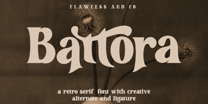 Battora is a Modern Retrotype with various alternates and ligatures, an updated blend of bohemian style. There's some connected letters and some alternates that suitable for any graphic designs such as branding materials, t-shirt, print, business cards, logo, poster, t-shirt, photography, quotes .etc This font support for some multilingual. Also contains uppercase A-Z and lowercase a-z, alternate character, numbers 0-9, and some punctuation. If you need help, just write me! Thanks so much for checking out my shop!
 - Movere by Supfonts,
$14.00 Movere is a modern serif family with vintage charm, fashionable appearance with a touch of retro Quick access - using the built-in OPEN TYPE functions. Just add "-" or "_" to the letter and instantly get an alternative. This feature works in most applications Font is an open type with clean shapes and precise kerning. It includes ligatures encoded by the PUA. Language support: All European languages Don't forget to subscribe so you don't miss out on the new awesome fonts Dima
 - Kaylie Diary by Reyrey Blue Std,
$16.00 Introducing, Kaylie Diary. It is the new serif typeface with classy, playful, cute and feminine look. It consisting of several kinds of alternative variations that can make your design more unique and trendy. Kaylie Diary is perfect for an elegant & luxury logo, book or movie title design, fashion brand, magazine, clothes, lettering, quotes, poster designs, branding, magazines, merchandise, logos and so much more. Features : · All Uppercase and Lowercase · Number & Symbol · Supported Languages · Alternates and Ligatures · PUA Encoded Hope you enjoy with our font!
 - Alma Mater by Studio K,
$45.00 As the Latin tag for one’s college or university, Alma Mater seemed to me to be an appropriate title for a font family reminiscent of the lettering commonly used on college sweaters and sports jerseys. Essentially Alma Mater is an extension of my Oscar Bravo font family, but the lively demand for Oscar Bravo Blank persuaded me to go the whole nine yards and and offer inline, outline and shadow variations on the theme. Pick 'em up and run with 'em!
 - Spookies Identity by Putracetol,
$32.00 Spookies Identity is a horror display font. This font is inspired by movie titles and some horror logos. The impression of horror is highly emphasized, but the alternate character of this font that curves at the beginning and end of the letter makes this font very suitable to be used as a logo and poster. Spookies Identity would be perfect for Logo, title, logotype, cover, headline, apparel, comic, cover books, cards, posters, or anything that requires a horrror or scarylook!
 - Fiction Crusader by PizzaDude.dk,
$17.00 The name “Fiction Crusader” was generated by a random word generator. It may sound odd, but I like the feel of it. Use your imagination: what exactly is a fiction crusader? Each letter has 6 slightly different versions, and they automatically cycle as you type. A great way to make your text look more lively and vibrant! I guess that this is an all-purpose font, because I can’t think of a project that couldn’t use a font like this!
 - Mourghan by Flawlessandco,
$9.00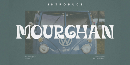 Mourghan is a Modern Retrotype with various alternates and ligatures, an updated blend of bohemian style. There's some connected letters and some alternates that suitable for any graphic designs such as branding materials, t-shirt, print, business cards, logo, poster, t-shirt, photography, quotes .etc This font support for some multilingual. Also contains uppercase A-Z and lowercase a-z, alternate character, numbers 0-9, and some punctuation. If you need help, just write me! Thanks so much for checking out my shop!
 - Brand by Lián Types,
$37.00 Jam jars; Warhol’s “Tomato Soup”; chalk lettering and baseball. Those were the triggers to make this soft chancery cursive turned into a script font. Brand is thought mainly for packaging but can be used in magazines and invitations also. It can be easily converted into a logo when using it and its features. Pro styles are loaded with the most complete sets of alternates, ligatures and ornaments; while Std styles are smaller versions of the font, with no decorative alternates.
 - Forseti by Flawlessandco,
$9.00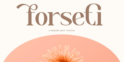 Forseti is a Modern Serif with various alternates and ligatures, an updated blend of bohemian style. There's some connected letters and some alternates that suitable for any graphic designs such as branding materials, t-shirt, print, business cards, logo, poster, t-shirt, photography, quotes .etc This font support for some multilingual. Also contains uppercase A-Z and lowercase a-z, alternate character, numbers 0-9, and some punctuation. If you need help, just write me! Thanks so much for checking out my shop!
 - AT Move Strano by André Toet Design,
$39.95 STRANO Like the name indicates it’s a strange typeface. Just capitals (including punctuation marks and numbers), composed from early sketches for a corporate identity in 2005 by André Toet. The complete font was restyled and translated to a Monospaced version. It’s a quite versatile font: it can be used in a lot of different cases, not only in print but also in architecture and street furniture. Think about lettering on benches, bridges, buildings. Concept/Art Direction/Design: André Toet © 2017
 - Wairel by Supfonts,
$14.00 Wairel is a modern serif family with vintage charm, fashionable appearance with a touch of retro Quick access - using the built-in OPEN TYPE functions. Just add "-" or "_" to the letter and instantly get an alternative. This feature works in most applications Font is an open type with clean shapes and precise kerning. It includes ligatures encoded by the PUA. Language support: All European languages Don't forget to subscribe so you don't miss out on the new awesome fonts Dima
 - Rephone by Majestype,
$15.00 Rephone is a handwriting font that has a force and rush personality but still beautiful. Each letter was made with love so that it can work well with one another. Rephone are designed to work well on the design like invitation, clothing, photography, branding, album covers, signature and the style that can work well with this font. Rephone support Multiple Language & OpenType features, that can allow you to choose a character that you like and suitable for the project you're working on.
 - Pixel Arcade by Comicraft,
$19.00 GAME OVER, MAN, GAME OVER! Time to grab your joystick, turn to channel 3 and level up, Player One, or you'll never beat the high score on your new game cartridge. Or bring a stack of quarters and a couple of friends to the mall, and we'll play some Rick Astley and Kajagoogoo over the PA while you scope out hotties near the food court. Either way, eight bit lettering has never looked more eighties than it does in our new PIXELARCADE font!
 - PM Alcorn by Paper Moon Type & Graphic Supply,
$17.00 A new font inspired by classic retro and mid-century modern interlocking hand-written typography. Do you need to create some fun snack packaging to stand out on the shelf? PM Alcorn will quell your appetite. Are you designing a product that needs a funky, friendly retro vibe? PM Alcorn is fun, funky, friendly, and easy to read! It's perfect for everything from games to bath products. Plus with tons of ligatures and stylistic alternates it has real hand-lettered feel.
 - Adieu Mon Ami by Hanoded,
$15.00 No, I am not leaving and none of my friends or relatives have packed up and left. I needed a more ‘letter-like’ name for this font and I found Adieu Mon Ami (farewell, my friend in French). Adieu Mon Ami is a handmade pencil font that will add that extra ‘je ne sais quoi’ to your designs. It comes with joie de vivre, un petit peu de vilain, but can be doux comme de la soie as well. Bonne chance!
 - Make Wish by Flawlessandco,
$9.00 Make Wish is a Handwritten Funny Font. Unleash a burst of laughter and lightheartedness with "Make Wish," a delightful handwritten font that adds a touch of humor and playfulness to your designs. There's some connected letters and some alternates that suitable for any graphic designs. This font support for some multilingual. Also contains uppercase A-Z and lowercase a-z, alternate character, numbers 0-9, and some punctuation. If you need help, just write me! Thanks so much for checking out my shop!
 - Cally by Gleb Guralnyk,
$15.00 Cally is a classic looking typeface with decorative vintage elements. It is perfectly suited for label design and for various lettering postcards and invitations. Cally includes the English alphabet, punctuation, numbers and Western European multilingual characters (check out the screenshots with all available characters). Also there are few ligatures and swashes. To access swash glyphs, just type underscore character and number 1-5, like this _1. Using "standard ligature" feature this symbols will be automatically replaced with one of the swash symbols.
 - Diablo by Solotype,
$19.95Diablo Light was originally called Fabric and was issued by the Farmer, Little & Co. foundry in New York. We liked everything about this font except for the lowercase 'g'. So we changed the offending letter, but for purity kept the orginal as an alternate. We created a bold version of Diablo Light, with minor changes to accomodate the bolder stroke weight. Although the original design is over a century old, the style seems to have an up-to-date look. - Woly Wonka by Flawlessandco,
$9.00 Introducing "Woly Wonka" - A Display Sans Font. Step into a world of whimsy and imagination with "Woly Wonka," a captivating display sans font that adds a touch of playfulness to your designs. There's some connected letters and some alternates that suitable for any graphic designs. This font support for some multilingual. Also contains uppercase A-Z and lowercase a-z, alternate character, numbers 0-9, and some punctuation. If you need help, just write me! Thanks so much for checking out my shop!
 - Greenwood by Protimient,
$22.50Greenwood is a monospaced, cursive typewriter script, based on a typewritten letter from a Mr J. G. Greenwood Esq. to a branch of the National Westminster bank in Oxfordshire, Great Britain, dated 6th June 1904. This uncommon style of typeface is suitable for many tasks as it not only has the functionality of a monospaced font but it has a quirky distinctiveness that lends itself especially well to any setting that requires a decorative font that reads surprisingly well in extended text. - Popsmart by Bogstav,
$14.00 Popsmart means "smart or skilled in a superficial, self-righteous or annoying way" - but when I was young in the 1980ies, it was a positive thing to be popsmart. At least in Denmark! :) Anyway, I find this font to be smart in a positive way: It has a bouncy appearance ( with help from the Contextual Alternates, the font cycles the 6 different versions of each letter!) and a "go-ahead-and-type-anything-and-it-will-end-up-looking-good" kinda vibe.
 - Happy Easter by Trim Studio,
$15.00 **Happy Easter **A cute script font that's perfect for Easter-themed moments is whimsical and playful. It has flowing, organic lines that resemble the curves of an Easter egg or the curling petals of a spring flower. The letters are so airy, with a gentle bounce that gives them a sense of movement and liveliness. --- File Include: - Readme.pdf Thank you for let us be your design partner, If you have any questions please don't hesitate to drop me a message
 - Flower Island by Flawlessandco,
$9.00 Flower Island - A Playful Bubble Display Font. Immerse yourself in the whimsical world of Flower Island, a delightful bubble display font that adds a touch of fun and playfulness to your designs. There's some connected letters and some alternates that suitable for any graphic designs. This font support for some multilingual. Also contains uppercase A-Z and lowercase a-z, alternate character, numbers 0-9, and some punctuation. If you need help, just write me! Thanks so much for checking out my shop!
 - Tecna Dark Square BNF V1.2 by Descarflex,
$30.00 The Tecn@ Square family were designed to head, enumerate, point out or highlight a point in a writing or plan. In this sense and for this reason, the characters are available only in capital letters and some signs or symbols that could serve such purposes. Among other applications, these characters are used in the personalization of plans, highlighting or indicating parts of the design that facilitate the Descriptive Memory of the plan or the development of a Manual or Installation Instructions.
 - Geekabeat by PizzaDude.dk,
$20.00 Geekabeat is my wooden lookalike grunge typeface! All uppercase letters has got a funky swirl. Comes with different upper- and lowercase letters, alternate letters (both upper- and lowercase!) and ligatures for both double letters and double numbers, along with ligatures for most common letter-combinations - and of course it has got unique accented letters! You will need to use OpenType supporting applications to use the ligatures.
 - Tiny Tube - Unknown license

- Norwich Aldine ML by HiH,
$12.00 Norwich Aldine ML is a all-cap typeface with enlarged serifs, designed and produced in wood by William Hamilton Page of Norwich, Connecticut in 1872. Norwich Aldine ML is a fine example of the strength of decorative wood types: large, simple type forms that provide the visual boldness sought by advertisers of the Victorian period. While our marketing has gotten so very sophisticated, there is always a place for a simple, visually strong typeface. Although about 14 miles inland, Norwich, Connecticut lies at the head of the Thames River. The river is both wide and deep, and therefore was not bridged in the early 20th century. Until then, if you wanted to get from Groton on the west bank to the whaling port of New London on the east bank by land, you had to go by way of Norwich. Because of its size, the Thames is navigable all the way from Norwich to New London. Docks were built in Norwich around 1685 and the city became Connecticut’s 2nd largest port by 1800. With the construction of the Norwich & Worcester Railroad in 1835, Page could easily ship his wood type north by rail or south by coastal schooner. Included with our font, Norwich Aldine ML, are two 19th century printer’s ornaments of sailing ships similar to those that sailed up the Thames to Norwich. Reference: Moon’s Handbooks, Connecticut 2nd Edition (Emeryville CA 2004) The family has expanded from one to four fonts: 1. Norwich Aldine ML: the concept font, computer-sharp corners and smooth curves, as we imagine it was designed. 336 Glyphs including some reduced-width alternatives for better letter spacing. 2. Norwich Aldine Worn ML: the way actual wooden type would look after have been used for a while. 332 Glyphs 3. Norwich Aldine Distressed ML: the way the wooden type would look after it had really been used, perhaps abused. Alternatives to the more popular letters reflect the damage that typically occurs on a well-wormn font, with nicks, cuts and scratches and the overall wear that reduces the overall height and leads to uneven inking due to varying heights in the chase. A couple of bullets look like bullet holes. 345 glyphs. 4. Norwich Aldine Cyrillic: Cyrillic includes alll English and Cyrillic letters for MS Windows Code Page 1251, ISO 8859-5 and MacOS Cyrillic. 235 glyphs. We did Cyrillic because is was fun and we felt the basic design cried out for Cyrillic. While obviously subjective, we hope you will agree.
 - FS Me Paneuropean by Fontsmith,
$90.00Mencap When most of us go about everyday tasks, we take for granted the reading that’s involved, on instructions, labels and so on. For people with learning disabilities, reading is made much harder by certain fonts. FS Me is designed specifically to improve legibility for people with learning disabilities. The font was researched and developed with – and endorsed by – Mencap, the UK’s leading charity and voice for those with learning disabilities. Mencap receive a donation for each font license purchased. Every letter of FS Me was tested for its appeal and readability with a range of learning disability groups across the UK. Inclusive Fontsmith were determined to design a font that was accessible to those with learning disabilities without standing out as such – one that was inclusive of all readers. It should comply with accessibility guidelines and work best at 12pt, but still have a character of its own that was warm and approachable. “So much accessible design is done separately to the main body of brand work,” says Jason Smith. “We wanted to make a typeface that covered both brand tone and neutrality, and that could be used legitimately as a brand font as well as in accessible design.” Me, you, everyone FS Me is about design that doesn’t patronise. People with learning disabilities are often treated as inferior by childlike design. FS Me is designed for adults, not children – a beautifully-designed font for everyone. Its features include very subtle distinguishing elements of each letter to aid the reading and comprehension of texts, and tails, ascenders and descenders that have been extended for extra clarity. What the people said... Here is a sample of comments from the extensive research groups that helped to shape the letterforms of FS Me: “I want something round, clear and friendly.” “We like movement in the letters but don’t want anything childish.” “The ‘b’ and ‘d’ need to be different as they can be confused.” “I prefer the handwriting-style ‘a’.” “It’s important to have an accessible ‘a’ and ‘g’. Teachers sometimes complain that learners cannot read or understand the inaccessible ‘a’ and ‘g’.” - FS Me by Fontsmith,
$80.00 Mencap When most of us go about everyday tasks, we take for granted the reading that’s involved, on instructions, labels and so on. For people with learning disabilities, reading is made much harder by certain fonts. FS Me is designed specifically to improve legibility for people with learning disabilities. The font was researched and developed with – and endorsed by – Mencap, the UK’s leading charity and voice for those with learning disabilities. Mencap receive a donation for each font license purchased. Every letter of FS Me was tested for its appeal and readability with a range of learning disability groups across the UK. Inclusive Fontsmith were determined to design a font that was accessible to those with learning disabilities without standing out as such – one that was inclusive of all readers. It should comply with accessibility guidelines and work best at 12pt, but still have a character of its own that was warm and approachable. “So much accessible design is done separately to the main body of brand work,” says Jason Smith. “We wanted to make a typeface that covered both brand tone and neutrality, and that could be used legitimately as a brand font as well as in accessible design.” Me, you, everyone FS Me is about design that doesn’t patronise. People with learning disabilities are often treated as inferior by childlike design. FS Me is designed for adults, not children – a beautifully-designed font for everyone. Its features include very subtle distinguishing elements of each letter to aid the reading and comprehension of texts, and tails, ascenders and descenders that have been extended for extra clarity. What the people said... Here is a sample of comments from the extensive research groups that helped to shape the letterforms of FS Me: “I want something round, clear and friendly.” “We like movement in the letters but don’t want anything childish.” “The ‘b’ and ‘d’ need to be different as they can be confused.” “I prefer the handwriting-style ‘a’.” “It’s important to have an accessible ‘a’ and ‘g’. Teachers sometimes complain that learners cannot read or understand the inaccessible ‘a’ and ‘g’.”
 - Mariage by Linotype,
$40.99Morris Fuller Benton, the principal designer of the American Type Founders, designed Mariage in 1901. Mariage, which has been sold under a plethora of different names during the last century, is a blackletter typeface belonging to the Old English category. The term blackletter refers to typefaces that stem out of the historical printing traditions of northern Europe. These letters, called gebrochene Schriften, or "broken type" in German, are normally elaborately bent and distorted. Their forms often print large amounts of ink upon the page, creating text that leaves a heavy, black impression. The Old English style is a subset of blackletter type that dates back to 1498, when Wynken de Worde introduced textura style printing to England. Continental printers had been printing with textura style letters since Gutenberg's invention of the printing press fifty years earlier. Italian printers stopped using them around 1470. For northern Europeans, texturas remained the most popular form of typeface design until the invention of the fraktur style in Nuremberg. Mariage is heavily classicized sort of Old English type. During the Victorian era, designers admired the Middle Ages for its chivalric, community-based values and its pre-industrial lifestyle. Yet they also found the basic medieval textura letterform too difficult to read by present standards. They desired to modernize this old style. Today, this sort of update is often referred to not as "modernization" but as classicism. Benton's design for ATF builds upon earlier Victorian classicist interpretations of Old English/textura letters. For an example of what these Victorian designs looked like, check out the popular 1990 revival of the genre, Old English . Old English style types often appear drastically different from other blackletters. For contrast, compare Mariage to a classical German fraktur design, Fette Fraktur , a schwabacher style face, or the popular early 20th Century calligraphic gothic from Linotype, Wilhelm Klingspor Gotisch . Especially in the United States, classicist Old English typefaces are thought to espouse tradition and journalistic integrity. These features, together with the inherent, complex beauty of Mariage's forms, make this typeface a perfect choice for certificates, awards, and newsletter mastheads. - Miranda Wright by Din Studio,
$29.00 Miranda Wright is a captivating serif font designed in an exquisite and elegant style. Each letter is meticulously crafted with fine details, evoking a sense of sophistication and grace. What sets Miranda Wright apart are the last few letters, which feature graceful circular swings that add a touch of charm and uniqueness to the font.. The circular swings at the end of certain letters infuse this serif with a delightful flair. These subtle and graceful details add an air of playfulness and individuality to the font, setting it apart from conventional serif typefaces. The circular swings give the font a distinctive personality, making it ideal for creative projects that seek to stand out. Its legible and elegant letterforms make it suitable for both body text and headings, while the circular swings add a touch of character that enhances the overall visual appeal. Enjoy the available features here. Features: Stylistic Sets Ligatures Multilingual Supports PUA Encoded Numerals and Punctuations Miranda Wright fits in headlines, logos, posters, flyers, invitations, greeting cards, branding materials, print media, editorial layouts, website headers, and many more. Find out more ways to use this font by taking a look at the font preview. Thanks for purchasing our fonts. Hopefully, you have a great time using our font. Feel free to contact us anytime for further information or when you have trouble with the font. Thanks a lot and happy designing.
 - Technique BRK Pro by CheapProFonts,
$10.00 I noticed this font for its versatile techno look - it makes wonderful logotype word images. Every letter combination is perfectly kerned so that the letters fit together nicely... Also includes some alternate letterforms, but only in their basic forms (not made in combinations with diacritics). These alternates are available via your programs' glyph palette or using the OpenType functions "Stylistic Alternates"/"ss02" and "Swash"/"ss01". Technique BRK Pro is the perfect companion for Technique Outline BRK Pro (it exactly fills the "holes") but also a nice techno font in its own right. ALL fonts from CheapProFonts have very extensive language support: They contain some unusual diacritic letters (some of which are contained in the Latin Extended-B Unicode block) supporting: Cornish, Filipino (Tagalog), Guarani, Luxembourgian, Malagasy, Romanian, Ulithian and Welsh. They also contain all glyphs in the Latin Extended-A Unicode block (which among others cover the Central European and Baltic areas) supporting: Afrikaans, Belarusian (Lacinka), Bosnian, Catalan, Chichewa, Croatian, Czech, Dutch, Esperanto, Greenlandic, Hungarian, Kashubian, Kurdish (Kurmanji), Latvian, Lithuanian, Maltese, Maori, Polish, Saami (Inari), Saami (North), Serbian (latin), Slovak(ian), Slovene, Sorbian (Lower), Sorbian (Upper), Turkish and Turkmen. And they of course contain all the usual "western" glyphs supporting: Albanian, Basque, Breton, Chamorro, Danish, Estonian, Faroese, Finnish, French, Frisian, Galican, German, Icelandic, Indonesian, Irish (Gaelic), Italian, Northern Sotho, Norwegian, Occitan, Portuguese, Rhaeto-Romance, Sami (Lule), Sami (South), Scots (Gaelic), Spanish, Swedish, Tswana, Walloon and Yapese.
 - Mightiest Autograph by Din Studio,
$29.00 Digital designs seldom show personal touches to make them stand out and to give unique displays. Generic fonts are no longer enough to do so. You need something special to make great impacts on your work. Therefore, a handwritten font can be the perfect solution to such a necessity. This is the Mightiest Autograph. Mightiest Autograph is a handwritten font in a signature looking style to add elegant, personal nuances on your designs. The curves and wipes in the swinging ends of the letters are the main characters. Like the other cursive fonts, each letter is connected to one another to make the font legible. The letters’ proportions are made different for a more artistic looking style applicable for such romantic texts. You can apply this font for any text sizes due to its great legibility. Additionally, you can enjoy the available features here. Features: Alternates Ligatures Multilingual Supports PUA Encoded Numerals and Punctuations Mightiest Autograph fits best for various design projects, such as brandings, posters, banners, invitations, greeting cards, magazine covers, quotes, printed products, merchandise, logos, social media, etc. Find out more ways to use this font by taking a look at the font preview. Thanks for purchasing our fonts. Hopefully, you have a great time using our font. Feel free to contact us anytime for further information or when you have trouble with the font. Thanks a lot and happy designing.
 - Brotherhood by 38-lineart,
$19.00 The current trend is social media, friendship connection applications and personal web portfolios. This media is used to tell about existence, most people like to upload photos on social media networks, even for personal web portfolios, sometimes people prefer to see the side of daily activities rather than products which are offered. Photos are visual responses, and there are many stories that can be told from a photo. But it will look more interesting if it is added with captions. The very appropriate caption is a text in handwriting. This is what inspired us to create attractive handwriting for social media and networking. We started to do a little research to see the trends of this type of font. Here are some of our notes; 1. Texts are usually in the form of relaxed, non-connected handwriting. 2. There are several connected glyphs, usually by the letters 'o', 'i' and 'y'. And double letters like ‘ll’ and ‘tt’. We anticipate this by making ligature for common texts written concatenated. 3. For personal web portfolio needs, provide affirmation as a characteristic. So the first letter is usually in the form of uppercase which is more prominent than the lowercase rhythm. Prominent but still in proportion. So this is "Brotherhood", a handwritten font that you can use for personal brands, captions and even paragraph writing. Expand your friendship and make your business more closely to your customers as a "Brotherhood" with this font.
 - Tokoloshe by Scholtz Fonts,
$17.95Tokoloshe is a name in African mythology for a mischievous leprechaun-like figure that loves practical jokes and tricking people. There are many books of such African stories, for example Tales of the Tokoloshe by Pieter Scholtz. The letter shapes that I used in the Tokoloshe font have inspiration from two sources: -- the spiky character of the font was derived from the wonderfully imaginative, wooden carvings of the Makonde people of beings called "shetani". The word "tokoloshe" is used by other tribes, but from his behaviour, he is certainly a type of shetani. -- some of the letter shapes were informed by Art Deco styles of fonts, for example: Kunjani, Black Tie SF, Selznick Normal, Zaire SF, Binner Gothic and ITC Anna. But the Tokoloshe font, like its namesake, is much more freespirited. Use this font whenever you want to suggest the rich artistic, cultural and spiritual heritage of Africa. The font is fully professional in terms of its character set. It contains over 235 characters - (upper and lower case characters, punctuation, numerals, symbols and accented characters are present). In fact, it has all the accented characters used in the major European languages.
