10,000 search results
(0.044 seconds)
- Sancoale by insigne,
$22.00 Sancoale is a new sans serif that is simple and geometric. It is a contemporary design that is distinctive and unique, but not too far outside the box. This makes for a typeface family that is very useful for many applications. The design is simplified without stems or spurs in the default character set. The OpenType alternates do include alternates with stems, and there are six weights with true italics. Please see the informative .pdf brochure to see these features in action. OpenType capable applications such as Quark or the Adobe suite can take full advantage of the automatically replacing ligatures and alternates. This family also includes the glyphs to support a wide range of languages. Sancoale is a great choice for a professional designer that wants to achieve a simple but still unique look.
 - P22 Kelly by IHOF,
$39.95 P22 Kelly is a Celtic-styled uncial font with a medieval gothic flavor and an overall contemporary feel. The font is an addition to Ted Staunton’s collection of historical and period-based fonts. It is ideal for uses that need to evoke the Celtic spirit or the medieval period. Based on half-uncial Irish monastic handwriting of the 8th to 10th centuries, but instead of having a traditional upright stress, has an italic slant. Some Gothic influence is evident—like the thorn-like tick-marks decorating the capitals—but the rounded forms of h, m, n, u emphasize a wide, open, horizontal visual texture. The font is named in honor of the Book of Kells, the 8th-century masterpiece of Celtic calligraphic art, which is kept in Trinity College, Dublin.
 - Grippo by Canada Type,
$24.95 The first Grippo sketches were done in the 1980s, but only now does it see the light of day as a complete series of interchangeable, layerable fonts. The original single-font concept was simple enough: Double the stems so they become sturdy handles. But then we elected to add more playfulness and versatility to the idea. By separating the main idea’s layers and producing them as individual fonts, layerability is achieved, and endless possibilities of play and variation arise. In 2D or 3D, colourful or demure, in titling or as initials, Grippo is a great eye-catcher that emphasizes the big fun aspect of your design. Each font of the Grippo suite comes with a few built-in alternates, a glyphset of over 385 characters, and support for the majority of Latin-based languages.
 - Public Figure by Hanoded,
$15.00 During the Covid pandemic, I noticed that a lot of public figures (politicians, actors, influencers and even kings and princesses) had to apologise for not following the social distance rules, the lockdown rules or the 'stay at home' rules. They threw parties, went on holidays abroad and - in general - made a nuisance of themselves. When I finished this font, I decided to call it Public Figure! Public Figure is quite a neat, handmade font. It doesn't stick to the rules (but does like to keep up appearances), likes to party (but manages to stay safe) and brightens up your work (without being too gaudy). Public Figure comes with two alternate sets for the lower case glyphs (that cycle as you type) and a massive amount of diacritics, including Vietnamese.
 - Fleursdumal by Letterhead Studio-YG,
$40.00 How should an authentic baudelairean type look like? Aesthetically beautiful, that’s for sure. Intellectual, neurotic. Uptight — oh, the conventions of the time. Easily readable — still 20 years to go until the age of art nouveau with its outrage of typefaces. It may have a vibe of a Paris salon - salute to the Parnassiens. Such a modern-class (don’t mix it with the modern-styled) pharmaceutical Antiqua. Contrasts, thin serifs, the integrity of the operating theatre. But Baudelaire is not Heredia. «Une charogne» is not that much a vivid metaphor as a drawing from nature. The baudelairean typeface should have its cavern, flow, dark side. Not to demonstrate the fragile romantic profile of a cursed poet, as Baudelaire was seen 130 years ago, but to express the real pain. A true, unattractive, egoistic, suicidal passion.
 - Englewood by Lipton Letter Design,
$19.00 Richard Lipton’s inspiration for Englewood came from the calligraphic hand of Philip Grushkin. Lipton has always admired his somewhat loose but disciplined hand and felt that it was worthy of keeping this style alive in a typeface that could be a somewhat accurate emulation of the warmth and life found in these letterforms. Spontaneity is a challenge to capture in a type treatment but with Englewood, Lipton hopes to honor Mr. Grushkin with a design that works especially well for an invitation, a menu, or in any display setting that calls for an informal calligraphic hand. This single weight display script includes small caps — somewhat of a rarity for a handwritten script — for flexible typesetting, along with 42 alternates that include 18 contextual ligatures to simulate the appearance of spontaneous writing.
 - Tropical by Sudtipos,
$49.00 The single-named, multi-talented designer Joluvian now lives in Madrid. But he grew up in the “Caribe” of Venezuela, where thick jungles meet endless beaches, and fecund trees bear juicy fruit – a tropical paradise where music and dance vibrate in the humid air. The Tropical pack, designed by Joluvian and digitized by Ale Paul, echoes the spirit of his birthplace. Its three faces are casually stylish – a bold, wet-looking display script, an inky, textured brush script, and hand-penned capitals with a felt-tip look. Like a fruit cocktail, each ingredient is tasty on its own, but they combine even more deliciously. Sprinkle the included catchwords, shapes, and bursts in your layout to complete the easygoing, Carribbean vibe. Each face includes alternates and support for multiple Latin languages.
 - Moron by Barnbrook Fonts,
$30.00 Moron is a distinctive and idiosyncratic display typeface: a winsome-but-nasty, old-and-yet-new drawing of Victorian sans-serif letterforms (with some 1970s sausage fonts thrown in). Moron started life as a sans-serif redrawing of Nylon but developed into a unique typeface with a character all its own. It is based, very loosely, upon Victorian Tuscan and Grotesque type found in the churches and cemeteries of the city of Glasgow. These letterforms originated before the dawn of modernism and at a time when the Arts and Crafts Movement was flourishing. In this age of early mass production and mechanisation, the Victorian ability to balance functionality with ornamentation had fascinating results. The typography of that period displays a unique combination of industrial heft and romantic decoration.
 - Asphalt Crack by Gassstype,
$25.00 Hello Everyone, Introduce our new collection Asphalt Crack is Distressed Cartoon Typeface is Cute Cartoon Font,Bold Display , Inspired from Modern logos of brands that have very strong characteristics, very suitable for posters,card to kids cute,and guaranteed to add a sweet touch to your next design,packaging, branding, logotype and more. Asphalt Crack is font with strong and challenging nuances. very suitable for the title, typography, Poster, magazines, brochures, packaging,Websites and much more for your design needs, making your designs more modern and professional.
 - Kooltura by IKIIKOWRK,
$17.00 Introducing Kooltura Psychadelic Type, created by ikiiko. Is a trippy typeface with unique stylistic in 70s era. This typeface is perfect for an poster, cover album, cult product, hipster stuff, fashion, quotes, or simply as a stylish text overlay to any background image. What's included? Lowercase & Uppercase Number & Punctuation Multilingual Support Format File : TTF & OTF Works on PC & Mac Get also a good offer & FREEBIE at our site : www.ikiiko.com Enjoy our font and if you have any questions, you can contact us by email : ikiikowrk@gmail.com
 - RSVP Brush by Outside the Line,
$19.00 RSVP Brush is a fresh, bold, confident brush font. The bigger the better... great for posters, signs, a headline or a small block of copy. Versatile and quirky. Turn on Contextual Alternates in supporting programs so multiple letters do not repeat. Big. Bold. Brush.
 - Only You Pro by LeType,
$49.90 Only You is handmade, and specially romantic. It was made to brighten your projects, turning everything more beautiful. The special encounter between uppercase letters and lowercase letters is perfect. Only You is unicase, with 888 glyphs, and what’s better: it has one special alternative for all letters as uppercase, and that creates an infinity of combinations. Only You is brilliant, gorgeous, and multilingual - it also includes the Cyrillic version! It has more than 200 ligatures, several alternates and swashes. You can also obtain an unlimited number of possibilities in your layout - there are several possibilities for starting and finishing a word. Do you want some more? You should take a look at Only You Icons with more than 300 options between icons, ribbons and frames that will make your project very attractive and romantic. The font doesn't have PDF and works better in softwares that support the complete OpenType function.
 - Nawin Latin by Letterjuice,
$66.00 Nawin is an informal Arabic typeface inspired by handwriting. The idea behind this design is to create a type family attractive and ownable for children but at the same time a design that keeps excellent letter recognition for reading. Handwriting has been a great source of inspiration in this particular typeface. By emulating the movements of the pen, we have obtained letter shapes that express spontaneity. A bright group of letters create a lively and beautiful paragraph of text. To get closer to handwriting and the variety of letter shapes that we draw while writing, this typeface offers a large number of alternative characters, which differ slightly from the default ones. Because we have programed the «Contextual Alternate» feature in the fonts, these alternate characters appear automatically as you set a text on your computer. For instance, in the Arabic variability on vertical proportions between letters Alef and initial Lam, create movement in text and avoid the cold mechanical feel of repetition. In the case of the Latin a part from having an entire alternate basic alphabet, there are also different letterforms for characters with diacritics, this way variability becomes even greater. Nawin is quirky and elegant at the same time. Letter recognition is relevant when reading continuous text. For this reason, in the Arabic, we have added another contextual alternate feature with alternate characters that help to avoid confusion when letters with similar or the same shape repeat inside one word. This is the case of medial «beh and Yeh» repeated three times continuously in the same word. The alternate characters change in shape and length, facilitating distinction to the reader. Since this typeface is inspired by handwriting and the free movement of the hand while writing, we considered ligatures a good asset for this design. The Arabic has a wide range of ligatures that enhance movement and fluidity in text making look text alive, while the Latin achieves this same effect via contextual alternates.
 - Nawin Arabic Ltn by Letterjuice,
$107.00 Nawin is an informal Arabic typeface inspired by handwriting. The idea behind this design is to create a type family attractive and ownable for children but at the same time a design that keeps excellent letter recognition for reading. Handwriting has been a great source of inspiration in this particular typeface. By emulating the movements of the pen, we have obtained letter shapes that express spontaneity. A bright group of letters create a lively and beautiful paragraph of text. To get closer to handwriting and the variety of letter shapes that we draw while writing, this typeface offers a large number of alternative characters, which differ slightly from the default ones. Because we have programed the «Contextual Alternate» feature in the fonts, these alternate characters appear automatically as you set a text on your computer. For instance, in the Arabic variability on vertical proportions between letters Alef and initial Lam, create movement in text and avoid the cold mechanical feel of repetition. In the case of the Latin a part from having an entire alternate basic alphabet, there are also different letterforms for characters with diacritics, this way variability becomes even greater. Nawin is quirky and elegant at the same time. Letter recognition is relevant when reading continuous text. For this reason, in the Arabic, we have added another contextual alternate feature with alternate characters that help to avoid confusion when letters with similar or the same shape repeat inside one word. This is the case of medial «beh and Yeh» repeated three times continuously in the same word. The alternate characters change in shape and length, facilitating distinction to the reader. Since this typeface is inspired by handwriting and the free movement of the hand while writing, we considered ligatures a good asset for this design. The Arabic has a wide range of ligatures that enhance movement and fluidity in text making look text alive, while the Latin achieves this same effect via contextual alternates.
 - Arapix by Anatoletype,
$69.00 Arapix is a 12 pixel high multilingual Latin-Arabic pixel font with incredible capabilities. The Arapix is an almost traditional Naskh. It is elegant and easy to read even in very small sizes. It includes almost every feature you would expect from a high range Naskh font. Its humanistic look and feel fit perfectly to its Latin counterpart. Arapix was originally designed for a web project that didn't see the light a few years back. It started with the idea of fitting both Latin and Arabic into a 12 pixel vertical grid. The latin glyphs fit properly within the vertical limits, but when it came to the arabic glyphs, it proved to be more challenging. Arabic letters with lower diacritic dots like the (Yeh-fina) or letters with accents above like the (Alef-Hamza-above) need much more space than any Latin letter. Add to this the fact that accents needs to be positioned above and below the glyphs. It is technically impossible to fit a (Yeh-fina-kasratan) or a (Alef-Hamza-above-shadda-damma) into 12 pixels. Initially the accents were dropped and not included in the design. Although it seemed impossible at the start, Sylvain found a solution in the end, including as many contextual alternates and contextual kerning as needed to avoid every collision between letters and diacritics, letters and accents, and diacritics and accents. The contextual kerning was added to achieve an even letter and word spacing in longer text. Arapix is amazingly legible in small size on screen and in print. On the other hand, it also works perfectly as display titling font due to its unique and contemporary pixel approach. It can be used for screens with very low resolution as well as for high resolution screens and prints. The new Arapix comes with various new features and new glyphs including Persian and Urdu letters, stylistic set, old style figures, contextual kerning, contextual alternates and a few icons too. Enjoy the new Arapix and have fun with it.
 - Brass by HiH,
$8.00 The Brass Family has a lineage that extends into English history. About five hundred years ago a devout, but anonymous Englishman gave glory to the God he worshipped by designing the capital letters and decorations of these two fonts. Originally recorded in The History Of Mediaeval Alphabets And Devices by Henry Shaw (London 1853), they are described by Alexander Nesbitt in his Decorative Alphabets And Initials (Mineola, NY 1959) as “Initials and stop ornaments from brasses in Westminster Abbey.” I wish I could say I remember seeing them when I was there, but that was forty-two years ago and all I remember was seeing the tomb of Edward the Confessor. One definition of “stop” as a noun is a point of punctuation. I have heard people from the British Isles speak of a “full stop” when referring to a period. Some may remember a 19th century form of communication called a telegram being read aloud in an old movie, with the use of the word “stop” to indicate the end of a sentence or fragment. A full dozen of these stop ornaments are provided. They occupy positions 060, 062, 094, 123, 125, 126, 135, 137, 167, 172, 177 & 190. The Brass Family consists of two fonts: Brass and Brass Too. Both fonts have an identical upper case and ornaments, but paired with different lower cases. Although the typefaces from which the lower cases were drawn are both of modern design, both are interpretations of the textura style of blackletter in use in England when the upper case and ornaments were fashioned for the Abbey. Brass is paired with Morris Gothic, which matches the color of the upper case quite well. Brass Too is paired with Wedding Regular, which is distinctly lighter than the upper case. I find it very interesting how each connects differently. The resulting fonts are unusual and most useful for evoking an historic atmosphere.
 - Ryzes by Ferry Ardana Putra,
$17.00 Introducing "Ryzes" – a font that plunges you into the immersive world of cyber graffiti with a distinct cyberpunk feel. This font is your gateway to a dystopian digital realm, combining edgy aesthetics with a futuristic vibe that speaks of rebellion and technology. "Ryzes" captures the very essence of the cyberpunk genre, offering a text that embodies the rebellious and high-tech spirit of a dystopian future. Each character resonates with the anarchic energy and unconventional style of cyber graffiti, making your designs pop with a captivating and distinctive edge. In our globalized world, language is a bridge that knows no borders. "Ryzes" is equipped with extensive multi-language support, ensuring that your message can be effectively communicated to audiences around the world, regardless of language or script. Complete Character Set: "Ryzes" boasts a comprehensive character set that includes both uppercase and lowercase letters, numerals, and a rich selection of symbols and punctuations. This versatility ensures that your text is not only visually stunning but also functionally adaptable. But that's not all. "Ryzes" takes your creativity a step further with an extruded version. This adds depth and dimension to your designs, allowing you to effortlessly create 3D text that embodies the cyberpunk aesthetic. The combination of the regular and extruded styles offers endless possibilities for crafting captivating 3D designs. Whether you're working on cyberpunk-inspired branding, futuristic posters, or any project that demands a cyber graffiti aesthetic, "Ryzes" is your ultimate companion for pushing the boundaries of design. Dive into a world where rebellion meets technology and let "Ryzes" be your creative tool in crafting designs that resonate with the electrifying spirit of the cyberpunk genre in 2D and 3D dimensions, bursting with color and pop culture excitement. ——— Ryzes features: A full set of Uppercase and Lowercase Numbers and punctuation Multilingual language support PUA Encoded Characters OpenType Features Layered Style +274 Total Glyphs ——— Ryzes Includes: Ryzes Regular Ryzes Extruded Left Ryzes Extruded Right
 - FS Joey Paneuropean by Fontsmith,
$90.00Kangaroo FS Joey was the offspring of a project with Rudd Studio to develop a logotype for an online streaming TV service, in 2008. While under wraps, the secret project was code-named Kangaroo. The logotype led to a second project, to design a corporate typeface for the service. It was the first big project Fernando Mello had worked on with Jason Smith. “Like any designer who just joined a team, I was very excited about it, drawing and sketching lots of ideas. I remember Jason and I experimenting with lots of possibilities, for both the logo and the typeface.” Online As the font for a Spotify-style, internet-based service, FS Joey needed to be highly legible on-screen, including at very small sizes. There had to be a range of weights, and they’d have to work well in print, too. It was also important that it felt corporate, not too quirky, while still having a strong character of its own. Quirkiest “We designed three weights specifically for use on the Web,” says Jason Smith. “There was the usual fight between me and my team. I wanted at least one identifiable letter that was a quirk. As always I went straight for the lowercase ‘g’, and it was drawn numerous times with lots of variation. I got the quirkiest one accepted by the client.” But, later in 2009, the Competition Commission blocked Project Kangaroo, and Fontsmith were left with a couple of weights of an as yet unused font. From Kangaroo, Joey was born. A favourite “Straight away, people started to notice the typeface,” says Jason. “I can take the credit for pushing the art direction and standing up for the quirks. But it was Fernando who was the key to pulling it all together and adding his own distinct flavour. Now it’s one of my favourite designs in our library.” Fresh and friendly, geometric and energetic, Joey is available in five weights, all with italics, all finely-tuned for both screen and print. - FS Joey by Fontsmith,
$80.00 Kangaroo FS Joey was the offspring of a project with Rudd Studio to develop a logotype for an online streaming TV service, in 2008. While under wraps, the secret project was code-named Kangaroo. The logotype led to a second project, to design a corporate typeface for the service. It was the first big project Fernando Mello had worked on with Jason Smith. “Like any designer who just joined a team, I was very excited about it, drawing and sketching lots of ideas. I remember Jason and I experimenting with lots of possibilities, for both the logo and the typeface.” Online As the font for a Spotify-style, internet-based service, FS Joey needed to be highly legible on-screen, including at very small sizes. There had to be a range of weights, and they’d have to work well in print, too. It was also important that it felt corporate, not too quirky, while still having a strong character of its own. Quirkiest “We designed three weights specifically for use on the Web,” says Jason Smith. “There was the usual fight between me and my team. I wanted at least one identifiable letter that was a quirk. As always I went straight for the lowercase ‘g’, and it was drawn numerous times with lots of variation. I got the quirkiest one accepted by the client.” But, later in 2009, the Competition Commission blocked Project Kangaroo, and Fontsmith were left with a couple of weights of an as yet unused font. From Kangaroo, Joey was born. A favourite “Straight away, people started to notice the typeface,” says Jason. “I can take the credit for pushing the art direction and standing up for the quirks. But it was Fernando who was the key to pulling it all together and adding his own distinct flavour. Now it’s one of my favourite designs in our library.” Fresh and friendly, geometric and energetic, Joey is available in five weights, all with italics, all finely-tuned for both screen and print.
 - Banda Neira by Redy Studio,
$16.00 Banda Neira Script is a luxury and modern script inspired by hand lettering. It is designed resulting in clean and wavy character, has pretty much alternatives glyphs choice in the pack. It provides beautiful letter essence for any design project including invitations, labels, logo, card, Quote, packaging, headline, poster, magazine and more design concepts. We do really hope you enjoy and get interested towards our offer. We'll be very happy to answer your questions. Alternatively, you can drop me a message and you can get your service started immediately nfajriredy@gmail.com. ~ Redy Studio
 - Reylith by Keristyper Studio,
$14.00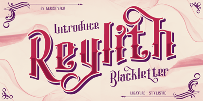 introduce Reylith fonts, a typeface inspired by tattoo letters. This font is good for logo design, Social media, Movie Titles, Books Titles, short text even long text letters, and good for your secondary text font with sans or serif. **Featured:** * Standard Uppercase & Lowercase * Numeral & Punctuation * Multilingual : ä ö ü Ä Ö Ü ß ¿ ¡ * Alternate & Ligature * PUA encoded We recommend programs that support the OpenType feature and the Glyphs panel such as Adobe applications or Corel Draw. so you can use all the variations of the glyphs. Hope you enjoy our fonts!
 - Rough Riders Redux by FontMesa,
$35.00Rough Riders Redux along with our Rough Riders font, got its start from a small sample of letters used in the logo for the Beach Creek Railroad Co. dating back to the early 1860’s. I studied the design for one year before drawing the letters. Rough Riders and the Redux version are simply the most Wildest Western looking fonts you'll find. The Rough Riders fill font is not meant to be used as a stand alone black typeface, the fill font is designed to be layered behind the regular Rough Riders font. - Doskyball by Keristyper Studio,
$14.00 Introducing a new retro pop script called Doskyball Inspired by '70s script letters. This font is good for logo design, Social media, Movie Titles, Books Titles, short text even long text letters, and good for your secondary text font with sans or serif. Featured: Standard Uppercase & Lowercase Numeral & Punctuation Multilingual : ä ö ü Ä Ö Ü ß ¿ ¡ Alternate & Ligature PUA encoded We recommend programs that support the OpenType feature and the Glyphs panel such as Adobe applications or Corel Draw. so you can use all the variations of the glyphs. Hope you enjoy our fonts!
 - Hughoney by Arterfak Project,
$17.00 Introducing our new exploration of a brush font, Hughoney . This freestyle script font is created by creative randomization the letter shapes. Gives minimalist, sweet, elegant and solid looks to your creative projects. This font has a lot of feature that you can apply as you need. The features in this font have a consistent adjustment with the basic letters. This sweet brush font is suitable for your poster, quotes, t-shirt design, menu, product design, invitation, etc. Very recommended for Headline or your display. We hope you are interested.
 - Turkuaz by Fontop,
$10.00 Welcome my new typeface family Turkuaz. Funny and stylish, creative and distinctive Turkuaz is great in headlines, premiums and web sites + blogs. Being a super readable it can be used in texts as well. Three fonts are included into the family – Turkuaz Regular, Turkuaz Deco and Turkuaz Italic. Special ligatures that you can switch on/switch off make headlines and texts sooo cute, I love them! Both OTF and TTF are included for each font. Fonts are Latin multilingual and have uppercase letters, lowercase letters, numbers and basic punctuations.
 - Vintage Heirloom by PeachCreme,
$23.00 Introducing our new gorgeous calligraphy font, Vintage Heirloom! A beautiful script for those who wish to enhance their designs with elegance and style. Vintage Heirloom includes a full set of uppercase and lowercase regular letters, numerals, punctuation, and 52 ligatures. There are three different swashes for each lowercase letter so you can easily give your designs a natural, yet sophisticated, hand-calligraphy look. Vintage Heirloom is a wonderful choice for wedding invitations, save-the-date cards, feminine branding, upscale packaging, websites, and any other projects requiring a handwritten and luxurious touch.
 - Rough Riders by FontMesa,
$35.00Rough Riders, along with our Rough Riders Redux font, got its start from a small sample of letters used in the logo for the Beach Creek Railroad Co. dating back to the early 1860’s. I studied the design for one year before drawing the letters. Rough Riders and the Redux version are simply the most Wildest Western looking fonts you'll find. The Rough Riders fill font is not meant to be used as a stand alone black typeface, the fill font is designed to be layered behind the regular Rough Riders font. - Hermione by NendesKombet,
$18.00 Hermione Classic-Modern Ligature Typeface by NendesKombet Studio Hermione is a stylish font that is classic, elegant and unique font that uses ligatures to smoothly link letters. Perfect for branding, logos, invitation, masterheads and more. Hermione has 48 ligatures, 63 alternates for upper and lower case as well as numbers and punctuation making it super versatile. Hermione is also included full set of : Uppercase and Lowercase Letters Multilingual Symbols Numerals Punctuation Ligatures Alternates Wish you enjoy our font and if you have a question, don't hesitate to drop message & I'm happy to help
 - Quietism Variable by Michael Rafailyk,
$150.00 A smooth contemplative Antiqua with aspiring to the sky ascenders, inspired by the Quietism philosophy. Clarity of the mind is achieved by bringing the body into a state of calm and contemplation, and this is reflected in the design – the quiet horizontal serifs (body) are opposed to the peaky soaring ascenders (mind). The design also features four optical size subfamilies with different x-height and contrast, oldstyle diagonal stress, oldstyle figures by default, smooth details and slightly dark texture. Variable axes: Weight, Contrast, X-Height. Scripts: Latin, Greek, Cyrillic. Languages: 480+. The complete list of supported languages: michaelrafailyk.com/quietism Kerning: 4553 class-to-class pairs. Hinting: Not applied. Format: TTF – OpenType with TrueType outlines. Variable Font: Quietism Variable provides more options than static versions, and has three axes: Weight (Thin–Black), Contrast (Low-High), and X-Height (Low-High). Variable fonts includes thousands of styles that you can access using a sliders on graphic editor or via CSS on web browser. Mixing different axes gives you extra styles not represented by static fonts. Optical Size: The typeface is represented by four subfamilies: Text (low contrast, high x-height – for paragraph 10-20 pt), Deck (medium contrast, medium x-height – for subheading 20+ pt), Display (high contrast, medium x-height – for heading 72+ pt), Poster (high contrast, low x-height – for big size 120+ pt). Small Caps: Lowercase letters and Oldstyle Figures are replaced with Small Capitals forms. Capitals to Small Caps: Uppercase letters, all figures, and some punctuation are replaced with Small Capitals forms. Case Sensitive Forms: ()[]{}‹›«»-–—•·#%‰@ and Arrows are centered on capitals. Oldstyle figures are replaced with Lining figures. Oldstyle Figures: 0123456789 #%‰. Designed to work with lowercase letters. Used by default. Lining Figures: 0123456789 #%‰. Figures are the same height as uppercase letters (cap height). Proportional Figures: Lining, Oldstyle, Small Caps, Capitals to Small Caps. Tabular Figures: Lining, Oldstyle, Small Caps, Capitals to Small Caps. Ordinals: adehnorst. Superscript, Subscript, Numerator, Denominator: 0123456789. Fractions: ¼½¾⅐⅑⅒⅓⅔⅕⅖⅗⅘⅙⅚⅛⅜⅝⅞⅟ (precomposed). Any other fractions (even those typed through a slash) will also be displayed correctly, with the automatic replacement to Numerator + fraction + Denominator. Slashed Zero: All 0 figures. Contextual Alternates: Number sign character (#) before uppercase letters is replaced by its version centered on capitals. Hyphen character (-) between two uppercase letters is replaced by its version centered on capitals. First of two TT letters is replaced by its alternate form. Letters vwy before the letters fijmnprtuvwxy are replaced with an alternate shorter versions that fits better in the context. Contextual Alternates (Greek): ΆΈΉΊΌΎΏ. Greek uppercase accented characters lose their tonos accent and retain only dieresis in All Caps and Small Caps modes. Turned on by default. If you need tonos accents in All Caps then turn off Contextual Alternates (calt) feature. Stylistic Alternates: FTГТИЦЩцщ and their versions with diacritical marks. Stylistic Set 01 “Arrows”: Left <- Right -> Up Left Right <-> Up Down North West South East \> South West Stylistic Set 02 “Round-Square Cyrillic”: ДИЙЍЛФвгджзийѝклнптцчшщьъю characters are replaced with its Bulgarian or Russian forms. Stylistic Set 03 “Cyrillic Tse Shcha short tails”: ЦЩцщ characters are replaced with its alternate form with short tail. Stylistic Set 04 “Cyrillic I full serifs”: ИЙЍӢ characters are replaced with its alternate form with inner serifs. Stylistic Set 05 “FT bent inward serif”: FTГ characters and their versions with diacritical marks are replaced with its alternate form with right head serif that bent inside. Stylistic Set 06 “Small Caps centered on Capitals”: Small Caps are vertically centered on uppercase letters. Standard Ligatures: fi fl fb ff fh fj fk ffb ffh ffi ffj ffk ffl. Discretionary Ligatures: Th ct st. Localized Forms: 52 character substitutions for Azeri, Bulgarian, Catalan, Dutch, German, Kazakh, Macedonian, Moldavian, Polish, Romanian, Serbian, Tatar, Turkish. Glyph Composition/Decomposition (Diacritics): Full Latin and based Vietnamese set of diacritics (571 characters). Precomposed.
 - Phitaya by Peterdraw,
$18.00 Let’s have fun with the sweet and fun handwritten font Phitaya that will brighten all your handy works. It is a suitable choice for children-themed work, book, logo, quote, greeting cards, quaint branding, and many more. It is also perfect for a stylish text overlay to any background image or semi-formal text. This font package consists of a full set of the alphabet from A to Z, uppercase and lowercase letters, numbering, and punctuation that available in OTF format only. For international use, Phitaya, a sweet handwritten font is supported for multilingual language so it will be a perfect match for fun and cheerful occasion. Phitaya is easy to download and uses a font that will complement your scribble works. Give a fresh and unique statement in every letter you make by using our brand-new font. Please contact our support team if you find any difficulties in purchasing, downloading, or using the font. You may also send us messages or questions regarding this or any other product of ours.
 - Gens De Baton by HiH,
$10.00 Gens De Baton is based on a charming lower case alphabet that appeared in the Almanach des Enfants pour 1886 (Paris 1886) under the heading “Amusing Grammar Lessons.” Gens De Baton means simply “Stick People.” The unknown designer turned the bare letter forms into drawings of people for the enjoyment of the children for whom the almanac was intended. The letter forms themselves were based on the French Romain du Roi (King’s Roman), except for the ‘g’ and the ‘j’ -- which were based on Baskerville. The letters ‘w’ and ‘y’ were not included, as they are seldom seen in French. We have left the letters somewhat rough, as they appeared in the Almanach des Enfants , resisting the temptation to clean up all the lines and render them with digital perfection. We have used our HiH Firmin Didot to supply an upper case and auxiliary characters, as Didot was originally a modified version of Romain du Roi. It is interesting to observe the contrast between the polished look of the Didot upper case and the rough, hand-drawn look of the lower case. Purchasers of this font have our permission to use it for the amusement of adults as well as children. We recommend setting Gens De Baton at 24 points or larger.
 - Simply Sweet by Nicky Laatz,
$18.00 Say hello to the SIMPLY SWEET Font Duo! - Two delicious new companion fonts that go together like milk and cookies. Flamboyant and curvaceous, the playful script includes a large selection of alternate characters to choose from as well as natural looking ligatures to add to the authenticity of the lettering. A collection of whimsical end and beginning swashes are also included to add a finishing touch or fill design space in your type designs. Complimenting it, is a cute little wonky all caps serif font , with double letter ligatures for a natural look. Simply Sweet Script makes custom lettering designs a dream thanks to all the little extra decorative options you can include for a pretty and unique customisation - swashes, endings, alternate letters and ligatures, all make her the prettiest little thing since tutus and tiaras.
 - Sidestroke by Ramen,
$9.00 The typeface is inspired by our love of old hand-painted signs in butchers, and based on some very quick sketches using a brush pen to find what shapes worked. There is quite a quirky element to the type, as we tried to create the original sketches by rotating the brush pen to reflect the strokes of a paint brush. This lead to a horizontal stressing, which is most noticeable in letters like C, G, S and J. Sidestroke comes in 2 styles, both a standard solid version, and a pre-shadowed outline version. This can be outlined and divided in Illustrator to quickly create an alternate coloured fill for your letters. The lowercase letters have been designed to automatically horizontally align with any uppercase letters, which is a great shortcut when creating logos or other unique type layouts.
 - Fiasco Cursive Font by BeckMcCormick,
$14.00 Introducing Fiasco Script, a bouncy modern calligraphy font. Fiasco is a clean cursive font with a feminine aesthetic, making it a perfect choice for designing feminine logos & branding, cute paper products like wedding invitation suites, or for displaying headlines on your website. Fiasco can also be used for other print design like magazines and flyers or printed marketing materials. This font can also be used for digital marketing materials and social media items! Fiasco Script’s clean edge makes it a great candidate for craft projects on your Cricut or Silhouette machine; it cuts beautifully! Fiasco Script includes: - full upper + lowercase characters - numbers + punctuation - 2 ligatures — ox, tt - PUA-encoding Extensive Language Support: Western European, Central European, South Eastern European, South American, Oceanian, Vietnamese, Esperanto Fiasco Script can be used with graphic design programs such as Illustrator or Photoshop, word processing programs like Pages or Word, Design Space for Cricut, Silhouette, Procreate, Canva Pro, Glowforge, GoodNotes, & more. This font is an installable for desktop & laptop machines, as well as iPads or iPhones. See below for links to help with installation.
 - Sophistic by Redy Studio,
$19.00 Sophistic – Luxurious Script Font Fashion and luxury are the first things that come to mind when you see or hear this font. Sophistic is an authentic and luxurious font that is dynamic with a hand-drawn stroke. It is full of life and movement which will add a modern sensibility to your graphic designs. Think runway shows, model and designer photography, fashion mags, beauty, cosmetics, and jewelry marketing campaigns. See how good it looks in tandem with other script font styles? Watch out because consumer appetite for luxe products is at an all-time high! This curly font can also be used for wedding invitations or to define your blog header. Sophistic features: A full set of upper & lowercase characters Numbers & punctuation 23 Gorgeous ligatures Uppercase beginning swashes Lowercase beginning swashes Lowercase ending swashes Lowercase alternates characters Multilingual symbols PUA Encoded Characters – Fully accessible without additional design software. Feel free to give me a message if you have a problem or question. Thank you so much for taking the time to look at one of our products.
 - Ambitious by Create Big Supply,
$17.00 Ambitious is the perfect choice for adding a cute and energetic twist to your creative projects. With its combination of uppercase and lowercase letterforms, Ambitious offers versatility and allows you to create captivating typography that stands out. Whether you're designing posters, children's books, social media graphics, or any other lively project, this font will infuse your work with a sense of joy and excitement. The font includes a comprehensive range of characters, including numbers and punctuation marks, ensuring flexibility and compatibility across various design applications. It also supports multiple languages, enabling you to communicate your message effectively to a diverse audience. One of the standout features of Ambitious is its PUA Encoding, which grants easy access to all the special characters and glyphs. This means you can effortlessly incorporate unique flourishes and creative elements into your designs. Embrace the playful spirit of Ambitious and let your imagination soar. Whether you're working on personal projects, branding, or any other creative endeavor, this font will bring a cheerful vibe to your audience's experience.
 - MGN Edinson Monospace by Morgana Studio,
$17.50 MGN Edinson is a modern typeface that is both stylish and versatile. This font is perfect for creating a sleek and contemporary design that will appeal to today's audiences. It has a minimalist design that is clean and easy to read, making it an ideal choice for modern digital applications. MGN Edinson is a monospace font that features a consistent width for each character, giving it a uniform look that adds to its modern aesthetic. Our new product, a cutting-edge mobile app, uses MGN Edinson font to give it a modern and professional look. The app features a sleek and intuitive design with a focus on user experience. The modern type of MGN Edinson font adds to the overall design of the app, creating a seamless and cohesive user interface. The monospace font is particularly useful for displaying data and statistics in a clear and organized way. The use of MGN Edinson font adds a touch of sophistication to the product, making it the perfect choice for users who demand high-quality design and functionality.
 - Mofista by ToniStudio,
$10.00 Introducing a new retro font, Mofista font, Mofista is a modern serif typeface that honors expressive old style serif typography, the Mofista font comes with alternatives that will make your presentation or logo stand out even more! This font will make your project look retro, chic and neat. Its soft, juicy serif gives the typeface just the right amount of warmth and nostalgia. While hinting at classics like Cooper, the reinterpretation features some unconventional letterforms that make for a very dynamic italic romance. suitable for many projects: invitations, postcards, posters, books, advertisements, websites, blog headers, logos, brands, magazines, fashion, photography, etc. This font is a must-have in your collection and is perfect for your next design project. Mofista Features: Mofista(Regular,Italic) Uppercase And Lowercase Numerals & Punctuation alternatif characters Multilingual Support. While using this product, if you encounter any problem or spot something we may have missed, please don't hesitate to drop us a message. We'd love to hear your feedbacks in order to further fine-tune our products. Thanks and have a wonderful day :)
 - Margita by Din Studio,
$20.00 Have you ever missed something in creating a pretty design and thought of adding your magic touch to it? Margita is more than just a script font as it expresses luxury and elegance in each character from which you will increase your sales and leave the best impressions. This font has great legibility and thickness level options to make it more special. As a result, you have more freedom of how and where you will use it. Include 8 different weight fonts: Margita Hairline Margita Thin Margita Light Margita Light Margita Regular Margita Medium Margita Semi Bold Margita Bold Features: Multilingual Options PUA Encoded Numerals and Punctuation Margita fits best for various designs, such as posters, banners, logos, book covers, headings, printed products, merchandise, social media, and more. Find out more ways to use this font by taking a look at the font preview. Enjoy your experience with this font and feel free to contact us for further product information or trouble complaints. Thank you for purchasing our font and happy designing.
 - HWT Gothic Round by Hamilton Wood Type Collection,
$24.95 Gothic Round was first introduced as wood type by the George Nesbitt Co. in 1838. The font is a softened variation of a standard heavy Gothic typeface. The style evokes a much more recent history of the 1960s and 70s and can be seen in such places as donut shops and on children's toys as well as inspiration for such fonts as VAG Rounded. Gothic Round has not previously been available as a digital font until now. The font was digitized by Miguel Sousa from a wide variety of historical sources, including visits to the Cary Collection at RIT (Rochester, NY), WNY Book Arts Center (Buffalo, NY) and the Hamilton Wood Type Museum (Two Rivers, WI). The result is a very solid and contemporary font with a 175 year history. For more information about this release, check out the Hamilton Wood Type Foundry website .