10,000 search results
(0.041 seconds)
- Stockhand by Aminmario Studio,
$20.00 Introducing Stockholm font is charming and elegant handwritten with a quick stroke pen effect. This font was created to look as close to a natural handwritten script, as possible by including lowercase alternates, ligature and underlines. Perfect for any awesome projects that need hand writing taste. Comes with regular and italic. With built in Opentype features, this script comes to life as if you were writing it yourself. What's included: Stockholm (ttf.otf.web) Stockholm Italic (ttf.otf.web) Don't hesitate if you have any questions. Thanks for checking out this font. I hope you enjoy it! AminMario
 - Cochin by Linotype,
$29.99 Georges Peignot designed Cochin based on copper engravings of the 18th century and Charles Malin cut the typeface in 1912 for the Paris foundry Deberny & Peignot. The font is named after the French engraver Charles Nicolas Cochin (1715–1790) although its style had little to do with that of the copper artist’s. The font displays a curious mix of style elements and could be placed as a part of the typographical Neorenaissance movement. Cochin is especially large and wide and was very popular at the beginning of the 20th century.
 - Donna Bodoni by Wiescher Design,
$39.50 DonnaBodoni was inspired by David Farey. He once wrote, somebody should honor the widow of Giambattista Bodoni the brave Signora Paola Margherita Dall 'Aglio for her effort to have the Manuale tipografico di Giambattista Bodoni published after his death. Since I have redesigned a good deal of Bodoni’s work and added some of my own, I thought it was my duty to do at least this for Bodoni’s unknown widow. Here is my 3-cut script in her honor. The design is remotely based on Bodoni’s English-Initials. Your honorable Gert Wiescher
 - Barle by Locomotype,
$18.00 Big is beautiful. Barle font has an extremly heavy weight and wide shape. A sans-serif display font that's perfect for large headlines, posters, packaging and any graphic design that requires a font that will stand out to audiences. Barle font has two faces, a standard character and a sliced version which can be accessed through the Stylistic Alternates feature. This font consists of 4 fonts; upright and italic style in the normal version and the outlined version. If you just want to use the sliced version, you just need to purchase Barle Alt.
 - Kurdis by That That Creative,
$32.00 Kurdis Varibel Font Family is a modern sans serif family with six widths and five Weights Making 30 Set Styles and of course 10,000 more combinations when considering the Variable options. This Typeface is a real work horse for titles. At its condensed Width it is sophisticated and professional with well considered ink traps that help it really stand out at Large Sizes. the Regular width works well for longer bodies of text on websites or posters and the Wide Styles give an elevated look to your average wide sans serif.
 - Harriella by Letterara,
$14.00 Harriella is a refined and delicate handwritten font. This lovely script font has a wide spectrum of applications ranging from greeting cards to headlines and is guaranteed to add a romantic feel to your next project. It will turn any design project into a true stand-out. Add it to your most creative ideas and notice how it makes them come alive! This font is PUA encoded which means you can access all of the amazing glyphs and swashes with ease! It also features a wealth of special features including alternate glyphs, swashes, and ligatures.
 - Revoxa by Almarkha Type,
$29.00 Revoxa – Modern Sans, Display Sans made specifically developed for contemporary design styles, made with three styles; Regular- Cut – line. These styles have been carefully designed to coat each other, creating an alternative third style. This feature allows you to adjust opacity and blending modes and different color settings, giving various possible results. very good for combining your design work with a clear line and a circle with several different weights that are very comfortable in the design area you are easy to read and as a title on a blog or magazine page
 - Chivertta by Eurotypo,
$38.00 Chivertta combines elements of casual and modern aesthetics. The font is inspired by a logo discovered on the streets of Buenos Aires. One of Chivertta’s distinctive features lies in its careful design and its wide repertoire of ligatures and stylistic alternatives. This extensive collection offers a wealth of options, allowing designers to enhance their creative output, imbuing their designs with a greater sense of authenticity and realism. In essence, Chivertta transcends convention, offering a powerful tool for designers and resulting in designs that come out with authenticity and contemporary style.
 - Bron Shadline by Jeremia Adatte,
$49.00 Bron Shadline is the semi-outline and lighter variation of the original Bron typeface. The outline adds an extra vibrancy, more contrast and bring a special shading effect out. The Shadline version has also two separate layered fonts to make your own multi-color compositions. Possibilities of editing the font are infinite : even use Bron Black Two Color One to add an extra third layer. These can be used separately to create even more subtle effects. Bron Shadline is packed with an extended character set, supporting Central, Western and Eastern European languages.
 - Arshaq by Flawlessandco,
$9.00 Arshaq is an Arabic display font that showcases an elegant and beautiful design. This font has been carefully crafted to provide a stunning appearance to every Arabic script. An Original typeface that suitable for any graphic designs such as branding materials, t-shirt, print, business cards, logo, poster, t-shirt, photography, quotes .etc This font support for some multilingual. Modern Sweet Retro that contains uppercase A-Z and lowercase a-z, alternate character, numbers 0-9, and some punctuation. If you need help, just write me! Thanks so much for checking out my shop!
 - Muifamoso by TypeClassHeroes,
$17.00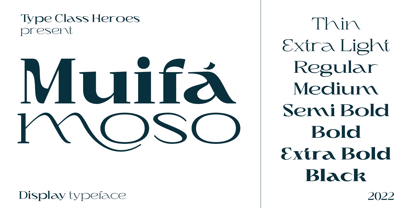 Muifamoso designed to become a elegant, this font has the potential to bring each of your creative ideas to the highest level. Combine with ligatures and special alternative glyphs so you can create a lots with layouts and compositions. Muifamoso brings a touch of luxury and bespoke custom typography to logos, websites, social media quotes, wedding branding, and more. Whats Included? Uppercase & Lowercase Number & Symbol International Glyphs Multilingual support Thank you so much for checking out my shop, and please get in touch if you have any questions!
 - Sraben Grotesk by Yukita Creative,
$14.00 Sraben Grotesk is a beautiful, versatile font that's perfect for all kinds of projects! It features balanced and harmonious proportions, plus bold variations to make certain elements stand out. This font offers classic characteristics inspired by Grotesk typography, making it an ideal choice for posters, flyers, brochures, brand identity designs, and magazine layouts. Whether you're looking to create something new or bring a creative twist to an existing project, Sraben Grotesk can be the perfect choice. Let its clean aesthetic fuel your imagination and inspire you as you achieve your design goals!
 - Kuniku by ArimaType,
$18.00 Kuniku is an unconventional sans serif font that sticks to the rules. These can easily fit into a very large set of projects, so add them to your creative ideas and see how they make them stand out. Each character is uniquely crafted and would be amazing to complement any project you're working on. Use it to create beautiful titles, beautiful invitations, stunning logos and more!! Perfect for displays, headers, invitations, save the date, weddings and more! This font is PUA encoded which means you can access all the glyphs and sweeps easily!
 - Oskal by Pesotsky Victor,
$15.00 "OSKAL" is a font that appeared as an experiment to cross the neutral grotesque and antique. The idea is to make a strange hybrid out of a simple grotesque. The serifs are added in non-standard places and make this font unusual for perception. It's a sharp and active font that you can shout at or break down walls with. OSKAL supports Basic Latin and Extended Latin, Cyrillic — in total about 90 languages are supported. The font has one Regular weight, uppercase and lowercase, punctuation. OSKAL font was designed by Viktor Pesotsky.
 - Funky Outfit by Olivetype,
$18.00 Love to be different? Mix up your design with Funky Outfit, the all caps display typeface that is fun, youthful, and playful. Funky Outfit is a striking display typeface with a distinctive personality. The quirky, energetic design of this font suits a variety of uses, ideal for headlines, logos, posters, product packaging, and more. Make your design stand out with Funky Outfit! So what’s included : Basic Latin Uppercase and Lowercase Numbers, symbols, and punctuations Multilingual Support. PUA Encoded and fully accessible without additional design software Simple Installations works on PC & Mac Thank You !
 - Sangkane Sanscript by Differentialtype,
$12.00 Sangkane sanscript is a modern bold script font. This font is a combination of uppercase and lowercase which can stand alone or as a unit. For example, sans serif uppercase can be used for titles, headlines, logos, branding or others. Lowercase that can be used for wedding invitations, greeting cards, or as complementary text in each of your designs. Of course, the uppercase and lowercase combination will stand out even more if combined. Masterfully designed to become a true favorite, this font has the potential to take your every creative idea to the highest level!
 - Collingethon by Namara Creative Studio,
$20.00 Collingethon is chic handwritten script font with a calligraphy flair, Perfect for creating handwritten-style logos, wedding stationery, photographer watermarks logos, modern websites, and more. For those of you who are needing a touch of elegant, chic and modernity for your designs, this font was created for you! Font Features Full Set of standard alphabet and punctuation. Beginning and ending swashed lowercase. Alternates, ligatures and multilingual characters. PUA Encoded | no special software needed to access extra characters. Feel free to follow, like and share. Thanks so much for checking out my shop!
 - The Jagret by Ergibi Studio,
$19.00 Jagret is a Soft and Bold serif, The many alternate character on serif makes this typeface unique and stands out rather than the regular sans font, perfectly for headlines, logos, posters, packaging, T-shirts,coffee shops, restaurants, magazine's headers, signs or gift/post cards,cafe's and weddings or any type of advertising purpose.With italic version that you can use as a complimentary! Features Regular & Italic Version Uppercase & Lowercase Number & Symbol Ligatures Multilingual and PUA Encoded If there is a problem, question, or anything about my fonts, don't hesitate to ask! Big Thanks Ergibi Studio
 - Blank Page by Ergibi Studio,
$21.00 Blank Page Font Duo, these fonts are of two types serif and script. Display Serif inspired by famous logo, This typeface has been made carefully to make sure its premium quality and luxury feel. The ligatures on serif makes this typeface unique and stands out rather than the regular serif font, perfectly for headlines, wedding, social media, logos, posters, packaging, T-shirts,coffee shops, restaurants, magazine’s headers, signs or gift/post cards,cafe’s and weddings or any type of advertising purpose. if you have any questions, don’t hesitate to contact us Ergibi Studio
 - MGN Marcelino by Morgana Studio,
$18.00 MGN Marcelino, crafted by Morgana Studio in 2024, is a captivating serif font that exudes timeless elegance. The distinctive serifs, characterized by their generous and slightly rounded contours, lend a unique charm to the typeface. This vintage-inspired font carries a sense of sophistication and nostalgia, making it a perfect choice for projects that seek to evoke a classic and refined aesthetic. MGN Marcelino seamlessly combines modern design sensibilities with a touch of the past, creating a versatile and visually appealing typeface that stands out with its bold and gracefully rounded serifs.
 - Bluzonir by Typebae,
$15.00 Bluzonir is an exquisite sans-serif font that effortlessly blends elegance and style. Featuring 52 style alternatives and 26 ligatures included in the regular variant, as well as provided separately for ease of use, with no special software needed to access them. Its versatility allows you to create visually stunning designs that stand out. Elevate your projects with the impeccable elegance and style of Bluzonir. What Includes? Character Map Features: Standard alphabet and punctuation Stylistic Alternates and Ligatures PUA Encoded - no special software is needed to access extra characters Multilingual Characters
 - Gelato Sans by Stolat Studio,
$29.00 Gelato is the Italian word for ice cream, commonly used in English for ice cream made in an Italian style. Gelato Sans designed by Ania Wieluńska is a humanistic typeface with geometric construction. It is characterised by a lot of details, which gives it a friendly and warm character. Scalable and large x height, sharp cuts makes Gelato good choice for many purposes from textes to display usage. All family consist 18 styles with italics from hairline to black. Ania was awarded a TDC Beatrice Warde Scholarship for this type family.
 - Thorowgood by Linotype,
$29.99Thorowgood was originally released by the Stephenson Blake typefoundry in the UK. The types were first cut by the English typefounder Robert Thorne, predecessor of William Thorowgood, and first shown in his specimen books in the early nineteenth century. The fat face was revived in roman (1953) and italic. The S and the C appear to be smaller than the other capitals. Most serifs are flat and thin horizontals. In the italic the main strokes of h, k, m, n, and r are curved inwards at the foot. - Autoradiographic by Typodermic,
$11.95 Ahoy there, folks! Have we got a typeface for you! It’s called Autoradiographic, and it’s inspired by those trusty old warning signs from back in the day. You know the ones…“Inflammable! Stay away!” And boy oh boy, does it have personality! Back in the post-WWII era, low waistlines were all the rage—but let me tell you, strict waistline alignment was not. No, sir! That’s where Autoradiographic comes in. It’s informational, sure, but it’s also neat as a pin and chock full of personality. And listen to this—Autoradiographic has everything you need to crunch those numbers like a pro. Mathematical symbols? Check. Fractions? Check. Currency symbols? Check, check, and check. And for those times when you really want to make an impact, Autoradiographic’s italics are narrow and loosely spaced. Now that’s what I call a typeface with some serious sass! So what are you waiting for? Grab a copy of Autoradiographic today—it comes in five weights and italics, so you’re sure to find just the right fit for your project. Don’t miss out on the chance to add some mid-century flair to your work—you won’t regret it! Most Latin-based European, and some Cyrillic-based writing systems are supported, including the following languages. A Afaan Oromo, Afar, Afrikaans, Albanian, Alsatian, Aromanian, Aymara, Bashkir (Latin), Basque, Belarusian (Latin), Bemba, Bikol, Bosnian, Breton, Bulgarian, Cape Verdean, Creole, Catalan, Cebuano, Chamorro, Chavacano, Chichewa, Crimean Tatar (Latin), Croatian, Czech, Danish, Dawan, Dholuo, Dutch, English, Estonian, Faroese, Fijian, Filipino, Finnish, French, Frisian, Friulian, Gagauz (Latin), Galician, Ganda, Genoese, German, Greenlandic, Guadeloupean Creole, Haitian Creole, Hawaiian, Hiligaynon, Hungarian, Icelandic, Ilocano, Indonesian, Irish, Italian, Jamaican, Kaqchikel, Karakalpak (Latin), Kashubian, Kikongo, Kinyarwanda, Kirundi, Komi-Permyak, Kurdish (Latin), Latvian, Lithuanian, Lombard, Low Saxon, Luxembourgish, Maasai, Macedonian, Makhuwa, Malay, Maltese, Māori, Moldovan, Montenegrin, Ndebele, Neapolitan, Norwegian, Novial, Occitan, Ossetian, Ossetian (Latin), Papiamento, Piedmontese, Polish, Portuguese, Quechua, Rarotongan, Romanian, Romansh, Russian, Sami, Sango, Saramaccan, Sardinian, Scottish Gaelic, Serbian, Serbian (Latin), Shona, Sicilian, Silesian, Slovak, Slovenian, Somali, Sorbian, Sotho, Spanish, Swahili, Swazi, Swedish, Tagalog, Tahitian, Tetum, Tongan, Tshiluba, Tsonga, Tswana, Tumbuka, Turkish, Turkmen (Latin), Tuvaluan, Uzbek (Latin), Venetian, Vepsian, Võro, Walloon, Waray-Waray, Wayuu, Welsh, Wolof, Xhosa, Yapese, Zapotec Zulu and Zuni.
 - Catalpa by TypeTogether,
$35.00 The Catalpa font family is José Scaglione and Veronika Burian’s wood type inspired design for an overwhelming headline presence. It has no regular weights, only four slender and four hulking weights. Catalpa wasn’t made to be normal; it was made to overwhelm, to stand out, to bellow. Catalpa is the first font family within a trilogy that will be released through 2020. Each of the three have a distinct purpose and their own look, but they serve a common goal: to act as a complete family covering an editorial’s wide array of needs. As the first of the three, Catalpa is the bookend font family with a headlining purpose. What requirements are there for a great headline typeface? Distinction, weight, and cohesiveness are a good start. Its distinctiveness must catch attention, it must have a range of weights applicable to its purpose, and its internal consistency and external look must create a cohesive family. Catalpa is a distinct and unified family whose weights are attuned to its single-minded purpose — headlines and large text. Catalpa has only eight styles that are divided into two ranges of weights — four very light weights (Hairline, Thin, Extralight, and Light ) and four very bold ones (Extrabold, Heavy, Black, and Extrablack). The thin and heavy ends of the spectrum also have their own variable fonts, each with one axis of weight so designers can fine-tune their work. The geometric influence of the design is more obvious in the light range, with their line thickness increasing in the classical manner. The bold weights increase more in width and substance to serve well in websites, mobile apps, posters, advertisements, and magazines that aim for impact more than spreading information. As a family, Catalpa gels in big headlines, short sentences, and isolated words. The family has many recognizable features, in the bolder weights especially, like the reversed contrast ‘S, s’ or the angular design of ‘Q, M, W, w, a, f, 2, 3’. Catalpa’s headlining mixture of geometry and quirkiness leaves an impression that is so characteristic of wood type, but designed for substrates and screens.
 - Courage by Positype,
$35.00 High-contrast? High impact? Have Courage? Eye-catching and (extra, extra) bold, Courage balances ultra-high stroke weight, delicate details, and unique letterforms with a self-indulgent passion that will make you feel a little guilty using it. Honestly, use it large and don’t try to force it into a small space, because these fearless letterforms need room to move. Flavored with both upright and italic styles, each font includes an indulgent level of alternates, swashes and titling options, visual elements and more. A backstory with a different name Years ago, I was commissioned to take my Lust typeface and produce something unique to use for large format graphics for an event…cool. It needed to be hyper-contrast with a lot of over-the-top details. With a tight turnaround, I looked for primers within my development catalogue to help me, and settled on some early work on a typeface I had drawn called Hedonist. I used those sketches and its conventions to retrofit and build out Lust Hedonist (only to see the project go bust on the client’s end). I intended to go back shortly after the Lust Hedonist release to finalize a retail version of the OG Hedonist, but I never could settle on the look of the 'g' or the numerals, got distracted with other projects, and never picked it back up… until last year. After randomly doodling a fat, flat ‘g’ with an extremely tilted counter axis, I knew immediately how it could be used and that (re)set things in motion. Only problem was, in the process of refining the letterforms I began truly dissecting the pieces, rediscovering all of the recklessness within Hedonist, and decided on fundamentally rewriting the approach to the typeface… literally flaying it to the bone. I’m much, much happier with this finished typeface now, but the name no longer fit the moniker given to the first, adolescent approach—there’s far more audacity and cleverness in these letterforms, tenacious in their resolution now. As a result, the name Courage fit the mettle of this typeface so much more, so I kept it.
 - TT Cometus by TypeType,
$19.00 Dynamic, attractive and catchy - the new TypeType display font! Please note! If you need OTF versions of the fonts, just email us at commercial@typetype.org TT Cometus is an expressive typeface that captivates from the first time you read a text set in it. Despite its massiveness, the typeface is malleable and dynamic, like a comet piercing the space in order to achieve the only goal - to capture the attention of the viewer. TT Cometus is a slab serif whose strong serifs are serifed at the junctions with the vertical stroke to give the typeface a dynamic and modern character. Thanks to this solution, some elements of the font evoke associations with calligraphic works, while display elements remain stable thanks to massive serifs. The pointed endings of the letters c, y, e, t and noticeable inflows of arches and semi-ovals make the character of TT Cometus dynamic. The contrast between the thicknesses of the horizontal and vertical elements is small, but in the serifs, inflows, and letter endings, the contrast is pronounced. The nature of the font is balanced, and its friendliness is supported by the smoothness of shapes. Oriented towards the viewer, flowing yet massive and dynamic, TT Cometus is suitable for use in eye-catching projects. This is a display font that shows its character better in a large body size and can be used in printed materials or on the web. The font looks flawless in headlines and logos, and is suitable for use in branding. TT Cometus consists of 5 faces: 4 upright and one variable font. Each face has 568 glyphs. The font contains 18 OpenType features, including a large number of ligatures, sets of alternative characters for the ampersand and the letter g.
 - Supernett cn by FaceType,
$19.90 ›Hi! Please note you are visiting Old Supernett. We decided to upgrade it: more styles, more glyphs, more features, more everything! View New Supernett here: Supernett 2019› Georg from FaceType Supernett – a versatile hand drawn/handmade/handwritten font – is tailored for large font sizes but also impresses with an astounding legibility in small typesettings. Supernett is fairly condensed for space-saving headlines. The extensive character set supports Central and Eastern European as well as Western European languages. Each style contains more than 4700 glyphs to let the font look real hand-made. Three OpenType features are specially created to enhance this impression, with a maximum effect when applied to big type: Alternating Letters For a truly hand-drawn look, letters and numerics alternate randomly between three different variants → activate Contextual Alternates Rotating letters All glyphs rotate randomly and slightly around their own axis → activate OpenType Swashes Varying Baseline Shift Each single glyph moves individually up or down → activate OpenType Titling Alternates More OpenType Features: Case Sensitive Forms This feature shifts various punctuation marks to a position that works better with all caps typography → It is deployed when an app’s all-caps styling is applied Slashed Zero The problem with the numeral 0 is that it can look too much like O in some typefaces. This feature replaces every zero with a slashed zero → activate Zero with a Slash Fractions Substitutes figures separated by a slash by proper fraction glyphs. A date however, written like 10/12/2013 will remain unchanged → activate Fractions Stylistic Set 03 Choose between two different styles of bullet (•) → activate Stylistic Set 03 Stylistic Set 04 Choose between two different styles of Y → activate Stylistic Set 04 View other fonts from Georg Herold-Wildfellner: Sofa Serif | Sofa Sans | Mila Script Pro | Pinto | Supernett | Mr Moustache | Aeronaut | Ivory | Weingut
 - Linotype Funny Bones by Linotype,
$29.00Linotype Funny Bones is part of the Take Type Library, chosen from the contestants of the International Digital Type Design Contests of 1994 and 1997. The font was designed by the German artist Ingo Preuss and is available in two weights, one and two. Linotype Funny Bones one consists of two different alphabets containing only capital letters and offers a variety of interesting combinations. Weight two and one set of capitals of weight one are somewhat light and delicate, while the other set of capitals of weight one are of a strongly constructed nature, which makes for a good contrast. The carefully constructed details of the font detract from its legibility, but Linotype Funny Bones is perfect for short texts and headlines in point sizes larger than 12. - 1512 Initials by GLC,
$20.00 This set of initial decorated letters is an entirely original creation, drawn inspired by Italian renaissance patterns. It contains two roman alphabets : one drawn in white on black background and the other in black on white. We have included a few fleurons and decorative elements. It can be used as variously as web-site titles, posters and flyers design, publishing texts looking like ancient ones, or greeting cards, all various sorts of presentations, as a very decorative, elegant and luxurious additional font... This font supports strong enlargements remaining very smart and fine. It's prefered height is about one inch equivalent to about four lines of characters. This font may be used with all blackletter fonts, but works especially well with 1543 Humane Jenson, 1557 Italique and 1742 Civilite, without any anachronism.
 - Kidros by Alit Design,
$15.00 Introducing KIDROS Typeface The KIDROS font is designed with a sans serif font concept that has a retro display stencil style. Irregular dynamic shapes but impressively regular and unique make the font "KIDROS" different and steal attention. Sans serif typefaces such as "KIDROS" are very easy to apply to any design, especially those with an retro, vintage and strong, besides that this font is very easy to use both in design and non-design programs because everything changes and glyphs are supported by Unicode (PUA). The "KIDROS"contains 540 glyphs with many unique and interesting alternative options. Plus, there's a cool sans serif font family for header and description text from thin to heavy to thin. In the poster preview all the letters are in the KIDROS typeface.
 - Ador by Fontador,
$24.99 Ador is a humanist sans serif especially designed for contemporary typography and comes up with 8 weights from ultralight to black plus true italics and 343 ligatures. A large x-height not only creates space in the letters for extra-bold styles, but also lends Ador an open and generous character in the more narrow and semi-bold versions. The nice balance between sharp ink trapped and soft, dynamic shapes helps to work in small sizes. Diagonal stress, angled finials and the 4 degree true italic styles give Ador a dynamic look. The font contains 981 glyphs including small caps, tabular, old style, fractions … and a wide range of flexibility for Latin language support for every typographical needs. Ador is a contemporary sans serif typeface, special for logotypes, brands, magazines and editorial.
 - Bogdan by ParaType,
$30.00 An original script font designed by Victor Kharyk and licensed by ParaType in 2006. Based on Ukrainian Skoropis (fast handwriting) of 16-17th centuries. The font was named after Ukrainian Getman Bogdan Khmelnitsky, because the main sources and inspirations for the project were taken from collection of handwriting Universals (decrees) of that time -- the middle of 17th century. The shape of letters imitates flat nib quill handwriting with stress, bringing them informal liveliness. The Bogdan font character set contains Cyrillic, Old Slavonic , Glagolitic, Latin and Greek alphabets in two variants: Rejestrowy (Regular) and Siczowy (Alternate). The font is for use in display typography, but can work quite well for short text setting. Bogdan type is well suited for historical and cultural texts associated with Europe of 15-17th centuries
 - Blueberry Spot by Kaer,
$14.00 I’m glad to present my new hand-drawn typeface Blueberry Spot. The clearances in some letters are filled as if somebody put a blueberry blot in them. Also, I created the second style of this font. If you don’t want blots use a clear style. This font is perfect for making your project look pleasantly scruffy, handmade. Use it for nice identity, funny craft package, blog posts, holidays poster, etc. What's included? Regular and Clean styles Uppercase and lowercase Multilingual support Numbers Symbols Punctuation I hope you enjoy this font. Follow my shop to receive updates of products and the very hottest news! If you have any question or issue, please contact me: kaer.pro@gmail.com Please request to add additional characters and glyphs if you need! Thank you!
 - Geis by Galapagos,
$39.00In 1978 I went to work at Mergenthaler as a letter drawer. Being an inquisitive sort I decided that I should take a stab at this type design 'stuff'. I drew 25 or 30 glyphs before the work found its way to a high shelf in a dark corner of my apartment. Just 23 years later I found the drawings on a different shelf, in a different home, in a different city and decided to finish what I had started. I'm still trying to deal with my predisposition toward procrastination but I've finished the font. The name of the font is the last name of somebody I played softball with before I moved to Beantown. Ronnie Geis was one of the courageous firefighters we lost on September 11th when the WTC collapsed. - MFC Vice Monogram by Monogram Fonts Co.,
$19.95 The source of inspiration for Vice Monogram is an Art Deco letterset (capitals only) from a 1915 publication by Cartier-Bresson of Paris containing classic and modern monogram patterns for embroidery. This Art Deco monogram style has been redrawn, balanced, and brought into the digital age for your type-setting use and enjoyment. Vice Monogram can create one-, two-, or three-letter monograms as well as basic headline and titling settings. By default, Vice Monogram types in a horizontal format, but by utilizing Opentype Contextual Alternates, you can typeset in a three smallcap or smallcap-Capital-smallcap diagonal format as well! It is a refined vintage look that is perfect for a wide array of classic personalization settings. Download and view the MFC Vice Monogram Guidebook if you would like to learn a little more.
 - Opticum by ParaType,
$25.00Font family Opticum is not just a set of fonts, it’s a maze construction kit that hides letters inside. Each inscription is a little brain-twister with variable difficulty, where the level is defined by the style. The third one is the most difficult. When you type with these fonts you fill the space entirely without spaces because characters in the fonts don’t have side bearings and the leadings are set to zero. This converts you into an artist who produces geometric abstractions containing verbal messages. Texts set with this font not only catch an eye, but keep it for a long time. The duration of attention period can be adjusted by selection of the font style. The third one keeps longer. Opticum was designed by Erken Kagarov and released by ParaType in 2009. - The Sculptor by Comicraft,
$39.00 In much the same way that the leading character in Scott McCloud's first full-length graphic novel has given his life to art, Comicraft's John 'JG' Roshell has given HIS life to sculpt a unique font to suit it. Well, not his LIFE, but at least a couple of days. However, unlike the eponymous hero of THE SCULPTOR, you don't have to make a deal with Death to get your own copy of The Sculptor font! You too can letter anything with your bare hands! And a keyboard. And a computer. And some operating programs and software, obvs. Because creating anything is always going to be harder than you think, especially when you have only 200 days to live. Not you, The Sculptor. In all good bookstores now!
 - Cordelia by PintassilgoPrints,
$20.00 Impacting and vibrant, Cordelia family draws inspiration from covers of 'cordel literature’, small booklets of popular story-poems that played an essential role on the folk-popular cultural life of Brazil. Printed in coarse paper, usually with an woodcut illustration and lettering in the front, these booklets were sold on the streets, in marketplaces and town squares, hung in a cord - therefore the name ‘cordel’. The work of these humble printers and poet-singers of northeastern Brazil strongly served as source for acclaimed romances and movies and still inspires writers of all genres, movie makers, painters, musicians. And type designers too :) Cordelia doesn’t bring a picture font yet, but it goes pretty well with Chronic and Manicuore illustrations. It goes well with and without them. It definitely goes well. You bet!
 - Nougat Script by Sudtipos,
$59.00 The first glyphs of Nougat Script were born in 2010 to honor the birth of my first chubby and charming daughter, Siena. The ongoing project with significant progress was presented at Tipos Latinos, the biennal of Latin America typography where Nougat Script was selected among 70 of the best fonts. After a long pause, the project had a powerful restart at the begining of 2018. In those days, it not only grew in number of signs but in complexity of behavior. There are 4 different types of writing within the same font file accesible via opentype features: Script (base or normal), two glyphic alternatives with well differentiated swashes and finally a small cap version. Nougat Script has a fresh and relaxed lettering attitude combined with the typographic harshness for elegant text compositions.