10,000 search results
(0.035 seconds)
- Dancing Fool by PizzaDude.dk,
$15.00 A Dancing Fool is not always meant as a positive thing - but in this case it is 100 percent positive and innocent. It's just about someone who is dancing in a foolish way. A good way to describe this font, because it is silly looking, but not in any offensive way!
 - Codswallop by Hanoded,
$20.00 The origin of the word Codswallop is uncertain, but it might have something to do with a 19th century English soft drink brewer named Hiram Codd. Codswallop is a beautiful hand drawn font. A little weird, a tad grotesque and a wee bit over the top, but fun and useful nonetheless.
 - Wolves, Lower - Unknown license

- Antelope H - Unknown license

- Doctor Azul - Unknown license

- Melanie - Unknown license

- Tombats Smilies - Unknown license

- Odaiba Soul by Megami Studios,
$12.50 The second in our Cool Japan series, Odaiba Soul echoes back to some of the futuristic amusement centers and entertainments found on Odaiba Island in Tokyo Bay. Tailored for sci-fi lettering, anime awesomeness or even just making flyers for a day trip across the Rainbow Bridge, this is one to keep in mind!
 - Harmond by Dirtyline Studio,
$25.00 Harmond a new fresh & modern serif with a strong style, a dancing baseline! So beautiful on invitation like greeting cards, branding materials, business cards, quotes, posters, and more! Harmond Display Typeface is the part of a strong and modern display family. This typeface both impressive at display sizes and easily readable in text size, while the sharp shapes of the triangular serifs and the distinctive letter shapes show their strength in logo design and impressive editorial use. Harmond come with elegant style, strength and contrasts, with features an extended latin character set of 470 glyphs covering over 88 languages. Casta is ready to be like a top model on the design catwalk, making your projects looking classic but contemporary, finely tuned but assertive, and elegant as the best luxury fashion.
 - Eterea by Corradine Fonts,
$60.00 Eterea is a formal font inspired in the monumental inscriptions of classic Rome, but not strictly sticking to the ancient roman typographic characteristics. Its unique look is the result of mixing diverse typographic styles, but mostly having traces from the 16th century transitional style. It bears a big difference of proportion between upper and lower case, additionally to the upper case having much more ornamental traces. Eterea has four different flavors of capitals which change very slightly in the cursive versions. In the italic versions, the lower case (actually small capitals) changes substantially its characters to make its reading more flowing and is not simply an inclined version of the letters. Eterea is a very expressive font, ideal for titles and short texts of sober and elegant appearance.
 - Wagon by Dirtyline Studio,
$25.00 Wagon a new fresh & modern serif with a strong style, a dancing baseline! So beautiful on invitations like greeting cards, branding materials, business cards, quotes, posters, and more! Wagon Display Typeface is part of a strong and modern display family. This typeface is both impressive at display sizes and easily readable in text size, while the sharp shapes of the triangular serifs and the distinctive letter shapes show their strength in logo design and impressive editorial use. Wagon comes with elegant style, strength and contrasts, with features an extended latin character set of 415 glyphs covering over 87 languages. Wagon is ready to be like a top model on the design catwalk, making your projects look classic but contemporary, finely tuned but assertive, and elegant as the best luxury fashion.
 - Lucida Console by Monotype,
$50.99 Kris Holmes and Charles Bigelow designed Lucida Console in 1993 for on-screen console and terminal emulation windows that needed monospaced fonts with sturdy letter shapes. Lucida Console has simple, clear, robust letterforms, a big x-height, and economical fitting. It looks large on-screen and in print but takes up less space than traditional typewriter and monospaced fonts. Its short capitals were originally technical adaptations to user interfaces on computers, but its compact look and active italic appeals to typographers and designers for a wide variety of uses, including in games and digital devices. The Lucida Console family has 675 glyphs in each font, and supports the WGL and W1G character sets. This includes the Extended Latin, Greek, and Cyrillic alphabets along with a generous set of symbols, box-draw, and graphical characters.
 - ITC Styleboy by ITC,
$29.99 Although ITC Styleboy has a retro feel, it isn't based on any earlier typeface. As far as inspiration goes," says designer Chester Wajda, "I'd have to say comic strips of the '20s and '30s, and silent-film marquee lettering from the '20s - with a hint of a Chinese brush?" He originally created the typeface for a children's book he was working on. "I wanted it to be fun, but still somewhat formal in its underlying structure," he says. "It's largely based on right and 45-degree angles, with slight tucks inward on the stems and bowls, and a few flourishes here and there." Styleboy's top-heavy look is most noticeable in the caps, but it's exaggerated too in the "8" and the lowercase "g." Styleboy is Wajda's first typeface design."
 - Slim Pickens by Dear Alison,
$19.00Have you ever seen lettering that you can connect with but have no clue where you've seen it before? It strikes a chord with certain feelings but you don't know why. Slim Pickens was inspired by the lobby card and poster titling from the 1949 Doris Day film "My Dream is Yours", and keys into the look and feel of vintage handwritten film poster titling. Something about that era in film made it easy to tie visuals with getting swept up in all sorts of emotions, good and bad. A narrow font, full of life and wonderfully hand-drawn, Slim Pickens is an accent font you'll want to have in your font collection for those tight fits, so buy it today and fill in the gaps of your designs with a little nostalgia! - Fortezza by Eurotypo,
$22.00 Fortezza is a family of fonts inspired by the great masters who have created the Modern Roman style: Firmin Didot (1764 -1836) and Giambattista Bodoni (1740 -1813) Both typefaces can be similar, but a trained and close vision, show clear differences in the final result, like its weight and the degree of transition of the strokes. The type of Didot suggests greater warmth and elegance, they are characterized by extreme contrast in thick strokes and thin strokes, by the use of serifs very thin and by the vertical stress of the letters. while the Bodoni type conveys a greater robustness and hardness. Fortezza brings together the elegance and spirit of both types, but proposes a contemporary vision, establishing a distance with certain features typical of the baroque that was manifested at that time.
 - Polygraph by PintassilgoPrints,
$29.00 Inspired on posters by the extraordinary polish artist Leszek Żebrowski, Polygraph is a highly unusual face. Packed with eccentric alternates, it is an all-caps font with four exchangeable variations for each letter. These alternates are programmed to cycle when the font is used in OpenType-savvy programs, creating a random effect on glyphs distribution. The resulting pieces are truly outstanding, with an audacious handmade twist. To achieve this, just turn on the contextual alternates feature and play – you can easily try different glyphs sequences by adding spaces before words. When you need a more well-behaved look, but still with a subtle hand-drawn flair, turn off the contextual alternates and set text in uppercase. Polygraph comes in two weights, for added flexibility. But be warned: it’s quite addictive!
 - Like Butterflies by Bogstav,
$10.00 Now here's a font that is named Like Butterflies, but has got nothing to do with butterflies! What? Why? Well, I recently heard the song "Even flow" by Pearl Jam and took a trip down memory lane - back to my early twenties. I remember how the lyrics affected me, and had an impact on how my life changed the years to follow. Maybe the style of the font does not reflect the inner meaning of the song, but it does reflect a look back in time for me - and the change that took place. Nevertheless, I hope you enjoy the somewhat simple, handmade style of Like Butterflies and the 4 versions that works very well together! Please notice that each letter has got 5 slightly different versions to choose from!
 - Razom Script by DizajnDesign,
$39.00 Razom Script is a typeface with deep roots in pointed brush calligraphy that takes advantage of current font technology to go beyond handwriting and reach new limits. A successful blend between printed and handwritten letterforms is visible when comparing upper and lowercase. The weight of the typeface evolve in a way that pushes the limits of a script typeface to suggest new uses. Normally, families are developed in weights, not proportions. Also, having several weights in a script family is rather rare. But in Razon Script, as the fonts gain weight, big differences show up in the font outlines: the thin weight looks soft and delicate but as we examine darker variables, they also seem to get broken. The counters of the letters rotate from vertical to horizontal during this process.
 - Keratine by Zetafonts,
$39.00 The letterforms that we now accept as the historical standard for printing latin alphabets were developed in Italy around the end of 1400. Deriving from Roman capitals and from italic handwriting, they soon replaced the blackletter letterforms that were used a few years before by Gutenberg for his first moveable types. Between these two typographical traditions there's an interesting and obscure middle ground of historical oddballs, like the Pannartz-Sweynheym Subiaco types, cut in Italy in 1462. Keratine is the result of Cosimo Lorenzo Pancini's exploration of that territory. Like our Kitsch by Francesco Canovaro it explores the impossible territory between antiqua and blackletter, not as a mere historical research, but rather as a way to re-discover and empower an unexpected and contemporary dynamism. Using contemporary digital aesthetics to combine the proportions of humanistic type with the gestural energy of Fraktur letterforms, Keratine develops a "digitally carved", quasi-pixelated appearance (clearly stressed in Keratine's italics) that allows an unexpected balance between small-size readability and display-size personality. Keratine also relies heavily on a variable identity as the letterforms change dynamically with weight, developing from a contrasted, text-oriented light range to more expressive and darker display range, for a total of 8 weights with italics. Open type features and glyph alternates further enrich the usage possibility of this typeface that embodies our contemporary swap culture by embracing the contradictory complexity at the crossroads between Gothic and Humanist styles, while playfully empathising with a digital, brutalist spirit.
 - IC Havolane by Ironbird Creative,
$7.00 Havolane, A display serif font with a modern vintage twist, ideal for branding, headlines, and packaging. Havolane offers two styles, "Regular" and "Inked," to add versatility and depth to your designs. Perfectly complements sans-serif fonts, making your creations stand out effortlessly.
 - Black Manta Brush by Creaditive Design,
$12.00 Black Manta is a strong charactered, brushed display font. It looks fierce and urban and it will most certainly make each of your designs stand out. Add it confidently to your favorite creations and let yourself be amazed by the outcome generated.
 - Sweet Mia by Angele Kamp,
$24.00 Sweet Mia is a playful modern calligraphy font with a dancing baseline. This sweet font has nice smooth lines and is perfect for crafters and cutting machines. Sweet Mia will look gorgeous on cards, mugs, quotes, logos and all your other lovely projects.
 - Anjara by 611 Studio,
$15.00 This typeface got its name from "anyar", which means "new/modern" in local Indonesian (Javanese). Just like it's name, this typeface gives a modern and simple look. Anjara's medium contrast makes it easily stand out in any compositions, especially it's bold version.
 - Scratchedman by OCSstudio,
$12.00 Scratchedman Font is a natural handwritten font. This All Caps typeface is strong to stand out in your design projects. Scratchedman Font has two font styles Regular and Italic so you can customize it in your design project, as well as multilingual support.
 - The Inlines by Okaycat,
$19.50 The Inlines is available in two styles - inlined, or non-inlined. A distinctive font set for logo creation, titling, and more. Check it out! The Inlines is extended, containing West European diacritics and ligatures, making it suitable for multilingual environments and publications.
 - Oatlander by Almarkha Type,
$29.00 Introducing, Oatlander ! A bold script that will stands out from the crowd! Perfect to be used as logotype, badge and label! This has many opentype features like stylistic alternate,and support multi language. if you have any Question please Message Me. Thank You
 - Hermaphrodite by Volcano Type,
$29.00Hermaphrodite was developed for the Bastard Project and had its origin in the idea of applying the process of an Antiqua on a Grotesque. In other words, a Grotesque font was drawn calligraphically and then digitized. Some inconvenient corners were simply cut off. - Chop Phooey by Pink Broccoli,
$14.00 An offbeat typeface inspired by the titling of the 1969 Pink Panther cartoon starring the Aardvark, "Technology, Phooey". It contains an alternate H and T, as well as a handful of ligature swap outs for doubles like EE OO SS TT, etc.
 - Yenda by Deniart Systems,
$20.00 Yenda is a bold angular font with just a bit of swoosh. Great for short text and headlines! Don't leave this one out of your next sci-fi or bold designs! This typeface includes all the special diacritics required for European languages.
 - Fathers by Konstantine Studio,
$18.00 Introducing Fathers, Inspired from the vintage classic old packaging and advertising back in 1950 - 1980's era. perfectly fit for your classic packaging, vintage logo branding, old poster and advertising. Get the easy forefathers feel by just type it out to your design.
 - Pique-Nique NF by Nick's Fonts,
$10.00 The 1895 specimen book from American Type Founders included the pattern for this face, originally called Outing—Art Nouveau with a laid-back vibe. Both versions of this font support the Latin 1262, Central European 1250, Turkish 1254 and Baltic 1257 codepages.
 - Queasily by Ali Hamidi,
$10.00 Queasily is a superb single line font that will make your work stand out through its elegant and simple lines. It is perfect for product packaging, branding project, magazine covers, social media, wedding, or just used to express words above the background.
 - Astarie by Yukita Creative,
$12.00 Astarie is a modern sans with a trendy and not stiff style that will make your poster, cover, or logo more stunning and stand out! This font supports Multi-Language. This font will go well with logos, headlines, titles, and minimal layouts.
 - Raifin by Hooper Type,
$9.99 Out with the old in with the BOLD. Raifin is a messy, gory and fantastical piece of work which shoves two fingers up at conformity. A title font, a copy font, a bonkers font. An experimentation of the rules, or lack thereof. Enjoy!
 - El Mayor by Typefactory,
$15.00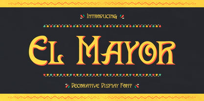 El Mayor is a decorative display font. The font has festival vibes. It will turn any design project into a stand out. El Mayor font is really great for a restaurant menu, business branding, clothing, quotes, headings, birthday invitations, posters, and many others.
 - Advertisers Gothic by Monotype,
$29.99AdvertiserÆs Gothic Light, from a volume of headline fonts, was designed by Robert Wiebking in 1917. Wiebking was a skilled type engraver from Chicago who created his own pantographic machine, used to cut punches drawn by other successful type designers, including Frederic Goudy. - Somatype Skwosh by ArtyType,
$10.00 Somatype Skwosh was born out of a desire to ignore traditional rules for condensed character forms in favour of contrasting vertical and horizontal thicknesses and the interesting shapes produced by re-scaling along only one axis. Somatype Bold was the starting point.
 - No Liming by chicken,
$17.00 A chunky, laid-back typeface inspired by a hand-painted notice on the doors of a mechanic's workshop in Plymouth, Tobago. Two different mostly-uppercase alphabets in one font help to keep things loose. 'Liming'? hanging out, drinking rum, shooting the breeze...
 - Vetto Cosellza by Graphicfresh,
$8.00 Vetto Cosellza - Handwritting Font Introducing Vetto Cosellza Handwritten Font. It comes with an elegant and feminine style which is perfect to make any design stand out! This font is perfect for branding, wedding invites, magazines, mugs, business cards, quotes, posters, and more.
 - Revitale by FallenGraphic,
$17.00 Revitale is stands out as a diverse selection of typefaces, beautiful alternates character that maintain a coherent look and feel throughout. font is perfect for branding, headings, signatures, logos, blog, wedding invitations, t-shirts, letterhead, merchandise, signage, lable, news, posters, badges etc.


