10,000 search results
(0.082 seconds)
- Benson Script by Kyle Wayne Benson,
$10.00 Benson Script is a script that is desperately trying to be anything but a script. With 3 contrast levels, and 2 styles, the six styles of Benson Script are an experiment in the diversity of a single stem width. Modernism’s desire to fit all elements within geometric constraints and adhere to strong verticals has spread throughout type design, but has had little to do with the frills and ornaments of script. Cutting a script down to its bare bones is an offensive idea to many—almost seeming insulting to its genre. Benson Script bridges that genre gap between frill and function. As a matter of genre Benson Script errs on the side of modernism, and adds flair as a last resort. Read more about her open type features, and the development process here.
 - Hymers JNL by Jeff Levine,
$29.00 Born on May 8, 1892 in Reno Nevada, Lewis Franklin (“Lew” ) Hymers left an indelible mark as a caricaturist, cartoonist and graphic artist. At the age of twenty [in 1912] he worked for the San Francisco Chronicle. During World War I he worked for the Washington Post. He even was employed for a time by Walt Disney as an animator - but most of his life was spent in either Tujunga, California or his birthplace of Reno, Nevada as a self-employed illustrator. Hymers inked a feature for the Nevada State Journal called “Seen About Town”, which was published during the 1930s and 1940s. In this panel, he caricaturized many of the familiar faces around Reno. He also designed signs, logos, post cards and numerous other commercial illustrations for clients, but what has endeared him to a number of fans was his vast library of stock cuts (the predecessor to paper and electronic clip art) which feature his humorous characters in various professions and life situations. So popular is his work amongst those “in the know” that a clip art book collection of over seven hundred of his drawings that was issued by Dover Publications [but long out of print] commands asking prices ranging from just under $15 to well over $100 for a single copy. Lew Hymers passed away on February 5, 1953 just a few months shy of his 61st birthday. Although his artwork depicts the 1930s and 1940s lifestyles, equipment and conveniences, more than sixty years after his death they stand up amazingly well as cheerful pieces of nostalgia. The twenty-seven images (and some variants) in Hymers JNL were painstakingly re-drawn from scans of one of his catalogs and is but just a tiny fraction of the hundreds upon hundreds of illustrations from the pen of this prolific artist.
 - RePublic by Suitcase Type Foundry,
$75.00In 1955 the Czech State Department of Culture, which was then in charge of all the publishing houses, organised a competition amongst printing houses and generally all book businesses for the design of a newspaper typeface. The motivation for this contest was obvious: the situation in the printing presses was appalling, with very little quality fonts existing and financial resources being too scarce to permit the purchase of type abroad. The conditions to be met by the typeface were strictly defined, and far more constrained than the ones applied to regular typefaces designed for books. A number of parameters needed to be considered, including the pressure of the printing presses and the quality of the thin newspaper ink that would have smothered any delicate strokes. Rough drafts of type designs for the competition were submitted by Vratislav Hejzl, Stanislav Marso, Frantisek Novak, Frantisek Panek, Jiri Petr, Jindrich Posekany, and the team of Stanislav Duda, Karel Misek and Josef Tyfa. The committee published its comments and corrections of the designs, and asked the designers to draw the final drafts. The winner was unambiguous — the members of the committee unanimously agreed to award Stanislav Marso’s design the first prize. His typeface was cast by Grafotechna (a state-owned enterprise) for setting with line-composing machines and also in larger sizes for hand-setting. Regular, bold, and bold condensed cuts were produced, and the face was named Public. In 2003 we decided to digitise the typeface. Drawings of the regular and italic cuts at the size of approximatively 3,5 cicero (43 pt) were used as templates for scanning. Those originals covered the complete set of caps except for the U, the lowercase, numerals, and sloped ampersand. The bold and condensed bold cuts were found in an original specimen book of the Rude Pravo newspaper printing press. These specimens included a dot, acute, colon, semicolon, hyphens, exclamation and question marks, asterisk, parentheses, square brackets, cross, section sign, and ampersand. After the regular cut was drafted, we began to modify it. All the uppercase letters were fine-tuned, the crossbar of the A was raised, E, F, and H were narrowed, L and R were significantly broadened, and the angle of the leg and arm of the K were adjusted. The vertex of the M now rests on the baseline, making the glyph broader. The apex of the N is narrower, resulting in a more regular glyph. The tail of Q was made more decorative; the uppercase S lost its implied serifs. The lowercase ascenders and descenders were slightly extended. Corrections on the lower case a were more significant, its waist being lowered in order to improve its colour and light. The top of the f was redrawn, the loop of lowercase g now has a squarer character. The diagonals of the lowercase k were harmonised with the uppercase K. The t has a more open and longer terminal, and the tail of the y matches its overall construction. Numerals are generally better proportioned. Italics have been thoroughly redrawn, and in general their slope is lessened by approximatively 2–3 degrees. The italic upper case is more consistent with the regular cut. Unlike the original, the tail of the K is not curved, and the Z is not calligraphic. The italic lower case is even further removed from the original. This concerns specifically the bottom finials of the c and e, the top of the f, the descender of the j, the serif of the k, a heavier ear on the r, a more open t, a broader v and w, a different x, and, again, a non-calligraphic z. Originally the bold cut conformed even more to the superellipse shape than the regular one, since all the glyphs had to be fitted to the same width. We have redrawn the bold cut to provide a better match with the regular. This means its shapes have become generally broader, also noticeably darker. Medium and Semibold weights were also interpolated, with a colour similar to the original bold cut. The condensed variants’ width is 85 percent of the original. The design of the Bold Condensed weights was optimised for the setting of headlines, while the lighter ones are suited for normal condensed settings. All the OpenType fonts include small caps, numerals, fractions, ligatures, and expert glyphs, conforming to the Suitcase Standard set. Over half a century of consistent quality ensures perfect legibility even in adverse printing conditions and on poor quality paper. RePublic is an exquisite newspaper and magazine type, which is equally well suited as a contemporary book face. - ITC Simran by ITC,
$29.99ITC Simran was created by the London designer Satwinder Sehmi in 1998. The Indian influence is recognizable at first glance and lends the font an exotic feel - at least to the western eye. Sehmi borrowed forms and feelings from northern Indian writing systems for this typeface. Both the upper and lowercase letters make use of the same lowercase forms, but the upperacse letters have the addition of a horizontal bar running over them at the ascender height. This feature is directly reminiscent of writing systems in northern India, and is ITC Simran's most distinguishing characteristic. But there were other influences as well: Sehmi was also inspired by uncial forms when designing this typeface. ITC Simran exhibits the typical look of writing with a broad-tipped pen, with its strong strokes, as well as characteristic letter forms, for example, the a or h. ITC Simran is a fascinating and harmonious symbiosis of a variety of influences from different cultures. This font is best used for headlines and short texts in point sizes of 12 and larger. - Big Fish by Fenotype,
$30.00 Big Fish is a low contrast Script and Slanted Casuals with bold characters. Big Fish has three weights of Script and a set of Extras that can be used as themselves or combined with script charters for custom swashes. Big Fish is packed with OpenType features: Keep on Contextual Alternates and Standard Ligatures for better flow and try Swashes to spice up your words. Big Fish Casuals is a sturdy casual lettering font with same stroke shapes as the script. Casuals works great with the script but is also a strong font by itself. All Big Fish fonts have wide language support and cover even Cyrillic alphabets. Big Fish is a tremendous pack for any display use from branding to packaging and online to print.
 - Areno by BoxTube Labs,
$24.00 Areno was our first ever font family, released in 2017. We’ve learned a lot since then and made the decision to redraw it from scratch with improved letterforms, better readability and added language support. Most adjustments are very subtle, but some glyphs have gotten a complete makeover. We've also added lowercase letters to the family. Areno is a strong and bold sports block font. These fonts are perfect for sports logos, branding, posters, apparel design, magazine headlines, labels and so much more. Areno now features a full Adobe Latin 1 Character Set with support for most Western European languages including Afrikaants, Basque, Breton, Catalan, Danish, Dutch, English, Finnish, French, Gaelic, German, Icelandic, Indonesian, Irish, Italian, Norwegian, Portuguese, Sami, Spanish, Swahili and Swedish.
 - York Handwriting by Thinkdust,
$10.00 A hand-drawn font inspired by the menu from a tearoom in York. York Handwriting is simple but with accentuated features, creating an effect that is decorative and distinct while still being clear. Giving the look of chalk or wet-wipe pens, this font will provide you with texture to make your work stand out, almost literally. With York Handwriting, any design can be granted the humble, homely look of a small, side-alley tearoom, especially with the emphasised x-height helping the text to stand out.
 - Hannah and Clay by loryn ipsum,
$14.00 HANNAH & CLAY | handwritten serif font After the love that MILK & CLAY received, I thought I would make a serif version for all you serif typeface lovers out there. It is the handwritten version of one of my favourite fonts 'hannah hannah'. I absolutely love how this turned out and the unpolished warm feeling this font has. It feels very high-end, but still approachable, inviting and grounded because of its soft edges and human feel. I hope you love it as much as I do xx
 - Wintermint by Pink Broccoli,
$16.00 A funtastic and playful typestyle, Wintermint started as a digitization of a film typeface called Lori by LetterGraphics. This font is filled with bounce and liveliness taken from its original limited character set and fleshed out to a fully functional typeface. Flare serifs along with the occasional weird and wonderful curl gives this typeface a festive holiday vibe, but it could easily blend into a psychedelic design space, or just an all out wacky groove. Give it a spin, and see where Wintermint takes you.
 - RSVP Brush by Outside the Line,
$19.00 RSVP Brush is a fresh, bold, confident brush font. The bigger the better... great for posters, signs, a headline or a small block of copy. Versatile and quirky. Turn on Contextual Alternates in supporting programs so multiple letters do not repeat. Big. Bold. Brush.
 - Only You Pro by LeType,
$49.90 Only You is handmade, and specially romantic. It was made to brighten your projects, turning everything more beautiful. The special encounter between uppercase letters and lowercase letters is perfect. Only You is unicase, with 888 glyphs, and what’s better: it has one special alternative for all letters as uppercase, and that creates an infinity of combinations. Only You is brilliant, gorgeous, and multilingual - it also includes the Cyrillic version! It has more than 200 ligatures, several alternates and swashes. You can also obtain an unlimited number of possibilities in your layout - there are several possibilities for starting and finishing a word. Do you want some more? You should take a look at Only You Icons with more than 300 options between icons, ribbons and frames that will make your project very attractive and romantic. The font doesn't have PDF and works better in softwares that support the complete OpenType function.
 - Mantika Sans Paneuropean by Linotype,
$67.99With its well-defined characters that are readily legible even in the small font sizes, Mantika Sans by Jürgen Weltin is ideal for typesetting. The elaborately designed and highly individual set of italics enhances the attractiveness of the font.Jürgen Weltin developed the Mantika™ Sans sans serif font using older designs for an serif font as his inspiration. Nothing more than the merest suggestion of the original serifs has survived. Bevelled line endings and the slight variation in thickness of verticals, in particular, provide Mantika Sans with a very dynamic character that evokes manuscript. Short ascenders and descenders give the font a compact appearance that is also underscored by its condensed proportions. Weltin has achieved his aim of producing a typeface with excellent legibility even in small sizes not just by means of the x-height, which is tall in comparison with the capital letters, but also by using clearly defined and well differentiated designs for critical letters, such as i", "I" and "l". Lower case "i", for example, has a serif while the "l" has a curved base.In addition to uppercase numerals, Mantika Sans also has lowercase or old style numerals that have been designed so that they can be used in both tabular and proportional settings. The uppercase numerals are slightly shorter than the uppercase letters, ensuring that the latter can be sympathetically incorporated within continuous text.The Mantika Sans italics are very unusual. They are inclined at only 4.5° (the usual angle for italics is 10 - 12°) and so appear to be almost upright. In addition, they also have quite distinctive forms. The overall effect calls attention to their curvilinear, manuscript character, enhances contrasts and further emphasizes the terminals. Weltin explains: "Within the variety of forms of the italics there are many contrasting terminal elements that create dynamism. The result is a diversity of interaction between the rounded and angular forms". Mantika Sans Italic thus has all the features of a display typeface, but can also be happily used on its own to set longer text passages. Mantika Sans is available in two weights; Regular and Bold, both of which have corresponding italics sets. Mantika Sans has been designed so that the widths of the four related cuts are identical, meaning that a change of font within a single layout will have no effect on justification. In addition, the members of the Mantika Informal font family, designed by Jürgen Weltin in 2010, also have the same thickness. Other font families having weights with equal thickness can be found in the "Linotype Office Alliance series".The Mantika Sans character sets are paneuropean. There are characters for setting texts in Eastern European languages, Greek and Cyrillic. There is also a range of special symbols, including right-angled brackets, subscript and superscript lower case letters, together with numerals, arrows and many different bullet points.As a vibrant and highly legible text font, Mantika Sans has a broad spectrum of potential applications. Its unusual italics are not just perfect for use in display text. The fact that it has only four cuts means that Mantika Sans is particularly suitable for office use or for the setting of business reports. Its excellent legibility even in the small font sizes also makes it ideal as a text for electronic reading devices; this also applies to Mantika Informal.At the 3rd International Eastern Type Design Competition Granshan 2010, Mantika Sans was awarded in the category Greek text typefaces." - Mantika Sans by Linotype,
$50.99 With its well-defined characters that are readily legible even in the small font sizes, Mantika Sans by Jürgen Weltin is ideal for typesetting. The elaborately designed and highly individual set of italics enhances the attractiveness of the font.Jürgen Weltin developed the Mantika™ Sans sans serif font using older designs for an serif font as his inspiration. Nothing more than the merest suggestion of the original serifs has survived. Bevelled line endings and the slight variation in thickness of verticals, in particular, provide Mantika Sans with a very dynamic character that evokes manuscript. Short ascenders and descenders give the font a compact appearance that is also underscored by its condensed proportions. Weltin has achieved his aim of producing a typeface with excellent legibility even in small sizes not just by means of the x-height, which is tall in comparison with the capital letters, but also by using clearly defined and well differentiated designs for critical letters, such as i", "I" and "l". Lower case "i", for example, has a serif while the "l" has a curved base.In addition to uppercase numerals, Mantika Sans also has lowercase or old style numerals that have been designed so that they can be used in both tabular and proportional settings. The uppercase numerals are slightly shorter than the uppercase letters, ensuring that the latter can be sympathetically incorporated within continuous text.The Mantika Sans italics are very unusual. They are inclined at only 4.5° (the usual angle for italics is 10 - 12°) and so appear to be almost upright. In addition, they also have quite distinctive forms. The overall effect calls attention to their curvilinear, manuscript character, enhances contrasts and further emphasizes the terminals. Weltin explains: "Within the variety of forms of the italics there are many contrasting terminal elements that create dynamism. The result is a diversity of interaction between the rounded and angular forms". Mantika Sans Italic thus has all the features of a display typeface, but can also be happily used on its own to set longer text passages. Mantika Sans is available in two weights; Regular and Bold, both of which have corresponding italics sets. Mantika Sans has been designed so that the widths of the four related cuts are identical, meaning that a change of font within a single layout will have no effect on justification. In addition, the members of the Mantika Informal font family, designed by Jürgen Weltin in 2010, also have the same thickness. Other font families having weights with equal thickness can be found in the "Linotype Office Alliance series".The Mantika Sans character sets are paneuropean. There are characters for setting texts in Eastern European languages, Greek and Cyrillic. There is also a range of special symbols, including right-angled brackets, subscript and superscript lower case letters, together with numerals, arrows and many different bullet points.As a vibrant and highly legible text font, Mantika Sans has a broad spectrum of potential applications. Its unusual italics are not just perfect for use in display text. The fact that it has only four cuts means that Mantika Sans is particularly suitable for office use or for the setting of business reports. Its excellent legibility even in the small font sizes also makes it ideal as a text for electronic reading devices; this also applies to Mantika Informal.At the 3rd International Eastern Type Design Competition Granshan 2010, Mantika Sans was awarded in the category Greek text typefaces."
 - Cori by HiH,
$8.00 You wrote on your school notebooks, didn't you. Of course, just about everyone did. And those that didn't are probably in therapy trying to overcome the repression and guilt. Balloon letters are fun, easy to draw and have a light-hearted presence. With little autonomy, what young person can resist the opportunity to make a public, personal statement on their notebook. Guess what! Adults do it too - with our cars, our houses, our toys, our accessories and so on. And how "grown-up" are we really? Anyway, my niece, Cori, made this nice, colorful, hand-drawn birthday card. It was so vibrant and fun - in warm circus colors - that I could not resist making it into a font. Use it for positive, fun stuff, stuff with a light touch - an invitation for an informal party perhaps, but probably not a formal dinner at the White House. This font is not comfortable in a bowtie. But don't be fooled. Casual as Cori is, you can set at least twelve major European languages with it, in addition to English: Albanian, Danish, Dutch, Finnish, French, German, Hungarian, Italian, Norwegian, Portuguese, Spanish and Swedish. Cori Valentine adds a decorative Valentine border to the upper case of Cori. By leaving out the bow in the upper center of the border we were able to fit the border around the accented caps. Similarly, we omitted the butterfly for the Ccedilla glyph. Blank versions of the regular border & the bowless border are provided at positions 135 & 137 in case you want to put a border around your signature or something like that. Just for reference, the letterforms for Cori Valentine are 75% the size as the regular Cori font. We would like to assure you that it is permissible to use Cori Valentine to create a romantic card, flyer or note during any month with less the 32 days.
 - Warsuck by Arterfak Project,
$26.00 Introducing Warsuck, a hand-drawn font inspired by the underground culture, and a blackletter font. Warsuck emphasizes the usage of uppercase letters as the main display but still includes lowercase letters. Strong, vintage, and aesthetic blackletter with extra alternates characters. This font is combining several styles in blackletter fonts such as Bastarda, Rotunda, and Old English to produce an experimental font. Great for displays, especially dark and vintage themes. You can use this font on t-shirts, tote bags, stickers, labels, logos, badges, banners, quotes, and short text. Thank you for your visits!
 - Quickat by deFharo,
$18.00 Quickat is a handwritten font, thick, condensed calligraphic style has several sets of terminal ornaments for decoration of phrases and titles. This font is drawn by hand with a pen following proportions based on the numbers of Perrin applied completely to the capital letter H and from this letter all the proportions of the rest of the alphabet are calculated according to mathematical formulas that I have been perfecting and putting into practice in my last fonts, is ideal for designing greeting cards or weddings, posters, flashy headlines or small texts.
 - Peanut Square Layer by PizzaDude.dk,
$19.00 This is a font that will fit in the "hard to read section" because it may not be super legible at first sight - that is because of the negative space. But when you combine the two layers (Layer and Box) the letter suddenly appears very legible! Play around with your favourite colour palette while adjusting the transparency in order for the colours to blend, giving a really nice handcrafted look! You have 4 different versions of each letter to play around with and of course there is multilingual support!
 - Rushtard Brush by ijemrockart,
$10.00 Rushtard Brush is handmade signature style font with stunning characters. Ideal for logos, name tag, handwritten quotes, product packaging, merchandise, social media & greeting cards. It contains a full set of lower & uppercase letters, a large range of punctuation, numerals, and multilingual support. The font also contains several alternatives for lowercase characters, accessible in the Adobe Illustrator Glyphs panel, or under Stylistic Alternates in the Adobe Photoshop OpenType menu. But If you don't have any opentype specific software, you can still use Collatin as is with its standard lowercase and uppercase letters.
 - Ludeco by WildOnes,
$12.00 Ludeco is a modern display font with an asymmetrical structure. Letterforms have some resemblance to classic Art Deco style, but with a twist - the weight of the letterform shifts by making a unique pattern. Ludeco Font is perfect for logo design, branding, art prints, wedding cards and invitations, packaging, business cards, greeting cards, posters, magazines, social media, home decors, stationary, blogs, website design, and more. Ludeco Font contains all uppercase and lowercase letters from A to Z and numbers from 0 to 9. Latin Extended letters are supported together with other bonus characters.
 - The Black Knight by IKIIKOWRK,
$17.00 Introducing The Black Knight - Classic Blackletter, created by ikiiko. The Black Knight is inspired by the typeface in the era of the old European empire, with a lettering style but with a modern touch. The Black Knight has several choices of unique letter alternates as in classic writing. This font is perfect for an logo, poster event, flyer, magazine layout, fashion stuff, quotes, and so much more. What's included? Uppercase & Lowercase Number & Punctuation Alternates Multilingual Support Enjoy our font and if you have any questions, you can contact us by email : ikiikowrk@gmail.com
 - Song Composer JNL by Jeff Levine,
$29.00 The sheet music for the 1939 tune "Chico's Love Song (Ma-La-Ja Fa-La Pas-Ka Lah-Ta) [Cuban Double Talk]" may have had an odd title, but the main portion of it was hand lettered in an interesting style. Condensed letters with rounded corners complemented by sharp lines and angles give the characters an almost futuristic look, despite the fact that they were designed during the Art Deco era. This became the basis for Song Composer JNL, which is available in both regular and oblique versions.
 - Bernhard Fashion by Monotype,
$40.99The German-born designer Lucian Bernhard designed Bernhard Fashion in 1929. An American" typeface, Bernhard's original design was created for the American Type Founders (ATF). It bespeaks the spirit of the roaring 20s. The hairline-thin letters exhibit elongated ascenders (but not descenders), and many stylized elements. The capital letters also all descend visibly below the baseline. In text, the extra large capitals seem almost like drop caps. This typeface is best used sparingly in text. Largely set headlines will allow readers to enjoy the fashionable quality of Bernhard Fashion's design." - Addressotype by Midwest Type,
$19.00 Addressotype is based on lettering from a vintage ad for the Addressograph-Multigraph Corporation, manufacturers of the Addressograph addressing machine. In days when the U.S. postal service delivered everything, mailing addresses were as important as email addresses are today. The Addressograph machines stamped out dog-tag-like plates that were used to print mailing labels at high volume. Embodying the company’s work ethic and durability, Addressotype recalls the gaspipe form of lettering popular in the 30s and 40s, updated to reflect the “streamlining” trend popular during the period.
 - Shaq Attack NF by Nick's Fonts,
$10.00No: Jethro Bodine didn't design this typeface although, to look at it, you might be tempted to think so. Rather, the pattern was a product of the fertile imagination of famed lettering artist Alf Becker. The lowercase letters are the same as the uppercase, but angled differently so, if you want a randomized appearance, you can activate Contextual Alternates and the font will do the shift-key double-clutching needed. Both versions include the complete Unicode Latin 1252, Central European 1250 and Turkish 1254 character sets, with localization for Moldovan and Romanian. - Janges by Supfonts,
$18.00 This handwritten script has been attentively written, with gentle curves to produce a font thats completely distinctive and original. Perfect for adding a elegant and unique touch to your lettering projects and branding Also with their help, you can create a Wedding lettering or beautiful frame for your home. Or just use for your small business, book covers, stationery, marketing, magazines and more. --- TTF & OTF versions are available. A lot of Swashes Multilingual Support I hope you have oodles of fun using Janges script! Dmitriy --- Check out my blog: instagram.com/media.lab.co pinterest.com/dmitriychirkov7
 - Dublishines Signature by ijemrockart,
$10.00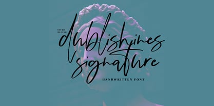 Dublishines Signature is handmade script font with stunning characters. Ideal for logos, name tag, handwritten quotes, product packaging, merchandise, social media & greeting cards. It contains a full set of lower & uppercase letters, a large range of punctuation, numerals, and multilingual support. The font also contains several alternatives for lowercase characters, accessible in the Adobe Illustrator Glyphs panel, or under Stylistic Alternates in the Adobe Photoshop OpenType menu. But If you don't have any opentype specific software, you can still use Collatin as is with its standard lowercase and uppercase letters.
 - Golum by Type Innovations,
$39.00 Deep in the bowels of the earth a tortured creature tries to mimic the writings of mankind. It labors long and hard carving the letter forms on the walls of its cave. Many years later, rubbings where taken of these impressions and fashioned to create this hideous font. All kidding aside, with such a formal training in type design, it was not easy for me to create these ill-shaped letters. I kept wanting to smooth out the outlines. Anyway, it was a good exercise and we now have this antique heavy-weight.
 - Respect by Resistenza,
$39.00 Respect! Our tribute to hand lettering culture. This exuberant new script font family draws inspiration from the traditional craftsmanship of sign painting and brush pen calligraphy techniques. Our aim was to create a modern interpretation of brush script, which referenced old-school hand lettering but also adds some contemporary forms, terminations and swashes you might expect to find in street art. The slanted angles and curved steams are designed to give this font an active energy, plenty of attitude and a courageous/brave character. We recommend to combine Timberline with: Turquoise
 - Engrave by BaronWNM,
$14.00 Engrave is a vintage-style scrips font. This font is an elegant font, and has a luxurious impression with sweet curves on the alternate letters. "Engrave" is perfect for branding luxury fashion products, jewelry, and is also great for use as a lettering in logos and mockups. The use of this font is also not limited to that, but can also be used for writing book covers, movies, posters, taglines, etc. "Engrave" also has ligatures and alternatives that give each lowercase style a choice of styles and add a luxurious feel to this font.
 - Killen Seven by Factory738,
$15.00 Halloween is quickly approaching!!! Killen Seven is an excellent choice for any Halloween project. Get inspired by its spooky atmosphere and use it to make any Horror project stand out. It has separate lower and uppercase letters, as well as numbers, punctuation, and multilingual letters. The Ligatures will come in handy for whatever your imagination can come up with! 7 Styles Basic Latin A-Z and a-z Numerals & Punctuation Stylistic Ligatures Multilingual Support for ä ö ü Ä Ö Ü ... Free updates and feature additions Thanks for looking, and I hope you enjoy it.
 - Happy Trails by Breauhare,
$35.00 Happy Trails is a font that is based on the lettering (all upper case) used on most Trailways buses from 1936 through the very early 1960s. It also has a newly created set of lower case letters which never existed before. The font was tweaked and digitized by Bob Alonso & John Bomparte. Happy Trails has not only the flavor of the early Trailways buses but also a folksy, Western feel to it, and it’s even a bit silly or goofy, a fun font that has a variety of uses.
 - Smoothing by Hanzel Space,
$25.00 Smoothing is a stylish modern calligraphic font in an original handwriting style. It's perfect for branding, wedding invitations and cards, and maybe for red wine labels. Smoothing includes a full set of beautiful upper and lower case letters, numbers, a wide variety of punctuation marks and 46 ligatures. All lowercase letters include initial and final strokes, giving a realistic handwritten style. What did you get, honey? Full Set of standard alphabet and punctuation Extra set of ending swashed lowercase Handwritten ligatures Thanks so much for checking out my shop! Happy creating! Cheers! Hanief - Hanzel Space
 - Turkuaz by Fontop,
$10.00 Welcome my new typeface family Turkuaz. Funny and stylish, creative and distinctive Turkuaz is great in headlines, premiums and web sites + blogs. Being a super readable it can be used in texts as well. Three fonts are included into the family – Turkuaz Regular, Turkuaz Deco and Turkuaz Italic. Special ligatures that you can switch on/switch off make headlines and texts sooo cute, I love them! Both OTF and TTF are included for each font. Fonts are Latin multilingual and have uppercase letters, lowercase letters, numbers and basic punctuations.
 - Flowery Drop Caps by Celebrity Fontz,
$15.99The Flowery Drop Caps font is a set of highly ornate block letters with rich embedded flowery designs, perfect for Spring and holiday themes and publications or any text where you want to add some texture, pizzazz, and depth to make your message stand out. This one-of-a-kind font has the feel of a homemade embroidered or quilted design and comes with both upper and lower case letters to give you more design flexibility. (Numbers, special characters, and punctuation are a neutral sans serif typeface and are included for convenience only.) - Milmay Brush by ijemrockart,
$10.00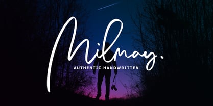 Milmay Brush is handmade script font with stunning characters. Ideal for logos, name tag, handwritten quotes, product packaging, merchandise, social media & greeting cards. It contains a full set of lower & uppercase letters, a large range of punctuation, numerals, and multilingual support. The font also contains several alternatives for lowercase characters, accessible in the Adobe Illustrator Glyphs panel, or under Stylistic Alternates in the Adobe Photoshop OpenType menu. But If you don't have any opentype specific software, you can still use Collatin as is with its standard lowercase and uppercase letters. Thank You.
 - Alphonse by RagamKata,
$16.00 Alphonse Script Font exudes charm with its distinctive letter details. Crafted with a bold yet modern style, this font presents characters that are not just clear but also invite the eye to explore the beauty of its typography. With available alternate swash accents, each word comes alive, allowing users to express their creativity in an elegant and captivating manner. This font is good for logo design, Social media, Movie Titles, Books Titles, a short text even a long text letter and good for your secondary text font with sans or serif.
 - Minimaly by Luxfont,
$18.00 Introducing clean, minimalistic and actually fonts family. Balanced letter height and width - based on analysis of current design trends. Text typed in this font does not distract attention from design, but organically complements any design. Ideal for short phrases, footnotes and headlines. Font has High readability in large volumes of text. Branding with this font looks trendy and expensive. Minimaly font family is versatile in use and very modern. Features: Clean letters and absolute minimalism 6 fonts in family: - Thin, Thin Italic - Regular, Italic - Bold, Bold Italic Kerning ld.luxfont@gmail.com
 - Ossuary by Wundes,
$13.00Ossuary is a font in which each letter is formed using a uniquely arranged pile of skulls. The font was originally designed to be caps only, but small caps were added for convenience. There is now a character for each typeable letter of the American English keyboard. The font was inspired by images from the Kostnice ossuary in Sedlec, Kutna Hora near Prague. (Google it.) Whether you are fascinated or repulsed, such images have a mystery about them. They demand your attention. That is the feel this font was intended to capture. - Gristwood JNL by Jeff Levine,
$29.00 The rustic lettering which also served as the model for Grist Mill JNL is the basis for Gristwood JNL. Another set of vintage wood type has the letters reversed out of blocks, making for a specialty titling font. Decorative end caps are located on the greater and less than keys and also on the plus and equal keys. A blank block for regular word spacing is on the underscore key, along with a wider blank box on the backslash key. This typeface has a somewhat limited character set.
 - Larch by Mans Greback,
$29.00 Larch is a clear and crisp high quality script typeface. It consists of five weights: White, Bright, Shaded, Dark & Black. Each style is working great separately, but they make the perfect combination together. Larch is designed by Måns Grebäck in 2016. The font supports hundreds of languages. It contains contextual and stylistic alternates, swashes and ligatures. Write # after any lowercase letter to make swashes! You can also write % after the following letters to make left swashes: b d f h i j k l t Example: Black% Lar#ch