10,000 search results
(0.031 seconds)
- Bike Jam by PizzaDude.dk,
$17.00 I love my bike, and I couldn't dream of not using it on a daily basis - I use my bike in rain, sun, snow, and windy days...all year, in other words! This font is dedicated to my bike, and is the second in a series of handmade fonts! Play around with the 5 layers and your favourite colours, for awesome effects. All versions comes with Contextual Alternates, which means several versions of each letter. In this case, every letter has 7 different versions that automatically cycles as you type! A quite awesome thing, because it makes your text more lively and natural looking!
 - Gone Hills by Twinletter,
$14.00 Gone Hills is a whimsical display typeface that’s perfect for a variety of creative projects. Your project will appear natural and attractive in the eyes of onlookers if you use this typeface. Let’s use this typeface to increase the quality of your graphics. This typeface is ideal for use in games, sporting events, branding, banners, posters, movie titles, book titles, quotations, logotypes, and other applications. Naturally, your varied design projects will be excellent and extraordinary if you use this font because it comes with a complimentary font family, which can be used for titles, subtitles, and sentence text. Start utilizing our fonts for your great projects today.
 - FF Page Sans by FontFont,
$47.99 French type designer Albert Boton created this sans FontFont in 2003. The family has 8 weights, ranging from Light to Bold (including italics) and is ideally suited for advertising and packaging, book text, editorial and publishing as well as logo, branding and creative industries. FF Page Sans provides advanced typographical support with features such as ligatures, small capitals, alternate characters, case-sensitive forms, fractions, and super- and subscript characters. It comes with a complete range of figure set options – oldstyle and lining figures, each in tabular and proportional widths. This FontFont is a member of the FF Page super family, which also includes FF Page Serif.
 - Tighten - Personal use only

- Outlook Display by Redy Studio,
$10.00 Outlook Font Duo offers a perfect combination of elegance and versatility by seamlessly blending serif and script font styles. This font duo provides a harmonious balance between a sophisticated and traditional serif typeface and a stylish and handcrafted script font, resulting in a visually captivating and dynamic typography experience. The serif font of Outlook Font Duo exudes a sense of refinement and classic appeal. Its letterforms are meticulously crafted with clean lines, precise curves, and balanced proportions, also includes many ligatures (CC,CO,EA,GG,GO,KA,LA,NN,OC,OG,OO,RA,TT) and dligatures (CC,CH,CI,CO,LL,LI,OC,OF,OH,OI,OO,OU) which lso you can see in the preview. Complementing the serif font, the script font of Outlook Font Duo adds a touch of creativity and informality. The script font features hand-drawn letterforms with rough strokes.This script font also includes ligatures, lowercase swsh which lso you can see in the preview. The versatility of Outlook Font Duo lies in its ability to be used together or separately, offering flexibility in creating various design compositions. Outlook Font Duo is suitable for a wide range of design projects, including branding, logos, packaging, invitations, and editorial designs. Feel free to give me a message if you have a problem or question. Thank you so much for taking the time to look at one of our products. ~Redy
 - Nexa Slab by Fontfabric,
$35.00 Nexa Slab is a geometric slab serif font whose design is based on the already popular best-seller Nexa . The font family contains 3 basic forms: italics, obliques and uprights, each of which has 8 different weights. This visual richness makes it the ideal slab serif font family for the web as well as for print, for motion graphics, logos, t-shirts and so on. It is also great for headings, fitting nicely with both small and large typesetting text blocks. Nexa Slab draws from the rich traditions of the classic Neo-Grotesque slab serif fonts such as Lubalin Graph, Rockwell and Memphis, which conceal the richness of typesetting text in its crucial advertising function. Just like these fonts, it’s design is subject to rational, carefully thought-out, thick and thin bars with a low contrast between them. The letters are characterized by the strict geometry and square proportions of the original, extra-fortified by suitably balanced slab serifs. Nexa Slab is serious without being rigid and inflexible, finished and lacking in nothing, systematic without being monotonous, and though it may seem at first glance to be more suitable for short, direct messages; in the hands of a master designer... it can build and create exquisite and harmonic designs. Open Type Features: Lining figures (proportional and tabular) The “f” ligature set Alternate characters (a, g, y) Automatic fractions Automatic numerators Automatic denomerators Automatic subscript and superscript Automatic ordinals Extended language support (most Latin-based scripts supported)*
 - Model by Lián Types,
$49.00 When designing a typeface, one has to be conscious of superfluous details. Although I am always tempted to add little personal touches, experience taught me that the phrase -less is more- is totally true. In Model, the letters (like models do) participated of a contest: An event in which models engage in competition against each other, often for a prize or similar incentive. The prize was staying in the font! yay! Tall, delicate, refined, the right amount of elegancy: These were some of the aspects to be chosen. Typographically speaking, these things were achieved thanks to a tall x-height (which leaded the font to be somehow condensed), a subtle contrast between thicks and thins, and just the right amount of decorative swirls. The result is a nice script that can be used in magazines, invitations, posters, book-covers and works very well when used over photographs. Get Model and let it be the star of the catwalk. STYLES Model Pro and Model Small Pro are the most complete styles of the font. Both have all the ligatures and decorative glyphs seen in posters above (OT programmed). Model Std One, Std Two and Std Three are reduced versions of Pro. This means they have less glyphs inside. TIP If you are planning to print the font in small sizes, it’s highly recommended to purchase Model Small Pro. Its thins are thicker so they will be better printed.
 - TT Tunnels by TypeType,
$29.00 TT Tunnels useful links: Specimen | Graphic presentation | Customization options TT Tunnels is a modular font family with narrow proportions and a large number of pronounced visual compensators. In the basic version of the typeface, all glyphs have simple chopped shapes, created according to the usual geometric principles. In the alternative version of TT Tunnels, which becomes available when you turn on OpenType feature stylistic alternates or stylistic set 1, the typeface comes to life and turns into a stylized ductal gothic grotesque, in which the design of glyph forms is created based on the pen movements. Despite the fact that TT Tunnels was created as a display typeface for use in short inscriptions and titles, it works very interestingly in the body text, adding a small touch of archaics. This is especially evident in the Bold and Black faces, when the rhythm and thickness of the strokes create a dense set, covering the paper with a solid, dense pattern. The density and style of such a set conceptually refers us to the old Gothic texture and the Old Slavonic script. In addition to a larger number of alternates for lowercase letters, the typeface features an alternate for number 2, an alternate slashed zero, many ligatures, and other useful OpenType features (ordn, frac, sinf, sups, numr, dnom, case, tnum, onum, pnum, liga, salt, ss01, zero). The TT Tunnels includes five faces: Thin, Light, Regular, Bold, Black.
 - Garrigue by Nootype,
$45.00 Garrigue is a sans-serif typeface, it's inspired by the typography of German rationalism of mid XXth century, the base version is combining this rationalism with more organic elements, while Garrigue Sharp is simpler, ideal for technical applications. The OpenType functions allows near 700 different combinations of ligatures in Capital letters, which gives to text interesting patterns and a lot of dynamism in 100 different languages, including cyrillic. The family contains different stylistic alternates which gives more flexibility to the typeface. The Garrigue family includes 14 weights, seven styles from Thin to Black in Normal and “Sharp” version. Each font includes OpenType Features such as Discretional Ligatures, Proportional Figures, Tabular Figures, Numerators, Superscripts, Denominators, Scientific Inferiors, Subscript, Ordinals, Standard Ligatures, Stylistic Alternates and Fractions. Larsseit family supports Latin and Cyrillic, all these languages are covered: Latin language support: Afrikaans, Albanian, Asturian, Azeri, Basque, Bosnian, Breton, Bulgarian, Catalan, Cornish, Corsican, Croatian, Czech, Danish, Dutch, English, Esperanto, Estonian, Faroese, Filipino, Finnish, Flemish, French, Frisian, Friulian, Gaelic, Galician, German, Greenlandic, Hungarian, Icelandic, Indonesian, Irish, Italian, Kurdish, Latin, Latvian, Lithuanian, Luxembourgish, Malagasy, Malay, Maltese, Maori, Moldavian, Norwegian, Occitan, Polish, Portuguese, Provençal, Romanian, Romansch, Saami, Samoan, Scots, Scottish, Serbian, Slovak, Slovenian, Spanish, Swahili, Swedish, Tagalog, Turkish, Walloon, Welsh, Wolof Cyrillic language support: Adyghe, Avar, Belarusian, Bulgarian, Buryat, Chechen, Erzya, Ingush, Kabardian, Kalmyk, Karachay-Balkar, Karakalpak, Kazakh, Komi, Kyrgyz, Lak, Macedonian, Moldovan, Mongol, Permyak, Russian, Rusyn, Serbian, Tatar, Tofa, Tuvan, Ukrainian, Uzbek
 - Eclectic One by Altered Ego,
$45.00STF Eclectic One is a visual cornucopia of symbols, like the junk drawer in your kitchen. Stuff you'll need someday for a graphic element, bullet or dingbat application. Perfect for website icons! The Eclectic family is legendary, with a cult-like following among the inititated. As one of the first dingbat fonts available on the web, it gain popularity after its design in the early 1990s. With over 150 characters in the complete set, you'll find yourself using Eclectic One almost daily to add spice to your otherwise san-serif typographic existence. This font is essentially a soap opera of typographic image elements, created for projects when I couldn't find the "thingbat" I needed. Almost more of a collection of illustrations, there are many characters which connect to form patterns, and of course it's like a "small neutral European country" army knife for the creative community. EcOne features complete hour, quarter, and half-hour notations in an analog clock design glyph, recycled/recyclable symbols, a registration mark, a toaster, globes, sideways diamond arrows, spaceships, stoplights, the "running man," several atomic references, da buzz saw, target icons, the unusual smiley face floating in a ball (with a drop shadow, no less!), and the fish skeleton which complements the fallout shelter symbol, and more. Make your own juxtapositions! One reviewer proclaims "for whatever you do, Eclectic One is an excellent dingbat source." Available in Mac and PC formats. License it today! - Ongunkan France Glozel Runic by Runic World Tamgacı,
$100.00 In March 2010, Émile Fradin, a modest peasant farmer from central France, died at the age of 103. To his grave he took the secret behind one of the most controversial archaeological discoveries of the 20th century. A discovery which put into question the very origins of the written word and the paternity of European culture. It was the uncovering of peculiar artefacts would come to be known as the Glozel runes. The discovery of the Glozel runes On the first day of March 1924, a not yet 18-year-old Fradin was ploughing his family’s field in the hamlet of Glozel, when his cow stumbled into a hole. When he and his grandfather, Claude, looked closer, they discovered a mass of broken stone, under which lay an underground chamber. Within, they discovered pottery fragments, carved bones, and a peculiar clay tablet covered in bizarre characters that neither of the two could decipher. The family requested a subsidy for excavation works to be carried out, but were refused by the regional authority. With that disappointment, it seemed as though the discovery would fade into obscurity. However, the following year, news of Fradin’s unusual clay tablet reached the ears of the physician and amateur archeologist, Antonin Morlet. By the end of May 1925, Morlet began the first of his excavations.4 Within the first two years alone, he had amassed some 3,000 finds.
 - DynaGrotesk by Storm Type Foundry,
$55.00 The most exciting new feature of DynaGotesk is the Vintage Italics stylistic set, which activates the decorative forms. It includes the looped "w", curved ascenders and descenders of many lowercase letters. These can significantly change the feel of a poster or invitation. DynaGrotesk may look like a revival of an old typeface, but it is not. It uses only some historical reminiscences, sharp edges and curved shapes, but it’s completely original design aimed at ease of use. The bigger the size, the more evident and pronounced are the spicy details. In smaller and even smallest sizes it’s appearance is qieter, very well suited even for long portions of text. DynaGrotesk was created in 1995 with the use of Multiple Master interpolation. But the MM fonts never achieved the desired application in industry, so designers returned back to single fonts. Over the following decades, the font was modified several times as an old house, and the present re-animation includes the Variable font format. Since its first release in the mid-nineties, it is widely used in all areas of graphic industry from small publishing to international corporate identity. The warm character of DynaGrotesk derives from early sans-serif typefaces, those which appeared before Helvetica. All 60 styles contain common OTF features like Small Caps, various sorts of figures, ligatures, Cyrillics, Greek, and full Latin diacritics. Perfect for branding systems and corporate identities, lettering, as well as cultural posters and catalogs.
 - Hassan by Linotype,
$187.99Hassan is a traditional-style Arabic text face designed by Hassan Sobhi Mourad, an experienced calligrapher and teacher of the art and first produced by the Linotype Design Studio (U.K.) as a PostScript font in 1993. An individual Naskh style, Hassan cleverly combines elegant proportions, echoing an inscriptional Thuluth in its tall vertical stems and deeply rounded final jim and ain. The effect of verticality is enhanced by the tense, reined-in kerning strokes of ra and waw, the well-poised lam-alif, and the compactly drawn ligatures. The broad-band strokes of Hassan Bold smooth some of the angularity and relax the tension apparent in the Light. The traditional-style ligatures are rendered with an easy flow. Because of the economical character count, Hassan Light and Bold text may be headed by the compact titling styles (Hisham, Mariam) as well as designs like Ahmed or Kufi which answer to the inscriptional qualities of Hassan. In addition to other uses, Hassan would be particularly suited to document text-setting. Hassan’s two OpenType weights include Latin glyphs from Janson Text Roman, and Janson Text Bold, respectively, inside the font files, allowing a single font to set text in both most Western European and Arabic languages. The OpenType glyph ranges incorporate Basic Latin and the Arabic character set, which supports Arabic, Persian, and Urdu. The fonts include tabular and proportional Arabic, Persian, and Urdu numerals, as well as a set of tabular European (Latin) numerals. - Brotherhood by 38-lineart,
$19.00 The current trend is social media, friendship connection applications and personal web portfolios. This media is used to tell about existence, most people like to upload photos on social media networks, even for personal web portfolios, sometimes people prefer to see the side of daily activities rather than products which are offered. Photos are visual responses, and there are many stories that can be told from a photo. But it will look more interesting if it is added with captions. The very appropriate caption is a text in handwriting. This is what inspired us to create attractive handwriting for social media and networking. We started to do a little research to see the trends of this type of font. Here are some of our notes; 1. Texts are usually in the form of relaxed, non-connected handwriting. 2. There are several connected glyphs, usually by the letters 'o', 'i' and 'y'. And double letters like ‘ll’ and ‘tt’. We anticipate this by making ligature for common texts written concatenated. 3. For personal web portfolio needs, provide affirmation as a characteristic. So the first letter is usually in the form of uppercase which is more prominent than the lowercase rhythm. Prominent but still in proportion. So this is "Brotherhood", a handwritten font that you can use for personal brands, captions and even paragraph writing. Expand your friendship and make your business more closely to your customers as a "Brotherhood" with this font.
 - Happy Twigs by Yumna Type,
$25.00 Fonts are sometimes so limited and boring that it is hard to stand out your designs. What is worse is that you want unique, visually interesting designs, but you still have to use common fonts people have already used. Therefore, Happy Twigs can be your interesting alternatives. Happy Twigs is a twig branch-inspiring display font of which letters are made in a lot of lines forming complex, attractive displays. Its unique character is due to the complex, detailed displays with which you can apply for any artistic, creative designs. Such a display font is applicable for any nature related products. Its complex, attractive letters will help you emphasize the messages you deliver and express different nuances depending on the design and color choices. In addition, it shows crowded and detailed, yet artistic and attractive nuances. Happy Twigs provides a clipart in accordance with the font theme as a bonus and features you can enjoy. Features: Multilingual Supports PUA Encoded Numerals and Punctuations Happy Twigs fits best for various design projects, such as brandings, headings, magazine covers, quotes, printed products, merchandise, social media, etc. Find out more ways to use this font by taking a look at the font preview. Thanks for purchasing our fonts. Hopefully, you have a great time using our font. Feel free to contact us anytime for further information or when you have trouble with the font. Thanks a lot and happy designing.
 - Floro by Andinistas,
$29.95 Floro is a typographic family with 3 members designed by Carlos Fabian Camargo. Its idea combines medieval ideas, grotesque, stencil and grunge for T-shirts, stickers, advertising material design. More specifically the concept of Floro join several DNAís coordinating X height, ascendant, descendant and wide, in which proportions and adaptive optics were determined to inject great visual impact when composing titles. Its forms and counter forms have imperfections controlled with vitality and consistency. Floro is useful for ranking words and phrases with corroded edges and creases between the lines of his letters. In that vein, Floro refers to improvised design, deletion and copying. For that reason, its determinants seem stencil patterns that attract the attention of the reader. Its inaccurate decisions were planned that way, in which the type of contrast seems made with a flat tip and the amount of contrast between thick and thin is medium. Its sizes, regular and italic shine by their systematic wear and terminations sometimes in pointed forms resembling medieval darkness. In short, we can say that Floro comes from the miscegenation of Gothic calligraphy texture, foundational calligraphy and some refinements of gothic writings with italic sans-serif ideas of late 19th century. Even with the blur appearance, floro has ideal proportions to pile for horizontal and vertical areas when composing titles with striking looks and robust. And finally, floro dingbats are related shields and stamps, to accompany the written resulting useful at the level of visual support and hierarchical.
 - Morgan Sans by Feliciano,
$50.00The Morgan Project can be considered a big type family with ‘many styles’ or a set of different types that match with each other. For me it’s one typeface with different versions with deliberate and visible differences according to the propose to which each version was created. The design started in 2000 as a display type with the design of the Morgan Tower, to which more two display versions were added; Morgan Poster and Morgan Big — all together the make our: FTF Morgan Display Kit 1. All three versions consist only in uppercase with alternate letters in the lowercase and a set of special ligatures. Morgan Tower has four variants that differ in width/weight, Morgan Poster has six variants (often called styles), three weights in upright and oblique and Morgan Big has twelve, six weights in upright and oblique. Lately, the FTF Morgan Tex Kit 1 was added. Apropriate versions to use in text setting. Both versions, FTF Morgan Sans and FTF Morgan Sans Condensed share the same structure and character mapping. Four variants each; regular, bold, oblique and bold oblique with a large character set including: small caps, lining and old style figures (here called Office figures) — both tabular —, small caps lining figures, mathematical symbols and fraction figures, and, a set of foreign characters expanding the possibilities of use for a wider range of languages. Characters are distributed in six different font layouts: Lining, Office, Expert, Caps, Figures & Pi. - Fushar Arabic by Mikołaj Grabowski,
$19.00 Fushar Arabic is a bold comic color font family which comes in 5 layer-styles easy to compose in a multicolor manner and 3 OpenType-SVG color styles to make the work faster and easier. Character set covers Latin A-Z all caps, Arabic, Persian and Urdu with 230 ligatures, European, Arabic and Persian / Urdu localized digits, punctuation, currencies and other symbols - the total of 729 glyphs. The idea came from a custom logotype I made several years ago for a local charity organisation that helps children. The logotype was based on bold letters with light that make the "balloon" effect visible in "Holes" style. Later I expanded the family with "Cuts" and all the derivative fonts that make the whole color family. The purpose was to create a funny, friendly and playful script that would embrace the beauty of the Arabic alphabet. Solid, Cuts and Holes are classic one-color styles which can be used separately to compose a simple text. With Shadows and Lights they can produce a multicolour design, as shown on the images above. To save the time, there are three already prepared combinations in the new OpenType-SVG color format. The features include required ligatures, discretionary ligatures, proper mark attachment, contextual alternates, case-sensitive forms, ordinals, localised Persian/Urdu numerals, superscript (1, 2, 3) & fractions. Now you can buy Extended Latin character set (uppercase and lowercase) at Fushar font family page on MyFonts. European languages, Vietnamese and Pinyin included.
 - Patihan Variable by Jehoo Creative,
$119.00 Introducing Patihan Variable, a variant that makes it easy for you to access fonts with sharp, strong, bold characters. Patihan Variable is a combination of three different styles – Sans, Slab, and Serif – which are united into 2 Axes weight axes and serif axes, where weight axes have instances: Thin, Extra Light, Light, Regular, Medium, Semibold, Bold , Extrabold, and Black. This font has beautiful Ligature and Stylistic Alternate settings, Patihan font is also equipped with the Smallcaps feature which gives more control over typography, allowing you to create elegant and unique typography. The sans version of this typeface is versatile and easy to read, with a minimalist but impactful aesthetic. The Slab version is characterized by its solid and powerful strokes, while the Serif style has that extra classic flair with elegant curves and a stark contrast to the look. Patihan Variable is optimized to make it easier to access each variation, all you have to do is slide the slide in the software, and then you can access the style you want. Without sacrificing easy readability, this makes it a great choice for headlines, titles, and any long-form content. Ligature settings and discretionary styling add an extra layer of sophistication, making this font a great choice for magazines, branding and advertising. Overall, this font is a great choice for those looking to make a lasting impression. Its versatility, readability and unique features make it an excellent choice for any project.
 - Serena by Canada Type,
$24.95The story of Serena is a unique one among revivals. Serena was neither a metal face nor a film one. In fact it never went anywhere beyond Stefan Schlesinger’s 1940-41 initial sketches (which he called Saranna). A year later, while working with Dick Dooijes on the Rondo typeface, Schlesinger was sent to a concentration camp where he died, along with any material prospects for the gorgeous letters he'd drawn. The only sketches left of Schlesinger’s Saranna work are found in the archives of the Drukkerij Trio (the owner of which was Schlesinger’s brother-in-law). The sketches were done in pencil and ink over pencil on four sheets of paper. And now Hans van Maanen revives Schlesinger’s spirit as closely as the drawings permit, and elaborately expands the work to cover a multitude of codepages and languages. It took more than 65 years for Schlesinger’s drawings to see the light, so van Maanen made sure to bring them to life stylishly and respectfully. Serena embodies the peace and calm rarely ever found in mainstream calligraphy or other genres of display type. With upright elegance and a slight Eastern touch, this typeface expertly bridges the gracefully casual with the deeply spiritual. The light and soft letter forms add a pleasant, breezy element to anything they touch. When used sparingly in titling or display, Serena is like a sigh of desire, rare but quite memorable and very appreciated. - Fantastic ML by HiH,
$12.00 Fantastic ML is an exuberant Art Nouveau font. It was originally released as “Modern Style” by Fonderie G. Peignot & Fils, Paris, France sometime before 1903. Since “Le style moderne” was the generic French name for Art Nouveau, it is possible that someone decided a less generic name was needed. The typeface became known as Fantastic. Compared to conventional text letters, it is just that. Fantastic has a whimsical, architectural feel. The typeface reminds me of a cross between Hoffmann’s Palais Stoclet in Brussels and Gaudi’s Sagrada Familia church in Barcelona. The letterforms themselves are similar to those by Ludwig von Zumbusch on the cover of “Jugend” in March, 1896, but with the addition of serifs. Fantastic ML is a decorative, all-cap font intended for display use and functions best at 18 points or larger. There are a total of 306 glyphs. In addition to the standard 1252 Western Europe Code Page with character slots up to decimal position 255, there are glyphs for the 1250 Central Europe, the 1252 Turkish and the 1257 Baltic Code Pages. However, some older applications may only be able to access the Western Europe character set (1252). The zip package includes two versions of the font at no extra charge. There is an OTF version which is in Open PS format and a TTF version which is in Open TT format. Use whichever works best for your applications.
 - Jazayeri Kufic Shoushtar by Arabetics,
$79.00 The Jazayeri Kufic Shoushtar font is a beautiful typographic implementation of the decorative Kufic calligraphy inscribed on the walls of the historic Grand Mosque of Shoushtar in southwestern Iran. This mosque contains many other inscriptions added over time for documentary purposes but its four monumental Kufic inscriptions which are revived in this font are the most essential ones to understand its design and meaning. Built in the ninth century CE, this mosque is one of the earliest hypostyle mosques in Iran. It was built in “the city of scholars” when its residents included two great Sufis, Sahl Ibn Abdullah Tostari and Mansur Hallaj. The designer and producer of the font is Seyed Mohammad Vahid Mousavi Jazayeri, a well-known Iranian master calligrapher, designer, scholar, and author. Mousavi Jazayeri has taken a personal interest in the Kufic script and devoted years to independent research, visiting archaeological locations, historic buildings and cemeteries, mosques, libraries and museums to study the script through direct contact. He has developed a systematic research methodology and published his findings in several books. His professional interest in script and calligraphy stimulated his discovery of the historic method for cutting the Kufic pen, which has had a direct impact on his own work, as seen in several well-received exhibitions and workshops. The historical research and achievements of Mousavi Jazayeri brought together the first international group dedicated to the study and revival of the historic Kufic script operation through kuficpedia.com.
 - Qene G by Balibilly Design,
$21.44 Say hello to Qene-G Typeface, Qene-G is based on a problem that often occurs when I design, which is to combining typefaces in typographic art. I am pretty sure you also in this problem, so Qene-G Typeface comes to solve the problem. Qene-G is a complete package consisting of serif fonts and signature scripts. A careful approach makes this font give a luxurious and elegant taste to your project. Smooth curves, some flowy terminals, and flirty tails will make your project looks unique. The handmade signature combination emphasizes the style that you create in the natural beauty atmosphere. Qene-G consists of 5 families, they are Qene-G-Regular, Qene-G-Regular Italic, Qene-G-Outline, Qene-G-Outline Italic, and Qene-G-Script. You will get all caps letters with 2 styles that you can access via uppercase and lowercase buttons, charming script fonts, and tons of ligatures and stylistic alternates. Complete with Unicode and PUA which allows you to access all features without graphic design software. Your project will travel around the world with 131 languages of this font. Qene-G is a strikingly versatile font, It is a bold choice for branding projects, fashion magazine imagery, social media text overlays, posters, website headers, and more. Let's start creating stand out designs with this font. We are pleased to tell you about our newest product made with totality, please CLICK HERE
 - Fundstueck by Ingo,
$12.00 Inspired by a find a coarse but decorative font was created. "Fundstueck" ist the German term for it. Fonts can be so simple. That is what I was thinking as my attention was turned to this rusty piece of metal. Only a few centimeters in size, I couldn’t imagine which purpose it might truly serve. But my eyes also saw an E, even a well-proportioned E: a width to height ratio of approximately 2/3, black and fine strokes with a 1/2 proportion — could I create more characters on this basis? Thought it, did it. The form is based on a 5mm unit. The strikingly thick middle stroke of E suggests that the emphasis is not necessarily placed on the typical stroke, and likewise with the other characters. But if the font is going to be somewhat legible, then you cannot leave out slanted strokes completely. Eventually I found enough varying solutions for all letters of the alphabet and figures. A font designed in this way doesn’t really have to be extremely legible, which is why I forwent creating lower case letters. Nevertheless, Fundstueck still contains some diverse forms in the layout of upper and lower case letters. Thus, the typeface is a bit richer in variety. By the way — the “lower” letters with accents and umlauts stay between the baseline and cap height. And with that, you get wonderful ribbon-type lines.
 - TT Ricordi Greto by TypeType,
$29.00TT Ricordi Greto useful links: Specimen | Graphic presentation | Customization options TT Ricordi Greto is the 5th project from the TT Ricordi collection of fonts, the main task of which is to find gems in old tablets and on stones and bring these inscriptions back to life in the form of contemporary fonts under the general name TT Ricordi. TT Ricordi Greto is Kseniya Karataeva’s original experimental project, inspired by a floor plaque dating from 1423 found in the Basilica di Santa Croce, Florence. When working on the typeface, we wanted to do something new and modern, but at the same time find details or artifacts in the source that could be exaggerated to the maximum. TT Ricordi Greto is a non-contrasting Florentine sans-serif with dynamic proportions and a hint on what would be serifs. The main features of the typeface are the closed aperture, dynamic proportions, and the combination of historical forms with modern visual solutions, flowing terminals with curling dash ends and flared ends, and subtle serifs that hint at the historical material. Another feature of the typeface is a large set of graphic icons (characters and objects), margin markers (flowers, stars and drops) and thirteen catchwords. All icons and spacing have been carefully selected and rendered in order to best match the visual plasticity of the font and interact well with it. The TT Ricordi Greto font family consists of 4 styles: Regular, Medium, Demibold + the Variable font. Each style includes 678 glyphs and 14 OpenType features. In addition to wide language support (extended Latin and basic Cyrillic), each style has two sets of figures and currencies (proportional and tabular), a set of arrows alternative versions of the letter M (flared and straight versions) and the letter Ф (round and oval) and the same a set of icons, margin markers and catchwords. TT Ricordi Greto OpenType features list: aalt, ccmp, locl, numr, ordn, tnum, pnum, case, ss01, ss02, ss03, ss04, ss05, calt. TT Ricordi Greto language support: Acehnese, Afar, Albanian+, Aleut (lat), Alsatian, Aragonese, Arumanian+, Asu, Aymara, Azerbaijani +, Banjar, Basque +, Belarusian (lat), Bemba, Bena, Betawi, Bislama+, Boholano+, Bosnian (lat), Breton +, Catalan+, Cebuano+, Chamorro+, Chichewa, Chiga, Colognian+, Cornish, Corsican +, Cree, Croatian, Czech+, Danish, Dutch+, Embu, English+, Esperanto, Estonian+, Faroese+, Fijian, Filipino+, Finnish, French, Frisian, Friulian+, Gaelic, Gagauz (lat), Galician+, Ganda, German+, Gikuyu, Guarani, Gusii, Haitian Creole, Hawaiian, Hiri Motu, Hungarian+, Icelandic+, Ilocano, Indonesian+, Innu-aimun, Interlingua, Irish, Italian+, Javanese, Jola-Fonyi, Judaeo-Spanish, Kabuverdianu, Kalenjin, Kamba, Karachay-Balkar (lat), Karaim (lat), Karakalpak (lat), Karelian, Kashubian, Kazakh (lat), Khasi, Kikuyu, Kinyarwanda, Kirundi, Kongo, Kurdish (lat), Ladin, Latvian, Leonese, Lithuanian+, Livvi-Karelian, Luba-Kasai, Ludic, Luganda+, Luo, Luxembourgish+, Luyia, Machame, Makhuwa-Meetto, Makonde, Malagasy, Malay+, Maltese, Manx, Maori, Marshallese, Mauritian Creole, Meru, Minangkabau+, Moldavian (lat), Montenegrin (lat), Morisyen, Nahuatl, Nauruan, Ndebele, Nias, Norwegian, Nyankole, Occitan, Oromo, Palauan, Polish+, Portuguese+, Quechua+, Rheto-Romance, Rohingya, Romanian +, Romansh+, Rombo, Rundi, Rwa, Salar, Samburu, Samoan, Sango, Sangu, Sasak, Scots, Sena, Serbian (lat)+, Seychellois Creole, Shambala, Shona, Silesian, Slovak+, Slovenian+, Soga, Somali, Sorbian, Sotho+, Spanish+, Sundanese, Swahili, Swazi, Swedish+, Swiss, German +, Tagalog+, Tahitian, Taita, Talysh (lat), Tatar+, Teso, Tetum, Tok Pisin, Tongan+, Tsakhur (Azerbaijan), Tsonga, Tswana +, Turkish+, Turkmen (lat), Uyghur, Valencian+, Vastese, Vepsian, Volapük, Võro, Vunjo, Walloon, Walser+, Welsh+, Wolof, Xhosa, Zaza, Zulu+, Belarusian (cyr), Bosnian (cyr), Bulgarian (cyr), Erzya, Karachay-Balkar (cyr), Khvarshi, Kumyk, Macedonian+, Montenegrin (cyr), Mordvin-moksha, Nogai, Russian+, Rusyn, Serbian (cyr)+, Ukrainian. - Mallikay by sizimon,
$20.00 Mellyana Script is free-flowing, feminine, fashionable and friendly. Mellyana is perfect for fashion, e-commerce brands, trend blogs, or any business that wants to appear classy and chic. Mellyana Includes: Uppercase, lowercase, numeral, punctuation & Symbol multilingual support Stylistic alternates PUA Encoded Characters Fully accessible without additional design software. To access the alternate glyphs, you need a program that supports OpenType features such as Adobe Illustrator CS, Adobe Photoshop CC, Adobe Indesign and Corel Draw.
 - Bavaroir by URW Type Foundry,
$39.99 Bavaroir looks like a techno party in the throne room of Neuschwanstein: grandiose, original and still high-tech, modern, stylish and chic? anything but lifeless. The design experiment was to create a sans serif based on ?dropping endings?. Something between elegance and protest, Bavaroir coquettishly hides its edges. Although pretty narrow in design, Bavaroir still flows easily, openly and well readably, even in very small sizes. Bavaoir was designed for the URW++ FontForum.
 - Tyrumate by Differentialtype,
$12.00 Tyrumate is an elegant serif font with a vintage touch and classic. Comes in two styles, regular and italic. Its clean lines and meticulous attention to detail embody the essence of classic typography, making it a chic serif font. Tyrumate is suitable for template design, brochures, videos, advertising branding, logos, invitations, layout designs, elegant crafts, beauty designs, and much more. It will add a splash of luxury to any design project you want to create!
 - La Paloma Script by Make Media Co,
$16.00 Add a touch of elegance to your work with La Paloma Script - A clean, modern, hand-written typeface with over 170 Ligatures and Decorative End Characters to add a dash of luxury to any project. And if you're looking for a lovely logo font, you just found it! La Paloma was designed with Branding in mind! But don't stop there, use this chic type in headlines & titles, signage, greeting cards, invitations & more!
 - Vogue Sans by Fenotype,
$20.00 Vogue Sans is a luxurious high contrast sans serif well suited for fashion and haute couture design or glamorous headlines. Try typing any word or name with Vogue Sans and it'll look great. Vogue Sans is equipped with several interlocking ligatures - CC, CO, LA, LC, LL, LE, OO & TT. Vogue Sans also has Swash & Titling Alternates for letters A K L T X Q R and Stylistic Alternates for letters K and R. Go chic!
 - Queensytrix by Maulana Creative,
$15.00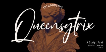 Queensytrix is a chic script font. With light contrast stroke, slanted and fun character with a rich of ligatures. To give you an extra creative work. Queensytrix font support multilingual more than 100+ language. This font is good for logo design, Social media, Movie Titles, Books Titles, a short text even a long text letter and good for your secondary text font with sans or serif. Make a stunning work with Queensytrix font. Cheers, MaulanaCreative
 - Wild Comedy JNL by Jeff Levine,
$29.00 John Sigvard ‘Ole’ Olsen and Harold Ogden ‘Chic’ Johnson were musicians-turned-comedians who rose to fame in the zany 1938 Broadway musical review “Hellzapoppin'”. They reprised their roles in the 1941 film adaptation of the show, and the opening title card of the film has “Hellzapoppin'” hand lettered in a tall, condensed sans serif design with an inline. This is now available as Wild Comedy JNL in both regular and oblique versions.
 - Avengars by Mevstory Studio,
$20.00 Avengars is a modern and chic typeface, best used as a display for headings, logos, branding, magazines, product packaging and invitations. Avengarscome with clean lines and smooth curves give any project an extra touch of class. If there's anything else you are unsure of feel free to pop me a message :) That's it! Have fun using Avengars Typeface!!! Feel free to follow, like and share. Thanks so much for checking out my shop!
 - Dominica Calligraphy by Ride Studio,
$10.00 Dominica Calligraphy is a balanced, subtle, elegant and stylish handwritten font. It has beautiful character. This font comes with a matching Outline/Monoline version. Perfectly match the design of invitation cards, company logos, movie titles, movie names, business cards, book titles, brand names and various other designs. Dominica Calligraphy is a chic, refined script font that emanates sophistication and elegance. Its stylish alternates and ligatures make this font the perfect match for any project.
 - Yellow Cute by Sakha Design,
$10.00 Yellow Cute is a lovely and modern script font that exudes elegance and sophistication. Each letter is delicately crafted with fluid and graceful strokes, creating a timeless look that’s perfect for everything from wedding invitations to branding projects. Its sleek and chic style will add a touch of class to any design. Keep in mind that the font is PUA encoded, meaning that you can access all delightful glyphs and swashes effortlessly.
 - Svarga by Krismagraph,
$19.00 Introducing our new "Svarga", Elegant Fashionable Typeface with Unique, Classy and Stylish. Svarga Typeface is a classy and elegant serif typeface – This font is both modern and nostalgic and works great for logos, magazine, social media. Already matched up and ready to be used together for your next design! For those of you who are needing a touch of elegant, stylish, classy, chic and modernity for your designs, this font was created for you!
 - Skylines by Zamjump,
$19.00 Skylines- a chic modern serif with letters that seem to accentuate their character.Lots of ligatures for both uppercase and lowercase, as well as several alternates, to add typographical style to your designs.To access these OpenType features, you need software that supports Opentype such as: Word, Textedit, Photoshop, Sketch, Pages, Keynote, Numbers, iBooks Author, QuarkXPress, Indesign, and Illustrator. A wide variety of useful glyphs are included - see preview images of all glyphs. Thank you
 - Odalisque NF by Nick's Fonts,
$10.00Here’s a revised and updated version of one of my oldies, based on the typeface Chic, designed by Morris Fuller Benton. The addition of small caps, improved kerning, and an expanded character set make this one an excellent choice for projects that demand grace, elegance and a bit of mischievous fun. This font contains the complete Latin language character set (Unicode 1252) plus support for Central European (Unicode 1250) languages as well. - Georgica by Mevstory Studio,
$25.00 Georgica is a modern and chic typeface, best used as a display for headings, logos, branding, magazines, product packaging and invitations. Georgica come with clean lines and smooth curves give any project an extra touch of class. If there's anything else you are unsure of feel free to pop me a message :) That's it! Have fun using Georgica Typeface!!! Feel free to follow, like and share. Thanks so much for checking out my shop!
 - Reborn by Sensatype Studio,
$15.00 Reborn is a modern and chic font for brand and logo design with ligature that easy to use for beginner and ready to use on any software that support Opentype Feature. This is based on our experience as a font creator, so many users with dummy and never use Opentype feature before. So, we try to brainstorming and create this font to make the idea is going out. This is perfect for BRANDING and LOGO DESIGN. You will get chic, unique, and certainly font for graphic design. To make it look more unique, here we prepared some ligatures: KA KC KE KG KO KS KU KY RA RC RE RG RO RS RU RY QA QC QE QG QO QS QU QY LA LC LE LG LO LS LU LY Include Fancy Style in some Uppercase and Lowercase, Just try it!!! Reborn is also included full set of: uppercase and lowercase letters multilingual symbols numerals punctuation ligatures Wish you enjoy our font and if you have a question, don't hesitate to drop message & I'm happy to help :)
