10,000 search results
(0.035 seconds)
- Offhand Brush by PintassilgoPrints,
$24.00 Offhand Brush is a fast and spontaneous brush font with quite a messy feel, a great option for book covers, packaging projects, album art, web titles, and even small chunks of text. It looks messy, but don't get it wrong: on the inside, it's a laborious piece of work, with four alternates for each Latin letter and two for numerals, as well as two options for Cyrillic and Greek letters. To make things even more uneven, there are still a few different letter designs programmed to pop up when specific combinations of three or four glyphs appear in the text. These are managed by the OpenType 'Standard Ligatures' feature, although they are far from standard and are not quite ligatures. And why so? Because this way it will usually be on by default, making the font way more interesting. Hey, wait! There are some ornaments too. And a couple of contextual kerning pairs, hell yes! Use it big!
 - Mr Canfields Pro by Sudtipos,
$45.00 The Charles Bluemlein Script Collection is an intriguing reminder of the heady days of hand lettering and calligraphy in the United States. From the early 1930s through World War II, there were about 200 professional hand letterers working in New York City alone. This occupation saw its demise with the advent of photo lettering, and after digital typography, became virtually extinct. The odd way in which the Bluemlein scripts were assembled and created - by collecting different signatures and then building complete alphabets from them - is a fascinating calligraphic adventure. Because the set of constructed designs looked nothing like the original signatures, fictitious names were assigned to the new script typefaces. The typeface styles were then showcased in Higgins Ink catalogs. Alejandro Paul and Sudtipos bring the Bluemlein scripts back to life in a set of expanded digital versions, reflecting the demands of today’s designer. Extreme care has been taken to render the original scripts authentically, keeping the fictitious names originally assigned to them by Bluemlein.
 - Wastern by Say Studio,
$12.00 About the Product Introducing "Wastern" - A brand new bold display typeface with both modern and vintage curves. Modern or Vintage. If you are going Vintage Retro : Access your OpenType features to access the large selection of alternate letters and ligatures, select the letters you like from the large variety to get the vintage look you are after. Vary between a light and heavy vintage look based on how many letters you alter. Due to alternates , Wastern is a very versatile font, covering a wide range project types, from bold magazine imagery , to wedding invitations, to branding, poster design and so much more. What's you get? Wastern Italic Unique letterforms Works on PC & Mac Simple Installations Accessible in the Adobe Illustrator, Adobe Photoshop, Microsoft Word even work on Canva! PUA Encoded Characters Fully accessible without additional design software. Language Support : Danish, English, Finnish, French, German, Italian, Luxembourgish, Norwegian Portuguese, Spanish, Swedish, Swiss German. Let me know if you any question:) Have a wonderful Day Say Studio
 - Lil Johnny by Mans Greback,
$59.00 Lil Johnny is a beautiful calligraphic script typeface. Drawn and created between 2020 to 2022, this logotype lettering has a vivid style and a strong personality. It has an optimistic look, a wild movement and big expressive capital letters. Use underscore _ anywhere in a word to make an underline. Example: Love_letter Use multiple underscores to make different swashes. Example: Base_____ball Use numbersign # after any letter to make a swash. Example: Welcome# Summer# (Download required.) The Lil Johnny typeface family consist of Regular and Italic. The font is built with advanced OpenType functionality and has a guaranteed top-notch quality, containing stylistic and contextual alternates, ligatures and more features; all to give you full control and customizability. It has extensive lingual support, covering all Latin-based languages, from Northern Europe to South Africa, from America to South-East Asia. It contains all characters and symbols you'll ever need, including all punctuation and numbers.
 - Mr Blaketon Pro by Sudtipos,
$45.00 The Charles Bluemlein Script Collection is an intriguing reminder of the heady days of hand lettering and calligraphy in the United States. From the early 1930s through World War II, there were about 200 professional hand letterers working in New York City alone. This occupation saw its demise with the advent of photo lettering, and after digital typography, became virtually extinct. The odd way in which the Bluemlein scripts were assembled and created - by collecting different signatures and then building complete alphabets from them - is a fascinating calligraphic adventure. Because the set of constructed designs looked nothing like the original signatures, fictitious names were assigned to the new script typefaces. The typeface styles were then showcased in Higgins Ink catalogs. Alejandro Paul and Sudtipos bring the Bluemlein scripts back to life in a set of expanded digital versions, reflecting the demands of today’s designer. Extreme care has been taken to render the original scripts authentically, keeping the fictitious names originally assigned to them by Bluemlein.
 - AJ Quadrata by Adam Jagosz,
$25.00 Once, Blackletter was a calligraphy style. Full of ligatures, with letters bumping into each other to create an unapologetic picket-fence pattern. Some even claimed that the regularity improved legibility! But then Blackletter was cast into metal, and only a handful of established ligatures survived, while most interletter connections were disentangled. Everyone since followed suit, and hundreds of years later, digital Blackletter fonts were modelled mostly on the metal fonts that prevailed rather than the original handwriting. Up until now! AJ Quadrata is an authentic revival of the textura quadrata hand, and its major inspiration is a 15th-century Latin manuscript of the Bible from Zwolle, the Netherlands. The typeface is delivered in two flavors. The default cut is a modern take on textura quadrata that can be useful for today and tomorrow. The standard ligatures feature employs nearly all letters. The tittle of i retains its original, hasty squiggle form (except for the Turkish localization). Discretionary ligatures include medieval ligatures da, de, do, pa, pe, po (and their mixed-case counterparts!). Stylistic sets allow to use historic letter variants such as long s and rotunda r, closed-counter a, and alternate capitals. AJ Quadrata Medieval is perfect for setting Latin. Default forms of capital F, H and O are swapped with the alternates. The squiggles above i only appear for disamibiguation nearby m, n or u, as in original manuscripts. Discretionary ligatures and historic variants are promoted to the standard ligatures feature to make room in the discretionary ligatures feature for a variety of scribal abbreviations. Dedicated stylistic sets include medieval punctuation and justification alternates — glyphs with elongated terminals used for lengthening lines that end up too short. The Rubrum styles can be layered and colored to create the illuminated effect on the capital letters. Besides a faithful rendition of extended Latin including Vietnamese, numerous synthetic additions are included: polytonic Greek, Armenian, and Cyrillic (with Bulgarian and Serbian/Macedonian localizations). Both flavors of the typeface can be considered a starting point that can be further customized using OpenType features, including Stylistic Sets (some features differ between AJ Quadrata and AJ Quadrata Medieval): ss01 Alt E ss02 Descending F / Roman F ss03 Uncial H / Roman H ss04 Angular O / Round O ss05 Contextual closed-counter a ss06 Diamond-dot i j / Always dotted i, j ss07 Contextual rotunda r / No r rotunda ss08 Contextual long s / No long s ss09 Dotless y ss10 Serbian Cyrillic ss11 Alt Cyrillic de ss12 Alt Cyrillic zhe ss13 Alt Cyrillic sha ss14-ss17 [reserved for future use] ss18 Scribal punctuation ss19 Alt linking hyphen ss20 Justification alternates
 - ALS Direct by Art. Lebedev Studio,
$63.00 ALS Direct is an open and dynamic typeface with clear-cut letterforms that make it instantly readable. It lends text a neutral, yet agreeable and modern feel. Direct has nine font styles convenient for the purposes of navigation signage. Regular-style letterforms are rather wide, because direction signs are likely to appear before readers at an angle, so the type needs to withstand perspective distortions. And as signs and boards may vary in size, Direct was developed to include several width variations. Condensed fonts can be used where horizontal space is limited, allowing you to keep proper height and readability of the characters. A signage typeface must be easily readable from some distance away and have simple letterfoms with clear-cut features to quickly identify characters. Designing a type for a potentially wide range of purposes calls for a universal approach. If not destined to be used for navigation in a particular building, it shouldn’t incorporate any peculiar elements to agree with certain design or architecture. All of the above determined our choice of a sans serif with large apertures and definite features allowing readers to instantly recognize letters. Descenders are made compact not to interfere with the line below. And the low contrast between thick and thin strokes renders all elements equally perceptible. The x-height is significant, close to the cap height, which inhances readability of the lowercase type. There are two reasons why directions must not be set in all caps. Firstly, lowercase letters are more diverse and include ascenders and descenders identifying some of the letters in the line. And secondly, having learned to read, people recognize word shapes rather than individual letters, which makes lowercase text more readable. With Direct being a signage typeface, first to be developed were its width variations, and different weight styles and italics were added later. Another thing to be kept in mind was that signs often use dark background colors, and black type on a white background appears smaller than white type on a black background. Direct is the first Cyrillic typeface created for navigation purposes. Before that, designers could use the Cyrillic version of Frutiger (Freeset) developed by Adrian Frutiger for the Paris Charles de Gaulle International Airport, and a number of other, mostly body copy, neutral sans serif types. However, signs and boards were dominated by Arial, which Direct would be glad to replace offering elegance and lucidity of form instead of type bluntess. Direct was designed as a signage typeface, but its neutral style and clear-cut letterforms suggest various other ways of application.
 - Mimolette by The Ampersand Forest,
$20.00 Every designer has a favorite geometric sans serif. For a century, they've been a staple for text that needs to be clear, strong, architectural, and objective. Mimolette offers a sans serif family that's great for text and display alike—the panache of Neutraface, the readability of Avenir, the sleekness of Avant Garde, the strength of Mark, the architecture of Gotham, and the classic lines of Futura—but she's entirely her own creature, and she's designed to offer maximum versatility and beauty at an affordable price. And she's got some nifty features, too! Her italic is a true italic, not just an oblique. Are the uberpointy diagonals (AMVW) not working in a particular context? Activate Stylistic Set 01, and they become flat-topped! Want more playful cursive alternatives in the italic? Activate Stylistic Set 02, and you've got them in the A, E, K, Q, R, and k. She's got true small caps in all styles! She's got true fractions in all styles, as well as oldstyle (small cap) and lining numerals, in both tabular and proportional widths. Best of all, perhaps, Mimolette was made with love, as always, by yer pals in the Ampersand Forest.
 - Coco Sharp by Zetafonts,
$39.00 Coco Sharp is the newest evolution of the Coco typographic project, developed since 2013 by Cosimo Lorenzo Pancini for the foundry Zetafonts, with the help of Francesco Canovaro and Andrea Tartarelli. Influenced by vernacular grotesques sign-painting and modernist ideals, and inspired by the classy aesthetic of fashion icon Coco Chanel, Coco is drawn on a classic geometric sans skeleton but applies humanist proportions and visual corrections to key letters with the aim to create a warmer, subtly vintage texture on the page and on the screen. Coco Sharp drops the rounded corners of previous incarnations (Coco Gothic and Cocogoose) to pair the typeface display and logo capability with a sharper definition for text use. As in the other Coco families, a wide range of alternate letterforms allows to express different historical moods, including elegant, quirky and unexpected designs able to transform a simple word in a memorable wordmark. The other peculiarity of Coco Sharp lies in the wide choice of x-heights given to the user, both by providing a variable version and five graded sub-families, that allows designers to fine-control text readability and space usage. Large and XLarge versions provide big and easily readable lowercase letters, perfect for small point size typesetting or bold copywriting; Small and XSmall provide smaller lowercase letters with the elegant proportions of Futura and its modernist eponyms, optimized for display use or for adding a classy flare to body text; the Regular x-height offers a "one size fits all" solution that works both for texts and for display use. Alle the 60 weights of Coco Sharp come with a full set of open type features allowing faultless typesetting thanks to small capitals, positional numbers & case sensitive forms. Use Coco Sharp out of the box as a solid workhorse family or enjoy discovering the limitless possibilities of its 2000+ latin, cyrillic and greek glyphs covering over 200 languages worldwide. • Suggested uses: perfect for modern branding and logo design, editorial design, web design, packaging and countless other projects; • 62 styles: 6 weights + 6 italics x 5 different x-heights + 2 variable fonts; • 2011 glyphs in each weight; • Useful OpenType features: Access All Alternates, Small Capitals From Capitals, Case-Sensitive Forms, Glyph Composition / Decomposition, Denominators, Fractions, Kerning, Lining Figures, Localized Forms, Mark Positioning, Mark to Mark Positioning, Alternate Annotation Forms, Numerators, Oldstyle Figures, Ordinals, Proportional Figures, Stylistic Alternates, Scientific Inferiors, Small Capitals, Stylistic Set 1, Stylistic Set 2, Stylistic Set 3, Stylistic Set 4, Stylistic Set 5, Stylistic Set 6, Stylistic Set 7, Stylistic Set 8, Stylistic Set 9, Subscript, Superscript, Tabular Figures, Slashed Zero • 220 languages supported (extended Latin, Cyrillic, Greek alphabets): English, Spanish, Portuguese, French, Russian, German, Javanese (Latin), Vietnamese, Turkish, Italian, Polish, Afaan Oromo, Azeri, Tagalog, Sundanese (Latin), Filipino, Moldovan, Romanian, Indonesian, Dutch, Cebuano, Igbo, Malay, Uzbek (Latin), Kurdish (Latin), Swahili, Greek, Hungarian, Czech, Haitian Creole, Hiligaynon, Afrikaans, Somali, Zulu, Serbian, Swedish, Bulgarian, Shona, Quechua, Albanian, Catalan, Chichewa, Ilocano, Kikongo, Kinyarwanda, Neapolitan, Xhosa, Tshiluba, Slovak, Danish, Gikuyu, Finnish, Norwegian, Sicilian, Sotho (Southern), Kirundi, Tswana, Sotho (Northern), Belarusian (Latin), Turkmen (Latin), Bemba, Lombard, Lithuanian, Tsonga, Wolof, Jamaican, Dholuo, Galician, Ganda, Low Saxon, Waray-Waray, Makhuwa, Bikol, Kapampangan (Latin), Aymara, Zarma, Ndebele, Slovenian, Tumbuka, Venetian, Genoese, Piedmontese, Swazi, Zazaki, Latvian, Nahuatl, Silesian, Bashkir (Latin), Sardinian, Estonian, Afar, Cape Verdean Creole, Maasai, Occitan, Tetum, Oshiwambo, Basque, Welsh, Chavacano, Dawan, Montenegrin, Walloon, Asturian, Kaqchikel, Ossetian (Latin), Zapotec, Frisian, Guadeloupean Creole, Q’eqchi’, Karakalpak (Latin), Crimean Tatar (Latin), Sango, Luxembourgish, Samoan, Irish, Maltese, Tzotzil, Fijian, Friulian, Icelandic, Sranan, Wayuu, Papiamento, Aromanian, Corsican, Breton, Amis, Gagauz (Latin), Māori, Tok Pisin, Tongan, Alsatian, Atayal, Kiribati, Seychellois Creole, Võro, Tahitian, Scottish Gaelic, Chamorro, Greenlandic (Kalaallisut), Kashubian, Faroese, Rarotongan, Sorbian (Upper Sorbian), Karelian (Latin), Romansh, Chickasaw, Arvanitic (Latin), Nagamese Creole, Saramaccan, Ladin, Kaingang, Palauan, Sami (Northern Sami), Sorbian (Lower Sorbian), Drehu, Wallisian, Aragonese, Mirandese, Tuvaluan, Xavante, Zuni, Montagnais, Hawaiian, Marquesan, Niuean, Yapese, Vepsian, Bislama, Hopi, Megleno-Romanian, Creek, Aranese, Rotokas, Tokelauan, Mohawk, Onĕipŏt, Warlpiri, Cimbrian, Sami (Lule Sami), Jèrriais, Arrernte, Murrinh-Patha, Kala Lagaw Ya, Cofán, Gwich’in, Seri, Sami (Southern Sami), Istro-Romanian, Wik-Mungkan, Anuta, Cornish, Sami (Inari Sami), Yindjibarndi, Noongar, Hotcąk (Latin), Meriam Mir, Manx, Shawnee, Gooniyandi, Ido, Wiradjuri, Hän, Ngiyambaa, Delaware, Potawatomi, Abenaki, Esperanto, Folkspraak, Interglossa, Interlingua, Latin, Latino sine Flexione, Lojban, Novial, Occidental, Old Icelandic, Old Norse, Slovio (Latin), Volapük;
 - Sigmund Freud Typeface by Harald Geisler,
$29.00 “For those who regret what keyboards and touch screens have done to their penmanship, typographer Harald Geisler has an answer: Sigmund Freud.” — The Wall Street Journal Sigmund Freud was a neurologist who lived from 1856 to 1939. His research and studies led to the foundation of ‘Psychoanalysis’. When I first saw Freud’s century old letters, I was fascinated by the beauty of these historic manuscripts. It made me smile to imagine a person writing his or her shrink a letter set in Freud’s handwriting. I started to plan creating a font based on his manuscripts. I contacted the Sigmund Freud Museum Vienna and Freud Museum London. To start the creation I selected eight handwritten documents from the archive in Vienna – This selection of specimen was my orientation during the design process. The Samples were created between 1883 to 1938 and are of various character such as handwritten scientific papers, personal letters, notes and a telegram. A successful Kickstarter Campaign "The Sigmund Freud Typeface - A Letter to your Shrink" with over 1400 Backers enabled me to visit the archive in Vienna and study the original manuscripts of Sigmund Freud. After a year of preparation and design work, I finished four alphabets based on Freud’s handwriting. What are the different Versions PRO, Kurrent, #1, #2, #3 and #4 about? “This project gives people the convenience afforded by the computer while maintaining the romantic nostalgia, beauty, and character of letter writing with real handwriting.” — Daniel Vahab, The Huffington Post When you write with your hand, every letter looks a little different. When you write a text on your computer every letter looks exactly the same. In order to make type look like handwriting, I chose four different variations of each letter from Freud’s manuscripts, drew and stored them in the font. The font is then programmed to exchange letters while you are typing. This makes the rendered result on your screen or print look like unique handwriting. PRO While you are typing… the PRO Version actively combines all four alphabets and exchanges them automatically. Through this mechanism never the same two o’s will stand next to each other. With every touch a unique look is generated. This works in certain applications i.e. Word 2010(or newer), Pages, TextEdit, Editor(Pre-installed on Windows 7 or newer), InDesign, Illustrator… →Here you can see an animation of what this effect looks like in action. (Please Note: some applications like LibreOffice, OpenOffice do currently not support this feature. Date: December 2013) #1 #2 #3 and #4 The Sigmund Freud Typeface #1, #2, #3 and #4 each hold one individual lowercase alphabet based on Freud’s handwriting. Kurrent Most of Freud’s correspondence was written in German. Until the 1950′s a different handwriting was taught throughout German speaking countries (Switzerland, Austria, Germany). This style is called Kurrent. The name Kurrent and Cursive derive from the Latin word currere - to run, hurry - both styles were designed to write fast. As you can see in the samples above, Freud practiced both Kurrent and when writing english Cursive (Latin script or Joined-up). Kurrent has three significantly different letters (s,h,e). Use Kurrent to render the authentic look of an historic Sigmund Freud letter in German. Bundle On the Top of this page you can get all six fonts of the Sigmund Freud Typeface Family in a bundle. International Typeface All styles of the Sigmund Freud Typeface feature a wide range of accented letters so you can write to all your friends in Sweden (Bjørn) France (Chloé & Zoë), Ireland (Dáirine), Poland (Łucja), Germany (Jörg) and almost everywhere around the globe (Find a complete list in the tech specs). Usage recommendations I hope that this design will be valuable to you and most of all that you have fun with this typeface! 1. Point Size — To reproduce the size of Sigmund Freud’s handwriting adjust the type size between 18-24 point in your word processor. If you are using an imaging software like Photoshop set the resolution to 300dpi and adjust the point size between 18-24. 2. Line Spacing — Narrow the line hight until swashes of capital letters touch the baseline above. This also happens when you write a letter and gives the document a unique handwritten look. 3. Right Aligned — Freud had the habit to write towards the right edge of the page and start loosely on the left. Set your text alignment to ‘right’ to incorporate this dramatic expression also to your documents. What do other People say about the Sigmund Freud Typeface? “Wouldn’t you love to write a letter to your shrink using the Sigmund Freud typeface?” — Dorothy Tan, Design TAXI ''“JUST DON’T WRITE A LETTER TO YOUR MOTHER WITH IT… …until the reader looks a bit closer, and they see 70+ years of modern science weighing in on turn-of-the-century pop psychology."'' — Mark Willson, Fast Company “Doctor, what does it mean if you dream of creating a font of Freud’s handwriting?” — Ayun Halliday, Open Culture “…geekily romantic, at once artistic and scientific” — Edie Jarolim, Freud’s Butcher “…sympathisch” — Jürgen Siebert, Fontblog !WOW! Thank you for reading the complete font description! You are awesome! If you still have a question please contact me through MyFonts or my website haraldgeisler.com. Credits This project was made possible by the help of 1481 Backers on Kickstarter and the kind support of the Sigmund Freud Museum Vienna and the Freud Museum London. Thank you. All of Freud’s Manuscripts shown are © Sigmund Freud Museum Vienna. Poster Image: IN17 - Sigmund Freud, Germany 1932. © Freud Museum London. Flag Image: IN19 - Sigmund Freud 1930’s. © Freud Museum London.
 - MetroDF - Unknown license

- Guadalupe - Unknown license

- Oberon by ITC,
$29.99 Oberon is the work of British designer Phill Grimshaw. It has a touch of the 1970s about it and includes a number of alternative lowercase letters and ligatures. Oberon is a free-flowing, elegantly casual typeface.
 - Ritornelos by PintassilgoPrints,
$24.90 Ritornelos is a lively hand-drawn typeface, perfect for adding that whimsical touch to your designs. It's a unicase alphabet that contains two variations for each letter (accessible through keyboard's upper/lower keys) and handy embellishments.
 - Huron by Solotype,
$19.95A Barnhart Bros. & Spindler type from the late victorian period. We have been faithful to the spirit of the original buy "calmed down" a few of the lowercase letters to make the lines read more smoothly. - Scribiola by Calligraplay,
$13.00 Scribiola is a charming, casual font that features alternate characters and special ligatures. Its unique double letter pairings make it feel authentically handwritten, perfect for any quirky or craft-related design, especially chalkboards, cards and labels.
 - Nema by Hurufatfont,
$29.00 Nema is a sans serif family built in calligraphic structure. It consists of 14 styles including 7 weights and italics. Even if the character structure is constructed in classical geometric proportions, some letters were treated flexibly.
 - Trolley JNL by Jeff Levine,
$29.00 The Art nouveau era sheet music "Goodbye Sweet Old Manhattan Isle" (1905) offers up a classic hand lettered sans reflective of that era. It is available digitally as Trolley JNL in both regular and oblique versions.
 - Detective Case JNL by Jeff Levine,
$29.00 The cover title for “Private Detective” magazine (from October, 1942) was hand lettered in a stylized, extra bold Art Deco type design which is now available as Detective Case JNL in both regular and oblique versions.
 - Customs Agent JNL by Jeff Levine,
$29.00 The hand lettered, condensed stencil title on a movie poster for the 1950 film “Customs Agent” inspired both the digital typeface and the font’s name. Customs Agent JNL is available in both regular and oblique versions.
 - Dandy JY by JY&A,
$29.00 Danielle Smith describes her friendly, hand-drawn typeface family, available in roman and italic, as ‘non-élitist and accessible’. Originally created for a theatre project at Massey University, Dandy is reminiscent of Pablo Ferro’s hand-lettering.
 - Sangkala by RagamKata,
$14.00 Sangkala is A serif modern and classic typeface that has own unique style & modern look. This typeface is perfect for an elegant & luxury logo, book or movie title design, fashion brand, magazine, clothes, lettering and quotes.
 - Bandes by Sealoung,
$20.00 Bandes is a bold, thick lettered, retro styled display font. Whether you use it for cartoon related designs, children games or just any creation that requires a lovely touch, this font will be an amazing choice.
 - Danza Macabra by 2D Typo,
$36.00 That's a special horrific font with an intricate pattern of bones. All letters are put together of nonrecurring elements drawn individually by hand. The classical forms as we see it sound afresh with the bones attire.
 - ID Monotrap by ID Typeface,
$15.00 ID Monotrap is a display monospace typeface, specifically designed with equal width for each letter across the glyphs set. With mono weight, maintaining consistent stroke thickness throughout its parts, giving it a distinct and modern aesthetic.
 - Bolgen by Blankids,
$25.00 Introducing of our new product the name is Bolgen Handlettering Serif font. Bolgen inspired by Sketch Style Lettering this font is a fun theme very good for display, tshirt design, craft, quote sign, logotype and etc
 - Summer Strike by Letterafandi Studio,
$14.00 Summer Strike is a simple, thin lettered and flowing handwritten font. This adaptable font will look great on a variety of design ideas. It will add a fun and friendly touch to each of your projects!
 - Packed JNL by Jeff Levine,
$29.00One of six fonts inspired by old stencil lettering guides, Jeff Levine has drawn a font which captures the feel of simpler times when signs and posters were stencilled by school children, teachers, librarians and shopkeepers. - Repetition by PizzaDude.dk,
$15.00 Authentic and handmade brush font. Comes with a great variety because of the contextual alternates (7 different versions of each letter that cycles as you type!) Also, a wide range of accented glyphs for your pleasure!
 - French Wine JNL by Jeff Levine,
$29.00 French Wine JNL is an Art Deco thick-and-thin type design based on the hand lettering from a vintage poster for Monarch Cabernet Sauvignon wine. The typeface is available in both regular and oblique versions.
 - Shantika Script by Masinong Studio,
$14.00 Shantika Script is inspired by a retro and hand lettering style and features a very bouncy baseline. This font is ideal for logos, handwritten quotes, product packaging, headers, posters, merchandise, social media, greeting cards and more.
 - Wonsmith by Katsia Jazwinska,
$19.00 Wonsmith is a family of 3 handwritten script fonts, including latin and cyrillic alphabet and diacritic symbols, so the font can be used for most European languages. Ligatures of the most common letter pairs are included.
 - ITC Machine by ITC,
$40.99 ITC Machine font was created by the design team of Bonder and Carnase, a bold uppcase alphabet whose geometric letters add strength to any presentation. ITC Machine font is excellent for signage and other display applications.
 - Term Paper JNL by Jeff Levine,
$29.00Jeff Levine's collection of stencil fonts based on original source material has grown by one with the addition of Term Paper JNL, a bold sans serif based on a stencil lettering guide from the 1950's. - Love Flowers by Epiclinez,
$15.00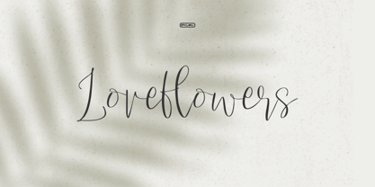 Love Flowers is a lovely and timeless handwritten font. It is a nice choice for creating eye-catching logos, branding, and quotes. Every letter has a unique and beautiful touch, to make your design come alive.
 - Longbranch by Solotype,
$19.95A modern cutting designed to give the appearance of an old wood type. The letters were cut as linoleum blocks about 2 inches high, then duplicated as copper electrotypes. Used for some Ringling Bros. circus work. - Melody and Memory by Epiclinez,
$19.00 Melody and Memory is a delicate and elegant handwritten font. Its distinct and well rounded letters make this font a masterpiece. Fall in love with its incredibly versatile style and use it to create spectacular designs!
 - British Cinema JNL by Jeff Levine,
$29.00 The hand lettered titles and credits from the 1945 British film “The Way to the Stars” were the working model for the aptly-titled British Cinema JNL, which is available in both regular and oblique versions.
 - JH Lina by JH Fonts,
$60.00 JH Lina is an Arabic Naskh typeface, including four weights; it is typical for long running text, headlines, branding , news letters, magazines, signage and electronic publishings ... The diacritic positioning is fine tuned per the publishers requirements.
 - Sneaker Script by Dharma Type,
$34.99 This script loops and loops like a spaghetti using the power of OpenType alternates. The lettering made by this font would evoke your young days in the 60s & 70s.Please check the instruction in the Galley tab.

