10,000 search results
(0.235 seconds)
- Become Display by Brenners Template,
$19.00 BECOME Display Font Family It tries to display playful ideas in well-balanced styles. Hello, designers. We always seek new innovations, but run into the world of forms and frames, presently. This font family presupposes pleasant imagination and provocation, but controls the change of various styles so as not to lose a sense of balance. B, E, M and W glyphs started from the same skeleton, but the detailed correction work for interpolation transformation was all applied differently. It is designed to be well suited to any layout while providing a unique stimulus. It can be a great display for all ages, from kids to seniors, and covers publishing, web, app and graphic design areas. OpenType Features Stylistic Sets(ss01) : C,E,G,H,L,N,O,Q,U,Z(Uppercases), a,b,c,d,e,g,i,j,l,,n,o,p,q,u,z(lowercases) Stylistic Sets(ss02) : ↑↗→↘↓↙←↖↔↕ ligatures : fi,fl oldstyle figures tabular figures fractions
 - Salloon by Ingrimayne Type,
$8.95 The original version of Salloon was what has become Salloon-Wide. It was designed a year or two before 1990. The narrower version, which is now the regular version of the face, was constructed a few years later. There never has been a true lower-case set of letters for these fonts, but the narrower version introduced a second set of caps by removing the side bumps from the letters. Although Salloon may look like an old font, no historic font closely resembles it. Fonts with bold, thick stems such as Salloon invite interior decoration. The five striped versions and the shattered version of the font were produced a year or two after the construction of the narrower Salloon when the arrival of a font distortion program made it easy to cracked and stripe fonts. In 2019 an outline style and two highlighter styles were added to be used in layers with the Salloon-Regular and one highlighter style was added to be used with Salloon-Wide.
 - Gallinari by Jehoo Creative,
$18.00 Modern Grotesk with attractive Display set Gallinari has it. . Gallinari is an attractive Grotesque suitable for all kinds of design needs. Starting from the Heading - Body font is reliable, Has a humanist and geometric character makes it a universal grotesque. Gallinari is equipped with very complete size variants, thin to black, not only that, this font has a condensed style which is paired with Oblique style for a total of 36 fonts in a complete family. What makes it interesting Gallinari has the Uppercase Display set on ss05 bold and sharp, for the letters C, G, O, Q, S, Z completely changed from their basic shape to meet the wild and cool type of display, ss01 ss02 ss03 ss04 is used to give alternative forms of the basic letters (A, P, R, Q, W, Y, a, w, y). Each Gallinari style has more than 680 glyphs and supports various Western European and Cyrillic languages.
 - Majora Pro by Latinotype,
$29.00 Majora Pro is a slab serif typeface which derives its name from a Portuguese historical toy manufacturer. The font comes in 8 styles, ranging from a delicate Thin to a robust Black, with matching italics and an upright version of stencil fonts, resulting in a total of 24 weights. Majora Pro is well-suited to a wide range of design projects which include packaging, editorial design, screen use, etc. Its humanistic features and moderate contrast between thick and thin strokes make it also suitable for long block of texts while having a high degree of legibility. The font includes a set of alternate glyphs which help give your compositions a different and unique look. The Stencil version was specially designed for use in signage, packaging, titles and headings. Majora Pro contains an extensive set of 750 characters (including small caps, different figure styles, etc.) that support over 200 Latin-based languages. Majora is the previous version of Majora Pro.
 - Nikola by Untype,
$29.00 Nikola is a text typeface that offers a wide range of possibilities. While its regular and medium weights were specially optimized for maximum performance, balanced for excellent legibility and carefully crafted to spread a scent of tradition on long text settings; its extreme weights, on the other hand, were designed with a more display use in mind, and thanks to the flexibility place at disposal by its many alternates, swashes, decorative cartouches, borders and ornaments, can deliver a vintage, reliable, dynamic, fancy and even playful inflection to the text. Nikola includes a large set of over 1400 glyphs, support for more than 200 latin script languages and 1.21 gigawatts of the finest type design generated by classic proportions, the elegance and formality of the early XX century and a glimpse of expressionism on terminals and serifs. Nikola was named after Nikola Tesla as a tribute to the pioneers of the electric age.
 - Brevia by HVD Fonts,
$40.00 Type designer Hannes von Döhren created Brevia, a soft sans-serif type family consisting of seven weights plus matching italics. The fonts have a hint of a brushed feeling and come across as casual and friendly. Nevertheless Brevia’s architecture is straight, making it perfect for longer texts. Because of its large x-height, it also performs well in very small sizes. Brevia’s heavier weights are slightly more curved and have an eye-catching appearance. They unfold their strength especially in greater sizes. This contemporary type family is intended to be used in applications like Cosmetics, Service, Food and Advertising–basically everywhere a pleasant feeling should be conveyed. Brevia is equipped for highly professional use. The OpenType fonts have an extended character set to support Central and Eastern European as well as Western European languages. Each font includes small caps, fractions, old style-, lining-, tabular numbers, scientific superior/inferior figures and a set of arrows.
 - DM PopCap by DM Founts,
$20.00 DM PopCap is the third typeface released by DM Founts. It was created to accompany a 2013 LEGO-based project, which itself was inspired by the music video for Scream by Michael and Janet Jackson. I had to create the typeface in order to make title cards, as no such typeface appeared to exist. Although the resulting typeface looks similar to the text appearing in the music video, I also set myself the challenge of creating the remaining characters of the alphabet, as well as others that some would find useful. As suggested by the music video, the typeface would be ideal for a futuristic or technological setting, particularly concerning space travel. In the project I had paired this typeface with Myriad Pro. As with my other offerings, this font is intended for use heading or standalone title use - but it also appears to work on its own for small paragraphs of text.
 - Balcony by Shaily Patel,
$10.00 Balcony is a decorative display typeface inspired by the patterns of metal safety grills. Its highly geometric features may be used to identify it as Art Deco. It is a monospaced type family with all characters confined in a square frame. The main idea of Balcony is to create a grill-like pattern when letterforms are placed together. This creates an illusionary experience for the reader. The best way to use this typeface is without leading, as shown in the visuals. Balcony also comes with two stylistic sets. The first stylistic set contains most characters with more decorative elements and the second one includes Dingbats. These Dingbats are motifs with simple geometric patterns that may be used for any kind of ornamentation. The diacritics letterforms are geometrically squeezed within the square frame to include the accents. This experimental typeface comes with about 650 characters and four weights (Thin, Light, Regular and Bold). The font family supports Western and Central European languages.
 - Brandon Text by HVD Fonts,
$40.00 Brandon Text is the companion of the famous Brandon Grotesque type family. It has a higher x-height than the Grotesque version and is optimized for long texts, small sizes and screens. This sans serif type family of six weights plus matching italics was designed by Hannes von Döhren in 2012. Influenced by the geometric-style sans serif faces that were popular during the 1920s and 30s, the fonts are based on geometric forms that have been optically corrected for better legibility. Brandon Text has a functional look with a warm touch and works perfectly together with Brandon Grotesque . It is manually hinted and optimized for screens, so it will be a good choice for Websites, eBooks or Apps. The whole Brandon series is equipped for complex, professional typography with different sets of numbers, alternate letters, fractions and an extended character set to support Central and Eastern European as well as Western European Languages.
 - Espinosa Nova by Estudio CH,
$- Espinosa Nova is a revival based on the types used by Antonio de Espinosa, the most important Mexican printer of the sixteenth century and very probably the first punchcutter anywhere in the American continent (1551). In 2010, its main fonts were awarded two certificates of excellence: one by TDC2 (Type Directors Club Typeface Design Competition), one by Tipos Latinos (Biennial of Latin American Typography). According to Robert Bringhurst, it is “an unusually intelligent family of type, reaching back to one of the most exciting moments in typographic history and reaching forward to the typographic future”. All of the fonts intended for setting text include small caps, five sets of figures (oldstyle and lining, both proportional and tabular, plus tabular small caps), many f and long s ligatures, and capital sharp S (U+1E9E). In addition, the Capitular fonts allow to create interesting effects by overlapping layers. This family feels very comfortable in books, but it can be used everywhere a touch of classic & elegance is required.
 - PGF Qualta by PeGGO Fonts,
$24.00 "Qualta" was initially designed in 2017 as a submission for a type design assignment while at typography school, originally launched under Alt-A Foundry, "PGF Qualta" was developed specially for Publishing Agency under the supervision of Peggo Fonts Foundry, now with a complete Small Caps set, classic and old style numeric figures, lining and tabular forms, scientific and fractional notation set, arrows set, light parenthesis set. Set on producing a geometric sans, it started with the circular form drawn from a 50s television screen. The bloated shape gave an illusion of protrusion and so much open space to the rounded letters. A broken stem was then added to the lowercase to provide a notch that allowed the typeface legibility in smaller sizes. The typeface was then developed into eight cuts with their corresponding italics. The lower case g includes a variation with a transitional link derived from the upper case Q’s tangent tail. Qualta’s original concept was designed by Isabel Gatuslao and was developed by Pedro Gonzalez.
 - Alpha Dance - Unknown license

- Metro Office by Linotype,
$50.99The Metro Office family is designed after the model of the original sans serif family – Metro No.1 – produced by W.A. Dwiggins and Mergenthaler Linotype’s design studio during the late 1920s and 1930s. A distinctly new interpretation of the sans serif idea, Metro was a thoroughly “American” sans serif when it was released. However, over the ensuing decades, it became a favorite the world over. Moreover, it is one of the first “humanist” sans serif typefaces designed. While redesigning Metro in 2006, Linotype’s Type Director Akira Kobayashi drew from his own knowledge of humanistic letterforms. The result is a redefined Metro; a typeface that is finally ready for heavy text setting. The original Linotype Metro No.1 never had italic variants. Kobayashi has created oblique variants, extending its use in document setting. A double-storey a and g, as well as a wider w were features of Dwiggins’ original Metro design that were filtered out by Mergenthaler Linotype in the 1930s. Kobayashi remedied this historical slight, retooling Dwiggins’ original forms and optimizing their legibility. Kobayashi has additionally retooled some of Metro’s more troublesome letters, which has black elements that became too dense. By opening up the troublesome joins (like that on the Q), Kobayashi has given his new Metro a more even color in text, improving its legibility while retaining its original spirit. - LC Trinidad by Compañía Tipográfica de Chile,
$34.00 Lc Trinidad is the result of a series of wonderings regarding geometric Sans Serif typography design, in particular; Futura of Paul Renner. A “conversation” arose between me and the designer – actually there was no conversation, it is an euphemism for “I saw his designs, I draw them and discussed with myself some of his decisions – that ended up being the origin of this font firsts glyphs: A, H, N, O, R and S. I started with uppercase letters, and here is when Rudolf Koch with Kabel and his “Das schreibbuchlein” joined the conversation. This is how I could develop some alternative lowercase letters so as to illustrate this imaginary discussion. The result is a sans serif, geometric, modern typeface with classical Roman proportion in the uppercase letters; two stylistic sets for lowercase letters (setKoch and setRenner), rational, open and sharp ends. It is ideal to form titles, medium length texts, branding, exhibitions and animations. The family consists of 9 weight variants and their corresponding oblique versions and small caps. With more than 900 glyphs, it covers more than 190 Latin languages and together with its Opentype functions it creates a modern and versatile family. Besides, it has powerful OpenType features for each style, including stylistic sets, extended language support, ligatures, contextual alternates, lining figures, oldstyle figures, small caps numbers, arrows, fractions, superscripts, subscripts and many more.
 - Esperanza™ - Unknown license

- Noma by Spinturnix,
$15.00 Noma is a new wide-set display font with a minimal geometric style. I designed Noma because I wanted a tech-inspired font that has plenty of character while remaining legible. Noma is a great choice for high-impact headings and logotypes. I hope you enjoy, thanks for checking it out!
 - Hongkong Script by Hrz Studio,
$14.00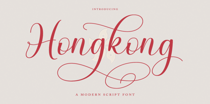 Hongkong Script is a beautiful handwritten font, it is perfect for logos, invitations, stationery, wedding designs, social media posts, advertisements, product packaging, product design, labels, photography, watermarks, special events or anything else. Hongkong Script comes with a full set of uppercase and lowercase letters, lowercase swash, multilingual symbols, numbers, punctuation.
 - Primitive Icons by Juraj Chrastina,
$14.00 Primitive Icons is a set of 52 simple icons included in a font in place of the letters A-Z and a-z. You can quickly and easily use it in your web design, GUI design, stationery design or any other graphic work. You can download the instruction PDF here.
 - My Little Eye NF by Nick's Fonts,
$10.00Here's another experiment in minimalism, using just three basic shapes to fashion an alphabet. Use it liberally when you want an air of intrigue, or to send secret messages. This font contains the complete Latin language character set (Unicode 1252) plus support for Central European (Unicode 1250) languages as well. - RMU Gong by RMU,
$30.00 Based upon an Arno Drescher design for Schriftguss, RMU Gong was freshly redrawn and redesigned and is intended for being a splendid font for headlines, subtitles, ads, posters etc. It comes with full sets of superior and inferior numbers, and even a long s can be accessed by typing [alt] + b.
 - Picaro NF by Nick's Fonts,
$10.00A rather quaint but charming typeface, originally named Harlequin, provide the inspiration for this typeface. Its mild eccentricities will add an inviting warmth to your next project. Both versions of this font contain the Unicode 1252 (Latin) and Unicode 1250 (Central European) character sets, with localization for Romanian and Moldovan. - Impressive by Ghuroba Studio,
$11.00 Impressive is a light and charming handwritten font with incredible style, and comes in two styles: Regular and Italic. Get inspired by its modern simplicity. It's perfect for logos, branding, photography, invitations, watermarks, advertisements, product designs, stationery, labels, product packaging, special events or anything that need a hand-written style.
 - See You Later JNL by Jeff Levine,
$29.00 The sheet music cover of Lew Brown and Albert Von Tilzer's 1917 wartime song "Au Revoir, But Not Goodbye (Soldier Boy)" had its title hand-lettered in a condensed sans serif design with the influence of Art Nouveau styling. This has now been re-drawn digitally as See You Later JNL.
 - Mahgdalena by Phonnastudio,
$15.00 Mahgdalena is a beautiful, well-balanced, and refined script font. It has a classy, elegant, and modern look that can be used for logos, branding, invitations, stationery, wedding designs, social media posts, and much more! what you get: - Stylistic Alternate - a ligature - Number and Punctuation - Include Multilingual support Latin simple.
 - Superbia by Rillatype,
$14.00 Superbia is a textured brush font! The natural hand writing script is suitable for you who needs a typeface for headline, logotype, apparel, branding, packaging, advertising and more. This typeface is comes with uppercase, lowercase, punctuation, symbols, numerals, stylistic set alternates as well as multi-lingual support. It is PUA Encoded.
 - Miralight by Herofonts,
$39.00 Miralight™ is a fresh and casual script. It will give a fresh and trendy touch to your artwork. Modern and stylish, Miralight™ also comes with fancy alternate characters like ending swashes and tales.The font has an extended character set supporting most Central European and Eastern European languages. Enjoy :)
 - Alderlite by Ditatype,
$29.00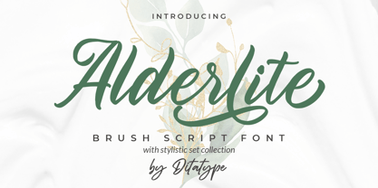 Alderlite is a elegant brush font. With a classy style, it brings a beautiful and chic typeface. Alderlite is best used for branding logotype, and quotes. Includes: Alderlite (OTF) Features: Standart Ligatures Stylistic Set Multilingual Support PUA Encoded Numerals and Punctuation Thank you for downloading premium fonts from Dita Type
 - Food Vendor JNL by Jeff Levine,
$29.00Here's a simple little retro font that got its inspiration from a food vending truck pictured in a local newspaper's online article. Fun and retro, Food Vendor JNL evokes simpler times. The font is a basic character set, with a blank diamond on the equal sign keystroke for spacing or embellishment. - Hammock by One Fonty Day,
$10.00 Hammock is a chilled and simple handwritten typeface. Having the combination of the large capital letters and the small lowercase enable you to play with the font uniquely and flexibly. Also, its left-slanted letters give a bit of special look to the typeface. Most of the european languages are supported.
 - Takeshi by Hanoded,
$15.00 I just finished book 8 of The Expanse (by James S.A. Corey) and the name Takeshi popped up somewhere, so I decided to use it for this font family! Takeshi is a hand made set of fonts: a fat display font, a thinner complementary font and a doodle font. Enjoy!
 - Black Orchard by ErlosDesign,
$19.00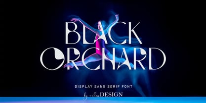 Black Orchard is a sans serif font with modern style. It includes uppercase letters, numeral, a large range of punctuation and also multilingual support. Perfects for poster, web design, magazine cover, album cover , branding and many more. The file you will get is: • Works on PC & Mac • Simple installation Enjoy!
 - Speaker by Arendxstudio,
$15.00 Speaker - Graffiti font is a type of font typically used in street art and graffiti designs. It is a bold and expressive font, which usually features stylized and distorted letters, drips, and splatters. Some characteristics of graffiti fonts Features : • Character Set A-Z • Numerals & Punctuations (OpenType Standard) • Accents (Multilingual characters)
 - Balava PS Font Duo by pentagonistudio,
$19.00 Balava Is A Modern Duo Font Character Inspired By Serif and Script Style SOFTWARE REQUIREMENTS : Fonts and alternate : No special software required they may be used in any basic program /website apps that allows standard fonts That's it folks! You can go ahead and get cracking :) Have a Good Day !
 - Dusty Rose NF by Nick's Fonts,
$10.00Based on the logotype lettering for the Dutch magazine Geillustreerd Schildersblad in 1940, this devilishy different Deco font will add a bit of naive charm to any project it graces. This font contains the complete Latin language character set (Unicode 1252) plus support for Central European (Unicode 1250) languages as well. - Florania by Eko Bimantara,
$18.00 Florania is an elegant yet versatile font that shown beauty and classy look. It have lot of alternates and ligature choices with standard latin language coverage. Florania is fit for display, title, large sizes, and short text. Also fit for broad design project such as brand, web, logo, and others.
 - Engram Pro by Borutta Group,
$35.00 Engram (2015-2020) designed by Mateusz Machalski is a classical sans geometric family. This typeface is characterised by a lot of details, which gives it a friendly character. Scalable x height, rounded corners makes Engram good choice for many purposes. All family consist 22 styles with italics from Hairline to Black.
 - Oh Chewy by Motokiwo,
$23.00 Oh Chewy... a sweet bold script font with alternates and lovely swashes. It has fat strokes and smooth edge, that's great for food branding, retro style, and eye-catching logo. Feature: Uppercase Lowercase Numeral & Punctuation Special Character (Standard Multilingual) Stylistic Alternates Stylistic Set (SS01 & SS02) Swash Access All Alternates PUA Encoded
 - Gatter Sans by Arodora Type,
$35.00 Gatter Sans is a modern family with lots of alternate glyphs with geometric lines. Thanks to the crowd family, it will give you a great advantage in your poster works. You can also benefit from this creative and original family for your digital designs, ui/ux applications, and corporate identities.
 - Hoosier Daddy by Parkinson,
$20.00 Hoosier Daddy is based on Foundry Type samples from various mid-19th century specimen books. This shaded slab serif was made by conforming several different cuts of the styles, filling out the character set, and adding a few contemporary touches for freshness. This is a display face. Use it big.
 - Bla Bla by S6 Foundry,
$25.00 Bla Bla is a contemporary serif typeface inspired by brutalist forms, featuring large open counters, curved, round forms, creating a modern & elegant glyph set. The organic curves with gentle repetitions create powerful and harmonious forms. Designed to be a stylish modern family it is perfect for communication and branding projects.

