10,000 search results
(0.25 seconds)
- Bechamel by Andinistas,
$29.00 Hello! Do you need letters that look like they are drawn with a brush so that your creative work shines and stands out? We present Bechamel, a family of script fonts designed to be combinable with Bechamel Roman. BECHAMEL SCRIPT was hand drawn to design words and phrases in logos, packaging, posters, envelopes and greeting cards. BECHAMEL SCRIPT has high expressiveness because its energetic set of letters are meticulously drawn with calligraphy and lettering. In addition each of its incredible cursive letters give you the possibility to add a central vein to change the color, enhancing its impressive artisan splendor. These are the possibilities you receive by acquiring BECHAMEL: A) BECHAMEL-SCRIPT & VEIN: Cursive letters with carousel effect and OPENTYPE contained in: 26 Uppercase letters, 26 Small letters, 10 Numbers, 3 Fractions, 31 Punctuation marks, 77 Signs for languages belonging to Western Europe, 113 Signs for Central European languages. 20 Lowercase wipes, 13 uppercase alternatives for WORD START, 44 lowercase alternatives for HALF of word, 20 lowercase alternatives for WORD FINAL. NOTICE: Alternatives appear by clicking on glyph panel in Adobe Illustrator, Inkscape or Photoshop CC. B) BECHAMEL-WORDS: 57 words with capital letters underlined and combinable with BECHAMEL-SCRIPT 1, 2 and 3 ideal to connect and decorate your designs increasing expressiveness and authentic handwritten look of your ideas C) BECHAMEL-ORNAMENTS: 30 wonderful drawings made up of stars, borders, waves, hearts, dots, arrows, bow ties, etc., all specially coordinated to accompany your composite designs in BECHAMEL-SCRIPT and BECHAMEL-WORDS. Well, I hope that my work will be useful and above all that you have fun with it. If you have questions write to me that I will be happy to help you: • INTAGRAM: instagram.com/andinistas • BEHANCE: be.net/andinistas • FACEBOOK: fb.com/carlosfabiancamargoguerrero • TWITTER: twitter.com/andinistas
 - Brother Dreams by Ditatype,
$29.00 Brother Dreams is a captivating brush font that exudes a raw and artistic vibe. With its bold capitalized letterforms and ragged edges, this typeface brings a unique and rebellious touch to your designs. The defining feature of Brother Dreams lies in its rugged and ragged edges, giving the font a handcrafted and slightly distressed appearance. This font is designed with expressive brush strokes, capturing the essence of brush calligraphy. The bold capitalized letterforms command attention, making a powerful statement with their unconventional and untamed style. Inspired by the untamed spirit of artistic expression, Brother Dreams embodies a sense of creativity and authenticity. The rough and ragged edges add a touch of uniqueness and individuality to each letter, as if they were painted with passion and emotion. This font embraces imperfection and celebrates the beauty of artistic spontaneity. Each letter of Brother Dreams is meticulously crafted to maintain its boldness and legibility while embracing the rugged and ragged edges. The resulting composition is a balance of artistic expression and readability. This font allows your message to stand out with its raw energy and rebellious charm. Enjoy the various features available in this font. Features: Multilingual Supports PUA Encoded Numerals and Punctuations Brother Dreams is ideal for headlines, titles, logos, and any design that requires a lively and energetic display. Whether you're working on posters, packaging, branding materials, or any project that needs a touch of liveliness, this font will bring a contagious sense of cheer. Find out more ways to use this font by taking a look at the font preview. Thanks for purchasing our fonts. Hopefully, you have a great time using our font. Feel free to contact us anytime for further information or when you have trouble with the font. Thanks a lot and happy designing.
 - Rolling Brush by Ditatype,
$29.00 Rolling Brush is a script font that gives handwriting appearance with original and personal brush details. This font is made beautifully so that the letters are connected to each other, creating a continuous and flowing look. Each letter is attached to the previous letter and continues to the next letter, creating beauty in writing unity. This font shows brush details on each letter. Brush strokes displays a rough, organic texture to the edges of the letters, adding dimension and visual life. These details give a unique impression to this script font. On the other hand, even though it has a rough border, this script still maintains a natural and elegant aesthetic touch. Some letters may have dramatic twists, while others are simpler. This flexible shape creates an expressive and creative look to the lettering. Because it is designed with a rough border, it would be better if you use this font at a large text size so it is more easy to read. Enjoy the various features available in this font as well. Features: Alternates Ligatures Multilingual Supports PUA Encoded Numerals and Punctuations Rolling Brush is suitable for any designs that want to convey a warm, personal and alluring impression. You can use this font in the design of greeting cards, invitations, logos, labels, and many other design projects that want to create uniqueness through a natural, handwritten touch. Find out more ways to use this font by taking a look at the font preview. Thanks for purchasing our fonts. Hopefully, you have a great time using our font. Feel free to contact us anytime for further information or when you have trouble with the font. Thanks a lot and happy designing.
 - Sangli by insigne,
$- It started in 2007 with Chennai, the first of a three-part series of sans that I envisioned with slab serif counterparts. Each font would differ from the others in how the stem terminals were expressed. The initial font was extremely well received, and a revitalized and remastered Chennai made its appearance two years later, complete with new weights and new, novel OpenType features. Then came Madurai, a variation of Chennai based on the same core, only without the rounded stems. Chennai’s rounded stems made it distinctive and great for headlines but left it lacking appeal as copy--a problem that Madurai easily solved. And now comes Sangli, the final iteration of my original 2007 vision. Sangli is a happy medium. Like Chennai, it’s great for headlines--but not too distinct for copy. Sangli keeps the same core structure as the other two, but new less sharp forms give this latest font a friendlier look that’s more versatile than the original Chennai and less formal than Madurai. The font includes a whole range of six weights from light to black, along with condensed and extended options as well for a total of 54 fonts. There are plenty of OpenType features, including small caps. Alternates include normalized capitals and lowercase letters that include stems for when you want a more traditional look or when you’re writing copy. Sangli also supports over 70 languages that use the extended Latin script. Use Chennai, Madurai, and their slab serif variants interchangeably with Sangli, too, for even more options in your work. All three complement one another well. So when you need a balanced font that stands boldly on the page and commands your reader’s attention, look within and find your Sangli.
 - ITC Franklin by ITC,
$40.99 The ITC Franklin™ typeface design marks the next phase in the evolution of one of the most important American gothic typefaces. Morris Fuller Benton drew the original design in 1902 for American Type Founders (ATF); it was the first significant modernization of a nineteenth-century grotesque. Named in honor of Benjamin Franklin, the design not only became a best seller, it also served as a model for several other sans serif typefaces that followed it. Originally issued in just one weight, the ATF Franklin Gothic family was expanded over several years to include an italic, a condensed, a condensed shaded, an extra condensed and, finally, a wide. No light or intermediate weights were ever created for the metal type family. In 1980, under license from American Type Founders, ITC commissioned Victor Caruso to create four new weights in roman and italic - book, medium, demi and heavy - while preserving the characteristics of the original ATF design. This series was followed in 1991 by a suite of twelve condensed and compressed designs drawn by David Berlow. ITC Franklin Gothic was originally released as two designs: one for display type and one for text. However, in early digital interpretations, a combined text and display solution meant the same fonts were used to set type in any size, from tiny six-point text to billboard-size letters. The problem was that the typeface design was almost always compromised and this hampered its performance at any size. David Berlow, president of Font Bureau, approached ITC with a proposal to solve this problem that would be mutually beneficial. Font Bureau would rework the ITC Franklin Gothic family, enlarge and separate it into distinct text and display designs, then offer it as part of its library as well. ITC saw the obvious value in the collaboration, and work began in early 2004. The project was supposed to end with the release of new text and display designs the following year. But, like so many design projects, the ITC Franklin venture became more extensive, more complicated and more time consuming than originally intended. The 22-font ITC Franklin Gothic family has now grown to 48 designs and is called simply ITC Franklin. The new designs range from the very willowy Thin to the robust Ultra -- with Light, Medium, Bold and Black weights in between. Each weight is also available in Narrow, Condensed and Compressed variants, and each design has a complementary Italic. In addition to a suite of new biform characters (lowercase characters drawn with the height and weight of capitals), the new ITC Franklin Pro fonts also offer an extended character set that supports most Central European and many Eastern European languages. ITC Franklin Text is currently under development.
 - Directors Cut Pro by Type Innovations,
$39.00 Directors Cut Pro is a compelling new font series designed by Alex Kaczun. It recently won the second place—a commendation in the Canberra Typeface Competition. This handsome Geometric Antique serif design is based on the early 19-century Moderns and Scotch styles, infused with the warm charm of traditional antique, added for interest. Capturing the best of both ages: it's warm, comforting and persuasive. Directors Cut Pro's graceful aspects naturally invite uses at large sizes, for which we have created a stunning and elegant lighter weight. But, this workhorse typeface series incorporates a solid regular weight, along with its italic—ideal for a multitude of text purposes, at varying point sizes. A robust Bold weight is available for headlines and emphasis. Director Cut Pro comes with proportional as well as tabular lining figures for quickly setting up charts and tables. It also contains an extended character set—including most Central European languages. Alex Kaczun is in the process of expanding this typeface series to include additional weights, styles and proportions. Stay tuned! The large Pro font character set supports most Central European and many Eastern European languages.
 - High Class by Redy Studio,
$19.00 High Class – Handwritten Font High Class is a handwritten font, with high-end style and embodies the most desirable elements of fashion, setting an impression of classiness. This font truly brings on the vibe of high society. While this font comes with over 122 hand-drawn ligatures, it has been carefully kerned to give results as if they were all handwritten. It comes with a clean base look and all over the place forms with imperfect letters, messy style ligatures, and ampersands that make it complete. Easy to use, you can create a great impact on your work. High Class font is perfect for branding projects, logos, wedding designs, social media posts, advertisements, product packaging, product designs, label, photography, watermark, invitation, stationery, and any projects that need handwriting taste. High Class features: A full set of upper & lowercase characters Numbers & punctuation 122 Gorgeous ligatures A full set of alternate upper & lowercase characters Multilingual symbols PUA Encoded Characters – Fully accessible without additional design software. Feel free to give me a message if you have a problem or question. Thank you so much for taking the time to look at one of our products.
 - Kostic Serif by Kostic,
$50.00 Kostic Serif is a classic transitional typeface (like Baskerville, Bookman, Caslon, Times) with tall, clean characters and a large glyph set to support all European languages - Greek and Cyrillic script included. Excellent for setting multiple pages of text and packed with OpenType features (proportional lining and oldstyle numbers, tabular figures, superscript and subscript, numerator and denominator figures, fractions and 31 ligature in 659 characters), it should meet the demands of even the most demanding typographic works. Kostic Serif is made with fairly large x-height, so the text is legible in very small sizes. Zoran began the work on Kostic Serif around 2002 and after completing Regular, Bold and matching italics, he wasn’t too pleased with the design, so he dropped further work on it to make other fonts. In 2010 Nikola came upon unfinished files for Kostic Serif, and decided to redesign the letters, while retaining basic proportions and widths that Zoran established earlier. When they were both pleased with the new look of the font, they made Medium and decided to add CE and Greek script to the glyph set, to make it pan-european.
 - Ekamai by Eclectotype,
$40.00 This is Ekamai, named after the district of Bangkok I lived in. It is based on Quinella, and was supposed to be a quick and easy reworking of that font into a "tight-not-touching" (rather than overlapping) version. As is often the case with quick and easy things, it turned out to be neither, and the vast majority of glyphs needed to be completely overhauled to fit the new system. This face is deliciously plump face, with lovingly rendered curves and just the right amount of cuteness; perfect for food packaging (of the sweeter variety probably!), logos, magazine headlines and the like. It performs admirably in all caps settings. The numerals are expressive hybrid figures (somewhere between lining and oldstyle). The overall feel is friendly and soft, without being overtly saccharine. Ekamai is equipped with subtle contextual alternates (which I'd recommend leaving on) to help with the tight fit, a handful of discretionary ligatures if that's your thing, and a case feature for all caps settings. The stylistic alternates and stylistic set 1 features simply change the # glyph to an attractive numero. Automatic fractions are included along with wide-ranging language support.
 - Canilari by W Type Foundry,
$35.00 Canilari is a post-modern type family inspired by Diaguita pottery and contemporary serif typefaces. The Diaguita culture—developed from 10th century A.D. until 16th century A.D.—settled in the area of the present-day north Chile and northwest Argentina. Surviving cultural expressions of the Diaguita people are reduced to just a few pieces of beautifully decorated pottery of high technical quality. Canilari itself is a scream of identity with an incomparable tone that borrows elements from native America and proudly show them to the world. The intense and consistent personality of Canilari makes it a functional font for a wide range of uses: from continuous text in the most challenging environments to pithy, high-impact headlines. Canilari is well-suited for publishing: newspapers, magazines, books, etc. Its flashy look and angular shapes also make it an excellent choice for posters, logotypes, and advertising. The family consists of 2 sets: one standard and one pro, each in 4 weights plus italics. Canilari also includes a set of ornaments and illuminated caps. Together, the Std set (369 characters) and Pro (710 characters) support 219 different languages. This typeface was selected at the Bienal Tipos Latinos 2014.
 - AT Orlando by Monotype,
$29.99Orlando is the work of British designer Freda Sack. It is an all capital, outline typeface including a complete set of swash initials and an array of stunning flourishes designed especially for this typeface. Orlando was inspired by and modelled upon 19th century antique type styles. - Adversary BB by Blambot,
$8.00 Blambot's Adversary BB family is a robust sans with a hint of retro-futurism. It was initially created for use in Blambot founder, Nate Piekos's pesonal title block for design projects. It's therefor very clean and extremely legible. The set includes regular, italic, bold, and bold italic.
 - Hadesz PRO by JOEBOB graphics,
$28.00 Hadesz is a lusty and playful font with a rough, brushy texture. It comes with an abundance of opentype features, which make for the handwritten authenticity one looks for in a handwriting font. Hadesz comes in two versions: Basic (without ligatures) and PRO (the complete set).
 - Display Ardent by Gerald Gallo,
$20.00 Display Ardent is a display font not intended for text use. It was designed specifically for display, headline, logotype, branding, and similar applications. Display Ardent has the lowercase alphabet only, there is no uppercase alphabet. For convenience, the lowercase alphabet characters were repeated in the shift set.
 - The Sherloks by Dikas Studio,
$15.00 Sherlock have 4 Style : Regular, Oblique Regular, Vintage and Oblique Vintage with hand drawn character and opentype feature its very helpfull to get Vintage design. Suitable and applicable to create vintage design, branding, logos, product packaging, invitation, quotes, t-shirt, label poster etc. Caps Only Fonts.
 - Orlando by ITC,
$29.99Orlando is the work of British designer Freda Sack. It is an all capital, outline typeface including a complete set of swash initials and an array of stunning flourishes designed especially for this typeface. Orlando was inspired by and modelled upon 19th century antique type styles. - Mono and Friends by Alit Design,
$12.00 Mono and Friends font is inspired by monoline style font. Mono and Friends consists of 6 unique and cool family packs. Especially if it is combined between several fonts. You get a cool font package for design projects that are non-formal, funny, kidy and so on.
 - Norline by ATK Studio,
$15.00 Norline™ is a new bold sans-serif typeface created to be used for bold titles with 3 shapes into a display fonts way to make it legible for contemporary use. This type features a Latin Pro character set, covering multiple languages written with the Latin script.
 - The Boundaries by Dirtyline Studio,
$15.00 The Boundaries is a handmade Clean typeface, with authentic brush imperfections, and a very bouncy baseline It has a perfectly paired complimentary marker font , and a super handy set of bonus Swash. Ideal for logos, handwritten quotes, product packaging, header, poster, merchandise, social media & greeting cards.
 - Sahan by GRIN3 (Nowak),
$20.00 Sahan is a typeface which looks almost like Arabic, but it is not a real Arabic font. This simulation font includes upper and lower case Latin alphabets and numerals. Language support includes Western, Central and Eastern European character sets, as well as Baltic and Turkish languages.
 - Bayle Daisy by madeDeduk,
$16.00 Introduce Bayle Daisy is a brush handwritten font to give an incredible impression for all your project design come with a lot ligatures and Alternative to make everything look realistic handmade handwritten. Included: Uppercase & Lowercase Number & Symbol International Glyphs Multilingual Support Ligature Alternative Hope you enjoy it.
 - Count Floyd by Elemeno,
$10.00Bold and simple, but shaky, Count Floyd was named for the horror host spoof from SCTV. It has the look of a spooky grunge font, but is far easier to read, even at relatively small sizes. Please note that this font has a limited character set. - Raspail by Eurotypo,
$48.00 Raspail is a contemporary calligraphic font inspired by copperplate. Raspail has a great inclination with extensions of ascending and descenders strokes, widely ornate, and a special emphasis on the connection of the letters. It includes more than 350 alternates, 50 ligatures and a great set of ornaments.
 - Noman by Arendxstudio,
$15.00 Noman - Bold Display Fontl, retro looking display font. Whether you use it for cartoon related designs, children games or just any creation that requires a lovely touch, this font will be an amazing choice. Features : • Character Set A-Z • Numerals & Punctuations (OpenType Standard) • Accents (Multilingual characters) Ligature
 - Crushland by Ditatype,
$29.00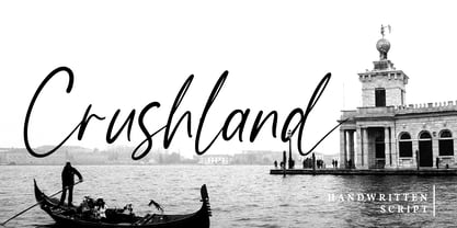 Crushland is a beautiful handwritten font. With a natural handwritten style, it brings a classy and beautiful typeface. Crushland is best used for branding, logotype, and quotes. Features: - Multilingual Support - Stylistics Set - Beautiful Ligatures - PUA Encoded - Numerals and Punctuation Thanks for visiting and purchasing my font!
 - BD Unicorse by Typedifferent,
$25.00 BD Unicorse is a retro futuristic mixed case display font with the main characters set on the small keys and alternatives on the capital characters. It features 12 ligatures and is great for the use as headlines in magazines, logotypes on posters, games, movies or music packaging.
 - Mevada SRF by Stella Roberts Fonts,
$25.00 Mevada SRF and its oblique partner are a remix of the Ray Larabie design Devama SRF, another exclusive from Stella Roberts Fonts. The net profits from my font sales help defer medical expenses for my siblings, who both suffer with Cystic Fibrosis and diabetes. Thank you.
 - Panther Black by Device,
$39.00 Developed from Rian Hughes’ Black Panther logo for Marvel, Panther Black is a sharp and stylish three-weight headline sans. Built from sweeping curves and tapered crossbars, its bold, dynamic design is seen to best effect in shorter settings. Available in condensed, normal and extended variants.
 - II Increments Sans by Increments,
$19.00 Informed by classic grotesk proportions and principles within musical theory, II Increments Sans results in a rhythmic and composed sans-serif. Set within a structured grid, the intonation and harmony between its functional principles and emotive characteristics allow for use at both text and display sizes.
 - Pureline by Cititype,
$12.00 Pureline is a modern signature font full of life. Get inspired by its unique charm! Available in regular and italic style. Pureline: is perfect for branding projects, logo, social media posts, advertisements, product packaging, product designs, label, photography, watermark, stationery, and any projects that need handwriting taste.
 - Elite Resort JNL by Jeff Levine,
$29.00 A 1940s sheet music edition of an early 1900s song entitled "You Taught Me How to Love You, Now Teach Me to Forget" was set in a popular metal type slab serif face. It is presented digitally as Elite Resort JNL, in both regular and oblique versions.
 - Suarez by GRIN3 (Nowak),
$24.00 Suarez is a handwritten, fully connected script with ligatures to help with flow and readability. It can be used for invitations, greeting cards, posters, advertising, weddings, books, menus etc. Language support includes Western, Central and Eastern European character sets, as well as Baltic and Turkish languages.
 - JT Douro Sans by JAM Type Design,
$10.00 Inspired by the art deco movement in France at the turn of the last century and in United States in the 1930s. Boasting over 500 glyphs, with its multiple ligature sets and alternatives, this is a wonderful typeface to use on posters, magazines and on promotional collateral!
 - Limelly by Yumna Type,
$16.00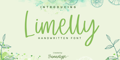 Limelly is a elegant handwritten font. Made for any professional project branding. It is the best for logos, branding and quotes. Every letter has a unique and beautiful touch. Includes: Limelly (OTF) Features: Standard Ligatures Stylistic Set PUA Encoded Multilingual Support Numerals and Punctuation by Yumnatype
 - RMU Skizze by RMU,
$35.00 In 1935 Ludwig & Mayer released Walter Höhnisch’s Skizze. This beautiful font was completely redrawn and redesigned for today’s usage. The following letters have stylistic alternatives: E, F, P, S, and T. To get access to all ligatures, it is recommended to both activate Standard and Discretionary Ligatures.
 - With A Twist by Letters by Wordsworth,
$23.00 With A Twist is not shy, not ordinary, not predictable which makes it the perfect choice for attention-getting titles. With A Twist Monoline is slightly more retiring and fun to fill in. Pull up a stool, order a martini & have some font fun - With A Twist.
 - Aradela Display by Attract Studio,
$18.00 Aradela Display is a psychedelic style font with unique ornamental characteristics that will set your project apart from the rest. Aradela Display comes using the opentype feature to access ligatures and alternates, each glyph is created to create harmony. It will brighten up your work, for sure.
 - Basic Nouveau JNL by Jeff Levine,
$29.00 The 1913 sheet music for "You’ll Be Welcome When You Get Back Home" had its title hand lettered in a simple, yet attractive Art Nouveau sans serif design which has been preserved as digital type. Basic Nouveau JNL is available in both regular and oblique versions.
 - Rascals by Letterhend,
$14.00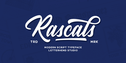 Rascals is a script typeface with vintage and rustic look! It works perfectly for those who need a typeface for headlines, logotype, apparel, invitation, branding, packaging, advertising etc. This typeface is comes in uppercase, lowercase, punctuation, symbols, numerals, stylistic set alternate, ligatures, and also contains multilingual characters.
 - Montgrove by Surplus Type Co,
$9.00 Montgrove is a beautiful serif font that includes an extensive set of ligatures that's too long to list! Montgrove features large extended serifs that help make it a memorable display font. This font works really well for branding projects, editorial layouts, stationery & so many other projects.