10,000 search results
(0.021 seconds)
- LEGO BRIX - Personal use only

- Zinjaro by ITC,
$29.99Zinjaro is the work of English designer Carol Kemp. Its clever design captures elements of both African and Latin American art in its forms. A combination of decorated and solid capital strokes gives it an exciting, unpredictable appearance and an array of devices and border elements further enhance the font. - Logos - Unknown license

- Lagos by Device,
$29.00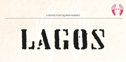
- Lugo by Eurotypo,
$90.00 The font "Lugo" is a heavy typeface designed for use in headlines and caption text. Their design has a strong visual impact, a persuasive and seductive personality throughout its organic shapes. This is a versatile and expressive font. Lugo can create an appealing atmosphere, conveying a gamut of message and emotions. It is well suited in the jobbing areas like packaging, logotypes, magazines, web pages and advertising, etc. Lugo has all the advantages of OpenType features that allow a variety of combinations: You may choose to set types in connected or unconnected ways, being used as body text or headlines for its good legibility, visual impact and accurate kerning. It has more than thousand glyphs: swashes, standard and discretional ligatures, stylistics and contextual alternates, old style numerals, word ending and tails. It has also an extended character set to support Central and Eastern European as well as Western European languages. Lugo is a city in northwestern Spain in the autonomous community of Galicia. The Celtic name Lug suggests that it may have been a sacred site. Augustus founded the Roman town of Lucus Augusti in 15-13 BCE following the pacification of this region. It is the only city in the world to be surrounded by completely intact Roman walls.
 - Lagos by Scholtz Fonts,
$19.00 Lagos was created because of the lack of African-inspired fonts that are truly modern without being partly art-deco in origin. I wanted to make a vigorous, sharp-edged font that reflects the energy and dynamism of modern Africa. The lines of the font combine the sharp angularity of African rocks and mountains with the smooth fluidity of Africa's snake-black rivers. The font is supplied in two styles, Lagos Regular and Lagos Light. Lagos Light is not a simple, mechanical modification of Lagos Regular. The outlines and proportions have been subtly modified to accommodate the lighter weight. Lagos contains a full 256 character set (upper and lower case, punctuation, diacritical characters, special symbols and numerals), in which all characters have been fully kerned and letter-spaced.
 - Lemos by Goodigital13,
$20.00 hand drawn brush who make the typeface looks very instant and messy. Uses for film title, cover album, logo, clothing, invitation, event, labels, poster, etc.
 - Ego - Unknown license

- Leo by Canada Type,
$29.95 Leo is an economic magazine and book face meant for use in sizes suitable for immersive reading, with different cuts optimized for different body copy size ranges, like footnotes and legal text. Designed with the explicit intent of relaying information without calling attention to itself, this typeface places itself squarely on the "function" side of the eternal debate about form versus content. The roman Leo fonts were built with as little ornamentation as possible, with wedge serifs, a high x-height and a skeleton somehwat rooted in the designers' reflections on the modern, post-war Dutch archetype. Rather than follow traditional models with entirely different forms, contracted widths and steep slants, the Leo italics deliver naturally subtle emphasis in reading by closely relating to the forms, stance and rhythm of their roman counterparts. The 12 Leo fonts contain over 700 glyphs each, and include support for the vast majority of Latin languages. Included OpenType features are built-in small caps, lining and oldstyle figures in both proportional and tabular sets, superiors, numerators, denominators inferiors, ordinals, automatic fractions, ligatures, and optional long descenders for optimal counterspace management in book and magazine text layout. For more information on Leo's character set, features and some print tests, please consult the PDF in the gallery section of this page.
 - Font - Unknown license

- KG Lego House - Personal use only

- KG Lego House by Kimberly Geswein,
$5.00 Neat handwriting perfect for teachers. This font includes extra math symbols for teachers. Just enough personality while still being perfectly neat.
 - Ninjas - Unknown license

- SONY's Logo - Unknown license

- TNA LOGO - Unknown license

- Leco 1988 by CarnokyType,
$18.00 The typeface LECO 1988 is another font family which belongs to LECO set. It is a display typeface, which is inspired by the title written on the bottle of lečo from 1988. Its typical features are embedded diacritics and significant black look with low contrast. Lower case is united with upper case and has several identical glyphs in both forms. Font contains alternative set of glyphs for letter „E“. Tabular numerals, superiors and inferiors and the full set of (glyphs - symbols) for languages using the Latin alphabet are also included in this font. LECO 1988 font family includes six specific styles: Regular, Blind, Gradient, Outline, Shadow and Stencil style. Those styles extend typographic options by mutual combination or overlapping, whilst every style share the identical metrics and kerning. Font format is Open Type with the support of several open type features. This typeface is suitable for creating logotypes, powerful posters or can be used as a headline display typeface.
 - Lugo Rockwell by madeDeduk,
$16.00 Introduce Lugo Rockwell is a brush vintage handwritten font to give an incredible impression for all your project design come with a lot ligatures and Alternative to make everything look realistic handmade handwritten. Included: Uppercase & Lowercase Number & Symbol International Glyphs Multilingual Support Ligature Alternative Hope you enjoy it.
 - Levo Dope by Sitintahitam,
$15.00 Introducing Levo Dope Slab Serif Font a typeface that exudes boldness and confidence. With its thick, heavy serifs and rectangular shape, this font is the perfect choice for any design that needs to make a strong impact. Transport your audience to the American West with the vintage charm of the Western slab serif font. Whether you're creating posters, advertisements, or signage, this font will capture attention and convey a sense of stability and strength. Also come with FREE illustrations and editable logo to make better design.
 - Leco 1983 by CarnokyType,
$15.00 LECO 1983 is a headline display OpenType typeface with its three styles: LECO 1983: regular LECO 1983 Blind: without interiors of signs LECO 1983 Negative: in its inverse form. The inspiration for creating this font came from the label on a 1983 bottle of Lečo. The characteristic feature of this font is an embedded diacritic. The monolinear character of drawings is dominant. This font is drawn as capital letter type for both: upper case and lower case letters. It contains alternatives of some signs (e, f, g, m, n, y) and (& and a glyph No) but it consists several interesting alternatives (ligatures) of pairs as (in, on, of, by) as well. This font is best used on strong posters or as a headline display typeface.
 - Leto Two by Glen Jan,
$30.00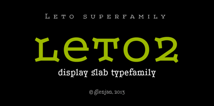
- Leto Sans by Glen Jan,
$20.00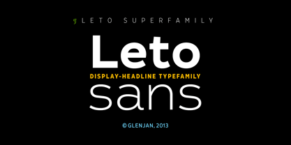
- Abdo Logo by Abdo Fonts,
$30.00 Abdo Logo is an Arabic display and text typeface. It is useful for headlines, books covers, logos design, slogans, advertisement and other graphic projects. The font is based on the simple lines of free style calligraphy. The font supports Arabic language and I may extended to cover additional scripts.
 - Ian Segoe by Ingrimayne Type,
$6.00 The faces of IanSegoe were early attempts by IngrimayneType to construct medieval-looking faces. They drew inspiration from several medieval-themed fonts that were available at the time (1990). The upper-case letters are similar but not identical in the two faces but the lower-case letters are completely different.
 - Hasta Luego by Hanoded,
$15.00 Hasta Luego means ‘see you later’ in Spanish. It is something you say when parting, but it doesn’t really mean you’ll have to see each other again. Hasta Luego is a happy, all caps font. It’s a bit random, a bit wobbly and it comes with some interesting discretionary ligatures for you to play with.
 - Segoe Print by Microsoft Corporation,
$39.00The Miramonte™ Pro Family was designed by Steve Matteson in 2006 as a friendly sans serif design suitable for user-interface design, corporate branding and publishing. The name means 'behold the mountains' in Spanish, suggesting the rustic, unrefined type design. Miramonte™ Pro Family is based on Stanislav Marso's humanist sans serif released by Graphotechna in 1960. This revival includes a cursive style italic rather than a sloped roman. Miramonte Pro Family includes an extensive character set for publishing Central and Eastern European languages. Its OpenType features include the euro symbol, alternates, old style figures, proprtional lining figures, diagonal fractions, stacked fractions, superscript/subscript and scientific inferiors. Character Set: Latin-1, CE, OpenType Pro features. View Miramonte Pro Type Specimen (PDF)NOTE: An OpenType-savvy application such as Adobe Creative Suite, Mellel or QuarkXPress is required to access the OpenType typographic features. - Leco 1976 by CarnokyType,
$- LECO 1976 is a headline display typeface in OpenType format. The title at the 1976 bottle of Lečo became an inspiration for creating this font. Besides the regular weight of the font, the font is drawn in light and bold font styles too, while each of these typefaces consists of a special alternative of an embedded diacritic. The font contains several specific styles as Stencil, Pixel, Tride, Shadow which combinations offer interesting possibilities for the typesetting. The metrics and kerning of every glyph of the font (except several glyphs in Bold) are identical. All the signs share the same character and size of the capital letters. This font is best used on strong posters or as a headline display typeface.
 - Leto Slab by Glen Jan,
$25.00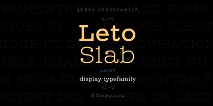
- Logo Sans by Emily Lime,
$16.00 Logo Sans is a clean, geometric sans-serif created with an obvious use in mind - logos (although quite suitable for longer texts as well). It is a clear, easy to read font that comes in a variety of weights & italics ...allowing for pleasing logo design combination and marketing pieces. Its wide characters and linear lines have a very modern, luxurious appeal. The family includes 5 weights...plus italics - for a total of 10 fonts.
 - Leto One by Glen Jan,
$30.00
- Segoe TV by Microsoft Corporation,
$39.00The Segoe™ TV font family was originally developed for MSNTV. Segoe TV italic was designed with attributes for improved legibility on TV screens. Segoe TV italic includes the Latin-1 character set. - Logos Service by Monotype,
$29.99 - Longhaultrucker Logo by sugargliderz,
$5.00
- Segoe Chess by Microsoft Corporation,
$29.00Segoe™ Chess font is part of the Segoe family of fonts from Microsoft. The Segoe Chess font contains the chess figurines and symbols for creating chess diagrams. Segoe Chess was designed by Jim Ford and is a symbol-encoded font. - FEAR Logo - Unknown license

- FEAR Logo - Personal use only

- Leo Arrow - 100% free

- Alter-Ego - Unknown license

- Dirty Ego - 100% free

- Fat Legs - Unknown license

- Ego trip - Unknown license


Page 1 of 250Next page