1,316 search results
(0.014 seconds)
- sonovovitch by 10four,
$24.95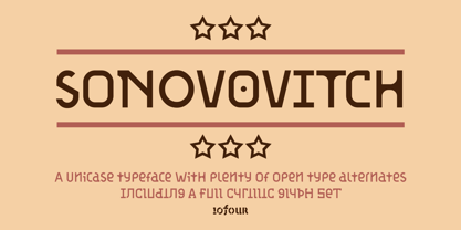 Sonovovitch is a unicase display typeface inspired by the Russian Constructivist movement and Soviet Cold War era propaganda. Although a faux Russian font, Sonovovitch has language support for the true Cyrillic alphabet. Originally intended as an exercise in downsizing the typical font’s character set, Sonovovitch quickly expanded in the opposite direction, adding multiple variations for letterforms and utilizing Open Type features allowing for easy substitution of glyphs… creating plenty of variety for letter combinations. Open Type “Titling Alternates” even substitute completely foreign glyphs, never seen before in any language, allowing for totally alien typesetting. The results found in Sonovovitch are packed with bold character and eastern European influenced flair. Sonovovitch’s eclectic geometric forms lend itself to a multitude of graphic applications; from serious branding programmes, to light-hearted packaging, to sports jerseys, to hand-crafted DIY projects.
 - Ruth Script by Estudio Calderon,
$68.99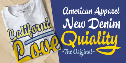 Ruth Script is perfect for neon signs, we took as referents some of these signs found in the street, especially those hanging in bars, billiard halls, motels and night clubs, we also took into consideration the Photo-lettering One Line manual to solve ligatures and alternatives (We want to thank Ed Ronthaler for that treasure to study and learn). The scripts can be considered as a compendium of connections, aesthetic and functional alternatives, where all the possible word combination is a universe depending on the language and the user's creativity. We have developed a project that offers to our customers a bridge that connects the brush with the digital typography through a partial vowels and consonants control and ligatures with opentype programming. We know that the scripts make typography users, fall in love. That is why we have created a type font that achieves all the demands and requests for any project where our font can be applied. Ruth Script was designed with patience and love, with the purpose of recovering the work done by those people who have been working as letterer during decades and that have left us hundreds of guides, books and videos. A great legacy! We want to invite you to use Ruth Script in your projects and fall in love with ESTUDIO CALDERÓN's new daughter. ENJOY IT!
 - Regrettably, as of my last update in April 2023, I don't have specific information on a font named "KING ARTHUR" designed by Maelle Keita. However, the realm of typography is a canvas for creativity,...
- Realtime Rounded by Juri Zaech,
$30.00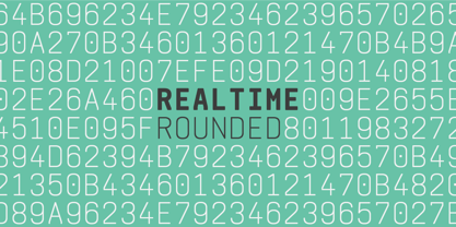 Information displays have an aesthetic of their own. Functional design where transmission of information is key — and best in real time. The Realtime Rounded typeface is not meant to recreate the appearance of those applications, instead it takes inspiration from them. The result is a technical yet friendly design with details that serve function and visual impact alike. Its soft edges apply warmth to the otherwise rather technical appearance. As a monospaced typeface it lends itself to tabular designs, sturdy columns and tidy layouts. Nevertheless Realtime comes with a feature for setting continuous text — a proportional design employable through OpenType — it further comes in five weights, from light to black, and with a character set that covers over 200 latin languages. Please see the Realtime Rounded Type Specimen PDF in the gallery. Realtime Rounded is the soft companion to the standard Realtime Typeface which is available separately. Thanks for visiting!
 - Nor Tidal by IbraCreative,
$17.00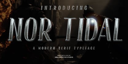 Nor Tidal – A Modern Serif Font Nor Tidal is a contemporary serif font that seamlessly merges timeless elegance with a sleek, modern aesthetic. Designed to exude sophistication and readability, Nor Tidal strikes a perfect balance between tradition and innovation. Its well-defined serifs lend a touch of classic refinement, while subtle tweaks and clean lines bring a distinctly contemporary flair. The font’s versatile nature makes it suitable for a wide range of applications, from editorial design to branding, offering a timeless yet fresh typographic solution that captivates with its graceful curves and crisp, professional demeanor. Nor Tidal is perfect for branding projects, logo, wedding designs, social media posts, advertisements, product packaging, product designs, label, photography, watermark, invitation, stationery, game, fashion and any projects. Fonts include multilingual support for; Afrikaans, Albanian, Czech, Danish, Dutch, English, Estonian, Finnish, French, German, Hungarian, Italian, Latvian, Lithuanian, Norwegian, Polish, Portuguese, Slovak, Slovenian, Spanish, Swedish.
 - Godwit by yasireknc,
$19.00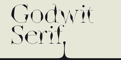 Godwit is an experimental high-contrast serif font. The piece screams creative freedom and exploration, as the color literally breaks through the boundaries of the original type. The final piece is really fluid as each letter links smoothly into the next and you can feel the real natural ink paths. This is a benefit of Godwit and the most powerful-distinguishable feature, as most standard fonts wouldn’t allow for this fluidity, especially a serif font. The Aphorism: The main idea comes from being fluent and smooth-spoken natural ink shapes. As we go into the details, the organic shape of the body makes the font a unique piece. The collection lends itself to the design, packaging, and advertising of everything with a romantic feel like liquid love potion; weddings, greetings, cosmetics, lingerie, book covers, and too many more to mention! This font is a great place to begin getting that tone.
 - Safe Font by Galapagos,
$39.00Some typefaces are more deserving of the reference "original typeface design" than are others. Such a typeface is Steve's Safefont GD. It is indeed safe to say that this design has caused some controversy. However, the management of Galapagos Design Group believes that the message of the typeface, even before its characters are used to form words in print, is important enough-and the design itself compelling enough-to warrant the risk of any unintended offense it might cause. Safefont GD is made up of condoms, in various shapes and sizes. The design originated as a lampoon of contemporary-punk- and -garagefont- designs of the nineties. It soon evolved into the quintessence of socially conscious design. Steve suggests this typeface could be "useful as a public service font aimed at important health and social issues." In addition, Safefont GD lends itself to a wide range of fun uses. - Quatie by insigne,
$24.00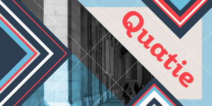 Originally a conceptual approach from the Chatype project of Jeremy Dooley and Robbie de Villiers, Quatie has been restructured to add a new industrial element to Insigne’s offerings. Like the Official Font of Chattanooga, Tennessee, Quatie definitely carries a contemporary, hipster feel. Quatie similarly draws much of its inspiration from the industrial brawn of the railroad and the unique characteristics of Cherokee letterforms, giving it an atypical form not usually found in an industrial slab. While the Quatie concept was originally set aside for the more technological look of Chatype’s final image, Jeremy revived this face from its dormant state and refined it for its commercial release in 2013. This bracketed slab with its slightly rounded, soft edges adds a warm, retro, industrial element to Insigne’s offerings. The resulting quirky, ‘hipster’ vibe of Quatie lends its voice to give an unparalleled edge to your designs.
 - Frontage Condensed by Juri Zaech,
$25.00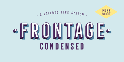 Frontage Condensed is a layered type system inspired by eye-catching and colorful facade signage. Its main aspect is — like many typographic installations on storefronts — three dimensional. The narrow, generously spaced letterforms lend the typeface a bold and eminent voice. The more ornamental layers like Bulb or Neon bring nostalgia to the family, while the Shadow layer maximizes the spacial impression. The system’s ten layers can be used alone or combined making the family a versatile toolkit. The use of color reveals Frontage Condensed’s full potential, yet for stark applications it works great in black and white too. Check the specimen PDF for examples. Frontage Condensed features 52 catchwords. They can be simply activated through OpenType’s Discretionary Ligatures and are an easy way to enrich the typographic texture. Other features include fractions, numerators and denominators. Frontage Condensed’s 339-character set covers over 190 latin languages.
 - Portfield by Set Sail Studios,
$16.00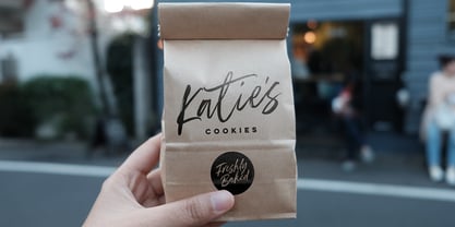 Introducing Portfield; A strikingly versatile and charming brush script font, hand-brushed with care. With organically flowing letters and a real brush pen texture, Portfield provides a perfect balance of casual yet captivating lettering for your design projects. Porfield was created as a 'go-to' brush font, with the ability to slot right in to a wide range of projects and instantly add a touch of personality and warmth. It lends itself perfectly to commercial lettering and suits large display text for advertisements, product packaging, branding, logos, invitations and merchandise. Portfield includes two sets of each letter provided in the 'Regular' and 'Alt' versions, along with 15 ligatures, allowing you to recreate a custom hand-lettered aesthetic. Portfield supports the following languages; English, French, Italian, Spanish, Portuguese, German, Swedish, Norwegian, Danish, Dutch, Finnish, Indonesian, Malay, Hungarian, Polish, Croatian, Turkish, Romanian, Czech, Latvian, Lithuanian, Slovak, Slovenian
 - Kugelhopf JF by Jukebox Collection,
$32.99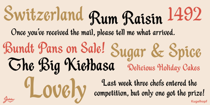 Kugelhopf is a calligraphic style font with an old-world Blackletter feel to it. Full of charm and flair, this friendly script font will lend a sense of childlike magic to any design. Perfect for themes relating to holidays, fairy tales, storybooks and even Renaissance designs, Kugelhopf was inspired by a hand-lettered sample in an old book about sign painting. It can also be used for cards, invitations and scrapbooking as well! ‘Kugelhopf’ is a German & Austrian holiday yeast cake from which our modern western Bundt cake was derived. It has a particular shape that is said to be inspired by Turkish turbans. Jukebox fonts are available in OpenType format and downloadable packages contain both .otf and .ttf versions of the font. They are compatible on both Mac and Windows. All fonts contain basic OpenType features as well as support for Latin-based and most Eastern European languages.
 - Whiteblack by Fontador,
$24.99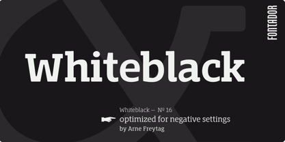 Whiteblack is a slab serif with a soft touch, designed for contemporary typography and comes up with 6 weights for positive and negative settings plus handslanted obliques. In dark backgrounds, especially for signage and on screen, negative settings glow and appear heavier than positive settings. To avoid the „glow-effect“ the typeface contains special weights for an optimal balance between white and black. A large x-height and open apertures not only creates space for smaller sizes, but also lends Whiteblack a solid balanced and generous character for print and screen. Many OpenType features including 324 ligatures, contextuel alternates, and stylistic set built into all cuts. The font contains 1.076 glyphs with a wide range of flexibility for Latin language support for every typographical needs. Whiteblack brings elegance and a certain warmth wherever a contemporary slab serif typeface is needed, special for signage, brands, magazines and corporate design.
 - Eirinn by Linotype,
$29.99Eirinn was designed by Norbert Reiners for Linotype in 1994. Its forms are based on those of Irish scripts of the 7th and 8th centuries, an example of which can be found in the Book of Kells in Dublin. Characteristic of this style are for example the lower case f with its short cross stroke on the base line and long cross stroke above, the unusual form of the g, and the t, whose form is almost like that of a c. This style consisted of a mixture of lower case and capital letters at the time of its conception, but Eirinn has a full set of both lower case and capital alphabets. At first glance the viewer is reminded of ancient and indecipherable writings of the Celts before the forms of our contemporary letters and words become evident. Eirinn will lend a touch of mysticism and secrecy to any text. - Wonderglast by IKIIKOWRK,
$19.00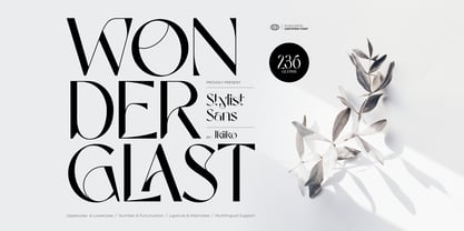 Proudly present Wonderglast - Stylist Sans, created by ikiiko. Wonderglast is a chic sans serif typeface with a seductively avant-garde vibe. This typeface effortlessly captures the spirit of elegance and sophistication thanks to its simple lines and contemporary design. Its modern, minimalist design lends an air of refinement to any project, making fashion-related projects the ideal fit for it. Wonderglast's letters have a sense of fluidity that makes them flow across the page and produce a pleasing visual effect. Its lack of serifs gives it a modern appearance, and its carefully constructed curves and proportionate design add to its allure. This typeface is perfect for an elegant logo, branding, fashion brand, luxury brand, layout magazine, beauty product, packaging product, quotes, or simply as a stylish text overlay to any background image. What's Included? Uppercase & Lowercase Numbers & Punctuation Ligature & Alternates Multilingual Support Works on PC & Mac
 - Palmas by Viswell,
$19.00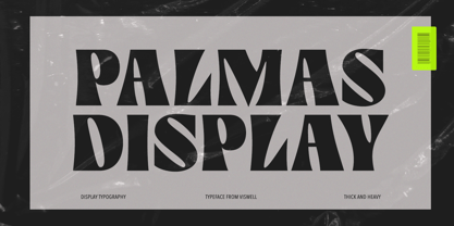 Palmas is a striking display typeface that exudes a sense of boldness and vintage charm. Its thick and heavy letterforms make a statement, demanding attention from viewers. With its retro psychedelic style, Palmas is perfect for designs that require a touch of nostalgia or a hint of the 70s-90s era. The letters of Palmas are intricately crafted, with subtle curves and serifs that add character to each glyph. The font's weight gives it a commanding presence, making it ideal for headlines and titles. It's easy to imagine Palmas being used for album covers, movie posters, and other designs that require a bold and unique typeface. Despite its retro inspiration, Palmas remains versatile and adaptable. Its bold style works equally well in modern designs, lending a touch of personality and character to any project. Whether used in print or digital media, Palmas is sure to leave a lasting impression on viewers.
 - Patrima by Juri Zaech,
$30.00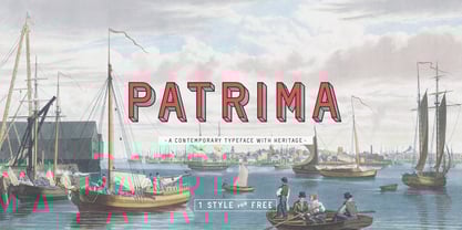 Patrima is a contemporary typeface with roots in the past. Specifically in the late nineteen hundreds where decorative type applications were en vogue and dimensional aspects and shadings where heavily used. Patrima takes simplified cues from these designs to make the typeface contemporary and versatile. Its base is a squarish Sans which expands through diagonal hatching to a three dimensional body. The hatching is wide enough for screen applications down to 24pt while remaining detailed for decorative purposes in larger sizes. Patrima’s different styles can be layered for chromatic results or used – complementary – alongside. As a decorative typeface it lends itself to display applications and eclectic logo designs, it brings a vintage touch to any branding project and elevates contemporary editorial layouts. Patrima comes with a set of catchwords which enrich its typographic texture even further. They are easily accessible through OpenType’s Discretionary Ligatures feature.
 - Cushy by Jeff Kahn,
$-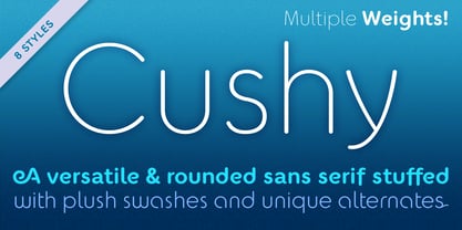 Cushy is a versatile san serif font that’s stuffed with numerous plush swashes and unique alternates. But it’s not limited to display use only. Cushy is well suited for text or display applications. Cushy’s large “x” height, square proportions, and generous even weight enhance its legibility in all point sizes. The font’s bold personality radiates friendliness and warmth. Clean classic proportions lend it authority and vigor. Cushy bends around corners and flows throughout. You won't find any sharp corners. The diagonal strokes possess a subtle arch and enhance its characteristics. Available in 8 styles with multiple weights: Thin, Light, Regular, Bold, including italics. Cushy includes stylistic sets, stylistic alternates, swashes, ligatures & discretionary ligatures, and foreign language diacritic glyph support. Cushy provides 40 distinctive swash options, 17 ligatures, and 13 alternates. Weights include Thin, Light, Regular, Bold, with italics. Cushy is suited for corporate ID, retail, magazines, books, brochures, websites, logotypes, etc.
 - Sedoya by Twinletter,
$13.00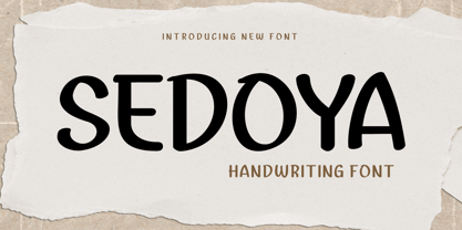 Introducing “SEDOYA Font” – Where Handwriting Meets Elegance. SEDOYA Font is the epitome of graceful handwriting. With its exquisite handwriting theme, this font adds a touch of sophistication to your creative projects, making it the ideal choice for those seeking refined and elegant script. Whether you’re designing invitations, branding materials, or anything in between, SEDOYA Font effortlessly captures attention and infuses your designs with timeless charm. Crafted with meticulous detail, SEDOYA Font exudes the elegance and allure of handwritten script, forging an immediate connection with your audience. Its versatility knows no bounds, making it suitable for a wide array of applications, from wedding invitations to luxury branding. SEDOYA Font elevates both legibility and style with its flowing strokes and refined lines, lending a natural and enchanting appearance to your text. It also offers multilingual support, ensuring it resonates with a global audience. – PUA Encoded Characters – Fully accessible without additional design software.
 - Amrys by Monotype,
$65.00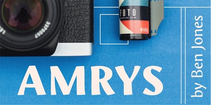 There's an appealing quirkiness about Amrys, which offers a confidently unusual alternative to more conventional designs. Its charm lies in its tapering tips, flexing stems, and unexpected notches, which combine to suggest something of the chiseller's tool at work. As a modulated serif, its letter shapes live between serif and sans serif, lending the design a sense of pleasing irregularity – something that's really highlighted at larger sizes. However this is also a typeface that works for text, injecting rhythm and texture into reading. “It's distinctive, idiosyncratic, and weird,” says its designer, Ben Jones. He started designing Amrys while studying an MA at Reading University, creating it in response to a brief for a magazine typeface. Amrys features an extensive and impressive character set. In addition to Latin, Amrys covers several scripts including Cyrillic, Greek, Arabic and Armenian. The family consists of 8 weights, from Light to Black, with matching italics.
 - Annlie by ITC,
$29.99Annlie™ Extra Bold and Annlie Extra Bold Italic are two display faces designed by Fred Lambert in 1966 for the Annlie type family. These two samples from the Annlie family are both fat faces. Fat faces were offshoots of the modern, or Didone, typefaces that were de rigueur during the early 1800s. These fat faces were among the first typefaces to be used solely for advertising purposes. Naturally, they were always used in larger point sizes, in display functions. Annlie could be called an optimization of these old advertising typefaces. With high x-heights, ultra contrast between thick and thin strokes, and perfectly engineered drawing techniques, Annlie is a highly crafted typeface. Give it a spin in your next advertising campaign! Annlie’s fine thin strokes are very graceful in their appearance, and lend a strong, yet soft, feminine feeling to anything they touch. - Regulator Nova by Device,
$39.00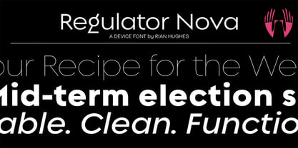 A high lower-case x-height geometric sans with open counters, Regulator Nova is extremely legible at text sizes and in extended settings while the range of weights also make it suitable for headlines. The stoke terminals are all cut at close to 90 degrees, lending a sharp precision to the characters. Alternate versions of the g, j, r, w, K, R, W, # and ampersand are available in both upright and italic, and can be toggled on and off in the Opentype panel or the Glyphs palette. Clean, elegant and legible, Regulator Nova has a classical proportions based on a circumscribed circle and square, and shares structural similarities to early sans serifs such as Rudolf Koch’s Kabel, while adopting more British forms for the M and R. Regulator Nova is an extension and reworking of Regulator, now with extra weights, reweighed italics, Opentype-savvy alternates and a full European character set.
 - PF Square Sans Condensed Pro by Parachute,
$79.00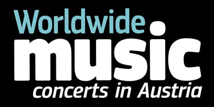 Square Sans Pro is one of Parachute’s most popular typefaces. It has been used by the likes of companies such as Samsung and organizations like the European Commission. Now a new version has been released. Square Sans Condensed Pro is a square-shouldered, modern and self-assured text typeface which lends style to a variety of projects. With its generous x-height, full-bodied counters and uniform stroke weight, it provides high legibility and uniform typographic color at all sizes. This is an exceptionally warm and comprehensive type family -with slightly rounded edges and softened curves- which possesses a robust and friendly appearance. The family consists of 12 fonts -from extrablack to thin- including true italics. It supports opentype features like small caps, fractions, ordinals, etc. and offers multilingual support for all European languages including Latin, Greek and Cyrillic. Download its complehensive PDF Specimen Manual for further details.
 - Wermut by Brownfox,
$45.00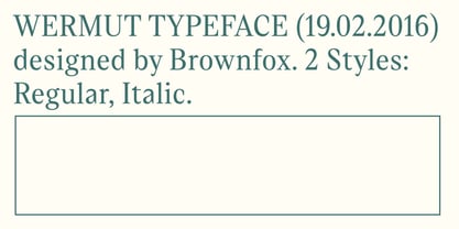 An intoxicating blend of rare flavours is what makes the new transitional typeface Wermut (German for vermouth) resemble its alcoholic namesake. Bitter and thorny at first glance, it proceeds to surprise the palate with a complicated taste that leaves a pleasant aftertaste. Wermut may not be taken in hastily, but needs to be thoughtfully enjoyed at a measured pace. Its dark colour, compressed, spring-like, shapes, well-built proportions, and agreeable letterforms all look safe enough until one is jolted to encounter the clipped serifs that lend the page an unexpectedly edgy appearance. The font comes in two weights with an extended character set in Latin and Cyrillic scripts supporting 66 languages. A product of slow, careful distillation, this infusion of multiple ingredients comes together to form a unique mature taste which will be appreciated by true connoisseurs of typographic cocktails. Desined by Gayaneh Bagdasaryan and Vyacheslav Kirilenko.
 - Aqueo by R9 Type+Design,
$38.00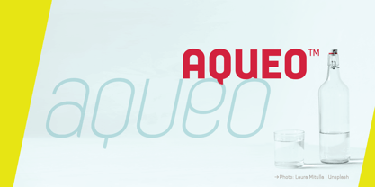 Aqueo™ is a versatile display font family inspired by the cylindrical wireframe of a water glass. The one-sided round corner details added a contemporary feel to this unique typeface. It comes in 6 weights and 12 styles. To ensure the accuracy of the letterforms, we painstakingly drew a master set for each weight. And with over 1,350 glyphs each, Aqueo™ fonts support most Latin-based languages and feature an extensive set of stylistic alternates; The standard uppercase set takes more traditional forms, while the alternate uppercase set sports unorthodox lowercase forms. The standards exude confidence and dependability yet are friendly and approachable, and the alternates elicit more fun, quirky and whimsical. The More Opentype Features, the More Zing for Your Design Projects. Aqueo™ Display Sans Serif comes loaded with Opentype features such as case-sensitive marks, punctuations and mathematic symbols. It also has an extensive set of discretionary ligatures, stylistic alternates, and over 80 essential UX/UI icons, each in three design options. These various Opentype features help improve your user experience, streamline your workflow, and unlock a broader range of typography details you can choose for your design. If you’re looking for a unique contemporary typeface, try Aqueo™ on your packaging design, logo design, infographic, print design, store signages, and UX/UI projects today! To find out more about Aqueo™ Opentype features and type specimens, please visit https://r9typedesign.com/aqueo-font-features-specimen
 - Neufile Grotesk by Halbfett,
$30.00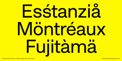 Neufile Grotesk has its roots in some of the earliest commercially available sans-serif typefaces. This highly legible sans-serif design is well-suited for many display and text-based typographic uses. Users can apply the fonts effortlessly to a large number of messages and media, from advertising to book design. The typeface family ships in two different formats. Depending on your preference, you can install the typeface as a single Variable Font or use the family’s eight static OpenType font files instead. Those weights run from Extralight through Black. While the static-format fonts offer a good intermediary-step selection, users who install the Variable Font have vastly greater control over their text’s stroke width. The Neufile Grotesk Variable Font’s weight axis allows users to differentiate between almost 1,000 possible font weights. That enables you to fine-tune your text’s exact appearance on-screen or in print. But even the eight static fonts satisfy the need for flexibility, creating harmonious variations of texture and emphasis. Whichever format you choose, the Neufile Grotesk fonts include several sophisticated OpenType features. In addition to standard ligatures, there are a few discretionary ligatures and a stylistic set replacing “a”, “g”, and “R” with geometric-sans-style forms. Other features include numeral variants – there are proportional and tabular versions of lining figures and oldstyle figures – as well as fractions and numbers in circles. The fonts have arrows and a feature for setting case-sensitive forms, too.
 - Et Cetera by Scholtz Fonts,
$25.00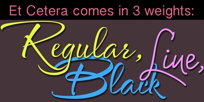 Et Cetera is a beautiful, hand-lettered script. It abounds in OpenType features such as terminal swashes and ligatures and is best used with OpenType savvy software with the “standard ligatures” and “contextual alternates” features turned ON. Et Cetera is comprehensive and vigorous. Most letters in the font are connected, but, as in typical handwriting fonts, not all are connected. Most characters have a consistent shape within the font, but not all. Some characters in Et Cetera are sensitive to their position in the text and change depending on the adjoining characters. This contributes to the casual and relaxed style of Et Cetera; not allowing the features of the font to get between the reader and the message. A wealth of OpenType features lie beneath the mellow exterior of Et Cetera. These Open Type features make few demands on the user which makes for a versatile script font that requires no expertise from the user, performs well at larger sizes, and remains legible even when setting copy at very small sizes. Et Cetera comes in three styles, Black, Regular & Line. Et Cetera Black is dramatic and bold, making a powerful statement. Et Cetera Regular is elegant and romantic, perfect for wedding stationery and clothing brands. Et Cetera Line is delicate and feminine, portraying a smooth, flowing effect. Et Cetera is a breezy, light, yet expressive font that is perfect for titling work, product packaging and romantic stationery.
 - Demetria by Andinistas,
$39.95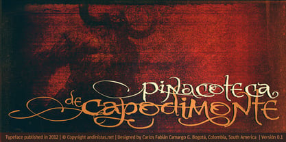 Demetria is a font created in 2012 by Carlos Fabián Camargo and works to form words and headlines with medieval expressiveness. Thus his concept mix uncial, Roman and italic letters resulting serifs some here and there, extended width and high amount of contrast between thick and thin strokes. That way its vigorous ups and downs are higher than its “x” height, highlighting it as a font with regular caliber,outstanding to design headlines with strong proportions and texture. Consequently, typographic and aesthetic possibilities of Demetria are visually appealing by its chaotic forms that are embedded and remain fixed in the minds of its viewers; also, “Demetria Pro” has OpenType features such as “Swash”, “Titling”, “Discretionary Ligatures”, “Standard Ligatures”, Ordinals, Fractions and Superscript that make shine what is written by their abstract shapes resembling elongated paths of black ink diluted in water. This font also works in software without opentype features, so it is recommended to use the remaining files NON-PRO. In short, the expressiveness and mysticism of Demetria is reaffirmed with some capital letters with lower height designed to be interchangeable with similar metrics to lowercase but aesthetically different.Thus the font mimics strong imperfections and splashes that get slim or grow depending on their degree of spontaneity. In that sense Demetria is recommended to compose words, phrases and typographic textures in graphic design projects related to epic, historical or legendary matters.
 - Adobe Caslon by Adobe,
$35.00The Englishman William Caslon punchcut many roman, italic, and non-Latin typefaces from 1720 until his death in 1766. At that time most types were being imported to England from Dutch sources, so Caslon was influenced by the characteristics of Dutch types. He did, however, achieve a level of craft that enabled his recognition as the first great English punchcutter. Caslon's roman became so popular that it was known as the script of kings, although on the other side of the political spectrum (and the ocean), the Americans used it for their Declaration of Independence in 1776. The original Caslon specimen sheets and punches have long provided a fertile source for the range of types bearing his name. Identifying characteristics of most Caslons include a cap A with a scooped-out apex; a cap C with two full serifs; and in the italic, a swashed lowercase v and w. Caslon's types have achieved legendary status among printers and typographers, and are considered safe, solid, and dependable. Carol Twombly designed this Caslon revival for Adobe in 1990, after studying Caslon's own specimen sheets from the mid-eighteenth century. This elegant version is quite true to the source, and has been optimized for the demands of digital design and printing. Adobe Caslon? makes an excellent text font and includes just about everything needed by the discriminating typographer: small caps, Old style Figures, swash letters, alternates, ligatures, expert characters, central European characters, and a plethora of period ornaments. - Happy Twigs by Yumna Type,
$25.00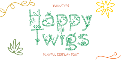 Fonts are sometimes so limited and boring that it is hard to stand out your designs. What is worse is that you want unique, visually interesting designs, but you still have to use common fonts people have already used. Therefore, Happy Twigs can be your interesting alternatives. Happy Twigs is a twig branch-inspiring display font of which letters are made in a lot of lines forming complex, attractive displays. Its unique character is due to the complex, detailed displays with which you can apply for any artistic, creative designs. Such a display font is applicable for any nature related products. Its complex, attractive letters will help you emphasize the messages you deliver and express different nuances depending on the design and color choices. In addition, it shows crowded and detailed, yet artistic and attractive nuances. Happy Twigs provides a clipart in accordance with the font theme as a bonus and features you can enjoy. Features: Multilingual Supports PUA Encoded Numerals and Punctuations Happy Twigs fits best for various design projects, such as brandings, headings, magazine covers, quotes, printed products, merchandise, social media, etc. Find out more ways to use this font by taking a look at the font preview. Thanks for purchasing our fonts. Hopefully, you have a great time using our font. Feel free to contact us anytime for further information or when you have trouble with the font. Thanks a lot and happy designing.
 - Metro New One by JAB'M,
$15.00The main inspiration is from Art Nouveau which flourished in Europe at the end of the 19th and beginning of the 20th centuries. This design included furniture (Majorelle, Lalique) and architecture (Victor Horta, Henry Van de Velde, Gaudi, Alfons Mucha). But Hector Guimard remains the favorite for all aspects of its art and, of course, its typefaces used on the Parisian Metropolitan posters. In particular, the various kerning of the various letters he used to make the poster a whole design from singular designs, leading to numerous variations. As a designer, I first worked with the individual glyphs Hector Guimard designed and I discovered that they vary constantly from a poster to another, depending on the overall result he was looking for. Another difficulty in transferring his design to printing is that there was no lower case. I was excited to create the whole font from the original designs of Hector Guimard, incorporating its variations and "crazy kerning". After several attempts, it appeared to be impossible to include all variations and I slightly moved to my own new design as a complete font, upper and lower case, with kerning. I voluntarily limited the ascenders and descenders to the usual typography so that it can be used from 10 / 12 points. This version can be used to edit letters and books in the context of Art, specially Art Nouveau and Art Deco of course, posters of any kind. - Fantastic ML by HiH,
$12.00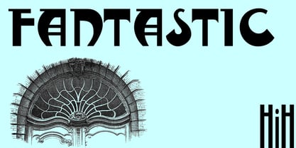 Fantastic ML is an exuberant Art Nouveau font. It was originally released as “Modern Style” by Fonderie G. Peignot & Fils, Paris, France sometime before 1903. Since “Le style moderne” was the generic French name for Art Nouveau, it is possible that someone decided a less generic name was needed. The typeface became known as Fantastic. Compared to conventional text letters, it is just that. Fantastic has a whimsical, architectural feel. The typeface reminds me of a cross between Hoffmann’s Palais Stoclet in Brussels and Gaudi’s Sagrada Familia church in Barcelona. The letterforms themselves are similar to those by Ludwig von Zumbusch on the cover of “Jugend” in March, 1896, but with the addition of serifs. Fantastic ML is a decorative, all-cap font intended for display use and functions best at 18 points or larger. There are a total of 306 glyphs. In addition to the standard 1252 Western Europe Code Page with character slots up to decimal position 255, there are glyphs for the 1250 Central Europe, the 1252 Turkish and the 1257 Baltic Code Pages. However, some older applications may only be able to access the Western Europe character set (1252). The zip package includes two versions of the font at no extra charge. There is an OTF version which is in Open PS format and a TTF version which is in Open TT format. Use whichever works best for your applications.
 - Yafferbuddle by Aah Yes,
$7.00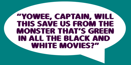 Yafferbuddle comes in the category of 'a funky fun font' with a pleasing rounded shape, but it still has the extensive range of features you'd expect in a modern OpenType font. It's especially useful for posters, headlines and comics. There's 5 weights and a Shadow version in Regular and Italic, making 12 fonts in all. To let you know what's in the font that you might otherwise not suspect . . . With Discretionary Ligatures on, you get special characters if you type Mc St. Rd. Bd. Ave. c/o No. (p) (P) - include the full-stop/period where given. With Stylistic Alternates switched on, you get plenty of extra characters - including a WiFi symbol (type Wifi or WiFi) / bullet numbers instead of ordinary numbers / that different U-dieresis / special characters for c/o No. Mc / an upside down ~ / a huge bullet, and different forms for cent, dollar, percent, per-thousand. As you'd expect, there's all the accented characters for all Western European scripts using Latin letters, and standard ligatures, plus other Open Type features including Class Kerning, Slashed-Zero, Historical Forms, Sub- and Superscript numbers, fractions for halves, thirds and quarters, Ornamental forms giving bullet numbers, etc. There's even some of the more obscure stuff like the main mathematical operators, symbols like card-suits and male/female signs and so on, schwa, U-horn O-horn, and there's more if you can Access All Alternates. Much will depend on what features your software recognises.
 - Haboro Soft by insigne,
$-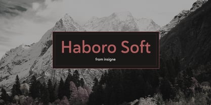 Stop trekking through the thick, wintery font forest, and step lightly into the fresh life of the Haboro hyperfamily. Though simple in nature, the Haboro hyperfamily provides you with a variety of options. Take, for instance, Haboro Soft, the latest member. Soft features a clean, geometric shape based off Haboro Sans. Unlike Sans, however, Soft’s blunted terminals give your work a more contemporary appearance. It’s a gentle touch for those times you prefer subtilty over pounding your message home. Take Haboro Soft even farther with its OpenType features. The typeface contains specially shaped small caps and old-fashioned figures--just enough to give your work a unique touch. Of course, for more options, use the entire Haboro hyperfamily to expand your abilities. Enjoy the comfort in knowing you’re choosing a font family equipped with tools for most anything: packaging, branding, web pages, iPhone apps and more. Its simplicity lends itself to achieve perfect results. And yes, your work will even thank you.
 - Balmecia by IbraCreative,
$17.00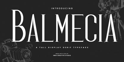 Balmecia – A Tall Display Serif Typeface Balmecia is a distinguished tall display serif typeface that exudes a timeless elegance and sophistication. With its tall and slender letterforms, Balmecia commands attention and lends a touch of grace to any design it graces. The carefully crafted serifs add a classic flair, while the generous letter spacing ensures optimal legibility even in larger sizes. Balmecia’s vertical proportions create a sense of stateliness, making it an ideal choice for headings, titles, and other display applications where a touch of refinement is desired. This typeface seamlessly blends tradition with a modern aesthetic, offering a unique personality that captures the essence of both vintage and contemporary design sensibilities. Balmecia is perfect for branding projects, logo, wedding designs, social media posts, advertisements, product packaging, product designs, label, photography, watermark, invitation, stationery, game, fashion and any projects. Fonts include multilingual support for; Afrikaans, Albanian, Czech, Danish, Dutch, English, Estonian, Finnish, French, German, Hungarian, Italian, Latvian, Lithuanian, Norwegian, Polish, Portuguese, Slovak, Slovenian, Spanish, Swedish. **Uppercase
 - Pluto by HVD Fonts,
$40.00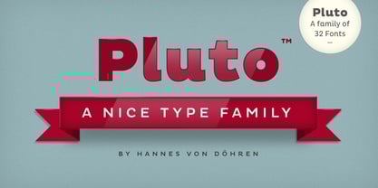 Pluto - and its straight companion Pluto Sans - was designed by Hannes von Döhren. The whole family consists of 16 Pluto Uprights, 16 Pluto Italics, 16 Pluto Sans Uprights and 16 Pluto Sans Italics; 64 fonts in all. Type designer Hannes von Döhren has created Pluto, a sweet type family consisting of 16 Uprights and 16 Italics; 32 fonts in all. The fonts are informal and friendly at first sight and lend themselves to display settings, however the straight and upright architecture of Pluto also makes it perfect for longer copy. Because of its large x-height, it even performs nicely in very small sizes. This contemporary type family is ideal for use in retail, cosmetics, food and hospitality applications and advertising. Pluto is equipped for complex, professional typography. The OpenType fonts have an extended character set to support Central and Eastern European as well as Western European languages. Each font includes alternate letters, fractions, lining-, tabular numbers, scientific superior/inferior figures and a set of arrows.
 - Reilief by Sopheynoft,
$35.00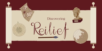 Reilief is an elegant font, timeless and sophisticated choice that adds a personal touch to any design project. With its flowing strokes and graceful curves, this typeface captures the artistry and fluidity of a skilled calligrapher's pen. Each letter is thoughtfully crafted to convey a sense of elegance and refinement, with delicate flourishes and tapered strokes that lend a sense of movement and grace. With many available ligatures, joining certain letter combinations it creates more legible and pleasing appearance, with the letters appearing to dance across the page. Whether used for wedding invitations, branding, or editorial design, Reilief Fonts brings a touch of intimacy and personality to any project. Its warmth and beauty create a connection with the reader, conveying a sense of care and attention to detail. With its timeless appeal and ability to convey emotion and personality, an elegant handwriting font is a versatile choice for any designer looking to add a touch of sophistication and style to their work.
 - Mozsar by Miklós Ferencz,
$59.00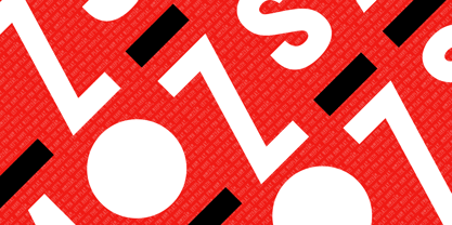 Mozsár, named after Mozsár Street in the downtown of Budapest (pronounced ‘mo-zhar’, meaning mortar in Hungarian.) Mozsár is a unicase display typeface with constructivist characteristics from the early 20th Century. It uses pure geometric shapes and purposefully departs from strict typographical rules to give a more friendly look. With Mozsár you can create really unique and awesome looking displays, titles and even name plates for your business. It works very well in big size. The central idea behind the design was that two variants of the typeface would randomly alternate as the user types. The typeface uses Contextual Alternates (CALT) created with the OpenType’s semi-random feature to mix the variants. The width and height of the letter shapes are generally equal, but I made some exceptions to lend the type a character of unexpectedness. The curves are identical in both versions of each letter, and the intersections of the axes are always perpendicular (with some evident exceptions).
 - Menara by Hazztype,
$20.00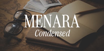 Menara is a captivating vintage serif font that effortlessly blends elegance and charm with a touch of nostalgia. This condensed typeface showcases the beauty of traditional letterforms, infused with a contemporary twist. Its italic variant adds a dash of dynamic flair, creating a truly versatile font that is perfect for both classic and modern design projects. With its refined and sleek appearance, Menara exudes a sense of sophistication and refinement. The condensed letterforms allow for maximum impact, making it ideal for headlines, titles, and branding materials. Whether you're designing a vintage-inspired logo, packaging, or editorial layouts, Menara delivers a timeless aesthetic that commands attention. The italic style of Menara introduces a subtle sense of motion and playfulness to the font. It adds an expressive quality that can bring emphasis and character to your designs. Perfect for adding an extra touch of elegance to wedding invitations, book covers, or product labels, the italic variant of Menara lends a unique personality to your typography.
 - Aviano Flare by insigne,
$24.99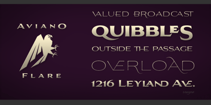 The Aviano series returns with a flared semi-serif. Aviano Flare's subtly curved forms lend refinement and luxurious elegance to your designs. Aviano's foundational extended classical forms give the face strength and power. Aviano Flare is a versatile new addition to the Aviano titling series. Aviano Flare comes in six different weights and is packed with OpenType features. Want to get rid of the serifs for that logotype or headline? Need swash forms? Art Deco alternates? Aviano Flare includes 74 alternate characters. Two style sets are available, two sets of art deco inspired alternates, small forms, swash, titling and stylistic alternates. Aviano Flare also includes 40 discretionary ligatures for artistic typographic compositions. Please see the informative .pdf brochure to see these features in action. Be sure to check out the rest of the Aviano series which can be used as complementary faces, including Aviano, Aviano Serif, Aviano Sans, Aviano Didone and Aviano Slab.
 - Voluta Script by Adobe,
$35.00Voluta Script is the work of Austrian designer Viktor Solt, created for use in a guide to the Austrian Gallery at Castle Belvedere. A volute (Latin voluta") is a spiral or scroll-shaped ornament used in the Baroque architecture of Castle Belvedere, similar to the swashes in this typeface. The castle was the historic residence of Prince Eugene of Savoy, one of the great military commanders of the 18th century and a prominent figure in Austrian history. When asked to create a typeface based on the calligraphy of the period to illustrate Eugene's epic, Solt turned for inspiration to Kurrent writing, a cursive blackletter style. Solt created a hybrid style that embodies the rhythm and basic forms of its ancestors, with large capitals, dark vertical strokes, and flourished beginning and ending characters. The typeface was designed to be used in sizes of 24 points and greater. Voluta Script allows designers to evoke the Baroque era or to lend a hint of majestic grace to contemporary typesetting."