9,793 search results
(0.022 seconds)
- Angie Sans Std by Typofonderie,
$59.00 A sanserif with human touch in 6 fonts Angie Sans is a low contrast incised sans serif sharing some similarities with Optima by Hermann Zapf and Pascal by José Mendoza, both created at the end of the 50’s. The later, feature an italic not published by the initial foundry who launched Pascal. Angie Sans follow same path with its italic based on Chancery forms from the Renaissance, narrower than the roman shapes. With its capitals based on Roman proportions, lowercases featuring open counters, strong horizontals, Angie Sans is a legible typeface. The manual gesture is present in Angie Sans, which offer the plastic qualities such as warmth, craftmanship and humanity. Angie Sans is an Incised Garalde who works well for display as text settings. Available in 6 series, with matching italics, Angie Sans will work well in design projects where delicate and human touch is required. Angie Sans Morisawa Awards 1990
 - Iwata Gyousho Std by IWATA,
$149.00 楷書と草書の中間的な筆法の書体です。 字体を崩しすぎず、読みやすくなるようデザインしています。
 - Hebrew Frank Std by Samtype,
$59.00 This is The Classic font of the XX century.
 - Hebrew Saphire Std by Samtype,
$59.00 Beautiful font, good for posters, books, and folders. This is a complete font with all Nikud and also Shevana, Kamatz Katan, Dagesh Chazak, and Holam chaser.
 - LT Festive Medium - 100% free

- Wiegel Latein Medium - 100% free

- Tt-Kp Medium - Unknown license

- COM4t Sans Medium - Unknown license

- SF Espionage Medium - Unknown license

- SF Arborcrest Medium - Unknown license

- Wiegel Kurrent Medium - 100% free

- SF Arborcrest Medium - Unknown license

- Abbey Medium Extended - Unknown license

- SF Espionage Medium - Unknown license

- Bill Corporate Medium by OGJ Type Design,
$35.00 Bill Corporate is a geometric typeface with generous capitals. A modern classic, based on Max Bill’s lettering work, its straightforward and uncompromising construction can be both edgy and sublime. With minimalist letterforms, pointy apexes instead of flat ones, and archetypal proportions, this font family doesn’t follow any trends but strives to achieve a timeless formal vocabulary. The skeleton of its letters is based heavily on the famous primary shapes of the Bauhaus: square, circle, and triangle. This makes for quite wide uppercase and much narrower lowercase letters. The contrast between uppercase and lowercase benefits inexperienced users, who will be able to get appealing results quickly. At the same time, it’s a powerful tool for seasoned designers, who can employ either case selectively to set the desired typographic course. Bill Corporate Medium’s 16 styles (including a set of eight lighter-than-light fonts from “Two” to “ExtraLight”) are an excellent choice for editorial design, branding, headlines, and even short to mid-length copy in a wide range of applications and industries. The uppercase letters in particular—with their varied widths and lavish dimensions—are suitable for cosmopolitan and stylish logotypes and wordmarks. Whenever a timeless, staid, and classy look is demanded, choose Bill Corporate.
 - Mementor Medium Regular by Wooden Type Fonts,
$15.00 Medium slab serif
 - Varial Rounded Medium by Cloud9 Type Dept,
$35.00
- Bernhard Gothic Medium by Wooden Type Fonts,
$15.00 A version of Bernhard Gothic Medium. Quite useful for advertising.
 - Martin Medium Regular by Wooden Type Fonts,
$15.00 Medium weight, sans serif.
 - Copperplate Classic Medium by Wiescher Design,
$49.50 Copperplate was the classic nineteenth century engravers typeface, consisting of capitals and small caps only. Among others (for example Deberny & Peignot) F. W. Goudy's cut for ATF around 1901 is probably the most widely known. Copperplate typefaces are traditionally used for business cards and all that "serious" stuff. My Copperplate Classic is a completely new design, based on some old samples. To make it look more up-to-date and elegant, I gave it some extra swings here and there. The old fonts were all designed with clogging corners or points that can break off in the minds of its designers. Today we do not have those problems any longer, so I could give my Copperplate Classic real sharp pointed serifs. To give you more choice I now added this medium cut in three variations, medium, sans and rounded! Enjoy! Gert Wiescher
 - LT Leap Medium - 100% free

- LT Shortcake Medium - 100% free

- LT Fillet Medium - 100% free

- LT Bread Medium - 100% free

- Medio - 100% free

- Medin by Viaction Type.Co,
$25.00 Medin is a serif font with elegant characters. Medin is perfect for your elegant-themed work, suitable also for elegant vintage. This font is available multilingual & alternate characters, making it easy to do work on various design themes. Medin is equipped with multilingual accents. Get it now Medin fonts, to add to your collection and work solutions. Viaction Type Thanks.
 - Modum by The Northern Block,
$- A contemporary serif font family. The design takes influence from traditional serif forms to develop a precise, highly functional text face with a low contrast. Smooth radius details are blended with carefully drawn angles that give a crisp, distinctive aesthetic when used across body copy. Modum is a stylish modern day serif with great charm, harmony and practicality that is best suited for complex hierarchical projects, such as editorials, newspapers and text based books. Details include 8 weights and true italics, over 800 characters with alternative lowercase a, e, g and y. 7 variations of numerals, true small caps with accents, ligatures, manually edited kerning and Opentype features.
 - Meditative by UICreative,
$23.00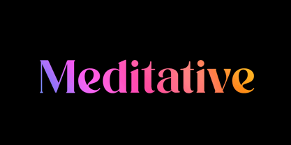 Introducing our new product the name Meditative Elegant Classic Serif Font. Modern Serif font that feels beautiful classy, elegant, and modern. This font is perfectly suited for a wide variety of projects, such as signature, stationery, logo, wedding, typography quotes, magazine or book covers, website headers, clothing, branding, packaging design, and more. Also for fashion-related branding or editorial design and displays both masculine and feminine qualities.
 - Romance Fatal Serif Std - Personal use only

- Le Monde Courrier Std by Typofonderie,
$59.00 A rounded slab in 4 styles In our age, since the arrival of microcomputing, the majority of professional letters have been composed in quality typefaces. Typewriters & the typestyles they used have become antiques. A letter set in Times or Helvetica & printed with a laser printer at 600 dpi or more are of such quality that one can no longer distinguish it with a document produced by offset printing. But letters composed in this way appear overly institutional when a bit of informality is needed. Le Monde Courrier, designed by Jean François Porchez, attempts to re-establish a style halfway between writing and printing. Informal neo-tech style This rounded slab serif returns the informal character of “typewritten” fonts to letters and suit well all bad conditions, from inkjet printed memos to webfonts use. With a unique typographic colour, it integrate itself with the rest of the Le Monde family with effective contrast. The verticals metrics and proportions of Le Monde Courrier are calibrated to match perfectly others Typofonderie families. Bukva:raz 2001 Type Directors Club .44 1998 European Design Awards 1998
 - Hebrew Caligraphic Stam Std by Samtype,
$49.00 Beautiful font, good for posters and small books and folders. This is a complete font with all diacritic marks (Nikud and Taamim) and also shevana, kamatz katan, dagesh hazak and holam chaser.
 - Preto Serif OT Std by DizajnDesign,
$50.00 Preto is an extensive type family, which explores the function of serifs on readability and legibility. Preto consist of three subfamilies: Sans, Semi and Serif. Preto is designed for multilingual typesetting. All of the subfamilies have equal gray value but different texture which can be use to differentiate languages. Preto sub-families have two text weights and two bold styles (Regular -> Bold, Medium -> Black). Every weight has a companion Italic style as well. The serif version has been designed to work best at small point sizes (around 8, 9 points). You will not achieve calm, boring or invisible look of your text with Preto Serif. Its long, spiky and sharp serifs contribute to give the typeface a distinct and energetic character. It is very suitable for magazines, corporate identity, brochures or other print materials where a typeface for continuous reading is required. The ligatures in Preto Serif are very special. You can set them in different tracking values and spacing will increase/decrease consistently in the ligatures as well. Alternative characters in the font files allow you to change the feeling of the text from typical to more special (J, Q, g , &). Each font contains a full set of small caps and many alternative characters for complex typesetting.
 - Le Monde Journal Std by Typofonderie,
$59.00 A highly legible typeface in 4 series Le Monde Journal by definition is intended for newspaper use & at small sizes. It’s an economical and workshorse typeface adapted to any extrem condition of uses. Even though it has the same colour as Times, it appears more open. The reading flow has been made more fluent & less abrupt. The glyphs counters are bigger, as if they were “alluminating the interior.” The form, characterized by its serifs, remains embedded in our visual memory. Intermediate weights like Book can be considered as a grade supplement of the Regular. Italics accompany Le Monde Journal. With a more delicate design & a distinctive rhythm, they remain noticeable when used with the romans. Its companion, Le Monde Sans can extend your typographic palette. For beautiful page layout, use it in conjunction with Le Monde Livre for titling sizes. The verticals metrics and proportions of Le Monde Journal are calibrated to match perfectly others Typofonderie families. This family was designed in 1994 as bespoke typeface family for the French newspaper Le Monde. The family is not used any more by this newspaper from November 2005. Bukva:raz 2001 Type Directors Club .44 1998 European Design Awards 1998
 - Iwata News Mincho Std by IWATA,
$199.00 数多くの新聞社で使われてきた伝統ある「岩田新聞明朝体」を再現した「イワタ新聞明朝体」と、かなを現代風にアレンジした「イワタ新聞明朝体新がな」があります。
 - TT Norms Std Condensed by TypeType,
$35.00 TT Norms® Std Condensed useful links: Specimen | Graphic presentation | Customization options TT Norms® Std Condensed is the logical development of our bestselling TT Norms®. Since the release of TT Norms®, we received a bunch of requests to create its narrow version and even managed to make several custom projects of the narrow TT Norms® before we decided to start creating a full-fledged commercial version of the typeface. At the very beginning of the project, we did some research and tested several options for the possible width of the typeface. Despite the fact that TT Norms® Std Condensed has narrower proportions than the original family, it inherited the classic proportions of characters, attention to detail and meticulous elaboration of each character in the typeface. The TT Norms® Std Condensed font family consists of 18 faces (9 upright and 9 italics). Each style includes a sufficient set of characters that allow you to solve most of the problems that arise in the field of graphic design, branding, packaging design or website design.
 - PF Bague Sans Std by Parachute,
$39.00 Bague Sans is an award-winning monoline typeface with a distinct and eye-catching personality. Despite its inspiration from early 20th century geometrics, it diverts from the mechanical rigidity of those typefaces by incorporating humanist characteristics, such as subtle variations in stroke width and open counter shapes with vertical endings. This is a very clean and legible typeface with a warm and well-balanced texture which is ideal for intense editorial use in magazines and newspapers. The most remarkable feature of Bague Sans is its vast array of uppercase alternates and ligatures which truly shine when set at display sizes. This typeface is automatically transformed into a flexible, charming and stylish typeface with strong modern aesthetics. Explore its dual personality, switch from Humanist to Geometric and vice versa by using alternate characters such as the single-storey a and single-storey g. From classic to modern, from excessive to neutral, Bague Sans is a multipurpose typeface which offers enormous possibilities and variations for editorial design, branding and corporate identity while it performs amazingly well on web. This superfamily includes 18 weights from Hairline to Ultra Black with a consistent and well-refined structure. It supports extended Latin such as Central European, Baltic, Turkish, Romanian and includes numerous alternates and ligatures for unlimited text variations. You may also want to check out Bague Sans Pro which supports Cyrillic and Greek as well.
 - AW Conqueror Std Slab by Typofonderie,
$59.00 Slab serif with a 70’s aesthetic A version of AW Conqueror Sans, AW Conqueror Slab draws inspiration from geometrical slab serifs of the 1930s, of which Rockwell is a perfect example. Lubalin Graph, a reworking of the genre, came out in the wake of the Avant Garde wave of the early 70s. In recent years, ‘slabs’ have made a comeback in the graphic design world. AW Conqueror Slab advances the cause quite happily. AW Conqueror superfamily AW Conqueror Didot is part of a larger family, who include 4 others subfamilies with great potential: They’re but based on same structure, with some connection between them (width for example), to offer a great & easy titling toolbox to any designers, from skillful to beginner. Each of the members try their best to be different from the others because of their features. They should work harmoniously in contrast. Club des directeurs artistiques Prix 2010 European Design Awards 2011
 - Preto Sans OT Std by DizajnDesign,
$50.00 Preto is an extensive type family, which explores the function of serifs on readability and legibility. Preto consist of three subfamilies: Sans, Semi and Serif. Preto is designed for multilingual typesetting. All of the subfamilies have equal gray value but different texture which can be use to differentiate languages. Preto subfamilies have two text weights and two bold styles (Regular --> Bold, Medium --> Black). Every weight has a companion Italic style as well. Preto Sans OT Std The Sans version of Preto forms the basic skeleton of the family, it is decidedly simpler than the other styles (Semi and Serif). Although you can find many distinctive and unique elements in the details. The most visible elements are the tapered upper part of the letters. The capital letters have uniform widths achieving very different texture than traditional roman proportions. There are two different options for ligatures and alternative characters (J, Q, g, &) gives more variability for different languages.
 - Le Monde Livre Std by Typofonderie,
$59.00 A text face in 4 styles Before the arrival of Phototypesetting, each font size had a specific design. Le Monde Livre, designed by Jean François Porchez, along with Le Monde Journal re-establishes this practice. When Le Monde Journal was developed specifically for use at small point sizes (below 10 points.) Le Monde Livre works beautifully for book typography, magazine settings. In comparison to the italics in Le Monde Journal, Le Monde Livre’s italics are of a totally different design, closer to the models of the Renaissance. The families match well together on the same page, Le Monde Journal for small sizes settings, Le Monde Livre for large settings. The verticals metrics and proportions of Le Monde Livre are calibrated to match perfectly others Typofonderie families.
 - Hebrew Pirkei Avot Std by Samtype,
$49.00 This is beautiful script font based in typeface of the Pirkei Avot book.


