10,000 search results
(0.015 seconds)
- Xspace by Artyway,
$14.00 I'm thrilled to present you a new futuristic typeface. Smooth humanistic forms and elongated proportions, modern trends dictate a new fashion in type design. Perfect for science research posters, modern futuristic logos, automotive type design and more. Check how it works and let me know, I am always glad to hear your opinion.
 - Pantera by Lián Types,
$39.00 ROARRR! THE STYLES -Pantera Pro is the most complete style, and although its default look is mono-rhythmic it gets really playful and crazy like the examples of the posters by just activating the Decorative Ligatures button in the Open-type Panel of Adobe Illustrator. However, I recommend using also the Glyphs Panel because there you'll find much more variants per letter. Pantera Pro is in fact, coded in a way the combination of thicknesses will always look fantastic. -Pantera Black Left, and Pantera Black Right are actually “lite” versions of Pantera Pro: They have very little Open-Type code, so what you see here is what you get. Pantera Black Left has its left strokes thick, while Pantera Black Right has its right strokes thick. -Pantera White is a lovely member in this family that looks lighter and airy, hence its name. With the feature Standard Ligatures activated (liga) the font gets very playful. -Pantera Caps is based on sign painters lettering and since it follows the same pointed brush rules as the other styles, it matches perfectly. -Pantera Claws like its name suggests, is a set of icons that were done by our dear panther. THE STORY It is said that typography can never be as expressive as calligraphy, but sometimes it can get close enough. I tend to think that calligraphic trials, in order to work well as potential fonts, need first to go through very strict filters before going digital: While calligraphy is synonym of freedom (once its rules are mastered), type-design, in the other hand, has its battlefield a little tighter and tougher. When I practice pointed brush lettering, there are so many things happening on the paper. And most of them are delicious. The ones who know my work may see that although many of my fonts are very expressive, my handmade brush trials are much more lively than them. With that in mind, this time I tried to go further and rescue more of those things that are lost in the process of thinking type when first sketches are calligraphic. I wondered if I could create something wild, hence its name Panther, by understanding the randomness that sometimes calligraphy conveys and turning it to something systemic: With Pantera, I created an ordered disorder. Like it happens a lot in many kinds of lettering styles, in order to enrich the written word the scribe mixes the thickness of the strokes and the width of the letters. Like one of my favorite mentors say (1), they make thoughtful gestures Some lively strokes go down with a thick, while some do that with a thin. Some letters are very narrow, meaning some of them will need to be very wide to compensate. Why not?. The calligrapher is always thinking on the following letters, and he/she designs in his head the combination of thicks and thins before he/she executes them. He/she knows the playful rhythm the words will have before writing them. It takes time and skill to master this and achieve graceful results. Going back to the font, in Pantera, this combination of varying thicknesses and widths of letters were Open-Type coded so the user will see satisfactory results by just enabling or disabling some buttons on the glyphs panel. I'm very pleased with the result since it’s not very easy to find fonts which play with the words' rhythm like Pantera does, following of course, a strong calligraphic base. I believe that if you were on the prowl for innovative fonts, this is your chance to go wild and get Pantera! NOTES (1) Phrase by Yves Leterme. In fact, it’s the title of a book by him. EPILOGUE Esta fuente está dedicada a mi panterita
 - Virginia by Type Associates,
$31.95 Virginia has a proven track-record. Unashamedly geometric, starkly simple with a touch of art deco/bauhaus/rococo about her, she was the most popular headline face around, at least in my home town in the year of her release circa 1970. That was the year my five-weight design won the inaugural (and only) Lettergraphics International Alphabet design competition and shut out 5000 competitors. Alas, Lettergraphics ceased to trade from its LA studios after the mid-80s and Virginia's two-inch film fonts were left to collect dust on the cutting room floor. Until my recent decision to revive her along with some subtle tweaking, a few additional glyphs and Opentype features, supported by an abundance of kern pairs making Virginia suitable for text or the largest display type.
 - Breughel by Linotype,
$29.99Adrian Frutiger came up with this unusually purposeful and strong design in 1981 for Linotype. Early humanistic typefaces of the sixteenth century, especially Jenson, served as models for Breughel. The right sides of the stems are vertical and at right angles to the baseline while the left sides of the stem curve into the serifs, making the typeface look as though it slants to the right, and giving it a sense of movement and liveliness. The ductus of the broad-edged pen is reflected in the flow, rhythm, and texture of text set in Breughel, but at the same time this design has a regularity of form that is typographically solid. Breughel is an ideal typeface for the designer with skill and vision. Use it to create innovative publications, posters, and advertisements. - Heavenly Bodies by Aah Yes,
$0.25 All 6 fonts use the characters A - K and a - k to show two planets/stars/moons moving across each other. Nice and simple. There's a different number of points on the stars, or they're different sizes, and some appear to pass left-to-right, and some appear to pass the other way. Just type in ABCDEFGHIJK or abcdefghijk and you'll see. Two fonts have all the characters on the same level, (All-Black and Black+White). The Offset font has the 'sun/moon' with one slightly above the other and in black and white, and Half has them all-black. Partial has them even further separated in 2-tone. NearMiss is a very close shave. Comma, hyphen, and full stop/period give just a single symbol; there's a Space, and that's it.
 - Jigger Statz by Poole,
$32.00During the spring of 2006, while creating this typeface, I was reading Praying For Gil Hodges, by Tom Oliphant, who grew up a Brooklyn Dodgers fan. I grew up a Los Angeles Dodgers fan. My mother worked as secretary to the president of the old Triple A LA Angels Baseball Team. In 1952 when she was pregnant with me, she left the team. They gave her an autographed baseball and a puppy named Angel. That's the dog I grew up with. Toward the end of the book the author talks about Gil Hodges' favorite ballplayer, a slugger for the LA Angels, Jigger Statz. I thought, could it be? My mother died two years ago and I got the team baseball. Sure enough, the first name after the dedication to my mother was Jigger Statz. - Bronzo by XO Type Co,
$39.00 This is a 2023 redesign of Bronzo, originally designed by Rick Valicenti and Mouli Marur in 1991. With this redesign, Bronzo now has 6 new weights, for a total of 9, and 587 more glyphs than it was able to in 1991. Bronzo appears to move forward, yet remain still, via a center stroke that only sticks out on the left, a tense curve that only happens on the right, and a width that sits uncomfortably between square and rectangle. Those three things, combined with a balanced light to dark ratio, are what makes Bronzo appear tense and ready. Bronzo accepts Modernist ideals of minimal, rational construction—but it also adopts luxuriant shapes over Modernism’s sandblasted neutrality. It’s almost an alternate reality, a “what if?” of Modernism. Modernism’s fun, interesting, cute reboot.
 - Volterra by Blank Is The New Black,
$25.00 In today's typographic landscape, few would still consider Bodoni to have a "modern" feel, but there was once a time when it's vertical axis and thinned horizontal strokes were considered radical. Volterra—inspired by the forms of Bodoni—finishes what Bodoni started and eliminates the horizontal stroke altogether, breathing an elegant new energy into a 200-year-old classic. Named for the artist hired to paint loincloths over Michelangelo's "Last Judgement" when nudity in religious art was condemned, Volterra acknowledges that it is no easy feat picking up where a master left off. Volterra takes what has grown to feel traditional and transforms it into a delicate mixture of classic and modern, with razor-edged serifs and ultra-sharp strokes. Strictly a display face, the larger Volterra is used, the better it looks.
 - NERMOLA Scripcy Font by Alit Design,
$12.00 Introducing NERMOLA Scripcy Font from alitdesign. The rise of typeface duos in the marketplace made us not want to be left behind so we created a pairing of our own. This font duo launch contains both a sans serif and signature script. NERMOLA Scripcy sans serif has characters that are unique, elegant, formal and assertive. It is suitable for the heading or subheading of any text. The uppercase of the sans looks very unique and elegant. The script letters are also unique and natural in character. Additionally, it has several alternatives that can be replaced using OpenType features. NERMOLA Scripcy fonts are the perfect addition to your font collection library. The designs are elegant and romantic and are equally suitable for logotype design and for any phrase, poem, or quote.
 - Fellowship by Canada Type,
$24.95 Named in tribute to the members of the American Typecasting Fellowship, this font is an original expression of Jim Rimmer's left-handed calligraphy. It was designed and cut in 24 p in the early 1980s, then cast as foundry type on Jim's own Thompson typecasting machine. This alphabet exhibits classic semi-italic text tension, with sqaurish minuscules and hybrid renaissance majuscules. Jim's unique sense of restrained but attractive typo-calligraphic creativity puts on quite a show here. Fellowship was updated and remastered for the latest technologies in 2013. It comes with plenty of built-in alternates and ligatures. Its glyphset contains over 420 characters, and supports the majority of Latin-based languges. 20% of this font's revenues will be donated to the GDC Scholarship Fund, supporting higher typography education in Canada.
 - Dark Brush by Blankids,
$20.00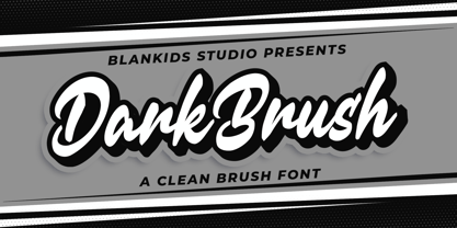 Hello, Are you looking for a clean brush script font? Do you want of creating Something that stand out and inspire creativity, imagination, and endless fun? Wait no more, we will give you the best choice. Dark brush a Clean Brush Font Dark brush a Clean Brush Font, Inspiring from brush lettering style typography. This font is perfect for a design that makes it more attractive and playful. made with a very good level of aesthetics making this font suitable for book cover, poster, packging, merchandise, logotype and much more. Dark brush font includes Multilingual Support, among others : Afrikaans, Albanian, Asu, Basque, Bemba, Bena, Breton, Catalan, Chiga, Cornish, Danish, Dutch, English, Estonian, Faroese, Filipino, Finnish, French, Friulian, Galician, German, Gusii, Indonesian, Irish, Italian, Kabuverdianu, Kalenjin, Kinyarwanda, Luo, Luxembourgish, Luyia, Machame, Makhuwa, Meetto, Makonde, Malagasy, Manx, Morisyen, North Ndebele, Norwegian Bokmål, Norwegian Nynorsk, Nyankole, Oromo, Portuguese, Quechua, Romansh, Rombo, Rundi, Rwa, Samburu, Sango, Sangu, Scottish Gaelic, Sena, Shambala, Shona, Soga, Somali, Spanish, Swahili, Swedish, Swiss German, Taita, Teso, Uzbek (Latin), Volapük, Vunjo, Zulu FEATURES : Uppercase Lowercase Number Punctuation Multilingual PUA Encode Opentype
 - VLNL Kouseband by VetteLetters,
$30.00 The starting point for VLNL Kouseband was spotted by Donald DBXL Beekman on the Christian Reformed Church in the Dutch town of Naarden. The iron wire lettering contained a number of unusual characters and details, which eventually led to this five weight family. The Kouseband fonts mix elements of geometric sans serifs and upright unconnected scripts, with a hint of Dutch school writing. VLNL Kouseband is monolinear and has an very large cap height compared to the (lowercase) x-height, giving the capital letters an elongated condensed appearance. Kouseband is the Dutch word for ‘garter (belt)’ and also gave the name to a long tropical bean known as Yardlong bean. Kouseband beans are a common ingredient in Roti and other Surinamese dishes. As the Dutch Christian church is sometimes referred to as ‘Zwarte kousenkerk’ (Black stocking church), and stockings are held up by garter belts, we have come full circle and VLNL Kouseband has a name. VLNL Kouseband contains a set of oldstyle numbers matching the lowercase letters, and a couple of wider alternate capitals (HMNOQ) to enhance the liveliness of your designs.
 - South Central by Loshaj Foundry,
$9.00 "To us it ain't vandalism. It's just letting the people know: We grew up here. This is our neighborhood. And as they pass by they know where we're at." – Los Angeles gang member Graffiti is equivalent to local news, its intended purpose is to inform general populace where gang members are, where they operate, as far as territory lines, and which neighborhoods are at war. Gang Graffiti can be used for: – Marking territory with graffiti. – It's a form of gang advertisement. – Letting people know who's in the gang, living, dead, or in prison. – Which neighborhoods they are at war with. – Who are their allies. Graffiti has along history, specifically Los Angeles gang graffiti, which has has been around since the 1930s. South Central typeface includes uppercase letters, numbers, and select punctuation glyphs.
 - Easy Breezy Type by Hipfonts,
$17.00 Introducing Easy Breezy, a font that effortlessly transports you to a bygone era of carefree charm and nostalgic beauty. Inspired by the retro styles of the past, this vintage gem captures the essence of a relaxed and laid-back vibe. Its flowing letterforms and playful curves breathe life into your designs, exuding a sense of whimsy and joy. With Easy Breezy, your projects will radiate a delightful vintage aura, whether you're designing invitations, branding materials, or signage. Let this font whisk you away to a world of sunny days, gentle breezes, and endless possibilities. Embrace the effortless beauty of Easy Breezy and create designs that capture the heart with their timeless appeal. Experience the nostalgia, embrace the freedom, and let your creativity soar with Easy Breezy at your fingertips.
 - Mikagi by Thinkdust,
$10.00 Mikagi is a textured form of the 2008 Miyagi typeface, giving the original creation a new personality along with its makeover. The rough texture is a different direction from the original, smooth line style of its predecessor, instead creating something that might be described as lean and tough. Worn and weary, Mikagi emphasises everything it says, taking care to slow itself down and not get caught up in the speed of its youth. Use Mikagi for a range of design work, to add a blend of smooth easiness and faded cynicism to your creation.
 - BAR SADY by Borutta Group,
$- BAR SADY is a revival of a typeface based on famous lettering from "BAR SADY". The project was implemented as part of the Warsaw Participatory Budget 2023. Mateusz Machalski & Małgorzata Bartosik were responsible for the new digital version of the typeface. In the first phase, the original lettering was lifted, then extended to a full set of characters (A-Z). Finally, the bold style was created. The whole family is available under a free license.
 - Klein Rough Gemein by TypoGraphicDesign,
$19.00 The typeface Klein Rough & Gemein(e) is designed from 2020 for the font foundry Typo Graphic Design by Inga Luft and Manuel Viergutz. The display font based on original old german rubber stamps and is inspired in the past and present. 4 font-styles (Rough, Rougher, Roughest, Rough Mix) + 1 icon-style with 432 glyphs (Adobe Latin 2) incl. 100+ decorative extras like icons, arrows, dingbats, emojis, symbols, geometric shapes, catchwords, decorative ligatures (type the word #LOVE for ❤ or #SMILE for ☺ as OpenType-Feature dlig) and stylistic alternates (7 stylistic sets). For use in logos, magazines, posters, advertisement plus as webfont for decorative headlines. The font works best for display size. Have fun with this font & use the DEMO-FONT (with reduced glyph-set) FOR FREE! ■ Font Name: Klein Rough & Gemein(e) ■ Font Weights: 4 + 1 (Icons) + DEMO (with reduced glyph-set) ■ Font Category: Display for headline size ■ Font Format:.otf (Mac + Win, for Print) + .woff (for Web) ■ Glyph Set: 432 glyphs (Adobe Latin 2) incl. 100+ decorative extras like dingbats ■ Design Date: 2020 ■ Type Designer: Manuel Viergutz und Inga Luft
 - Alvia by Zane Studio,
$12.00 Alvia is a clean, modern script font that is carefully crafted with a touch of elegance. This font can be used to write letters, invitations, food products, headlines and more. It will turn any creative idea into a true work of art!
 - Saissant by Magpie Paper Works,
$54.00 Edgy and modern, Saissant is a hand-drawn font that leaves an impression. Bold capitals and kinetic lowercase letters have been designed for emotional impact. Saissant includes multi-language support as well as contextual alternates and discretionary ligatures for a convincing calligraphic effect.
 - Brown Chunkers by Letterhend,
$19.00 Brown Chunkers is an unique serif based display typeface containing many alternates, swashes, ligatures that can make your lettering/logotype become more interesting. The clean and neat of a serif combined with the swirl swashes makes this font one of a kind.
 - Feilla by AEN Creative Studio,
$20.00 Feilla is a cute valentine’s handwritten font featuring lovely ornaments. This font is perfect for romantic-themed designs, especially when combined with pink or bright colors. It is PUA encoded, which means you can access all of the glyphs and swashes with ease!
 - Creepy Halloween Monogram by AEN Creative Studio,
$15.00 Creepy Halloween Monogram is a detailed and creepy duo font (display and decorative). It is perfectly suitable for any Halloween-related project or crafty idea! It is also PUA encoded which means you can access all of the glyphs and swashes with ease!
 - Ladies by Creaditive Design,
$12.00 Ladies is a gorgeous yet thin and simple handwritten font. Ladies will add a luxury spark to design project that you wish to create! This font is PUA encoded which means you can access all of the glyphs and swashes with ease!
 - Headey by Alex Couture,
$15.00 Headey is a clean and lining brush script with a bouncing baseline. Include OpenType alternates and common ligatures. Try the alternates and ligatures to give your designs looks good, fresh, casual, stylish, and modern. That's it! I really hope you enjoy it.
 - Kids by Nirmalagraphics,
$14.00 Kids is inspired by the writing style of a child who is learning to write letters and numbers. This font can be used for a variety of needs including logos, flyers, magazines, clothes, business cards brochures and more. It includes multi-lingual support.
 - YT Play Latin by Yangtype,
$9.00 The concept of this letter is health. Eat well, sleep well, exercise comfortably, have strong muscles and endurance. It makes people feel quite positive. It will give great strength to sentences that have meaning that people can understand, rather than inflammatory messages.
 - Spooky Halloween by Creaditive Design,
$12.00 Spooky Halloween is a cool and scary decorative font. Use it for each of your October designs and notice how they instantly come to life. Spooky Halloween is PUA encoded which means you can access all of the glyphs and swashes with ease!
 - Anjara by 611 Studio,
$15.00 This typeface got its name from "anyar", which means "new/modern" in local Indonesian (Javanese). Just like it's name, this typeface gives a modern and simple look. Anjara's medium contrast makes it easily stand out in any compositions, especially it's bold version.
 - MBF Inno by Moonbandit,
$17.00 Inno font, is a modern take on the futuristic scifi theme, this typeface is clean, sharp, and have plenty of alternative, you can easily access them through uppercase lowercase. This font is great for headlines, sub titles and many attention grabber projects.
 - Allenisa by Letterafandi Studio,
$14.00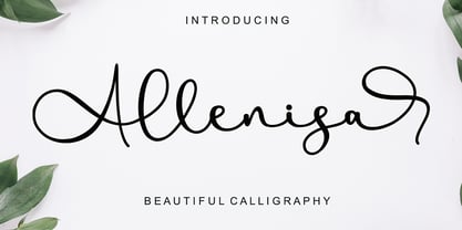 Allenisa is a chic, refined script font that emanates sophistication and elegance. Its stylish alternates and ligatures make this font the perfect match for any project. Allenisa is PUA encoded which means you can access all of the glyphs and swashes with ease!
 - Hello Miracle by Letterafandi Studio,
$16.00 Hello Miracle is a cool and interestingly designed display font. It will elevate a wide range of crafting ideas, from cards, to branding, labels and much more. This font is PUA encoded which means you can access all of the glyphs with ease!
 - Brab by VSF,
$30.00 A bold grotesque typeface in the best traditions of the Star Wars logo. It has clean geometric lines, a humnaist character, it combines a tech feeling with a friendly organic feeling. Will work excellently as a white text on a busy background.
 - Stellator JNL by Jeff Levine,
$29.00The future is now with Stellator JNL! With all the clean lines and styling one would expect of a futuristic or space age font, your design projects will have a simple, yet effective type design that conveys modern technology and interplanetary travel. - Cute Christmas Monogram by AEN Creative Studio,
$18.00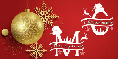 Cute Christmas Monogram is a joyful and festive duo font (decorative + script). It is ideal for Holiday-themed greeting cards and for any crafting project. This font is PUA encoded which means you can access all of the glyphs and swashes with ease!
 - Channelley Script by dotHK Studio,
$25.00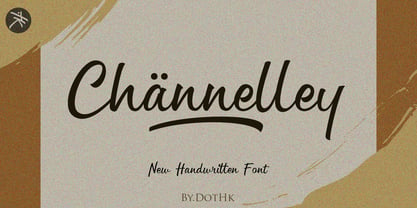 Channelley is a casual and clean brush script font. It has a trendy style and it will be a tremendous hit for each of your branding, product packaging, invitations, quotes, t-shirts, label, poster, logos or anything else that you wish to design.
 - Pisang by Hanoded,
$15.00 Pisang means banana in Malay and Bahasa Indonesia. It is a tall, narrow and very clear font, ideal for books, recipes, food labeling and posters. It comes with a full range of diacritics and some interesting alternates for the closed glyphs as well.
 - Sundoes by ahweproject,
$9.00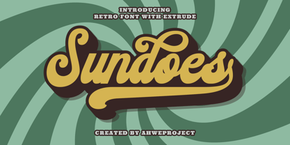 Sundoes is a cool and fun script display font. With a retro and groovy vibe, this font is suitable for a wide pool of design ideas. This font is PUA encoded which means you can access all glyphs and swashes with ease!
 - Romance Sans by AEN Creative Studio,
$15.00 Romance Sans is a modern display font featuring lovely ornaments. This font is perfect for romantic themed designs, especially when combined with red or bright colors. It is PUA encoded which means you can access all of the glyphs and swashes with ease!
 - Valentine Cute by AEN Creative Studio,
$14.00 Valentine Cute is a quirky display font featuring lovely ornaments. This font is perfect for valentine themed designs, especially when combined with pink or bright colors. It is PUA encoded which means you can access all of the glyphs and swashes with ease!
 - 1312 Lamberet by Ezequiel Filoni,
$10.00 Lamberet is a geometric sans-serif typeface, all caps display font. Has a clean, sharp and emphatic form especially suitable for headlines, headings, branding, posters, packaging, titles, logos or whatever. It comes in its italics forms for regular sharp and soft versions. - Uppercase