727 search results
(0.022 seconds)
- Cressida NF by Nick's Fonts,
$10.00Here's a flashback to the sixties, which originally went by the rather unimaginative name of Triline. It's available in two versions: regular and swash caps. In the swash version, the uppercase Q is a "Qu" ligature; a plain Q is located in the ASCII circumflex position (SHIFT+6 on PC or Mac). Named for the heroine of a medieval romance. The Postscript and Truetype versions contain a complete Latin language character set (Unicode 1252); in addition, the Opentype version supports Unicode 1250 (Central European) languages as well. - Horse Drawn Carriage JNL by Jeff Levine,
$29.00 Picture if you will, a balmy autumn evening in Manhattan during the 1930s and a well-dressed couple out on the town. They hail one of the hansom cabs located near Central Park and climb in for an old-fashioned romantic ride around the green. Such are the type of images the stylized Art Deco hand-lettering comprising Horse Drawn Carriage JNL evokes. The inspiration for this font was the title card for a 1935 Bette Davis feature entitled "The Girl from 10th Avenue".
 - Yapari by Power Type,
$15.00 YAPARI is a font inspired by a street typography located in a Makassar city 2005, this writing is poured into a font and then made several variations of width which are Wide, Extended, and Expanded kind of stretched font then have thickness ranging from Thin, Extra Light, Light, Regular, Medium, Semi Bold, Bold, Extra Bold, Ultra. This font is suitable for use for design projects that have a bold impression and can also be used for all lines of media as well as formal and informal
 - Fast Racer Italic by Sipanji21,
$16.00 Fast Racer is a sport display Font. The font is ready to be used for your racing sports or automotive related projects . Built to be perfect for headlines, jerseys, logos, branding, posters, packaging, advertising, and much more. If you Find some trouble with this font please chat me. thanks and have a nice day
 - Local Eatery JNL by Jeff Levine,
$29.00 Here's yet another variation of the classic Futura Black Art Deco stencil form of display lettering. The inspiration for this typeface came from various images of the Blossom Dairy Co. restaurant, originally opened as an ice cream and sandwich shop located on Quarrier Street in Charleston, West Virginia. The restaurant first opened in 1938 as an outgrowth of the Blossom Dairy Co. itself, and existed under various ownerships until it permanently closed on Nov. 11, 2016. Digitally redrawn as Local Eatery JNL, it is available in both regular and oblique versions.
 - Mentor-51 by Pilot,
$10.00 While developing one of their own IP's, Pilot needed a typeface which reflected a developing story with a science fiction theme. Mentor-51 is proudly the first release born out of this IP. It was created by designer and Pilot co-founder Bill Concannon and Brendan Keohane, a graphic designer at the studio. Pilot, located at Boston Design Center, is home to graphic designers and illustrators who enjoy the mix of the two disciplines. Pilot's primary goal is effective brand development through telling brand stories using strategy and art.
 - Tertre by Paragraph,
$22.00 Tertre is a display/short text typeface with a wide range of applications from signage or posters to menus and pricelists; branding, packaging or publishing. It is named after Place du Tertre, a square located at the top of Montmartre—a hill overlooking Paris, made famous by the artists of the 19th and 20th Century. Like in Galette, the letters have no overhangs and the stroke thickness of capitals and lower case letters is identical, making hinting or anti-aliasing more uniform at any point size and zoom combination.
 - Marketing Strategy JNL by Jeff Levine,
$29.00 Marketing Strategy JNL was inspired by some display signage used in an episode of the classic "Alfred Hitchcock Hour". Evoking the early-60s feel of kitchy advertising, this display font has a limited character set and is specifically designed for creating retro ad banners and point-of-sale attention getters as well as period piece signage. For those preferring a blank hexagon for spaces between words, one is located on the equal key. Marketing Strategy JNL is available in both regular (outline) and solid (white letters on black) versions.
 - On The Town JNL by Jeff Levine,
$29.00 On the Town JNL is a reworking of Parks Department JNL, giving it a classic "solid black Art Deco treatment". The wide monoline font of the original design was inspired by hand lettering on a WPA (Works Progress Administration) poster. Art Deco typography and the streamlined style it embraced often conjures up images of New York City in the 1930s and 1940s, thus On the Town JNL is named for the classic MGM musical starry Gene Kelly, Frank Sinatra and Jules Munchen that was filmed on location in "the city that never sleeps".
 - Whakatani by Jadugar Design Studio,
$20.00 Whakatani is a new font with only have Bold option at the moment, beautifully kerned letters and multi language supporting. About Whakatani---- Whakatane invites you to throw away your watch, relax in the sunshine, experience the special lure of the ocean and marvel at the relaxed friendliness of the people - as you discover all the little things that make Whakatane so exceptional. Renowned for great weather, beautiful beaches, culture and a relaxed lifestyle, the Whakatane region is one of New Zealands most attractive locations for visitors and relocators.
 - Gristwood JNL by Jeff Levine,
$29.00 The rustic lettering which also served as the model for Grist Mill JNL is the basis for Gristwood JNL. Another set of vintage wood type has the letters reversed out of blocks, making for a specialty titling font. Decorative end caps are located on the greater and less than keys and also on the plus and equal keys. A blank block for regular word spacing is on the underscore key, along with a wider blank box on the backslash key. This typeface has a somewhat limited character set.
 - Pocatello JNL by Jeff Levine,
$29.00 The hand-lettered title, cast and crew credits for 1943's "Presenting Lily Mars" (starring Judy Garland and Van Heflin) inspired Pocatello JNL, but the name of this typeface has another Judy Garland connection. In the 1954 remake of "A Star is Born", Judy sings of being born in a trunk in a theater located in Pocatello, Idaho. The name of this Midwest town had such a great sound to it, so it was the perfect choice for the font's name. Available in regular, oblique, bold and bold oblique versions.
 - Gekomach by Keristyper Studio,
$14.00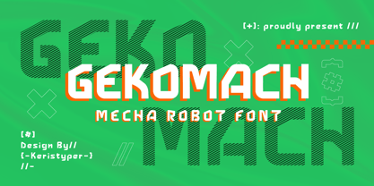 Gecomach robotic mecha typeface is inspired by a modern futuristic. This font is good for logo design, Social media, Movie Titles, Books Titles, short text even long text letters, and good for your secondary text font with sans or serif. **Featured:** * Standard Uppercase & Lowercase * Numeral & Punctuation * Multilingual : ä ö ü Ä Ö Ü ß ¿ ¡ * Alternate & Ligature * PUA encoded We recommend programs that support the OpenType feature and the Glyphs panel such as Adobe applications or Corel Draw. so you can use all the variations of the glyphs. Hope you enjoy our fonts!
 - Sharka by PeGGO Fonts,
$10.00 Sharka is heavy sharp condensed system of 7 display typefaces widths, plus 7 italics and 7 alternative version on each family member, inspired on dangerous personality and aggressive reputation of the great white shark, it was thought to create the feel of high impact, high risk action on extreme situations, polemic public scandals, financial advertisement alert, the italic version specially creates the feel of velocity, powerful mechanical energy and related similar topics. Recommended to use in big headlines, magazine covers, advertisements, robust public visual calls, but also, if it applied with good taste and good typographical skills, could be a good choice not only for prints but also for web and digital media devices.
 - Venetian 301 by ParaType,
$30.00 Venetian 301 is the Bitstream version of the Centaur type family. Centaur was designed by the American book designer Bruce Rogers on the basis of Venetian typefaces of 1470 of Nicolas Jenson. Beautiful Italic based on a face by Ludovico degli Arrighi was developed by Frederic Warde who was an American calligrapher and typography researcher was added as Italic to Centaur. Adapted for mechanical composition by English Monotype in 1929. Its lettershapes owe much to pen-drawn letters of Italian humanist minuscule and cursive. This elegant humanist face is useful for the finest typography both for book text and display matter. Cyrillic version included small caps was developed for ParaType in 2003 by Dmitry Kirsanov.
 - Arial Narrow OS by Monotype,
$54.99Arial was designed for Monotype in 1982 by Robin Nicholas and Patricia Saunders. A contemporary sans serif design, Arial contains more humanist characteristics than many of its predecessors and as such is more in tune with the mood of the last decades of the twentieth century. The overall treatment of curves is softer and fuller than in most industrial style sans serif faces. Terminal strokes are cut on the diagonal which helps to give the face a less mechanical appearance. Arial is an extremely versatile family of typefaces which can be used with equal success for text setting in reports, presentations, magazines etc, and for display use in newspapers, advertising and promotions. - Plague Master by Hanoded,
$15.00 I admit: I had a bit of a crazy week when I thought up an drew this font. I broke my arm during kickboxing training on monday, leaving me in a cast - unable to do most everyday things, like getting a good night's sleep (try sleeping with a humongous cast on your arm). Thank goodness, it is my left arm, so I can still draw letters and use my laptop. So… this font has been made entirely using one arm! It is a bit of a horror font - it sort of sums up my mood right now. Glyphs have very little spacing, adding to the evil look of Plague Master. Comes with a lethal amount of diacritics.
 - Clavo by Dada Studio,
$29.00 Clavo was picked for the EXHIBITION CALL FOR TYPE - NEW TYPEFACES and is presented in the Gutenberg Museum in Mainz, Germany. Clavo is a multipurpose font family. Its warmth comes from subtle details, classical proportions and traditional forms, while harmonious structure prevents distraction while reading. This makes Clavo a universal typeface. In all sizes, from caption to display. The family consists of ten weights. They were not created in a linear way. The steps between the weights were adjusted carefully to avoid a mechanical graduation, in favor of optical harmony. Clavo covers all latin languages. It contains a wide set of numerals, small capitals, fractions and other OpenType goodies. And of course every weight comes with matching italics.
 - Arial for Ortho Clinical by Monotype,
$45.99Arial was designed for Monotype in 1982 by Robin Nicholas and Patricia Saunders. A contemporary sans serif design, Arial contains more humanist characteristics than many of its predecessors and as such is more in tune with the mood of the last decades of the twentieth century. The overall treatment of curves is softer and fuller than in most industrial style sans serif faces. Terminal strokes are cut on the diagonal which helps to give the face a less mechanical appearance. Arial is an extremely versatile family of typefaces which can be used with equal success for text setting in reports, presentations, magazines etc, and for display use in newspapers, advertising and promotions. - ATF Brush by ATF Collection,
$59.00 Oh, Brush … beloved script emblem of plumbers, mechanics, bodegas, lunch counters, and other low-rent concerns. Since 1942, you have given faceless apartment buildings a name, brought life to the badges and banners of otherwise tedious trade conventions, and lent excitement to the postcards of middle America’s unsung travel destinations. We have seen so much of you … but not enough! We need more weights: how about five, extending beyond humdrum Medium? We want swash alternates, too, plus lively ligatures and sporty underline tails! Give us cleaner curves and smoother connections, but stay true to your frisky self! Like a nail salon that offers cucumber water, the new ATF Brush is one step classier than the rest.
 - Super Active Matrix by Folding Type,
$9.00 S.A.M (Super Active Matrix) combines the big, bright and bold with the microscopic and mathematically precise. Inspired by old science fiction films and new technologies, S.A.M merges the rigid constraints of display mechanics with the free-flowing curves of neon signs. This font is great for a classic sci-fi look – perfect for headlines/logotype. S.A.M also works for blocks of text, unlike some other display fonts. The matrix exists to bring order to an idea – it tames the free-flowing curves of neon signage into a repeatable structure while maintaining a retro aesthetic. Each character, glyph or symbol is drawn on a bitmap grid, merged with a dot matrix to round off the edges.
 - Arial Unicode by Monotype,
$208.99Arial was designed for Monotype in 1982 by Robin Nicholas and Patricia Saunders. A contemporary sans serif design, Arial contains more humanist characteristics than many of its predecessors and as such is more in tune with the mood of the last decades of the twentieth century. The overall treatment of curves is softer and fuller than in most industrial style sans serif faces. Terminal strokes are cut on the diagonal which helps to give the face a less mechanical appearance. Arial is an extremely versatile family of typefaces which can be used with equal success for text setting in reports, presentations, magazines etc, and for display use in newspapers, advertising and promotions. - Arial Paneuropean by Monotype,
$92.99Arial was designed for Monotype in 1982 by Robin Nicholas and Patricia Saunders. A contemporary sans serif design, Arial contains more humanist characteristics than many of its predecessors and as such is more in tune with the mood of the last decades of the twentieth century. The overall treatment of curves is softer and fuller than in most industrial style sans serif faces. Terminal strokes are cut on the diagonal which helps to give the face a less mechanical appearance. Arial is an extremely versatile family of typefaces which can be used with equal success for text setting in reports, presentations, magazines etc, and for display use in newspapers, advertising and promotions. - Cantilever by Meat Studio,
$9.00 Cantilever is a variable, 20 style display typeface designed by Stew Deane. The idea came from using variable type mechanics to create a typeface that became more than type — it's designed to be impactful, fill space and turn text into something graphic and visual. Being fixed-width (at whatever width you choose) means it is perfect for stacking, as well as stretching ultra wide. It's a typeface designed to take centre stage and own space. By using the variable sliders in your design software you can give your typography a bespoke, ownable aesthetic. The sliders in Cantilever are Weight and Width, and are designed for maximum impact in any space. Play around.
 - Grosse Pointe Metro by GroupType,
$19.00GP Metro® is a faithful version of the Dwiggins 1930 urban classic: Metrolight, Metromedium, and Metroblack. In 1929, English type designer, William Addison Dwiggins, (WAD) was commissioned by the Merganthaler Type Foundry to design a warmer, more humanistic, and less mechanical sans to effectively compete with Futura, a highly-popular geometric sans designed by Paul Renner in 1927 and first released by Meganthaler's arch-rival, the Bauer Type Foundry in Germany. FontHaus has licensed from GroupType updated files with additional styles including 2 rough versions and a soft together with the classic Regular styles and weights. These new styles will offer designers a wider range of options to design with these amazing classics. - Loew by The Northern Block,
$39.00 Loew is a geometric sans serif font influenced by the methods of the early industrial designers. Pure mechanical shapes are carefully adjusted to give the characters the right form, function and usability. These subtle human touches combined with the technical detail provide great readability at both large and small point sizes. Loew is a versatile sans serif font with simple and honest geometry aimed at a wide range of modern applications. Details include over 800 characters with alternative lowercase a, e and g. Seven variations of numerals, true small caps with accents, manually edited kerning and Opentype features. For additional non-latin language support in Cyrillic, Greek and Arabic, visit Loew Next and Loew Next Arabic.
 - Typist Slab Mono by VanderKeur,
$25.00 The typeface Typist originated during an extensive research on the origin and development of typewriter typestyles. The first commercially manufactured typewriter came on the market in 1878 by Remington. The typestyles on these machines were only possible in capitals, the combination of capitals and lowercase came available around the end of the nineteenth century. Apart from a few exceptions, most typestyles had a fixed letter width and a more or less unambiguous design that resembled a thread-like structure. A lot of this mechanical structure was due to the method the typestyles were produced. Looking at type-specimens for print before the first typewriters were good enough to came on the market we can see that in 1853 and in 1882 Bruce’s Type Foundry already had printing type that had a structure of the typewriter typestyles. Of course printing types were proportional designed as typewriter typestyles had a fixed width. So it is possible that except from the method of production for typewriter typestyles, the design of printing types were copied. In the design of the Typist, the purpose was – next to the monospace feature – to include some of the features of the early typewriter typestyles. Features such as the ball terminals and the remarkable design of the letter Q. This new typeface lacks the mechanical and cold look of the early typewriter typestyles. The Typist comes in six weights with matching italics in two versions. One that resembled the early typewriter typestyles (Typist Slab) and a version designed with coding programmers in mind (Typist Code).
 - Typist Code Mono by VanderKeur,
$25.00 The typeface Typist originated during an extensive research on the origin and development of typewriter typestyles. The first commercially manufactured typewriter came on the market in 1878 by Remington. The typestyles on these machines were only possible in capitals, the combination of capitals and lowercase came available around the end of the nineteenth century. Apart from a few exceptions, most typestyles had a fixed letter width and a more or less unambiguous design that resembled a thread-like structure. A lot of this mechanical structure was due to the method the typestyles were produced. Looking at type-specimens for print before the first typewriters were good enough to came on the market we can see that in 1853 and in 1882 Bruce’s Type Foundry already had printing type that had a structure of the typewriter typestyles. Of course printing types were proportional designed as typewriter typestyles had a fixed width. So it is possible that except from the method of production for typewriter typestyles, the design of printing types were copied. In the design of the Typist, the purpose was – next to the monospace feature – to include some of the features of the early typewriter typestyles. Features such as the ball terminals and the remarkable design of the letter Q. This new typeface laks the mechanical and cold look of the early typewriter typestyles. The Typist comes in six weights with matching italics in two versions. One that resembled the early typewriter typestyles (Typist Slab) and a version designed with coding programmers in mind (Typist Code).
 - Wrong Boys Graffiti by Sipanji21,
$16.00 Wrong Boys is a spectacular Display font with a Fatty and Thick graffiti style for your design look awesome. It will elevate a wide range of design projects to the highest level, be it branding, headings, wedding designs, invitations, signatures, logotype, wall art illustration, apparel, labels, and much more! If you find some problem please chat me Have A Nice Day
 - Lynchburg by FontMesa,
$25.00Lynchburg was inspired by the Jack Daniels Green Label Whiskey logo, included in Lynchburg are a couple Whiskey Barrels located on the less than and greater than keys. Disclaimer: The FontMesa fonts that were inspired by famous company logos although very accurate in detail have not been approved as official art work by the companies which logos they've been patterned after. They were created for entertainment purposes and if you plan on using the famous logos from these fonts for any legitimate or commercial purpose then it is recommended that you contact those companies and request guideline information along with their official artwork. - Mr. Mamoulian by Comicraft,
$19.00 “In some way I was Mr Mamoulian, and someone else was writing and drawing this stuff. He kept sending me these pages. I had to sign my name and pass them off as my own. I had no choice. He was holding my aged mother hostage, you see. I told him when the pages were due and he somehow got them to me. Sometimes he left them in secret locations. I don't remember them at all.” -- Brian Bolland Mr. Mamoulian has four weights with automatic alternating uppercase letters, Crossbar I Technology, and European, Vietnamese & Cyrillic language support.
 - Kaizena by MaxnorType,
$12.00 Kaizena is a modern script font with alternates, final form, stylistic sets, including front and back swashes. It can be used for various purposes, and suitable for logo design, branding, greeting cards, stationery, wedding invitations and much more. The design of Kaizena nuanced Japanese style, but it is very feasible to use in modern themed designs. Kaizena uses OpenType Features, so designers can access alternate glyphs easily with graphic design softwares. Besides that, these alternate glyphs are located in Private Use Area, so they can be accessed easily with Character Map, Babel Map, or font manager softwares.
 - Magasin by Type-Ø-Tones,
$50.00 Magasin is a high contrast display typeface inspired by the pointed pen calligraphy, yet with a retro-chic twist. It combines a sense of script with geometric and slightly condensed structure resulting in idiosyncratic curves softly connecting the vertical elegance of its forms, ideally suited to use at large sizes in headlines for magazines, posters or packaging. Magasin boasts a rich set of OpenType features that provide a better flow such as Ligatures, Stylistic Alternates, Contextual Alternates, and Final Forms. It also includes a set of capital Swashes. Please check the ‘Read me’ file located in the gallery for more specifications.
 - Print Shop Parts JNL by Jeff Levine,
$29.00 Print Shop Parts JNL has a nostalgic assortment of blank sign panels, a pointing hand, decorative embellishments and even an assortment of "Made in U.S.A.", "Made in America" and "Made in United States" emblems located on the 1-9 keys. All are from vintage type catalogs and sign painting instruction books from the early 1900s. When scaled up, the blank sign panels can be used for small signs or price tags as originally made in years past. During the early part of the 20th Century, it was common to create show cards in attention-getting shapes matched with beautiful hand lettering.
 - Karol by Type-Ø-Tones,
$60.00 Karol was designed in 2011 as a project in the MA in Advanced Typography from EINA/UAB, in Barcelona. It was born as text typeface inspired by the work of East European type designers. Two years later, Karol is ready for public release, in a collection of eight styles (four weights and matching italics) with high readability, strength and character. A few days before its publication, we received the news that Karol had been awarded the Certificate of Typographic Excellence (Judges’ Choice) of the Type Directors Club. Please check the ‘Read me’ file located in the gallery for more specifications.
 - Eixample Glaces by Type-Ø-Tones,
$55.00 The Eixample project is inspired by modernist signage of various examples found in the Eixample neighbourhood in Barcelona. The name of each subfamily is related to its location or to specific elements of the original sign. In 2003 we photographed a sign with the word GLACES painted on a refrigerator, on which, over the years, we have speculated on how to manage the concept of double vertical modulation. This model has been expanded and the original idea has been developed in three variants that oscillate between monolinear and high contrast. In order to increase its versatility, the character set includes small caps.
 - Scarab - Unknown license

- Ni Serif by DSType,
$40.00 Ni is a kind of typographic love letter, revealed in three distinct, yet close, type formulas. Ni Serif is a contemporary serif typeface with slight diagonal modulation, amazingly legible, and with a very steady rhythm that allows a wonderful performance, especially in long passages of text. Ni Sans closely match the design characteristics and proportions of the serif counterpart. Ni Sans undeniably shows the strong calligraphic influence that comes from Ni Serif, resulting in a very comfortable humanistic typeface, suited both for print and digital environments. Ni Slab is not a simple Sans with serifs attached. Despite the thick and strong serifs, Ni Slab is a gentle mixture of the DNA of the Serif and Sans counterpart and does not intend to reflect any mechanic approach.
 - Letteria Pro by Latinotype,
$29.00 A triple threat, Letteria Pro is a typographic trio designed for branding and packaging. With the soul of a broad nib pen and the grace of a brush, it has five weights and a lot of style. In order to achieve a pragmatic contrast between a composition’s communication levels, we have created a mechanical typeface with only capital letters in sans and slab versions that elude to a De Stijl style. Ligatures and swashes provide a plethora of options, including Thin, Light, Regular, Bold and Black weights, while its companions offer a single weight. Together, this Latinotype original covers more than 200 languages within the Latin alphabet. Yet another powerful tool for your arsenal of fonts that command consumer attention.
 - Ni Slab by DSType,
$40.00 Ni is a kind of typographic love letter, revealed in three distinct, yet close, type formulas. Ni Serif is a contemporary serif typeface with slight diagonal modulation, amazingly legible, and with a very steady rhythm that allows a wonderful performance, especially in long passages of text. Ni Sans closely match the design characteristics and proportions of the serif counterpart. Ni Sans undeniably shows the strong calligraphic influence that comes from Ni Serif, resulting in a very comfortable humanistic typeface, suited both for print and digital environments. Ni Slab is not a simple Sans with serifs attached. Despite the thick and strong serifs, Ni Slab is a gentle mixture of the DNA of the Serif and Sans counterpart and does not intend to reflect any mechanic approach.
