10,000 search results
(0.037 seconds)
- Flirt by Canada Type,
$25.00It's a very happy day when we stumble upon beautiful alphabets that were never digitized. It is even a happier day when the beautiful alphabet finds its way to us through friends and people who like our work. Some two months ago, the forms of this gorgeous font were pointed to us by a friend who saw it in an old Dover Publications specimen book showcasing historical alphabets. It was there under the name Vanessa, with nothing else to go by. We looked and researched for further information but found nothing else. So this gem comes to you like a coal that winked its way out of the ashes because it wanted to shine again. Flirt is very authentic art deco with a noticeable element of artistic pride, swashy delicate majuscules and very aristocratic, fashionable and flirty minuscules. The majuscules can be used as every other capitals usually are, or as initial caps. The minuscules can very nicely stand on their own quite independently from the caps whenever desired. These letters are quite similar to the hand lettering used on of the kind of theater posters, specifically burlesque and opera entertainment, which are now considered very retro-chic and fashionable to see hanging on walls in home or office. The initial specimen we worked from showed a single basic art deco alphabet with numerals which seemed as they belonged to another font. That alphabet became the base Flirt font, the numerals were redrawn to fit much better with the minuscules, and the character set was greatly expanded to include punctuation, accented characters, and many many alternates, especially for the majuscules. Majuscules with a descending right vertical stroke were a common artistic touch in the high days of theater posters, so we thought they would be great additions to the character set. These alternates can be found all over the font. So to maximize the design fun, have a character map or glyphs palette handy when you use Flirt. After the base font was finished, we thought it would be a good idea to give it a bold treatment unlike anything seen out there, and the farthest thing from the mechanical bolds seen everywhere now. This bolding treatment consisted of thickening the lowercase's vertical strokes inwards, but leaving the horizontal stroke weight as is, and thickening only the thicker vertical strokes of the uppercase. The result is quite the visual feat. We encourage you to test both the regular and bold weights and see for yourself. - Velour - Unknown license

- Rogers2 - Unknown license

- Ongunkan Modern Latin by Runic World Tamgacı,
$45.00 I present a beautiful interpretation of the Modern Latin Alphabet, in which the foundations of today's modern world and civilization have risen, enjoy it.
 - Lustre by ParaType,
$25.00Non-alphabetic typeface consisting of 38 silhouette and outline images of women’s footwear and accessories. Designed by Yana Kutyina. Released by ParaType in 2008. - Blippo by Bitstream,
$29.99Another variant of Bayer’s Universal Alphabet, resembling ITC Bauhaus in design, ITC Ronda in proportion and fit, prepared by FotoStar in the mid 1970s. - Albrecht Fraktur by New Renaissance Fonts,
$20.00 In his 1538 book on measurement, Albrecht Dürer gave clear descriptions and drawings about the proportions of the letters in both Roman and 'fraktur' alphabets (from Latin 'fractura', meaning that it's broken up with lots of different angles rather than smooth curves). Here is the fraktur alphabet as a font completed for use today, with a few characters modernised and some gaps filled. Of course there are countless examples of fraktur fonts already circulating, and indeed one foundry even has another version of this particular one; but we have different approaches to some of the questions raised, we have aimed at a more even tracking (horizontal spacing), and the 260 glyphs in our version include accents and other diacritics, and the modern symbols which Dürer would surely have embraced if he had had access to the internet.
 - Seashore Pro by Sudtipos,
$59.00 A feminine, graceful script whose thicker horizontals create a wave-like rhythm — hence the name. Seashore is loosely based on an "eccentric" (left-leaning) penmanship style of the late 19th century. Used mainly by professional "engrossers" in certificates and tributes, or by society ladies in their stationery and invitations, it sent a message of true refinement, as the style would have been only been mastered after the more common business, Spencerian, and standard ornamental styles. In fact, unusual script styles were in such demand that type foundries of the era exploded with metal-type knockoffs of increasing fanciness. Seashore includes a wide variety of swash capitals, alternate endings, and contextual ligatures, over 900 glyphs in all. Seashore is best used in short display settings — in names and addresses on formal invitations, in menus and food packaging, or fashion and beauty contexts.
 - Manas Pro by Fontuma,
$24.00 Manas is the name of the epic of the Kyrgyz Turks. The font family is also designed with serifs to reflect the characteristics of the epic from which it is named. This typeface, which is a serif, consists of three families: ▪ Manas: Font family containing Latin letters ▪ Manas Pro: Font family including Latin, Arabic and Hebrew alphabets ▪ Manas World: A family of typefaces including Latin, Cyrillic, Greek, Arabic and Hebrew alphabets
 - SK Gothenburg by Salih Kizilkaya,
$9.99 SK Gothenburg is a double-weighted sans serif font designed with inspiration from the blending of the historical structure of the city of Gothenburg with its modern life. It contains all the typographic elements you will need. It offers full support for the Latin alphabet, and includes basic characters in Cyrillic and Greek alphabets. SK Gothenburg contains 48 different fonts and 34,176 glyphs. It includes a free version for you to experience.
 - Core Bori by S-Core,
$59.00 CoreBori is a soft Serif font. The Korean alphabet is designed into ovals, and it is also reflected in English alphabets. With oval shape and condensed width of initial and final consonants are distinguishing factors in hangul. Supported codepages are MS Windows 1252 Latin1 and MS Windows 949 Korean consisting of 11,172 Korean letters and Symbols except Chinese. We Suggest to use this font to fairy tale books, t-shirts, posters, logos and other items.
 - Manas World by Fontuma,
$40.00 Manas is the name of the epic of the Kyrgyz Turks. The font family is also designed with serifs to reflect the characteristics of the epic from which it is named. This typeface, which is a serif, consists of three families: ▪ Manas: Font family containing Latin letters ▪ Manas Pro: Font family including Latin, Arabic and Hebrew alphabets ▪ Manas World: A family of typefaces including Latin, Cyrillic, Greek, Arabic and Hebrew alphabets
 - Manas by Fontuma,
$20.00 Manas is the name of the epic of the Kyrgyz Turks. The font family is also designed with serifs to reflect the characteristics of the epic from which it is named. This typeface, which is a serif, consists of three families: ▪ Manas: Font family containing Latin letters ▪ Manas Pro: Font family including Latin, Arabic and Hebrew alphabets ▪ Manas World: A family of typefaces including Latin, Cyrillic, Greek, Arabic and Hebrew alphabets
 - Coral by Scholtz Fonts,
$17.00Coral had its origins in the font Leah. I had requests from users that I create a cursive version of Leah. (In a cursive font the letters are joined together as in handwriting). In the process of development it changed sufficiently that I decided to release it under its own name. Hence "Coral". Coral is relaxed but very readable. It is, perhaps, a tad more formal and regular than Leah but not sufficiently so as to detract from its relaxed quality. The font is fully professional: carefully letterspaced and kerned. It contains over 235 characters - (upper and lower case characters, punctuation, numerals, symbols and accented characters are present). (It has all the accented characters used in the major European languages). - Ongunkan Irk Bitig Viking by Runic World Tamgacı,
$99.00 This is the Viking font that I developed based on the letters in the Irk Bitig book, which is written with the brush line of the old Turkish runic alphabet, the information below. It was interesting work. Irk Bitig or Irq Bitig (Old Turkic: 𐰃𐰺𐰴 𐰋𐰃𐱅𐰃𐰏), known as the Book of Omens or Book of Divination in English, is a 9th-century manuscript book on divination that was discovered in the "Library Cave" of the Mogao Caves in Dunhuang, China, by Aurel Stein in 1907, and is now in the collection of the British Library in London, England. The book is written in Old Turkic using the Old Turkic script (also known as "Orkhon" or "Turkic runes"); it is the only known complete manuscript text written in the Old Turkic script. It is also an important source for early Turkic mythology.
 - Eleckatrical Banana JNL by Jeff Levine,
$29.00 From the same page of a vintage German lettering textbook entitled “50 Alphabete fur Technikur und Fachschulen” (loosely translated to “50 Alphabets for Technicians and Specialized Schools”) that inspired Trippy Hippy JNL comes Eleckatrical Banana JNL. It’s another novelty, free form Art Nouveau hand lettered alphabet that works well in recreating 1920s period pieces or for designing a retro-inspired rock and roll concert poster reminiscent of the 1960s. The name of the typeface is from a line in the 1966 pop hit “Mellow Yellow by Donovan (Leitch), and his extended pronunciation of ‘electrical’: “…E-lec-a-tric-cal’ banana is going to be the very next craze…” Caps only Fonts. Eleckatrical Banana JNL is available in both regular and oblique versions.
 - Guinevere Pro by Canada Type,
$29.95 Guinevere Pro is a typeface designed by Icelandic art director Sigurdur Armannsson. It started in 2001 as simple hand-drawn sketches of a few letters built from modules, then became an experiment with four goals: - Construct an original alphabet from a specific set of predetermined modules. - See how certain letter forms built without said modules would behave within the totality of the module-constructed alphabet. - See if certain letters would actually enforce their own shapes to be drawn a certain way within the totality of the typeface. Likewise, see if the totality of the alphabet demands that individual letters be drawn in a specific way, and if so, how much room for variation would there be? - See how all of the above reacts/changes to implementing the alphabet across different weights. The experiment was finessed and re-worked over many years of technology changes, and Guinevere Pro is the final outcome, ten years later. The Guinevere Pro set is four cross-platform Open Type fonts, with built-in small caps, alternates, ligatures, and support for a wide range of Latin-based languages.
 - Wonderblend by Sabrcreative,
$10.00 Introducing Wonderblend Script with Swashes Ligatures Font, a stunning script font that combines elegance and versatility. With its flowing letterforms, enchanting swashes, and beautiful ligatures, this font is perfect for adding a touch of sophistication to your designs. Whether you're working on wedding invitations, branding materials, or creative projects, Wonderblend Script with Swashes Ligatures Font will elevate your work and leave a lasting impression. The uppercase and lowercase characters in Wonderblend Script with Swashes Ligatures Font offer a harmonious balance and allow for flexible and dynamic typography. The intricate swashes add an exquisite flair to the letterforms, providing an elegant and decorative touch. In addition, the font includes a wide range of ligatures, ensuring smooth and seamless connections between letters for a more natural and handwritten look. Not only is Wonderblend Script with Swashes Ligatures Font visually appealing, but it also offers functional features. It supports numbers and punctuations, enabling you to incorporate them seamlessly into your designs. Its multilingual capabilities allow you to communicate your message effectively across different languages and reach a global audience. With PUA encoding, Wonderblend Script with Swashes Ligatures Font provides easy access to alternate characters, giving you the freedom to experiment and create unique designs. The ligatures and alternates add variety and style, allowing you to customize your text and add a personalized touch. Enhance your designs with the elegance and versatility of Wonderblend Script with Swashes Ligatures Font. Let your creativity shine and bring a sense of sophistication to your projects.
 - Virnature by Alit Design,
$19.00 Presenting 🍃The Virnature Nature Script Font🍃 by alitdesign. Welcome to the Virnature font page, Thank you for visiting and finding this font. The Virnature font is inspired by elegant script fonts combined with the concept of nature. It can be seen by the beautiful and fitting leaf ornaments that make the Virnature font besides elegance also unique with the concept of nature. The Virnature font includes full set of Uppercase and Lowercase Basic Characters, Numerals, Punctuation and Multi lingual support. Also it contains ligatures and a lot of stylistic alternatives to perfectly re-create natural calligraphy and nature concept designs (check the previews in order to see them all). The Virnature font has alternatives that you can combine between swashes and symbols that have the theme of elegant nature. Besides that this font is very easy to use both in design and non-design programs because everything changes and glyphs are supported by Unicode (PUA). The Virnature Nature Script Font has a total of 768 glyphs including symbol, multilingual. Language Support : Latin, Basic, Western European, Central European, South European,Vietnamese. In order to use the beautiful swashes, you need a program that supports OpenType features such as Adobe Illustrator CS, Adobe Photoshop CC, Adobe Indesign and Corel Draw. but if your software doesn't have Glyphs panel, you can install additional swashes font files.
 - Mollani by Alit Design,
$17.00 Presenting 🍃The Mollani Nature Script Font🍃 by alitdesign. Welcome to the Mollani font page, Thank you for visiting and finding this font. The Mollani font is inspired by elegant script fonts combined with the concept of nature. It can be seen by the beautiful and fitting leaf ornaments that make the Mollani font besides elegance also unique with the concept of nature. The Mollani font includes full set of Uppercase and Lowercase Basic Characters, Numerals, Punctuation and Multi lingual support. Also it contains ligatures and a lot of stylistic alternatives to perfectly re-create natural calligraphy and nature concept designs (check the previews in order to see them all). The Mollani font has alternatives that you can combine between swashes and symbols that have the theme of elegant nature. Besides that this font is very easy to use both in design and non-design programs because everything changes and glyphs are supported by Unicode (PUA). The Mollani Nature Script Font has a total of 818 glyphs including symbol, multilingual. Language Support : Latin, Basic, Western European, Central European, South European,Vietnamese. In order to use the beautiful swashes, you need a program that supports OpenType features such as Adobe Illustrator CS, Adobe Photoshop CC, Adobe Indesign and Corel Draw. but if your software doesn't have Glyphs panel, you can install additional swashes font files.
 - Wien Pro by Wannatype,
$36.00 Wien Pro, the sans serif by Ekke Wolf. Typeface lovers looking for a modern, well-developed sans serif font with a touch of retro and warm, individual lettering will get excited about a new addition to the font market. The more than complete Wien Pro front comes in three styles and four different weights. In addition to the upright Wien Pro there is the Wien Pro Oblique with a moderate 6° slant and the Wien Pro Superoblique with an 18° slant. Available weights are light, regular, medium, bold and black. These fonts are equipped with extended Latin alphabet for Central and Eastern Europe and also Cyrillic and Greek alphabet. The set of characters includes nine different sets of numbers, plus its own set for the small caps, as well as alternative characters and groovy ligatures. In addition, all Wien Pro styles are also available as unicase with upper case and lower case x-height alignment. The style, metrics and proportions of Wien Pro combine perfectly with the Liebelei Pro and the script fonts of the Calafati Pro.
 - Barbed Wire by Monotype,
$29.99Andrew Smith played with his pencil and scetched an alphabet with several strokes. and as he made come cross strokes it lokes like barbed wire. - Felix Titling by Monotype,
$39.00 An all-caps titling font designed by the Monotype Drawing Office in 1934, based on an alphabet designed by Veronese calligrapher Felice Feliciano in 1463.
 - Zenith by Glyphobet,
$9.99 Chinese characters have simplifed and more complex, "traditional" variants. Zenith imagines what an un-simplified, traditional version of the Latin alphabet might have looked like.
 - Fletcher by Solotype,
$19.95A special effect type from the French foundry of Beaudoire & Cie. We changed a couple of characters to improve the overall harmony of the alphabet. - Antiquarian by Three Islands Press,
$39.00 The titles struck me as handsome -- the titles and captions and place labels on a page I have of Henri Abraham Chatelain's Atlas Historique. I'd already modeled Antiquarian Scribe after the neat, slanted penmanship used in the body text of Chatelain's famous old world atlas; now I felt compelled to digitize this legible roman handlettering, as well. The letterforms are strong and handsome. They've got a certain deft, organic character. A personality. I can't fully explain it. But this antique alphabet seems suitable for many applications. Antiquarian is a full-featured font that works well with Antiquarian Scribe.
 - CounselorScript - Unknown license

- the DEEPER - Personal use only

- Pacifico - 100% free

- PopStar Autograph - Personal use only

- Schneidler by Bitstream,
$29.99Working for Bauer in the thirties, F.H.E. Schneidler followed Weiss’ lead to provide an alternative. In 1956 he added the companion italic under the name Amalthea. - Staylive by Rotterlab Studio,
$12.00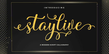 Staylive is a beautiful calligraphy font with many alternative styles & leaf swashes, it looks natural, elegant and perfect for any extraordinary project. Staylive is suitable for a wide range of products such as invitations, product packaging, quotes, product design, crafters, labels, photography, watermarks, logos & branding. Everything can be accessed using software that supports Opentype, such as Adobe Indesign, Adobe CS Illustrator, Adobe Photoshop CC, and Corel Draw. Thank you & happy design :)
 - Dansburg by Uncurve,
$30.00 Dansburg is an aesthetic vintage font, inspired from the past typography , elegant signage, gold leaf , sign painting and old label product. Dansburg comes with tons of alternates characters to make more eye cacthy . Dansburg Font is suitable for authentic logos, headings, sign painting, posters ,letterhead, branding, magazines, album covers, book covers, movies, apparel design, flyers, greeting cards, product packaging, and more. Finally BOOM..!! you get a great design for your project.
 - Etched Stencil JNL by Jeff Levine,
$29.00 The American Sign Museum in Cincinnati houses an amazing collection of vintage signage from all kinds of sources and covering many eras of retail advertising. Someone visiting the museum posted online an image of one particular piece of glass with hand lettering saying “gold leaf” in a bold Art Deco stencil style. Etched Stencil JNL was inspired by that image and is available in both regular and oblique versions.
 - Renefont by URW Type Foundry,
$39.99 ReneFont is strong, heavy design which looks quite technical. Originally planned as a caps-only, Breil changed his mind and also drew the lower case alphabet.
 - Double Line Deco JNL by Jeff Levine,
$29.00 Take a classic hand lettered Art Deco alphabet, add in a treatment of dual straight vertical lines and the resulting typeface is Double Line Deco JNL.
 - PIXymbols Backstitch by Page Studio Graphics,
$40.00A tool for cross-stitch creators. A highly readable backstitch alphabet font to be used in a word processor, especially useful for long, or centered text. - Great Vibes - 100% free

- Daily Hours - Unknown license

- Shade Blue - Personal use only


