10,000 search results
(0.067 seconds)
- Bitsaylen by Aqeela Studio,
$20.00 Bitsaylen is a new script full of elegance and quirk with a playful demeanor and a playful side. Perfect for adding a unique yet relaxed feel, this bag comes with a wide selection of natural looking ligatures. This font is perfect for logos, invitations, wedding designs, social media posts, and more!
 - Charme by Linotype,
$29.99In 1957, Helmut Matheis designed Charme for the Ludwig and Mayer type foundry, located in Frankfurt am Main, Germany. This informal script is of medium weight and has some variation of color. The caps are flowing and the lower case letters are close fitting. Their is a bold companion, called Slogan. - Matteus by Epiclinez,
$18.00 Matteus is a new, fresh, and beautifully crafted signature script font. It's suitable for branding, logos, social media posts, and everywhere else you're looking for an awesome signature style. So what’s included : Basic Latin Uppercase and Lowercase Numbers, symbols, and punctuations Ligatures Multilingual Support Simple Installations Works on PC & Mac
 - Amoure Brides Couple Font by Panatype Studio,
$7.00 Amoure Brides Couple Font is a pairing font between sans serif and handwritten script, These two couple lovely fonts would be perfect to combine in your design. This combination creates an elegant and romantic impression. Suitable for digital invitation, wedding design, fashion design, logo, business cards, branding materials, quotes, etc.
 - Basecamp by Jorsecreative,
$20.00 Introducing ! The Basecamp the beautiful script brush Fonts and unique, it is a model of modern calligraphy typography in combination with calligraphy writing style. Star Font consists of 433 glyphs, including alternative Alternative options including seven lowercase terminal elect and early letters, ligatures, alternate, and multiple language support. Thank you.
 - Hollyweird by ITC,
$29.00Hollyweird is another original, funky work of California designer Jill Bell, a bold display script with intentionally shaky strokes and tightly curled flourishes. The capitals are ideal as initials and the lowercase is best used tightly set. Hollyweird is a good choice for any work requiring a casual chic appearance. - The Delicate by madeDeduk,
$15.00 The Delicate is a classic bold script and this perfect for all your designs project, events, and more. It features: - UPPERCASE - lowercase - Number & Symbol - International Glyphs - Alternative Uppercase - Alternative lowercase If you need anything else please contact dedukvic@gmail.com Find more previews on my Instagram here : https://www.instagram.com/acekelgondolayu/?hl=en
 - Mahgdalena by Phonnastudio,
$15.00 Mahgdalena is a beautiful, well-balanced, and refined script font. It has a classy, elegant, and modern look that can be used for logos, branding, invitations, stationery, wedding designs, social media posts, and much more! what you get: - Stylistic Alternate - a ligature - Number and Punctuation - Include Multilingual support Latin simple.
 - Hastagram by IbeyDesign,
$17.00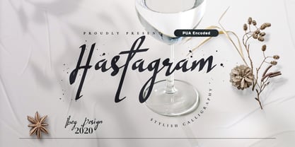 Hastagram Calligraphy Script Font is a fresh calligraphy font. It has a modern style and is perfect for adding an unique look to your watermarks, social media posts, advertisements, logos & branding, invitations, product designs, labels, stationery, wedding designs, product packaging, special events or anything that needs a calligraphy or handwriting taste.
 - Gautami by Microsoft Corporation,
$49.00Gautami™ is an OpenType font for the Indic script Telugu. Telugu is based on Unicode, contains TrueType outlines and was designed by Raghunath Joshi (Type Director) and Omkar Shende for use as a UI font. Copyright ™ 2001 Microsoft Corporation. All rights reserved. Gautami Character Set: Latin-1, Telugu - Bloomilife by Timurtype,
$14.00 Introducing by Timur type Proudly Present, Bloomilife Bloomilife A Handwritten Script Font Bloomilife is perfect for product packaging, branding project, megazine, social media, wedding, or just used to express words above the background. Bloomilife also multilingual support. Embelish your designs with our original fonts. Enjoy the font 😉 Thank you!
 - Superbia by Rillatype,
$14.00 Superbia is a textured brush font! The natural hand writing script is suitable for you who needs a typeface for headline, logotype, apparel, branding, packaging, advertising and more. This typeface is comes with uppercase, lowercase, punctuation, symbols, numerals, stylistic set alternates as well as multi-lingual support. It is PUA Encoded.
 - Signature of Incognito by Innire,
$17.00 Signature of incognito is a handwriting script font, that was created using a fountain pen. Diacritical symbols and glyphs allow you to use the font not only for Latin. Ligatures and swashes diversify the text and can be applied to design cards, logos, clothing design, wedding invitations, and much more
 - MC Tamoth Utamo by Maulana Creative,
$16.00 Tamoth Utamo handwritten display font. This font is good for logo design, Social media, Movie Titles, Books Titles, a short text even a long text letter and good for your secondary text font with signature or script typeface. Make a stunning work with Tamoth Utamo handwritten display font. Cheers, Maulana Creative
 - Snakehead Graffiti by Sipanji21,
$18.00 Snake head is a script font with a graffiti look. cool to be use in various types of designs, with several choices of characters and various kinds of swashes, so that your design looks powerful, this font is sutable for branding, clothing, logotype, packaging, advertising, crafting, and various other designs.
 - Anhattan by Stringlabs Creative Studio,
$25.00 Anhattan is a nostlagic retro script with a fun feel. Get inspired by its vintage aesthetic! This is a beautiful combination of timeless elegance and authentic calligraphy. It features an incredibly classic style, while still keeping a friendly feel. Anhattan is the perfect font for making original and outstanding designs.
 - Signatural by Rochart,
$24.00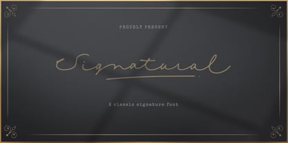 Give your designs an classy feel! Signatural is perfectly suited to signature, stationery, logo, typography quotes, magazine or book cover, website header, clothing, branding, packaging design and more. A handwritten script font containing uppercase and lowercase characters, numerals, a large range of punctuation, International language, ligatures, stylistic alternate and swashes.
 - Miralight by Herofonts,
$39.00 Miralight™ is a fresh and casual script. It will give a fresh and trendy touch to your artwork. Modern and stylish, Miralight™ also comes with fancy alternate characters like ending swashes and tales.The font has an extended character set supporting most Central European and Eastern European languages. Enjoy :)
 - Mattoa by Bombastype,
$35.00 Introduce Mattoa, a bold and sporty script. This font is very great for bold logotype . Comes with many swashes options that you can play with. Will works well for both modern and retro style. If you need a font for your display purposes, you defintely need to consider this font.
 - Letikas Rose by Lumiks Design,
$15.00 Here's a delicate script font with fluid connection and authentic calligraphy, providing a high legibility and elegant design. Letikas rose includes Alternates and Ligatures, making the font more stylized. Perfect for Type-based creations, websites, signature logos, wedding invitations, social media, quotes, greetings and anything that needs a romantic touch.
 - Coldcoast by Putracetol,
$22.00 Coldcoast is a modern handwritten script that inspired by streetwear and combination hand lettering style. Coldcoast is ideal for logos, badges, labels, apparel, clubs, events, handwritten quotes, product packaging, headers, posters, merchandise, social media posts, greeting cards and more. Coldcoast includes OpenType features like ligatures, alternates and also support multiple languages.
 - Danilla by Arendxstudio,
$12.00 Danilla Signature Modern script is very suitable for your design project because it is very elegant and you you can apply it on business cards, posters, branding names, logos, your products and others. It's a handwritten font. This font includes all upper and lower case standard characters, punctuation, numerals and ligatures.
 - Airone by Cititype,
$17.00 Airone is an authentic & organic hand-drawn script font . Every single letter has been carefully crafted to make your design look natural. This style is perfect for branding, photography, watermark, quotes, blog header, poster, wedding, Airone Featuring ligatures and alternates, Supports Western European, Central/Eastern European, Baltic, Turkish, Romanian Language.
 - JH Fatina by JH Fonts,
$120.00 An Arabic font designed without specific rules. Its letters are taken from the following Calligraphic Scripts: Sounboli, Naissabouri, Diwani and Thuluth; It contains more than 1,300 additional characters to simulate the real calligraphy and enhance the beauty of the font. Jh Fatina is ideal for greeting / wedding cards, books titles, poetry ....
 - Blusbow by Rvandtype,
$15.00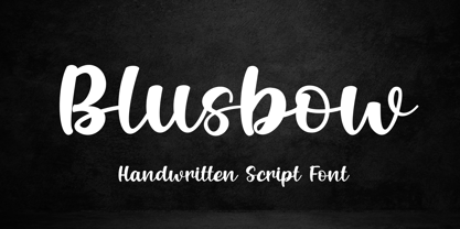 Blusbow is a handwritten Script font. It has an elegant and playful look that can be used for logos, branding, invitations, stationery, wedding designs, social media posts, and so much more. Its authentic look will add a personal and realistic feel to your designs. Thank You, i hope you enjoy it.
 - Silkstone by Zeenesia Studio,
$15.00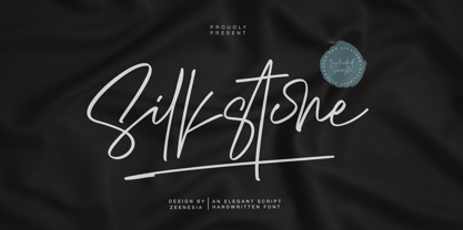 Presenting! Silkstone - Handwritten ScriptFont Silkstone is a handwritten script font with a simple and classy style, this font is great for your next creative projects such as watermark on photography, logo design, wedding, invitation, quotes, book cover, business card, and many other design project. From business cards to photo watermarks.
 - Aleanderica by Adante Creative,
$23.00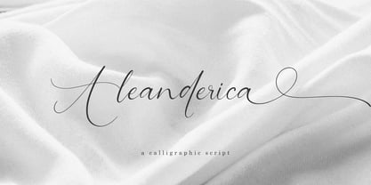 Introducing by Adante.Creative Proudly Present, Aleanderica Aleanderica A Calligraphy Script Font Aleanderica is perfect for product packaging, branding project, megazine, social media, wedding, or just used to express words above the background. Aleanderica also multilingual support. Enjoy the font, feel free to comment or feedback, send me PM or email.
 - Gorgeous Angels by ErlosDesign,
$19.00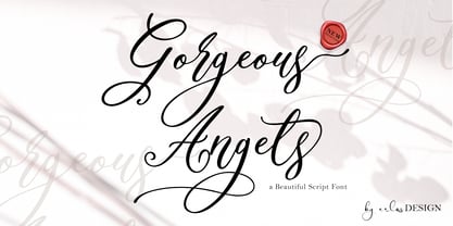 Gorgeous Angels - A Beautiful Script Font by erlosDESIGN Gorgeous Angels is a beautiful and magical modern calligraphy font, with characters that dance along the baseline. It has a casual, yet elegant touch. This font is PUA encoded which means you can access all of the glyphs and swashes with ease!
 - Skytree by madeDeduk,
$15.00 Skytree is a modern brush script. Skytree comes in two styles with a lot of stylish alternates characters that will make this font suitable for any design project. Feature Uppercase Lowercase Number & Symbol International Glyphs Alternatives Ligatures Swashes If you need anything else just shoot me on email dedukvic@gmail.com
 - Billfold by Arendxstudio,
$16.00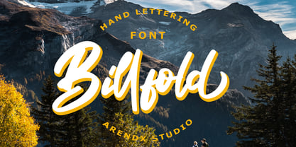 Billfold Handwritten Script is a font with distinctive handwritten characters, perfect for branding projects, logos, wedding designs, media posts, advertisements, product packaging, product designs, labels, photography, watermarks, invitations, stationery, and any project that needs a handwritten feel. Features : • Character Set A-Z • Numerals & Punctuations (OpenType Standard) • Accents (Multilingual characters) • Ligature
 - Aryzena by Scratch Design,
$9.00 Aryzena is handwritten, textured, artistic brush script. This font also has swash characters that make your design more attractive and natural, giving your text an authentic and laid-back characteristic. This font works well in designs for clothing, tittle books, quotes, branding, logos, packaging designs, posters, invitation, mural and more!
 - Funky Chunk NF by Nick's Fonts,
$10.00Lettering whiz Carl Holmes called this creation "Pelt Emphasis Script", and its funky, chunky charm will indeed lend emphasis to any headline it graces. The Postscript and Truetype versions contain a complete Latin language character set (Unicode 1252); in addition, the Opentype version supports Unicode 1250 (Central European) languages as well. - Sally Alone by Bluestype Studio,
$16.00 Hello ! This is our newest product called Sally Alone. Sally Alone is an incredibly stunning script that will turn any design idea into a true stand out! This font is perfect for use on branding, business cards, weddings, t-shirt designs, logos, magazines, quotes, fashion, watermarks, invitations, social media post.
 - Thanks by Monotype,
$15.99 Designed by Romanian lettering artist Andrea Stan, Thanks is a contemporary script packed full of quirky shapes, bouncy baselines and uneven letter heights. This makes Thanks a truly fun and friendly design (Oh and also very polite!). This off-beat font is Bold, monolinear and has a subtle inline twist.
 - Creamy Sugar by Aestherica Studio,
$9.00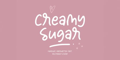 Creamy Sugar is a modern handwritten monoline script. This font looks natural, stylish, and perfect for any extraordinary project that requires a handwritten feel. Its versatile style looks lovely on wedding invitations, thank you cards, quotes, greeting cards, logos, business cards, and every other design which needs a customized touch.
 - Timeless Wonderland by Letterhanna Studio,
$19.00 Timeless Wonderland is a captivating calligraphic handwritten script font that weaves a story of timeless beauty and enchantment. Each stroke of this font is a testament to the artistry of calligraphy, making it the perfect choice for creative projects that seek to blend elegance with an enduring sense of wonder.
 - Betty Finty by Stringlabs Creative Studio,
$29.00 Betty Finty is a friendly and modern script font with a unique style. It will add a romantic touch to any crafting project! Fall in love with its authentic feel and use it to create gorgeous wedding invitations, beautiful stationary art, eye-catching social media posts, and cute greeting cards.
 - Balava PS Font Duo by pentagonistudio,
$19.00 Balava Is A Modern Duo Font Character Inspired By Serif and Script Style SOFTWARE REQUIREMENTS : Fonts and alternate : No special software required they may be used in any basic program /website apps that allows standard fonts That's it folks! You can go ahead and get cracking :) Have a Good Day !
 - Headson by Garisman Studio,
$20.00 Introducing Headson Headson combines attractive curves with a fresh urban edge; delivering a stylish script which is guaranteed to add an eye-catching appeal to your logo designs, brand imagery, quotes, product packaging, merchandise & social media posts. - Simple installation - Work for PC and MAC - Multilingual Support Thank You! GRSMN Std. 2012
 - The Banten by Stringlabs Creative Studio,
$25.00 The Banten is a Monoline Script Font with Retro Vintage Style. This font is perfect for fashion brand, apparel, shoes company, wedding invitation, business card, logo brand, clothing, and also business brand name like barber shop or taylor. This Font Template contains Classy, Elegant, Creative, and has a Unique Concept.