7,639 search results
(0.011 seconds)
- Koara by Rosario Nocera,
$14.99 Koara is a handmade font family inspired by nature. It's composed of two versions, (rough and wild) and available in the weights, light, regular and bold, with an alternative capital K, linear lowercase and capital numbers. It's recommended for large titrations, small paragraphs, typographic compositions and logotype, Koara shines on several backgrounds like leafs, jungle, nature images and even organic food.
 - Robine by Craft Supply Co,
$20.00 Introducing Robine – Condensed Sans Serif Robine – Condensed Sans Serif font is the ideal choice for creating attention-grabbing titles and headings. With its high x-height, this modern sans-serif typeface offers a sleek and contemporary appearance, ensuring your designs will stand out. Stylish and Space-Efficient: Robine – Condensed Sans Serif strikes the perfect balance between style and space efficiency. Its condensed design allows you to fit more text into tight spaces without sacrificing readability. Versatile Usage: This font is incredibly adaptable, making it suitable for a wide range of design projects. Whether you’re designing posters, logos, or web graphics, Robine – Condensed Sans Serif adds a touch of modern sophistication to your work. Exceptional Clarity: Robine – Condensed Sans Serif ensures your titles and headings remain easily readable, even at smaller sizes, thanks to its clear and legible characters. It’s designed to make a bold statement while maintaining clarity.
 - Hargloves Sans by Heypentype,
$20.00 Hargloves sans remixes between grotesque proportions and 80’ industrial inspired-typefaces. Yes, it is a major improvement from original Hargloves fonts with completely different projections. Hargloves Sans intended primarily for text, editorial or long-form text. This new design emphasized on reader joy experience when reading text without losing typeface characters. Hargloves Sans support almost all Latin script language, roughly around 356 latin language according to hyperglot analytics. This language coverage is heypentype priority to serve all possible Latin script language all over the world. The premise is simple, because it is text typeface it should cover all Latin script languages whether its popular language or not. Hargloves Sans have a higher x-height compared to Hargloves. Higher x-height will give a seamless, undistracted reading. The open counter on nearly squared proportions is Hargloves Sans main character. There’s a lot of feature coming for this typeface in the future.
 - Raimes by Craft Supply Co,
$20.00 Introducing Raimes – Script Typeface Charming and Playful Script Meet Raimes, the Script Typeface that effortlessly infuses charm and playfulness into your designs. Whimsical Elegance Raimes boasts a whimsical elegance that’s perfect for a wide range of creative projects, adding a delightful touch of fun to your content. Versatile for Creative Projects Raimes’ versatility shines through, making it an ideal choice for various creative endeavors, including branding, invitations, and more. A Script Typeface That Delights Raimes ensures that your content is not only visually pleasing but also engaging. It leaves a memorable and delightful impression on your audience. In Conclusion In summary, Raimes – Script Typeface is the font that will bring charm and playfulness to your design projects. Its versatility makes it a great choice for branding, invitations, and a variety of creative endeavors. Raimes captivates your audience, leaving them with a delightful and memorable experience, ensuring accessibility to a broad readership.
 - Cosmetiqa by Mysterylab,
$15.00 Here's a posh serif typeface and its matching italic. Glowing with elegance, Cosmetiqa can go head to head with classic evergreens like Bodoni, Didot, or Century. And just like those go-to favorites, Cosmetiqa really shines at the huge, layout-dominating sizes which have been a staple of top-shelf fashion branding and magazine design since at least the mid-1980s. You'll also find this font to be a great workhorse at much smaller sizes and in extended text passages, as the hairline serifs don't disappear in the smaller size ranges. As its title suggests, Cosmetiqa's unique look works perfectly in cosmetics and fashion branding, but also try it with 1990s-style message forward ad headline applications if you're after a retro look with a hint of a modern twist. The semi-condensed proportions and tall x-height make it great for pull quotes, page banners, and logo design.
 - Manye by Craft Supply Co,
$20.00 Introducing Manye – Blackletter Font A Unique Display Typeface Manye stands out as a captivating Blackletter Font, adding a touch of distinctiveness to your display and design requirements. Distinctive Elegance Manye’s design exudes a distinctive elegance, making it the perfect choice for attention-grabbing displays. Versatile for Creative Projects Beyond its elegant design, Manye’s versatility shines, allowing it to seamlessly complement a wide range of creative endeavors. Captivating and Memorable Manye ensures that your content is not only captivating but also memorable, leaving a lasting and distinctive impression. In Conclusion To sum it up, Manye – Blackletter Font is the ideal choice for display and unique design needs in the world of typography. Its distinctive elegance and versatility make it a great fit for a variety of creative projects. Manye captivates your audience, leaving them with a memorable and distinctive experience, ensuring accessibility to a broad readership.
 - ITC Scram Gravy by ITC,
$29.99The 1928 logotype for Sertal Toiletries consisted of a stylized woman's head, a very snaky S, and five fine, fat deco caps spelling out the rest of the brand name. From these five clues, designer Nick Curtis divined the rules" of the typeface and drew a complete alphabet, including a lower case. The result: ITC Scram Gravy. The finished product could be described as Bodoni on steroids. Tight curls in characters like the 'm,' 'r' and 'y' soften the lower case and give the design a light-hearted flavor. ITC Scram Gravy takes its name from one of many running gags in the screwball comic strip "Smokey Stover," which had folks alternately splitting their sides and scratching their heads from 1935 to 1973. Those familiar with Bill Holman's strip will recall Smokey's car, the Foomobile, and one of his famous nonsense declarations: "No foo-ling, that scram gravy ain't wavy."" - Entestats by Typephases,
$25.00 Nearly a hundred human heads, in three dingbat files. The whole series comes from the sketchbook: the original ink drawings were then digitized and refined to create vector outlines. Rather than perfectly smooth, geometrical shapes, the Entestats, like their close relatives in the Capsbats series, the Entestats retain a handmade look and feel. The Entestats are ready-made illustrations, though of course they will appreciate being enriched with colours, textures, an imaginative layout... and use them for a variety of projects. Use them small, as spot illustrations or as big as a whole page or page spread. The Entestats and their kin, the Capsbats, are a terrific resource for presentations, packaging, logos, brochures and advertisements, to name a few applications. The book 1000 Heads is a compendium of the drawings featured in the Capsbats and Entestats and it gives a glimpse of the limitless applications of this collection.
 - Senpai Coder by Dharma Type,
$9.99 Senpai Coder is a family of typewrighter-style monospaced font for developing, programming, coding, and table layout. Some desirable features in monospaced fonts are listed below. 1.Easy to distinguish 2.Easy to identify 3.Easy to read Senpai Coder has very distinguishing letterforms for confusable letters such as Zero&Oh, One&I, and Two&Z. A lot of ingenuity makes this family very distinguishable. Italics have somewhat large inclination angle to be distinguished from their Roman. For the same reason, Italics are slightly lighter than Romans. Italic is not cursive Italic. It is near the slanted Roman. This is an intentional design to identify Italic letters. Cursive is not suitable for programming font. Typewriter letterform (serif) is good for reading. Common elements for each letterform makes harmony and a sense of unity. Senpai Coder supports almost all Latin languages. Try this all-new experiment.
 - Inflate PTx by Pedro Teixeira,
$20.00 Introducing the Inflate PTx font family, a delightful and playful typeface collection that embodies the buoyant spirit of celebration and festivity. This font can be use in old and new apps that use/read fonts, because it's format (old school format :)), not OpenType SVG format. To install fast on the PC: right click in the OpenType file, then "Install". But if you want to open the file, please be pacient. It takes time to open and read the OpenType file depending of the capacity of your PC. The Inflate PTx font family is tailor-made for creative projects, from birthday party invitations and children's book illustrations to social media graphics for Instagram or themed event posters. Its rounded edges and bubbly forms infuse any design with an infectious sense of joy and lightheartedness, making it an ideal choice for those seeking a playful and festive typographic solution.
 - Tighten Caps Light - Personal use only

- Donaire Black - Personal use only

- Maketa IT - Personal use only

- Donaire It Black - Personal use only

- Salma Alfasans by Alifinart Studio,
$10.00 Salma Alfasans is a modern sans serif font, created on February 25, 2021. The main inspiration for this font is its modern geometry and bold design, but looks elegant and smooth. This font is well-crafted and has almost no contrast at all. The advantage of the Salma Alfasans font is that it is very appropriate when used as a heading, but also looks good when used as body text. With many weight options, you can freely adjust the design scenario based on your needs. Salma Alfasans is very good for logos, branding, books (headings, sub headings, and body text), invitations, business cards and others. SALMA ALFASANS UPDATE VERSION 2.0 Update Details: - New designs and mayor changes - Tabular and proportional lining figures - Tabular and proportional oldstyle figures - Stylistic set for a, l, y, and G - Numerator, denominator, and fractions - New ligatures for ff, fi, fj, ft, fk, ffk, and more - Case sensitive, and - Arrows Language Support: Afrikaans, Albanian, Asu, Basque, Bemba, Bena, Breton, Catalan, Chiga, Cornish, Danish, Dutch, English, Estonian, Filipino, Finnish, French, Friulian, Galician, German, Gusii, Indonesian, Irish, Italian, Kabuverdianu, Kalenjin, Kinyarwanda, Luo, Luxembourgish, Luyia, Machame, Makhuwa-Meetto, , Makonde, Malagasy, Manx, Morisyen, North Ndebele, Norwegian Bokmål, Norwegian Nynorsk, Nyankole, Oromo, Portuguese, Quechua, Romansh, Rombo, Rundi, Rwa, Samburu, Sango, Sangu, Scottish Gaelic, Sena, Shambala, Shona, Soga, Somali, Spanish, Swahili, Swedish, Swiss German, Taita, Teso, Uzbek (Latin), Volapük, Vunjo, Zulu. Thank you. Alifinart Studio alifinart@gmail.com Instagram | Behance
 - Ah, Roddy! If fonts were guests at a party, Roddy would be the one wearing a bow tie with sneakers, casually charming everyone with stories that span from the quirky to the profound. It’s not just a ...
- Arable by Heyfonts,
$18.00 Arable Font Is "Unique Display Font" refers to a specific type of typography that is characterized by its distinctive, one-of-a-kind design, and it is typically used for eye-catching and decorative purposes. Here's a detailed explanation of what a unique display font is: -Distinctive Design: Unique display fonts stand out because of their distinct and unconventional design. They often deviate from traditional letterforms and can take on a wide range of creative and artistic shapes. Unlike standard, legible fonts used for body text, display fonts prioritize aesthetics over readability. -Specialized Use: Display fonts are not intended for extended reading. Instead, they are used in small quantities for headlines, titles, logos, posters, banners, invitations, and other design elements where visual impact is essential. Their unique and attention-grabbing design makes them ideal for drawing attention to specific text. -Creative Freedom: Designers have creative freedom when creating unique display fonts. This allows for a wide array of styles, from whimsical and ornate to futuristic and abstract. Some display fonts may be inspired by art movements, cultures, historical periods, or nature, leading to highly original and thematic designs. -Limited Character Set: Display fonts often have a limited character set compared to standard fonts. They typically include uppercase letters, numbers, and basic punctuation marks, but may lack lowercase letters or extended characters. This limitation is due to their specialized use and focus on visual impact. -Customization: Some unique display fonts are custom-designed for specific projects or brands. Designers work closely with clients to create a font that aligns with the brand's identity or the project's theme, ensuring a truly unique and tailored result. -Combination with Other Fonts: In many design projects, unique display fonts are paired with more standard, legible fonts to achieve a balance between visual impact and readability. This combination allows for a harmonious and effective overall design.
 - Avenir Next Cyrillic by Linotype,
$49.00 The original Avenir typeface was designed by Adrian Frutiger in 1988, after years of having an interest in sans serif typefaces. The word Avenir means “future” in French and hints that the typeface owes some of its interpretation to Futura. But unlike Futura, Avenir is not purely geometric; it has vertical strokes that are thicker than the horizontals, an “o” that is not a perfect circle, and shortened ascenders. These nuances aid in legibility and give Avenir a harmonious and sensible appearance for both texts and headlines. In 2012, Akira Kobayashi worked alongside Avenir’s esteemed creator Adrian Frutiger to bring Avenir Next to life, as a new take on the classic Avenir. The goal of the project was to take a beautifully designed sans and update it so that its technical standards surpass the status quo, leaving us with a truly superior sans family. Since then, Monotype expanded the typeface to accommodate more languages. Akira’s deep familiarity with existing iterations of the Frutiger designs, along with his understanding of the design philosophy of the man himself, made him uniquely suited to lead the creation of different language fonts. Avenir Next World family, the most recent release from Monotype, is an expansive family of fonts that offers support for more than 150 languages and scripts that include Latin, Cyrillic, Greek, Hebrew, Arabic, Georgian, Armenian and Thai. Avenir Next World contains 10 weights, from UltraLight to Heavy. The respective 10 Italic styles do not support Arabic, Georgian and Thai, since Italic styles are unfamiliar in these scripts/languages. Separate Non-Latin products to support just the Arabic, Cyrillic, Georgian, Hebrew and Thai script are also available for those who do not need the full language support.
 - Avenir Next World by Linotype,
$149.00 The original Avenir typeface was designed by Adrian Frutiger in 1988, after years of having an interest in sans serif typefaces. The word Avenir means “future” in French and hints that the typeface owes some of its interpretation to Futura. But unlike Futura, Avenir is not purely geometric; it has vertical strokes that are thicker than the horizontals, an “o” that is not a perfect circle, and shortened ascenders. These nuances aid in legibility and give Avenir a harmonious and sensible appearance for both texts and headlines. In 2012, Akira Kobayashi worked alongside Avenir’s esteemed creator Adrian Frutiger to bring Avenir Next to life, as a new take on the classic Avenir. The goal of the project was to take a beautifully designed sans and update it so that its technical standards surpass the status quo, leaving us with a truly superior sans family. Since then, Monotype expanded the typeface to accommodate more languages. Akira’s deep familiarity with existing iterations of the Frutiger designs, along with his understanding of the design philosophy of the man himself, made him uniquely suited to lead the creation of different language fonts. Avenir Next World family, the most recent release from Monotype, is an expansive family of fonts that offers support for more than 150 languages and scripts that include Latin, Cyrillic, Greek, Hebrew, Arabic, Georgian, Armenian and Thai. Avenir Next World contains 10 weights, from UltraLight to Heavy. The respective 10 Italic styles do not support Arabic, Georgian and Thai, since Italic styles are unfamiliar in these scripts/languages. Separate Non-Latin products to support just the Arabic, Cyrillic, Georgian, Hebrew and Thai script are also available for those who do not need the full language support.
 - Avenir Next Hebrew by Linotype,
$79.00 The original Avenir typeface was designed by Adrian Frutiger in 1988, after years of having an interest in sans serif typefaces. The word Avenir means “future” in French and hints that the typeface owes some of its interpretation to Futura. But unlike Futura, Avenir is not purely geometric; it has vertical strokes that are thicker than the horizontals, an “o” that is not a perfect circle, and shortened ascenders. These nuances aid in legibility and give Avenir a harmonious and sensible appearance for both texts and headlines. In 2012, Akira Kobayashi worked alongside Avenir’s esteemed creator Adrian Frutiger to bring Avenir Next to life, as a new take on the classic Avenir. The goal of the project was to take a beautifully designed sans and update it so that its technical standards surpass the status quo, leaving us with a truly superior sans family. Since then, Monotype expanded the typeface to accommodate more languages. Akira’s deep familiarity with existing iterations of the Frutiger designs, along with his understanding of the design philosophy of the man himself, made him uniquely suited to lead the creation of different language fonts. Avenir Next World family, the most recent release from Monotype, is an expansive family of fonts that offers support for more than 150 languages and scripts that include Latin, Cyrillic, Greek, Hebrew, Arabic, Georgian, Armenian and Thai. Avenir Next World contains 10 weights, from UltraLight to Heavy. The respective 10 Italic styles do not support Arabic, Georgian and Thai, since Italic styles are unfamiliar in these scripts/languages. Separate Non-Latin products to support just the Arabic, Cyrillic, Georgian, Hebrew and Thai script are also available for those who do not need the full language support.
 - Mirantz by insigne,
$32.00 Y’all ready for this? Now starting for Insigne: the new serif Mirantz. This rookie all-star plays a precise game every game, cutting at all the right angles to leave your reader impressed and ready to see more. You can always count on Mirantz to lead with solid mechanics and a clean style, but don’t be surprised when the face keeps it real with a little individual flare and creativity. This personal touch is nothing short of elegance in every appearance. So what makes us love this rookie above the other great players in the field? Contrast, for one. Mirantz brings more contrast to the game than most serifs out there. The serifs on this face have a crisp, sharp wedge that naturally draws the reader’s eye. You can’t help but fall in love with its clean, natural style. Mirantz also features a tall x-height and regular proportions that can play a number of positions on the page and still stay strong through the last half of the copy or even the final period. Mirantz is a solid powerhouse player, containing a complete set of small capitals and nine weights from thin to bold. It can play well both down low and up top with its subscripts and superscripts and can move your reader’s eye easily across the copy with its titling capitals, condensed and extended variants, and open style figures. With its options covering more than 72 Latin-based languages, look for this newcomer to have international success in the near future. It you haven’t set your draft picks for this next round of projects, think hard before passing up Mirantz. A capable serif like this one is a guaranteed asset to any team of fonts. Production assistance from Lucas Azevedo.
 - Paralucent Slab by Device,
$39.00 Paralucent Slab is an addition to the ever-popular Paralucent family. Paralucent is versatile all-purpose modern sans and slab serif design. Available in seven weights, from Thin to Heavy, with corresponding italics, it avoids some of the more eccentric calligraphic quirks of Akzidenz or Helvetica or the cool precision of Univers for an elegant, functional, yet warm design. Several core ideas inform Paralucent’s design. Prime attention has given to the negative space between characters, giving a more even “colour”, especially in text. For example, the J, L and T have shorter arms than comparable sans typefaces, while the M and W are wider. The A has a lower bar, opening up the interior counter. An unusually high lower-case x-height again helps to give a more even colour and improve legibility. Care has been taken to rationalise repeated elements like the tails on lower-case letters, or the Q and the “ear” of the g. Typographic design solutions that are consistent across all these features add more stylistic cohesion. ‘Ink traps’ are exaggerated incisions used to open up a letter's narrower internal angles, which can become clogged with ink, especially in small point sizes. Now largely redundant due to the high quality of modern print, they are still sometimes used as a stylistic quirk or design feature. Now that digital fonts are often reversed or outlined, or enlarged to enormous sizes, these can also lead to unexpected or obtrusive results. Paralucent takes these inevitable digital manipulations into account, and adds optical corrections without resort to ink traps. The family has been picked up by many UK and US publishers, featuring heavily in magazines like Loaded, Heat and TV Quick, as well as high-end coffee-table photography books and gallery websites. The addition of the Slab family adds even more options for running text and headline.
 - Guhly by Ingo,
$35.00 A modern Sans Serif — prosaic, designed geometrically, beautiful in large sizes All the dimensions of the font are based on Factor 10. The general principle of construction leads to slim forms and nearly equally wide characters. So the font appears very solid but is actually difficult to decipher in longer texts. Along with the ”normal“ Guhly Regular there are also the two versions Guhly Light and Guhly Bold, whereas in each only the vertical strokes [Guhly Light] or horizontal [Guhly Bold] have been changed in strength. The result is a very individual decorative effect which slightly reflects old circus and western scripts. The lower case characters in the version Guhly Book are, therefore, optimized to be suitable for longer texts in smaller font sizes — because after all, sometimes you should read a bit more than just the headline… The design of a shampoo bottle stands behind the creation of this sans serif display font. Prominent, clearly constructed forms with circular arcs define its appearance. This is a font primarily designed for use with capital letters — for all sorts of advertising purposes, headlines and titles. But lower case letters also belong to a good functional font; so, of course, Guhly includes them and ligatures for the more ”critical“ letter combinations as well as stylistic alternates for the letters K (or k), V (v) and o. As a decorative “encore”, the Guhly family also contains the “normal” weight in two variants: on the one hand the Guhly Cutout – these are letters without counter, as if the letters were cut out and the internal surfaces fell out; and on the other hand the Guhly stencil – as the name suggests, a stencil font with the typical bars that give a stencil the necessary cohesion.
 - Fractus by Eurotypo,
$36.00 The requirements of Middle Ages scribes who copied and produced books in monasteries were fundamentally to preserve space, due to the high cost of the writing surface. During this long period of the development of Gothic forms, many other variations of the style of black letters appear: Textur or “Gothic-antique”, another group called Rotunda preferred by Italian and Spanish scribes. In 1490, the style "Bâtarde" (according to the the French classification) began to be widely used in Germany with more rounded shapes and named Scwabacher (probably derived from the city of Schwabach, but not certified) Fractur is a more condensed and narrower form than Schwabacher. This style is attributed to Johann Neudörfer of Nuremberg, cut in 1513; it was quickly imitated, therefore a few years later became to be a German national identity that extended over the next four centuries. The shape of its characters can be considered as a fusion of Texture and Schwabacher: the lowercase actually has medium strictly vertical and half curved strokes. The first expressions of the baroque influence this writing whose appearance of movement is due to the ornaments applied to the uppercase letters and the ascending and descending features of the lowercase. Despite having spent so many years and being a typeface not suitable for extensive reading texts, the Gothic Fractur has endured over time for possessing a strong and solid characteristic, as well as being closely linked to the spirit of gothic cathedrals of countries in northen Europe. In fact, it is probably that this expressive feature leads them to be chosen in the most varied graphic communication needs, which run from from banks and financial companies, insurers, law offices, publishers, newspapers and TV networks, till alcoholic drinks, funeral tombstones, packaging and even tattoos.
 - Alfarooq by Eyad Al-Samman,
$20.00 Alfarooq is the most widely known epithet for the Islamic figure Umar ibn al-Khattab (c. 586 - 644) who was a leading companion and an adviser to the Islamic prophet Muhammad (peace be upon him) who later became the second Muslim Caliph after Muhammad’s death (pbuh) in 632. Muslims widely know Umar ibn Al-Khattab (may Allah be pleased with him) as Alfarooq (i.e., he who knows and distinguishes between truth and falsehood). Alfarooq is a unique, wide, and headline Arabic display typeface. The main trait of this typeface is the novel design of its letters' tails and its dots which renders it as one of the modern stylish typefaces used for headlines and titles. This can be noticed in different letters such as Ain, Ghain, Jeem, Khah, Seen, Sheen, and others. In addition, Alfarooq font has an Arabic character set which supports Arabic, Persian, Kurdish, and Urdu letters and numerals with a limited range of specific Arabic ligatures. This typeface comes in two ultra-bold styles (i.e., Alfarooq and Alfarooq-Pro) and more than 430 distinctive glyphs with a single weight for each style. Alfarooq typeface effectively offers diverse typographic and digital usages including mainly the very large and wide poster-size works. Due to its strong baseline-stroke, Alfarooq typeface is appropriate for heading and titling works in Arabic, Persian, Kurdish, and Urdu newspapers, magazines, and other printed materials. It is also elegantly suitable for signs, book covers, advertisement light boards, street and city names, products- and services names, and titles of flyers, pamphlets, and posters. The wide style of Alfarooq font’s characters gives it more distinction when it is used in greeting cards, covers, exhibitions' signboards, external or internal walls of malls, and also the exits and entrances of airports and halls.
 - Black Eye Nue is a distinctive typeface created by Tom Tor, a font that immediately grabs attention due to its unique characteristics and bold design. The name itself, "Black Eye Nue," suggests a pla...
- Rotondo, a typeface crafted by the skilled hand of Rafael Dinner, stands as a testament to the harmonious blend of classic elegance and modern flair. At its core, Rotondo embodies the fundamental pri...
- Nasalization Free - Unknown license

- Drawing Blood - Personal use only

- Burdigala X Serif by Asgeir Pedersen,
$24.99 Burdigala X Serif is an open and spacious typeface inspired by the classic Didones. The X Serif is ideal for larger amounts of (printed) texts in brochures, magazines and books. Being wider than usual, it works especially well in media intended for on-screen reading, such as in Pdf-documents and e-books etc. Burdigala is the ancient Roman name of the city of Bordeaux France.
 - AT Move Altera by André Toet Design,
$39.95 ALTERA a typeface based on a logotype André Toet made for a dutch broadcast company. This typeface is in fact carries a transformation in itself: it’s composed of three different weights and shapes. In our humble opinion the possibilities are endless ! So be a sport and use this typeface for logo’s and headings. Kick the can ! Concept/Art Direction/Design: André Toet © 2017
 - Prima Sans by Bitstream,
$29.99Prima is a series of fonts designed at Bitstream by Jim Lyles (Sans and Serif) and Sue Zafarana (Sans Mono), released in 1998. The fonts have been tuned to give exceptionally good quality at low screen resolutions. The fonts are therefore suitable for sustained use in browsers and other applications where users read for long periods from the screen. Of course, Prima looks great printed out too. - Paciak by Cuda Wianki,
$20.00 Paciak is a hand-drawn dynamic font that provides you an opportunity to create fresh and intricate design projects. It is loaded with handy features including-alternate characters for all numbers and letters (it has mixed upper and lowercase characters to make it more crazy), multi-language coverage and is accompanied with vague borders and ornaments. This extraordinary mix will give you a lot of fun!
 - WBP Red Tape by Studio Jasper Nijssen,
$20.00 A wise orange cat said once: There are three things certain in life. Death, taxes and teddy bears. The closest thing to a fourth is red tape. Restricting you, bounding you to the rules of a bureaucratic organisation. My advise, carry a scissor with you all the time to cut through it. WBP Red Tape is a great monospace font specifically designed for headings and logo design.
 - Medoc by Kustomtype,
$25.00 Medoc is a clean and fresh font, designed with the intention of producing a good readable modern typeface. Medoc has historical roots, though it's redesigned with precision and a high contrast. Medoc will catch the reader's eye immediately. Both the regular and italic match in perfect harmony. Useful for titling, head text, magazines, posters and all your graphic work that need a nice and modern look!
 - Mighty Rooster by Invasi Studio,
$13.00 Introducing a versatile Vintage Sans Serif. Mighty Rooster includes 2 font files with Regular and Rough style. Mighty Rooster is a great font for achieving an authentic vintage aesthetic as seen in the display images or Body text project, it is perfect for headings, flyers, greeting cards, product packaging, book cover, printed quotes, logotype, apparel design, album covers. Mighty Rooster Features: Ligatures Alternate Multi-language Punctuation
 - Monasha Script by Almeera Studio,
$15.00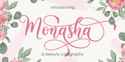 Monasha is a beautiful calligraphy font with many alternative styles & leaf swash, this font looks natural, elegant and perfect for any extraordinary project.Monasha is suitable for various products such as invitations, product packaging, quotes, product design, crafter, labels, photography, watermarks, logos & branding.Everything can be accessed using software that supports Opentype, such as Adobe Indesign, Adobe CS Illustrator, Adobe Photoshop CC, and Corel Draw. Thank you & Happy design :)
 - Rumo Script by Bean & Morris,
$35.00 Rumo Script is a bright, breezy, free-flowing contemporary script to lighten the load when a change of pace is required to communicate freshness, fun, lifestyle and a general 'good feeling'. Designed so that some letters connect while others don't giving a spontaneous feel at the same time keeping it a 'considered' style. Rumo (pronounced Roo-mo) will enhance your graphics and give them that 'wow' look!
 - Prima Serif by Bitstream,
$29.99Prima is a series of fonts designed at Bitstream by Jim Lyles (Sans and Serif) and Sue Zafarana (Sans Mono), released in 1998. The fonts have been tuned to give exceptionally good quality at low screen resolutions. The fonts are therefore suitable for sustained use in browsers and other applications where users read for long periods from the screen. Of course, Prima looks great printed out too. - Hokkien by AdultHumanMale,
$12.00 HOKKIEN is an all caps sister to my other font Penang. It was inspired by some old pieces of Art Deco signage I had discovered in Penang Malaysia, The font is available in one weight for now. The font is loaded with plenty of foreign extras and currency symbols. I have also included an alternate cap S which works better visually in blocks of copy.


