10,000 search results
(0.273 seconds)
- Quant by Hoftype,
$49.00 Quant is a contrasted typeface with a fresh and well-reasoned appearance. It owes allegiance to classical structure but is a free design and does not refer to any historical model. Although it has strong qualities as a reading type, its distinct and powerful ductus makes it superb for headlines and in display sizes. Quant is well-equipped for ambitious typography. The Quant family consists of 8 styles, comes in OpenType format with extended language support for more than 40 languages. All weights contain small caps, proportional lining figures, tabular lining figures, proportional old style figures, lining old style figures, matching currency symbols, fraction and scientific numerals.
 - Closing Time by Putracetol,
$16.00 Closing Time - Display Retro Font takes you on a nostalgic journey to the charming days of classic design. This font is the epitome of retro and classic aesthetics, with its distinctive features and timeless appeal. The font boasts a perfect blend of retro and classic elements, achieved by slightly curving the font's edges inward. It offers two distinct versions: a clean variant for a polished look and a textured one for added character. Moreover, it provides alternative characters to infuse a touch of uniqueness and creativity into your designs. Closing Time - Display Retro Font is the ideal choice for logos, invitations, packaging, posters, titles, businesses, greeting cards, magazines, and any design projects that seek to capture the essence of retro and classic themes. Embrace the nostalgia and timeless charm of Closing Time - Display Retro Font, and let your designs tell a story of a bygone era.
 - IJF0100 - Unknown license

- ElectricLiquorGoggles - Unknown license

- Sanderling by Atlantic Fonts,
$26.00 Sanderling is irrepressibly cheerful. Turn on discretionary ligatures to access double-letter ligatures for both cases, plus more chirpy ligatures designed to give flight to Sanderling’s lively character. Sanderling has the legs to make waves!
 - Lebensjoy by Monotype,
$29.99Lebensjoy was used by the Co-op chain stores in Sweden for a nationwide fortnightly flyer (called Livsgldje = Joy of Life) during 1993 and 1994. They wanted a simple but still lively and active letterform. - Portculliard Engraved by Greater Albion Typefounders,
$20.00 Portculliard is in the finest traditions of 19th century blackletter revival. It's a lively mock medieval face, engraved in the manner of many a 19th century printer's plate ideal for recreating traditional certificates and invitations.
 - Lustig by Juraj Chrastina,
$39.00 In german lustig means funny. Furthermore Mr. Lustig is a character in one of Karel Čapek's miraculous fairy tales. In addition it's also a lively hand-lettered font equipped with playful interlocking ligatures. Have fun!
 - Lorenzo by Canada Type,
$24.95 The lifetime of Lorenzo de Medici (1449-1492) coincides with the rise of metal type as it displaced broad pen calligraphy for the production of books. This revolution marked the end of formal Western calligraphy, as the industry employed metalworkers who designed type according to geometric measurement while calligraphers were forced to become secretaries who practiced handwriting systems. Renaissance Florence should have witnessed the marriage of calligraphy and typography, just as all the other arts and sciences flourished as classical learning was applied to technical advances; but the metalworkers and geometricians measured, dissected and recast the calligraphic letters by crude indirect methods, and in the end took all the life out of them. Here they languished until digital type has made it possible to render the precise motion of the broad pen stroke into type. Lorenzo is a confluence of many strains from the Middle Ages, brought together within the classical harmony of the capitals. It attempts to bypass metal type, using calligraphic means to achieve the precision of type while retaining the life of the stroke: a classical font that would be familiar to Lorenzo himself as well as to the modern eye. The Lorenzo family comes in four weights, ranging from light to bold. Two sets of italics, one with swashed caps and ascenders, complement each weight. The family boasts extensive language support and an offering of over fifty calligraphic ornaments/flourishes included within the character set.
 - HT Orologiaio by Dharma Type,
$19.99 HT Orologiaio is made by sharp and thin lines with a retro mood. Holiday Type Project offers retro hand drawing scripts. Inspired by retro script on shopfront lettering, wall paint advertisements in Italy around 1950s. Check out the script fonts from Holiday Type!
 - Born Strong by Rook Supply,
$16.00 Born Strong is built with athletics in mind. The goal was to make the perfect typeface for sports teams, college football, athletic wear and everything in between. The font family supports a wide range of languages and is available in many different weights.
 - Italianno by TypeSETit,
$24.95 Italianno is an elegant, calligraphic script with clean connectors and classic forms. Perfect for invitations, scrap-booking, and packaging.
 - Yzerfontein by Vic Fieger,
$11.99Yzerfontein is an angular variation on the classic German blackletter that started with a sketch of a lowercase 'g'. - Behetem Lachok MF by Masterfont,
$59.00 This classic title font has a wide proportion and minor contrast to make it the ideal choice for headlines.
 - Engel by Intellecta Design,
$9.00Engel is a revival of a classic wood type font, in a large array of variations in the family. - Monster Fiesta PB by Pink Broccoli,
$24.00 An offbeat, fun, and frightful serif typeface inspired by the 1969 Rankin Bass animagic classic titled, Mad Monster Party.
 - Lockup JNL by Jeff Levine,
$29.00Lockup JNL is a more condensed version of Jeff Levine's Hoosegow JNL - based on a classic wood type design. - Prillwitz Pro by preussTYPE,
$49.00 Johann Carl Ludwig Prillwitz, the German punch cutter and type founder, cut the first classic Didot letters even earlier than Walbaum. The earliest proof of so-called Prillwitz letters is dated 12 April 1790. Inspired by the big discoveries of archaeology and through the translations of classical authors, the bourgeoisie was enthused about the Greek and Roman ideal of aesthetics. The enthusiasm for the Greek and Roman experienced a revival and was also shared by Goethe and contemporaries. »Seeking the country of Greece with one’s soul«. All Literates who are considered nowadays as German Classics of that time kept coming back to the Greek topics, thinking of Schiller and Wieland. The works of Wieland were published in Leipzig by Göschen. Göschen used typefaces which had been produced by until then unknown punch cutter. This punch cutter from Jena created with these typefaces master works of classicist German typography. They can stand without any exaggeration on the same level as that of Didot and Bodoni. This unknown gentleman was known as Johann Carl Ludwig Prillwitz. Prillwitz published his typefaces on 12th April 1790 for the first time. This date is significant because this happened ten years before Walbaum. Prillwitz was an owner of a very successful foundry. When the last of his 7 children died shortly before reaching adulthood his hope of his works was destroyed, Prillwitz lost his will to live. He died six months later. His wife followed him shortly after. The typeface Prillwitz as a digital font was created in three optical styles (Normal, Book and Display). The typeface Prillwitz Press was created especially for a printing in small sizes for newspapers. »Prillwitz Press« combines aesthetic and functional attributes which make written text highly readable. It was originally designed for a newspaper with medium contrast to withstand harsh printing conditions. Its structure is quite narrow which makes this typeface ideal for body text and headlines where space is at premium. For the Normal – even more for the Book – a soft and reader-friendly outline was created through a so-called »Schmitz« and optimized in numerous test prints. The arris character and the common maximal stroke width contrast of the known classicist typefaces (Didot/Bodoni) were edited by the study of the original prints. This was also done in order to reach a very good readability in small type sizes. This typeface is perfectly suited to scientific and belletristic works. Accordingly it has three styles: Regular, Bold and Italic as Highlighting (1). The typeface Prillwitz is a complete new interpretation and continuing development of the conservated originals from 1790. They have been kept in the German Library in Leipzig. It was always given the priority to keep the strong roughness and at the same time optimizing the readability of this striking font. The type family has all important characters for an efficient and typographic high quality work. ----------- (1) Accentuation of particular words or word orders (e.g. proper names, terms etc.). Typographic means for Highlighting could be Italic, SmallCaps or semi-bold.
 - Foyer by Friso Blankevoort,
$14.50 This bold, sharp and geometrically designed font exudes elegance and sophistication that will bring any design project to life. With its strong lines and shapes, it evokes memories of the glamorous era of art deco, making it perfect for theatre posters or hotel branding. A display font suitable for both print and digital media, adding an extra touch of class wherever it appears.
 - Herochin by DonyaDesign,
$12.00 Herochin is a modern calligraphy design, including Regular. This font is elegant and beautiful with swash. Can be used for various purposes. such as logos, product packaging, wedding invitations, branding, headlines, signage, labels, signatures, book covers, posters, quotes, etc. Herochin chooses changes to the OpenType, Bond and international language styles for reviews of Most Western Languages. To activate the OpenType Stylistic alternative, you request a program that supports the OpenType feature such as Adobe Illustrator CS, Adobe Indesign & CorelDraw X6-X7, Microsoft Word 2010 or a newer version. How to access all alternative characters using Adobe Illustrator: https://www.youtube.com/watch?v=XzwjMkbB-wQ Herochin coded PUA Unicode, which was given full access to all additional characters without having special design software. Mac users can use the Letter Book, and Windows users can use Character Maps to view and use one of the characters to paste into your favorite text editor / application. How to access all alternative characters, use Windows Character Map with Photoshop: https://www.youtube.com/watch?v=Go9vacoYmBw If you need help or have questions, please let me know. I am happy to help: Thank you & Congratulations on the Design
 - Byron - Personal use only

- Streetwise buddy - Unknown license

- Wardshus Calligraphy by Mans Greback,
$59.00 Wardshus Calligraphy is a unique blend of medieval gothic style and modern script, creating a distinctive and eye-catching blackletter font. The heavy, hand-drawn design brings an air of the Middle Ages to your projects, making it perfect for logos, posters, rock or hip-hop music album covers, and other display purposes that require a cool and striking touch. The beautiful cursive elements add a touch of elegance to the font, while the bold strokes and intricate details give it a strong presence. Wardshus Calligraphy is a testament to the rich artistic history of the past, reimagined for contemporary design projects. Use # after any letter to make a crown. Example: Que#en Use underscore _ anywhere to make a swash. Example: Kingdom_Heroes Use multiple underscores to make underlines of different lengths. Example: Knig___hters The Wardshus Calligraphy font family includes nine high-quality styles to suit various design needs: Regular: A well-balanced, classic blackletter script style. Regular Upright: Adds a more controlled, vertical look to the regular style. Regular Italic: Combines the balance of regular with a touch of expressiveness. Bold: A stronger, more assertive version of the script for impactful designs. Bold Upright: Merges the boldness of the bold style with the structure of upright. Bold Italic: A dynamic fusion of the bold style and the energy of italic. Black: The heaviest, most powerful iteration of the blackletter script. Black Upright: Combines the weight of the black style with the upright structure. Black Italic: Adds expressiveness and flair to the intense black style. Built with advanced OpenType functionality, Wardshus Calligraphy ensures top-notch quality and provides you with full control and customizability. It includes stylistic and contextual alternates, ligatures, and other features to make your designs truly unique. It has extensive lingual support, covering all Latin-based languages, from Northern Europe to South Africa, from America to South-East Asia. It contains all characters and symbols you'll ever need, including all punctuation and numbers.
 - Karmella by Mantype Studio,
$20.00 Karmella a classy serif font with a handful of curvy ligatures. Think Wild Mango with a twist! This font is both bold and elegant.. modern yet vintage.. either way, it is sure to bring attention to your brand and designs! Karmella includes alternate letters (letters with the curvy swashes). These letters are embedded into the font file and easily accessible in programs such as photoshop and illustrator. You can access these in more basic design programs but you will need to use your character map or font book
 - Backind Maldina by Multype Studio,
$19.00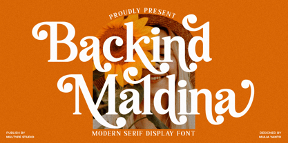 Backind Maldina is a chic,classy, and modern bold serif font with many alternates character to access in OpenType features. This font is perfect for branding, logos, social media, advertisements, product packaging, watermark, invitation, stationery, tshirt, prints, posters and more What’s Included : Uppercase & Lowercase Stylistic Alternate Ligature Numbers & Symbols Works on PC / Mac Simple installations Accessible in the Adobe Illustrator, Adobe Photoshop, Adobe InDesign, even work on Microsoft Word PUA Encoded Characters, Fully accessible without additional design software. Multilingual support Thank you for your purchase! Hope you enjoy with our font!
 - Asgaria by Cooldesignlab,
$15.00 Asgaria is a serif font family with an elegant and classy look. Each letter is designed with natural and beautiful curves. These fonts are tailor-made for luxury themed projects, from bold magazine images, to wedding invitations, branding, poster designs, logos, business cards and more. If you're involved in a project that requires beautiful, professional writing, this font is perfect to help you get it done. The Asgaria font features open, ligature and alternative types that are packaged in 2 fonts: Regular, and Italic. Asgaria fonts include uppercase, lowercase, numbers, punctuation marks and multilingual support.
 - Philliper by Gatype,
$14.00 Philliper is a signature bold script font, masterfully designed to become a true favorite. It maintains its modern classy influences while feeling contemporary and fresh. Fall in love with it and bring your projects to the highest levels! Philliper is perfect for product packaging, branding project, megazine, social media, wedding, or just used to express words above the background. Fonts featured : Uppercase, Lowercase, Numbers, Symbols, Accents, Stylistic, Swash, and Ligatures also Multilingual Support Enjoy the font, feel free to comment or feedback, send me PM or email. Thank you!
 - Romes by PeachCreme,
$16.00 Hi, peaches! Glad to introduce to you our latest “Romes” font duo that combines classy serif and cute script fonts. The exquisite curves of the serif font and natural beautiful flow of the script font can give your projects a voguish and elegant touch! Romes Script is a lovely and at the same time clear and easy-to-read handwriting font. Romes is a moderately bold font that blends traditional influences into a contemporary aesthetic. This font duo works well for branding, weddings, social media, product design, stationery, advertising, and many more.
 - Cift by Graptail,
$15.00 Cift Serif is inspired by the work of charming lettering artists with a combination of Old Style Display Bold. Each letter is modified so that the distance, width and weight can give the beauty of the alternates given. A passionate curve gives a touch of beauty to this font.
 - Ailey Display by Graptail,
$15.00 Ailey Display is inspired by the work of charming lettering artists with a combination of Old Style Display Bold. Each letter is modified so that the distance, width and weight can give the beauty of the alternates given. A passionate curve gives a touch of beauty to this font.
 - MBF Bad Motor by Moonbandit,
$15.00 Moonbandit proudly presents Bad Motor typeface, a powerful bold vintage font. Inspired by the glorious old world of route 66, Bad Motor is perfect for that retro look and feel for your projects. This typeface is maxed with anarchy, attitude and attention. OpenType features include ligatures and kerning.
 - Halvan by driemeyerdesign,
$35.00 HALVAN –a striking type with half-serifs The Halvan font family comes in 5 styles from Roman to Bold, Italic and a Small Caps Version. Each version includes old style figures and lining figures. It is a versatile type and can be used in a wide range of circumstances.
 - Globet - Personal use only

- DR Ad Astra by Darumo,
$15.00 Enjoy this sophisticated serif font. Modern trends finally meet timeless classics here. This typeface, wherever it's used, will give a sense of refinement in detail, and at the same time, a touch of relaxed elegance. If you are looking for a trendy font that could give you these feelings of modern grace and classic elegance, you've already found it. This font is quite versatile and can be used in both classic and modern designs. Whether it's a sensuous Jane Austen-inspired love letter or a trendy acid-jazz concert poster, this font will give your design a finished look and a touch of sophistication.
 - Reins by Craft Supply Co,
$20.00 Introduction Introducing Reins – Serif Typeface, a masterpiece that exudes classic elegance with a modern twist. Initially, it captivates with its timeless appearance and style. Versatility at its Best Moreover, it’s incredibly versatile, adapting seamlessly to a multitude of projects. From logos to editorial designs, it enhances every artwork it graces. Furthermore, it brings out the richness in your content, making each word profoundly striking. Classic Appeal This typeface carries a classic appeal, gracefully bridging the past and the present. Coupled with a sense of nostalgia, it remains relevant and attractive for contemporary designs. Therefore, each character stands out, adding a touch of historical elegance.
 - Barosa by NREY,
$19.00 Hi, friends! Introducing new typeface - Barosa. It is a new display font with 2 styles and cool characters. Typeface designed as monolite, all descending and ascending elements has same size as most characters. Barosa has multilingual support includes cyrillic. Many ligatures make your typography most variable. Barosa Typeface was inspired by ethnic slavonic style which combining classic typography with awesome features bring classic touch on this culture. It works well with normal size text and for large displays or short words. You may combine uppercase and smallcase in the text body, as alternates symbols. The Barosa typeface is suitable for : product packaging, labeling, logo, classic shop, ethnic shop, titles, etc
 - Hoax by More Etc,
$18.00 Introducing Hoax – a pre-worn sans serif with spirit, personality and distinction. This bold and semi-condensed sans serif is inspired by old copy machines and vintage prints. It is lively and eye-catching, ideal for where and when you want to make a lasting impression. Hoax is a celebration of character, a tribute to curiosity. Use this typeface and let everyone know that you mean business. OPENTYPE FEATURES: This font includes over 40 discretionary ligatures of prepositions and common words in English. These OpenType features can be accessed using OpenType friendly applications that allow the use of discretionary ligatures and stylistic sets. MULTILINGUAL SUPPORT: With over 700 glyphs, it has support for more than 150 languages, including Cyrillic script. List of discretionary ligatures: AND, ARE, AT, BY, FOR, EST, FEAT., FROM, IN, IS, OF, ON, OR, OUR, THAN, THAT, THE, TO, WITH, YOUR, CO. Each word is available in both upright and slanted versions. How to use: Activate the discretionary ligatures as you normally do in your OpenType friendly application. When activated, the words are in upright versions. To access the slanted versions, activate the first stylistic set (“Slanted Ligatures”). Happy typing!
 - Cooper BT by ParaType,
$30.00Bitstream Cooper was designed at Bitstream in 1986 by means of adding light, medium, and bold styles, with the corresponding italics, to the existing black ones. Based on Cooper Black, 1919, by Oswald Bruce Cooper, which was firstly released as a hand composition font in 1922 by Barnhart Brothers & Spindler of Chicago and later spread by ATF. Cooper Black is an extra bold face based on Cooper Old Style. Bitstream Cooper is an old style face with rounded serifs and tilted back ovals. For use both in text (normal weights) and in advertising and display typography (heavy weights). Cyrillic version was developed for ParaType in 2000 by Manvel Shmavonyan and based on TM Oswald face of TypeMarket, 1996, by Victoria Grigorenko. - GF Krater - Unknown license

- Crakoom! - Unknown license


