3,754 search results
(0.016 seconds)
- Beret by Linotype,
$29.99Brazilian designer Eduardo Omine designed his Beret family of typefaces in an attempt to create a warm counterpart to the clean, minimalist sans serif of the 20th Century. The most individual characteristics of Beret are the terminals at the ends of its vertical strokes. They are slightly bent", simulating a subtle flare. Like many classic sans-serif typefaces (e.g., the original Syntax and Univers), this family does not include true (calligraphic) italics. Instead, a masterful set of obliques has been created. As Stanley Morison articulated in the early 1920s and 30s, these slanted versions of the regular "roman" faces may even work better when one wishes to emphasize certain words or passages within a text. The Beret family of typefaces is suitable for numerous applications, in both text and display sizes. The following nine fonts make up the family's design: Beret Light, Beret Light Italic, Beret Book, Beret Book Italic, Beret Regular, Beret Medium, Beret Medium Italic, Beret Bold, and Beret Bold Italic. Beret was awarded an Honorable Mention in the 2003 International Type Design Contest, sponsored by the Linotype GmbH." - Interval Next by Mostardesign,
$25.00 Interval Next is a modern sans serif font family that is the successor of the successful Interval Sans Pro. Designed by Olivier Gourvat, Interval Next typeface consists of 16 fonts in 8 weights — Ultra Light, Light, Book, Regular, Medium, Semi Bold, Bold, Black— and has 4 styles. This super family combines a humanist mind with its contrasted shapes and a modern look with its open counters. With its four versatile styles (Condensed, Narrow, Roman and Wide) Interval Next has a creative palette able to meet the modern typographic demands. Its OpenType features will provide you almost unlimited multilingual support as well as small caps, case sensitive forms, proportional and tabular figures, slashed zero, numerators, superscripts, denominators, scientific inferiors, circled figures, subscript, ordinals, fractions, arrows and f-ligatures. Also extremely functional for professional editorial design, Interval Next has a pro kerning and would be extremely suitable for mobile applications, e-books, web sites, headlines, posters, signage and many more. Interval Next covers a large spectrum of languages such as West European, East European and the Cyrillic.
 - Slate by Monotype,
$34.99 A typeface of grace, power and exceptional versatility, the Slate collection is a truly beautiful design that achieves stellar levels of readability, both in print and on screen. Created by the award winning type designer Rod McDonald, this six-weight sans serif family is a rare example of sublime aesthetics meeting world-class functionality. The typeface’s legible letterforms embody an amalgam of the best traits of both humanistic and grotesque letterforms. “I didn’t want a face with an ‘engineered’ look, or with any noticeable design gimmicks or devices,” admits designer McDonald. “I wanted a pure design. I confess that I was ruthless with any character that wanted to stand out from the rest.” The Slate collection is available in six weights with complementary italics, with slight changes in structure from the light to the black weights. Its light weight is reminiscent of early American sans. Whether for use in display work or in longer-form settings, few typefaces possess the beauty and power of this design, leaving the Slate family an excellent addition to any designer’s typographic quiver.
 - Sinova by Linotype,
$29.99 The simplified letterforms of Sinova™ make it an ideal choice for those settings where you really don't want the type to shout too loudly or draw unnecessary attention to itself. Christian Mengelt has drawn five weights: Thin, Light, Regular, Medium, and Bold, all with complimentary obliques. Sinova is an OpenType family that is unfussy, functional, and legible, with extensive language support (some 48 languages). Thanks to its clear and straightforward design and dynamic rhythm, one of the main characteristics of Sinova is its excellent legibility, irrespective of whether it is used in longer passages as a stylish book script or for text in the digitalised office environment. But Sinova also happily adapts itself to being used as a titling font in combination with Renaissance Antique serif typefaces. For this reason, another potential application for the font family is as a graceful and elegant titling and text script for job printing and in publicity texts. The two complementary stroke widths, light and bold, are perfect for commercial applications.
 - TXT101 by 101 Editions,
$19.00 TXT101 is a fresh, friendly typeface for mock text and borders. As a retro-cool digital successor to the pencil marks that were hand-drawn as placeholder text in the analog era, TXT101 includes 52 styles, from Arch to Zigzag, with a couple of loops, several slants, and a swell set of waves. If your final copy is TBD, use TXT101 to mock up roman, bold, italic or light. TXT101 looks GR8 and is EZ to set. BWTM! Corner pieces make TXT101 a complete and charming bordering typeface. All patterns come in four weights, so you can make frames and borders for everything from little labels to big broadsides. Corners (north, south, east, west) are TTLY a snap to select from their own stylistic sets. DIY: MIX & MATCH TO CREATE COOL PATTERNS! Many styles have aligning baselines, so glyphs will connect. Single- and double-line variations abound, and you can combine weights (light, regular, bold, black) as well as styles. BTW, feel free to insert word spaces or leave them out.
 - Core Sans CR by S-Core,
$20.00 Core Sans CR family is a rounded version of Core Sans C; a part of the Core Sans Series, such as Core Sans N, Core Sans M, Core Sans E, Core Sans A, Core Sans D, Core Sans G, Core Sans R and Core Sans B. Core Sans CR is inspired by classic geometric sans (Futura, Avenir, Avant Garde etc.). It is based on geometric shapes, like near-perfect circle and square. It has a much higher x-height (height of lowercase letters), an effect which promotes readability especially at small print sizes. The Core Sans C Family consists of 9 weights (Thin, Extra Light, Light, Regular, Medium, Bold, Extra Bold, Heavy, Black) and Italics for each format. Core Sans C supports complete Basic Latin, Cyrillic, Central European, Turkish, Baltic character sets. Each font includes proportional figures, tabular figures, oldstyle figures, numerators, denominators, superscript, scientific inferiors, subscript, fractions and case features. Core Sans C is an ideal font family for use in magazines, web pages, screens, displays, and so on.
 - Mellow Serif by ParaType,
$30.00 Mellow Serif is a soft and friendly typeface. It looks compelling in large point sizes due to the rounded terminals and calligraphic details. Mellow Serif also works well in body text with a small leading size as it has even proportions and a large x-height. Mellow Serif includes ten styles—five upright and five italic, ranging from Light to Extra Bold. The typeface supports extended Latin, extended Cyrillic, and Greek. The character set also includes old style figures, small caps in the Light, Regular, and Medium upright styles as well as stylistic alternate sets that slightly change the way Mellow Serif looks in large point sizes. The Regular style also has alternative letterforms with swashes. Mellow Serif is great for book printing (from fiction and children’s books to science literature), headings, and large texts on the web as well as for toys and confectionary packaging. It also works perfectly with a rounded sans serif Mellow Sans. Mellow Serif was created by Natalya Vasilyeva, an expert in designing text and calligraphic typefaces, and released by Paratype in 2023.
 - Margita by Din Studio,
$20.00 Have you ever missed something in creating a pretty design and thought of adding your magic touch to it? Margita is more than just a script font as it expresses luxury and elegance in each character from which you will increase your sales and leave the best impressions. This font has great legibility and thickness level options to make it more special. As a result, you have more freedom of how and where you will use it. Include 8 different weight fonts: Margita Hairline Margita Thin Margita Light Margita Light Margita Regular Margita Medium Margita Semi Bold Margita Bold Features: Multilingual Options PUA Encoded Numerals and Punctuation Margita fits best for various designs, such as posters, banners, logos, book covers, headings, printed products, merchandise, social media, and more. Find out more ways to use this font by taking a look at the font preview. Enjoy your experience with this font and feel free to contact us for further product information or trouble complaints. Thank you for purchasing our font and happy designing.
 - Absalon by Michael Nordstrom Kjaer,
$39.00 Absalon has square letter shapes. It has some characteristics semi-sharp and semi-rounded corners and it has a relatively tall x-height for legible text. To create the perfect typesetting the spaces between individual letter forms has been precisely adjusted. The Absalon font family is perfect for the web as well as for print, for display as well as longer text, for motion graphics, on the side of a van, t-shirts, logotypes and so on. The font family consist of 5 weights or 10 styles and it has 410 glyphs. A total of more than 4000 glyphs. The styles are: Light, Light Italic, Regular, Italic, Medium, Medium Italic, Bold, Bold Italic, Extra Bold & Extra Bold Italic. It has OpenType features such as automatic fractions, subscript, superscript, numerators, denomerators, ordinals and the “f” ligature set. Absalon has extended language support (most Latin-based scripts are supported). The name of the font family is Absalon and it is a reference to a Danish bishop in the middle ages. He was a key figure in the founding of Copenhagen, the Capital of Denmark.
 - Serpentine by Image Club,
$29.99Dick Jensen (USA) designed Serpentine, is a contemporary-looking display font, for the Visual Graphics Corporation in 1972. With the rise of digital typesetting and desktop publishing, this typeface quickly became both popular and ubiquitous. This dynamic, wide, boxy design is identifiable via tiny triangular swellings at the stroke endings - what might be called semi-serifs. Serpentine is available in six different font styles: Light, Light Oblique, Medium, Medium Oblique, Bold, and Bold Oblique. Serpentine" is a greenish rock that sometimes resembles a serpent's skin, and is often used as a decorative stone in architecture. Though this font doesn't seem at all snaky or sinuous, it does have an architectural, stone-like solidity. The subtle, almost non-existent curves and semi-serifs keep it from being too stern or cold. Although the underlying strokes of each weight are similar, the six members of the Serpentine font family all present their own individual personalities. Serpentine Light lends itself well to text for onscreen displays, for instance, while the numbers from typeface's heavier weights are seen around the world on soccer jerseys! Additionally, the oblique styles convey a streamlined sense of speed, furthermore lending Serpentine well to sport and athletic applications (especially the faster, high-speed varieties). Because of its 1970s pedigree, Serpentine has come to be known as a genuine "retro" face. This makes the typeface even more appropriate for display usage, in applications such as logo design, magazine headlines, and party flyers. If you like Serpentine, check out the following similar fonts in the Linotype portfolio: Copperplate Gothic (similar serifs) Eurostile (similar width) Princetown (another "athletic" font) Insignia (similar "techno" feeling)" - Serpentine by Linotype,
$29.00Dick Jensen (USA) designed Serpentine, is a contemporary-looking display font, for the Visual Graphics Corporation in 1972. With the rise of digital typesetting and desktop publishing, this typeface quickly became both popular and ubiquitous. This dynamic, wide, boxy design is identifiable via tiny triangular swellings at the stroke endings - what might be called semi-serifs. Serpentine is available in six different font styles: Light, Light Oblique, Medium, Medium Oblique, Bold, and Bold Oblique. Serpentine" is a greenish rock that sometimes resembles a serpent's skin, and is often used as a decorative stone in architecture. Though this font doesn't seem at all snaky or sinuous, it does have an architectural, stone-like solidity. The subtle, almost non-existent curves and semi-serifs keep it from being too stern or cold. Although the underlying strokes of each weight are similar, the six members of the Serpentine font family all present their own individual personalities. Serpentine Light lends itself well to text for onscreen displays, for instance, while the numbers from typeface's heavier weights are seen around the world on soccer jerseys! Additionally, the oblique styles convey a streamlined sense of speed, furthermore lending Serpentine well to sport and athletic applications (especially the faster, high-speed varieties). Because of its 1970s pedigree, Serpentine has come to be known as a genuine "retro" face. This makes the typeface even more appropriate for display usage, in applications such as logo design, magazine headlines, and party flyers. If you like Serpentine, check out the following similar fonts in the Linotype portfolio: Copperplate Gothic (similar serifs) Eurostile (similar width) Princetown (another "athletic" font) Insignia (similar "techno" feeling)" - Referenz Grotesk by Sudtipos,
$49.00 Made in Germany, Referenz Grotesk is a typeface full of references referring to the type design history of Stuttgart State Academy of Art and Design. Its typographic history holds a broad spectrum of shapes and characters, including F.H. Ernst Schneidler (1882–1956), Imre Reiner (1900–1987), Walter Brudi (1907–1987), Kurt Weidemann (1922–2011) and Frank Heine (1964–2003). During extensive research phases for Referenz Grotesk included collection and analysis. This led to further research in the Academy’s collection and archive where the majority of Weidemann’s estate is housed next to works of other designers and professors like F.H. Ernst Schneidler and Walter Brudi. Another place of research was the typesetting workshop where Schneidler had previously taught and worked. Some of his freshly cast fonts were tested and used there for the first time and are still stored in several of the type cases. Regarding the more recent history, for instance about the Emigre designer Frank Heine, former colleagues and professors have been consulted. These studies resulted in the new font Referenz Grotesk that includes traces of Kurt Weidemann’s Corporate as well as calligraphic hints that link to Schneidler’s Stuttgarter Schule (Stuttgart School) where writing played an important role during the form finding process. For the regular text fonts these features are integrated in a subtle manner whereas several alternative glyphs pick up more expressive forms. The final sans serif type family has a clarity and contemporary straightness that becomes more characteristic in its heavier weights. Additionally more than 60 alternative glyphs per weight allow for individual combinations that can be tailored specifically for each application and context. They open up a broad range of visual expressions, from subtle to playful and eccentric characteristics. Referenz Grotesk is available in six weights: Light, Regular, Medium, Bold, Extra Bold and Black, plus italics. In addition, the family includes multiple OpenType functions such as Stylistic Sets, Tabular Figures and Case Sensitive forms. Variable version of the font is included when you license the full pack.
 - Rotola TH Pro by Elsner+Flake,
$40.00 Karl-Heinz Lange presented his first drafts of Rotola during a Typoart® type design competition in 1985 under the name "Boutique". A year later, Norbert du Vinage, former manager of the type design department, integrated "Boutique" in his production plan. Due the Fall of the Wall, it took about 18 years until Lange finished this font family in cooperation with Elsner+Flake. Karl-Heinz Lange was born on July 29, 1929 in Wiesenkirch in West Prussia. He was enrolled in the Humanistic Gymnasium at Elbing from 1939 to 1945 and changed to the Wernigerode High School after his family had to flee to central Germany. From 1949 to 1951, Karl-Heinz Lange studied at the Werkkunstschule Halle, where one of his teachers was Professor Post. After 1951, he continued his studies at the Hochschule for Grafik und Buchkunst in Leipzig with an emphasis on book design. He received his diploma in 1955 with distinction based on his design of a hot metal typeface. From 1956 to 1961, Karl-Heinz Lange worked as a lecturer for Type and Commercial Graphics at the Hochschule für Angewandte Kunst in Magdeburg. From 1961 to 1963, he taught at the Hochschule für Grafik und Buchkunst in Leipzig, and finally as a freelance commercial designer in Magdeburg. He worked on a variety of assignments, one of which was the design of trick films. From 1969 to 1976 he took the position of Artistic Director of the Henschelverlag, Berlin; from 1976 to 1994 he was Professor of Type and Typography at the Fachschule für Werbung und Gestaltung in Berlin; and, until 2004, he taught at various institutes for advanced professional education. From 2005 to 2007 he taught at the Fachhochschule Magdeburg/Stendal. Karl-Heinz Lange was awarded the second prize at the "International Type Design Contest 1971" for a headline typeface, and, in 1984, at the XI. Biannual of Graphic Design in Brno, he won a Silver Medal for the design of his typeface family Publica. He created the telephone book typeface Minima and re-designed the Typoart Super Grotesk® (Arno Drescher, 1930) as well as the Newspaper typeface Magna® by Herbert Thannhaeuser for the use on digital typesetting systems. To the day of his death on June 29, 2010, Karl-Heinz Lange lived and worked as a type designer. Among others, he closely followed the designs of the typefaces which were developed under his guidance for Typoart®: "Publica®", "Typoart Super Grotesk®" and "Minima®" which he launched as "Publicala", "Minimala" and "Superla" in 2009. In cooperation with Elsner+Flake, he developed the Typeface family "Rotola" between 2006 and 2009 as well as the script families of the "Viabella®" series. To the end, he followed the development of his first typeface, the "Diplom Antiqua", which he also wanted to bring to market together with Elsner+Flake.
 - Second Lesson by Mans Greback,
$59.00 Second Lesson is a classic handwriting typeface. A calligraphic typeface family, Second Lesson follows the flowing and traditional handwritten typography taught at school. The script lettering is provided in styles Regular and Bold, and consists of over 1000 glyphs and support all Latin based languages as well as Russian, Bulgarian and other Cyrillic languages. Drawn and created by Mans Greback in 2021, this lettering has a slanted style and a beautiful personality. The font is built with advanced OpenType functionality and has a guaranteed top-notch quality, containing stylistic and contextual alternates, ligatures and more features; all to give you full control and customizability. It has extensive lingual support, covering all Latin-based languages, from North Europe to South Africa, from America to South-East Asia. It also supports Cyrillic. It contains all characters and symbols you'll ever need, including all punctuation and numbers.
 - Freco by Canada Type,
$24.95Freco is a celebration of the short but very productive life of Dutch designer and illustrator Fré Cohen (1903-1943). This font is mostly an assembled compilation of letters Fré created for a variety of print designs over the years, showcasing her consistent talent for the architectural moderne, art deco, and Wendingen styles of her era. Freco is a prime example of how seemingly minute details can visually be most relevant and consequential in typography. Fré Cohen's subtle variations on the familiar art deco forms and contrast have made her typographical work so stunning it continues to be taught and celebrated as some of the finest 20th century Dutch design. Freco comes in an expanded character set that includes support for Central and Eastern European languages, as well as Turkish, Baltic, Celtic, Maltese and Esperanto. It also includes complementary alternate forms and letter combinations for added flexibility in usage. - Quatre by Blank Is The New Black,
$15.00 Quatre is a clean, friendly, monoline display script with a number of subtle but significant features. Originally based on the style of cursive you may or may not have been taught in middle school, Quatre has a clean geometric flow to it while containing a robust set of OpenType features such as ligatures, swash capitals, and stylistic alternates that give it a unique look. With over 700 glyphs, coverage for over 30 languages, arbitrary fractions, contextual alternates and more, Quatre will have you covered for whatever situation you may run into. I mean, probably. I can’t know every single weird way you might be trying to use it. The point is, it’s got all of the bells and whistles you could reasonably hope for. Make sure you open up the OpenType panel in Illustrator, Photoshop, and InDesign to make use of all of those features.
 - Soundboy by Kustomtype,
$25.00 Soundboy is an ode to Elvis Presley and his music. The font was drawn by hand from a number of images from the Blue Hawaii film and finished to perfection. The digitization was done with great care and the font was also provided with a number of extras such as ligatures. Soundboy is a playful and translatable font that at first sight has already caught everyone with a spontaneous and broad smile. Logos, house styles, magazines, covers, vinyl records, book covers, t-shirts, house styles and all kinds of other graphic expressions will look a lot happier. This font is more than welcome in this sour society. The packaging makes the consumer buy and Soundboy certainly contributes to that. Don't wait for someone else to get it in your area, the best designs deserve the most beautiful fonts. Enjoy the "Soundboy font", it will never let you down.
 - Cybertroops by Maulana Creative,
$12.00 Cybertroops is a square letterform concept as mono handwritten display font. With light mono-line stroke, fun character with a bit of ligatures. To give you an extra creative work. Cybertroops font support multilingual more than 100+ language. This font is good for logo design, Social media, Movie Titles, Books Titles, a short text even a long text letter and good for your secondary text font with sans or serif. Make a stunning work with Cybertroops font. Cheers, MaulanaCreative
 - Jekatep by ActiveSphere,
$30.00 Jekatep is a sans-serif display font and works best in text and display applications, such as posters, headline, magazine, logos, titles, product branding, corporate branding and publishing. Jekatep font has three weights; light, regular, and bold, each available in italic, making a total of six styles. Each style has a full upper and lower-case, accents, punctuation and a selection of monetary symbols. Currently Available for Mac and PC, in Open Type, PostScript or TrueType.
 - Mottel Laguna by Maulana Creative,
$14.00 Mottel Laguna is a handwritten display font. With light contrast stroke, upright and fun character with a bit of ligatures. To give you an extra creative work. Mottel Laguna font support multilingual more than 100+ language. This font is good for logo design, Social media, Movie Titles, Books Titles, a short text even a long text letter and good for your secondary text font with sans or serif. Make a stunning work with Mottel Laguna font. Cheers, MaulanaCreative
 - Fraksen by Maulana Creative,
$14.00 Fraksen is a handwritten sans display font. With light consist stroke, fun character with a bit of ligatures and alternates. To give you an extra creative work. Fraksen font support multilingual more than 100+ language. This font is good for logo design, Social media, Movie Titles, Books Titles, a short text even a long text letter and good for your secondary text font with sans or serif. Make a stunning work with Fraksen font. Cheers, Maulana Creative
 - Linotype Afrika by Linotype,
$29.99Linotype Afrika, from German type designer Jörg Herz, is part of the TakeType Library, chosen from the entries of the Linotype-sponsored International Digital Type Design Contest 1999 for inclusion on the TakeType 3 CD. Dancing, jumping, and playing, the lively beings of this symbol font exude joy. Ornaments and a few frolicking animals complete the font. Combining the single figures, whether as decoration or border, creates a pattern which will surprise you with its lightness and dynamism. - Varino by Arterfak Project,
$15.00 Varino is a futuristic font. A font family inspired by the visual of technology that we can find in logos, Sci-Fi movies, games, and the present gadgets. Designed with minimalist style and unique letterforms, Varino is a perfect choice to use for logos, labels, posters, packaging, books, movies, presentations, games, and much more! Varino, complete with some elegant ligatures, will make your design look more futuristic and dynamic. Varino comes in Light, Normal, Bold, Outline and Extrude.
 - Logisco by Ideabuk,
$16.00 Introducing Logisco - a sleek and versatile display font family that combines modern geometry with a retro-cool vibe. This six-font collection boasts soft, rounded corners that add a dash of playfulness to any project. Logisco Light, Regular, and Bold offer a range of weights to fit any typographic need, while the Stencil variations add a unique edge to your designs. Whether you're creating sleek logos or funky posters, Logisco has you covered with its stylish and versatile letterforms.
 - M Ellan HK by Monotype HK,
$523.99 M Ellan HK is a soft yet robust typeface that strikes an appropriate balance between vertical and horizontal strokes (豎、橫). Finials of strokes are sharp but gentle, alluding to the appeal of calligraphy. It is elegant as well as contemporary. M Ellan Light features similar thickness in vertical and horizontal strokes (豎、橫) that together make it lucid and appealing, while thickness of strokes in M Ellan Bold are accordingly adjusted to maintain its friendly and graceful character.
 - Baraka by Typophobia,
$20.00 Baraka - in Swahili - a blessing. It is a simple, block-like typeface closed in cuboids. It was created and designed in Tanzania, Africa. It contains 183 gliphs, which due to their simplicity, which consisted in cutting out letters from rectangles using as little light as possible, makes an impression and is in fact a very heavy display typeface. It was created primarily for posters and labels, where thanks to its modularity and form enclosed in a limited geometric figure
 - FF Speak by FontFont,
$62.99 Danish type designer Jan Maack created this sans-serif FontFont in 2007. The family has 8 weights, ranging from Light to Heavy (including italics) and is ideally suited for advertising and packaging, editorial and publishing, logo, branding and creative industries as well as web and screen design. FF Speak provides advanced typographical support with features such as ligatures, case-sensitive forms, fractions, super- and subscript characters, and stylistic alternates. It comes with tabular lining and proportional lining figures.
 - Getman by Dima Pole,
$25.00 Getman is a light Gothic typeface. It made all the rules and traditions of classic Gothic typeface, but it has lightweight shapes, making it easy to read and understood. Getman is based on the works of type masters 1910s. This font has all 104 European alphabets, all Slavic alphabets, OpenType features (ligatures, oldstyle numerals, fistorical forms, localized forms, fractions, ordinals and others). Getman has an historic beauty of the medieval Germanic national script. Glory to the Germans!
 - Physe by Typotheticals,
$5.00 Physe. Physe is a basic set of fonts, designed for scrapbooking and general use. It comes in a variety of versions, with a light version, expanding up to bold. Many hurdles were taken to finalize this version, both physical and electronic. Like all of us, as I grow older, my glaucoma keeps pace with my arthritis, while I look on in amusement, hedging my bets on which will be the one to finally complete my retirement.
 - Chiffon by SilkType,
$35.00 Chiffon is a serif, display typeface. With high contrast and elegant curves. Chiffon includes three different versions of ‘c’ and ‘e’, which are carefully placed throughout the typeface, paired seamlessly with the following glyph. However, OpenType features and stylistic sets make the alternate forms available for the user to choose from as they see fit. Velour is available in 5 weights, from Extra light to Semi Bold, and supports Western, Central, and South-Eastern European languages.
 - Grandpas Typewriter by Misprinted Type,
$20.00 Granpa’s typewriter comes from an antique Olivetti Typewriter Machine I have. This font has all of the effects a typewriter machine can offer you: a regular version, a strong hit version, a light distressed version, a double-hit version and X version, which is a compilation of several typewriter mistakes, tests and stains. This font is specially handy when trying to use a typewriter effect on an edgy/grunge work, where there's no worry about perfection!
 - Tex Writer by Designova,
$15.00 Tex Writer is a custom handmade / handwritten Serif typeface with a simple and casual personality making it perfect for text typography, logotypes, marketing graphics, branding, package and advertisement design and anything in between. Extended Character Sets Along with the basic Latin character set, we have added Western European, Central European, South Eastern European character sets for your convenience. What You Get This typeface comes with 14 fonts having 7 weights + 7 italics (Light / Regular / Medium / SemiBold / Bold / ExtraBold / Heavy).
 - Quta by Fo Da,
$15.00 Quta is a sans serif typeface produced by FoDa foundry, that meets all the needs of professionals who search a family of clean geometric font, very well suited for headlines, newspaper and many purposes. With a basic character set in Five weights with their italics. Quta covers many features like: -Five main weights (Light, Regular, Medium, Bold and Extra Bold) -Matching italics for all weights. -language support for many Latin-based scripts -Ligatures and many other OpenType features.
 - Sonora by profonts,
$51.99 Sonora is a brandnew profonts script typeface family supplied in the new OpenType Pro font format. Sonora contains six styles as light, medium, bold and the corresponding italics. The character set covers about 1.500 glyphs for the complete Latin character set (West, East, Baltic, Turkish, Romanian), and a huge number of handmade ligatures and alternates to make it a perfect OpenType Pro connecting script. Sonora is a very distinguished, elegant and versatile, intentionally non-slanted script font.
 - Papagayo by Jonahfonts,
$30.00 Papagayo in 6 versions Light & Regular with Italics and Small-Caps. Designed with short ascenders and descenders for tighter line spacing. Effective for short headlines and texts. By invoking the Stylistic Alternates feature to an entire line or paragraph the M W g m w y will result in their respective alternates. You can also invoke each single glyph with the Alternate feature. The Alternates g & y contain a more characteristic letter-form for improving legibility in smaller texts.
 - Clifttons by Maulana Creative,
$12.00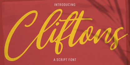 Clifttons is a Beauty yet casual signature font. With light stroke, slanted, unique and fun character with a bit of ligatures. To give you an extra creative work. Clifttons font support multilingual more than 100+ language. This font is good for logo design, Social media, Movie Titles, Books Titles, a short text even a long text letter and good for your secondary text font with sans or serif. Make a stunning work with Clifttons font. Cheers, MaulanaCreative
 - Bruna by Antonio Lechuga,
$35.00 Its open counters and large x height give it excellent performance in small sizes. On the other hand, its curved diagonals, generous width and soft shapes give it a friendly but functional personality for a wide range of messages and voices. We recommend the four most extreme weights (Thin, ExtraLight, Black, and Heavy) for large sizes starting at 18 points, and the five intermediate weights (Light, Book, Regular, Medium, and Bold) for small sizes starting at 7 points.
 - Castella by Maulana Creative,
$14.00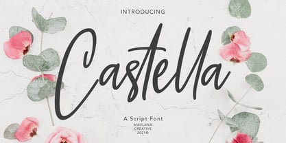 Castella is simply casual script font, with light felt-tip stroke, slant and fun character. It has Opentype features ligatures of character, To give you an extra creative work. Castella script font support multilingual more than 100+ language. This font is good for logo design, Social media, Movie Titles, Books Titles, a short text even a long text letter and good for your secondary text font with sans or serif. Make a stunning work with Castella font. Cheers, MaulanaCreative
 - St Ryde by Stereotypes,
$- St Ryde is a humanistic sans-serif with a slight touch of a script typeface. The most significant aspect of the typeface is the combined sharp and round treatment of the stroke endings. The complete Ryde Family contains five weights including real matching italics, so you can choose from thin, light, regular, medium and bold. St Ryde has a wide range of characters, including small caps, lining proportional and tabular figures plus small caps figures, too.
 - Biotif by Degarism Studio,
$45.00 BIOTIF is a modern sans serif with a geometric typical characters, Inspired by Modern Style & Industrial Era Typographic and Graphic design, comes in 16 weights from Light to Black, BIOTIF is was manually hinted and optimized in small sizes for screens. All the other characters can be accessed through the Opentype features. Fractions, Tabular Lining, Ligature, Alternate Characters, Circle Numbers, Symbols, arrow and more. Biotif has support for Multi-Language (Latin Extended) Western European, Central European & South European.